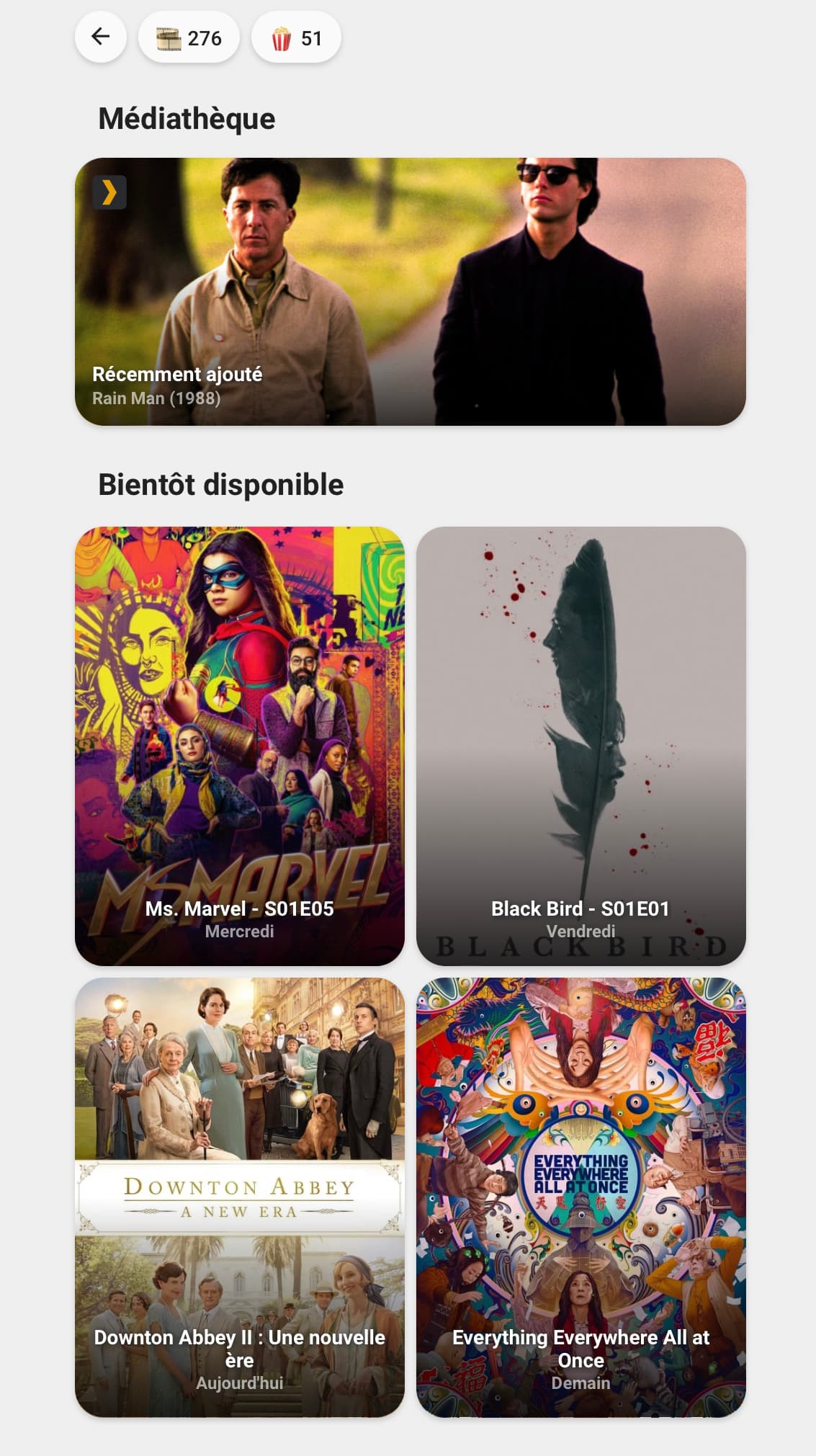
Salut tout le monde !
Si ca vous intéresse, j’ai créer des cartes pour les intégrations : « Plex Recently Added », « Sonarr Upcoming Media » et « Radarr Upcoming Media ».
Pour la carte Plex :
Cette carte a besoin des éléments suivants pour fonctionner correctement :
Utilisation :
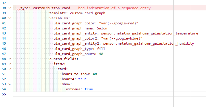
- type: custom:button-card
  template: "card_plex_recently_added"
  entity: sensor.plex_recently_added
  name: Récemment ajouté
Pour la carte Sonarr :
Cette carte a besoin des éléments suivants pour fonctionner correctement :
Utilisation :
- type: custom:button-card
  template: "card_sonarr_upcoming"
  entity: sensor.sonarr_upcoming_media
  variables:
    ulm_card_upcoming_media: 1
Variables :
| Variable |
Exemple |
Requis |
Explication |
| ulm_card_upcoming_media |
3 |
oui |
Le numéro de l'élément à afficher |
Pour la carte Radarr :
Cette carte a besoin des éléments suivants pour fonctionner correctement :
Utilisation :
- type: custom:button-card
  template: "card_radarr_upcoming"
  entity: sensor.radarr_upcoming_media
  variables:
    ulm_card_upcoming_media: 1
Variables :
| Variable |
Exemple |
Requis |
Explication |
| ulm_card_upcoming_media |
2 |
oui |
Le numéro de l'élément à afficher |
Le code du template pour les trois cartes :
card_media:
  show_icon: false
  show_name: true
  show_label: true
  show_state: false
  styles:
    grid:
      - grid-template-areas: '"n n" "l l"'
      - grid-template-columns: min-content auto
      - grid-template-rows: min-content min-content
    card:
      - z-index: 0
      - border-radius: var(--border-radius)
      - box-shadow: var(--box-shadow)
      - background-size: cover
      - background-position: center center
      - text-shadow: >
          [[[ return entity == "undefined" ? 'none' : '1px 1px 5px rgba(18, 22, 23, 0.9)'; ]]]
    name:
      - z-index: 2
      - color: white
      - font-weight: bold
      - font-size: 14px
    label:
      - z-index: 2
      - color: white
      - font-weight: bold
      - font-size: 12px
      - filter: opacity(60%)

card_plex_recently_added:
  triggers_update: "all"
  template:
    - "card_media"
    - "ulm_language_variables"
  label: >
    [[[
      if (entity == "unavailable"){
        return variables.ulm_unavailable;
      } else if (entity == "undefined"){
        return variables.ulm_unknow;
      } else{
        var data = entity.attributes.data;
        var number = (data[1].number == undefined) ? '(' + data[1].aired.split('-')[0] + ')' : data[1].number;
        return `${data[1].title} ${number}`;
      }
    ]]]
  aspect_ratio: 5/2
  styles:
    grid:
      - grid-template-areas: '"icon ." "n n" "l l" ". ."'
      - grid-template-rows: auto repeat(2, min-content) 12px
    card:
      - padding: 0
      - background-image: >
          [[[ return entity === undefined || `url(${states[entity.entity_id].attributes.data[1].fanart})`; ]]]
    name:
      - align-self: end
      - justify-self: start
      - margin-left: 12px
    label:
      - align-self: start
      - justify-self: start
      - margin-left: 12px
    custom_fields:
      icon:
        - z-index: 2
        - align-self: start
        - justify-self: start
        - height: 24px
        - width: 24px
        - margin-left: 12px
        - margin-top: 12px
      blur:
        - z-index: 1
        - position: absolute
        - top: 0
        - left: 0
        - height: 100%
        - width: 100%
        - border-radius: var(--border-radius)
        - background: linear-gradient(rgba(0,0,0,0) 40%, rgba(0,0,0,0.8) 100%)
  custom_fields:
    icon: >
      <svg viewBox="0 0 50 50">
        <path d="M7.7.3h34.6c4.1 0 7.4 3.3 7.4 7.4v34.6c0 4.1-3.3 7.4-7.4 7.4H7.7c-4.1 0-7.4-3.3-7.4-7.4V7.7C.3 3.6 3.6.3 7.7.3z" fill="#282a2d"/>
        <path d="M25,7.1H14.6L25,25L14.6,42.9H25L35.4,25L25,7.1z" fill="#e5a00d"/>
      </svg>
    blur: >
      [[[ return entity === undefined ? null : '<div id="blur"></div>'; ]]]
  tap_action:
    action: none

card_upcoming_media:
  aspect_ratio: 3/4
  styles:
    card:
      - background-image: >
            [[[ return entity === undefined || `url(${states[entity.entity_id].attributes.data[variables.ulm_card_upcoming_media].poster})`; ]]]
    grid:
      - grid-template-areas: '". . ." ". n ." ". l ." ". . ."'
      - grid-template-columns: "8px 1fr 8px"
      - grid-template-rows: auto repeat(2, min-content) 8px
    name:
      - align-self: end
      - justify-self: center
      # - display: inline
      # - max-width: 95%
      # - max-width: 200px
    label:
      - align-self: start
      - justify-self: center
    custom_fields:
      blur:
        - z-index: 1
        - position: absolute
        - top: 0
        - left: 0
        - height: 100%
        - width: 100%
        - border-radius: var(--border-radius)
        - background: linear-gradient(rgba(0,0,0,0) 50%, rgba(0,0,0,0.8) 100%)
  extra_styles: >
    .ellipsis:not(#blur){
      white-space: normal !important;
      word-wrap: break-all;
      max-height: 2.4em;
      line-height: 1.2em;
    }
  custom_fields:
    blur: >
      [[[ return entity === undefined ? null : '<div id="blur"></div>'; ]]]

card_sonarr_upcoming:
  triggers_update: "all"
  template:
    - "card_media"
    - "card_upcoming_media"
    - "ulm_language_variables"
  variables:
    ulm_card_upcoming_media: 1
  label: >
    [[[
      var data = entity.attributes.data;
      var airdate = new Date(data[variables.ulm_card_upcoming_media].airdate);

      Date.prototype.addDays = function (days) {
        const date = new Date(this.valueOf());
        date.setDate(date.getDate() + days);
        return date;
      }

      function formatDate(date){
        var weekday = ['Dimanche','Lundi','Mardi','Mercredi','Jeudi','Vendredi','Samedi'];
        var now = new Date();
        var tomorrow = now.addDays(1);

        var time = date - now;
        var secs = parseInt((time / 1000), 10);
        var days = Math.floor(secs / (3600*24));

        if (days < 6){
          if (weekday[date.getDay()] == weekday[now.getDay()]){
            return "Aujourd'hui";
          } else if (weekday[date.getDay()] == weekday[tomorrow.getDay()]){
            return "Demain";
          } else{
            return weekday[date.getDay()];
          }
        } else{
          return date.toLocaleDateString("fr-FR");
        }
      }
      return formatDate(airdate);
    ]]]
  name: >
    [[[
      if (entity == "unavailable"){
        return variables.ulm_unavailable;
      } else if (entity == "undefined"){
        return variables.ulm_unknow;
      } else{
        var data = entity.attributes.data;
        var number = data[variables.ulm_card_upcoming_media].number;
        return `${data[variables.ulm_card_upcoming_media].title} - ${number}`;
      }
    ]]]

card_radarr_upcoming:
  triggers_update: "all"
  template:
    - "card_media"
    - "card_upcoming_media"
    - "ulm_language_variables"
  variables:
    ulm_card_upcoming_media: 1
  label: >
    [[[
      var data = entity.attributes.data;
      var release = data[variables.ulm_card_upcoming_media].release;
      var airdate = new Date(data[variables.ulm_card_upcoming_media].airdate);

      Date.prototype.addDays = function (days) {
        const date = new Date(this.valueOf());
        date.setDate(date.getDate() + days);
        return date;
      }

      function formatRelease(release){
        if(release.includes("Available")){
          return ""
        } else if (release.includes("In Theaters")){
          return "au cinéma"
        }
      }

      function formatDate(date){
        var weekday = ['Dimanche','Lundi','Mardi','Mercredi','Jeudi','Vendredi','Samedi'];
        var now = new Date();
        var tomorrow = now.addDays(1);

        var time = date - now;
        var secs = parseInt((time / 1000), 10);
        var days = Math.floor(secs / (3600*24));

        if (days < 6){
          if (weekday[date.getDay()] == weekday[now.getDay()]){
            return "Aujourd'hui";
          } else if (weekday[date.getDay()] == weekday[tomorrow.getDay()]){
            return "Demain";
          } else{
            return weekday[date.getDay()];
          }
        } else{
          return date.toLocaleDateString("fr-FR");
        }
      }
      return formatDate(airdate) + " " + formatRelease(release);
    ]]]
  name: >
    [[[
      if (entity == "unavailable"){
        return variables.ulm_unavailable;
      } else if (entity == "undefined"){
        return variables.ulm_unknow;
      } else{
        var data = entity.attributes.data;
        return `${data[variables.ulm_card_upcoming_media].title}`;
      }
    ]]]
 Merci àtoi