Je me répond à moi même car j’ai trouvé la solution à mon problème et si ca peux en aider certains 
L’idée est toujours d’utiliser les custom:button-card et d’insérer dans les custom_fields une carte picture-glance :
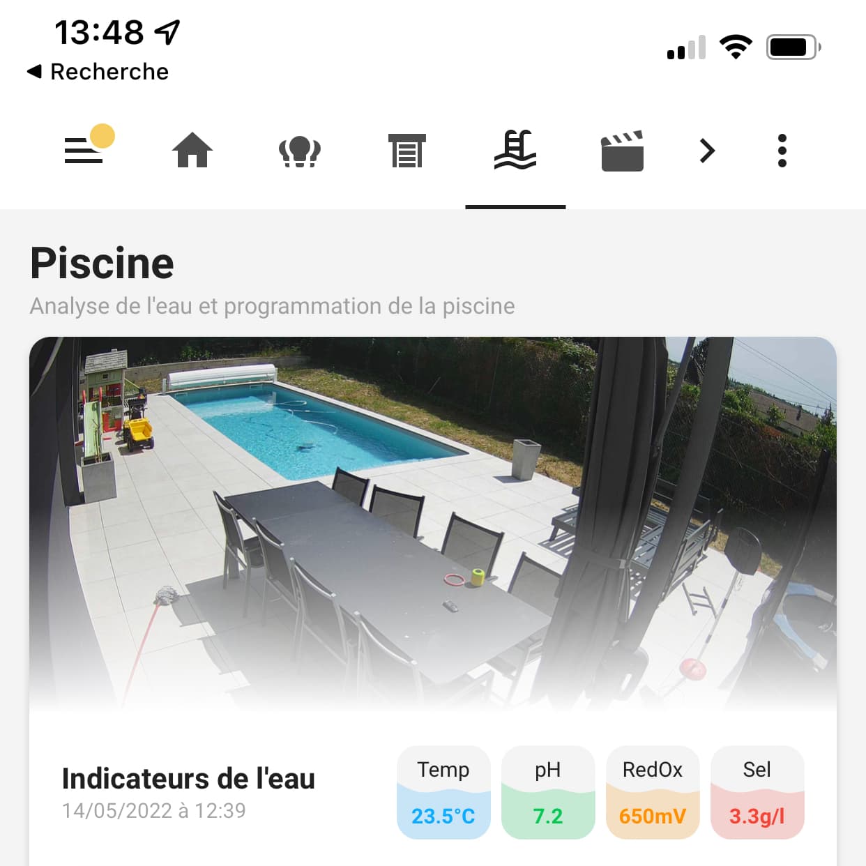
Voilà mon YAML :
card_pool:
  styles:
    card:
      - padding: "0px"
    grid:
      - grid-template-areas: "'cam overlay' 'measures measures'"
      - grid-template-columns: "1fr 0"
      - grid-template-rows: "180px min-content"
    custom_fields:
      overlay:
        - height: 180px
        - background: linear-gradient(180deg, rgba(var(--rgb-card-background-color),0) 45%, rgba(var(--rgb-card-background-color),1) 100%)
        - opacity: 1
        - padding: 0
  custom_fields:
    cam:
      card:
        type: picture-glance
        camera_image: camera.poolcamera
        entities: []
        card_mod:
          style:
            hui-image:
              $: |
                div img {
                  height: 180px;
                  object-fit: cover;
                  object-position: center -25px;
                }
              .: |
                hui-image {
                  height: 100%;
                }
            .: |
              ha-card {
                border-bottom-left-radius: 0px;
                border-bottom-right-radius: 0px;
                box-shadow: none;
              }
              ha-card .box {
                display: none;
              }
    overlay: <div></div>
    measures:
      card:
        type: custom:button-card
        name: Indicateurs de l'eau
        label: "[[[ return states['sensor.pool_analysed_at'].state; ]]]"
        show_name: true
        show_label: true
        styles:
          card:
            - padding: 4%
            - border-radius: 0px
            - box-shadow: "none"
          grid:
            - grid-template-areas: "'n tmp . ph . redox . sel' 'l tmp . ph . redox . sel'"
            - grid-template-columns: "1fr 45px 5px 45px 5px 45px 5px 45px"
            - grid-template-rows: "min-content min-content"
          name:
            - font-weight: "bold"
            - font-size: "14px"
            - place-self: end left
          label:
            - font-size: "10px"
            - place-self: start
            - filter: "opacity(40%)"
        custom_fields:
          tmp:
            card:
              type: custom:button-card
              template: button_pool_measure
              name: Temp
              label: 23.5°C
              variables:
                  color: "blue"
          ph:
            card:
              type: custom:button-card
              template: button_pool_measure
              name: pH
              label: 7.2
              variables:
                  color: "green"
          redox:
            card:
              type: custom:button-card
              template: button_pool_measure
              name: RedOx
              label: 650mV
              variables:
                  color: "yellow"
          sel:
            card:
              type: custom:button-card
              template: button_pool_measure
              name: Sel
              label: 3.3g/l
              variables:
                  color: "red"

button_pool_measure:
  variables:
    color: "blue"
  show_name: true
  show_label: true
  aspect_ratio: 1/1
  styles:
    card:
      - padding: "0px"
      - box-shadow: none
      - background-color: var(--primary-background-color)
      - background-image: >
          [[[
              let theme = hass.themes.themes[hass.themes.theme].modes[(hass.themes.darkMode ? "dark" : "light")];
              let color_bckg = theme[`google-${variables.color}`].replace('#', '%23');
              let opacity = theme['opacity-bg'];
              return "url(\"data:image/svg+xml;utf8,<svg xmlns='http://www.w3.org/2000/svg' xmlns:xlink='http://www.w3.org/1999/xlink' viewBox='0 0 1440 1440'><path fill='"+color_bckg+"' fill-opacity='"+opacity+"' d='m 0,566 48,26.7 C 96,619 192,673 288,699.3 384,726 480,726 576,710 c 96,-16 192,-48 288,-42.7 96,5.7 192,47.7 288,58.7 96,11 192,-11 240,-21.3 l 48,-10.7 v 754 H 1392 1152 864 576 288 48 0 Z'></path></svg>\")";
          ]]]
      - background-size: 100%
    grid:
      - grid-template-areas: "'n' 'l'"
      - grid-template-columns: "1fr"
      - grid-template-rows: "auto auto"
    name:
      - font-size: "10px"
      - place-self: center
    label:
      - font-size: "10px"
      - place-self: center
      - font-weight: "bold"
      - color: >
          [[[
            if (hass.themes.darkMode){
              return "#FFFFFF";
            } else {
              return `rgba(var(--color-${variables.color}), 1)`;
            }
          ]]]