Peux tu partager le code complet de la carte ?
Le code de la carte
type: vertical-stack
cards:
  - type: grid
    cards:
      - type: 'custom:button-card'
        entity: light.bonsoir
        name: Bonsoir
        icon: 'mdi:lightbulb-group'
        template: light
      - type: 'custom:button-card'
        entity: light.terrasse
        name: Terrasse
        show_state: false
        show_icon: true
        icon: 'mdi:coach-lamp'
        aspect_ratio: 1/1
        state:
          - value: 'on'
            styles:
              card:
                - background-color: 'rgba(255, 255, 255, 0.8)'
                - border: '1px rgba(80, 80, 80) solid'
              name:
                - color: 'rgba(0, 0, 0, 0.6)'
              icon:
                - color: var(--button-card-light-color-no-temperature)
        double_tap_action:
          action: more-info
        variables:
          circle_input: |
            [[[ return Math.round(entity.attributes.brightness / 2.54); ]]]
        styles:
          icon:
            - top: '-20%'
            - left: 4.5%
            - width: 3.05vw
            - position: absolute
          name:
            - top: 74%
            - left: 11%
            - position: absolute
          card:
            - font-family: Passion One
            - letter-spacing: 0px
            - color: 'rgba(255, 255, 255, 0.3)'
            - font-size: 100%
            - background-color: 'rgba(80, 80, 80, 0.6)'
            - border-radius: 15%
            - box-shadow: none
            - transition: none
            - border: '1px rgba(255, 255, 255) solid'
          custom_fields:
            circle:
              - top: 8.5%
              - left: 56.2%
              - width: 3.5vw
              - position: absolute
              - letter-spacing: 0.03vw
        custom_fields:
          circle: |
            [[[
              if (entity.state === 'on') {
                const input = variables.circle_input;
                const radius = 20.5;
                const circumference = radius * 2 * Math.PI;
                return `
                  <svg viewBox="0 0 50 50">
                    <style>
                      circle {
                        transform: rotate(-90deg);
                        transform-origin: 50% 50%;
                        stroke-dasharray: ${circumference};
                        stroke-dashoffset: ${circumference - input / 100 * circumference};
                      }
                      tspan {
                        font-size: 10px;
                      }
                    </style>
                    <circle cx="25" cy="25" r="${radius}" stroke="#b2b2b2" stroke-width="1.5" fill="none" />
                    <text x="50%" y="54%" fill="#8d8e90" font-size="14" text-anchor="middle" alignment-baseline="middle">${input}<tspan font-size="10">%</tspan></text>
                  </svg>
                `;
              }
            ]]]
      - type: 'custom:button-card'
        entity: switch.projecteur_palmiers
        name: palmiers
        template: light
      - type: 'custom:button-card'
        entity: light.orangerie
        name: Orangerie
        icon: 'mdi:desk-lamp'
        template: light
      - type: 'custom:button-card'
        entity: light.patio
        name: Patio
        icon: 'mdi:ceiling-light'
        template: light
      - type: 'custom:button-card'
        entity: light.veranda
        name: Véranda
        icon: 'mdi:floor-lamp-dual'
        template: light
      - type: 'custom:button-card'
        template: light
        entity: light.tv
        name: TV
        icon: 'mdi:television'
      - type: 'custom:button-card'
        entity: light.salon
        name: Salon
        icon: 'mdi:sofa'
        template: light
      - type: 'custom:button-card'
        entity: light.lampe_bureau
        name: Bureau
        icon: 'mdi:desk'
        template: light
      - type: 'custom:button-card'
        entity: light.buffet
        name: Buffet
        icon: 'mdi:buffet'
        template: light
      - type: 'custom:button-card'
        entity: light.sejour
        name: Séjour
        icon: 'mdi:silverware'
        template: light
      - type: 'custom:button-card'
        entity: light.couloir
        name: Couloir
        icon: 'mdi:track-light'
        template: light
      - type: 'custom:button-card'
        entity: light.chambre_de_clarisse
        name: Ch.Clarisse
        icon: 'mdi:bed'
        template: light
    columns: 4
    square: false
et la partie template du lovelace:
button_card_templates:
  base:
    aspect_ratio: 1/1
    show_icon: false
    state:
      - value: 'on'
        styles:
          card:
            - background-color: 'rgba(255, 255, 255, 0.8)'
          name:
            - color: 'rgba(0, 0, 0, 0.6)'
    styles:
      name:
        - top: 78%
        - left: 10%
        - line-height: 100%
        - position: absolute
      card:
        - letter-spacing: 0px
        - font-weight: 400
        - color: 'rgba(255, 255, 255, 0.3)'
        - font-size: 110%
        - background-color: 'rgba(115, 115, 115, 0.4)'
        - border-radius: 10%
        - box-shadow: none
        - transition: none
      custom_fields:
        circle:
          - top: 12%
          - left: 54%
          - width: 40%
          - position: absolute
    hold_action:
      action: more-info
  light:
    template:
      - base
    custom_fields:
      circle: >
        [[[ if (entity.state === 'on' && entity.attributes.brightness) { const
        brightness = Math.round(entity.attributes.brightness / 2.54); const
        radius = 20.5; const circumference = radius * 2 * Math.PI;  return `<svg
        viewBox="0 0 50 50"><circle cx="25" cy="25" r="${radius}"
        stroke="#b2b2b2" stroke-width="1.5" fill="none" style=" transform:
        rotate(-90deg); transform-origin: 50% 50%; stroke-dasharray:
        ${circumference}; stroke-dashoffset: ${circumference - brightness / 100
        * circumference};" /> <text x="50%" y="54%" fill="#8d8e90"
        font-size="14" text-anchor="middle"
        alignment-baseline="middle">${brightness}<tspan
        font-size="10">%</tspan></text></svg>`; } ]]]
      icon_hue: >
        [[[ const state = entity.state === 'on' ? 'animate' : null; return `<svg
        viewBox="0 0 50 50"><style>@keyframes animate{0%{transform:
        scale(0.85);}20%{transform: scale(1.1);}40%{transform:
        scale(0.95);}60%{transform: scale(1.03);}80%{transform:
        scale(0.97);}100%{transform: scale(1);}}.animate{animation: animate
        0.8s; transform-origin: center;}</style> <path fill="#9da0a2" d="M27.4
        47.3h-4.9s-.7.1-.7.8.4.9.7.9h4.9c.3 0
        .7-.1.7-.9s-.7-.8-.7-.8zm3.3-2.9H19.3s-.8 0-.8.8.6.9.8.9h11.5c.2 0
        .8-.1.8-.9-.1-.8-.9-.8-.9-.8zm0-3H19.3s-.8 0-.8.8.6.9.8.9h11.5c.2 0
        .8-.1.8-.9-.1-.8-.9-.8-.9-.8zm0-2.9H19.3s-.8 0-.8.8.6.9.8.9h11.5c.2 0
        .8-.1.8-.9s-.9-.8-.9-.8zm5.2-23.2c-3.3-5.3-7-5.6-10.9-5.6-3.8
        0-8.4.4-10.9 5.6-.1.1-.1.3.1.7.4.8 3.3 7.2 3.2 18.8 0 1.1-.1 1.6 0 1.7 0
        .1 0 .7 1.1.7h13c1 0 1-.5 1.1-.7v-1.7c-.1-11.6 2.8-18
        3.2-18.8.1-.4.1-.5.1-.7"/> <path class="${state}"
        fill="var(--button-card-light-color-no-temperature)" d="M14.1
        15.3c3.4-.3 7-.4 10.9-.4 3.8 0 7.5.2 10.9.4.4-.4.7-.8.9-1.1C39 8.5 38.9
        6.5 38.9 6c-.2-4.4-8.4-5-12.1-5h0-3.4c-3.7 0-12 .5-12.1 5 0 .5-.1 2.5
        2.1 8.2 0 .3.3.8.7 1.1z"/></svg>`; ]]]
    styles:
      custom_fields:
        icon_hue:
          - top: 16%
          - left: 6%
          - width: 50%
          - position: absolute
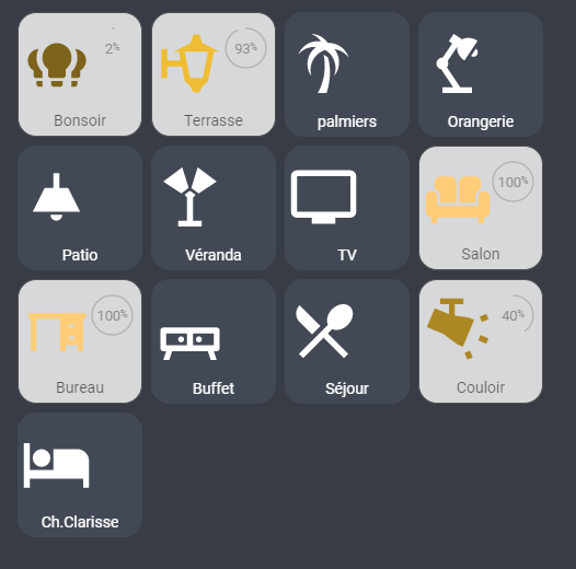
En fait c’est tout con, mais je veux juste plutot utiliser cette carte, et que l’icone s’allume de la couleyur que je souhaite, et intensité que je souhaite:

Là, elle s’allume en blanc:
Code de cette carte:
type: vertical-stack
cards:
  - type: grid
    cards:
      - type: 'custom:button-card'
        entity: light.bonsoir
        name: Bonsoir
        icon: 'mdi:lightbulb-group'
        template: light
      - type: 'custom:button-card'
        entity: light.terrasse
        icon: 'mdi:coach-lamp'
        name: Terrasse
        template: light
        custom_fields:
          icon_hue: |
            <font> <ha-icon icon="mdi:coach-lamp"> </font>
      - type: 'custom:button-card'
        entity: switch.projecteur_palmiers
        name: palmiers
        template: light
      - type: 'custom:button-card'
        entity: light.orangerie
        name: Orangerie
        icon: 'mdi:desk-lamp'
        template: light
      - type: 'custom:button-card'
        entity: light.patio
        name: Patio
        icon: 'mdi:ceiling-light'
        template: light
      - type: 'custom:button-card'
        entity: light.veranda
        name: Véranda
        icon: 'mdi:floor-lamp-dual'
        template: light
      - type: 'custom:button-card'
        template: light
        entity: light.tv
        name: TV
        icon: 'mdi:television'
      - type: 'custom:button-card'
        entity: light.salon
        name: Salon
        icon: 'mdi:sofa'
        template: light
      - type: 'custom:button-card'
        entity: light.lampe_bureau
        name: Bureau
        icon: 'mdi:desk'
        template: light
      - type: 'custom:button-card'
        entity: light.buffet
        name: Buffet
        icon: 'mdi:buffet'
        template: light
      - type: 'custom:button-card'
        entity: light.sejour
        name: Séjour
        icon: 'mdi:silverware'
        template: light
      - type: 'custom:button-card'
        entity: light.couloir
        name: Couloir
        icon: 'mdi:track-light'
        template: light
      - type: 'custom:button-card'
        entity: light.chambre_de_clarisse
        name: Ch.Clarisse
        icon: 'mdi:bed'
        template: light
    columns: 4
    square: false
Pour le problème de taille de l’icone en fonction de l’affichage, c’est a cause du paramétrage « width ».
En HUE, tu as width: 50%, alors que pour tes « Icon », tu as « width: 3.05vw », qui est une dimension qui dépend de la largeur totale de la page. J’avais eu le même problème quand j’ai adapté le thème de Mattias (lui il l’affiche sur une tablette a taille fixe), je te conseille de tout passer en %.
Pour le problème de couleur, je n’ai pas bien saisi ce que tu cherches à faire.
Quand j’allume ma lumiere, je souhaite que l’icone prenne la couleur de ma hue: Jaune, blanche, Roange Verte selon la couleur definie… et pareil pour l’intensite… là, dans mon code, quand j’allume la lumiere, l’icone devient blanche et ne reprend pas la couleur.
Extrait de code:
      - type: 'custom:button-card'
        entity: light.terrasse
        icon: 'mdi:coach-lamp'
        name: Terrasse
        template: light
        custom_fields:
          icon_hue: |
            <font> <ha-icon icon="mdi:coach-lamp"> </font>
Dans ce cas, tu ne peux pas passer juste avec un « icon », il faut du coup un SVG comme expliqué par Clemalex, avec le code associé pour cet icon:
Testé et approuvé! Merci @Clemalex
C’est bon, cela marche. Effectivement, en %, ca fonctionne bien mieux 
Ma card:
type: vertical-stack
cards:
- type: grid
cards:
- type: 'custom:button-card'
entity: light.bonsoir
name: Bonsoir
icon: 'mdi:lightbulb-group'
aspect_ratio: 1/1
state:
- value: 'on'
styles:
card:
- background-color: 'rgba(255, 255, 255, 0.8)'
- border: '1px rgba(80, 80, 80) solid'
name:
- color: 'rgba(0, 0, 0, 0.6)'
icon:
- color: var(--button-card-light-color-no-temperature)
double_tap_action:
action: more-info
variables:
circle_input: |
[[[ return Math.round(entity.attributes.brightness / 2.54); ]]]
styles:
icon:
- top: '-2%'
- left: 3%
- width: 57%
- position: absolute
name:
- top: 80%
- left: 15%
- position: center
card:
- font-size: 100%
- border-radius: 15%
- box-shadow: none
- transition: none
custom_fields:
circle:
- top: 8.5%
- left: 56%
- width: 40%
- position: absolute
custom_fields:
circle: |
[[[
if (entity.state === 'on') {
const input = variables.circle_input;
const radius = 20.5;
const circumference = radius * 2 * Math.PI;
return `
<svg viewBox="0 0 50 50">
<style>
circle {
transform: rotate(-90deg);
transform-origin: 50% 50%;
stroke-dasharray: ${circumference};
stroke-dashoffset: ${circumference - input / 100 * circumference};
}
tspan {
font-size: 10px;
}
</style>
<circle cx="25" cy="25" r="${radius}" stroke="#b2b2b2" stroke-width="1.5" fill="none" />
<text x="50%" y="54%" fill="#8d8e90" font-size="14" text-anchor="middle" alignment-baseline="middle">${input}<tspan font-size="10">%</tspan></text>
</svg>
`;
}
]]]
- type: 'custom:button-card'
entity: light.terrasse
name: Terrasse
show_state: false
show_icon: true
icon: 'mdi:coach-lamp'
aspect_ratio: 1/1
state:
- value: 'on'
styles:
card:
- background-color: 'rgba(255, 255, 255, 0.8)'
- border: '1px rgba(80, 80, 80) solid'
name:
- color: 'rgba(0, 0, 0, 0.6)'
icon:
- color: var(--button-card-light-color-no-temperature)
double_tap_action:
action: more-info
variables:
circle_input: |
[[[ return Math.round(entity.attributes.brightness / 2.54); ]]]
styles:
icon:
- top: '-2%'
- left: 3%
- width: 57%
- position: absolute
name:
- top: 80%
- left: 15%
- position: center
card:
- font-size: 100%
- border-radius: 15%
- box-shadow: none
- transition: none
custom_fields:
circle:
- top: 8.5%
- left: 56%
- width: 40%
- position: absolute
custom_fields:
circle: |
[[[
if (entity.state === 'on') {
const input = variables.circle_input;
const radius = 20.5;
const circumference = radius * 2 * Math.PI;
return `
<svg viewBox="0 0 50 50">
<style>
circle {
transform: rotate(-90deg);
transform-origin: 50% 50%;
stroke-dasharray: ${circumference};
stroke-dashoffset: ${circumference - input / 100 * circumference};
}
tspan {
font-size: 10px;
}
</style>
<circle cx="25" cy="25" r="${radius}" stroke="#b2b2b2" stroke-width="1.5" fill="none" />
<text x="50%" y="54%" fill="#8d8e90" font-size="14" text-anchor="middle" alignment-baseline="middle">${input}<tspan font-size="10">%</tspan></text>
</svg>
`;
}
]]]
- type: 'custom:button-card'
entity: switch.projecteur_palmiers
name: palmiers
aspect_ratio: 1/1
state:
- value: 'on'
styles:
card:
- background-color: 'rgba(255, 255, 255, 0.8)'
- border: '1px rgba(80, 80, 80) solid'
name:
- color: 'rgba(0, 0, 0, 0.6)'
icon:
- color: var(--button-card-light-color-no-temperature)
double_tap_action:
action: more-info
variables:
circle_input: |
[[[ return Math.round(entity.attributes.brightness / 2.54); ]]]
styles:
icon:
- top: '-2%'
- left: 3%
- width: 57%
- position: absolute
name:
- top: 80%
- left: 15%
- position: center
card:
- font-size: 100%
- border-radius: 15%
- box-shadow: none
- transition: none
custom_fields:
circle:
- top: 8.5%
- left: 56%
- width: 40%
- position: absolute
custom_fields:
circle: |
[[[
if (entity.state === 'on') {
const input = variables.circle_input;
const radius = 20.5;
const circumference = radius * 2 * Math.PI;
return `
<svg viewBox="0 0 50 50">
<style>
circle {
transform: rotate(-90deg);
transform-origin: 50% 50%;
stroke-dasharray: ${circumference};
stroke-dashoffset: ${circumference - input / 100 * circumference};
}
tspan {
font-size: 10px;
}
</style>
<circle cx="25" cy="25" r="${radius}" stroke="#b2b2b2" stroke-width="1.5" fill="none" />
<text x="50%" y="54%" fill="#8d8e90" font-size="14" text-anchor="middle" alignment-baseline="middle">${input}<tspan font-size="10">%</tspan></text>
</svg>
`;
}
]]]
- type: 'custom:button-card'
entity: light.orangerie
name: Orangerie
icon: 'mdi:desk-lamp'
aspect_ratio: 1/1
state:
- value: 'on'
styles:
card:
- background-color: 'rgba(255, 255, 255, 0.8)'
- border: '1px rgba(80, 80, 80) solid'
name:
- color: 'rgba(0, 0, 0, 0.6)'
icon:
- color: var(--button-card-light-color-no-temperature)
double_tap_action:
action: more-info
variables:
circle_input: |
[[[ return Math.round(entity.attributes.brightness / 2.54); ]]]
styles:
icon:
- top: '-2%'
- left: 3%
- width: 57%
- position: absolute
name:
- top: 80%
- left: 15%
- position: center
card:
- font-size: 100%
- border-radius: 15%
- box-shadow: none
- transition: none
custom_fields:
circle:
- top: 8.5%
- left: 56%
- width: 40%
- position: absolute
custom_fields:
circle: |
[[[
if (entity.state === 'on') {
const input = variables.circle_input;
const radius = 20.5;
const circumference = radius * 2 * Math.PI;
return `
<svg viewBox="0 0 50 50">
<style>
circle {
transform: rotate(-90deg);
transform-origin: 50% 50%;
stroke-dasharray: ${circumference};
stroke-dashoffset: ${circumference - input / 100 * circumference};
}
tspan {
font-size: 10px;
}
</style>
<circle cx="25" cy="25" r="${radius}" stroke="#b2b2b2" stroke-width="1.5" fill="none" />
<text x="50%" y="54%" fill="#8d8e90" font-size="14" text-anchor="middle" alignment-baseline="middle">${input}<tspan font-size="10">%</tspan></text>
</svg>
`;
}
]]]
- type: 'custom:button-card'
entity: light.patio
name: Patio
icon: 'mdi:ceiling-light'
aspect_ratio: 1/1
state:
- value: 'on'
styles:
card:
- background-color: 'rgba(255, 255, 255, 0.8)'
- border: '1px rgba(80, 80, 80) solid'
name:
- color: 'rgba(0, 0, 0, 0.6)'
icon:
- color: var(--button-card-light-color-no-temperature)
double_tap_action:
action: more-info
variables:
circle_input: |
[[[ return Math.round(entity.attributes.brightness / 2.54); ]]]
styles:
icon:
- top: '-2%'
- left: 3%
- width: 57%
- position: absolute
name:
- top: 80%
- left: 15%
- position: center
card:
- font-size: 100%
- border-radius: 15%
- box-shadow: none
- transition: none
custom_fields:
circle:
- top: 8.5%
- left: 56%
- width: 40%
- position: absolute
custom_fields:
circle: |
[[[
if (entity.state === 'on') {
const input = variables.circle_input;
const radius = 20.5;
const circumference = radius * 2 * Math.PI;
return `
<svg viewBox="0 0 50 50">
<style>
circle {
transform: rotate(-90deg);
transform-origin: 50% 50%;
stroke-dasharray: ${circumference};
stroke-dashoffset: ${circumference - input / 100 * circumference};
}
tspan {
font-size: 10px;
}
</style>
<circle cx="25" cy="25" r="${radius}" stroke="#b2b2b2" stroke-width="1.5" fill="none" />
<text x="50%" y="54%" fill="#8d8e90" font-size="14" text-anchor="middle" alignment-baseline="middle">${input}<tspan font-size="10">%</tspan></text>
</svg>
`;
}
]]]
- type: 'custom:button-card'
entity: light.veranda
name: Véranda
icon: 'mdi:floor-lamp-dual'
aspect_ratio: 1/1
state:
- value: 'on'
styles:
card:
- background-color: 'rgba(255, 255, 255, 0.8)'
- border: '1px rgba(80, 80, 80) solid'
name:
- color: 'rgba(0, 0, 0, 0.6)'
icon:
- color: var(--button-card-light-color-no-temperature)
double_tap_action:
action: more-info
variables:
circle_input: |
[[[ return Math.round(entity.attributes.brightness / 2.54); ]]]
styles:
icon:
- top: '-2%'
- left: 3%
- width: 57%
- position: absolute
name:
- top: 80%
- left: 15%
- position: center
card:
- font-size: 100%
- border-radius: 15%
- box-shadow: none
- transition: none
custom_fields:
circle:
- top: 8.5%
- left: 56%
- width: 40%
- position: absolute
custom_fields:
circle: |
[[[
if (entity.state === 'on') {
const input = variables.circle_input;
const radius = 20.5;
const circumference = radius * 2 * Math.PI;
return `
<svg viewBox="0 0 50 50">
<style>
circle {
transform: rotate(-90deg);
transform-origin: 50% 50%;
stroke-dasharray: ${circumference};
stroke-dashoffset: ${circumference - input / 100 * circumference};
}
tspan {
font-size: 10px;
}
</style>
<circle cx="25" cy="25" r="${radius}" stroke="#b2b2b2" stroke-width="1.5" fill="none" />
<text x="50%" y="54%" fill="#8d8e90" font-size="14" text-anchor="middle" alignment-baseline="middle">${input}<tspan font-size="10">%</tspan></text>
</svg>
`;
}
]]]
- type: 'custom:button-card'
icon: 'mdi:television'
entity: light.tv
name: TV
aspect_ratio: 1/1
state:
- value: 'on'
styles:
card:
- background-color: 'rgba(255, 255, 255, 0.8)'
- border: '1px rgba(80, 80, 80) solid'
name:
- color: 'rgba(0, 0, 0, 0.6)'
icon:
- color: var(--button-card-light-color-no-temperature)
double_tap_action:
action: more-info
variables:
circle_input: |
[[[ return Math.round(entity.attributes.brightness / 2.54); ]]]
styles:
icon:
- top: '-2%'
- left: 3%
- width: 57%
- position: absolute
name:
- top: 80%
- left: 15%
- position: center
card:
- font-size: 100%
- border-radius: 15%
- box-shadow: none
- transition: none
custom_fields:
circle:
- top: 8.5%
- left: 56%
- width: 40%
- position: absolute
custom_fields:
circle: |
[[[
if (entity.state === 'on') {
const input = variables.circle_input;
const radius = 20.5;
const circumference = radius * 2 * Math.PI;
return `
<svg viewBox="0 0 50 50">
<style>
circle {
transform: rotate(-90deg);
transform-origin: 50% 50%;
stroke-dasharray: ${circumference};
stroke-dashoffset: ${circumference - input / 100 * circumference};
}
tspan {
font-size: 10px;
}
</style>
<circle cx="25" cy="25" r="${radius}" stroke="#b2b2b2" stroke-width="1.5" fill="none" />
<text x="50%" y="54%" fill="#8d8e90" font-size="14" text-anchor="middle" alignment-baseline="middle">${input}<tspan font-size="10">%</tspan></text>
</svg>
`;
}
]]]
- type: 'custom:button-card'
entity: light.salon
name: Salon
icon: 'mdi:sofa'
aspect_ratio: 1/1
state:
- value: 'on'
styles:
card:
- background-color: 'rgba(255, 255, 255, 0.8)'
- border: '1px rgba(80, 80, 80) solid'
name:
- color: 'rgba(0, 0, 0, 0.6)'
icon:
- color: var(--button-card-light-color-no-temperature)
double_tap_action:
action: more-info
variables:
circle_input: |
[[[ return Math.round(entity.attributes.brightness / 2.54); ]]]
styles:
icon:
- top: '-2%'
- left: 3%
- width: 57%
- position: absolute
name:
- top: 80%
- left: 15%
- position: center
card:
- font-size: 100%
- border-radius: 15%
- box-shadow: none
- transition: none
custom_fields:
circle:
- top: 8.5%
- left: 56%
- width: 40%
- position: absolute
custom_fields:
circle: |
[[[
if (entity.state === 'on') {
const input = variables.circle_input;
const radius = 20.5;
const circumference = radius * 2 * Math.PI;
return `
<svg viewBox="0 0 50 50">
<style>
circle {
transform: rotate(-90deg);
transform-origin: 50% 50%;
stroke-dasharray: ${circumference};
stroke-dashoffset: ${circumference - input / 100 * circumference};
}
tspan {
font-size: 10px;
}
</style>
<circle cx="25" cy="25" r="${radius}" stroke="#b2b2b2" stroke-width="1.5" fill="none" />
<text x="50%" y="54%" fill="#8d8e90" font-size="14" text-anchor="middle" alignment-baseline="middle">${input}<tspan font-size="10">%</tspan></text>
</svg>
`;
}
]]]
- type: 'custom:button-card'
entity: light.lampe_bureau
name: Bureau
icon: 'mdi:desk'
aspect_ratio: 1/1
state:
- value: 'on'
styles:
card:
- background-color: 'rgba(255, 255, 255, 0.8)'
- border: '1px rgba(80, 80, 80) solid'
name:
- color: 'rgba(0, 0, 0, 0.6)'
icon:
- color: var(--button-card-light-color-no-temperature)
double_tap_action:
action: more-info
variables:
circle_input: |
[[[ return Math.round(entity.attributes.brightness / 2.54); ]]]
styles:
icon:
- top: '-2%'
- left: 3%
- width: 57%
- position: absolute
name:
- top: 80%
- left: 15%
- position: center
card:
- font-size: 100%
- border-radius: 15%
- box-shadow: none
- transition: none
custom_fields:
circle:
- top: 8.5%
- left: 56%
- width: 40%
- position: absolute
custom_fields:
circle: |
[[[
if (entity.state === 'on') {
const input = variables.circle_input;
const radius = 20.5;
const circumference = radius * 2 * Math.PI;
return `
<svg viewBox="0 0 50 50">
<style>
circle {
transform: rotate(-90deg);
transform-origin: 50% 50%;
stroke-dasharray: ${circumference};
stroke-dashoffset: ${circumference - input / 100 * circumference};
}
tspan {
font-size: 10px;
}
</style>
<circle cx="25" cy="25" r="${radius}" stroke="#b2b2b2" stroke-width="1.5" fill="none" />
<text x="50%" y="54%" fill="#8d8e90" font-size="14" text-anchor="middle" alignment-baseline="middle">${input}<tspan font-size="10">%</tspan></text>
</svg>
`;
}
]]]
- type: 'custom:button-card'
entity: light.buffet
name: Buffet
icon: 'mdi:buffet'
aspect_ratio: 1/1
state:
- value: 'on'
styles:
card:
- background-color: 'rgba(255, 255, 255, 0.8)'
- border: '1px rgba(80, 80, 80) solid'
name:
- color: 'rgba(0, 0, 0, 0.6)'
icon:
- color: var(--button-card-light-color-no-temperature)
double_tap_action:
action: more-info
variables:
circle_input: |
[[[ return Math.round(entity.attributes.brightness / 2.54); ]]]
styles:
icon:
- top: '-2%'
- left: 3%
- width: 57%
- position: absolute
name:
- top: 80%
- left: 15%
- position: center
card:
- font-size: 100%
- border-radius: 15%
- box-shadow: none
- transition: none
custom_fields:
circle:
- top: 8.5%
- left: 56%
- width: 40%
- position: absolute
custom_fields:
circle: |
[[[
if (entity.state === 'on') {
const input = variables.circle_input;
const radius = 20.5;
const circumference = radius * 2 * Math.PI;
return `
<svg viewBox="0 0 50 50">
<style>
circle {
transform: rotate(-90deg);
transform-origin: 50% 50%;
stroke-dasharray: ${circumference};
stroke-dashoffset: ${circumference - input / 100 * circumference};
}
tspan {
font-size: 10px;
}
</style>
<circle cx="25" cy="25" r="${radius}" stroke="#b2b2b2" stroke-width="1.5" fill="none" />
<text x="50%" y="54%" fill="#8d8e90" font-size="14" text-anchor="middle" alignment-baseline="middle">${input}<tspan font-size="10">%</tspan></text>
</svg>
`;
}
]]]
- type: 'custom:button-card'
entity: light.sejour
name: Séjour
icon: 'mdi:silverware'
aspect_ratio: 1/1
state:
- value: 'on'
styles:
card:
- background-color: 'rgba(255, 255, 255, 0.8)'
- border: '1px rgba(80, 80, 80) solid'
name:
- color: 'rgba(0, 0, 0, 0.6)'
icon:
- color: var(--button-card-light-color-no-temperature)
double_tap_action:
action: more-info
variables:
circle_input: |
[[[ return Math.round(entity.attributes.brightness / 2.54); ]]]
styles:
icon:
- top: '-2%'
- left: 3%
- width: 57%
- position: absolute
name:
- top: 80%
- left: 15%
- position: center
card:
- font-size: 100%
- border-radius: 15%
- box-shadow: none
- transition: none
custom_fields:
circle:
- top: 8.5%
- left: 56%
- width: 40%
- position: absolute
custom_fields:
circle: |
[[[
if (entity.state === 'on') {
const input = variables.circle_input;
const radius = 20.5;
const circumference = radius * 2 * Math.PI;
return `
<svg viewBox="0 0 50 50">
<style>
circle {
transform: rotate(-90deg);
transform-origin: 50% 50%;
stroke-dasharray: ${circumference};
stroke-dashoffset: ${circumference - input / 100 * circumference};
}
tspan {
font-size: 10px;
}
</style>
<circle cx="25" cy="25" r="${radius}" stroke="#b2b2b2" stroke-width="1.5" fill="none" />
<text x="50%" y="54%" fill="#8d8e90" font-size="14" text-anchor="middle" alignment-baseline="middle">${input}<tspan font-size="10">%</tspan></text>
</svg>
`;
}
]]]
- type: 'custom:button-card'
entity: light.couloir
name: Couloir
icon: 'mdi:track-light'
aspect_ratio: 1/1
state:
- value: 'on'
styles:
card:
- background-color: 'rgba(255, 255, 255, 0.8)'
- border: '1px rgba(80, 80, 80) solid'
name:
- color: 'rgba(0, 0, 0, 0.6)'
icon:
- color: var(--button-card-light-color-no-temperature)
double_tap_action:
action: more-info
variables:
circle_input: |
[[[ return Math.round(entity.attributes.brightness / 2.54); ]]]
styles:
icon:
- top: '-2%'
- left: 3%
- width: 57%
- position: absolute
name:
- top: 80%
- left: 15%
- position: center
card:
- font-size: 100%
- border-radius: 15%
- box-shadow: none
- transition: none
custom_fields:
circle:
- top: 8.5%
- left: 56%
- width: 40%
- position: absolute
custom_fields:
circle: |
[[[
if (entity.state === 'on') {
const input = variables.circle_input;
const radius = 20.5;
const circumference = radius * 2 * Math.PI;
return `
<svg viewBox="0 0 50 50">
<style>
circle {
transform: rotate(-90deg);
transform-origin: 50% 50%;
stroke-dasharray: ${circumference};
stroke-dashoffset: ${circumference - input / 100 * circumference};
}
tspan {
font-size: 10px;
}
</style>
<circle cx="25" cy="25" r="${radius}" stroke="#b2b2b2" stroke-width="1.5" fill="none" />
<text x="50%" y="54%" fill="#8d8e90" font-size="14" text-anchor="middle" alignment-baseline="middle">${input}<tspan font-size="10">%</tspan></text>
</svg>
`;
}
]]]
- type: 'custom:button-card'
entity: light.chambre_de_clarisse
name: Ch.Clarisse
icon: 'mdi:bed'
aspect_ratio: 1/1
state:
- value: 'on'
styles:
card:
- background-color: 'rgba(255, 255, 255, 0.8)'
- border: '1px rgba(80, 80, 80) solid'
name:
- color: 'rgba(0, 0, 0, 0.6)'
icon:
- color: var(--button-card-light-color-no-temperature)
double_tap_action:
action: more-info
variables:
circle_input: |
[[[ return Math.round(entity.attributes.brightness / 2.54); ]]]
styles:
icon:
- top: '-2%'
- left: 3%
- width: 57%
- position: absolute
name:
- top: 80%
- left: 15%
- position: center
card:
- font-size: 100%
- border-radius: 15%
- box-shadow: none
- transition: none
custom_fields:
circle:
- top: 8.5%
- left: 56%
- width: 40%
- position: absolute
custom_fields:
circle: |
[[[
if (entity.state === 'on') {
const input = variables.circle_input;
const radius = 20.5;
const circumference = radius * 2 * Math.PI;
return `
<svg viewBox="0 0 50 50">
<style>
circle {
transform: rotate(-90deg);
transform-origin: 50% 50%;
stroke-dasharray: ${circumference};
stroke-dashoffset: ${circumference - input / 100 * circumference};
}
tspan {
font-size: 10px;
}
</style>
<circle cx="25" cy="25" r="${radius}" stroke="#b2b2b2" stroke-width="1.5" fill="none" />
<text x="50%" y="54%" fill="#8d8e90" font-size="14" text-anchor="middle" alignment-baseline="middle">${input}<tspan font-size="10">%</tspan></text>
</svg>
`;
}
]]]
columns: 4
square: false
N’hésites pas a utiliser des « templates », cela t’évitera de devoir réécrire tout systématiquement. Comme cela tu défini par exemple dans un template tous les paramètres qui sont généraux (= identiques), puis lors de la déclaration d’un bouton, tu appelle le template, puis tu mentionne les paramètres spécifiques a ce bouton précis. Tu peux même déclarer des templates composés d’autres templates.
N’hésite pas à revoir la doc sur ce point (ou même dans le thème de Mattias, exemple avec son template « base »).
C’est ce que je voulais faire, mais là, dans mon cas, avec des icones differentes et la gestion des couleurs/intensité par icon, je n’ai pas trouvé mieux que par les card 
Bon, je débute avec HASS depuis 15j
Hello Tout le monde,
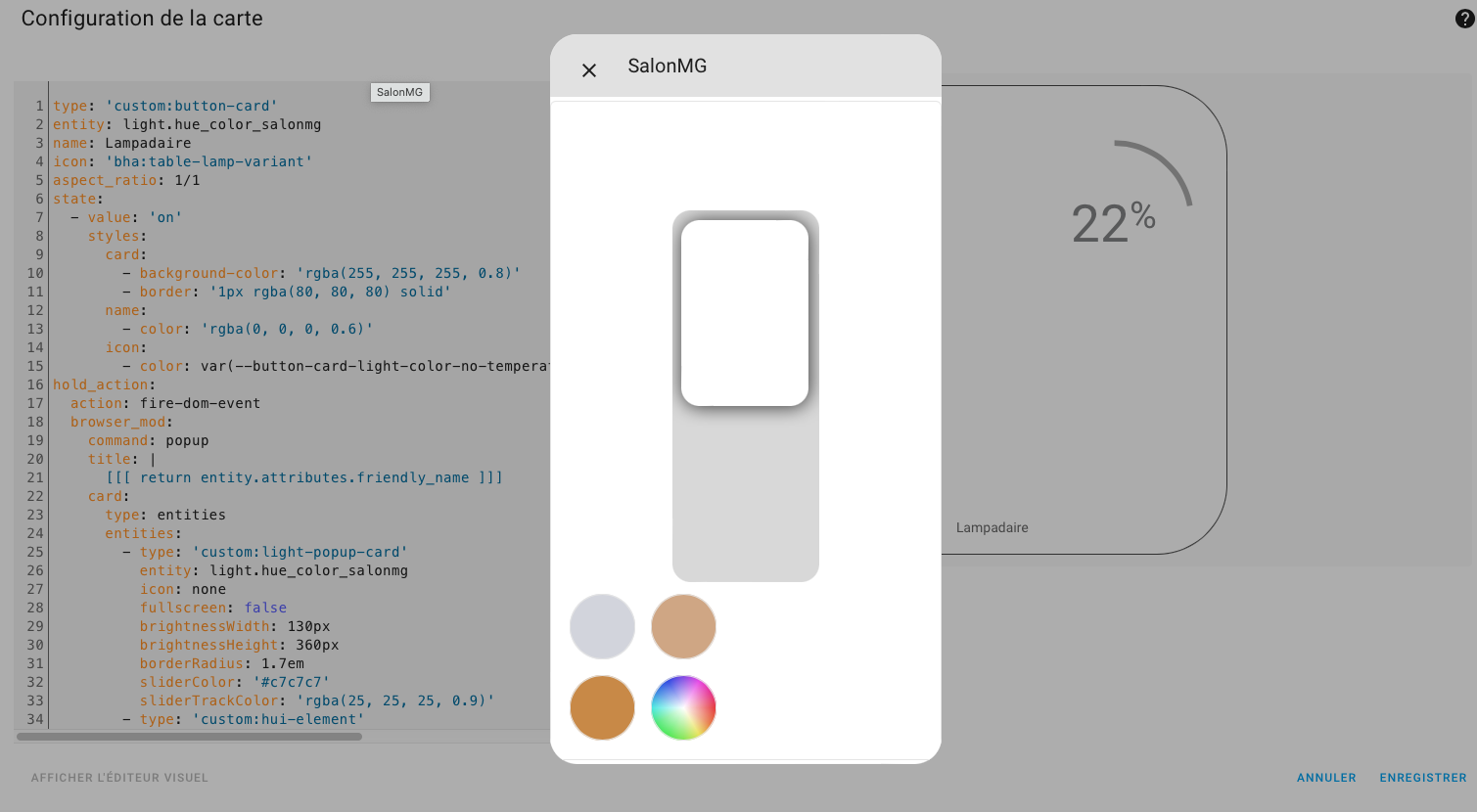
D’abord Merci @Plouf34 pour ta card, ça marche niquel.
J’apporte ma pierre a l’édifice et j’améliore ta card avec le « light-popup-card » que je trouve très esthétique (Bien sûr ce bout de code est à l’origine de Mattias_Persson).
Voici quelques photos :
Sur un hold_action :
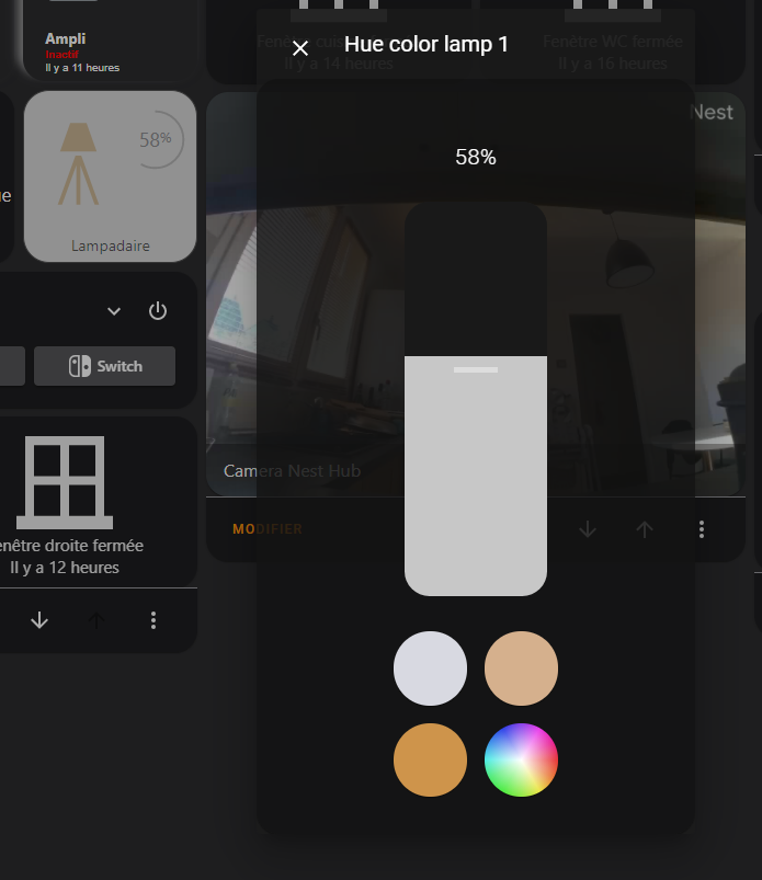
type: 'custom:button-card'
entity: light.hue_color_lamp_1
name: Lampadaire
icon: 'bha:table-lamp-variant'
aspect_ratio: 1/1
state:
- value: 'on'
styles:
card:
- background-color: 'rgba(255, 255, 255, 0.8)'
- border: '1px rgba(80, 80, 80) solid'
name:
- color: 'rgba(0, 0, 0, 0.6)'
icon:
- color: var(--button-card-light-color-no-temperature)
hold_action:
action: fire-dom-event
browser_mod:
command: popup
title: |
[[[ return entity.attributes.friendly_name ]]]
card:
type: entities
entities:
- type: 'custom:light-popup-card'
entity: |
[[[ return entity.entity_id ]]]
icon: none
fullscreen: false
brightnessWidth: 130px
brightnessHeight: 360px
borderRadius: 1.7em
sliderColor: '#c7c7c7'
sliderTrackColor: 'rgba(25, 25, 25, 0.9)'
- type: 'custom:hui-element'
card_type: horizontal-stack
card_mod:
style: |
#root {
justify-content: center;
margin-top: 2em;
}
cards:
- type: 'custom:button-card'
styles:
card:
- background: '#d8d9e1'
- border-radius: 50%
- height: 4em
- width: 4em
- margin: 4px
tap_action:
action: call-service
service: light.turn_on
service_data:
entity_id: |
[[[ return entity.entity_id ]]]
color_temp: 153
- type: 'custom:button-card'
styles:
card:
- background: '#d5b08d'
- border-radius: 50%
- height: 4em
- width: 4em
- margin: 4px
tap_action:
action: call-service
service: light.turn_on
service_data:
entity_id: |
[[[ return entity.entity_id ]]]
color_temp: 326
- type: 'custom:hui-element'
card_type: horizontal-stack
card_mod:
style: |
#root {
justify-content: center;
margin-bottom: 1em;
}
cards:
- type: 'custom:button-card'
styles:
card:
- background: '#ce944b'
- border-radius: 50%
- height: 4em
- width: 4em
- margin: 4px
tap_action:
action: call-service
service: light.turn_on
service_data:
entity_id: |
[[[ return entity.entity_id ]]]
color_temp: 500
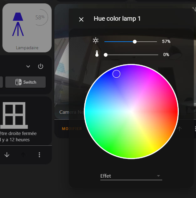
- type: 'custom:button-card'
styles:
card:
- background: >-
radial-gradient(circle, rgba(255, 255, 255, 1) 0%,
rgba(255, 255, 255, 0) 80%), conic-gradient(rgb(120, 39,
230), rgb(230, 34, 231), rgb(228, 5, 136), rgb(228, 25,
25), rgb(229, 105, 30), rgb(232, 226, 46), rgb(125, 230,
41), rgb(52, 232, 40), rgb(51, 231, 92), rgb(52, 232,
224), rgb(32, 125, 229), rgb(18, 39, 229), rgb(120, 39,
230))
- border-radius: 50%
- height: 4em
- width: 4em
- margin: 4px
tap_action:
action: fire-dom-event
browser_mod:
command: popup
title: |
[[[ return entity.attributes.friendly_name ]]]
card:
type: 'custom:light-entity-card'
entity: |
[[[ return entity.entity_id ]]]
brightness: true
color_temp: true
full_width_sliders: false
hide_header: true
show_slider_percent: true
smooth_color_wheel: true
persist_features: true
consolidate_entities: true
double_tap_action:
action: more-info
variables:
circle_input: |
[[[ return Math.round(entity.attributes.brightness / 2.54); ]]]
styles:
icon:
- top: '-2%'
- left: 3%
- width: 57%
- position: absolute
name:
- top: 80%
- left: 15%
- position: center
card:
- font-size: 100%
- border-radius: 15%
- box-shadow: none
- transition: none
custom_fields:
circle:
- top: 8.5%
- left: 56%
- width: 40%
- position: absolute
custom_fields:
circle: |
[[[
if (entity.state === 'on') {
const input = variables.circle_input;
const radius = 20.5;
const circumference = radius * 2 * Math.PI;
return `
<svg viewBox="0 0 50 50">
<style>
circle {
transform: rotate(-90deg);
transform-origin: 50% 50%;
stroke-dasharray: ${circumference};
stroke-dashoffset: ${circumference - input / 100 * circumference};
}
tspan {
font-size: 10px;
}
</style>
<circle cx="25" cy="25" r="${radius}" stroke="#b2b2b2" stroke-width="1.5" fill="none" />
<text x="50%" y="54%" fill="#8d8e90" font-size="14" text-anchor="middle" alignment-baseline="middle">${input}<tspan font-size="10">%</tspan></text>
</svg>
`;
}
]]]
Bon courage à tous.
1 « J'aime »