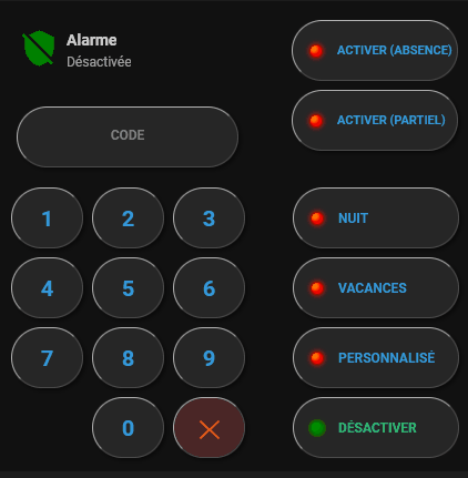
Code de la carte
type: vertical-stack
cards:
- type: horizontal-stack
cards:
- type: custom:button-card
entity: alarm_control_panel.alarmo
show_name: true
show_icon: true
show_state: true
name: Alarme
styles:
card:
- background: transparent
- border: none
- height: 60px
- width: 240px
grid:
- grid-template-areas: "\"i n\" \"i s\""
- grid-template-columns: 50px 1fr
icon:
- width: 35px
- color: |
[[[
if (entity.state === 'disarmed') return 'green';
if (entity.state.includes('armed')) return 'red';
return 'orange';
]]]
name:
- justify-self: start
- font-size: 14px
- font-weight: bold
state:
- justify-self: start
- font-size: 12px
- opacity: 0.7
- type: custom:button-card
name: ACTIVER (ABSENCE)
entity: alarm_control_panel.alarmo
custom_fields:
led: |
[[[
const status = entity.state;
const isArmed = status === 'armed_away';
const color1 = isArmed ? 'Lime' : 'Orange';
const color2 = isArmed ? 'Green' : 'Red';
const shadow = isArmed ? 'rgba(0, 255, 0, 0.6)' : 'rgba(255, 0, 0, 0.6)';
const border = isArmed ? 'DarkGreen' : 'DarkRed';
return `
<div style="
width: 10px;
height: 10px;
border-radius: 50%;
border: 1px solid ${border};
background: radial-gradient(circle at 3px 3px, ${color1} 10%, ${color2} 50%);
box-shadow: 0 0 4px 1px ${shadow};
display: block;
"></div>
`;
]]]
styles:
card:
- background: rgba(40,40,40,0.9)
- border-radius: 50px
- border: 1px rgba(0,0,0,1.0) outset
- height: 55px
- width: 150px
- margin: 5px 5px
- padding-left: 15px
grid:
- grid-template-areas: "\"led n\""
- grid-template-columns: 20px 1fr
- align-items: center
custom_fields:
led:
- justify-self: start
- display: flex
- align-items: center
- overflow: visible
name:
- color: "#3498db"
- font-size: 11px
- font-weight: bold
- justify-self: start
- margin-left: 5px
tap_action:
action: call-service
service: alarm_control_panel.alarm_arm_away
service_data:
entity_id: alarm_control_panel.alarmo
code: "[[[ return states['input_text.code_alarme'].state ]]]"
- type: horizontal-stack
cards:
- type: custom:button-card
entity: input_text.code_alarme
show_name: false
show_state: true
show_label: true
label: CODE
styles:
card:
- background: rgba(40,40,40,0.9)
- border-radius: 50px
- border: 1px rgba(0,0,0,1.0) outset
- box-shadow: 2px 2px 4px 0px rgba(0,0,0,0.5)
- height: 55px
- width: 200px
- margin: 10px 5px
- margin-right: 35px
grid:
- grid-template-areas: "\"l\" \"s\""
- grid-template-rows: auto auto
label:
- color: gray
- font-size: 12px
- font-weight: bold
- margin-top: 5px
state:
- color: "#3498db"
- font-size: 16px
- letter-spacing: 5px
- font-weight: bold
- type: custom:button-card
name: ACTIVER (PARTIEL)
entity: alarm_control_panel.alarmo
custom_fields:
led: |
[[[
const status = entity.state;
// Vérifie si l'alarme est en mode partiel (home)
const isArmedHome = status === 'armed_home';
const color1 = isArmedHome ? 'Lime' : 'Orange';
const color2 = isArmedHome ? 'Green' : 'Red';
const shadow = isArmedHome ? 'rgba(0, 255, 0, 0.6)' : 'rgba(255, 0, 0, 0.6)';
const border = isArmedHome ? 'DarkGreen' : 'DarkRed';
return `
<div style="
width: 10px;
height: 10px;
border-radius: 50%;
border: 1px solid ${border};
background: radial-gradient(circle at 3px 3px, ${color1} 10%, ${color2} 50%);
box-shadow: 0 0 4px 1px ${shadow};
display: block;
"></div>
`;
]]]
styles:
card:
- background: rgba(40,40,40,0.9)
- border-radius: 50px
- border: 1px rgba(0,0,0,1.0) outset
- box-shadow: 2px 2px 4px 0px rgba(0,0,0,0.5)
- height: 55px
- width: 150px
- margin: "-5px 5px"
- margin-right: 35px
- padding-left: 15px
grid:
- grid-template-areas: "\"led n\""
- grid-template-columns: 20px 1fr
- align-items: center
custom_fields:
led:
- justify-self: start
- display: flex
- align-items: center
- overflow: visible
name:
- color: "#3498db"
- font-size: 11px
- font-weight: bold
- justify-self: start
- margin-left: 5px
tap_action:
action: call-service
service: alarm_control_panel.alarm_arm_home
service_data:
entity_id: alarm_control_panel.alarmo
code: "[[[ return states['input_text.code_alarme'].state ]]]"
- type: horizontal-stack
cards:
- type: custom:button-card
name: "1"
styles:
card:
- background: rgba(40,40,40,0.9)
- border-radius: 50px
- border: 1px rgba(0,0,0,1.0) outset
- box-shadow: 2px 2px 4px 0px rgba(0,0,0,0.5)
- width: 65px
- height: 55px
name:
- color: "#3498db"
- font-size: 20px
- font-weight: bold
tap_action:
action: call-service
service: input_text.set_value
service_data:
entity_id: input_text.code_alarme
value: |
[[[ return states['input_text.code_alarme'].state + '1' ]]]
- type: custom:button-card
name: "2"
styles:
card:
- background: rgba(40,40,40,0.9)
- border-radius: 50px
- border: 1px rgba(0,0,0,1.0) outset
- box-shadow: 2px 2px 4px 0px rgba(0,0,0,0.5)
- width: 65px
- height: 55px
name:
- color: "#3498db"
- font-size: 20px
- font-weight: bold
tap_action:
action: call-service
service: input_text.set_value
service_data:
entity_id: input_text.code_alarme
value: |
[[[ return states['input_text.code_alarme'].state + '2' ]]]
- type: custom:button-card
name: "3"
styles:
card:
- background: rgba(40,40,40,0.9)
- border-radius: 50px
- border: 1px rgba(0,0,0,1.0) outset
- box-shadow: 2px 2px 4px 0px rgba(0,0,0,0.5)
- width: 65px
- height: 55px
- margin-right: 35px
name:
- color: "#3498db"
- font-size: 20px
- font-weight: bold
tap_action:
action: call-service
service: input_text.set_value
service_data:
entity_id: input_text.code_alarme
value: |
[[[ return states['input_text.code_alarme'].state + '3' ]]]
- type: custom:button-card
name: NUIT
entity: alarm_control_panel.alarmo
custom_fields:
led: |
[[[
const status = entity.state;
// Vérifie si l'alarme est en mode nuit
const isArmedNight = status === 'armed_night';
const color1 = isArmedNight ? 'Lime' : 'Orange';
const color2 = isArmedNight ? 'Green' : 'Red';
const shadow = isArmedNight ? 'rgba(0, 255, 0, 0.6)' : 'rgba(255, 0, 0, 0.6)';
const border = isArmedNight ? 'DarkGreen' : 'DarkRed';
return `
<div style="
width: 10px;
height: 10px;
border-radius: 50%;
border: 1px solid ${border};
background: radial-gradient(circle at 3px 3px, ${color1} 10%, ${color2} 50%);
box-shadow: 0 0 4px 1px ${shadow};
display: block;
"></div>
`;
]]]
styles:
card:
- background: rgba(40,40,40,0.9)
- border-radius: 50px
- border: 1px rgba(0,0,0,1.0) outset
- box-shadow: 2px 2px 4px 0px rgba(0,0,0,0.5)
- height: 55px
- width: 150px
- padding-left: 15px
grid:
- grid-template-areas: "\"led n\""
- grid-template-columns: 20px 1fr
- align-items: center
custom_fields:
led:
- justify-self: start
- display: flex
- align-items: center
- overflow: visible
name:
- color: "#3498db"
- font-size: 12px
- font-weight: bold
- justify-self: start
- margin-left: 5px
tap_action:
action: call-service
service: alarm_control_panel.alarm_arm_night
service_data:
entity_id: alarm_control_panel.alarmo
code: "[[[ return states['input_text.code_alarme'].state ]]]"
- type: horizontal-stack
cards:
- type: custom:button-card
name: "4"
styles:
card:
- background: rgba(40,40,40,0.9)
- border-radius: 50px
- border: 1px rgba(0,0,0,1.0) outset
- box-shadow: 2px 2px 4px 0px rgba(0,0,0,0.5)
- width: 65px
- height: 55px
name:
- color: "#3498db"
- font-size: 20px
- font-weight: bold
tap_action:
action: call-service
service: input_text.set_value
service_data:
entity_id: input_text.code_alarme
value: |
[[[ return states['input_text.code_alarme'].state + '4' ]]]
- type: custom:button-card
name: "5"
styles:
card:
- background: rgba(40,40,40,0.9)
- border-radius: 50px
- border: 1px rgba(0,0,0,1.0) outset
- box-shadow: 2px 2px 4px 0px rgba(0,0,0,0.5)
- width: 65px
- height: 55px
name:
- color: "#3498db"
- font-size: 20px
- font-weight: bold
tap_action:
action: call-service
service: input_text.set_value
service_data:
entity_id: input_text.code_alarme
value: |
[[[ return states['input_text.code_alarme'].state + '5' ]]]
- type: custom:button-card
name: "6"
styles:
card:
- background: rgba(40,40,40,0.9)
- border-radius: 50px
- border: 1px rgba(0,0,0,1.0) outset
- box-shadow: 2px 2px 4px 0px rgba(0,0,0,0.5)
- width: 65px
- height: 55px
- margin-right: 35px
name:
- color: "#3498db"
- font-size: 20px
- font-weight: bold
tap_action:
action: call-service
service: input_text.set_value
service_data:
entity_id: input_text.code_alarme
value: |
[[[ return states['input_text.code_alarme'].state + '6' ]]]
- type: custom:button-card
name: VACANCES
entity: alarm_control_panel.alarmo
custom_fields:
led: |
[[[
const status = entity.state;
// Vérifie si l'alarme est en mode vacances
const isArmedVacation = status === 'armed_vacation';
const color1 = isArmedVacation ? 'Lime' : 'Orange';
const color2 = isArmedVacation ? 'Green' : 'Red';
const shadow = isArmedVacation ? 'rgba(0, 255, 0, 0.6)' : 'rgba(255, 0, 0, 0.6)';
const border = isArmedVacation ? 'DarkGreen' : 'DarkRed';
return `
<div style="
width: 10px;
height: 10px;
border-radius: 50%;
border: 1px solid ${border};
background: radial-gradient(circle at 3px 3px, ${color1} 10%, ${color2} 50%);
box-shadow: 0 0 4px 1px ${shadow};
display: block;
"></div>
`;
]]]
styles:
card:
- background: rgba(40,40,40,0.9)
- border-radius: 50px
- border: 1px rgba(0,0,0,1.0) outset
- box-shadow: 2px 2px 4px 0px rgba(0,0,0,0.5)
- height: 55px
- width: 150px
- padding-left: 15px
grid:
- grid-template-areas: "\"led n\""
- grid-template-columns: 20px 1fr
- align-items: center
custom_fields:
led:
- justify-self: start
- display: flex
- align-items: center
- overflow: visible
name:
- color: "#3498db"
- font-size: 12px
- font-weight: bold
- justify-self: start
- margin-left: 5px
tap_action:
action: call-service
service: alarm_control_panel.alarm_arm_vacation
service_data:
entity_id: alarm_control_panel.alarmo
code: "[[[ return states['input_text.code_alarme'].state ]]]"
- type: horizontal-stack
cards:
- type: custom:button-card
name: "7"
styles:
card:
- background: rgba(40,40,40,0.9)
- border-radius: 50px
- border: 1px rgba(0,0,0,1.0) outset
- box-shadow: 2px 2px 4px 0px rgba(0,0,0,0.5)
- width: 65px
- height: 55px
name:
- color: "#3498db"
- font-size: 20px
- font-weight: bold
tap_action:
action: call-service
service: input_text.set_value
service_data:
entity_id: input_text.code_alarme
value: |
[[[ return states['input_text.code_alarme'].state + '7' ]]]
- type: custom:button-card
name: "8"
styles:
card:
- background: rgba(40,40,40,0.9)
- border-radius: 50px
- border: 1px rgba(0,0,0,1.0) outset
- box-shadow: 2px 2px 4px 0px rgba(0,0,0,0.5)
- width: 65px
- height: 55px
name:
- color: "#3498db"
- font-size: 20px
- font-weight: bold
tap_action:
action: call-service
service: input_text.set_value
service_data:
entity_id: input_text.code_alarme
value: |
[[[ return states['input_text.code_alarme'].state + '8' ]]]
- type: custom:button-card
name: "9"
styles:
card:
- background: rgba(40,40,40,0.9)
- border-radius: 50px
- border: 1px rgba(0,0,0,1.0) outset
- box-shadow: 2px 2px 4px 0px rgba(0,0,0,0.5)
- width: 65px
- height: 55px
- margin-right: 35px
name:
- color: "#3498db"
- font-size: 20px
- font-weight: bold
tap_action:
action: call-service
service: input_text.set_value
service_data:
entity_id: input_text.code_alarme
value: |
[[[ return states['input_text.code_alarme'].state + '9' ]]]
- type: custom:button-card
name: PERSONNALISÉ
entity: alarm_control_panel.alarmo
custom_fields:
led: |
[[[
const status = entity.state;
// Vérifie si l'alarme est en mode personnalisé
const isArmedCustom = status === 'armed_custom_bypass';
const color1 = isArmedCustom ? 'Lime' : 'Orange';
const color2 = isArmedCustom ? 'Green' : 'Red';
const shadow = isArmedCustom ? 'rgba(0, 255, 0, 0.6)' : 'rgba(255, 0, 0, 0.6)';
const border = isArmedCustom ? 'DarkGreen' : 'DarkRed';
return `
<div style="
width: 10px;
height: 10px;
border-radius: 50%;
border: 1px solid ${border};
background: radial-gradient(circle at 3px 3px, ${color1} 10%, ${color2} 50%);
box-shadow: 0 0 4px 1px ${shadow};
display: block;
"></div>
`;
]]]
styles:
card:
- background: rgba(40,40,40,0.9)
- border-radius: 50px
- border: 1px rgba(0,0,0,1.0) outset
- box-shadow: 2px 2px 4px 0px rgba(0,0,0,0.5)
- height: 55px
- width: 150px
- padding-left: 15px
grid:
- grid-template-areas: "\"led n\""
- grid-template-columns: 20px 1fr
- align-items: center
custom_fields:
led:
- justify-self: start
- display: flex
- align-items: center
- overflow: visible
name:
- color: "#3498db"
- font-size: 11px
- font-weight: bold
- justify-self: start
- margin-left: 5px
tap_action:
action: call-service
service: alarm_control_panel.alarm_arm_custom_bypass
service_data:
entity_id: alarm_control_panel.alarmo
code: "[[[ return states['input_text.code_alarme'].state ]]]"
- type: horizontal-stack
cards:
- type: custom:button-card
color_type: blank-card
styles:
card:
- width: 65px
- background: transparent
- box-shadow: none
- type: custom:button-card
name: "0"
styles:
card:
- background: rgba(40,40,40,0.9)
- border-radius: 50px
- border: 1px rgba(0,0,0,1.0) outset
- box-shadow: 2px 2px 4px 0px rgba(0,0,0,0.5)
- width: 65px
- height: 55px
name:
- color: "#3498db"
- font-size: 20px
- font-weight: bold
tap_action:
action: call-service
service: input_text.set_value
service_data:
entity_id: input_text.code_alarme
value: |
[[[ return states['input_text.code_alarme'].state + '0' ]]]
- type: custom:button-card
name: ✕
styles:
card:
- background: rgba(80,40,40,0.9)
- border-radius: 50px
- border: 1px rgba(0,0,0,1.0) outset
- box-shadow: 2px 2px 4px 0px rgba(0,0,0,0.5)
- width: 65px
- height: 55px
- margin-right: 35px
name:
- color: "#e74c3c"
- font-size: 24px
- font-weight: bold
tap_action:
action: call-service
service: input_text.set_value
service_data:
entity_id: input_text.code_alarme
value: |
[[[ return states['input_text.code_alarme'].state + '' ]]]
- type: custom:button-card
name: DÉSACTIVER
entity: alarm_control_panel.alarmo
custom_fields:
led: |
[[[
const status = entity.state;
const isDisarmed = status === 'disarmed';
const color1 = isDisarmed ? 'Lime' : 'Orange';
const color2 = isDisarmed ? 'Green' : 'Red';
const shadow = isDisarmed ? 'rgba(0, 255, 0, 0.8)' : 'rgba(255, 0, 0, 0.8)';
const border = isDisarmed ? 'DarkGreen' : 'DarkRed';
return `
<div style="
width: 10px;
height: 10px;
background: radial-gradient(circle at 3px 3px, ${color1} 10%, ${color2} 80%);
border-radius: 50%;
border: 1px solid ${border};
box-shadow: 0 0 4px ${shadow};
aspect-ratio: 1 / 1;
flex-shrink: 0;
"></div>
`;
]]]
styles:
card:
- background: rgba(40,40,40,0.9)
- border-radius: 50px
- border: 1px rgba(0,0,0,1.0) outset
- height: 55px
- width: 150px
- padding-left: 15px
grid:
- grid-template-areas: "\"led n\""
- grid-template-columns: 20px 1fr
- align-items: center
custom_fields:
led:
- justify-self: start
- display: flex
- align-items: center
- overflow: visible
name:
- color: "#2ecc71"
- font-size: 12px
- font-weight: bold
- justify-self: start
- margin-left: 5px
tap_action:
action: call-service
service: alarm_control_panel.alarm_disarm
service_data:
entity_id: alarm_control_panel.alarmo
code: "[[[ return states['input_text.code_alarme'].state ]]]"