Animation icon mushroom

Bonjour,

je veux animer un icone, par exemple ici ma machine à laver. Je veux la faire “vibrer” si l’entité est ON. ça ça fonctionne. Mais je voudrais faire une animation juste dans le milieu comme si le hublot tourné. Je ne sais pas comment faire..

Avez-vous une idée ?

type: custom:mushroom-template-card
entity: input_boolean.cycle_machine
primary: LL / Congel
card_mod:
  style: |
    ha-state-icon {
      animation: {% if is_state('input_boolean.cycle_machine', 'on') %} rotate-icon 0.2s linear infinite {% else %} none {% endif %};
    }
    @keyframes rotate-icon {
      0% {transform: rotate(-20deg);}
      100% {transform: rotate(-5deg);}
    }
secondary: |-
  {% if is_state('input_boolean.cycle_machine', 'on') %}
    Activé
  {% else %}
    Désactivé
  {% endif %}
icon: |-
  {% if is_state('input_boolean.cycle_machine', 'on') %}
    mdi:washing-machine
  {% else %}
    mdi:washing-machine-off
  {% endif %}
icon_color: |-
  {% if is_state('input_boolean.cycle_machine', 'on') %}
    orange
  {% else %}
    grey
  {% endif %}

Hello,

cdt

Edit, le message à été édité, j’avais pas ça au début il me semble. Du coup ma réponse n’est pas valide et supprimée :wink:

Salut, va voir sur cette page. Il y a pleins d’exemple. Mushroom Cards - Build a beautiful dashboard easily 🍄 (Part 1) - #3272 by rhysb - Share your Projects! - Home Assistant Community

1 « J'aime »

Salut

Ce que tu veux faire n’est simplement pas possible avec une mushroom. Tu veux animer seulement une partie de l’icône alors que les animations agissent sur l’icône entière.

1 « J'aime »

Dans le lien au dessus il y a un exemple pourtant. Mais j’arrive pas à le faire fonctionner..,

J’ai vu, j’essaye justement «mais j’y arrive pas

Bonjour,
essaye comme telle, j’ai corrigé le code :
popup4

type: custom:stack-in-card
cards:
  - type: custom:mushroom-template-card
    icon: mdi:washing-machine
    icon_color: orange
    primary: "Washing Machine #2"
    card_mod:
      style: |
        ha-state-icon {
          animation: shake 400ms ease-in-out infinite;
          transform-origin: 50% 58%;
          clip-path: polygon(0 0, 0 100%, 35% 100%, 34% 68%, 60% 41%, 71% 56%, 65% 74%, 47% 79%, 32% 69%, 35% 100%, 100% 100%, 100% 0);
        }
        @keyframes shake {
          0%, 100% { transform: translate(0, 0) rotate(0); }
          20%  { transform: translate(0.4px, -0.4px) rotate(-4deg); }
          40%  { transform: translate(-0.4px, 0.4px) rotate(4deg); }
          60%  { transform: translate(0.4px, 0.4px) rotate(-4deg); }
          80%  { transform: translate(-0.4px, -0.4px) rotate(4deg); }
        }
  - type: custom:mushroom-template-card
    icon: mdi:washing-machine
    icon_color: orange
    card_mod:
      style: |
        ha-state-icon {
          animation: spin 1s linear infinite;
          transform-origin: 50% 58%;
          clip-path: circle(21.7% at 50% 58%);
        }
        .shape {
          --shape-color: none;
        }
        ha-card {
          width: 56px;
          top: -64px;
        }
card_mod:
  style: |
    ha-card {
      height: 56px;
    }

une version avec juste le milieu qui tourne :
popup5

type: custom:stack-in-card
cards:
  - type: custom:mushroom-template-card
    icon: mdi:washing-machine
    icon_color: orange
    primary: "Washing Machine #2"
    card_mod:
      style: |
        ha-state-icon {
          clip-path: polygon(0 0, 0 100%, 35% 100%, 34% 68%, 60% 41%, 71% 56%, 65% 74%, 47% 79%, 32% 69%, 35% 100%, 100% 100%, 100% 0);
        }
  - type: custom:mushroom-template-card
    icon: mdi:washing-machine
    icon_color: orange
    card_mod:
      style: |
        ha-state-icon {
          animation: spin 1s linear infinite;
          transform-origin: 50% 58%;
          clip-path: circle(21.7% at 50% 58%);
        }
        .shape {
          --shape-color: none;
        }
        ha-card {
          width: 56px;
          top: -64px;
        }
card_mod:
  style: |
    ha-card {
      height: 56px;
    }
3 « J'aime »

Rrrr ça fonctionne.
Je vais regarder où est ce que cela merdé pour comprendre.
Merci.

1 « J'aime »

@WarC0zes : si j’abuse, on peut déclencher l’animation uniquement sur un état d’une entité ?

Oui, comme tu avais fait :

type: custom:stack-in-card
cards:
  - type: custom:mushroom-template-card
    icon: mdi:washing-machine
    icon_color: orange
    primary: "Washing Machine #2"
    card_mod:
      style: |
        ha-state-icon {
          clip-path: polygon(0 0, 0 100%, 35% 100%, 34% 68%, 60% 41%, 71% 56%, 65% 74%, 47% 79%, 32% 69%, 35% 100%, 100% 100%, 100% 0);
        }
  - type: custom:mushroom-template-card
    icon: mdi:washing-machine
    icon_color: orange
    card_mod:
      style: |
        ha-state-icon {
          animation: {% if is_state('input_boolean.cycle_machine', 'on') %} spin 1s linear infinite; {% else %} none; {% endif %}
          transform-origin: 50% 58%;
          clip-path: circle(21.7% at 50% 58%);
        }
        .shape {
          --shape-color: none;
        }
        ha-card {
          width: 56px;
          top: -64px;
        }
card_mod:
  style: |
    ha-card {
      height: 56px;
    }
1 « J'aime »

@WarC0zes je m’incline, je ne savais pas qu’on pouvais “decouper” l’icon en sous ensemble

3 « J'aime »

Bon ça prend forme merci.
J’ai 2 petites questions :

  • j’arrive pas à mettre les infos textes en secondary en dessous de l’icône. Et la card ne se mets pas automatiquement à la bonne taille. Obligé de jouer sur 56px en 103px pour que ça ait la même taille que mes autres card dans une grille.
  • j’arrive pas à appliquer un popup browsermod :person_facepalming:t2:

Désolé

Il faut dire que c’est du bidouillage pour avoir cette icône animé. Ça empile deux cartes l’une sur l’autre.


il faut ajouter un tap_action avec le popup browser_mod sur les deux cartes pour avoir un appui soit sur l’icône ou sur le texte. Il faudra jouer sur le width et top de la deuxième carte pour ajuster à ta configuration.
exemple:

type: custom:stack-in-card
cards:
  - type: custom:mushroom-template-card
    icon: mdi:washing-machine
    icon_color: orange
    primary: Machine à laver
    layout: vertical
    tap_action:
      action: fire-dom-event
      browser_mod:
        service: browser_mod.popup
        data:
          right_button: Fermer
          right_button_action:
            service: browser_mod.close_popup
            data:
              browser_id: THIS
          size: normal
          timeout: 10000
          content:
            type: shopping-list
    card_mod:
      style: |
        ha-state-icon {
          clip-path: polygon(0 0, 0 100%, 35% 100%, 34% 68%, 60% 41%, 71% 56%, 65% 74%, 47% 79%, 32% 69%, 35% 100%, 100% 100%, 100% 0);
        }
  - type: custom:mushroom-template-card
    icon: mdi:washing-machine
    icon_color: orange
    layout: vertical
    tap_action:
      action: fire-dom-event
      browser_mod:
        service: browser_mod.popup
        data:
          right_button: Fermer
          right_button_action:
            service: browser_mod.close_popup
            data:
              browser_id: THIS
          size: normal
          timeout: 10000
          content:
            type: shopping-list
    card_mod:
      style: |
        ha-state-icon {
          animation: spin 1s linear infinite;
          transform-origin: 50% 58%;
          clip-path: circle(21.7% at 50% 58%);
        }
        .shape {
          --shape-color: none;
        }
        ha-card {
          width: 533px;
          top: -94px;
        }
1 « J'aime »

Merci ça marche nickel. Je n’avais pas compris que je devais le mettre 2 fois. Grâce a ton exemple j’ai réussi à faire d’autres animation. Merci !!

1 « J'aime »

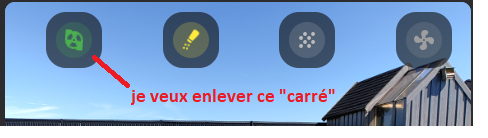
Hello, je coince encore sur un truc. Dans ce mushroom, autour de l’icone il y a un rond , ça c’est ok. Mais autour il y a un carré à bord arrondie et je n’arrive pas à le supprimer ou à le confondre avec l’autre au pire…j’ai essayé des choses dans le style de la carte, mais rien n’y fait…
Celle-ci est mise dans une picture element pour information

  - type: custom:mushroom-template-card
    icon: mdi:coffee-maker
    icon_color: |-
      {% if is_state('switch.cafetiere_switch_0', 'on') %}
        brown
      {% else %}
        grey
      {% endif %}
    entity: switch.cafetiere_switch_0
    style:
      top: 10%
      left: 10%
    card_mod:
      style: |
        {% if states('sensor.switch_0_power') | float > 1 %}
        ha-state-icon {
          animation: java 4s linear infinite;
                  backdrop-filter: blur(4px);

        }
        {% endif %}
        @keyframes java {
          0%, 80%, 100% { clip-path: polygon(0 0, 100% 0, 100% 32%, 47% 32%, 47% 43%, 100% 43%, 100% 100%, 0 100%); }
          10% { clip-path: polygon(0 0, 100% 0, 100% 32%, 47% 32%, 47% 43%, 100% 43%, 100% 100%, 55% 100%, 55% 79%, 63% 76%, 67% 70%, 66% 54%, 42% 55%, 42% 70%, 47% 77%, 55% 80%, 57% 100%, 0 100%); }
          15% { clip-path: polygon(0 0, 100% 0, 100% 100%, 55% 100%, 55% 79%, 63% 76%, 67% 70%, 66% 54%, 42% 54%, 42% 70%, 47% 77%, 55% 80%, 55% 100%, 0 100%); }
          20% { clip-path: polygon(0 0, 100% 0, 100% 32%, 47% 32%, 47% 43%, 100% 43%, 100% 100%, 55% 100%, 55% 76%, 63% 76%, 67% 70%, 66% 54%, 42% 55%, 42% 70%, 47% 76%, 55% 76%, 57% 100%, 0 100%); }
          25% { clip-path: polygon(0 0, 100% 0, 100% 100%, 55% 100%, 55% 76%, 63% 76%, 67% 70%, 66% 54%, 42% 54%, 42% 70%, 47% 76%, 55% 76%, 56% 100%, 0 100%); }
          30% { clip-path: polygon(0 0, 100% 0, 100% 32%, 47% 32%, 47% 43%, 100% 43%, 100% 100%, 55% 100%, 55% 73%, 64% 73%, 66% 70%, 66% 55%, 42% 55%, 42% 69%, 44% 73%, 55% 73%, 57% 100%, 0 100%); }
          35% { clip-path: polygon(0 0, 100% 0, 100% 100%, 55% 100%, 55% 73%, 64% 73%, 66% 70%, 66% 55%, 42% 54%, 42% 69%, 44% 73%, 55% 73%, 56% 100%, 0 100%); }
          40% { clip-path: polygon(0 0, 100% 0, 100% 32%, 47% 32%, 47% 43%, 100% 43%, 100% 100%, 55% 100%, 55% 70%, 67% 70%, 66% 54%, 42% 54%, 42% 70%, 57% 70%, 57% 100%, 0 100%); }
          45% { clip-path: polygon(0 0, 100% 0, 100% 100%, 55% 100%, 55% 70%, 67% 70%, 66% 54%, 42% 54%, 42% 70%, 55% 70%, 56% 100%, 0 100%); }
          50% { clip-path: polygon(0 0, 100% 0, 100% 32%, 47% 32%, 47% 43%, 100% 43%, 100% 100%, 55% 100%, 55% 66%, 67% 65%, 66% 54%, 42% 54%, 42% 65%, 57% 65%, 57% 100%, 0 100%); }
          55% { clip-path: polygon(0 0, 100% 0, 100% 100%, 55% 100%, 55% 66%, 67% 65%, 66% 54%, 42% 54%, 42% 65%, 55% 65%, 56% 100%, 0 100%); }
          60% { clip-path: polygon(0 0, 100% 0, 100% 32%, 47% 32%, 47% 43%, 100% 43%, 100% 100%, 55% 100%, 55% 60%, 66% 60%, 66% 54%, 42% 54%, 42% 60%, 57% 60%, 57% 100%, 0 100%); }
          65% { clip-path: polygon(0 0, 100% 0, 100% 100%, 55% 100%, 55% 60%, 66% 60%, 66% 54%, 42% 54%, 42% 60%, 55% 60%, 56% 100%, 0 100%); }
          70% { clip-path: polygon(0 0, 100% 0, 100% 32%, 47% 32%, 47% 43%, 100% 43%, 100% 100%, 55% 100%, 55% 56%, 66% 56%, 66% 54%, 42% 54%, 42% 56%, 57% 56%, 57% 100%, 0 100%); }
          75% { clip-path: polygon(0 0, 100% 0, 100% 100%, 55% 100%, 55% 56%, 66% 56%, 66% 54%, 42% 54%, 42% 56%, 55% 56%, 55% 100%, 0 100%); }
          
        }

Euh! pas comprendre. Fais une capture pour montrer ce que tu ne veux pas.

:joy: c’est vrai que mon explication est comment dire :thinking:

La mushroom est dans une picture element pour info:

type: picture-elements
image: /local/Photos/Maison10.jpg
aspect_ratio: "16:13"
card_mod:
  style: |
    ha-card {
      border-radius: 10px;
      overflow: hidden;
    }
elements:

Je veux donc virer ce carré et jouer sur l’opacité du rond autour de l’icone si c’est possible.

Ajoute dans la parti card_mod :

        ha-card {
          background-color: transparent;
        }
 - type: custom:mushroom-template-card
    icon: mdi:coffee-maker
    icon_color: |-
      {% if is_state('switch.cafetiere_switch_0', 'on') %}
        brown
      {% else %}
        grey
      {% endif %}
    entity: switch.cafetiere_switch_0
    style:
      top: 10%
      left: 10%
    card_mod:
      style: |
        {% if states('sensor.switch_0_power') | float > 1 %}
        ha-state-icon {
          animation: java 4s linear infinite;
                  backdrop-filter: blur(4px);

        }
        {% endif %}
        @keyframes java {
          0%, 80%, 100% { clip-path: polygon(0 0, 100% 0, 100% 32%, 47% 32%, 47% 43%, 100% 43%, 100% 100%, 0 100%); }
          10% { clip-path: polygon(0 0, 100% 0, 100% 32%, 47% 32%, 47% 43%, 100% 43%, 100% 100%, 55% 100%, 55% 79%, 63% 76%, 67% 70%, 66% 54%, 42% 55%, 42% 70%, 47% 77%, 55% 80%, 57% 100%, 0 100%); }
          15% { clip-path: polygon(0 0, 100% 0, 100% 100%, 55% 100%, 55% 79%, 63% 76%, 67% 70%, 66% 54%, 42% 54%, 42% 70%, 47% 77%, 55% 80%, 55% 100%, 0 100%); }
          20% { clip-path: polygon(0 0, 100% 0, 100% 32%, 47% 32%, 47% 43%, 100% 43%, 100% 100%, 55% 100%, 55% 76%, 63% 76%, 67% 70%, 66% 54%, 42% 55%, 42% 70%, 47% 76%, 55% 76%, 57% 100%, 0 100%); }
          25% { clip-path: polygon(0 0, 100% 0, 100% 100%, 55% 100%, 55% 76%, 63% 76%, 67% 70%, 66% 54%, 42% 54%, 42% 70%, 47% 76%, 55% 76%, 56% 100%, 0 100%); }
          30% { clip-path: polygon(0 0, 100% 0, 100% 32%, 47% 32%, 47% 43%, 100% 43%, 100% 100%, 55% 100%, 55% 73%, 64% 73%, 66% 70%, 66% 55%, 42% 55%, 42% 69%, 44% 73%, 55% 73%, 57% 100%, 0 100%); }
          35% { clip-path: polygon(0 0, 100% 0, 100% 100%, 55% 100%, 55% 73%, 64% 73%, 66% 70%, 66% 55%, 42% 54%, 42% 69%, 44% 73%, 55% 73%, 56% 100%, 0 100%); }
          40% { clip-path: polygon(0 0, 100% 0, 100% 32%, 47% 32%, 47% 43%, 100% 43%, 100% 100%, 55% 100%, 55% 70%, 67% 70%, 66% 54%, 42% 54%, 42% 70%, 57% 70%, 57% 100%, 0 100%); }
          45% { clip-path: polygon(0 0, 100% 0, 100% 100%, 55% 100%, 55% 70%, 67% 70%, 66% 54%, 42% 54%, 42% 70%, 55% 70%, 56% 100%, 0 100%); }
          50% { clip-path: polygon(0 0, 100% 0, 100% 32%, 47% 32%, 47% 43%, 100% 43%, 100% 100%, 55% 100%, 55% 66%, 67% 65%, 66% 54%, 42% 54%, 42% 65%, 57% 65%, 57% 100%, 0 100%); }
          55% { clip-path: polygon(0 0, 100% 0, 100% 100%, 55% 100%, 55% 66%, 67% 65%, 66% 54%, 42% 54%, 42% 65%, 55% 65%, 56% 100%, 0 100%); }
          60% { clip-path: polygon(0 0, 100% 0, 100% 32%, 47% 32%, 47% 43%, 100% 43%, 100% 100%, 55% 100%, 55% 60%, 66% 60%, 66% 54%, 42% 54%, 42% 60%, 57% 60%, 57% 100%, 0 100%); }
          65% { clip-path: polygon(0 0, 100% 0, 100% 100%, 55% 100%, 55% 60%, 66% 60%, 66% 54%, 42% 54%, 42% 60%, 55% 60%, 56% 100%, 0 100%); }
          70% { clip-path: polygon(0 0, 100% 0, 100% 32%, 47% 32%, 47% 43%, 100% 43%, 100% 100%, 55% 100%, 55% 56%, 66% 56%, 66% 54%, 42% 54%, 42% 56%, 57% 56%, 57% 100%, 0 100%); }
          75% { clip-path: polygon(0 0, 100% 0, 100% 100%, 55% 100%, 55% 56%, 66% 56%, 66% 54%, 42% 54%, 42% 56%, 55% 56%, 55% 100%, 0 100%); }
          
        }
        ha-card {
          background-color: transparent;
        }

non il est toujours là sur la cafetière,

Edit : mais disparait sur d’autre je vais donc regarder je dois avoir une erreur. Le cercle autour on peut aussi le foncé, rajouter du flou… ?

Oui, car j’ai testé avec juste le code :

        ha-card {
          background-color: transparent;
        }

Ça fonctionne, c’est quand je rajoute la partie pour l’animation de l’icône, ça ne fonctionne plus.