Bonjour,
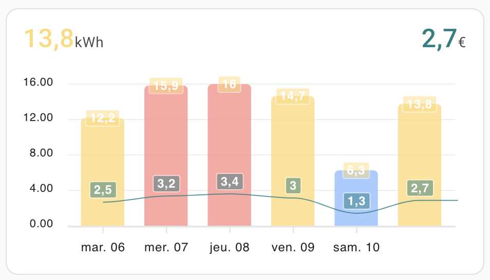
J’ai un petit problème de date sur le graphe de relevé d’électricité (gentiment piqué à @herveaurel , encore merci à lui) : les dates en dessous ne sont pas correct.
En gros, la barre au dessus de « sam 10 » correspond au dimanche 11 mai, et non au samedi 10. C’est idem pour toutes les autres dates. Et la barre tout à droite est bien ok, c’est la consommation actuelle : lundi 12 mai.
Voilà le code actuel :
type: custom:apexcharts-card
graph_span: 6d
span:
  end: day
  offset: "-1d"
experimental:
  color_threshold: true
apex_config:
  chart:
    stacked: true
    height: 200
  legend:
    show: false
  grid:
    show: true
    strokeDashArray: 0
    position: back
    borderColor: rgba(200,200,200,0.3)
  stroke:
    width: 1
  xaxis:
    labels:
      format: ddd dd
      hideOverlappingLabels: true
      showDuplicatges: true
  dataLabels:
    offsetY: -5
    background:
      enabled: true
      opacity: 0.5
  plotOptions:
    bar:
      borderRadius: 5
      dataLabels:
        position: top
  yaxis:
    - id: first
      decimals: 1
      min: 0
      forceNiceScale: true
      apex_config:
        tickAmount: 2
    - id: second
      decimals: 0
      max: 15
      min: 0
      forceNiceScale: false
      apex_config:
        tickAmount: 2
      opposite: true
      labels:
        show: false
header:
  show: true
  show_states: true
  standard_format: false
  colorize_states: true
series:
  - entity: sensor.today_hc_hp_meter
    yaxis_id: first
    type: column
    offset: +1d
    show:
      name_in_header: false
      datalabels: true
      legend_value: false
      header_color_threshold: true
    group_by:
      func: max
      duration: 1d
    opacity: 0.8
    color_threshold:
      - value: 0
        color: rgb(144, 191, 255)
      - value: 9
        color: rgb(206, 245, 149)
      - value: 12
        color: rgb(255, 218, 120)
      - value: 15
        color: rgb(255, 145, 138)
      - value: 18
        color: rgb(239, 177, 255)
  - entity: sensor.cout_actuel_edf
    yaxis_id: second
    type: line
    offset: +1d
    color: teal
    unit: €
    stroke_width: 2
    show:
      datalabels: true
      name_in_header: false
    group_by:
      func: last
      duration: 1d
    opacity: 0.8
card_mod:
  style: |
    ha-card {
      padding-top: 10px;
    }
Si quelqu’un à une solution, merci d’avance
Sans trop analyser, je dirais que le offset « -1d » => moins 1 jour, est la cause du décalage
1 « J'aime »
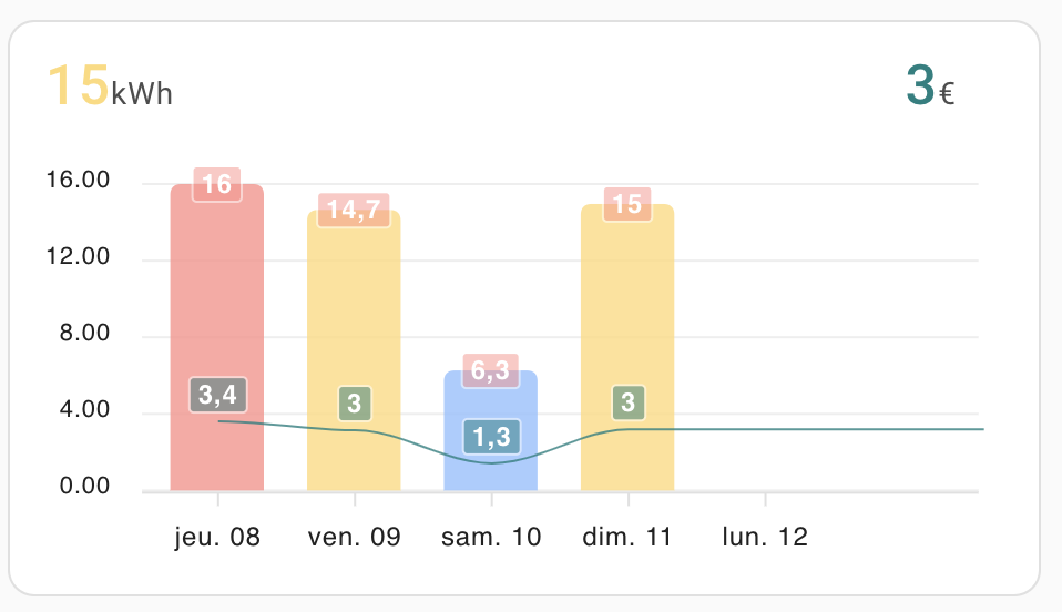
Si je le retire, j’ai un « trou » sur la droite, et j’ai toujours un décalage car nous sommes le lundi 12 et non le dimanche 11 :
Merci pour ton aide en tout cas.
Hello, au début de la config tu as un offset « -1d », alors que dans tes 2 séries tu as un offset de « +1d », ça ne serait pas ça le soucis ?
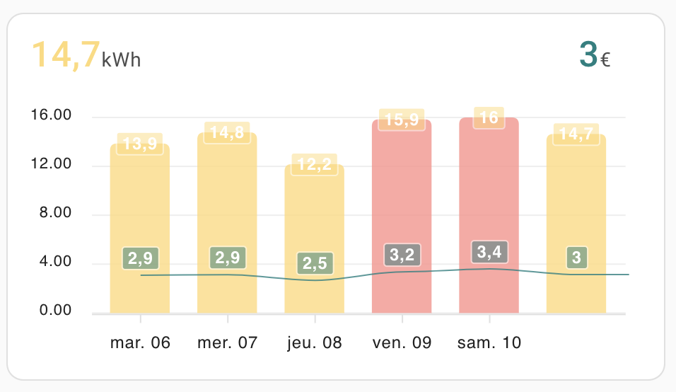
Si je mets du -1 partout, j’ai ça :
et du +1 partout j’ai ça :
Et sans l’offset dans les séries mais avec ceci
  - type: custom:apexcharts-card
    graph_span: 7d1
    stacked: true
    span:
      end: day
1 « J'aime »
c’est exactement ça, merci beaucoup !!!
1 « J'aime »
Du coup tu peux mettre un screenshot de ta carte à présent ?
1 « J'aime »
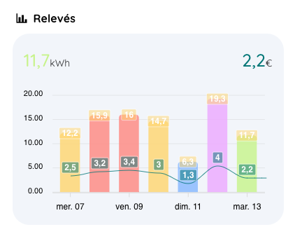
Voilà la carte complète. J’utilise le thème rounded et la carte viens du github de herveraurel .
Son code :
type: vertical-stack
cards:
  - type: heading
    heading: Relevés
    heading_style: title
    icon: mdi:chart-bar
    badges: []
    card_mod:
      style: |
        .content {
          font-size: 16px !important;
          font-weight: bold !important;
        }
  - type: custom:apexcharts-card
    graph_span: 7d1
    span:
      end: day
    experimental:
      color_threshold: true
    apex_config:
      chart:
        stacked: true
        height: 200
      legend:
        show: false
      grid:
        show: true
        strokeDashArray: 0
        position: back
        borderColor: rgba(200,200,200,0.3)
      stroke:
        width: 1
      xaxis:
        labels:
          format: ddd dd
          hideOverlappingLabels: true
          showDuplicatges: true
      dataLabels:
        offsetY: -5
        background:
          enabled: true
          opacity: 0.5
      plotOptions:
        bar:
          borderRadius: 5
          dataLabels:
            position: top
      yaxis:
        - id: first
          decimals: 1
          min: 0
          forceNiceScale: true
          apex_config:
            tickAmount: 2
        - id: second
          decimals: 0
          max: 15
          min: 0
          forceNiceScale: false
          apex_config:
            tickAmount: 2
          opposite: true
          labels:
            show: false
    header:
      show: true
      show_states: true
      standard_format: false
      colorize_states: true
    series:
      - entity: sensor.today_hc_hp_meter
        yaxis_id: first
        type: column
        show:
          name_in_header: false
          datalabels: true
          legend_value: false
          header_color_threshold: true
        group_by:
          func: max
          duration: 1d
        opacity: 0.8
        color_threshold:
          - value: 0
            color: rgb(144, 191, 255)
          - value: 9
            color: rgb(206, 245, 149)
          - value: 12
            color: rgb(255, 218, 120)
          - value: 15
            color: rgb(255, 145, 138)
          - value: 18
            color: rgb(239, 177, 255)
      - entity: sensor.cout_actuel_edf
        yaxis_id: second
        type: line
        color: teal
        unit: €
        stroke_width: 2
        show:
          datalabels: true
          name_in_header: false
        group_by:
          func: last
          duration: 1d
        opacity: 0.8
    card_mod:
      style: |
        ha-card {
          padding-top: 10px;
        }
Hello, génial merci !
1 « J'aime »
system
Mai 15, 2025, 7:26
11
Ce sujet a été automatiquement fermé après 2 jours. Aucune réponse n’est permise dorénavant.