Bonjour à tous,
je me suis inspirer d’une carte existante, le code trouvé sur le forum (MERCI)
Alors plusieurs points ou je sèche :
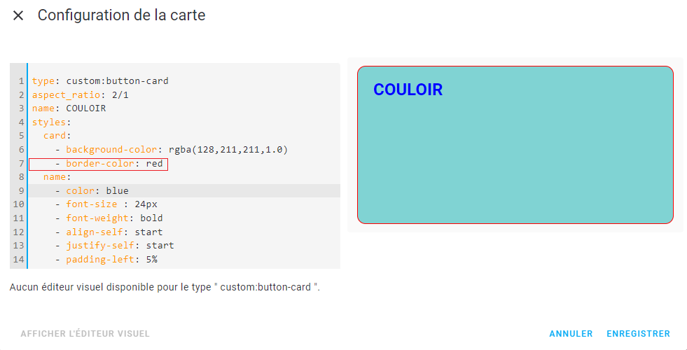
- je n’arrive pas à modifier la couleur de fond, ni la bordure !!
- je n’arrive pas à placer une icone dans dans le bouton pour allumer !!
- la taille de carte principale !!
La question suis-je parti sur la bonne piste ??
Pouvez-vous me conseiller.
Merci
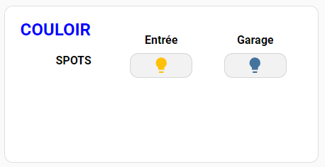
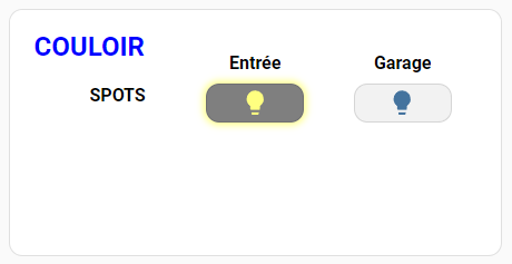
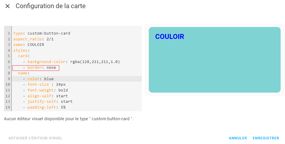
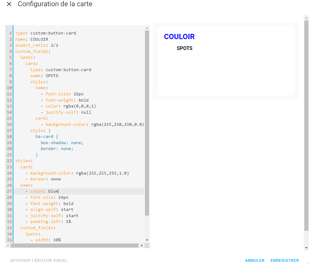
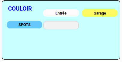
voici la carte

et le code
type: custom:layout-card
layout_type: masonry
styles: null
cards:
  - type: custom:button-card
    aspect_ratio: 2/1
    custom_fields:
      fond:
        card:
          type: custom:button-card
          name: COULOIR
          styles:
            name:
              - font-size: 24px
              - font-weight: bold
              - color: blue
              - justify-self: start
              - padding-left: 5%
            card:
              - background-color: rgba(250,250,250,1)
          style: |
            ha-card {
              box-shadow: rgba(250,250,250,1);
              border: rgba(0, 0, 0, 0.0);
            }
      Spots:
        card:
          type: custom:button-card
          name: SPOTS
          styles:
            name:
              - font-size: 16px
              - font-weight: bold
              - color: rgba(0,0,0,1)
              - justify-self: null
            card:
              - background-color: rgba(255,250,250,0.0)
          style: |
            ha-card {
              box-shadow: none;
              border: none;
            }
      entree_entree:
        card:
          type: custom:button-card
          name: Entrée
          styles:
            name:
              - font-size: 16px
              - font-weight: bold
              - color: rgba(0,0,0,1)
            card:
              - background-color: rgba((120,120,120,0.50)
          style: |
            ha-card {
              box-shadow: none;
              border: none;
            }
      entree_garage:
        card:
          type: custom:button-card
          name: Garage
          styles:
            name:
              - font-size: 16px
              - font-weight: bold
              - color: rgba(0,0,0,1)
            card:
              - background-color: rgba(255,255,255,0.0)
          style: |
            ha-card {
              box-shadow: none;
              border: none;
            }
      spot_entree:
        card:
          type: custom:button-card
          entity: switch.couloir_entree
          icon: phu:ceiling-fugato-two
          show_name: false
          state:
            - value: 'off'
              styles:
                card:
                  - box-shadow: none
                  - background-color: rgba(242,242,242,0.5)
                icon:
                  - color: rgb(255,255,128,1)
            - value: 'on'
              styles:
                icon:
                  - color: rgb(255,255,128)
                card:
                  - box-shadow: 0px 0px 6px 3px rgba(230,27,37,1)
                  - background-color: rgba(105,105,105,0.5)
      spot_garage:
        card:
          type: custom:button-card
          entity: switch.couloir_garage
          icon: phu:pendant-round
          show_name: false
          state:
            - value: 'off'
              styles:
                icon:
                  - color: Dimgray
                card:
                  - box-shadow: none
                  - background-color: rgba(242,242,242,0.5)
            - value: 'on'
              styles:
                icon:
                  - color: rgb(255,255,128)
                card:
                  - box-shadow: 0px 0px 6px 3px rgba(230,27,37,1)
                  - background-color: rgba(105,105,105,0.5)
    styles:
      custom_fields:
        fond:
          - background-image: null
          - position: absolute
          - left: 0
          - top: 0
          - width: 50%
          - height: 50%
          - background-size: null
          - background-position: center
          - opacity: 0.7
        Spots:
          - width: 30%
          - position: absolute
          - left: 5%
          - top: 25%
        entree_entree:
          - width: 25%
          - position: absolute
          - left: 40%
          - top: 15%
        entree_garage:
          - width: 25%
          - position: absolute
          - left: 70%
          - top: 15%
        spot_entree:
          - width: 25%
          - position: absolute
          - left: 40%
          - top: 25%
        spot_garage:
          - width: 25%
          - position: absolute
          - left: 70%
          - top: 25%


