Bonjour,
Lorsque je cherchais des informations sur la carte custom button-card.
Voila le lien :
Button card Lovelace Button card for your entities. -> github Features works with any toggleable entity 3 actions on tap toggle, more_info and service state display (optional) custom color for on and off state (optional) custom state...
Reading time: 1151 mins 🕑
Likes: 2400 ❤
Bijour
De mon coté je bute sur la mise une mise en forme « conditionelle » CF carte ci dessous (prise Zigbee) avec mesure conso : J’ai bien le truc pour intégrer la valeur du sensor « conso » dans la carte bouton du switch (en label), mais je voudrais (par exemple) changer la couleur de qqchose suivant des valeur de la conso (et pas de si le switch est on ou pas)
type: 'custom:button-card'
name: Fer à Repasser
entity: switch.z_tuya_prise04_on_off
label: >
  [[[ return 'Consommation : ' +
  states['sensor.z_tuya_prise04_electrical_measurement'].state + ' W'; ]]]
show_name: true
show_last_changed: false
show_state: false
show_label: true
color: auto
color_type: icon
styles:
  name:
    - font-size: 120%
  label:
    - color: gray
    - font-size: 80%
tap_action:
  action: toggle
lock:
  enabled: true
  unlock: double_tap
Pour la couleur de l’icône par exemple :
Code
type: 'custom:button-card'
name: Fer à Repasser
entity: input_boolean.hacf
label: |
  [[[ return 'Consommation : ' + states['input_number.hacf'].state + ' W'; ]]]
show_name: true
show_last_changed: false
show_state: false
show_label: true
color: auto
color_type: icon
icon: 'mdi:power-socket-fr'
styles:
  name:
    - font-size: 120%
  label:
    - color: gray
    - font-size: 80%
  icon:
    - color: |
        [[[
          if (states['input_number.hacf'].state > 90) return "red";
          if (states['input_number.hacf'].state > 75) return "rgb(252, 152, 3)";
          if (states['input_number.hacf'].state > 30) return "#0ec91e";
          if (states['input_number.hacf'].state > 10) return "#6054ff";
          if (states['input_number.hacf'].state > 0) return "#71e8f5";
          return "#b8b8b8";
        ]]]
tap_action:
  action: toggle
lock:
  enabled: true
  unlock: double_tap
j’avoue pas mal la video pour bien comprendre les possibilités
merci pour le partage
Oh - exactement ça - Bravo ! Merci !
trop fort !
Bon, on va pouvoir commencer a s’attaquer au fameux bouton grid et ses multi capteurs
Je profite de ce sujet sur l’excellent button-card (que je n’exploite certainement qu’à 20% de ses capacités, et encore…).
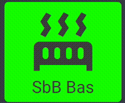
Je souhaiterai créer une « animation » lorsque mon sèche-serviettes est en route avec l’icône mdi:radiator qui se retourne horizontalement afin d’avoir ce rendu (montage rapide en gif) :
Je pense qu’il faut que j’utilise transform: scaleX(-1) mais je ne sais pas trop comment m’y prendre pour avoir l’effet recherché… une idée svp ?
La solution que je vois est d utiliser aussi card mod pour ajouter un style CSS sur le state du sensor Comme dans la vidéo 3.
Mais j’avoue que dans ma présentation, c’est avec card-mod que je travailles…
https://forum.hacf.fr/t/mon-dashboard-clemalex/737?u=clemalex
@deliwyn je pense que certaines de mes cartes peuvent t’inspirer pour ce que tu demandes…
Je vais regarder cela @Clemalex
J’ai quand même essayé un truc avec extra_styles, ça commence à ressembler à ce que je recherche mais c’est pas encore ça… y’a une rotation complète de l’icône que je ne souhaite pas.
Le code :
      - color: auto
        color_type: card
        icon: 'mdi:radiator'
        name: SbB Bas
        entity: light.seche_serviette_level
        size: 60%
        state:
          - value: 'on'
            styles:
              icon:
                - animation: testflip 1s infinite
              card:
                - background-color: lime
          - value: 'off'
            icon: 'mdi:radiator-disabled'
        extra_styles: |
          @keyframes testflip {
              0% {transform: scaleX(1)}
              25% {transform: scaleX(1)}
              50% {transform: scaleX(1)}
              75% {transform: scaleX(1)}
              100% {transform: scaleX(-1)}
              }
        tap_action:
          action: toggle
        double_tap_action:
          action: call-service
          service: script.toggle
          service_data:
            entity_id: script.1588265272117
C’est déjà bien que ça bouge
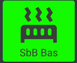
Voilà, ça va mieux avec ça :
        extra_styles: |
          @keyframes testflip {
              0% {transform: scaleX(1)}
              49% {transform: scaleX(1)}
              50% {transform: scaleX(-1)}
              99% {transform: scaleX(-1)}
              100% {transform: scaleX(-1)}
              }
Résultat :
Il y a un tout petit mouvement parasite, mais c’est pas bien grave… je m’arrête là
Il faut pousser le pourcentage à son maximum
extra_styles: |
  @keyframes testflip {
    49.99% {transform: scaleX(1)}
    50% {transform: scaleX(-1)}
    99.99% {transform: scaleX(-1)}
    100% {transform: scaleX(1)}
    }
jybi89
Avril 27, 2021, 4:11
16
faire une compilation de Animation Badges - Home Assistant - Tutoriels & Partages / Interface / Lovelace / Thème / Custom Card - Home Assistant Communauté Francophone (hacf.fr) et d’une carte animée n’est pas si facile, (mode boulet ON)
voici ce que j’arrive à faire…pas du tout mon but LOL
voici le code :
color_type: icon
entity: binary_sensor.octoprint_connected
name: '[[[if (entity.state == "on") return "On"; else return "Off"]]]'
show_icon: true
show_last_changed: false
show_name: false
icon: 'mdi:printer-3d'
styles:
  card:
    - border-radius: 10px
  label:
    - font-size: 10px
  name:
    - font-variant: small-caps
    - color: var(--primary-color)
  icon:
    - animation: |
        [[[
          if (entity.state == "on") return "printing 1s linear infinite alternate";
          else if (entity.state == "off") return "printing 100s linear infinite alternate";
          else return ;
        ]]]
    - color: var(--primary-color)
tap_action:
  action: null
type: 'custom:button-card'
style: |
  @keyframes printing {
    0% {
      background-image: url("/local/img/ender/printer-3d-01.svg");
    }
    33% {
      background-image: url("/local/img/ender/printer-3d-02.svg");
    }
    67% {
      background-image: url("/local/img/ender/printer-3d-03.svg");
    }
    100% {
      background-image: url("/local/img/ender/printer-3d-04.svg");
    }
  }
évidemment, le but serait de n’avoir que l’icone principale bouger … pas tout les mini icones en fond de cartes
Hello,
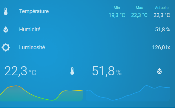
Card simple sans popup:
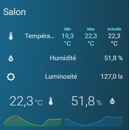
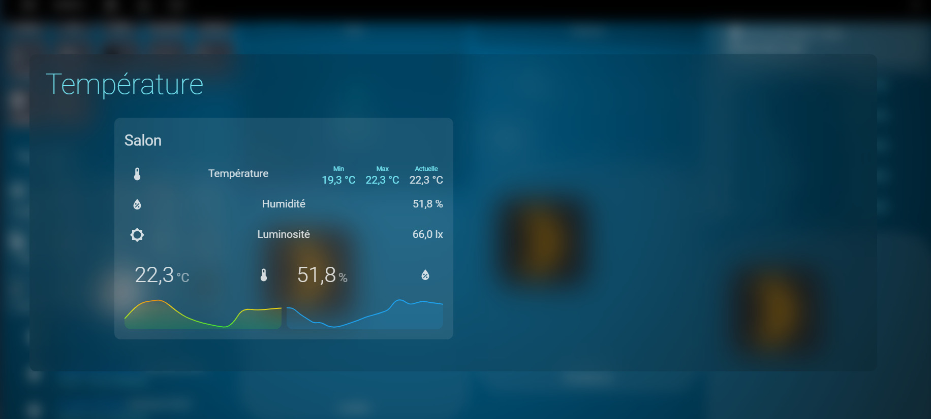
La même card incorporée dans un popup card :
voici le code :
tap_action:
  action: fire-dom-event
  browser_mod:
    command: popup
    title: Température
    hide_header: true
    large: true
    card:
      type: custom:button-card
      show_entity_picture: false
      entity_picture: /local/Neon/house.png
      entity: alarm_control_panel.alarmo
      show_icon: false
      name: Température
      tap_action:
        action: navigate
        navigation_path: '#empty'
      styles:
        card:
          - height: 500px
          - border-radius: 10px
          - background-color: transparent
          - '--mdc-ripple-press-opacity': 0
        name:
          - z-index: 2
          - position: absolute
          - font-size: 45px
          - font-weight: lighter
          - justify-self: start
          - color: var(--secondary-text-color)
          - left: 25px
          - top: 20px
        icon:
          - width: 50%
        img_cell:
          - z-index: 2
        custom_fields:
          blur:
            - z-index: 1
            - top: 0%
            - left: 0%
            - width: 100%
            - height: 100%
            - border-radius: 10px
            - position: absolute
            - background-color: rgba(0, 0, 0, 0.1)
            - backdrop-filter: blur(20px)
            - '-webkit-backdrop-filter': blur(20px)
          temp1:
            - z-index: 2
            - position: absolute
            - top: 20%
            - width: 40%
            - left: 10%
      custom_fields:
        blur: |
          <div></div>
        temp1:
          card:
            type: entities
            title: Salon
            entities:
              - entity: sensor.lumi_lumi_weather_temperature
                name: Température
                type: custom:multiple-entity-row
                style: |
                  .entity:not(.state)>div {
                    color: var(--secondary-text-color);
                   }
                state_header: Actuelle
                entities:
                  - entity: sensor.salon_temp_min
                    name: Min
                  - entity: sensor.salon_temp_max
                    name: Max
              - entity: sensor.lumi_lumi_weather_humidity
                name: Humidité
              - entity: sensor.xiaomi_lumi_sen_ill_mgl01_illuminance
                name: Luminosité
              - type: custom:swipe-card
                reset_after: 5
                parameters:
                  roundLengths: true
                  effect: coverflow
                  speed: 650
                  spaceBetween: 20
                  threshold: 7
                  coverflowEffect:
                    rotate: 80
                    depth: 300
                    start_card: 1
                cards:
                  - type: custom:hui-element
                    card_type: horizontal-stack
                    cards:
                      - type: custom:mini-graph-card
                        align_icon: state
                        line_width: 3
                        card_mod:
                          style: |
                            ha-card {
                            --ha-card-background: transparent;
                        color_thresholds:
                          - color: '#ef1d0f'
                            value: 25
                          - color: '#ef5a0f'
                            value: 24
                          - color: '#f0da11'
                            value: 22
                          - color: '#11f13a'
                            value: 19
                          - color: '#1da4f2'
                            value: 15
                        entities:
                          - entity: sensor.lumi_lumi_weather_temperature
                            index: 0
                        hour24: true
                        more_info: false
                        points_per_hour: 1
                        show:
                          labels: false
                          name: false
                      - type: custom:mini-graph-card
                        align_icon: state
                        entities:
                          - entity: sensor.lumi_lumi_weather_humidity
                            index: 0
                        hour24: true
                        card_mod:
                          style: |
                            ha-card {
                            --ha-card-background: transparent;
                        line_color: '#1da4f2'
                        more_info: false
                        name: Salon
                        line_width: 3
                        points_per_hour: 1
                        show:
                          labels: false
                          name: false
                  - type: custom:hui-element
                    card_type: horizontal-stack
                    cards:
                      - type: custom:mini-graph-card
                        align_icon: state
                        entities:
                          - entity: sensor.lumi_lumi_weather_pressure
                            index: 0
                        hour24: true
                        line_color: '#ff0000'
                        more_info: false
                        name: Salon
                        line_width: 3
                        points_per_hour: 1
                        show:
                          labels: false
                          name: false
                      - type: custom:mini-graph-card
                        align_icon: state
                        entities:
                          - entity: sensor.lumi_lumi_weather_power
                            index: 0
                        hour24: true
                        line_color: '#A700FF'
                        more_info: false
                        name: Salon
                        line_width: 3
                        points_per_hour: 1
                        show:
                          graph: bar
                          labels: false
                          name: false
            style: |
              ha-card {
                --ha-card-background: rgba(240, 240, 240, 0.1);
Le but étant de créer différents button-card sur mon popup et de faire apparaitre la card « température » ci-dessus en fonction (state-switch)
Une idée du problème ?
Voici quelques exemples.
type: grid
cards:
  - type: custom:button-card
    name: fliping
    icon: mdi:fire
    styles:
      icon:
        - animation: flip 1s infinite
    extra_styles: |
      @keyframes flip {
          0% {transform: scaleX(1)}
          49.99% {transform: scaleX(1)}
          50% {transform: scaleX(-1)}
          99.99% {transform: scaleX(-1)}
          100% {transform: scaleX(-1)}
          }
  - type: custom:button-card
    name: rotating
    icon: mdi:fire
    styles:
      icon:
        - animation:
            - rotating 3s infinite alternate
  - type: custom:button-card
    name: Slide In
    icon: mdi:fire
    styles:
      card:
        - height: 100%
      icon:
        - animation: slidein 3s infinite
    extra_styles: |
      @keyframes slidein {
        from { margin-left: 150%;}
        to { margin-left:0%;}
  - type: custom:button-card
    name: Slide
    icon: mdi:fire
    styles:
      icon:
        - animation: slide 3s infinite
    extra_styles: |

      @keyframes slide {
        from { margin-left: 50%;}
        to { margin-left:0%;}
  - type: custom:button-card
    name: bounce
    icon: mdi:fire
    show_entity_picture: true
    styles:
      icon:
        - animation: bounce 3s ease infinite
    extra_styles: |
      @keyframes bounce{
           from {top: 0%;}
           50%  {top: 100%;}
           to   {top: 0%;}
      }

  - type: custom:button-card
    name: Background
    icon: mdi:fire
    styles:
      icon:
        - animation: background 3s infinite
    extra_styles: |
      @keyframes background {
        from {background-color: red;}
        50% {background-color: yellow;}
        to {background-color: red;}
      }
  - type: custom:button-card
    name: icon color
    icon: mdi:fire
    styles:
      icon:
        - animation: icon-color 3s infinite
    extra_styles: |
      @keyframes icon-color {
        from {color: red;}
        50% {color: yellow;}
        to {color: red;}
      }
  - type: custom:button-card
    name: Fade
    icon: mdi:fire
    styles:
      icon:
        - animation: fade-out 3s infinite
    extra_styles: |
      @keyframes fade-out {
        0% { opacity:1; }
        50% { opacity:0; }
        100% { opacity:1; }
      }
  - type: custom:button-card
    name: Fade-out
    icon: mdi:fire
    styles:
      icon:
        - animation: fade-out 3s infinite
    extra_styles: |
      @keyframes fade-out {
        from { opacity:1; }
        to { opacity:0; }
      }
  - type: custom:button-card
    name: Rotation X
    icon: mdi:fire
    show_entity_picture: true
    styles:
      icon:
        - color: var(--state-icon-active-color)
        - animation: rotation_x 5s infinite
    extra_styles: |
      @keyframes rotation_x{
        0% {transform: scalex(-1)}
        50% {transform: scalex(1)}
        100% {transform: scalex(-1)}
      }
  - type: custom:button-card
    name: Rotation Y
    icon: mdi:fire
    show_entity_picture: true
    styles:
      icon:
        - color: var(--state-icon-active-color)
        - animation: rotation_y 5s infinite
    extra_styles: |
      @keyframes rotation_y{
        from {transform: scaley(1)}
        50% {transform: scaley(-1)}
        to {transform: scaley(1)}
      }
  - type: custom:button-card
    name: Flame
    icon: mdi:fire
    styles:
      icon:
        - animation: flame 1.5s infinite
    extra_styles: |
      @keyframes flame {
        0% {filter: blur(0px);transform: translate3d(0%, 0, 0); opacity:1; }
        50% {filter: blur(1px) ;transform: rotate(2deg) translate3d(1%, 0, 0); opacity:.60; }
        100% {filter: blur(0px);transform:  rotate(-1deg) translate3d(0%, 1%, 0); opacity:1;}
      }
  - type: custom:button-card
    name: Shake
    icon: mdi:fire
    styles:
      icon:
        - animation: shake 0.82s infinite
        - transform: translate3d(0, 0, 0)
    extra_styles: |
      @keyframes shake {
        10%, 90% {
          transform: translate3d(-1%, 0, 0);
        }

        20%, 80% {
          transform: translate3d(2%, 0, 0);
        }

        30%, 50%, 70% {
          transform: translate3d(-4%, 0, 0);
        }

        40%, 60% {
          transform: translate3d(4%, 0, 0);
        }
      }
  - type: custom:button-card
    name: Blur
    icon: mdi:fire
    styles:
      icon:
        - animation: blur 5s infinite
    extra_styles: |
      @keyframes blur {
        0% { filter: blur(0px);}
        50% { filter: blur(6px);}
        100% { filter: blur(0px);}
      }
  - type: custom:button-card
    name: drop-shadow
    icon: mdi:fire
    styles:
      icon:
        - animation: drop-shadow 5s infinite alternate
    extra_styles: |
      @keyframes drop-shadow {
        from { filter: drop-shadow(1.95rem 0 0 pink);}
        to { filter: drop-shadow(0 0 0.95rem chartreuse);}
      }
  - type: custom:button-card
    name: skew x
    icon: mdi:fire
    styles:
      icon:
        - animation: skewX 5s infinite alternate
    extra_styles: |
      @keyframes skewX {
        from { transform: skewX(50deg);}
        to { transform: skewX(-50deg);}
      }
  - type: custom:button-card
    name: skew y
    icon: mdi:fire
    styles:
      icon:
        - animation: skewY 5s infinite alternate
    extra_styles: |
      @keyframes skewY {
        from { transform: skewY(0deg);}
        to { transform: skewY(-180deg);}
      }
  - type: custom:button-card
    name: scale
    icon: mdi:fire
    styles:
      icon:
        - animation: scale 5s infinite alternate
    extra_styles: |
      @keyframes scale {
        from { transform: scale(0);}
        to { transform: scale(1);}
      }
square: false
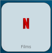
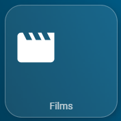
Je viens de découvrir qu’il était possible de mettre des gifs animés dans les cards.
Voici un exemple :
Boutton inactif (off):
Avec le code associé :
        type: custom:button-card
        entity: input_select.plex_recently
        name: Films
        show_icon: true
        icon: mdi:movie
        aspect_ratio: 1/1
        styles:
          icon:
            - top: '-9%'
            - left: 7%
            - width: 40%
            - position: absolute
          name:
            - top: 80%
            - left: 15%
            - position: center
            - color: rgba(240, 240, 240, 0.8)
          card:
            - font-size: 80%
            - background-color: rgba(240, 240, 240, 0.1)
            - border-radius: 15%
            - border-style: solid
            - border-color: rgba(240, 240, 240, 0.3)
            - border-width: 1px
            - transition: true
        state:
          - value: Films
            hide_icon: true
            styles:
              card:
                - background-color: rgba(255, 255, 255, 0.8)
                - border: 1px rgba(80, 80, 80) solid
              name:
                - color: rgba(0, 0, 0, 0.6)
              icon:
                - color: rgba(255, 255, 255, 0.0)
              custom_fields:
                netflix:
                  - top: '-10%'
                  - left: '-5%'
                  - position: absolute
                  - opacity: 11
            custom_fields:
              netflix: |
                [[[
                  if (states[entity.entity_id.replace(entity.entity_id.split('.')[0], 'input_select')].state === 'Films') {
                    return '<img src="/local/netflix.gif" width="105%">';
                  }
                ]]]
        tap_action:
          action: call-service
          service: input_select.select_option
          service_data:
            entity_id: input_select.plex_recently
            option: Films
(Dans le code, j’ai feinté pour « masquer » l’icône mdi:movies car je n’ai pas trouvé de solution pour la faire disparaitre suivant le state…)
Et voici le gif à enregistrer dans /config/www
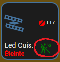
Bonjour,custom_fields ?
custom_fields et voudrais que la clignote quand c’est sur on.
            - type: custom:button-card
              entity: light.innr_fl_120_c_d9cc0105_level_light_color_on_off
              name: Led Cuis.
              icon: bha:led-strip
              aspect_ratio: 1/1
              layout: icon_label
              size: 100%
              label: |
                [[[
                  if (states['light.innr_fl_120_c_d9cc0105_level_light_color_on_off'].state == "off") return '<ha-icon icon="mdi:zigbee" style="width: 15px; height: 15px; color: red;"></ha-icon>' + states['sensor.innr_fl_120_c_d9cc0105_basic_lqi'].state;
                ]]]
              state:
                - value: 'on'
                  color: auto
                  styles:
                    state:
                      - color: green
                - value: 'off'
                  styles:
                    state:
                      - color: red
              show_state: true
              show_label: true
              template: header
              double_tap_action:
                action: more-info
                entity: binary_sensor.tz1800_fcdjzz3s_ty0202_iaszone
              custom_fields:
                motion: >
                  [[[ if
                  (states['binary_sensor.tz1800_fcdjzz3s_ty0202_iaszone'].state
                  == "off") return '<ha-icon icon="mdi:motion-sensor-off"
                  style="width: 22px; height: 22px; color: green;"></ha-icon>';
                  else return '<ha-icon icon="mdi:motion-sensor" style="width:
                  22px; height: 22px; color: red;"></ha-icon>' ]]]
              styles:
                custom_fields:
                  motion:
                    - top: 67%
                    - left: 63%
                    - position: absolute
                    - color: white
                    - font-size: 13px
                    - padding: 0.3em
                    - margin: 0.2em
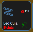
Edit:
Voila mon code:
            - type: custom:button-card
              entity: light.innr_fl_120_c_d9cc0105_level_light_color_on_off
              name: Led Cuis.
              icon: bha:led-strip
              aspect_ratio: 1/1
              layout: icon_label
              size: 100%
              label: |
                [[[
                  if (states['light.innr_fl_120_c_d9cc0105_level_light_color_on_off'].state == "off") return '<ha-icon icon="mdi:zigbee" style="width: 15px; height: 15px; color: red;"></ha-icon>' + states['sensor.innr_fl_120_c_d9cc0105_basic_lqi'].state;
                ]]]
              state:
                - value: 'on'
                  color: auto
                  styles:
                    state:
                      - color: green
                - value: 'off'
                  styles:
                    state:
                      - color: red
              show_state: true
              show_label: true
              template: header
              double_tap_action:
                action: more-info
                entity: binary_sensor.tz1800_fcdjzz3s_ty0202_iaszone
              custom_fields:
                motion: >
                  [[[ if
                  (states['binary_sensor.tz1800_fcdjzz3s_ty0202_iaszone'].state
                  == "off") return '<ha-icon icon="mdi:motion-sensor-off"
                  style="width: 22px; height: 22px; color: green;"></ha-icon>';
                  else return '<ha-icon icon="mdi:motion-sensor" style="width:
                  22px; height: 22px;"></ha-icon>' ]]]
              extra_styles: |
                [[[ return `
                  @keyframes pulse {
                    90% {
                      color: red;
                    }
                  }
                `]]]
              styles:
                custom_fields:
                  motion:
                    - top: 67%
                    - left: 63%
                    - position: absolute
                    - font-size: 13px
                    - padding: 0.3em
                    - color: transparent
                    - margin: 0.2em
                    - animation: |
                        [[[
                          if (states['binary_sensor.tz1800_fcdjzz3s_ty0202_iaszone'].state == "on")
                          return "pulse 1.5s infinite"; else return "none";
                        ]]]


