Voilà, ça va mieux avec ça :
extra_styles: |
@keyframes testflip {
0% {transform: scaleX(1)}
49% {transform: scaleX(1)}
50% {transform: scaleX(-1)}
99% {transform: scaleX(-1)}
100% {transform: scaleX(-1)}
}
Résultat :
Il y a un tout petit mouvement parasite, mais c’est pas bien grave… je m’arrête là
Il faut pousser le pourcentage à son maximum :
extra_styles: |
@keyframes testflip {
49.99% {transform: scaleX(1)}
50% {transform: scaleX(-1)}
99.99% {transform: scaleX(-1)}
100% {transform: scaleX(1)}
}
1 « J'aime »
jybi89
Avril 27, 2021, 4:11
16
faire une compilation de Animation Badges - Home Assistant - Tutoriels & Partages / Interface / Lovelace / Thème / Custom Card - Home Assistant Communauté Francophone (hacf.fr) et d’une carte animée n’est pas si facile, (mode boulet ON)
voici ce que j’arrive à faire…pas du tout mon but LOL
voici le code :
color_type: icon
entity: binary_sensor.octoprint_connected
name: '[[[if (entity.state == "on") return "On"; else return "Off"]]]'
show_icon: true
show_last_changed: false
show_name: false
icon: 'mdi:printer-3d'
styles:
card:
- border-radius: 10px
label:
- font-size: 10px
name:
- font-variant: small-caps
- color: var(--primary-color)
icon:
- animation: |
[[[
if (entity.state == "on") return "printing 1s linear infinite alternate";
else if (entity.state == "off") return "printing 100s linear infinite alternate";
else return ;
]]]
- color: var(--primary-color)
tap_action:
action: null
type: 'custom:button-card'
style: |
@keyframes printing {
0% {
background-image: url("/local/img/ender/printer-3d-01.svg");
}
33% {
background-image: url("/local/img/ender/printer-3d-02.svg");
}
67% {
background-image: url("/local/img/ender/printer-3d-03.svg");
}
100% {
background-image: url("/local/img/ender/printer-3d-04.svg");
}
}
évidemment, le but serait de n’avoir que l’icone principale bouger … pas tout les mini icones en fond de cartes
Hello,
Je viens poster ici un problème de mise en forme dans un popup card.
J’ai l’impression que le style z-index me pose ce problème
Voici le problème :
Card simple sans popup:
= le texte est aligné sur la gauche
La même card incorporée dans un popup card :
= le texte est aligné au centre
voici le code :
tap_action:
action: fire-dom-event
browser_mod:
command: popup
title: Température
hide_header: true
large: true
card:
type: custom:button-card
show_entity_picture: false
entity_picture: /local/Neon/house.png
entity: alarm_control_panel.alarmo
show_icon: false
name: Température
tap_action:
action: navigate
navigation_path: '#empty'
styles:
card:
- height: 500px
- border-radius: 10px
- background-color: transparent
- '--mdc-ripple-press-opacity': 0
name:
- z-index: 2
- position: absolute
- font-size: 45px
- font-weight: lighter
- justify-self: start
- color: var(--secondary-text-color)
- left: 25px
- top: 20px
icon:
- width: 50%
img_cell:
- z-index: 2
custom_fields:
blur:
- z-index: 1
- top: 0%
- left: 0%
- width: 100%
- height: 100%
- border-radius: 10px
- position: absolute
- background-color: rgba(0, 0, 0, 0.1)
- backdrop-filter: blur(20px)
- '-webkit-backdrop-filter': blur(20px)
temp1:
- z-index: 2
- position: absolute
- top: 20%
- width: 40%
- left: 10%
custom_fields:
blur: |
<div></div>
temp1:
card:
type: entities
title: Salon
entities:
- entity: sensor.lumi_lumi_weather_temperature
name: Température
type: custom:multiple-entity-row
style: |
.entity:not(.state)>div {
color: var(--secondary-text-color);
}
state_header: Actuelle
entities:
- entity: sensor.salon_temp_min
name: Min
- entity: sensor.salon_temp_max
name: Max
- entity: sensor.lumi_lumi_weather_humidity
name: Humidité
- entity: sensor.xiaomi_lumi_sen_ill_mgl01_illuminance
name: Luminosité
- type: custom:swipe-card
reset_after: 5
parameters:
roundLengths: true
effect: coverflow
speed: 650
spaceBetween: 20
threshold: 7
coverflowEffect:
rotate: 80
depth: 300
start_card: 1
cards:
- type: custom:hui-element
card_type: horizontal-stack
cards:
- type: custom:mini-graph-card
align_icon: state
line_width: 3
card_mod:
style: |
ha-card {
--ha-card-background: transparent;
color_thresholds:
- color: '#ef1d0f'
value: 25
- color: '#ef5a0f'
value: 24
- color: '#f0da11'
value: 22
- color: '#11f13a'
value: 19
- color: '#1da4f2'
value: 15
entities:
- entity: sensor.lumi_lumi_weather_temperature
index: 0
hour24: true
more_info: false
points_per_hour: 1
show:
labels: false
name: false
- type: custom:mini-graph-card
align_icon: state
entities:
- entity: sensor.lumi_lumi_weather_humidity
index: 0
hour24: true
card_mod:
style: |
ha-card {
--ha-card-background: transparent;
line_color: '#1da4f2'
more_info: false
name: Salon
line_width: 3
points_per_hour: 1
show:
labels: false
name: false
- type: custom:hui-element
card_type: horizontal-stack
cards:
- type: custom:mini-graph-card
align_icon: state
entities:
- entity: sensor.lumi_lumi_weather_pressure
index: 0
hour24: true
line_color: '#ff0000'
more_info: false
name: Salon
line_width: 3
points_per_hour: 1
show:
labels: false
name: false
- type: custom:mini-graph-card
align_icon: state
entities:
- entity: sensor.lumi_lumi_weather_power
index: 0
hour24: true
line_color: '#A700FF'
more_info: false
name: Salon
line_width: 3
points_per_hour: 1
show:
graph: bar
labels: false
name: false
style: |
ha-card {
--ha-card-background: rgba(240, 240, 240, 0.1);
Le but étant de créer différents button-card sur mon popup et de faire apparaitre la card « température » ci-dessus en fonction (state-switch)
Une idée du problème ?
Voici quelques exemples.
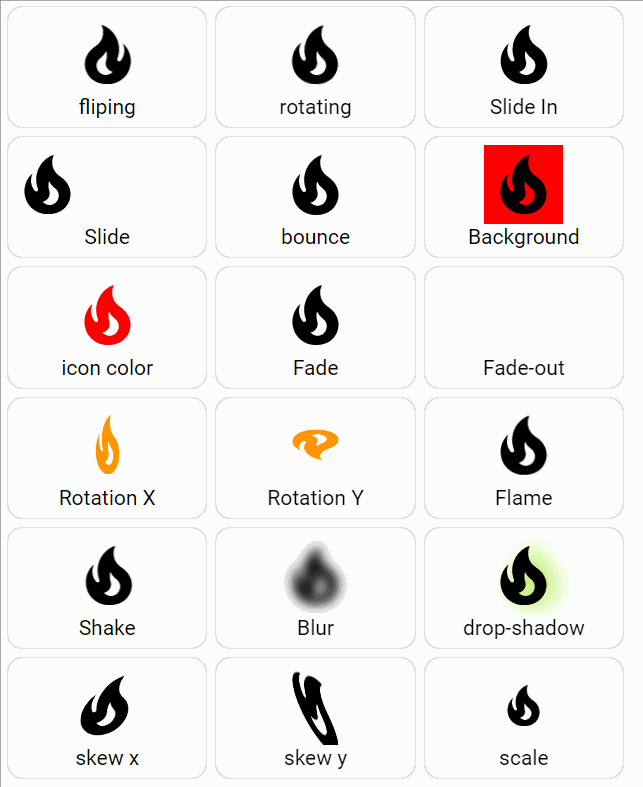
type: grid
cards:
- type: custom:button-card
name: fliping
icon: mdi:fire
styles:
icon:
- animation: flip 1s infinite
extra_styles: |
@keyframes flip {
0% {transform: scaleX(1)}
49.99% {transform: scaleX(1)}
50% {transform: scaleX(-1)}
99.99% {transform: scaleX(-1)}
100% {transform: scaleX(-1)}
}
- type: custom:button-card
name: rotating
icon: mdi:fire
styles:
icon:
- animation:
- rotating 3s infinite alternate
- type: custom:button-card
name: Slide In
icon: mdi:fire
styles:
card:
- height: 100%
icon:
- animation: slidein 3s infinite
extra_styles: |
@keyframes slidein {
from { margin-left: 150%;}
to { margin-left:0%;}
- type: custom:button-card
name: Slide
icon: mdi:fire
styles:
icon:
- animation: slide 3s infinite
extra_styles: |
@keyframes slide {
from { margin-left: 50%;}
to { margin-left:0%;}
- type: custom:button-card
name: bounce
icon: mdi:fire
show_entity_picture: true
styles:
icon:
- animation: bounce 3s ease infinite
extra_styles: |
@keyframes bounce{
from {top: 0%;}
50% {top: 100%;}
to {top: 0%;}
}
- type: custom:button-card
name: Background
icon: mdi:fire
styles:
icon:
- animation: background 3s infinite
extra_styles: |
@keyframes background {
from {background-color: red;}
50% {background-color: yellow;}
to {background-color: red;}
}
- type: custom:button-card
name: icon color
icon: mdi:fire
styles:
icon:
- animation: icon-color 3s infinite
extra_styles: |
@keyframes icon-color {
from {color: red;}
50% {color: yellow;}
to {color: red;}
}
- type: custom:button-card
name: Fade
icon: mdi:fire
styles:
icon:
- animation: fade-out 3s infinite
extra_styles: |
@keyframes fade-out {
0% { opacity:1; }
50% { opacity:0; }
100% { opacity:1; }
}
- type: custom:button-card
name: Fade-out
icon: mdi:fire
styles:
icon:
- animation: fade-out 3s infinite
extra_styles: |
@keyframes fade-out {
from { opacity:1; }
to { opacity:0; }
}
- type: custom:button-card
name: Rotation X
icon: mdi:fire
show_entity_picture: true
styles:
icon:
- color: var(--state-icon-active-color)
- animation: rotation_x 5s infinite
extra_styles: |
@keyframes rotation_x{
0% {transform: scalex(-1)}
50% {transform: scalex(1)}
100% {transform: scalex(-1)}
}
- type: custom:button-card
name: Rotation Y
icon: mdi:fire
show_entity_picture: true
styles:
icon:
- color: var(--state-icon-active-color)
- animation: rotation_y 5s infinite
extra_styles: |
@keyframes rotation_y{
from {transform: scaley(1)}
50% {transform: scaley(-1)}
to {transform: scaley(1)}
}
- type: custom:button-card
name: Flame
icon: mdi:fire
styles:
icon:
- animation: flame 1.5s infinite
extra_styles: |
@keyframes flame {
0% {filter: blur(0px);transform: translate3d(0%, 0, 0); opacity:1; }
50% {filter: blur(1px) ;transform: rotate(2deg) translate3d(1%, 0, 0); opacity:.60; }
100% {filter: blur(0px);transform: rotate(-1deg) translate3d(0%, 1%, 0); opacity:1;}
}
- type: custom:button-card
name: Shake
icon: mdi:fire
styles:
icon:
- animation: shake 0.82s infinite
- transform: translate3d(0, 0, 0)
extra_styles: |
@keyframes shake {
10%, 90% {
transform: translate3d(-1%, 0, 0);
}
20%, 80% {
transform: translate3d(2%, 0, 0);
}
30%, 50%, 70% {
transform: translate3d(-4%, 0, 0);
}
40%, 60% {
transform: translate3d(4%, 0, 0);
}
}
- type: custom:button-card
name: Blur
icon: mdi:fire
styles:
icon:
- animation: blur 5s infinite
extra_styles: |
@keyframes blur {
0% { filter: blur(0px);}
50% { filter: blur(6px);}
100% { filter: blur(0px);}
}
- type: custom:button-card
name: drop-shadow
icon: mdi:fire
styles:
icon:
- animation: drop-shadow 5s infinite alternate
extra_styles: |
@keyframes drop-shadow {
from { filter: drop-shadow(1.95rem 0 0 pink);}
to { filter: drop-shadow(0 0 0.95rem chartreuse);}
}
- type: custom:button-card
name: skew x
icon: mdi:fire
styles:
icon:
- animation: skewX 5s infinite alternate
extra_styles: |
@keyframes skewX {
from { transform: skewX(50deg);}
to { transform: skewX(-50deg);}
}
- type: custom:button-card
name: skew y
icon: mdi:fire
styles:
icon:
- animation: skewY 5s infinite alternate
extra_styles: |
@keyframes skewY {
from { transform: skewY(0deg);}
to { transform: skewY(-180deg);}
}
- type: custom:button-card
name: scale
icon: mdi:fire
styles:
icon:
- animation: scale 5s infinite alternate
extra_styles: |
@keyframes scale {
from { transform: scale(0);}
to { transform: scale(1);}
}
square: false
8 « J'aime »
Je viens de découvrir qu’il était possible de mettre des gifs animés dans les cards.
Voici un exemple :
Button actif (on) :
Boutton inactif (off):
Avec le code associé :
type: custom:button-card
entity: input_select.plex_recently
name: Films
show_icon: true
icon: mdi:movie
aspect_ratio: 1/1
styles:
icon:
- top: '-9%'
- left: 7%
- width: 40%
- position: absolute
name:
- top: 80%
- left: 15%
- position: center
- color: rgba(240, 240, 240, 0.8)
card:
- font-size: 80%
- background-color: rgba(240, 240, 240, 0.1)
- border-radius: 15%
- border-style: solid
- border-color: rgba(240, 240, 240, 0.3)
- border-width: 1px
- transition: true
state:
- value: Films
hide_icon: true
styles:
card:
- background-color: rgba(255, 255, 255, 0.8)
- border: 1px rgba(80, 80, 80) solid
name:
- color: rgba(0, 0, 0, 0.6)
icon:
- color: rgba(255, 255, 255, 0.0)
custom_fields:
netflix:
- top: '-10%'
- left: '-5%'
- position: absolute
- opacity: 11
custom_fields:
netflix: |
[[[
if (states[entity.entity_id.replace(entity.entity_id.split('.')[0], 'input_select')].state === 'Films') {
return '<img src="/local/netflix.gif" width="105%">';
}
]]]
tap_action:
action: call-service
service: input_select.select_option
service_data:
entity_id: input_select.plex_recently
option: Films
(Dans le code, j’ai feinté pour « masquer » l’icône mdi:movies car je n’ai pas trouvé de solution pour la faire disparaitre suivant le state…)
Et voici le gif à enregistrer dans /config/www
4 « J'aime »
Bonjour,
peu ton faire clignoté une icone d’un custom_fields
?
dans mon code, j’ai fait un changement d’icone et couleur suivant l’état du custom_fields
et voudrais que la clignote quand c’est sur on.
- type: custom:button-card
entity: light.innr_fl_120_c_d9cc0105_level_light_color_on_off
name: Led Cuis.
icon: bha:led-strip
aspect_ratio: 1/1
layout: icon_label
size: 100%
label: |
[[[
if (states['light.innr_fl_120_c_d9cc0105_level_light_color_on_off'].state == "off") return '<ha-icon icon="mdi:zigbee" style="width: 15px; height: 15px; color: red;"></ha-icon>' + states['sensor.innr_fl_120_c_d9cc0105_basic_lqi'].state;
]]]
state:
- value: 'on'
color: auto
styles:
state:
- color: green
- value: 'off'
styles:
state:
- color: red
show_state: true
show_label: true
template: header
double_tap_action:
action: more-info
entity: binary_sensor.tz1800_fcdjzz3s_ty0202_iaszone
custom_fields:
motion: >
[[[ if
(states['binary_sensor.tz1800_fcdjzz3s_ty0202_iaszone'].state
== "off") return '<ha-icon icon="mdi:motion-sensor-off"
style="width: 22px; height: 22px; color: green;"></ha-icon>';
else return '<ha-icon icon="mdi:motion-sensor" style="width:
22px; height: 22px; color: red;"></ha-icon>' ]]]
styles:
custom_fields:
motion:
- top: 67%
- left: 63%
- position: absolute
- color: white
- font-size: 13px
- padding: 0.3em
- margin: 0.2em
Edit:
je me repond a moi même , c’est possible.
Voila mon code:
- type: custom:button-card
entity: light.innr_fl_120_c_d9cc0105_level_light_color_on_off
name: Led Cuis.
icon: bha:led-strip
aspect_ratio: 1/1
layout: icon_label
size: 100%
label: |
[[[
if (states['light.innr_fl_120_c_d9cc0105_level_light_color_on_off'].state == "off") return '<ha-icon icon="mdi:zigbee" style="width: 15px; height: 15px; color: red;"></ha-icon>' + states['sensor.innr_fl_120_c_d9cc0105_basic_lqi'].state;
]]]
state:
- value: 'on'
color: auto
styles:
state:
- color: green
- value: 'off'
styles:
state:
- color: red
show_state: true
show_label: true
template: header
double_tap_action:
action: more-info
entity: binary_sensor.tz1800_fcdjzz3s_ty0202_iaszone
custom_fields:
motion: >
[[[ if
(states['binary_sensor.tz1800_fcdjzz3s_ty0202_iaszone'].state
== "off") return '<ha-icon icon="mdi:motion-sensor-off"
style="width: 22px; height: 22px; color: green;"></ha-icon>';
else return '<ha-icon icon="mdi:motion-sensor" style="width:
22px; height: 22px;"></ha-icon>' ]]]
extra_styles: |
[[[ return `
@keyframes pulse {
90% {
color: red;
}
}
`]]]
styles:
custom_fields:
motion:
- top: 67%
- left: 63%
- position: absolute
- font-size: 13px
- padding: 0.3em
- color: transparent
- margin: 0.2em
- animation: |
[[[
if (states['binary_sensor.tz1800_fcdjzz3s_ty0202_iaszone'].state == "on")
return "pulse 1.5s infinite"; else return "none";
]]]
1 « J'aime »
Bonjour ,
pourrais tu partager ton template « header » ?
Pas de soucis.
button_card_templates:
header:
styles:
card:
- padding: 0.2em
- '--mdc-ripple-color': rgb(68, 115, 158)
- '--mdc-ripple-press-opacity': 0.5
- box-shadow: 0px 0px 0px 2px var(--button-card-light-color)
icon:
- opacity: 1
name:
- margin-left: 2px
- justify-self: start
- font-size: 0.85em
- white-space: normal
state:
- margin-left: 2px
- justify-self: start
- font-weight: bold
- font-size: 0.75em
- white-space: normal
label:
- margin-right: 2px
- justify-self: end
- font-size: 0.65em
- white-space: normal
custom_fields:
circle:
- top: 19%
- left: 60%
- width: 35%
- position: absolute
hold_action:
action: more-info
custom_fields:
circle: >
[[[ if (entity.state === 'on' && entity.attributes.brightness) { const
brightness = Math.round(entity.attributes.brightness / 2.54); const
radius = 20.5; const circumference = radius * 2 * Math.PI; return `<svg
viewBox="0 0 50 50"><circle cx="25" cy="25" r="${radius}"
stroke="var(--button-card-light-color)" stroke-width="1.5" fill="none"
style=" transform:
rotate(-90deg); transform-origin: 50% 50%; stroke-dasharray:
${circumference}; stroke-dashoffset: ${circumference - brightness / 100
* circumference};" /> <text x="50%" y="54%" fill="#FFFFFF"
font-size="14" text-anchor="middle"
alignment-baseline="middle">${brightness}<tspan
font-size="10">%</tspan></text></svg>`; } ]]]
2 « J'aime »
fredokl
Septembre 29, 2022, 1:26
27
Bonjour, je débute avec Home Assistant et je souhaite changer la couleur d’une icône en fonction d’une valeur. Voici le code que j’essaie de mettre en place. L’animation fonctionne bien mais la couleur de l’icône ne change pas. Merci de votre aide.
entity: sensor.maison_meteo_netatmo_humidity
name: Humidité
icon: mdi:water-percent
show_state: true
show_icon: true
styles:
card:
- font: 13px Roboto
name:
- font: 0px Roboto
icon:
- width: 48px
- height: 48px
- animation: fade-out 3s infinite
- color: |
[[[
if (entity.state <= 25)
return '#e6ffff';
if (entity.state > 25 <= 50)
return '#66ffff';
if (entity.state > 50 <= 75)
return '#33ccff';
if (entity.state > 75)
return '#0066ff';
return '';
]]]
extra_styles: |
@keyframes fade-out {
0% { opacity:1; color: 'green';}
50% { opacity:0; color: 'yellow';}
100% { opacity:1; color: 'blue';}
};
Herbs
Septembre 29, 2022, 5:03
28
Salut @fredokl
Chez moi j’ai plus ce genre de truc sur les templates button-card
button-card utilise des templates javascript et à priori une succession de « if » et le simple « else » ne fonctionne pas.
1 « J'aime »
bricodx
Septembre 29, 2022, 11:10
29
dans la doc de button-card, c’est marqué un peu différemment (le > à la place de | ) :
icon:
- color: >
[[[
if (entity.state < 60) return 'lime';
if (entity.state >= 60 && entity.state < 80) return 'orange';
else return 'red';
]]]
sinon après tu peux mettre une seule couleur par défaut dans ton ICON COLOR, et puis tu places tes conditions dans une balise STYLE
2 « J'aime »
fredokl
Septembre 29, 2022, 11:24
30
Merci pour vos réponses. La solution de @bricodx fonctionne parfaitement.
Herbs
Septembre 29, 2022, 11:50
31
Hum ma mémoire me joue des tours, j’étais persuadé que ça n’avait fonctionné chez moi.
Ce pourquoi j’étais allé voir la doc dont j’ai donné le lien.
Bref faut que je retest ça pour voir où j’ai buggé à l’époque
bricodx
Septembre 29, 2022, 6:35
32
@Herbs plusieurs solutions sont possibles et donnent le même résultat. Donc si ça fonctionne comme tu veux, ne te creuse pas trop la tête.
@fredokl comme quoi un simple caractère change toute la donne
1 « J'aime »
Herbs
Septembre 29, 2022, 6:45
33
Ouais je crois je vais faire ça
Car une chose étonnante, c’est que chez moi le « | » au lieu de « > » fonctionne correctement
Exemple template pour les alertes météo :
vigi_meteo:
show_name: false
size: 25px
styles:
icon:
- color: |
[[[
if (entity.state == 'unknown') return 'rgb(169, 169, 169)';
else return 'rgb(255,255,255)';
]]]
card:
- height: 35px
- background-color: |
[[[
if (entity.state == 'Rouge') return 'rgb(220, 20, 60)';
else return 'var( --ha-card-background)';
]]]
- border: |
[[[
if (entity.state == 'Vert') return '2px solid rgb(0,250,154)';
else if (entity.state == 'Jaune') return '2px solid rgb(253, 216, 53)';
else if (entity.state == 'Orange') return '2px solid rgb(255, 127, 80)';
else if (entity.state == 'Rouge') return '2px solid rgb(255, 255, 255)';
else return '2px solid rgb(169, 169, 169)';
]]]
Et au final avec et sans alerte :
Bref on va pas s’en faire pour si peu
1 « J'aime »
Bonjour ( ou bonsoir ),
je cherche a rajouter un padding a button-card sur les cotés. J’utilise stack-in-card, avec l’option outer_padding: true
j’ai un espace sur les cotés mais pour toute la carte (image 2).
Je veux désactiver l’option outer_padding: false
, mais rajouter juste l’espace au button card.
Je sais pas, si ca peu ce faire de button-card ou passer par card_mod ?
stack-in-card avec outer_padding: false
stack-in-card avec outer_padding: true
Code des deux button-card:
- type: horizontal-stack
cards:
- type: custom:button-card
entity: button.diskstation_reboot
color_type: icon
aspect_ratio: 4.55/1
show_entity_picture: true
entity_picture: /local/images/nas ds214+3.png
name: DS214+<br/>Reboot
color: rgb(68, 115, 158)
layout: icon_name
size: 55%
styles:
card:
- padding: 0.2em
- margin: '-10px 0'
- '--mdc-ripple-color': rgb(68, 115, 158)
- '--mdc-ripple-press-opacity': 0.5
icon:
- opacity: 1
name:
- font-size: 0.80em
- white-space: normal
state:
- font-size: 0.75em
- white-space: normal
label:
- font-size: 0.65em
- white-space: normal
hold_action:
action: more-info
style: |
ha-card {
border-radius: 0px;
box-shadow: 0px 2px 4px 0px rgba(0,0,0,0.7);
}
- type: custom:button-card
entity: switch.ds214
color_type: icon
aspect_ratio: 4.55/1
show_entity_picture: true
show_state: true
entity_picture: /local/images/nas ds214+3.png
name: DS214+ On/Off
color: rgb(68, 115, 158)
layout: icon_name_state2nd
size: 55%
state:
- value: 'on'
styles:
state:
- color: green
- value: 'off'
styles:
state:
- color: '#E30022'
styles:
card:
- padding: 0.2em
- margin: '-10px 0'
- '--mdc-ripple-color': rgb(68, 115, 158)
- '--mdc-ripple-press-opacity': 0.5
icon:
- opacity: 1
name:
- font-size: 0.80em
- white-space: normal
state:
- font-weight: bold
- font-size: 0.80em
- white-space: normal
label:
- font-size: 0.65em
- white-space: normal
hold_action:
action: more-info
style: |
ha-card {
border-radius: 0px;
box-shadow: 0px 2px 4px 0px rgba(0,0,0,0.7);
}
2 « J'aime »
Herbs
Octobre 31, 2022, 9:19
35
Salut @WarC0zes
Un truc vite fait :
type: vertical-stack
cards:
- type: entities
entities:
- light.eclairage_exterieure
- switch.volet_bureau
- switch.volet_salon
- type: custom:mod-card
style:
.: |
ha-card {
margin: 0px 10px 0 10px;
}
card:
type: horizontal-stack
cards:
- type: custom:button-card
entity: light.sw_spots_cuisine
name: Cuisine
- type: custom:button-card
entity: switch.sw_lampe_salon
name: Salon
Bon comme j’ai dit « c’est vite fait », il y’a surement moyen de faire autrement.
Peut-être avec les « extra_styles » de button card ?
1 « J'aime »