Bonjour a tous,
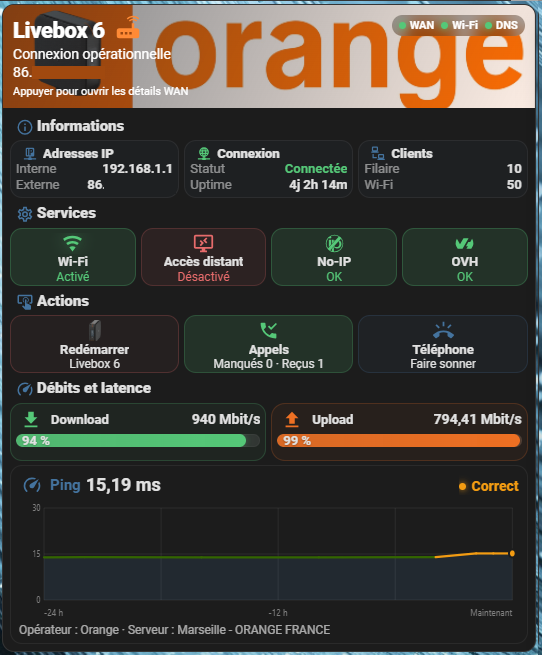
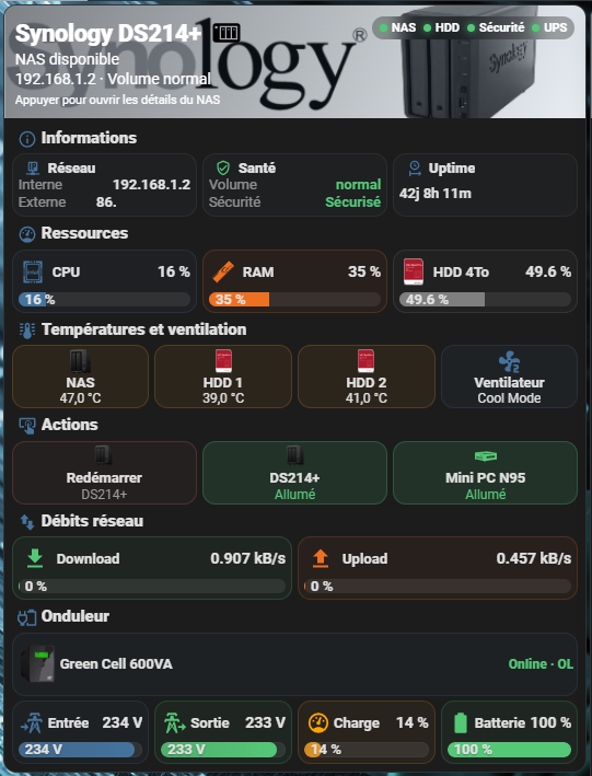
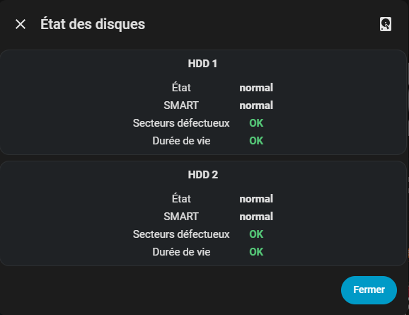
Voici une V3 de mes cartes , c'est la suite de ce sujet :
Pas mal d'informations, d'intégration à utiliser sont dans le sujet précédent. Je ne vais pas tout récapituler sur ce sujet. Allez faire un tour sur l'ancien post pour plus d'informations.
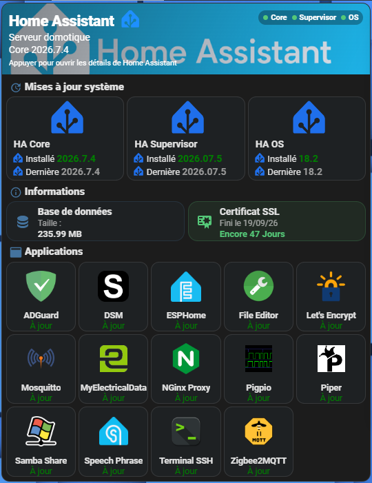
Carte mise à jour :
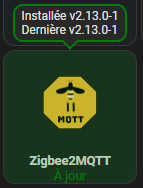
Tooltip, quand on a la souris sur le bouton (pour les applications) :
Code button_card_templates:
button_card_templates:
  haupdate:
    icon: mdi:home-assistant
    size: 50px
    aspect_ratio: 1.4/1
    state:
      - value: "off"
        color: rgb(31, 111, 235)
        styles:
          card:
            - "--button-card-ripple-color": rgb(31, 111, 235)
      - value: "on"
        color: red
        styles:
          card:
            - "--button-card-ripple-color": red
    styles:
      card:
        - "--button-card-ripple-icon-hover-opacity": 0.2
        - "--button-card-ripple-hover-opacity": 0.2
        - "--button-card-ripple-pressed-opacity": 0.3
        - padding: 2px 3px 3px 8px
        - font-size: 14px
        - text-transform: capitalize
        - size: 50px
        - background: rgba(68,115,158,.06)
      grid:
        - grid-template-areas: "\"i i\" \"n n\" \"installed installed\" \"latest latest\""
        - grid-template-columns: 1fr 1fr
        - grid-template-rows: 1fr min-content min-content min-content
      name:
        - font-weight: 700
        - font-size: 14px
        - justify-self: start
        - padding: 4px 2px 4px 2px
      icon:
        - width: 100%
        - animation: |
            [[[ if (entity.state == 'on') return 'blink 2s ease infinite'; ]]]
      custom_fields:
        latest:
          - justify-self: start
        installed:
          - "--text-color-sensor": >-
              [[[if (entity.attributes.latest_version !=
              entity.attributes.installed_version) return "red";else return
              "green"]]]
          - padding-bottom: 2px
          - justify-self: start
    custom_fields:
      latest: |
        [[[
          return `<ha-icon icon='mdi:home-assistant' style='width: 16px; height: 16px; color: rgb(31, 111, 235); transform: translateY(-3px);'></ha-icon>
          <span style='font-size: 13px;'>Dernière <span style="color: var(--secondary-text-color); font-size: 14px; font-weight: 700;">${entity.attributes.latest_version}</span></span>`
        ]]]
      installed: |
        [[[
          return `<ha-icon icon='mdi:home-assistant' style='width: 16px; height: 16px; color: rgb(31, 111, 235); transform: translateY(-3px);'></ha-icon>
          <span style='font-size: 13px;'>Installé <span style='color: var(--text-color-sensor); font-size: 14px; font-weight: 700;'>${entity.attributes.installed_version}</span></span>`
        ]]]
  update:
    aspect_ratio: 1/1
    show_icon: false
    show_entity_picture: true
    show_label: true
    label: |
      [[[
        if (entity.state == 'on') return '<font color="red">Mise à jour</font>';
        return '<font color="green">À jour</font>';
      ]]]
    tooltip:
      content: >
        [[[ return 'Installée ' + 'v' + entity.attributes.installed_version +
        '<br> Dernière ' + 'v' + entity.attributes.latest_version ]]]
      arrow: true
    state:
      - value: "on"
        styles:
          state:
            - color: red
          card:
            - "--button-card-ripple-color": red
      - value: "off"
        styles:
          state:
            - color: green
          card:
            - "--button-card-ripple-color": green
    styles:
      card:
        - padding: 0
        - "--button-card-ripple-icon-hover-opacity": 0.2
        - "--button-card-ripple-hover-opacity": 0.2
        - "--button-card-ripple-pressed-opacity": 0.3
        - background: rgba(68,115,158,.06)
      icon:
        - opacity: 1
        - animation: >
            [[[ if (entity.state == 'on') return 'blink 2s ease infinite';
            ]]]
      name:
        - font-weight: bold
        - font-size: 0.75em
        - white-space: normal
      state:
        - font-size: 0.75em
        - white-space: normal
      label:
        - font-size: 0.75em
        - white-space: normal
      tooltip:
        - "--button-card-tooltip-border-color": >
            [[[ if (entity.state == 'on') return 'red'; else return 'green';
            ]]]
        - "--button-card-tooltip-border-width": 2px
        - "--button-card-tooltip-border-style": solid
        - "--button-card-tooltip-text-align": left
        - "--button-card-tooltip-border-radius": 10px
Code button-card
type: custom:button-card
entity: update.home_assistant_core_update
show_name: false
show_icon: false
show_state: false
tap_action:
action: none
hold_action:
action: none
styles:
card:
- padding: 0
- border-radius: 12px
- overflow: hidden
- background: var(--ha-card-background, var(--card-background-color))
- box-shadow: 0 8px 22px rgba(0, 0, 0, 0.14)
grid:
- grid-template-areas: "\"hero\" \"content\""
- grid-template-columns: 1fr
- grid-template-rows: auto auto
custom_fields:
hero:
card:
type: custom:button-card
entity: update.home_assistant_core_update
name: Home Assistant
icon: mdi:home-assistant
show_name: true
show_icon: true
show_label: true
label: |-
[[[
const core = states['update.home_assistant_core_update'];
const version = core?.attributes?.installed_version || 'Version inconnue';
return `<span>Serveur domotique</span><br><span style="font-size:14px">Core ${version}</span>`;
]]]
tap_action:
action: more-info
custom_fields:
status: |-
[[[
const items = [
['Core','update.home_assistant_core_update'],
['Supervisor','update.home_assistant_supervisor_update'],
['OS','update.home_assistant_operating_system_update']
];
const dot = (label,id) => {
const s = states[id]?.state;
const c = s === 'on' ? '#ee9a23' : s === 'off' ? '#55c878' : '#7d8a96';
return `<span style="display:flex;align-items:center;gap:4px"><span style="width:7px;height:7px;border-radius:50%;background:${c}"></span>${label}</span>`;
};
return `<div style="display:flex;gap:7px;padding:4px 7px;border-radius:999px;background:rgba(0,0,0,.30);font-size:11px;font-weight:700">${items.map(x => dot(x[0],x[1])).join('')}</div>`;
]]]
hint: Appuyer pour ouvrir les détails de Home Assistant
styles:
card:
- min-height: 98px
- padding: 10px
- border-radius: 0
- border: none
- box-shadow: none
- color: white
- background-image: >-
linear-gradient(115deg, rgba(20,27,36,.55), rgba(68,115,158,.12)),
url('/local/images/home-assistant1.png')
- background-size: cover, 100% auto
- background-position: center, center top -18px
- background-repeat: no-repeat, no-repeat
- "--button-card-ripple-hover-opacity": 0.2
- "--button-card-ripple-pressed-opacity": 0.3
- "--button-card-ripple-color": dodgerblue
grid:
- grid-template-areas: "\"n i status\" \"l l l\" \"hint hint hint\""
- grid-template-columns: max-content 36px 1fr
- grid-template-rows: auto auto auto
- column-gap: 5px
- row-gap: 1px
icon:
- width: 30px
- color: dodgerblue
- justify-self: start
- align-self: center
- transform: translateY(-3px)
name:
- justify-self: start
- align-self: center
- font-size: 22px
- font-weight: 800
- letter-spacing: "-0.4px"
label:
- justify-self: start
- text-align: left
- font-size: 14px
- line-height: 1.3
- opacity: 1
custom_fields:
status:
- align-self: start
- justify-self: end
hint:
- justify-self: start
- margin-top: 2px
- font-size: 11px
- opacity: 1
content:
card:
type: custom:button-card
show_name: false
show_icon: false
tap_action:
action: none
styles:
card:
- padding: 6px
- border: none
- border-radius: 0
- box-shadow: none
- background: transparent
grid:
- grid-template-areas: >-
"system_title" "system_grid" "info_title" "info_grid" "apps_title"
"apps_grid"
- grid-template-columns: 1fr
- grid-template-rows: repeat(6, auto)
- row-gap: 4px
custom_fields:
system_title:
card:
type: custom:button-card
name: Mises à jour système
icon: mdi:update
show_icon: true
show_name: true
tap_action:
action: none
styles:
card:
- padding: 1px 2px 0
- border: none
- box-shadow: none
- background: transparent
grid:
- grid-template-areas: "\"i n\""
- grid-template-columns: 25px 1fr
icon:
- width: 18px
- color: "#44739e"
name:
- justify-self: start
- font-size: 15px
- font-weight: 800
system_grid:
card:
type: custom:button-card
show_name: false
show_icon: false
tap_action:
action: none
styles:
card:
- padding: 0
- border: none
- box-shadow: none
- background: transparent
grid:
- grid-template-areas: "\"core supervisor os\""
- grid-template-columns: repeat(3, minmax(0, 1fr))
- gap: 4px
custom_fields:
core:
card:
type: custom:button-card
entity: update.home_assistant_core_update
name: HA Core
template: haupdate
supervisor:
card:
type: custom:button-card
entity: update.home_assistant_supervisor_update
name: HA Supervisor
template: haupdate
os:
card:
type: custom:button-card
entity: update.home_assistant_operating_system_update
name: HA OS
template: haupdate
info_title:
card:
type: custom:button-card
name: Informations
icon: mdi:information-outline
show_icon: true
show_name: true
tap_action:
action: none
styles:
card:
- padding: 1px 2px 0
- border: none
- box-shadow: none
- background: transparent
grid:
- grid-template-areas: "\"i n\""
- grid-template-columns: 25px 1fr
icon:
- width: 18px
- color: "#44739e"
name:
- justify-self: start
- font-size: 15px
- font-weight: 800
info_grid:
card:
type: custom:button-card
show_name: false
show_icon: false
tap_action:
action: none
styles:
card:
- padding: 0
- border: none
- box-shadow: none
- background: transparent
grid:
- grid-template-areas: "\"database ssl\""
- grid-template-columns: repeat(2, minmax(0, 1fr))
- gap: 5px
custom_fields:
database:
card:
type: custom:button-card
entity: sensor.home_assistant_v2_db_size
name: Base de données
icon: mdi:database
tap_action:
action: more-info
custom_fields:
line1: |-
[[[
return 'Taille :';
]]]
line2: |-
[[[
const raw =
Number.parseFloat(
String(
states['sensor.home_assistant_v2_db_size']?.state ?? ''
).replace(',', '.')
);
if (!Number.isFinite(raw)) return 'Indisponible';
return `${(raw / 1.0485).toFixed(2)} MB`;
]]]
styles:
card:
- height: 58px
- min-height: 58px
- max-height: 58px
- box-sizing: border-box
- overflow: hidden
- padding: 5px 8px
- border-radius: 14px
- border: 1px solid rgba(68,115,158,.20)
- box-shadow: none
- background: rgba(68,115,158,.06)
- "--button-card-ripple-hover-opacity": 0.2
- "--button-card-ripple-pressed-opacity": 0.3
- "--button-card-ripple-color": rgb(68,115,158)
grid:
- grid-template-areas: "\"i n\" \"i line1\" \"i line2\""
- grid-template-columns: 30px 1fr
- grid-template-rows: 18px 14px 14px
- column-gap: 7px
- row-gap: 1px
icon:
- width: 24px
- color: "#44739e"
- justify-self: start
- align-self: center
name:
- justify-self: start
- text-align: left
- font-size: 14px
- font-weight: 800
custom_fields:
line1:
- justify-self: start
- text-align: left
- font-size: 12px
- opacity: 0.65
line2:
- justify-self: start
- text-align: left
- font-size: 13px
- font-weight: 700
ssl:
card:
type: custom:button-card
entity: sensor.xxxx_expiration_du_certificat
name: Certificat SSL
icon: mdi:certificate
tap_action:
action: more-info
custom_fields:
line1: |-
[[[
const raw =
states['sensor.xxxx_expiration_du_certificat']?.state;
if (!raw || ['unknown','unavailable'].includes(raw)) {
return 'Fini le —';
}
const date = new Date(raw);
if (Number.isNaN(date.getTime())) {
return `Fini le ${raw}`;
}
const formatted =
date.toLocaleDateString('fr-FR', {
day: '2-digit',
month: '2-digit',
year: '2-digit'
});
return `Fini le ${formatted}`;
]]]
line2: |-
[[[
const raw =
states['sensor.xxxx_expiration_du_certificat']?.state;
const target = new Date(raw).getTime();
if (Number.isNaN(target)) {
return 'Encore — Jours';
}
const days =
Math.ceil((target - Date.now()) / 86400000);
return `Encore ${days} Jours`;
]]]
styles:
card:
- height: 58px
- min-height: 58px
- max-height: 58px
- box-sizing: border-box
- overflow: hidden
- padding: 5px 8px
- border-radius: 14px
- border: |
[[[
const raw =
states['sensor.xxxx_expiration_du_certificat']?.state;
const target = new Date(raw).getTime();
if (Number.isNaN(target)) return '#7d8a96';
const days =
Math.ceil((target - Date.now()) / 86400000);
if (days >= 30) return '1px solid rgba(85,200,120,.20)';
if (days >= 20) return '1px solid rgba(238,154,35,.20)';
return '1px solid rgba(230,107,107,.20)';
]]]
- box-shadow: none
- background: |
[[[
const raw =
states['sensor.xxxx_expiration_du_certificat']?.state;
const target = new Date(raw).getTime();
if (Number.isNaN(target)) return '#7d8a96';
const days =
Math.ceil((target - Date.now()) / 86400000);
if (days >= 30) return 'rgba(85,200,120,.08)';
if (days >= 20) return 'rgba(238,154,35,.55)';
return 'rgba(230,107,107,.55)';
]]]
- "--button-card-ripple-hover-opacity": 0.2
- "--button-card-ripple-pressed-opacity": 0.3
- "--button-card-ripple-color": |-
[[[
const raw =
states['sensor.xxxx_expiration_du_certificat']?.state;
const target = new Date(raw).getTime();
if (Number.isNaN(target)) return '#7d8a96';
const days =
Math.ceil((target - Date.now()) / 86400000);
if (days >= 30) return '#55c878';
if (days >= 20) return '#ee9a23';
return '#e66b6b';
]]]
grid:
- grid-template-areas: "\"i n\" \"i line1\" \"i line2\""
- grid-template-columns: 30px 1fr
- grid-template-rows: 18px 14px 14px
- column-gap: 7px
- row-gap: 1px
icon:
- width: 24px
- color: |-
[[[
const raw =
states['sensor.xxxx_expiration_du_certificat']?.state;
const target = new Date(raw).getTime();
if (Number.isNaN(target)) return '#7d8a96';
const days =
Math.ceil((target - Date.now()) / 86400000);
if (days >= 30) return '#55c878';
if (days >= 20) return '#ee9a23';
return '#e66b6b';
]]]
- justify-self: start
- align-self: center
name:
- justify-self: start
- text-align: left
- font-size: 14px
- font-weight: 700
custom_fields:
line1:
- justify-self: start
- text-align: left
- font-size: 12px
- opacity: 0.65
line2:
- justify-self: start
- text-align: left
- font-size: 13px
- font-weight: 700
- color: |-
[[[
const raw =
states['sensor.xxxx_expiration_du_certificat']?.state;
const target = new Date(raw).getTime();
if (Number.isNaN(target)) return '#7d8a96';
const days =
Math.ceil((target - Date.now()) / 86400000);
if (days >= 30) return '#55c878';
if (days >= 20) return '#ee9a23';
return '#e66b6b';
]]]
apps_title:
card:
type: custom:button-card
name: Applications
icon: mdi:application
show_icon: true
show_name: true
tap_action:
action: none
styles:
card:
- padding: 1px 2px 0
- border: none
- box-shadow: none
- background: transparent
grid:
- grid-template-areas: "\"i n\""
- grid-template-columns: 25px 1fr
icon:
- width: 18px
- color: "#44739e"
name:
- justify-self: start
- font-size: 15px
- font-weight: 800
apps_grid:
card:
type: custom:button-card
show_name: false
show_icon: false
tap_action:
action: none
styles:
card:
- padding: 0
- border: none
- box-shadow: none
- background: transparent
grid:
- grid-template-areas: >-
"adguard dsm esphome file_editor lets_encrypt" "mosquitto
myelectricaldata nginx pigpio piper" "samba speech terminal
zigbee2mqtt ."
- grid-template-columns: repeat(5, minmax(0, 1fr))
- gap: 4px
custom_fields:
adguard:
card:
type: custom:button-card
entity: update.adguard_home
name: ADGuard
entity_picture: /local/images/adguard.png
size: 45%
template: update
tap_action:
action: more-info
hold_action:
action: more-info
dsm:
card:
type: custom:button-card
entity: update.diskstation_dsm_update
name: DSM
template: update
entity_picture: /local/images/dsm_icon.png
size: 45%
tap_action:
action: more-info
hold_action:
action: more-info
esphome:
card:
type: custom:button-card
entity: update.esphome_update
name: ESPHome
template: update
size: 45%
tap_action:
action: more-info
hold_action:
action: more-info
file_editor:
card:
type: custom:button-card
entity: update.file_editor_update
name: File Editor
template: update
size: 48%
tap_action:
action: more-info
hold_action:
action: more-info
lets_encrypt:
card:
type: custom:button-card
entity: update.let_s_encrypt_update
name: Let's Encrypt
template: update
size: 45%
tap_action:
action: more-info
hold_action:
action: more-info
mosquitto:
card:
type: custom:button-card
entity: update.mosquitto_broker_update
name: Mosquitto
template: update
tap_action:
action: more-info
hold_action:
action: more-info
myelectricaldata:
card:
type: custom:button-card
entity: update.myelectricaldata_dev_update
name: MyElectricalData
template: update
tap_action:
action: more-info
hold_action:
action: more-info
nginx:
card:
type: custom:button-card
entity: update.nginx_home_assistant_ssl_proxy_update
name: NGinx Proxy
template: update
size: 45%
tap_action:
action: more-info
hold_action:
action: more-info
pigpio:
card:
type: custom:button-card
entity: update.pigpio_update
name: Pigpio
template: update
tap_action:
action: more-info
hold_action:
action: more-info
piper:
card:
type: custom:button-card
entity: update.piper_update
name: Piper
template: update
tap_action:
action: more-info
hold_action:
action: more-info
samba:
card:
type: custom:button-card
entity: update.samba_share_update
name: Samba Share
template: update
size: 45%
tap_action:
action: more-info
hold_action:
action: more-info
speech:
card:
type: custom:button-card
entity: update.speech_to_phrase_mise_a_jour
name: Speech Phrase
template: update
size: 55%
tap_action:
action: more-info
hold_action:
action: more-info
terminal:
card:
type: custom:button-card
entity: update.terminal_ssh_update
name: Terminal SSH
template: update
size: 45%
tap_action:
action: more-info
hold_action:
action: more-info
zigbee2mqtt:
card:
type: custom:button-card
entity: update.zigbee2mqtt_update
name: Zigbee2MQTT
template: update
size: 45%
tap_action:
action: more-info
hold_action:
action: more-info
Bandeau :

Carte Raspberry pi :
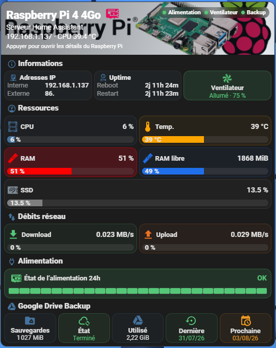
Code button-card
type: custom:button-card
entity: sensor.local_ip
show_name: false
show_icon: false
show_state: false
tap_action:
action: none
hold_action:
action: none
styles:
card:
- padding: 0
- border-radius: 12px
- overflow: hidden
- background: var(--ha-card-background, var(--card-background-color))
- box-shadow: 0 8px 22px rgba(0, 0, 0, 0.14)
grid:
- grid-template-areas: "\"hero\" \"content\""
- grid-template-columns: 1fr
- grid-template-rows: auto auto
custom_fields:
hero:
card:
type: custom:button-card
entity: sensor.local_ip
name: Raspberry Pi 4 4Go
icon: mdi:raspberry-pi
show_name: true
show_icon: true
show_label: true
label: |
[[[
const ip = states['sensor.local_ip']?.state;
const temp = states['sensor.system_monitor_temperature_du_processeur'];
const value = temp?.state;
const unit = temp?.attributes?.unit_of_measurement || '°C';
return `
<span>Serveur Home Assistant</span>
<br>
<span style="font-size:14px">
${ip && !['unknown','unavailable'].includes(ip) ? ip : 'IP indisponible'}
· CPU ${value ?? '—'} ${unit}
</span>
`;
]]]
tap_action:
action: more-info
custom_fields:
status: |
[[[
const power =
states['binary_sensor.rpi_power_status']?.state;
const fan =
states['fan.rpi_cooling_fan']?.state;
const backup =
states['event.backup_sauvegarde_automatique']
?.attributes?.event_type;
const powerOk = power === 'off';
const fanOn = fan === 'on';
const backupOk = backup === 'completed';
const dot = (label, ok) => `
<span style="display:flex;align-items:center;gap:4px">
<span style="
width:7px;
height:7px;
border-radius:50%;
background:${ok ? '#55c878' : '#e66b6b'};
box-shadow:${ok ? '0 0 8px #55c878' : 'none'};
"></span>
${label}
</span>
`;
return `
<div style="
display:flex;
gap:7px;
padding:4px 7px;
border-radius:999px;
background:rgba(0,0,0,.30);
backdrop-filter:blur(8px);
font-size:11px;
font-weight:700;
">
${dot('Alimentation', powerOk)}
${dot('Ventilateur', fanOn)}
${dot('Backup', backupOk)}
</div>
`;
]]]
hint: Appuyer pour ouvrir les détails du Raspberry Pi
styles:
card:
- min-height: 98px
- padding: 10px
- border-radius: 0
- border: none
- box-shadow: none
- color: white
- background-image: >-
linear-gradient(115deg, rgba(22,26,31,.55), rgba(68,115,158,.12)),
url('/local/images/RPi4B3.png')
- background-size: cover
- background-position: center
- "--button-card-ripple-hover-opacity": 0.2
- "--button-card-ripple-pressed-opacity": 0.3
- "--button-card-ripple-color": "#E30B5D"
grid:
- grid-template-areas: "\"n i status\" \"l l l\" \"hint hint hint\""
- grid-template-columns: max-content 36px 1fr
- grid-template-rows: auto auto auto
- column-gap: 5px
- row-gap: 1px
icon:
- width: 30px
- color: "#E30B5D"
- justify-self: start
- align-self: center
- transform: translateY(-3px)
name:
- justify-self: start
- align-self: center
- font-size: 22px
- font-weight: 800
- letter-spacing: "-0.4px"
label:
- justify-self: start
- text-align: left
- font-size: 14px
- line-height: 1.3
- opacity: 1
custom_fields:
status:
- align-self: start
- justify-self: end
hint:
- justify-self: start
- margin-top: 2px
- font-size: 11px
- opacity: 1
content:
card:
type: custom:button-card
show_name: false
show_icon: false
tap_action:
action: none
styles:
card:
- padding: 6px
- border: none
- border-radius: 0
- box-shadow: none
- background: transparent
grid:
- grid-template-areas: >-
"info_title" "info_grid" "resources_title" "resources_grid"
"network_title" "network_grid" "power_title" "power_grid"
"backup_title" "backup_grid"
- grid-template-columns: 1fr
- grid-template-rows: repeat(10, auto)
- row-gap: 4px
custom_fields:
info_title:
card:
type: custom:button-card
name: Informations
icon: mdi:information-outline
show_icon: true
show_name: true
tap_action:
action: none
styles:
card:
- padding: 0 2px
- border: none
- box-shadow: none
- background: transparent
grid:
- grid-template-areas: "\"i n\""
- grid-template-columns: 25px 1fr
icon:
- width: 18px
- color: "#44739e"
name:
- justify-self: start
- font-size: 15px
- font-weight: 800
info_grid:
card:
type: custom:button-card
show_name: false
show_icon: false
tap_action:
action: none
styles:
card:
- padding: 0
- border: none
- box-shadow: none
- background: transparent
grid:
- grid-template-areas: "\"network uptime fan\""
- grid-template-columns: repeat(3, minmax(0, 1fr))
- gap: 4px
custom_fields:
network:
card:
type: custom:button-card
entity: sensor.local_ip
name: Adresses IP
icon: mdi:ip-network
tap_action:
action: more-info
custom_fields:
internal: |
[[[
const value = states['sensor.local_ip']?.state;
return `<span style="opacity:.58">Interne</span><b>${value || 'Indisponible'}</b>`;
]]]
external: |
[[[
const value =
states['binary_sensor.wan_status_2']
?.attributes?.wan_ipaddress;
return `<span style="opacity:.58">Externe</span><b>${value || 'Indisponible'}</b>`;
]]]
styles:
card:
- height: 58px
- min-height: 58px
- max-height: 58px
- box-sizing: border-box
- overflow: hidden
- padding: 5px
- border-radius: 12px
- border: 1px solid rgba(127,127,127,.14)
- box-shadow: none
- background: rgba(68,115,158,.075)
- "--button-card-ripple-hover-opacity": 0.2
- "--button-card-ripple-pressed-opacity": 0.3
- "--button-card-ripple-color": "#44739e"
grid:
- grid-template-areas: "\"i n\" \"internal internal\" \"external external\""
- grid-template-columns: 24px 1fr
- grid-template-rows: auto auto auto
- row-gap: 1px
icon:
- width: 20px
- color: "#44739e"
name:
- justify-self: start
- font-size: 13px
- font-weight: 800
custom_fields:
internal:
- display: flex
- justify-content: space-between
- gap: 4px
- font-size: 13px
external:
- display: flex
- justify-content: space-between
- gap: 4px
- font-size: 13px
uptime:
card:
type: custom:button-card
entity: sensor.system_monitor_dernier_demarrage
name: Uptime
icon: mdi:clock-start
tap_action:
action: more-info
custom_fields:
reboot: |
[[[
const raw =
states['sensor.system_monitor_dernier_demarrage']
?.state;
const duration = (value) => {
if (!value ||
['unknown','unavailable'].includes(value)) {
return '—';
}
const started = new Date(value).getTime();
if (Number.isNaN(started)) return value;
const total =
Math.max(0, Math.floor((Date.now() - started) / 1000));
const days = Math.floor(total / 86400);
const hours = Math.floor((total % 86400) / 3600);
const minutes = Math.floor((total % 3600) / 60);
return `${days ? `${days}j ` : ''}${hours}h ${String(minutes).padStart(2,'0')}m`;
};
return `<span style="opacity:.58">Reboot</span><b>${duration(raw)}</b>`;
]]]
restart: |
[[[
const raw = states['sensor.temps_online']?.state;
const duration = (value) => {
if (!value ||
['unknown','unavailable'].includes(value)) {
return '—';
}
const started = new Date(value).getTime();
if (Number.isNaN(started)) return value;
const total =
Math.max(0, Math.floor((Date.now() - started) / 1000));
const days = Math.floor(total / 86400);
const hours = Math.floor((total % 86400) / 3600);
const minutes = Math.floor((total % 3600) / 60);
return `${days ? `${days}j ` : ''}${hours}h ${String(minutes).padStart(2,'0')}m`;
};
return `<span style="opacity:.58">Restart</span><b>${duration(raw)}</b>`;
]]]
styles:
card:
- height: 58px
- min-height: 58px
- max-height: 58px
- box-sizing: border-box
- overflow: hidden
- padding: 5px
- border-radius: 12px
- border: 1px solid rgba(127,127,127,.14)
- box-shadow: none
- background: rgba(68,115,158,.075)
- "--button-card-ripple-hover-opacity": 0.2
- "--button-card-ripple-pressed-opacity": 0.3
- "--button-card-ripple-color": "#44739e"
grid:
- grid-template-areas: "\"i n\" \"reboot reboot\" \"restart restart\""
- grid-template-columns: 24px 1fr
- grid-template-rows: auto auto auto
- row-gap: 1px
icon:
- width: 20px
- color: "#44739e"
name:
- justify-self: start
- font-size: 13px
- font-weight: 800
custom_fields:
reboot:
- display: flex
- justify-content: space-between
- gap: 4px
- font-size: 13px
restart:
- display: flex
- justify-content: space-between
- gap: 4px
- font-size: 13px
fan:
card:
type: custom:button-card
entity: fan.rpi_cooling_fan
name: Ventilateur
icon: phu:fan-blade
show_label: true
label: |-
[[[
const fan = states['fan.rpi_cooling_fan'];
const value = fan?.attributes?.percentage;
const status =
fan?.state === 'on'
? 'Allumé'
: fan?.state === 'off'
? 'Éteint'
: 'Indisponible';
return `${status} · ${value ?? 0} %`;
]]]
tap_action:
action: more-info
hold_action:
action: call-service
service: fan.toggle
target:
entity_id: fan.rpi_cooling_fan
styles:
card:
- height: 58px
- min-height: 58px
- max-height: 58px
- box-sizing: border-box
- overflow: hidden
- padding: 4px
- border-radius: 12px
- "--button-card-ripple-hover-opacity": 0.2
- "--button-card-ripple-pressed-opacity": 0.3
- "--button-card-ripple-color": |-
[[[
const state = states['fan.rpi_cooling_fan']?.state;
return state === 'on'
? 'rgb(85,200,120)'
: state === 'off'
? 'rgb(230,107,107)'
: 'rgb(127,127,127)';
]]]
- border: |-
[[[
const state = states['fan.rpi_cooling_fan']?.state;
return state === 'on'
? '1px solid rgba(85,200,120,.25)'
: state === 'off'
? '1px solid rgba(230,107,107,.20)'
: '1px solid rgba(127,127,127,.14)';
]]]
- box-shadow: none
- background: |-
[[[
const state = states['fan.rpi_cooling_fan']?.state;
return state === 'on'
? 'rgba(85,200,120,.13)'
: state === 'off'
? 'rgba(230,107,107,.08)'
: 'rgba(127,127,127,.055)';
]]]
grid:
- grid-template-areas: "\"i\" \"n\" \"l\""
- grid-template-columns: 1fr
- grid-template-rows: 21px 14px 14px
- row-gap: 1px
icon:
- width: 21px
- justify-self: center
- color: |-
[[[
const state = states['fan.rpi_cooling_fan']?.state;
if (state === 'on') return '#55c878';
if (state === 'off') return '#e66b6b';
return '#7d8a96';
]]]
- animation: |-
[[[
return states['fan.rpi_cooling_fan']?.state === 'on'
? 'rotation 2.5s linear infinite'
: 'none';
]]]
name:
- justify-self: center
- font-size: 13px
- font-weight: 700
label:
- justify-self: center
- font-size: 12px
- color: |-
[[[
const state = states['fan.rpi_cooling_fan']?.state;
if (state === 'on') return '#55c878';
if (state === 'off') return '#e66b6b';
return '#7d8a96';
]]]
extra_styles: |
@keyframes rotation {
0% { transform: rotate(0deg); }
100% { transform: rotate(359deg); }
}
resources_title:
card:
type: custom:button-card
name: Ressources
icon: mdi:gauge
show_icon: true
show_name: true
tap_action:
action: none
styles:
card:
- padding: 1px 2px 0
- border: none
- box-shadow: none
- background: transparent
grid:
- grid-template-areas: "\"i n\""
- grid-template-columns: 25px 1fr
icon:
- width: 18px
- color: "#44739e"
name:
- justify-self: start
- font-size: 15px
- font-weight: 800
resources_grid:
card:
type: custom:button-card
show_name: false
show_icon: false
tap_action:
action: none
styles:
card:
- padding: 0
- border: none
- box-shadow: none
- background: transparent
grid:
- grid-template-areas: "\"cpu temp\" \"ram free\" \"disk disk\""
- grid-template-columns: repeat(2, minmax(0, 1fr))
- gap: 4px
custom_fields:
cpu:
card:
type: custom:button-card
entity: sensor.system_monitor_utilisation_du_processeur
name: CPU
icon: phu:intel-cpu
tap_action:
action: more-info
custom_fields:
value: |
[[[
const sensor =
states['sensor.system_monitor_utilisation_du_processeur'];
const value =
Number.parseFloat(String(sensor?.state ?? '').replace(',', '.'));
const unit = sensor?.attributes?.unit_of_measurement || '%';
return Number.isFinite(value)
? `${Math.round(value)} ${unit}`
: '—';
]]]
bar: |
[[[
const raw =
states['sensor.system_monitor_utilisation_du_processeur']?.state;
const value =
Number.parseFloat(String(raw ?? '').replace(',', '.'));
const percent =
Number.isFinite(value)
? Math.max(0, Math.min(100, value))
: 0;
const color =
percent >= 90 ? '230,107,107' : '68,115,158';
return `
<div style="position:relative;width:100%;height:13px;border-radius:999px;overflow:hidden;background:rgba(127,127,127,.18)">
<div style="width:${percent}%;height:100%;background:rgb(${color});transition:width .35s ease"></div>
<div style="position:absolute;inset:1px 6px;display:flex;align-items:center;justify-content:flex-start;font-size:13px;font-weight:800">${Math.round(percent)} %</div>
</div>
`;
]]]
styles:
card:
- height: 58px
- min-height: 58px
- max-height: 58px
- box-sizing: border-box
- overflow: hidden
- padding: 5px
- border-radius: 12px
- border: 1px solid rgba(68,115,158,.20)
- box-shadow: none
- background: rgba(68,115,158,.055)
- "--button-card-ripple-hover-opacity": 0.2
- "--button-card-ripple-pressed-opacity": 0.3
- "--button-card-ripple-color": rgb(68,115,158)
grid:
- grid-template-areas: "\"i n value\" \"bar bar bar\""
- grid-template-columns: 22px 1fr auto
- grid-template-rows: auto 11px
- column-gap: 4px
- row-gap: 4px
icon:
- width: 24px
- color: "#44739e"
name:
- justify-self: start
- font-size: 13px
- font-weight: 700
custom_fields:
value:
- justify-self: end
- align-self: center
- font-size: 14px
- font-weight: 700
- white-space: nowrap
bar:
- width: 100%
temp:
card:
type: custom:button-card
entity: sensor.system_monitor_temperature_du_processeur
name: Temp.
icon: mdi:thermometer
tap_action:
action: more-info
custom_fields:
value: |
[[[
const sensor =
states['sensor.system_monitor_temperature_du_processeur'];
const value =
Number.parseFloat(String(sensor?.state ?? '').replace(',', '.'));
const unit = sensor?.attributes?.unit_of_measurement || '°C';
return Number.isFinite(value)
? `${Math.round(value)} ${unit}`
: '—';
]]]
bar: |
[[[
const raw =
states['sensor.system_monitor_temperature_du_processeur']?.state;
const value =
Number.parseFloat(String(raw ?? '').replace(',', '.'));
const maxTemperature = 80;
const warningTemperature = 60;
const percent =
Number.isFinite(value)
? Math.max(0, Math.min(100, (value / maxTemperature) * 100))
: 0;
const color =
value >= warningTemperature
? '230,107,107'
: '255,165,0';
const displayedValue =
Number.isFinite(value)
? `${Math.round(value)} °C`
: '— °C';
return `
<div style="
position:relative;
width:100%;
height:13px;
border-radius:999px;
overflow:hidden;
background:rgba(127,127,127,.18);
">
<div style="
width:${percent}%;
height:100%;
background:rgb(${color});
transition:width .35s ease, background .35s ease;
"></div>
<div style="
position:absolute;
inset:1px 6px;
display:flex;
align-items:center;
justify-content:flex-start;
font-size:13px;
font-weight:800;
">
${displayedValue}
</div>
</div>
`;
]]]
styles:
card:
- height: 58px
- min-height: 58px
- max-height: 58px
- box-sizing: border-box
- overflow: hidden
- padding: 5px
- border-radius: 12px
- border: 1px solid rgba(255,165,0,.20)
- box-shadow: none
- background: rgba(255,165,0,.055)
- "--button-card-ripple-hover-opacity": 0.2
- "--button-card-ripple-pressed-opacity": 0.3
- "--button-card-ripple-color": rgb(255,165,0)
grid:
- grid-template-areas: "\"i n value\" \"bar bar bar\""
- grid-template-columns: 22px 1fr auto
- grid-template-rows: auto 11px
- column-gap: 4px
- row-gap: 4px
icon:
- width: 24px
- color: rgb(255,165,0)
name:
- justify-self: start
- font-size: 13px
- font-weight: 700
custom_fields:
value:
- justify-self: end
- align-self: center
- font-size: 14px
- font-weight: 700
- white-space: nowrap
bar:
- width: 100%
ram:
card:
type: custom:button-card
entity: sensor.system_monitor_utilisation_de_la_memoire
name: RAM
icon: phu:ram-memory
tap_action:
action: more-info
custom_fields:
value: |
[[[
const sensor =
states['sensor.system_monitor_utilisation_de_la_memoire'];
const value =
Number.parseFloat(String(sensor?.state ?? '').replace(',', '.'));
const unit = sensor?.attributes?.unit_of_measurement || '%';
return Number.isFinite(value)
? `${Math.round(value)} ${unit}`
: '—';
]]]
bar: |
[[[
const raw =
states['sensor.system_monitor_utilisation_de_la_memoire']?.state;
const value =
Number.parseFloat(String(raw ?? '').replace(',', '.'));
const percent =
Number.isFinite(value)
? Math.max(0, Math.min(100, value))
: 0;
const color =
percent >= 90 ? '230,107,107' : '255,0,0';
return `
<div style="position:relative;width:100%;height:13px;border-radius:999px;overflow:hidden;background:rgba(127,127,127,.18)">
<div style="width:${percent}%;height:100%;background:rgb(${color});transition:width .35s ease"></div>
<div style="position:absolute;inset:1px 6px;display:flex;align-items:center;justify-content:flex-start;font-size:13px;font-weight:800">${Math.round(percent)} %</div>
</div>
`;
]]]
styles:
card:
- height: 58px
- min-height: 58px
- max-height: 58px
- box-sizing: border-box
- overflow: hidden
- padding: 5px
- border-radius: 12px
- border: 1px solid rgba(255,0,0,.40)
- box-shadow: none
- background: rgba(255,0,30,.2)
- "--button-card-ripple-hover-opacity": 0.2
- "--button-card-ripple-pressed-opacity": 0.3
- "--button-card-ripple-color": rgb(255,0,0)
grid:
- grid-template-areas: "\"i n value\" \"bar bar bar\""
- grid-template-columns: 22px 1fr auto
- grid-template-rows: auto 11px
- column-gap: 4px
- row-gap: 4px
icon:
- width: 24px
- color: rgb(255,0,0)
name:
- justify-self: start
- font-size: 13px
- font-weight: 700
custom_fields:
value:
- justify-self: end
- align-self: center
- font-size: 14px
- font-weight: 700
- white-space: nowrap
bar:
- width: 100%
free:
card:
type: custom:button-card
entity: sensor.system_monitor_memoire_libre
name: RAM libre
icon: phu:ram-memory
tap_action:
action: more-info
custom_fields:
value: |
[[[
const sensor =
states['sensor.system_monitor_memoire_libre'];
const value =
Number.parseFloat(String(sensor?.state ?? '').replace(',', '.'));
const unit = sensor?.attributes?.unit_of_measurement || 'MiB';
return Number.isFinite(value)
? `${Math.round(value)} ${unit}`
: '—';
]]]
bar: |
[[[
const raw =
states['sensor.system_monitor_memoire_libre']?.state;
const value =
Number.parseFloat(String(raw ?? '').replace(',', '.'));
const percent =
Number.isFinite(value)
? Math.max(0, Math.min(100, (value / 3800) * 100))
: 0;
return `
<div style="position:relative;width:100%;height:13px;border-radius:999px;overflow:hidden;background:rgba(127,127,127,.18)">
<div style="width:${percent}%;height:100%;background:#1f6feb;transition:width .35s ease"></div>
<div style="position:absolute;inset:1px 6px;display:flex;align-items:center;justify-content:flex-start;font-size:13px;font-weight:800">${Math.round(percent)} %</div>
</div>
`;
]]]
styles:
card:
- height: 58px
- min-height: 58px
- max-height: 58px
- box-sizing: border-box
- overflow: hidden
- padding: 5px
- border-radius: 12px
- border: 1px solid rgba(31,111,235,.20)
- box-shadow: none
- background: rgba(31,111,235,.055)
- "--button-card-ripple-hover-opacity": 0.2
- "--button-card-ripple-pressed-opacity": 0.3
- "--button-card-ripple-color": "#1f6feb"
grid:
- grid-template-areas: "\"i n value\" \"bar bar bar\""
- grid-template-columns: 22px 1fr auto
- grid-template-rows: auto 11px
- column-gap: 4px
- row-gap: 4px
icon:
- width: 24px
- color: "#1f6feb"
name:
- justify-self: start
- font-size: 13px
- font-weight: 700
custom_fields:
value:
- justify-self: end
- align-self: center
- font-size: 14px
- font-weight: 700
- white-space: nowrap
bar:
- width: 100%
disk:
card:
type: custom:button-card
entity: sensor.system_monitor_utilisation_du_disque
name: SSD
icon: phu:seagate-ssd
tap_action:
action: more-info
custom_fields:
value: |
[[[
const sensor =
states['sensor.system_monitor_utilisation_du_disque'];
const value =
Number.parseFloat(String(sensor?.state ?? '').replace(',', '.'));
const unit = sensor?.attributes?.unit_of_measurement || '%';
return Number.isFinite(value)
? `${value.toFixed(1)} ${unit}`
: '—';
]]]
bar: |
[[[
const raw =
states['sensor.system_monitor_utilisation_du_disque']?.state;
const value =
Number.parseFloat(String(raw ?? '').replace(',', '.'));
const percent =
Number.isFinite(value)
? Math.max(0, Math.min(100, value))
: 0;
const color =
percent >= 75 ? '230,107,107' : '127,127,127';
return `
<div style="position:relative;width:100%;height:13px;border-radius:999px;overflow:hidden;background:rgba(127,127,127,.18)">
<div style="width:${percent}%;height:100%;background:rgb(${color});transition:width .35s ease"></div>
<div style="position:absolute;inset:1px 6px;display:flex;align-items:center;justify-content:flex-start;font-size:13px;font-weight:800">${percent.toFixed(1)} %</div>
</div>
`;
]]]
styles:
card:
- height: 58px
- min-height: 58px
- max-height: 58px
- box-sizing: border-box
- overflow: hidden
- padding: 5px
- border-radius: 12px
- border: 1px solid rgba(127,127,127,.20)
- box-shadow: none
- background: rgba(127,127,127,.055)
- "--button-card-ripple-hover-opacity": 0.2
- "--button-card-ripple-pressed-opacity": 0.3
- "--button-card-ripple-color": "#7d8a96"
grid:
- grid-template-areas: "\"i n value\" \"bar bar bar\""
- grid-template-columns: 22px 1fr auto
- grid-template-rows: auto 11px
- column-gap: 4px
- row-gap: 4px
icon:
- width: 24px
- color: "#7d8a96"
name:
- justify-self: start
- font-size: 13px
- font-weight: 700
custom_fields:
value:
- justify-self: end
- align-self: center
- font-size: 14px
- font-weight: 700
- white-space: nowrap
bar:
- width: 100%
network_title:
card:
type: custom:button-card
name: Débits réseau
icon: mdi:swap-vertical-bold
show_icon: true
show_name: true
tap_action:
action: none
styles:
card:
- padding: 1px 2px 0
- border: none
- box-shadow: none
- background: transparent
grid:
- grid-template-areas: "\"i n\""
- grid-template-columns: 25px 1fr
icon:
- width: 18px
- color: "#44739e"
name:
- justify-self: start
- font-size: 15px
- font-weight: 800
network_grid:
card:
type: custom:button-card
show_name: false
show_icon: false
tap_action:
action: none
styles:
card:
- padding: 0
- border: none
- box-shadow: none
- background: transparent
grid:
- grid-template-areas: "\"download upload\""
- grid-template-columns: repeat(2, minmax(0, 1fr))
- gap: 4px
custom_fields:
download:
card:
type: custom:button-card
entity: sensor.system_monitor_debit_du_reseau_entrant_via_end0
name: Download
icon: mdi:download
tap_action:
action: more-info
custom_fields:
value: |
[[[
const sensor =
states['sensor.system_monitor_debit_du_reseau_entrant_via_end0'];
const value = sensor?.state;
const unit = sensor?.attributes?.unit_of_measurement || '';
return `${value ?? '—'}${unit ? ` ${unit}` : ''}`;
]]]
bar: |
[[[
const raw =
states['sensor.system_monitor_debit_du_reseau_entrant_via_end0']?.state;
const value =
Number.parseFloat(String(raw ?? '').replace(',', '.'));
const percent =
Number.isFinite(value)
? Math.max(0, Math.min(100, value))
: 0;
return `
<div style="position:relative;width:100%;height:13px;border-radius:999px;overflow:hidden;background:rgba(127,127,127,.18)">
<div style="width:${percent}%;height:100%;background:#55c878;transition:width .35s ease"></div>
<div style="position:absolute;inset:1px 6px;display:flex;align-items:center;justify-content:flex-start;font-size:13px;font-weight:800">${Math.round(percent)} %</div>
</div>
`;
]]]
styles:
card:
- height: 58px
- min-height: 58px
- max-height: 58px
- box-sizing: border-box
- overflow: hidden
- padding: 5px
- border-radius: 12px
- border: 1px solid rgba(85,200,120,.20)
- box-shadow: none
- background: rgba(85,200,120,.055)
- "--button-card-ripple-hover-opacity": 0.2
- "--button-card-ripple-pressed-opacity": 0.3
- "--button-card-ripple-color": "#55c878"
grid:
- grid-template-areas: "\"i n value\" \"bar bar bar\""
- grid-template-columns: 24px 1fr auto
- grid-template-rows: auto 11px
- column-gap: 4px
- row-gap: 4px
icon:
- width: 24px
- color: "#55c878"
name:
- justify-self: start
- font-size: 13px
- font-weight: 700
custom_fields:
value:
- justify-self: end
- font-size: 14px
- font-weight: 700
bar:
- width: 100%
upload:
card:
type: custom:button-card
entity: sensor.system_monitor_debit_du_reseau_sortant_via_end0
name: Upload
icon: mdi:upload
tap_action:
action: more-info
custom_fields:
value: |
[[[
const sensor =
states['sensor.system_monitor_debit_du_reseau_sortant_via_end0'];
const value = sensor?.state;
const unit = sensor?.attributes?.unit_of_measurement || '';
return `${value ?? '—'}${unit ? ` ${unit}` : ''}`;
]]]
bar: |
[[[
const raw =
states['sensor.system_monitor_debit_du_reseau_sortant_via_end0']?.state;
const value =
Number.parseFloat(String(raw ?? '').replace(',', '.'));
const percent =
Number.isFinite(value)
? Math.max(0, Math.min(100, value))
: 0;
return `
<div style="position:relative;width:100%;height:13px;border-radius:999px;overflow:hidden;background:rgba(127,127,127,.18)">
<div style="width:${percent}%;height:100%;background:#ee7023;transition:width .35s ease"></div>
<div style="position:absolute;inset:1px 6px;display:flex;align-items:center;justify-content:flex-start;font-size:13px;font-weight:800">${Math.round(percent)} %</div>
</div>
`;
]]]
styles:
card:
- height: 58px
- min-height: 58px
- max-height: 58px
- box-sizing: border-box
- overflow: hidden
- padding: 5px
- border-radius: 12px
- border: 1px solid rgba(238,112,35,.20)
- box-shadow: none
- background: rgba(238,112,35,.055)
- "--button-card-ripple-hover-opacity": 0.2
- "--button-card-ripple-pressed-opacity": 0.3
- "--button-card-ripple-color": "#ee7023"
grid:
- grid-template-areas: "\"i n value\" \"bar bar bar\""
- grid-template-columns: 24px 1fr auto
- grid-template-rows: auto 11px
- column-gap: 4px
- row-gap: 4px
icon:
- width: 24px
- color: "#ee7023"
name:
- justify-self: start
- font-size: 13px
- font-weight: 700
custom_fields:
value:
- justify-self: end
- font-size: 14px
- font-weight: 700
bar:
- width: 100%
power_title:
card:
type: custom:button-card
name: Alimentation
icon: mdi:power-plug-outline
show_icon: true
show_name: true
tap_action:
action: none
styles:
card:
- padding: 1px 2px 0
- border: none
- box-shadow: none
- background: transparent
grid:
- grid-template-areas: "\"i n\""
- grid-template-columns: 25px 1fr
icon:
- width: 18px
- color: "#44739e"
name:
- justify-self: start
- font-size: 15px
- font-weight: 800
power_grid:
card:
type: custom:button-card
show_name: false
show_icon: false
tap_action:
action: none
styles:
card:
- padding: 0
- border: none
- box-shadow: none
- background: transparent
grid:
- grid-template-areas: "\"power\""
- grid-template-columns: 1fr
custom_fields:
power:
card:
type: custom:button-card
entity: binary_sensor.rpi_power_status
name: État de l’alimentation 24h
icon: mdi:raspberry-pi
show_label: true
label: |-
[[[
const state =
states['binary_sensor.rpi_power_status']
?.state;
if (state === 'off') return 'OK';
if (state === 'on') return 'Danger';
return 'Indisponible';
]]]
tap_action:
action: more-info
styles:
card:
- height: 58px
- min-height: 58px
- max-height: 58px
- box-sizing: border-box
- overflow: hidden
- padding: 5px 8px
- border-radius: 12px
- border: |-
[[[
const state = states['binary_sensor.rpi_power_status']?.state;
return state === 'off'
? '1px solid rgba(85,200,120,.25)'
: state === 'on'
? '1px solid rgba(230,107,107,.24)'
: '1px solid rgba(127,127,127,.14)';
]]]
- box-shadow: none
- background: |-
[[[
const state = states['binary_sensor.rpi_power_status']?.state;
return state === 'off'
? 'rgba(85,200,120,.13)'
: state === 'on'
? 'rgba(230,107,107,.10)'
: 'rgba(127,127,127,.055)';
]]]
- "--button-card-ripple-hover-opacity": 0.2
- "--button-card-ripple-pressed-opacity": 0.3
- "--button-card-ripple-color": |-
[[[
const state = states['binary_sensor.rpi_power_status']?.state;
if (state === 'off') return '#55c878';
if (state === 'on') return '#e66b6b';
return '#7d8a96';
]]]
grid:
- grid-template-areas: "\"i n l\" \"history history history\""
- grid-template-columns: 30px 1fr auto
- grid-template-rows: auto 17px
- row-gap: 4px
icon:
- width: 24px
- color: |-
[[[
const state = states['binary_sensor.rpi_power_status']?.state;
if (state === 'off') return '#55c878';
if (state === 'on') return '#e66b6b';
return '#7d8a96';
]]]
name:
- justify-self: start
- font-size: 13px
- font-weight: 700
label:
- justify-self: end
- font-size: 14px
- font-weight: 700
- color: |-
[[[
const state = states['binary_sensor.rpi_power_status']?.state;
if (state === 'off') return '#55c878';
if (state === 'on') return '#e66b6b';
return '#7d8a96';
]]]
custom_fields:
history:
- width: 100%
- height: 17px
- align-self: center
- overflow: visible
custom_fields:
history: |-
[[[
return `
<iframe
src="/local/rpi_power_history_24h_sans_scintillement.html?v=2"
title="Historique de l’alimentation sur 48 heures"
loading="eager"
style="
display:block;
width:100%;
height:17px;
border:0;
margin:0;
padding:0;
overflow:hidden;
background:transparent;
">
</iframe>
`;
]]]
backup_title:
card:
type: custom:button-card
name: Google Drive Backup
icon: mdi:google-drive
show_icon: true
show_name: true
tap_action:
action: none
styles:
card:
- padding: 1px 2px 0
- border: none
- box-shadow: none
- background: transparent
grid:
- grid-template-areas: "\"i n\""
- grid-template-columns: 25px 1fr
icon:
- width: 18px
- color: "#44739e"
name:
- justify-self: start
- font-size: 15px
- font-weight: 800
backup_grid:
card:
type: custom:button-card
show_name: false
show_icon: false
tap_action:
action: none
styles:
card:
- padding: 0
- border: none
- box-shadow: none
- background: transparent
grid:
- grid-template-areas: "\"size status used last next\""
- grid-template-columns: repeat(5, minmax(0, 1fr))
- gap: 4px
custom_fields:
size:
card:
type: custom:button-card
entity: sensor.xxxx_total_size_of_backups
name: Sauvegardes
icon: mdi:folder-google-drive
show_state: true
tap_action:
action: more-info
styles:
card:
- height: 58px
- min-height: 58px
- max-height: 58px
- box-sizing: border-box
- overflow: hidden
- padding: 2px
- border-radius: 12px
- border: 1px solid rgba(68,115,158,.18)
- box-shadow: none
- background: rgba(68,115,158,.06)
- "--button-card-ripple-hover-opacity": 0.2
- "--button-card-ripple-pressed-opacity": 0.3
- "--button-card-ripple-color": "#44739e"
- grid-template-areas: "\"i\" \"n\" \"s\""
- grid-template-rows: 23px 14px 14px
- row-gap: 1px
icon:
- width: 23px
- justify-self: center
- color: "#44739e"
name:
- justify-self: center
- font-size: 13px
- font-weight: 700
state:
- justify-self: center
- font-size: 12px
status:
card:
type: custom:button-card
entity: event.backup_sauvegarde_automatique
name: État
icon: mdi:cloud-sync-outline
show_label: true
label: |-
[[[
const event =
states['event.backup_sauvegarde_automatique'];
const value =
event?.attributes?.event_type;
if (value === 'completed') return 'Terminé';
if (value === 'failed') return 'Échoué';
if (value === 'started' || value === 'in_progress') return 'En cours';
return 'Indisponible';
]]]
tap_action:
action: more-info
styles:
card:
- height: 58px
- min-height: 58px
- max-height: 58px
- box-sizing: border-box
- overflow: hidden
- padding: 2px
- border-radius: 12px
- border: |-
[[[
const value =
states['event.backup_sauvegarde_automatique']
?.attributes?.event_type;
if (value === 'completed')
return '1px solid rgba(85,200,120,.22)';
if (value === 'failed')
return '1px solid rgba(230,107,107,.22)';
if (value === 'started' || value === 'in_progress')
return '1px solid rgba(68,115,158,.22)';
return '1px solid rgba(127,127,127,.14)';
]]]
- box-shadow: none
- background: |-
[[[
const value =
states['event.backup_sauvegarde_automatique']
?.attributes?.event_type;
if (value === 'completed')
return 'rgba(85,200,120,.08)';
if (value === 'failed')
return 'rgba(230,107,107,.08)';
if (value === 'started' || value === 'in_progress')
return 'rgba(68,115,158,.08)';
return 'rgba(127,127,127,.055)';
]]]
- "--button-card-ripple-hover-opacity": 0.2
- "--button-card-ripple-pressed-opacity": 0.3
- "--button-card-ripple-color": |-
[[[
const value =
states['event.backup_sauvegarde_automatique']
?.attributes?.event_type;
if (value === 'completed')
return 'rgb(85,200,120)';
if (value === 'failed')
return 'rgb(230,107,107)';
if (value === 'started' || value === 'in_progress')
return 'rgb(68,115,158)';
return 'rgb(127,127,127)';
]]]
grid:
- grid-template-areas: "\"i\" \"n\" \"l\""
- grid-template-rows: 23px 14px 14px
- row-gap: 1px
icon:
- width: 23px
- justify-self: center
- color: |-
[[[
const value =
states['event.backup_sauvegarde_automatique']
?.attributes?.event_type;
if (value === 'completed') return '#55c878';
if (value === 'failed') return '#e66b6b';
if (value === 'started' || value === 'in_progress') return '#44739e';
return '#7d8a96';
]]]
name:
- justify-self: center
- font-size: 13px
- font-weight: 700
label:
- justify-self: center
- font-size: 12px
- color: |-
[[[
const value =
states['event.backup_sauvegarde_automatique']
?.attributes?.event_type;
if (value === 'completed') return '#55c878';
if (value === 'failed') return '#e66b6b';
if (value === 'started' || value === 'in_progress') return '#44739e';
return '#7d8a96';
]]]
used:
card:
type: custom:button-card
entity: sensor.xxxx_used_storage
name: Utilisé
icon: mdi:google-drive
show_state: true
tap_action:
action: more-info
styles:
card:
- height: 58px
- min-height: 58px
- max-height: 58px
- box-sizing: border-box
- overflow: hidden
- padding: 2px
- border-radius: 12px
- border: 1px solid rgba(68,115,158,.18)
- box-shadow: none
- background: rgba(68,115,158,.06)
- "--button-card-ripple-hover-opacity": 0.2
- "--button-card-ripple-pressed-opacity": 0.3
- "--button-card-ripple-color": "#44739e"
grid:
- grid-template-areas: "\"i\" \"n\" \"s\""
- grid-template-rows: 22px 14px 14px
- row-gap: 1px
icon:
- width: 22px
- justify-self: center
- color: "#44739e"
name:
- justify-self: center
- font-size: 13px
- font-weight: 700
state:
- justify-self: center
- font-size: 12px
last:
card:
type: custom:button-card
entity: sensor.backup_derniere_sauvegarde_automatique_reussie
name: Dernière
icon: mdi:backup-restore
show_label: true
label: |-
[[[
const raw = states['sensor.backup_derniere_sauvegarde_automatique_reussie']?.state;
if (!raw || ['unknown','unavailable'].includes(raw)) {
return '—';
}
const date = new Date(raw);
if (Number.isNaN(date.getTime())) return raw;
return date.toLocaleDateString('fr-FR', {
day: '2-digit',
month: '2-digit',
year: '2-digit'
});
]]]
tap_action:
action: more-info
styles:
card:
- height: 58px
- min-height: 58px
- max-height: 58px
- box-sizing: border-box
- overflow: hidden
- padding: 2px
- border-radius: 12px
- border: 1px solid rgba(85,200,120,.18)
- box-shadow: none
- background: rgba(85,200,120,.06)
- "--button-card-ripple-hover-opacity": 0.2
- "--button-card-ripple-pressed-opacity": 0.3
- "--button-card-ripple-color": "#55c878"
grid:
- grid-template-areas: "\"i\" \"n\" \"l\""
- grid-template-rows: 23px 14px 14px
- row-gap: 1px
icon:
- width: 23px
- justify-self: center
- color: "#55c878"
name:
- justify-self: center
- font-size: 13px
- font-weight: 700
label:
- justify-self: center
- font-size: 12px
- color: "#55c878"
next:
card:
type: custom:button-card
entity: sensor.backup_prochaine_sauvegarde_automatique_programmee
name: Prochaine
icon: mdi:calendar-clock
show_label: true
label: |-
[[[
const raw = states['sensor.backup_prochaine_sauvegarde_automatique_programmee']?.state;
if (!raw || ['unknown','unavailable'].includes(raw)) {
return '—';
}
const date = new Date(raw);
if (Number.isNaN(date.getTime())) return raw;
return date.toLocaleDateString('fr-FR', {
day: '2-digit',
month: '2-digit',
year: '2-digit'
});
]]]
tap_action:
action: more-info
styles:
card:
- height: 58px
- min-height: 58px
- max-height: 58px
- box-sizing: border-box
- overflow: hidden
- padding: 2px
- border-radius: 12px
- border: 1px solid rgba(238,154,35,.18)
- box-shadow: none
- background: rgba(238,154,35,.06)
- "--button-card-ripple-hover-opacity": 0.2
- "--button-card-ripple-pressed-opacity": 0.3
- "--button-card-ripple-color": "#ee9a23"
grid:
- grid-template-areas: "\"i\" \"n\" \"l\""
- grid-template-rows: 23px 14px 14px
- row-gap: 1px
icon:
- width: 23px
- justify-self: center
- color: "#ee9a23"
name:
- justify-self: center
- font-size: 13px
- font-weight: 700
label:
- justify-self: center
- font-size: 12px
- color: "#ee9a23"
Créer un fichier texte, puis copier/coller tout le contenu du code et sauvegarder en rpi_power_history_24h_sans_scintillement.html. Puis coller le fichier dans /config/www/
Code rpi_power_history_24h_sans_scintillement.html
<!doctype html>
<html lang="fr">
<head>
  <meta charset="utf-8">
  <meta name="viewport" content="width=device-width,initial-scale=1">
  <title>Historique alimentation Raspberry Pi</title>
  <style>
    :root {
      color-scheme: light dark;
      --unknown: rgba(127,127,127,.28);
      --separator: rgba(255,255,255,.08);
    }
    * { box-sizing: border-box; }
    html, body {
      width: 100%;
      height: 100%;
      margin: 0;
      overflow: hidden;
      background: transparent;
      font-family: Roboto, Arial, sans-serif;
    }
    #timeline {
      width: 100%;
      height: 100%;
      display: flex;
      align-items: center;
      gap: 1px;
      padding: 1px 0;
    }
    .segment {
      display: block;
      flex: 1 1 0;
      min-width: 2px;
      height: 11px;
      border-radius: 2px;
      background: var(--unknown);
      outline: 1px solid var(--separator);
      cursor: help;
    }
  </style>
</head>
<body>
  <div id="timeline" aria-label="Historique de l’alimentation sur 24 heures"></div>
  <script>
    (() => {
      'use strict';

      const ENTITY_ID = 'binary_sensor.rpi_power_status';
      const HOURS = 24;
      const HOUR_MS = 60 * 60 * 1000;
      const REFRESH_MS = 5 * 60 * 1000;
      const timeline = document.getElementById('timeline');

      const COLORS = {
        off: '#55c878',
        on: '#e66b6b',
        unknown: 'rgba(127,127,127,.28)',
        unavailable: 'rgba(127,127,127,.28)'
      };

      const LABELS = {
        off: 'OK',
        on: 'Danger',
        unknown: 'Inconnu',
        unavailable: 'Indisponible'
      };

      function initializeTimeline() {
        if (timeline.children.length === HOURS) return;

        timeline.replaceChildren();

        for (let index = 0; index < HOURS; index += 1) {
          const segment = document.createElement('span');
          segment.className = 'segment';
          segment.title = 'Chargement de l’historique…';
          timeline.appendChild(segment);
        }
      }

      function findHass() {
        let currentWindow = window;

        for (let depth = 0; depth < 5; depth += 1) {
          try {
            const parentWindow = currentWindow.parent;
            const root = parentWindow?.document?.querySelector('home-assistant');

            if (root?.hass?.callApi) {
              return root.hass;
            }

            if (!parentWindow || parentWindow === currentWindow) {
              break;
            }

            currentWindow = parentWindow;
          } catch (error) {
            break;
          }
        }

        return null;
      }

      async function waitForHass(timeoutMs = 15000) {
        const started = Date.now();

        while (Date.now() - started < timeoutMs) {
          const hass = findHass();
          if (hass) return hass;
          await new Promise(resolve => setTimeout(resolve, 250));
        }

        throw new Error('Contexte Home Assistant introuvable');
      }

      function timestampOf(item) {
        const raw = item?.last_changed || item?.last_updated;
        const value = raw ? new Date(raw).getTime() : Number.NaN;
        return Number.isFinite(value) ? value : null;
      }

      function normalizeHistory(payload, startMs, endMs) {
        const source =
          Array.isArray(payload?.[0])
            ? payload[0]
            : Array.isArray(payload)
              ? payload
              : [];

        const events = source
          .map(item => ({
            time: timestampOf(item),
            state: String(item?.state || 'unknown')
          }))
          .filter(item => item.time !== null && item.time <= endMs)
          .sort((a, b) => a.time - b.time);

        if (!events.length) {
          return [{ time: startMs, state: 'unknown' }];
        }

        if (events[0].time > startMs) {
          events.unshift({ time: startMs, state: 'unknown' });
        } else if (events[0].time < startMs) {
          events[0].time = startMs;
        }

        return events;
      }

      function stateAt(events, timestamp) {
        let state = 'unknown';

        for (const event of events) {
          if (event.time > timestamp) break;
          state = event.state;
        }

        return state;
      }

      function piecesForPeriod(events, startMs, endMs) {
        const pieces = [];
        let cursor = startMs;
        let state = stateAt(events, startMs);

        const changes = events.filter(event =>
          event.time > startMs && event.time < endMs
        );

        for (const change of changes) {
          pieces.push({ start: cursor, end: change.time, state });
          cursor = change.time;
          state = change.state;
        }

        pieces.push({ start: cursor, end: endMs, state });
        return pieces.filter(piece => piece.end > piece.start);
      }

      function mergeAdjacent(pieces) {
        const merged = [];

        for (const piece of pieces) {
          const previous = merged[merged.length - 1];

          if (previous && previous.state === piece.state) {
            previous.end = piece.end;
          } else {
            merged.push({ ...piece });
          }
        }

        return merged;
      }

      function backgroundForPieces(pieces, startMs, endMs) {
        const duration = Math.max(1, endMs - startMs);
        const merged = mergeAdjacent(pieces);

        if (merged.length === 1) {
          return COLORS[merged[0].state] || COLORS.unknown;
        }

        const stops = [];

        for (const piece of merged) {
          const startPercent = Math.max(
            0,
            Math.min(100, ((piece.start - startMs) / duration) * 100)
          );
          const endPercent = Math.max(
            0,
            Math.min(100, ((piece.end - startMs) / duration) * 100)
          );
          const color = COLORS[piece.state] || COLORS.unknown;

          stops.push(
            `${color} ${startPercent}%`,
            `${color} ${endPercent}%`
          );
        }

        return `linear-gradient(90deg, ${stops.join(', ')})`;
      }

      function formatDateTime(timestamp) {
        return new Date(timestamp).toLocaleString('fr-FR', {
          day: '2-digit',
          month: '2-digit',
          hour: '2-digit',
          minute: '2-digit'
        });
      }

      function formatDuration(milliseconds) {
        const minutes = Math.max(0, Math.round(milliseconds / 60000));

        if (minutes >= 60) {
          const hours = Math.floor(minutes / 60);
          const remaining = minutes % 60;
          return remaining ? `${hours} h ${remaining} min` : `${hours} h`;
        }

        return `${minutes} min`;
      }

      function tooltipForPieces(pieces, startMs, endMs) {
        const durations = new Map();

        for (const piece of pieces) {
          durations.set(
            piece.state,
            (durations.get(piece.state) || 0) + (piece.end - piece.start)
          );
        }

        const details = [...durations.entries()]
          .map(([state, duration]) =>
            `${LABELS[state] || LABELS.unknown}: ${formatDuration(duration)}`
          )
          .join(' · ');

        return (
          `${formatDateTime(startMs)} → ${formatDateTime(endMs)}` +
          (details ? ` · ${details}` : '')
        );
      }

      function render(events, startMs, endMs) {
        initializeTimeline();

        const segmentDuration = (endMs - startMs) / HOURS;
        const segments = timeline.children;

        for (let index = 0; index < HOURS; index += 1) {
          const segmentStart = startMs + index * segmentDuration;
          const segmentEnd =
            index === HOURS - 1
              ? endMs
              : startMs + (index + 1) * segmentDuration;

          const pieces = piecesForPeriod(events, segmentStart, segmentEnd);
          const segment = segments[index];

          segment.style.background = backgroundForPieces(
            pieces,
            segmentStart,
            segmentEnd
          );

          const tooltip = tooltipForPieces(
            pieces,
            segmentStart,
            segmentEnd
          );

          segment.title = tooltip;
          segment.setAttribute('aria-label', tooltip);
        }
      }

      async function refresh() {
        initializeTimeline();

        try {
          const hass = await waitForHass();
          const endMs = Date.now();
          const startMs = endMs - HOURS * HOUR_MS;
          const startIso = new Date(startMs).toISOString();
          const endIso = new Date(endMs).toISOString();

          const path =
            `history/period/${encodeURIComponent(startIso)}` +
            `?filter_entity_id=${encodeURIComponent(ENTITY_ID)}` +
            `&end_time=${encodeURIComponent(endIso)}` +
            `&minimal_response&no_attributes`;

          const payload = await hass.callApi('GET', path);
          const events = normalizeHistory(payload, startMs, endMs);
          render(events, startMs, endMs);
        } catch (error) {
          initializeTimeline();

          for (const segment of timeline.children) {
            segment.title =
              `Historique indisponible : ${error.message}`;
            segment.setAttribute(
              'aria-label',
              `Historique indisponible : ${error.message}`
            );
          }
        }
      }

      initializeTimeline();
      refresh();

      const interval = window.setInterval(refresh, REFRESH_MS);

      document.addEventListener('visibilitychange', () => {
        if (!document.hidden) refresh();
      });

      window.addEventListener(
        'beforeunload',
        () => window.clearInterval(interval),
        { once: true }
      );
    })();
  </script>
</body>
</html>
Bandeau :
J'ajouterais la suite au fur et a mesure.