Oui voici :
type: custom:bar-card
entities:
  - entity: sensor.garmin_connect_total_steps
    name: Pas du jour
    icon: mdi:foot-print
max: 10000
min: 0
height: 30px
decimal: 0
positions:
  icon: inside
  name: inside
  value: inside
color_gradient:
  - "#3498db"
  - "#2ecc71"
card_mod:
  style: |
    ha-card {
      box-shadow: 10px;
      margin: 0px;
      padding: 0px;
      }
    bar-card-backgroundbar {
      border-radius: 10px;
      border: 1px solid;
      background: linear-gradient(to right, red 15%,
      orange 40%, green 75%); border-radius: 10px
       }
    bar-card-currentbar {
      background: linear-gradient(to right, red 15%,orange
      35%, yellow 60%, green 85%); clip-path: polygon(0 0, var(--bar-percent) 0,
      var(--bar-percent) 100%, 0 100%); border-radius: 10px }
Xris
Décembre 30, 2025, 6:13
42
C’est qu’elle carte en particulier les graphs avec les colonnes je cherche justement ça pour mon temps de chauffe etc. Depuis mon thermostat.
Je vais copier ton code, merci
c’est la carte statistics-graph (Graphique des statistiques en français).
1 « J'aime »
vincen
Décembre 30, 2025, 10:21
44
Hé ben dis donc que de réponses en deux jours à ma question
Merci pour toutes vos idées en tout cas et bonnes fêtes
SoG
Décembre 30, 2025, 10:36
45
Faut que je regarde de mon coté pour avoir les infos de mi fitness… pour la balance @WarC0zes a déjà donné les infos donc ça va le faire de ce coté là.
Je me suis amusé avec une autre piste, c’était aussi pour comprendre la carte dual-gauge que j’ai fait ce test.
type: custom:dual-gauge-card
name: Pas du jour
gauge_size: 200
inner_gauge_size: 130
hide_card: false
gauges:
  - entity: sensor.garmin_connect_daily_step_goal
    min: 0
    max: 15000
    unit: cible
    leds_count: 60
    led_size: 2
    smooth_transitions: true
    animation_duration: 1000
    center_shadow: true
    center_shadow_blur: 25
    center_shadow_spread: 10
    markers:
      - value: 5630
        color: "#ffeb3b"
    zones:
      - from: 0
        to: 2000
        color: "#FF0000"
        opacity: 0.3
      - from: 2000
        to: 4000
        color: "#FF7700"
        opacity: 0.4
      - from: 4001
        to: 5630
        color: "#2ACC18"
        opacity: 0.3
      - from: 5631
        to: 15000
        color: "#40FF2B"
        opacity: 0.3
  - entity: sensor.garmin_connect_total_steps
    min: 0
    max: 15000
    unit: Pas
    smooth_transitions: true
    animation_duration: 1000
    center_shadow: true
    center_shadow_blur: 25
    center_shadow_spread: 10
    decimals: 0
    leds_count: 150
    severity:
      - color: "#4caf50"
        value: 1000
      - color: "#ff9800"
        value: 3000
      - color: "#f44336"
        value: 5000
    markers:
      - value: 5630
        color: "#ffeb3b"
        label: Mini
      - value: 9000
        color: "#ffeb3b"
        label: objectif 9000
      - value: 14000
        color: "#ffeb3b"
        label: Au top 14000
1 « J'aime »
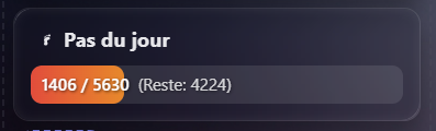
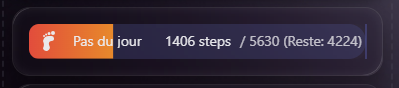
Ici tu as les infos d’objectif et ce qui reste à faire comme pas. :
une fois l’objectif atteins, la barre sera complète et le surplus sera quand même affiché
type: custom:bar-card
entities:
  - entity: sensor.garmin_connect_total_steps
    name: Pas du jour
    icon: mdi:foot-print
    target: sensor.garmin_connect_daily_step_goal
min: 0
max: 5630
height: 35px
decimal: 0
positions:
  icon: inside
  name: inside
  value: inside
card_mod:
  style: |
    bar-card-currentbar {
      border-radius: 10px;
      background: linear-gradient(to right, #e74c3c 0%, #f1c40f 50%, #2ecc71 100%) !important;
      clip-path: polygon(0 0, var(--bar-percent) 0, var(--bar-percent) 100%, 0 100%);
    }
    bar-card-backgroundbar {
      border-radius: 10px;
      background: rgba(255,255,255,0.1) !important;
    }
    /* Injection du texte personnalisé (Objectif et Reste) */
    bar-card-value::after {
      content: " / {{ states('sensor.garmin_connect_daily_step_goal') }} (Reste: {{ states('sensor.garmin_connect_daily_step_goal') | int - states('sensor.garmin_connect_total_steps') | int }})";
      font-size: 1em;
      opacity: 0.8;
      margin-left: 5px;
    }
    ha-card {
      --bar-card-max: {{ states('sensor.garmin_connect_daily_step_goal') }};
    }
btncrd
Décembre 30, 2025, 2:48
48
A priori custom:bar-card n’est plus maintenu mais elle peut se faire sans difficulté avec une custom:button-card (avec un peu plus de lignes de code
3 « J'aime »
A tester
type: custom:button-card
entity: sensor.garmin_connect_total_steps
show_name: true
show_icon: true
name: Pas du jour
icon: mdi:foot-print

# Variables pour centraliser les calculs
variables:
  goal: >
    [[[ return parseInt(states['sensor.garmin_connect_daily_step_goal'].state) || 0 ]]]
  steps: >
    [[[ return parseInt(states['sensor.garmin_connect_total_steps'].state) || 0 ]]]
  percent: >
    [[[
      let p = (parseInt(states['sensor.garmin_connect_total_steps'].state) / parseInt(states['sensor.garmin_connect_daily_step_goal'].state)) * 100;
      return Math.min(p, 100);
    ]]]
  reste: >
    [[[
      let r = parseInt(states['sensor.garmin_connect_daily_step_goal'].state) - parseInt(states['sensor.garmin_connect_total_steps'].state);
      return r > 0 ? r : 0;
    ]]]

styles:
  grid:
    - grid-template-areas: '"i n" "bar bar"'
    - grid-template-columns: min-content 1fr
    - grid-template-rows: auto auto
  card:
    - padding: 15px
    - border-radius: 15px
  img_cell:
    - justify-self: start
    - width: 30px
  name:
    - justify-self: start
    - font-weight: bold
    - font-size: 1.1em
  custom_fields:
    bar:
      - background: rgba(255, 255, 255, 0.1)
      - border-radius: 10px
      - height: 35px
      - margin-top: 12px
      - width: 100%
      - position: relative
      - overflow: hidden

custom_fields:
  bar: >
    [[[
      /* L'astuce du background-size permet de ne voir que la partie du dégradé correspondant au pourcentage actuel */
      return `
        <div style="
          width: ${variables.percent}%;
          height: 100%;
          background: linear-gradient(to right, #e74c3c 0%, #f1c40f 50%, #2ecc71 100%);
          background-size: ${100 / (variables.percent / 100)}% 100%;
          border-radius: 10px;
          transition: width 0.8s ease-in-out;
        ">
        </div>
        <div style="
          position: absolute;
          top: 0;
          left: 10px;
          height: 100%;
          display: flex;
          align-items: center;
          font-size: 0.9em;
          font-weight: 600;
          color: white;
          text-shadow: 1px 1px 3px rgba(0,0,0,0.7);
          pointer-events: none;
          white-space: nowrap;
        ">
          ${variables.steps} / ${variables.goal}
          <span style="opacity: 0.8; margin-left: 8px; font-weight: 400;">
            (Reste: ${variables.reste})
          </span>
        </div>
      `
    ]]]
1 « J'aime »
SoG
Janvier 1, 2026, 6:24
51
Bonsoir à tous,
J’ai installé l’intégration Bodymiscale pour ma balance, mais ayant mi fitness pour le reste je regardais un peu et trouve Health Connect, mais j’ai zéro info sur l’utilisation ni l’installation.
J’ai mis Santé connect sur mon tel, mi fitness balance quelques données mais Home Assistant n’utilise rien de cette appli, je ne sais pas si il lui faut du temps pour se mettre à jour ou pas, mais ensuite je sais pas ou je vais pouvoir retrouver ces infos vu qu’il n’y a aucune intégration health connect directement…
J’ai pensé regardé dans application mobile et mon portable j’ai quelques infos de santé effectivement mais elles sont toutes désactivées.
Si vous avez des idées je suis preneur. merci
Bonjour ,
Re,
Il va falloir être plus précis, la double authentification, il faut l’activer, ensuite tout dépend à quel niveau c’est activé HA ou autre.
Bref un max de précisions.
cdt
olivier_verstraet:
A tester
type: custom:button-card
entity: sensor.garmin_connect_total_steps
show_name: true
show_icon: true
name: Pas du jour
icon: mdi:foot-print

# Variables pour centraliser les calculs
variables:
  goal: >
    [[[ return parseInt(states['sensor.garmin_connect_daily_step_goal'].state) || 0 ]]]
  steps: >
    [[[ return parseInt(states['sensor.garmin_connect_total_steps'].state) || 0 ]]]
  percent: >
    [[[
      let p = (parseInt(states['sensor.garmin_connect_total_steps'].state) / parseInt(states['sensor.garmin_connect_daily_step_goal'].state)) * 100;
      return Math.min(p, 100);
    ]]]
  reste: >
    [[[
      let r = parseInt(states['sensor.garmin_connect_daily_step_goal'].state) - parseInt(states['sensor.garmin_connect_total_steps'].state);
      return r > 0 ? r : 0;
    ]]]

styles:
  grid:
    - grid-template-areas: '"i n" "bar bar"'
    - grid-template-columns: min-content 1fr
    - grid-template-rows: auto auto
  card:
    - padding: 15px
    - border-radius: 15px
  img_cell:
    - justify-self: start
    - width: 30px
  name:
    - justify-self: start
    - font-weight: bold
    - font-size: 1.1em
  custom_fields:
    bar:
      - background: rgba(255, 255, 255, 0.1)
      - border-radius: 10px
      - height: 35px
      - margin-top: 12px
      - width: 100%
      - position: relative
      - overflow: hidden

custom_fields:
  bar: >
    [[[
      /* L'astuce du background-size permet de ne voir que la partie du dégradé correspondant au pourcentage actuel */
      return `
        <div style="
          width: ${variables.percent}%;
          height: 100%;
          background: linear-gradient(to right, #e74c3c 0%, #f1c40f 50%, #2ecc71 100%);
          background-size: ${100 / (variables.percent / 100)}% 100%;
          border-radius: 10px;
          transition: width 0.8s ease-in-out;
        ">
        </div>
        <div style="
          position: absolute;
          top: 0;
          left: 10px;
          height: 100%;
          display: flex;
          align-items: center;
          font-size: 0.9em;
          font-weight: 600;
          color: white;
          text-shadow: 1px 1px 3px rgba(0,0,0,0.7);
          pointer-events: none;
          white-space: nowrap;
        ">
          ${variables.steps} / ${variables.goal}
          <span style="opacity: 0.8; margin-left: 8px; font-weight: 400;">
            (Reste: ${variables.reste})
          </span>
        </div>
      `
    ]]]
Hello, j’aimerai faire le même principe, mais inversé pour le poids
genre 85- 90Kg max en rouge
type: custom:button-card
entity: sensor.withings_poids_3
show_name: true
show_icon: true
name: Objectif poids
icon: mdi:weight-kilogram
variables:
  goal: |
    [[[ return parseInt(states['sensor.withings_weight_goal'].state) || 0 ]]]
  steps: |
    [[[ return parseInt(states['sensor.withings_poids_3'].state) || 0 ]]]
  percent: |
    [[[
      let p = (parseInt(states['sensor.withings_poids_3'].state) / parseInt(states['sensor.withings_weight_goal'].state)) * 100;
      return Math.min(p, 100);
    ]]]
  reste: |
    [[[
      let r = parseInt(states['sensor.withings_weight_goal'].state) - parseInt(states['sensor.withings_poids_3'].state);
      return r > 0 ? r : 0;
    ]]]
styles:
  grid:
    - grid-template-areas: "\"i n\" \"bar bar\""
    - grid-template-columns: min-content 1fr
    - grid-template-rows: auto auto
  card:
    - padding: 15px
    - border-radius: 15px
  img_cell:
    - justify-self: start
    - width: 30px
  name:
    - justify-self: start
    - font-weight: bold
    - font-size: 1.1em
  custom_fields:
    bar:
      - background: rgba(255, 255, 255, 0.1)
      - border-radius: 10px
      - height: 35px
      - margin-top: 12px
      - width: 100%
      - position: relative
      - overflow: hidden
custom_fields:
  bar: |
    [[[
      /* L'astuce du background-size permet de ne voir que la partie du dégradé correspondant au pourcentage actuel */
      return `
        <div style="
          width: ${variables.percent}%;
          height: 100%;
          background: linear-gradient(to right, #e74c3c 0%, #f1c40f 50%, #2ecc71 100%);
          background-size: ${100 / (variables.percent / 100)}% 100%;
          border-radius: 10px;
          transition: width 0.8s ease-in-out;
        ">
        </div>
        <div style="
          position: absolute;
          top: 0;
          left: 10px;
          height: 100%;
          display: flex;
          align-items: center;
          font-size: 0.9em;
          font-weight: 600;
          color: white;
          text-shadow: 1px 1px 3px rgba(0,0,0,0.7);
          pointer-events: none;
          white-space: nowrap;
        ">
          ${variables.steps} / ${variables.goal}
          <span style="opacity: 0.8; margin-left: 8px; font-weight: 400;">
            (Reste: ${variables.reste})
          </span>
        </div>
      `
    ]]]
Je suis arrivé à un truc pas trop mal
3 « J'aime »
Bonsoir,
Est-ce qu’il serait possible d’avoir le code du graphique horizontal avec avec les objectifs ? Merci
type: custom:button-card
entity: sensor.withings_poids_3
name: Suivi poids
icon: mdi:scale-bathroom
show_icon: false
show_name: true
variables:
  poids: |
    [[[
      let p = parseFloat(states['sensor.withings_poids_3'].state) || 0;
      return Math.round(p);
    ]]]
  objectif: |
    [[[ return parseInt(states['sensor.withings_weight_goal'].state)
    || 0 ]]]
  min: 70
  max: 90
styles:
  grid:
    - grid-template-areas: "\"n\" \"bar\""
    - grid-template-columns: 1fr
    - grid-template-rows: auto auto
  card:
    - padding: 20px 20px 50px 20px
    - border-radius: 20px
    - overflow: visible
  name:
    - font-weight: bold
    - font-size: 1.4em
    - margin-bottom: 40px
    - justify-self: center
  custom_fields:
    bar:
      - width: 100%
      - overflow: visible
custom_fields:
  bar: |
    [[[
      const min = variables.min;
      const max = variables.max;
      const cible = variables.objectif;
      const actuel = variables.poids;

      let posPoids = ((actuel - min) / (max - min)) * 100;
      posPoids = Math.min(Math.max(posPoids, 0), 100);

      let posObjectif = ((cible - min) / (max - min)) * 100;
      posObjectif = Math.min(Math.max(posObjectif, 0), 100);

      return `
        <div style="position:relative; width:100%; height:30px; isolation: isolate;">

          <div style="position:absolute; inset:0; background: linear-gradient(to right, #2ecc71 0%, #2ecc71 50%, #f39c12 50%, #f39c12 75%, #e74c3c 75%, #e74c3c 100%); border-radius:15px; z-index:0;"></div>

          <div style="position:absolute; top:35px; left:0; right:0; display:flex; justify-content:space-between; font-size:11px; font-weight:bold; color: var(--primary-text-color); opacity: 0.7; z-index:1;">
            <span>70kg</span>
            <span>80kg</span>
            <span>90kg</span>
          </div>

          <div style="position:absolute; left:${posObjectif}%; top:0; width:2px; height:30px; border-left: 2px dashed rgba(255,255,255,0.7); z-index:2;">
            <div style="position:absolute; top:48px; left:50%; transform: translateX(-50%); font-size:11px; font-weight:bold; color: #2ecc71; background: rgba(0,0,0,0.5); padding: 3px 8px; border-radius: 6px; white-space: nowrap; border: 1px solid #2ecc71;">
              But: ${cible}kg
            </div>
          </div>

          <div style="position:absolute; left:calc(${posPoids}% - 1px); top:-8px; width:3px; height:46px; background:white; z-index:3; box-shadow: 0 0 8px rgba(0,0,0,0.4); border-radius: 2px;">
            <div style="position:absolute; top:-30px; left:50%; transform: translateX(-50%); font-size:11px; font-weight:bold; color: white; background: rgba(0,0,0,0.7); padding: 3px 8px; border-radius: 6px; white-space: nowrap; border: 1px solid white;">
              Actuel: ${actuel}kg
            </div>
          </div>

        </div>
      `;
    ]]]
2 « J'aime »
 je pensais pas que c’était un sujet aussi actif parmi les membres
 )
)