Hello,
Home assistant ayant pas mal évolué depuis que je l’utilise (ça va bientôt faire 5 ans tout de même), je bascule peu a peu mon dashboard vers une version graphique et délaisse ma version yaml (plus compliquée à mainteniret a faire évoluer, même si elle ne bouge pas bcp).
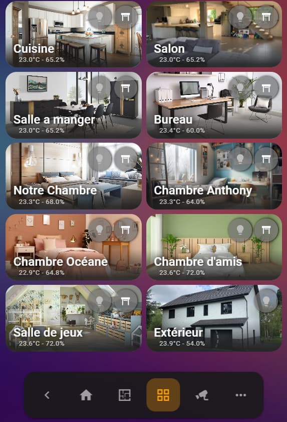
La carte pièces ne n’étant pas très customizable, et ne répondant pas totalement a mes besoins, je me suis pas mal inspiré de ce que j’ai trouvé sur les forums, et particulièrement sur ce topic, voici donc ma petite pierre à l’édifice.
Le rendu:
Afin de mutualisé, j’utilise decluttering_card, j’ai donc mon template dans les yaml (modifier le tableau de bord → Menu du tableau de bord → Editeur de configuration):
Code du modèle commun a toutes les cartes
decluttering_templates:
  dec_room2:
    default:
      light_id: null
      cover_id: null
    card:
      type: custom:vertical-stack-in-card
      cards:
        - type: custom:mushroom-chips-card
          chips:
            - type: conditional
              conditions:
                - condition: state
                  entity: '[[light_id]]'
                  state_not: unavailable
              chip:
                type: template
                entity: '[[light_id]]'
                icon: mdi:lightbulb
                icon_color: |
                  {% if is_state('[[light_id]]', 'on') %}
                    amber
                  {% else %}
                    disabled
                  {% endif %}
                double_tap_action:
                  action: more-info
            - type: conditional
              conditions:
                - condition: or
                  conditions:
                    - condition: state
                      entity: '[[cover_id]]'
                      state: open
                    - condition: state
                      entity: '[[cover_id]]'
                      state: closed
              chip:
                type: template
                entity: '[[cover_id]]'
                icon: |
                  {% if is_state(entity, 'open') %}
                   mdi:window-shutter-open
                  {% elif is_state(entity, 'closed') %}
                   mdi:window-shutter
                  {% else %}
                   mdi:window-shutter-alert
                  {% endif %}
                double_tap_action:
                  action: more-info
          alignment: end
          card_mod:
            style: |
              :host {
                 display: block;
                 height: 57px !important;
                 margin-bottom: 7px;
               }
               ha-card {
                 padding: 8px;
                 --chip-height: 42px;
                 --chip-border-radius: 50%;
                 --chip-spacing: 5px;
                 --chip-background: rgba(114, 114, 114, 0.7);
                 --chip-box-shadow: black 1px 0 5px;
                 margin-bottom: 7px;
                 }
               mushroom-conditional-chip:hover {
                 background-color: rgba(114, 114, 114, 0.8) !important;
                 border-radius: 50%;
               }
        - type: custom:mushroom-template-card
          primary: '[[room]]'
          secondary: >-
            {{ states('[[temp]]') ~ '°C' if states('[[temp]]') not in
            ['unknown', 'unavailable', 'none', ''] else '' }}  {{ ' - ' ~
            states('[[humid]]') ~ '%' if states('[[humid]]') not in ['unknown',
            'unavailable', 'none', ''] else '' }}
          layout: horizontal
          tap_action:
            action: navigate
            navigation_path: '[[navigation]]'
          card_mod:
            style:
              .: |
                ha-card {
                  background: linear-gradient(rgba(33, 33, 33, 0) 0%, rgba(33, 33, 33, 0.9) 90%);
                  --card-primary-font-size: 22px;
                  --card-secondary-font-size: 12px;
                  text-shadow: black 3px 0 8px;
                  padding-top: 0px;
                  padding-left: 4px;
                  height: 56px !important;
                  justify-content: flex-start
                }
              mushroom-state-info$: |
                .secondary {
                  position: absolute;
                  top: 32px;
                  margin-left: 10px;
                  margin-bottom: -2px;
                  margin-top: 2px;
                  color: rgba(227, 227, 227, 0.85) !important;
                  min-height: 16px;
                }
                .primary {
                  position: absolute;
                  top: 12px;
                  overflow: visible !important;
                }
      card_mod:
        style: |
          ha-card {
            background-image: url([[background]]);
            background-position: center;
            background-size: cover;
          }
Puis dans le dashboard, j’utilise cette carte avec des variables:
Code de la carte de la cuisin
type: custom:decluttering-card
template: dec_room2
variables:
  - room: Cuisine
  - background: /local/images/pieces/cuisine.png
  - temp: sensor.temp_cuisine
  - humid: sensor.humid_cuisine
  - navigation: areas-cuisine
  - cover_id: cover.cuisine
  - light_id: light.cuisine
grid_options:
  columns: 6
  rows: 2
Merci @BBE pour ce topic!