Hello.
 . Ces derniers temps, j’ai passé pas mal d’heures à bricoler une petite carte Lovelace pour mon homelab, et je me suis dit que ça pourrait intéresser d’autres personnes.
 L’idée c’était de centraliser l’accès aux applis de mon homelab (VM, containers, appliances, dashboards, etc.) comme un dashboard homarr par exemple. Je voulais pouvoir avoir acces à chaque lien web au meme endroit, avec un etat de connexion et quelques infos supplémentaire. J’ai fais un peu le tour d’internet, et j’ai pas vraiment trouvé ce que je voulais. Heureusement claud est mon amis, et en un coup il m’a fait des mockup hyper sympas.
Le partage peut etre utile pour certains, et ca peut amener des amélioration avec d’autres… N’hésitez pas…
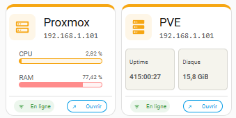
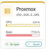
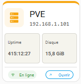
Voila le rendu des deux cartes :
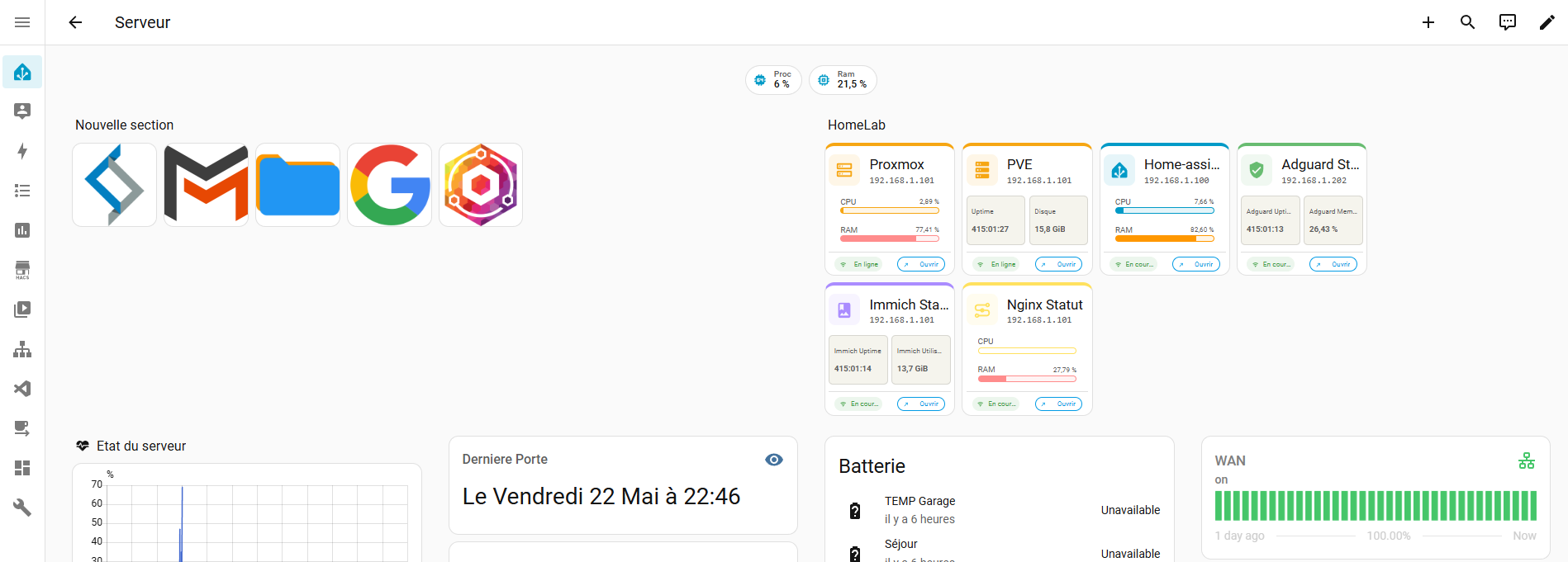
Les couleurs sont personnalisable, et voila ce que ca peut donner dans une grid:
Pré requis
Pour les pré requis, il faut connaitre et avoir ajouté la custom-button-card. Je vous fait pas vraiment de dessin…
Il faut aussi maitriser les templates lovelace. Ce qui n’est pas vraiment mon cas, donc si vous savez faire mieux je suis preneur.
Premiere carte, bar-card
button_card_templates:
  bar_card:
    variables:
      nom: |
        [[[
          return states[variables.statut_entity]?.name;
        ]]]
      protocole: http
      ip: ''
      port: '80'
      url: |
        [[[
          return `${variables.protocole}://${variables.ip}:${variables.port}`;
        ]]]
      couleur: var(--primary-color)
      couleur2: var(--accent-color)
      info1_entity: ''
      info2_entity: ''
      statut_entity: ''
      icon: ''
      state: |
        [[[
          return states[variables.statut_entity]?.state;
        ]]]
      is_on: |
        [[[
          return ['online', 'running'].includes(variables.state);
        ]]]
      state_color: |
        [[[
          return variables.is_on
            ? 'var(--success-color)'
            : 'var(--error-color)';
        ]]]
    type: custom:button-card
    entity: '[[[ return variables.statut_entity ]]]'
    name: '[[[ return variables.nom ]]]'
    show_name: false
    show_icon: false
    show_state: false
    show_label: false
    section_mode: true
    styles:
      grid:
        - grid-template-areas: |
            "entitee entitee"
            "entitee entitee"
            "bar1 bar1"
            "bar2 bar2"
            "separator separator"
            "etat lien"
        - align-content: stretch
        - grid-template-columns: 1fr 1fr
        - grid-template-rows: min-content min-content 1fr 1fr min-content min-content
        - gap: 0.3rem
      card:
        - pointer-events: none
        - padding: 0.3rem
        - min-height: 150px
        - border-top: |
            [[[
              return `4px outset ${variables.couleur}`;
            ]]]
      custom_fields:
        separator:
          - height: 1px
          - background: |
              [[[
                return `color-mix(in srgb, var(--secondary-text-color) 20%, white)`;
              ]]]
          - width: 100%
          - margin: 0.1rem 0
        etat:
          - align-self: end
          - justify-self: start
        lien:
          - align-self: end
          - justify-self: end
    custom_fields:
      separator: |
        <div class="divider"></div>
      entitee:
        card:
          type: custom:button-card
          entity: '[[[ return variables.statut_entity ]]]'
          name: '[[[ return variables.nom ]]]'
          show_name: true
          show_icon: true
          show_state: false
          show_label: true
          label: '[[[ return variables.ip ]]]'
          icon: '[[[ return variables.icon ]]]'
          styles:
            card:
              - pointer-events: auto
              - border: none
            grid:
              - grid-template-areas: |
                  "i n"
                  "i l"
              - grid-template-columns: 1fr 3fr
              - gap: 0rem 0.8rem
            icon:
              - width: 22px
              - color: |
                  [[[
                    return variables.couleur;
                  ]]]
            img_cell:
              - background: |
                  [[[
                    return `color-mix(in srgb, ${variables.couleur} 10%, white)`;
                  ]]]
              - border-radius: 8px
              - padding: 8px
              - width: 22px
              - height: 22px
            label:
              - font-size: 11px
              - color: var(--secondary-text-color)
              - text-align: left
              - font-family: monospace
              - justify-self: start
            name:
              - justify-self: start
              - margin: 0px
      etat:
        card:
          type: custom:button-card
          entity: '[[[ return variables.statut_entity ]]]'
          show_name: false
          show_icon: true
          show_state: true
          show_label: false
          icon: |
            [[[
              return variables.is_on
                ? 'mdi:wifi'
                : 'mdi:wifi-off';
            ]]]
          styles:
            grid:
              - grid-template-areas: '''i s'''
              - grid-template-columns: 1fr 2fr
            icon:
              - pointer-events: none
              - max-height: 48px
              - color: |
                  [[[
                    return variables.state_color;
                  ]]]
            card:
              - pointer-events: none
              - justify-self: center
              - font-size: 0.6rem
              - width: 80%
              - max-height: 22px
              - border: 0.5px solid
              - color: |
                  [[[
                    return variables.state_color;
                  ]]]
              - background: |
                  [[[
                    return `color-mix(in srgb, ${variables.state_color} 10%, white)`;
                  ]]]
              - border-color: |
                  [[[
                    return `color-mix(in srgb, ${variables.state_color} 10%, white)`;
                  ]]]
      lien:
        card:
          type: custom:button-card
          entity: '[[[ return variables.statut_entity ]]]'
          show_name: false
          show_icon: true
          show_state: false
          show_label: true
          label: Ouvrir
          icon: |
            [[[
              return variables.is_on
                ? 'mdi:arrow-top-right'
                : 'mdi:connection';
            ]]]
          tap_action:
            action: url
            url_path: '[[[ return variables.url ]]]'
          styles:
            grid:
              - grid-template-areas: '''i l'''
              - grid-template-columns: 1fr 2fr
            icon:
              - max-height: 48px
              - color: |
                  [[[
                    return variables.is_on ? 'var(--info-color)' : 'var(--secondary-text-color)';
                  ]]]
            card:
              - pointer-events: |
                  [[[
                    return variables.is_on ? 'auto' : 'none';
                  ]]]
              - justify-self: center
              - font-size: 0.6rem
              - width: 80%
              - max-height: 22px
              - border: 0.5px solid
              - color: |
                  [[[
                    return variables.is_on ? 'var(--info-color)' : 'var(--secondary-text-color)';
                  ]]]
              - border-color: |
                  [[[
                    return variables.is_on ? 'var(--info-color)' : 'var(--secondary-text-color)';
                  ]]]
              - opacity: |
                  [[[ return variables.is_on ? 1 : 0.4 ]]]
      bar1:
        card:
          type: custom:button-card
          entity: '[[[ return variables.info1_entity ]]]'
          show_name: true
          show_icon: false
          show_state: true
          show_label: true
          name: CPU
          label: none
          styles:
            grid:
              - grid-template-areas: '''n s'' ''l l'''
              - grid-template-columns: 1fr 2fr
              - grid-template-rows: 1fr 1fr
            card:
              - pointer-events: auto
              - border: none
              - border-radius: 0px
              - min-height: 30px
              - padding: 0.2rem 1rem
              - margin: 0
            name:
              - font-size: 0.7rem
              - color: var(--secondary-text-color)
              - text-align: left
              - justify-self: left
            state:
              - font-size: 0.6rem
              - color: var(--secondary-text-color)
              - text-align: left
              - justify-self: right
            label:
              - align-self: center
              - justify-self: stretch
              - font-size: 5vw
              - height: 6px
              - border: |
                  [[[
                    return `1px ${variables.couleur} solid`;
                  ]]]
              - border-radius: 15px
              - background: |
                  [[[
                    const val = Number(states[variables.info1_entity]?.state) ?? 0;
                    return `linear-gradient(to right,
                      ${variables.couleur} 0%,
                      ${variables.couleur} ${val}%,
                      color-mix(in srgb, ${variables.couleur} 10%, white) ${val}%,
                      color-mix(in srgb, ${variables.couleur} 10%, white) 100%)`;
                  ]]]
      bar2:
        card:
          type: custom:button-card
          entity: '[[[ return variables.info2_entity ]]]'
          show_name: true
          show_icon: false
          show_state: true
          show_label: true
          name: RAM
          label: none
          styles:
            grid:
              - grid-template-areas: '''n s'' ''l l'''
              - grid-template-columns: 1fr 2fr
              - grid-template-rows: 1fr 1fr
            card:
              - pointer-events: auto
              - border: none
              - border-radius: 0px
              - min-height: 30px
              - padding: 0.2rem 1rem
              - margin: 0
            name:
              - font-size: 0.7rem
              - color: var(--secondary-text-color)
              - text-align: left
              - justify-self: left
            state:
              - font-size: 0.6rem
              - color: var(--secondary-text-color)
              - text-align: left
              - justify-self: right
            label:
              - align-self: center
              - justify-self: stretch
              - font-size: 5vw
              - height: 6px
              - border: |
                  [[[
                    return `1px ${variables.couleur2} solid`;
                  ]]]
              - border-radius: 15px
              - background: |
                  [[[
                    const val = Number(states[variables.info2_entity]?.state) ?? 0;
                    return `linear-gradient(to right,
                      ${variables.couleur2} 0%,
                      ${variables.couleur2} ${val}%,
                      color-mix(in srgb, ${variables.couleur2} 10%, white) ${val}%,
                      color-mix(in srgb, ${variables.couleur2} 10%, white) 100%)`;
                  ]]]
On l’appel dans le lovelace avec les variables necessaires si besoin :
type: custom:button-card
template: bar_card
variables:
  protocole: https
  ip: 192.168.0.10
  port: "8006"
  couleur: rgb(246, 166, 19 )
  couleur2: rgb(255, 140, 140)
  info1_entity: sensor.proxmox_utilisation_du_processeur
  info2_entity: sensor.proxmox_memory_usage_percentage
  statut_entity: sensor.proxmox_statut
  icon: mdi:server-outline
Et pour la deuxième carte, info-card
button_card_templates:
  info_card:
    variables:
      nom: |
        [[[
          return states[variables.statut_entity]?.name;
        ]]]
      protocole: http
      ip: ''
      port: '80'
      url: |
        [[[
          return `${variables.protocole}://${variables.ip}:${variables.port}`;
        ]]]
      couleur: var(--primary-color)
      couleur2: var(--accent-color)
      info1_entity: ''
      info2_entity: ''
      statut_entity: ''
      icon: ''
      state: |
        [[[
          return states[variables.statut_entity]?.state;
        ]]]
      is_on: |
        [[[
          return ['online', 'running'].includes(variables.state);
        ]]]
      state_color: |
        [[[
          return variables.is_on
            ? 'var(--success-color)'
            : 'var(--error-color)';
        ]]]
    type: custom:button-card
    entity: '[[[ return variables.statut_entity ]]]'
    name: '[[[ return variables.nom ]]]'
    show_name: false
    show_icon: false
    show_state: false
    show_label: false
    section_mode: true
    styles:
      grid:
        - grid-template-areas: |
            "entitee entitee"
            "entitee entitee"
            "info1 info2"
            "info1 info2"
            "separator separator"
            "etat lien"
        - align-content: stretch
        - grid-template-columns: 1fr 1fr
        - grid-template-rows: min-content min-content 1fr 1fr min-content min-content
        - gap: 0.3rem
      card:
        - pointer-events: none
        - padding: 0.3rem
        - min-height: 150px
        - border-top: |
            [[[
              return `4px outset ${variables.couleur}`;
            ]]]
      custom_fields:
        separator:
          - height: 1px
          - background: |
              [[[
                return `color-mix(in srgb, var(--secondary-text-color) 20%, white)`;
              ]]]
          - width: 100%
          - margin: 0.1rem 0
        etat:
          - align-self: end
          - justify-self: start
        lien:
          - align-self: end
          - justify-self: end
    custom_fields:
      separator: |
        <div class="divider"></div>
      entitee:
        card:
          type: custom:button-card
          entity: '[[[ return variables.statut_entity ]]]'
          name: '[[[ return variables.nom ]]]'
          show_name: true
          show_icon: true
          show_state: false
          show_label: true
          label: '[[[ return variables.ip ]]]'
          icon: '[[[ return variables.icon ]]]'
          styles:
            card:
              - pointer-events: auto
              - border: none
            grid:
              - grid-template-areas: |
                  "i n"
                  "i l"
              - grid-template-columns: 1fr 3fr
              - gap: 0rem 0.8rem
            icon:
              - width: 22px
              - color: |
                  [[[
                    return variables.couleur;
                  ]]]
            img_cell:
              - background: |
                  [[[
                    return `color-mix(in srgb, ${variables.couleur} 10%, white)`;
                  ]]]
              - border-radius: 8px
              - padding: 8px
              - width: 22px
              - height: 22px
            label:
              - font-size: 11px
              - color: var(--secondary-text-color)
              - text-align: left
              - font-family: monospace
              - justify-self: start
            name:
              - justify-self: start
              - margin: 0px
      etat:
        card:
          type: custom:button-card
          entity: '[[[ return variables.statut_entity ]]]'
          show_name: false
          show_icon: true
          show_state: true
          show_label: false
          icon: |
            [[[
              return variables.is_on
                ? 'mdi:wifi'
                : 'mdi:wifi-off';
            ]]]
          styles:
            grid:
              - grid-template-areas: '''i s'''
              - grid-template-columns: 1fr 2fr
            icon:
              - pointer-events: none
              - max-height: 48px
              - color: |
                  [[[
                    return variables.state_color;
                  ]]]
            card:
              - pointer-events: none
              - justify-self: center
              - font-size: 0.6rem
              - width: 80%
              - max-height: 22px
              - border: 0.5px solid
              - color: |
                  [[[
                    return variables.state_color;
                  ]]]
              - background: |
                  [[[
                    return `color-mix(in srgb, ${variables.state_color} 10%, white)`;
                  ]]]
              - border-color: |
                  [[[
                    return `color-mix(in srgb, ${variables.state_color} 10%, white)`;
                  ]]]
      lien:
        card:
          type: custom:button-card
          entity: '[[[ return variables.statut_entity ]]]'
          show_name: false
          show_icon: true
          show_state: false
          show_label: true
          label: Ouvrir
          icon: |
            [[[
              return variables.is_on
                ? 'mdi:arrow-top-right'
                : 'mdi:connection';
            ]]]
          tap_action:
            action: url
            url_path: '[[[ return variables.url ]]]'
          styles:
            grid:
              - grid-template-areas: '''i l'''
              - grid-template-columns: 1fr 2fr
            icon:
              - max-height: 48px
              - color: |
                  [[[
                    return variables.is_on ? 'var(--info-color)' : 'var(--secondary-text-color)';
                  ]]]
            card:
              - pointer-events: |
                  [[[
                    return variables.is_on ? 'auto' : 'none';
                  ]]]
              - justify-self: center
              - font-size: 0.6rem
              - width: 80%
              - max-height: 22px
              - border: 0.5px solid
              - color: |
                  [[[
                    return variables.is_on ? 'var(--info-color)' : 'var(--secondary-text-color)';
                  ]]]
              - border-color: |
                  [[[
                    return variables.is_on ? 'var(--info-color)' : 'var(--secondary-text-color)';
                  ]]]
              - opacity: |
                  [[[ return variables.is_on ? 1 : 0.4 ]]]
      info1:
        card:
          type: custom:button-card
          entity: '[[[ return variables.info1_entity ]]]'
          show_name: true
          show_icon: false
          show_state: true
          show_label: false
          styles:
            grid:
              - grid-template-areas: '''n'' ''s'''
              - grid-template-columns: 1fr
              - grid-template-rows: 1fr
            card:
              - pointer-events: auto
              - padding: 0.2rem 0.4rem
              - min-height: 60px
              - margin: 0
              - border-radius: 5px
              - background: rgb(245, 244, 237)
            name:
              - font-size: 0.6rem
              - color: var(--secondary-text-color)
              - text-align: left
              - justify-self: left
            state:
              - font-size: 0.7rem
              - color: var(--secondary-text-color)
              - text-align: left
              - font-family: roboto
              - justify-self: left
              - font-weight: bold
              - margin-top: 0.8rem
      info2:
        card:
          type: custom:button-card
          entity: '[[[ return variables.info2_entity ]]]'
          show_name: true
          show_icon: false
          show_state: true
          show_label: false
          styles:
            grid:
              - grid-template-areas: '''n'' ''s'''
              - grid-template-columns: 1fr
              - grid-template-rows: 1fr
            card:
              - pointer-events: auto
              - padding: 0.2rem 0.4rem
              - min-height: 60px
              - margin: 0
              - border-radius: 5px
              - background: rgb(245, 244, 237)
            name:
              - font-size: 0.6rem
              - color: var(--secondary-text-color)
              - text-align: left
              - justify-self: left
            state:
              - font-size: 0.7rem
              - color: var(--secondary-text-color)
              - text-align: left
              - justify-self: left
              - font-weight: bold
              - margin-top: 0.8rem
Et on l’appel pareil, avec les meme variable mais un nom différent:
type: custom:button-card
template: info_card
variables:
  nom: PVE
  protocole: https
  ip: 192.168.1.101
  port: "8006"
  couleur: rgb(246, 166, 19 )
  couleur2: rgb(150, 220, 150)
  info1_entity: sensor.proxmox_uptime
  info2_entity: sensor.proxmox_utilisation_du_disque
  statut_entity: sensor.proxmox_statut
  icon: mdi:server
J’imagine à la suite ajouter des petits boutons pour démarrer ou arrêter les VM ou d’autre…
Vous pouvez aussi l’utiliser pour tout autre chose, comme un site google par exemple…
Merci de vos retours si vous m’en faite.
Profitez bien 