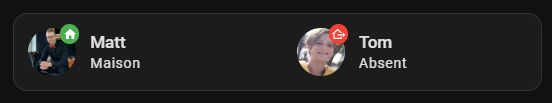
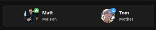
Quelqu’un sait-il comment je dois formuler le code pour simplement centrer ces 2 entités de personnes (plutôt qu’elles soient alignées chacune à gauche) ?
J’ai essayé plusieurs formules mais sans succès…
Terminal & SSH (9.14.0), File editor (5.8.0), Samba share (12.3.1), Home Assistant Google Drive Backup (0.112.1), Studio Code Server (5.15.0), Spotify Connect (0.13.0), OpenThread Border Router (2.6.0), Matter Server (6.0.0), Mosquitto broker (6.4.0), Frigate (0.13.2)
Dashboards
dashboards
2
resources
38
views
6
mode
storage
Recorder
oldest_recorder_run
8 mai 2024 à 04:07
current_recorder_run
17 mai 2024 à 21:09
estimated_db_size
528.59 MiB
database_engine
sqlite
database_version
3.44.2
Spotify
api_endpoint_reachable
ok
[/center]
Comment récupérer ma configuration :
Dans votre HA, Menu latéral `Paramètres` > `Système` > `Corrections` puis les trois petits points en haut a droite > `Informations Système` puis une fois en bas `Copier`
___
Bonjour @WarC0zes ,
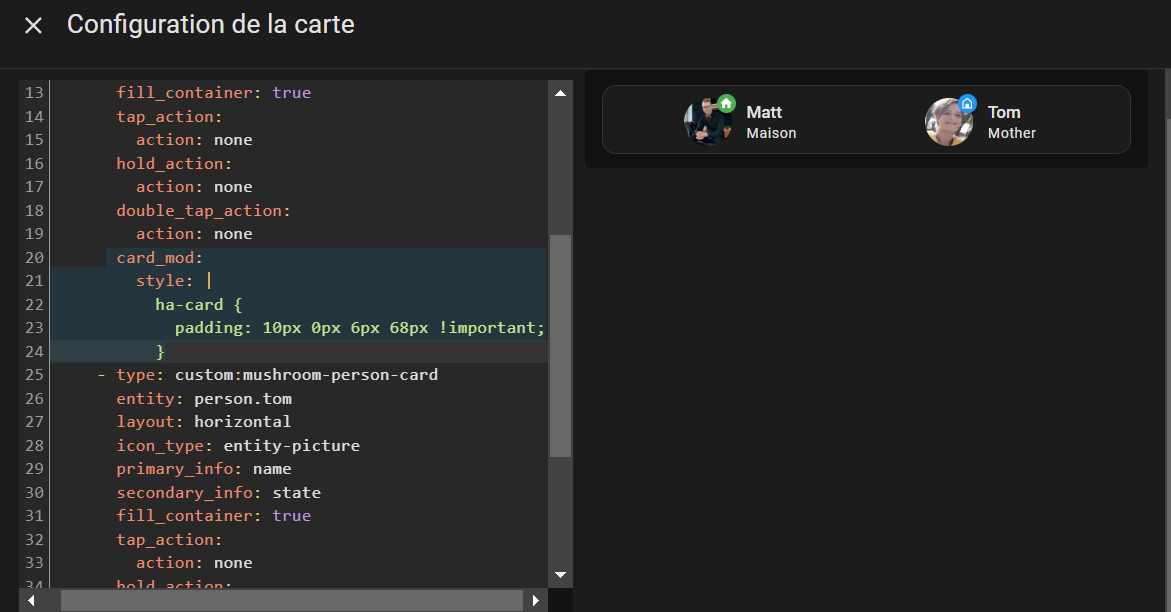
J’avais essayé avec card mod mais je ne mettais pas la bonne instruction
Donc, ça s’appelle du padding.
Merci pour le lien, j’irai voir cela.
Mais rien qu’avec le code card mod que tu me donnes, c’est déjà mieux centré.
Bonne journée,
Pour info, j’ai un peu amélioré mon centrage grâce à un code fourni par Gemini, même si ce dernier ne fonctionne pas toujours bien, ou que peut-être je ne questionne pas toujours bien.
Mon objectif était d’avoir une mise en page responsive et ça fonctionne.
Bonne soirée,
type: custom:vertical-stack-in-card
title: ''
cards:
  - type: horizontal-stack
    cards:
      - type: custom:mushroom-person-card
        layout: horizontal
        icon_type: entity-picture
        primary_info: name
        secondary_info: state
        entity: person.serurier_matthieu
        icon: ''
        fill_container: true
        tap_action:
          action: none
        hold_action:
          action: none
        double_tap_action:
          action: none
        card_mod:
          style: |
            ha-card {
              /* Style for the card container */
              display: flex; /* Enable flexbox layout */
              flex-direction: column; /* Arrange items vertically */
              align-items: center; /* Center horizontally */
              justify-content: center; /* Center vertically */
              padding: 0; /* Remove default padding */
              height: fit-content; /* Dynamic height based on content */
              max-height: 100px; /* Maximum height for responsiveness */
            }
            .card-content {
              /* Style for the card content area */
              display: flex; /* Enable flexbox layout */
              flex-direction: column; /* Arrange items vertically */
              align-items: flex-start; /* Align left horizontally */
              width: 100%; /* Full width for responsiveness */
            }
            .person-info {
              /* Style for the person info container */
              display: flex; /* Enable flexbox layout */
              align-items: center; /* Center vertically */
              width: 100%; /* Full width for responsiveness */
            }
            .icon {
              /* Style for the icon */
              width: 32px; /* Adjust icon size as needed */
              height: 32px; /* Adjust icon size as needed */
              margin-right: 10px; /* Add spacing between icon and text */
            }
            .name, .state {
              /* Style for primary and secondary text */
              font-size: 16px; /* Adjust font size as needed */
              line-height: 1.5; /* Adjust line height for better readability */
            }
      - type: custom:mushroom-person-card
        entity: person.tom
        layout: horizontal
        icon_type: entity-picture
        primary_info: name
        secondary_info: state
        fill_container: true
        tap_action:
          action: none
        hold_action:
          action: none
        double_tap_action:
          action: none
        card_mod:
          style: |
            ha-card {
              /* Style for the card container */
              display: flex; /* Enable flexbox layout */
              flex-direction: column; /* Arrange items vertically */
              align-items: center; /* Center horizontally */
              justify-content: center; /* Center vertically */
              padding: 0; /* Remove default padding */
              height: fit-content; /* Dynamic height based on content */
              max-height: 100px; /* Maximum height for responsiveness */
            }
            .card-content {
              /* Style for the card content area */
              display: flex; /* Enable flexbox layout */
              flex-direction: column; /* Arrange items vertically */
              align-items: flex-start; /* Align left horizontally */
              width: 100%; /* Full width for responsiveness */
            }
            .person-info {
              /* Style for the person info container */
              display: flex; /* Enable flexbox layout */
              align-items: center; /* Center vertically */
              width: 100%; /* Full width for responsiveness */
            }
            .icon {
              /* Style for the icon */
              width: 32px; /* Adjust icon size as needed */
              height: 32px; /* Adjust icon size as needed */
              margin-right: 10px; /* Add spacing between icon and text */
            }
            .name, .state {
              /* Style for primary and secondary text */
              font-size: 16px; /* Adjust font size as needed */
              line-height: 1.5; /* Adjust line height for better readability */
            }
Salut, pour faire simple, le padding c’est l’espace entre les bords de la carte et les éléments internes à la carte. Le margin, c’est l’espace entre 2 cartes.
Merci Cleya !
Et un truc génial, rien à voir, mais c’est le vertical stack-in-card pour enlever des bordures et faire une grande carte de plusieurs cartes:
là maintenant je m’attaque au chauffage. J’ai remplacé mon circulateur par un circulateur compatible avec le mode pression constante afin que chaque vanne thermostatique régule son ouverture et maintienne une température de consigne. Je travaille dès que possible avec Matter / Thread donc reste à trouver les vannes. Mon brûleur est raccordé aussi via l’ancienne entrée thermostat (via un Shelly 1) et j’ai créé une entrée dans HA qui commande le brûleur et toutes les futures vannes (pour couper le chauffage)
C’est deux cartes différente. En aucun cas vertical-stack-in-card est remplacer par stack-in-card.
vertical-stack-in-card a été créer bien après stack-in-card et ne dispose pas de même options.
vertical-stack-in-card colle les cartes entre elle, en enlevent la marge. Tandis que stack-in-card, peut enlever le box-shadow, le background, la marge et le padding.