[custom:button-card] Gestion d'un volet

Bonjour,

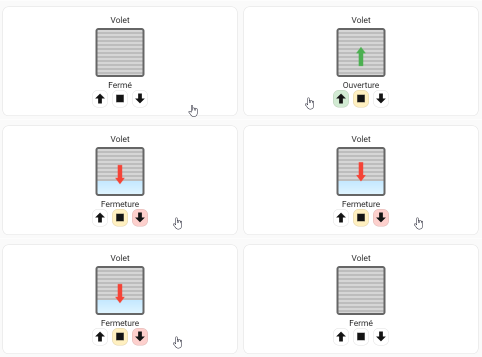
je vous partage une carte que j'ai réalisé pour gérer mes volets avec un peu d'animation.
Elle est faite entièrement avec custom:button-card et du CSS (= aucune image).

Voici le rendu :
vivaldiBwJTVbAHbB
Note : la fermeture dure 17 secondes car mon module de volet ne remonte pas l'état en temps réel.
Il faut donc attendre la fin de la temporisation de calibration pour obtenir l'état du volet et sa position, à moins de refaire une action sur le volet comme quand je clique sur stop.

La carte :

type: custom:button-card
entity: cover.0xa4c1388bc992fafd
show_name: true
show_state: true
show_icon: false
name: Volet
layout: vertical
tap_action: none
styles:
  grid:
    - grid-template-areas: |
        "n"
        "volet"
        "s"
        "buttons"
    - grid-template-rows: min-content 110px min-content min-content
  card:
    - padding: 16px
  custom_fields:
    volet:
      - justify-self: center
      - align-self: center
    buttons:
      - justify-self: center
      - align-self: center
custom_fields:
  volet: |
    [[[
      const position = entity.attributes.current_position ?? 0;
      const closed = 100 - position;

      return `
      <div class="fenetre">
          <div class="verre"></div>
      
          <div class="volet ${entity.state}" style="height:${closed}%;"></div>
      
          <div class="fleche ${entity.state}"></div>
      </div>
      
      <style>
      .fenetre{
          position:relative;
          width:90px;
          height:90px;
          border:4px solid #666;
          border-radius:6px;
          overflow:hidden;
          background:#222;
      }

      .verre{
          position:absolute;
          inset:0;
          background:linear-gradient(#7fc8ff,#dff4ff);
      }

      .volet{
          position:absolute;
          left:0;
          top:0;
          width:100%;
          background:
            repeating-linear-gradient(
              to bottom,
              #d6d6d6 0px,
              #d6d6d6 4px,
              #bdbdbd 4px,
              #bdbdbd 8px
            );
          transition:height .4s;
      }

      .fleche{
          position:absolute;
          left:50%;
          top:50%;
          transform:translate(-50%,-50%);
          font-size:50px;
          font-weight: bold;
          opacity:0;
          transition:opacity .2s, transform .2s;
          pointer-events:none;
      }

      /* ouverture => flèche vers le haut */
      .fleche.opening{
          opacity:1;
          color:#4CAF50;
          animation:ouverture 0.8s infinite;
      }
      .fleche.opening::before{
          content:"⬆";
      }

      /* fermeture => flèche vers le bas */
      .fleche.closing{
          opacity:1;
          color:#F44336;
          animation:fermeture 0.8s infinite;
      }
      .fleche.closing::before{
          content:"⬇";
      }
      
      /* idle = stop => invisible */
      .fleche.idle{
          opacity:0;
      }
      
      /* animations */
      @keyframes ouverture{
          0%   { transform:translate(-50%,-50%) translateY(6px); }
          50%  { transform:translate(-50%,-50%) translateY(-6px); }
          100% { transform:translate(-50%,-50%) translateY(6px); }
      }
      
      @keyframes fermeture{
          0%   { transform:translate(-50%,-50%) translateY(-6px); }
          50%  { transform:translate(-50%,-50%) translateY(6px); }
          100% { transform:translate(-50%,-50%) translateY(-6px); }
      }
      </style>
      `;
    ]]]
  buttons:
    card:
      type: horizontal-stack
      cards:
        - type: custom:button-card
          entity: cover.0xa4c1388bc992fafd
          show_name: false
          show_icon: false
          custom_fields:
            icon: |
              [[[
                return `
                <ha-icon id="up-btn" icon="mdi:arrow-up-bold" onclick="this.classList.remove('pulse');this.classList.add('pulse');"></ha-icon>

                <style>
                @keyframes pulse {
                  0%   { transform: scale(1); }
                  50%  { transform: scale(1.35); filter: brightness(1.4); }
                  100% { transform: scale(1); }
                }

                .pulse {
                  animation: pulse 0.4s ease;
                }
                </style>
                `;
              ]]]
          tap_action:
            action: call-service
            service: cover.open_cover
            target:
              entity_id: cover.0xa4c1388bc992fafd
          styles:
            card:
              - width: 32px
          state:
            - value: opening
              styles:
                card:
                  - background-color: rgba(76, 175, 80, 0.25)
                icon:
                  - color: "#4CAF50"
        - type: custom:button-card
          entity: cover.0xa4c1388bc992fafd
          show_name: false
          show_icon: false
          custom_fields:
            icon: |
              [[[
                return `
                <ha-icon icon="mdi:stop" onclick="this.classList.remove('pulse');this.classList.add('pulse');"></ha-icon>

                <style>
                @keyframes pulse {
                  0%   { transform: scale(1); }
                  50%  { transform: scale(1.35); }
                  100% { transform: scale(1); }
                }
                .pulse { animation: pulse 0.4s ease; }
                </style>
                `;
              ]]]
          tap_action:
            action: call-service
            service: cover.stop_cover
            target:
              entity_id: cover.0xa4c1388bc992fafd
          styles:
            card:
              - width: 32px
          state:
            - value: opening
              styles:
                card:
                  - background-color: rgba(255, 193, 7, 0.25)
            - value: closing
              styles:
                card:
                  - background-color: rgba(255, 193, 7, 0.25)
        - type: custom:button-card
          entity: cover.0xa4c1388bc992fafd
          show_name: false
          show_icon: false
          custom_fields:
            icon: |
              [[[
                return `
                <ha-icon icon="mdi:arrow-down-bold" onclick="this.classList.remove('pulse');this.classList.add('pulse');"></ha-icon>

                <style>
                @keyframes pulse {
                  0%   { transform: scale(1); }
                  50%  { transform: scale(1.35); filter: brightness(1.4); }
                  100% { transform: scale(1); }
                }
                .pulse { animation: pulse 0.4s ease; }
                </style>
                `;
              ]]]
          tap_action:
            action: call-service
            service: cover.close_cover
            target:
              entity_id: cover.0xa4c1388bc992fafd
          styles:
            card:
              - width: 32px
          state:
            - value: closing
              styles:
                card:
                  - background-color: rgba(244, 67, 54, 0.25)
                icon:
                  - color: "#F44336"
```

Version en streamlines-template pour ceux qui utilisent pour éviter les répétitions :

streamline_templates:
  volet:
    card:
      type: custom:button-card
      entity: '[[entity]]'
      show_name: true
      show_state: true
      show_icon: false
      name: Volet
      layout: vertical
      tap_action: none
      styles:
        grid:
          - grid-template-areas: |
              "n"
              "volet"
              "s"
              "buttons"
          - grid-template-rows: min-content 110px min-content min-content
        card:
          - padding: 16px
          - background: rgba(42,45,54,1.0)
        custom_fields:
          volet:
            - justify-self: center
            - align-self: center
          buttons:
            - justify-self: center
            - align-self: center
      custom_fields:
        volet: |
          [[[
            const position = entity.attributes.current_position ?? 0;
            const closed = 100 - position;
      
            return `
            <div class="fenetre">
                <div class="verre"></div>
            
                <div class="volet ${entity.state}" style="height:${closed}%;"></div>
            
                <div class="fleche ${entity.state}"></div>
            </div>
            
            <style>
            .fenetre{
                position:relative;
                width:90px;
                height:90px;
                border:4px solid #666;
                border-radius:6px;
                overflow:hidden;
                background:#222;
            }
      
            .verre{
                position:absolute;
                inset:0;
                background:linear-gradient(#7fc8ff,#dff4ff);
            }
      
            .volet{
                position:absolute;
                left:0;
                top:0;
                width:100%;
                background:
                  repeating-linear-gradient(
                    to bottom,
                    #d6d6d6 0px,
                    #d6d6d6 4px,
                    #bdbdbd 4px,
                    #bdbdbd 8px
                  );
                transition:height .4s;
            }
      
            .fleche{
                position:absolute;
                left:50%;
                top:50%;
                transform:translate(-50%,-50%);
                font-size:50px;
                font-weight: bold;
                opacity:0;
                transition:opacity .2s, transform .2s;
                pointer-events:none;
            }
      
            /* ouverture => flèche vers le haut */
            .fleche.opening{
                opacity:1;
                color:#4CAF50;
                animation:ouverture 0.8s infinite;
            }
            .fleche.opening::before{
                content:"⬆";
            }
      
            /* fermeture => flèche vers le bas */
            .fleche.closing{
                opacity:1;
                color:#F44336;
                animation:fermeture 0.8s infinite;
            }
            .fleche.closing::before{
                content:"⬇";
            }
            
            /* idle = stop => invisible */
            .fleche.idle{
                opacity:0;
            }
            
            /* animations */
            @keyframes ouverture{
                0%   { transform:translate(-50%,-50%) translateY(6px); }
                50%  { transform:translate(-50%,-50%) translateY(-6px); }
                100% { transform:translate(-50%,-50%) translateY(6px); }
            }
            
            @keyframes fermeture{
                0%   { transform:translate(-50%,-50%) translateY(-6px); }
                50%  { transform:translate(-50%,-50%) translateY(6px); }
                100% { transform:translate(-50%,-50%) translateY(-6px); }
            }
            </style>
            `;
          ]]]
        buttons:
          card:
            type: horizontal-stack
            cards:
              - type: custom:button-card
                entity: '[[entity]]'
                show_name: false
                show_icon: false
                custom_fields:
                  icon: |
                    [[[
                      return `
                      <ha-icon id="up-btn" icon="mdi:arrow-up-bold" onclick="this.classList.remove('pulse');this.classList.add('pulse');"></ha-icon>
      
                      <style>
                      @keyframes pulse {
                        0%   { transform: scale(1); }
                        50%  { transform: scale(1.35); filter: brightness(1.4); }
                        100% { transform: scale(1); }
                      }
      
                      .pulse {
                        animation: pulse 0.4s ease;
                      }
                      </style>
                      `;
                    ]]]
                tap_action:
                  action: call-service
                  service: cover.open_cover
                  target:
                    entity_id: '[[entity]]'
                styles:
                  card:
                    - width: 32px
                state:
                  - value: opening
                    styles:
                      card:
                        - background-color: rgba(76, 175, 80, 0.25)
                      icon:
                        - color: "#4CAF50"
              - type: custom:button-card
                entity: '[[entity]]'
                show_name: false
                show_icon: false
                custom_fields:
                  icon: |
                    [[[
                      return `
                      <ha-icon icon="mdi:stop" onclick="this.classList.remove('pulse');this.classList.add('pulse');"></ha-icon>
      
                      <style>
                      @keyframes pulse {
                        0%   { transform: scale(1); }
                        50%  { transform: scale(1.35); }
                        100% { transform: scale(1); }
                      }
                      .pulse { animation: pulse 0.4s ease; }
                      </style>
                      `;
                    ]]]
                tap_action:
                  action: call-service
                  service: cover.stop_cover
                  target:
                    entity_id: '[[entity]]'
                styles:
                  card:
                    - width: 32px
                state:
                  - value: opening
                    styles:
                      card:
                        - background-color: rgba(255, 193, 7, 0.25)
                  - value: closing
                    styles:
                      card:
                        - background-color: rgba(255, 193, 7, 0.25)
              - type: custom:button-card
                entity: '[[entity]]'
                show_name: false
                show_icon: false
                custom_fields:
                  icon: |
                    [[[
                      return `
                      <ha-icon icon="mdi:arrow-down-bold" onclick="this.classList.remove('pulse');this.classList.add('pulse');"></ha-icon>
      
                      <style>
                      @keyframes pulse {
                        0%   { transform: scale(1); }
                        50%  { transform: scale(1.35); filter: brightness(1.4); }
                        100% { transform: scale(1); }
                      }
                      .pulse { animation: pulse 0.4s ease; }
                      </style>
                      `;
                    ]]]
                tap_action:
                  action: call-service
                  service: cover.close_cover
                  target:
                    entity_id: '[[entity]]'
                styles:
                  card:
                    - width: 32px
                state:
                  - value: closing
                    styles:
                      card:
                        - background-color: rgba(244, 67, 54, 0.25)
                      icon:
                        - color: "#F44336"

La carte devient :

- type: custom:streamline-card
  template: volet
  variables:
    entity: cover.0xa4c1388bc992fafd

Salut,
Quel intérêt d'utiliser streamline-card, alors qu'il y a les button-card template ?

Pas faux, je crois que j'en avais fait un pour tester..
Il faudrait que je revois ça et que je migre. Ça fera une carte de moins.