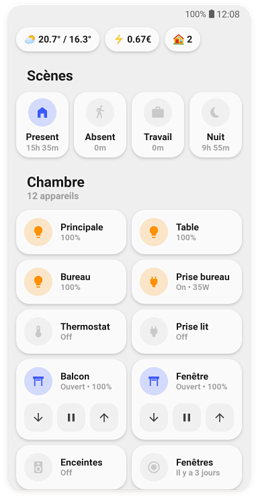
Un dashboard qui en vaut le coup 
(son auteur semble français au vue du langage utilisé dans les screenshots)
Original : GitHub - TBens/lovelace-ui-minimalist: 🌻 Lovelace UI • Minimalist
Réécrit :
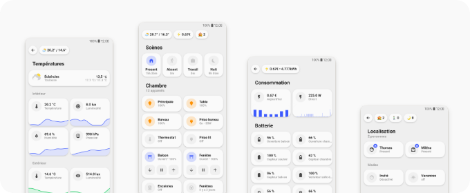
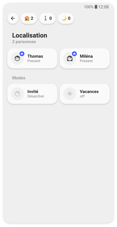

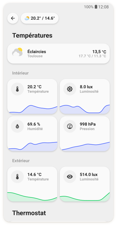
Un dashboard qui en vaut le coup
(son auteur semble français au vue du langage utilisé dans les screenshots)
Original : GitHub - TBens/lovelace-ui-minimalist: 🌻 Lovelace UI • Minimalist
Réécrit :
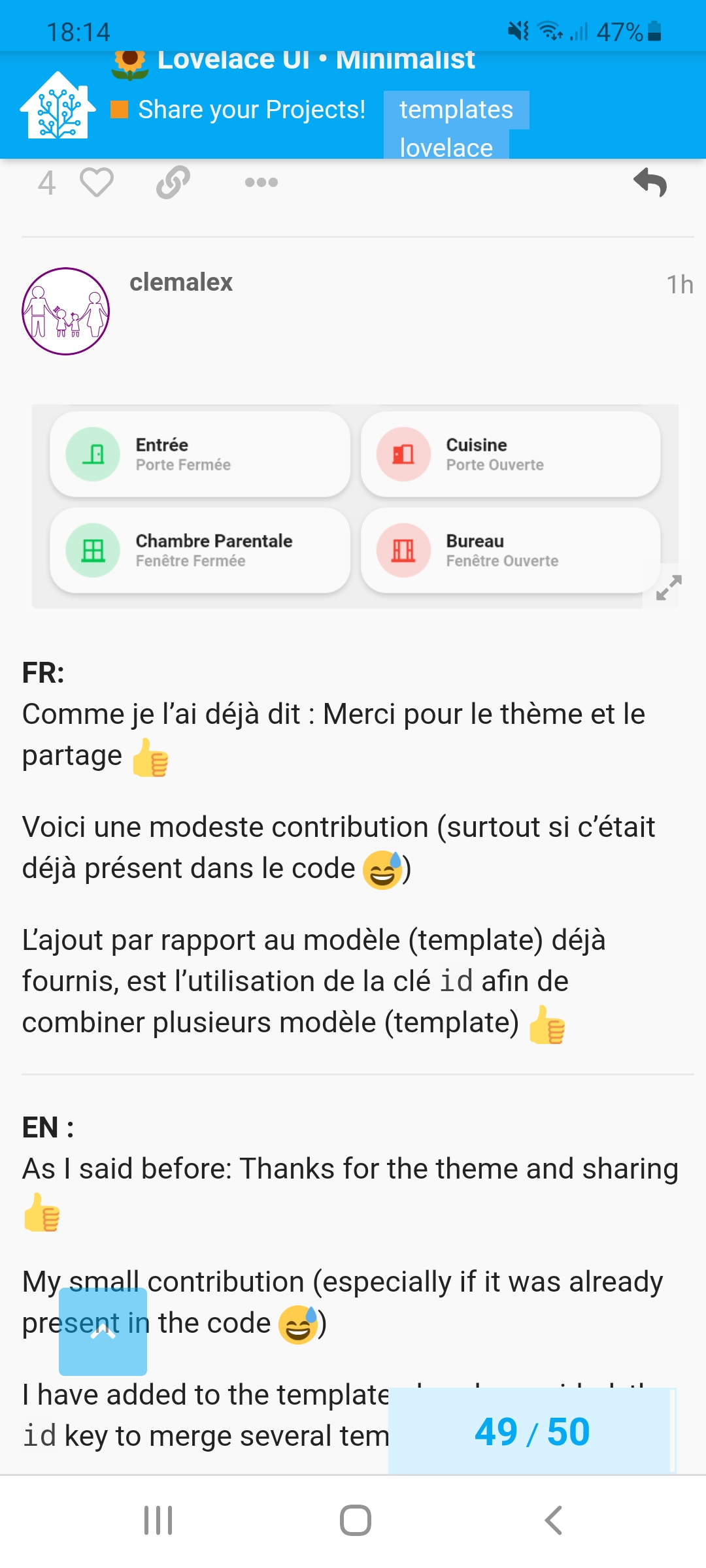
J’adore. On reconnait bien la la touche d’un UX designer, très homogène, sobre et efficace.
super propre sont interface
faut l’inviter chez nous
par contre il parle de template mais je voie ou il a mis ces template justement dans sa description
Ça va être dur de trouver quelqu’un qui puisse t’expliquer… 
Si personne ne te réponds d’ici ce soir ou demain, je le ferais…
Mais on en a déjà parler sur le forum :
https://forum.hacf.fr/t/button-card-les-modeles-templates/3737/2?u=clemalex
Vraiment sympa :
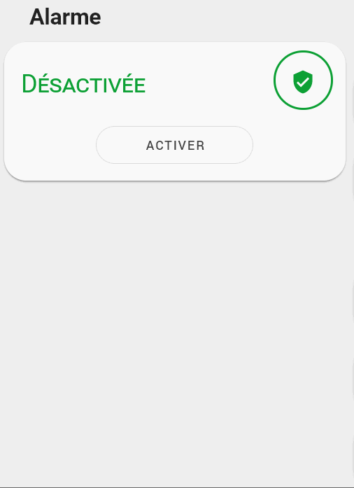
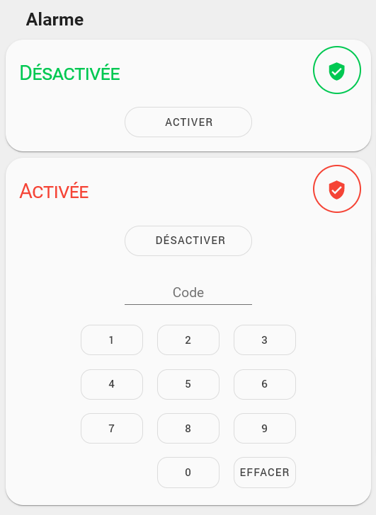
J’ai retravaillé la carte alarme pour qu’elle colle mieux au désign. Je laisse le code pour ceux qui veulent l’améliorer
type: vertical-stack
cards:
  - card:
      entity: alarm_control_panel.alarme
      states:
        - arm_home
      style:
        .: |
          ha-card > ha-label-badge{
            --alarm-state-color: var(--google-green-500) !important;
          }
          ha-card{
            padding-top: 16px;
            padding-bottom: 12px !important;
            border-radius: 21px;
          }
          ha-card > h1{
             padding-top: 0;
             color: transparent;
          }
          ha-card > h1::before{
             content: "Désactivée";
             color: var(--google-green-500);
             position: absolute;
             font-variant: small-caps;
          }
          #alarmCode{
            display: none;
          }
          #keypad{
            display: none !important;
          }
        '#armActions':
          mwc-button:
            $: |
              #button > span.slot-container{
                color: transparent;
                position: absolute;

              }
              #button{
                width: 150px;
                border-radius: 21px;
              }
              #button > span.slot-container::before{
                color: var(--mdc-theme-primary, #6200ee);
                content: "Activer";
                margin: 0 0 0 50%;
              }
      title: Alarme
      type: alarm-panel
    conditions:
      - entity: alarm_control_panel.alarme
        state: disarmed
    type: conditional
  - card:
      entity: alarm_control_panel.alarme
      states:
        - arm_home
      title: Alarme
      type: alarm-panel
      style:
        .: |
          ha-card > ha-label-badge{
            --alarm-state-color: var(--google-red-500) !important;
          }
          ha-card{
            padding-top: 16px;
            padding-bottom: 12px !important;
            border-radius: 21px;
          }
          ha-card > h1{
             padding-top: 0;
             color: transparent;
          }
          ha-card > h1::before{
             content: "Activée";
             color: var(--google-red-500);
             position: absolute;
             font-variant: small-caps;
          }
        '#armActions':
          mwc-button:
            $: |
              #button > span.slot-container{
                color: transparent;
                position: absolute;
              }
              #button{
                width: 150px;
                border-radius: 21px;
              }
              #button > span.slot-container::before{
                color: var(--mdc-theme-primary, #6200ee);
                content: "Désactiver";
                margin: 0 0 0 50%;
              }
        '#keypad':
          mwc-button:
            $: |
              #button{
                border-radius: 12px
              }
    conditions:
      - entity: alarm_control_panel.alarme
        state_not: disarmed
    type: conditional
Il reste a reprendre les couleurs… Fait :
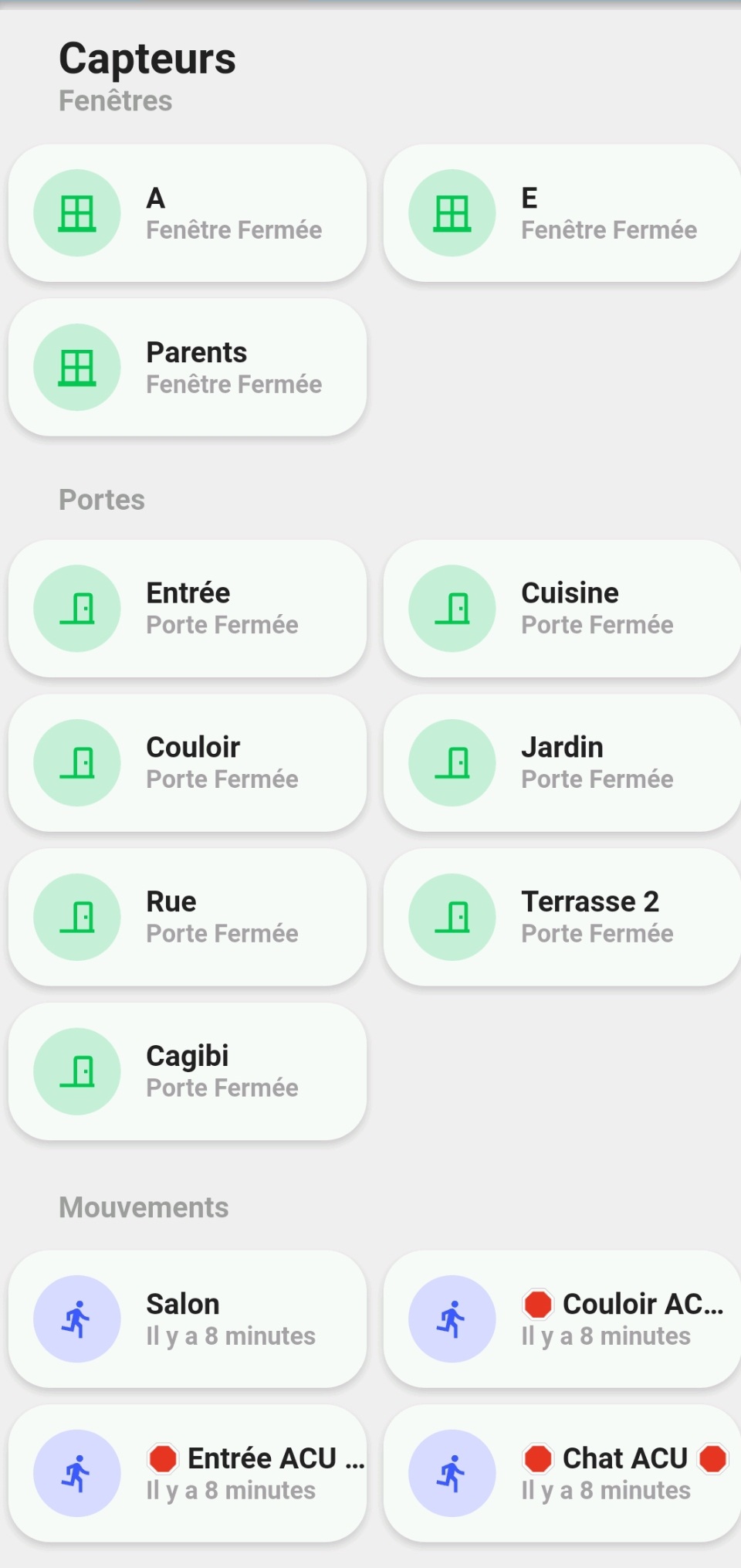
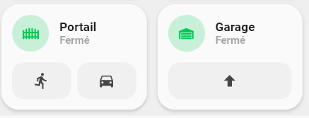
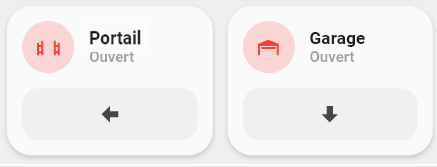
Sans optimiser le code, voici 2 nouvelles cartes que j’utilise.
#templates
button_card_templates:
  list_items_1:
    styles:
      card:
        - box-shadow: none
        - padding: 0px
      grid:
        - grid-template-areas: '"item1"'
        - grid-template-columns: 1fr
        - grid-template-rows: min-content
        - column-gap: 7px
  garage_button:
    variables:
      entity: binary_sensor.default
      name: Default name
      icon: mdi:home
      entity_command: input_boolean.default
    styles:
      card:
        - border-radius: 20px
        - box-shadow: var(--box-shadow)
        - padding: 12px
      grid:
        - grid-template-areas: '"item1" "item2"'
        - grid-template-columns: 1fr
        - grid-template-rows: min-content  min-content
        - row-gap: 12px
    custom_fields:
      item1:
        card:
          entity: '[[[ return variables.entity ]]]'
          name: '[[[ return variables.name ]]]'
          tap_action:
            action: more-info
          template:
            - icon_info
            - ouverture
          state:
            - icon: mdi:garage-open-variant
              value: 'on'
              id: 'on'
              label: Ouvert
            - icon: mdi:garage-variant
              value: 'off'
              id: 'off'
              label: Fermé
          type: custom:button-card
      item2:
        card:
          template: list_items_1
          type: custom:button-card
          custom_fields:
            item1:
              card:
                icon: '[[[ return variables.icon ]]]'
                tap_action:
                  action: call-service
                  service: input_boolean.turn_on
                  service_data:
                    entity_id: '[[[ return variables.entity_command ]]]'
                type: custom:button-card
                template: widget_icon
  portail_close_button:
    variables:
      entity: binary_sensor.default
      name: Default name
      icon: mdi:home
      entity_command: input_boolean.default
    styles:
      card:
        - border-radius: 20px
        - box-shadow: var(--box-shadow)
        - padding: 12px
      grid:
        - grid-template-areas: '"item1" "item2"'
        - grid-template-columns: 1fr
        - grid-template-rows: min-content  min-content
        - row-gap: 12px
    custom_fields:
      item1:
        card:
          entity: '[[[ return variables.entity ]]]'
          name: '[[[ return variables.name ]]]'
          tap_action:
            action: more-info
          template:
            - icon_info
            - ouverture
          state:
            - icon: mdi:gate-open
              value: 'on'
              id: 'on'
              label: Ouvert
            - icon: mdi:gate
              value: 'off'
              id: 'off'
              label: Fermé
          type: custom:button-card
      item2:
        card:
          template: list_items_1
          type: custom:button-card
          custom_fields:
            item1:
              card:
                icon: mdi:arrow-left-bold
                tap_action:
                  action: call-service
                  service: input_boolean.turn_on
                  service_data:
                    entity_id: '[[[ return variables.entity_command ]]]'
                type: custom:button-card
                template: widget_icon
  list_items_2:
    styles:
      card:
        - box-shadow: none
        - padding: 0px
      grid:
        - grid-template-areas: '"item1 item2"'
        - grid-template-columns: 1fr 1fr
        - grid-template-rows: min-content
        - column-gap: 7px
  portail_button:
    variables:
      entity_pieton: input_boolean.default
      entity_voiture: input_boolean.default
      name: Default name
    styles:
      card:
        - border-radius: 20px
        - box-shadow: var(--box-shadow)
        - padding: 12px
      grid:
        - grid-template-areas: '"item1" "item2"'
        - grid-template-columns: 1fr
        - grid-template-rows: min-content  min-content
        - row-gap: 12px
    custom_fields:
      item1:
        card:
          entity: '[[[ return variables.entity ]]]'
          name: '[[[ return variables.name ]]]'
          tap_action:
            action: more-info
          template:
            - icon_info
            - ouverture
          state:
            - icon: mdi:gate-open
              value: 'on'
              id: 'on'
              label: Ouvert
            - icon: mdi:gate
              value: 'off'
              id: 'off'
              label: Fermé
          type: custom:button-card
      item2:
        card:
          template: list_items_2
          type: custom:button-card
          custom_fields:
            item1:
              card:
                icon: mdi:run
                tap_action:
                  action: call-service
                  service: input_boolean.turn_on
                  service_data:
                    entity_id: '[[[ return variables.entity_pieton ]]]'
                type: custom:button-card
                template: widget_icon
            item2:
              card:
                icon: mdi:car
                tap_action:
                  action: call-service
                  service: input_boolean.turn_on
                  service_data:
                    entity_id: '[[[ return variables.entity_voiture ]]]'
                type: custom:button-card
                template: widget_icon
#cards
type: grid
cards:
  - type: horizontal-stack
    cards:
      - type: conditional
        conditions:
          - entity: binary_sensor.door_012
            state: 'off'
        card:
          type: custom:button-card
          variables:
            entity: binary_sensor.door_012
            entity_pieton: input_boolean.portail_pieton_command
            entity_voiture: input_boolean.portail_voiture_command
            name: Portail
          template:
            - portail_button
      - type: conditional
        conditions:
          - entity: binary_sensor.door_012
            state: 'on'
        card:
          type: custom:button-card
          variables:
            entity: binary_sensor.door_012
            entity_command: input_boolean.portail_pieton_command
            name: Portail
          template:
            - portail_close_button
  - type: horizontal-stack
    cards:
      - type: conditional
        conditions:
          - entity: binary_sensor.porte_du_garage
            state: 'off'
        card:
          type: custom:button-card
          variables:
            entity: binary_sensor.porte_du_garage
            entity_command: input_boolean.garage_command
            name: Garage
            icon: mdi:arrow-up-bold
          template:
            - garage_button
      - type: conditional
        conditions:
          - entity: binary_sensor.porte_du_garage
            state: 'on'
        card:
          type: custom:button-card
          variables:
            entity: binary_sensor.porte_du_garage
            entity_command: input_boolean.garage_command
            name: Garage
            icon: mdi:arrow-down-bold
          template:
            - garage_button
columns: 2
square: false
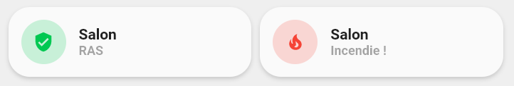
détecteur de fumée
#card:
entity: binary_sensor.smoke_sensor_salon
type: custom:button-card
template:
  - icon_info_bg
  - ouverture
name: Salon
state:
  - icon: mdi:fire
    value: 'on'
    id: 'on'
    label: Incendie !
  - icon: mdi:shield-check
    value: 'off'
    id: 'off'
    label: RAS
Toujours avec l’utilisation des id / Always with id key :
#template
  ouverture:
    template:
      - rouge_on
      - vert_off
    state:
      - label: Ouvert(e)
        id: 'on'
        value: 'on'
      - label: Fermé(e)
        id: 'off'
        value: 'off'
Toujours en partant de l’existant, voici pour mes volets somfy :
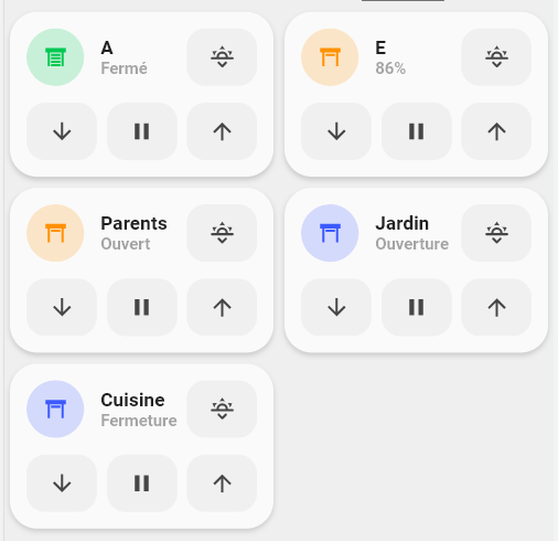
#templates
button_card_templates:
  cover_somfy:
    tap_action:
      action: more-info
    icon: |
      [[[
          var icon = 'mdi:window-shutter';
          if (entity.attributes.current_position == 0){
            var icon = 'mdi:window-shutter';
          } else
            var icon = 'mdi:window-shutter-open';
          return icon ;
      ]]]
    label: |-
      [[[
        if (entity.state == 'opening'){
            return 'Ouverture';
        }
        else if (entity.state == 'closing'){
            return 'Fermeture';
        }
        else{
          if (entity.attributes.current_position == 0){
            var etat = "Fermé";
          }else if (entity.attributes.current_position == 100){
            var etat = "Ouvert" ;
          }else{
            var etat = (entity.attributes.current_position) + '%' ;
          }
          return etat ;
        }
      ]]]
    state:
      - styles:
          icon:
            - color: rgba(var(--couleur-vert),1)
          img_cell:
            - background-color: rgba(var(--couleur-vert), 0.2)
        value: closed
      - styles:
          icon:
            - color: rgba(var(--couleur-jaune),1)
          img_cell:
            - background-color: rgba(var(--couleur-jaune), 0.2)
        value: open
      - styles:
          icon:
            - color: rgba(var(--couleur-bleu),1)
          img_cell:
            - background-color: rgba(var(--couleur-bleu), 0.2)
        value: opening
      - styles:
          icon:
            - color: rgba(var(--couleur-bleu),1)
          img_cell:
            - background-color: rgba(var(--couleur-bleu), 0.2)
        value: closing
  list_items_cover_favorite:
    styles:
      card:
        - box-shadow: none
        - padding: 0px
      grid:
        - grid-template-areas: '"item1 item1 item2"'
        - grid-template-columns: 1fr 1fr 1fr
        - grid-template-rows: min-content
        - column-gap: 7px
  cover_buttons_with_favorite:
    variables:
      entity: cover.default
      name: Default name
      sun_position: 0
    styles:
      card:
        - border-radius: 20px
        - box-shadow: var(--box-shadow)
        - padding: 12px
      grid:
        - grid-template-areas: '"item1" "item2"'
        - grid-template-columns: 1fr
        - grid-template-rows: min-content  min-content
        - row-gap: 12px
    custom_fields:
      item1:
        card:
          template: list_items_cover_favorite
          type: custom:button-card
          custom_fields:
            item1:
              card:
                entity: '[[[ return variables.entity ]]]'
                name: '[[[ return variables.name ]]]'
                tap_action:
                  action: more-info
                template:
                  - icon_info
                  - cover_somfy
                type: custom:button-card
            item2:
              card:
                icon: mdi:weather-sunset-down
                tap_action:
                  action: call-service
                  service: cover.set_cover_position
                  service_data:
                    entity_id: '[[[ return variables.entity ]]]'
                    position: '[[[ return variables.sun_position ]]]'
                type: custom:button-card
                template: widget_icon
      item2:
        card:
          template: list_items
          type: custom:button-card
          custom_fields:
            item1:
              card:
                icon: mdi:arrow-down
                tap_action:
                  action: call-service
                  service: cover.close_cover
                  service_data:
                    entity_id: '[[[ return variables.entity ]]]'
                type: custom:button-card
                template: widget_icon
            item2:
              card:
                icon: mdi:pause
                tap_action:
                  action: call-service
                  service: cover.stop_cover
                  service_data:
                    entity_id: '[[[ return variables.entity ]]]'
                type: custom:button-card
                template: widget_icon
            item3:
              card:
                icon: mdi:arrow-up
                tap_action:
                  action: call-service
                  service: cover.open_cover
                  service_data:
                    entity_id: '[[[ return variables.entity ]]]'
                type: custom:button-card
                template: widget_icon
#carte
    type: custom:button-card
    template: cover_buttons_with_favorite
    variables:
      entity: cover.volet_parent
      name: Parents
      sun_position: 13
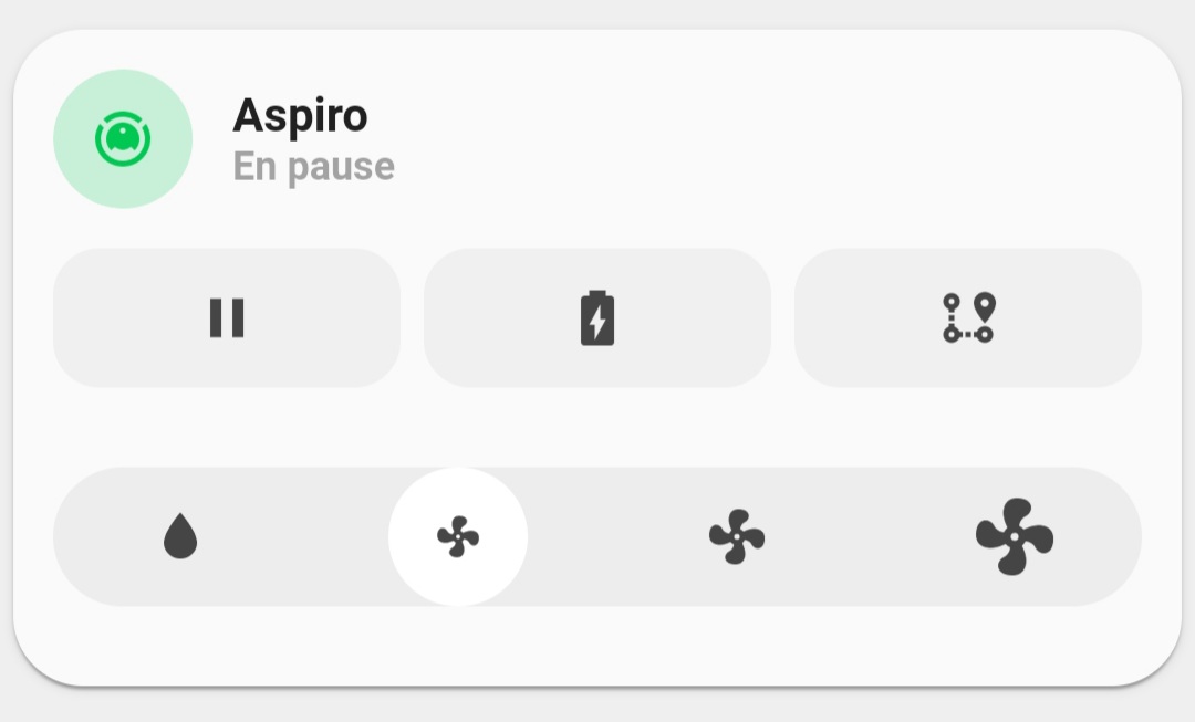
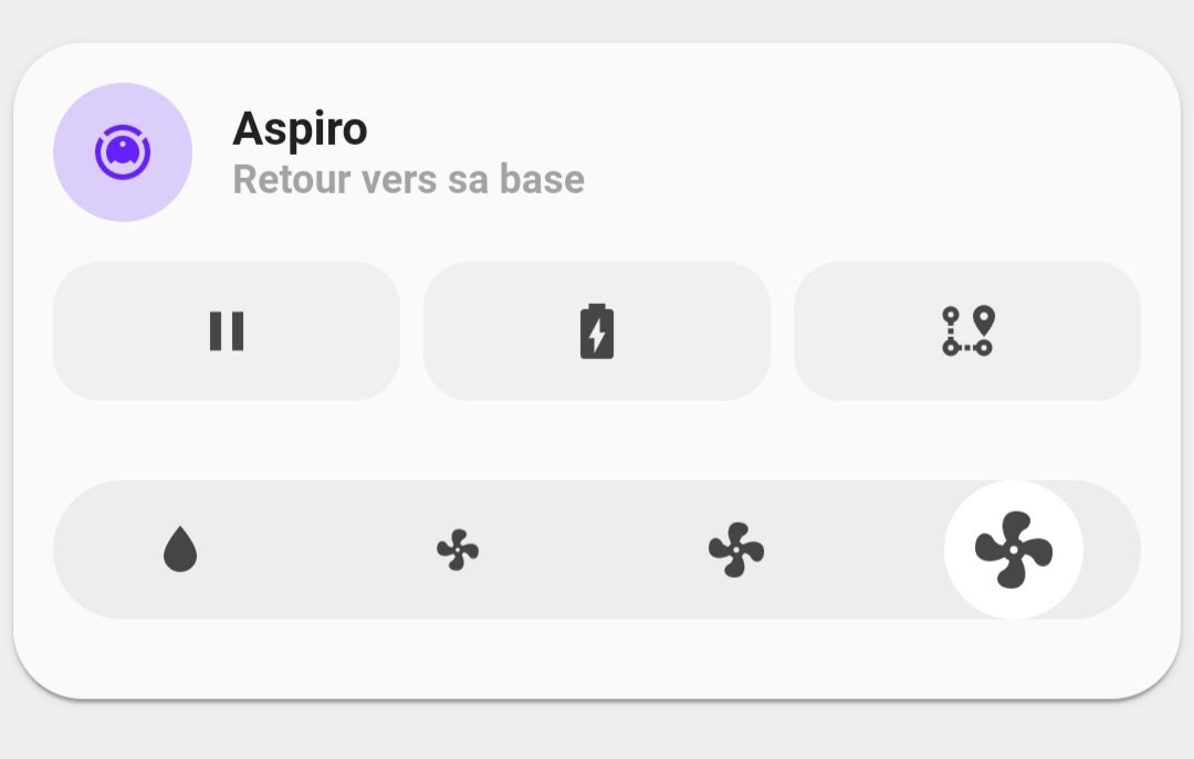
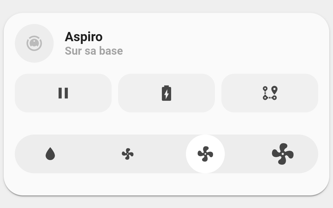
Pour l’aspirateur / Vacuum :
#card
type: custom:button-card
template: aspiro
variables:
  in_progress: Maison
  color: couleur-rouge
entity: script.aspiro_maison
icon: mdi:home
name: Maison
#template
button_card_templates:
  aspiro:
    variables:
      color: default
      in_progress: default
      script: default
    size: 20px
    show_label: true
    label: |
      [[[
        if (states["input_select.vacuum_aspiro_in_progress"].state == variables.in_progress){
            return '💧';
        }
        else if (states["input_select.vacuum_aspiro_last"].state == variables.in_progress){
            return '✔️'
        }
      ]]]
    styles:
      card:
        - border-radius: 20px
        - box-shadow: var(--box-shadow)
        - padding: 10px 0px 8px 0px
      grid:
        - grid-template-areas: '"i" "n" "l"'
      name:
        - margin-top: 10px
        - justify-self: center
        - font-weight: bold
        - font-size: 14px
      label:
        - justify-self: center
        - align-self: start
        - font-weight: bolder
        - font-size: 12px
        - filter: opacity(40%)
        - animation: |
            [[[
              if (states["input_select.vacuum_aspiro_in_progress"].state == variables.in_progress){
                  return 'blink 0.9s ease infinite';
              }
            ]]]
      icon:
        - color: '[[[ return ''rgb(var(--'' + variables.color + ''))'' ]]]'
      img_cell:
        - background-color: '[[[ return ''rgba(var(--'' + variables.color + ''),0.2)'' ]]]'
        - border-radius: 50%
        - place-self: center
        - width: 42px
        - height: 42px
    tap_action:
      action: call-service
      service: script.turn_on
      service_data:
        entity_id: '[[[return entity.entity_id]]]'
    name: '[[[return entity.entity_id]]]'
Comme toujours : Merci @tben 
Pour reprendre une réponse du Discord :
Voici par exemple, le rendu sur un PC :

Ce n’est pas parce que tu n’aime pas le code que tu es obligé d’y aller comme un bœuf 
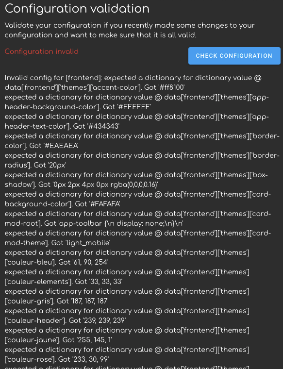
Montre nous ton fichier en plus des erreurs 
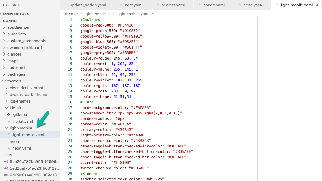
Aucun soucis pour ma part :
frontend:
  themes:
    minimalist:
     #Couleurs
      google-red-500 : '#F54436'
      google-green-500 : '#01C852'
      google-yellow-500 : '#FF9101'
      google-blue-500 : '#3D5AFE'
      google-violet-500 : '#661FFF'
      google-grey-500: '#BBBBBB'
      couleur-rouge : 245, 68, 54
      couleur-vert : 1, 200, 82
      couleur-jaune : 255, 145, 1
[...]
Il te manque la première clé qui est le nom du thème 
Comme ce thème utilise comme il faut la propriété grid ppur construire ses cartes, je mets un lien vers un excellent tutoriel :
bas j’ai fait un copier/coller de sont bout de code theme qu’il fournie, donc il et pas complet ?
ps: j’ai ajouter light-mobile: au debut et c’est passer… pffff
par contre @Clemalex comment faire pour que le menu du haut dans le dashbaord lovelace apparaisse ?
j’avais des menu/icône pour changer de page dans le dashboard et ils apparaissent plus…
ps: j’ai trouver en modifiant le fichier theme
Oui, il faut commenter ces dernières lignes du fichier du thème :
      # Enlever le header
      card-mod-theme: minimalist
      #card-mod-root: |
      #  app-toolbar {
      #    display: none;
      #  }
Le thème est complet, ensuite chacun suivant sa méthode doit l’insérer dans sa configuration.
Il faut essayer de comprendre en plus de copier 