Historique état - apex chart ou autre - [But: afficher historique du schedule pour Versatile Thermostat]

Bonjour,

J’ai l’état d’un select, que je peux afficher comme historique. Seulement if faut utiliser le picker. J’ai essayé avec apex mais sans succès, même en passant par un template pour transformer le texte en nombre. Mon sensor fonctionne parfaitement.

Cependant Apex est en mode chargement en permanence.

Mon template:

template:
  - sensor:
      - name: "Pilot Wire Mode Numeric"
        unique_id: pilot_wire_mode_numeric
        state: >
          {% if is_state('select.zb_nodon_1_pilot_wire_mode', 'off') %}0
          {% elif is_state('select.zb_nodon_1_pilot_wire_mode', 'eco') %}1
          {% elif is_state('select.zb_nodon_1_pilot_wire_mode', 'comfort') %}2
          {% elif is_state('select.zb_nodon_1_pilot_wire_mode', 'frost_protection') %}3
          {% else %}4
          {% endif %}

Le yaml pour apex en mode ligne pour commencer:

type: custom:apexcharts-card
graph_span: 24h
span:
  start: day
  offset: +0h
header:
  show: true
  title: Mode Chauffage (08h - 23h)
  show_states: true
series:
  - entity: sensor.pilot_wire_mode_numeric
    name: Mode Chauffage
    type: line
    stroke_width: 12
    curve: straight
apex_config:
  chart:
    animations:
      enabled: false
  yaxis:
    min: 0
    max: 3
    tickAmount: 3
    labels:
      formatter: |
        function(val) {
          if(val==0) return 'Off';
          if(val==1) return 'Eco';
          if(val==2) return 'Comfort';
          if(val==3) return 'Frost';
          return val;
        }

Je suis preneur de toute autre solution!

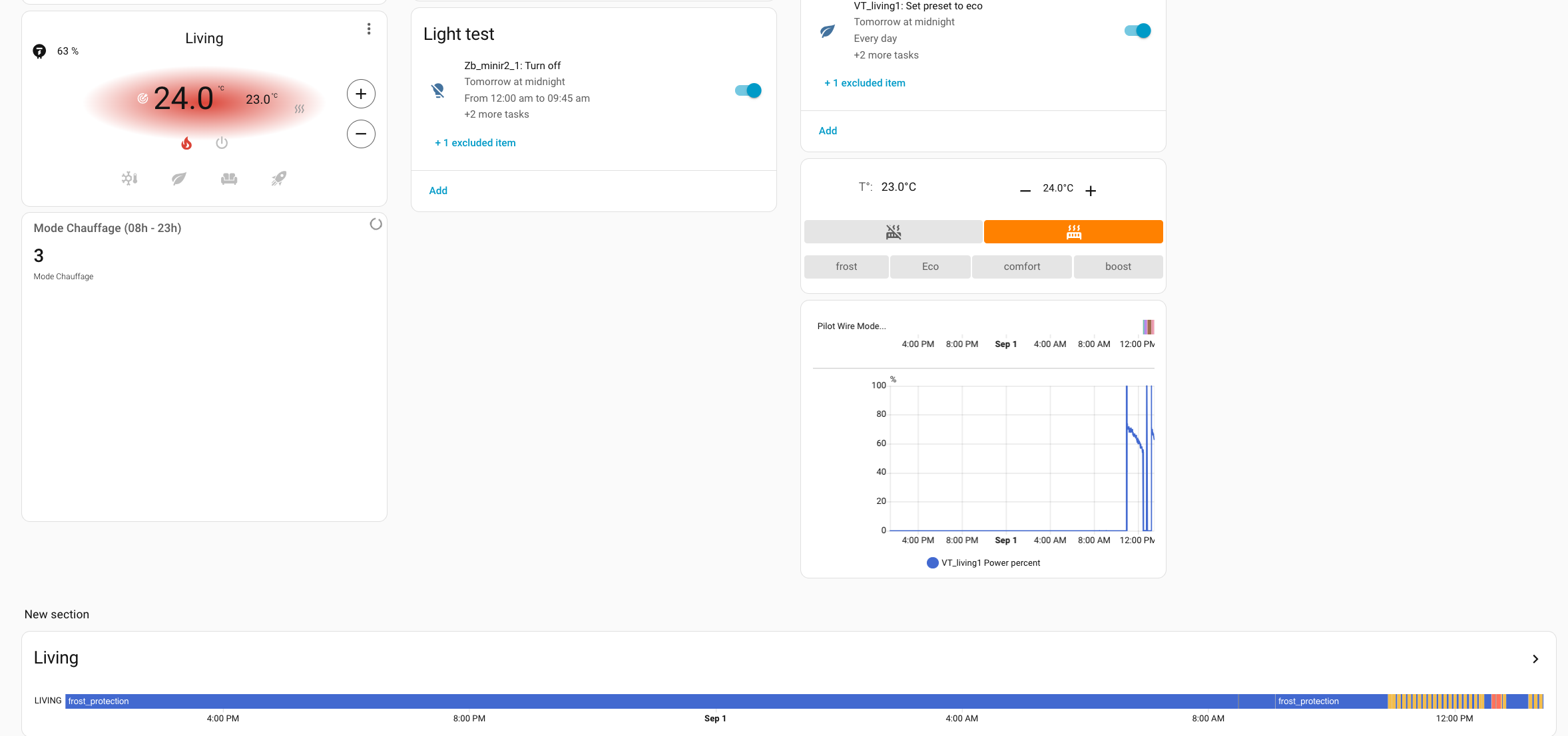
Le but est d’avoir la même chose que history tout en base de l’image mais avec un départ et une fion ou un span que je décide et pas 24h à partir de maintenant…

Merci

Bonjour,

Tu peux regarder la carte History Explorer Card (dans HACS), qui est d’une grande flexibilité pour ce type de graph. Tu pourras définir l’échelle de temps et le span comme tu e souhaites (et même le modifier sur le dashboard si tu veux).

GitHub - SpangleLabs/history-explorer-card: A card for Home Assistant Lovelace for exploring the history of your entities interactively and in real time.

Oui j’avais vu mais elle est mise comme obsolète sur github…

Bonjour,

Il y a une carte obsolète, mais elle a été reprise. Le lien que j’ai partagé au-dessus pointe vers la nouvelle carte il me semble.

Ca m’a l’air! Merci!

Pas dans HACS comme ça je vais l’ajouter à la main même si je n’aime pas ça. Tu l’avais trouvé sur HACS toi?

David

Ca fonctionne 1000 merci!

Pour ceux qui veulent essayer:

type: custom:history-explorer-card
header: Living
tooltip:
  size: slim
uimode: dark
stateTextMode: raw
defaultTimeRange: 24h
defaultTimeOffset: 1D
refresh:
  automatic: true
combineSameUnits: true
showUnavailable: true
graphs:
  - type: line
    title: Température
    entities:
      - entity: sensor.zb_themp_vtherm_1_temperature
        color: "#3e95cd"
        fill: rgba(151,187,205,0.15)
  - type: timeline
    title: Demande
    entities:
      - entity: select.zb_nodon_1_pilot_wire_mode
        name: Living
      - entity: select.zb_nodon_1_pilot_wire_mode
        name: Cuisine

Hop,

J’ai encore un souci, pas moyen de changer la couleur des états du timeline, ça reste avec les couleurs horribles comme ci-dessus.

Une idée?

Merci

type: custom:history-explorer-card
labelAreaWidth: 65     # the width of the label area in pixels, default is 65
header: Living
tooltip:
  size: slim
uimode: dark
stateTextMode: raw
defaultTimeRange: 24h
defaultTimeOffset: 1D
refresh:
  automatic: true
combineSameUnits: true
showUnavailable: true
timelineBarHeight: 35    # timeline bar height (default is 24)
timelineBarSpacing: 45   # spacing from the top of one timeline bar to the next (default is 40)

timeTicks:
  # If present, this will skip the auto-density and force the use of your selected density.
  densityOverride: 'medium'  # Options are: low, medium, high, higher, highest.

  # optional, this can be used to shorten the date representation on the time ticks, to make more space if you want high tick densities.
  dateFormat: 'short'         # Options are normal and short. Default is normal.

graphs:
  - type: line
    title: Température
    entities:
      - entity: sensor.zb_themp_vtherm_1_temperature
        color: "#3e95cd"
        fill: rgba(151,187,205,0.15)
  - type: timeline
    title: Demande
    entities:
      - entity: select.zb_nodon_1_pilot_wire_mode
        stateColors:
          'comfort': blue  
          'frost_protection': green  
          name: Living
      - entity: select.zb_nodon_1_pilot_wire_mode
        name: Cuisine

Dans la doc, je vois la possibilité de définir la couleur pour chaque état des entités:

# Dictionary of colour overrides for specified sensor states
stateColors:
  # Key is the name of the sensor and state, for example "on" state for "door" sensor would be "door.on"
  # Value is the colour that the specified state should have
  door.on: blue

Oui mais. j’ai essayé avec stateColors si tu regardes plus haut. Impossible de trouver la syntaxe pour mon sensor…

As-tu essayé la syntaxe sensor.status comme dans l’exemple de la doc?

The following example will turn the on state of all door sensors blue and the on state of all motion sensors yellow. The on state of other sensor device classes will not be affected. They will inherit their colors from either an entity specific, a device class or domain wide or a global color rule, in that order (see below). You specify the device class followed by a dot and the state you'd like to customize:

type: custom:history-explorer-card
stateColors:
  door.on: blue
  motion.on: yellow

Oui mais ce n’est pas ce qu’il me faut.

J’ai essayé plein de choses, openai,… sans resultat

Ce sujet a été automatiquement fermé après 2 jours. Aucune réponse n’est permise dorénavant.