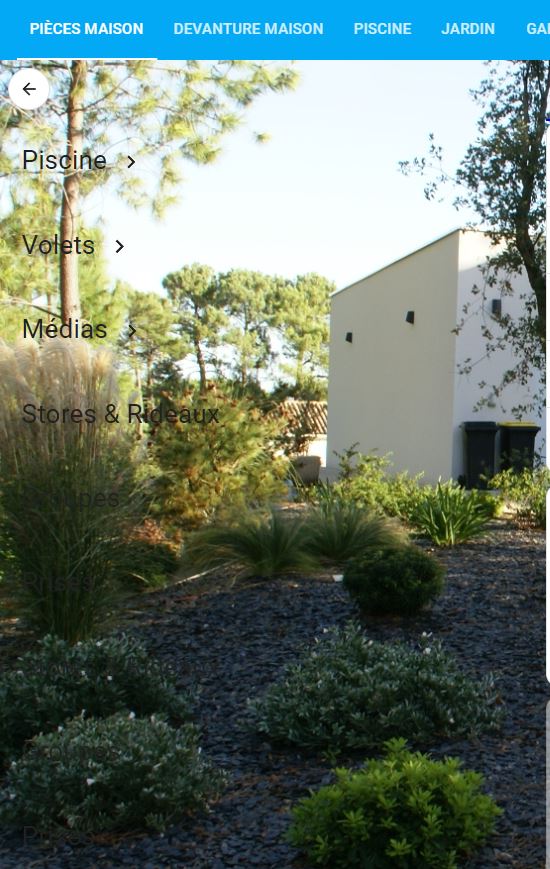
Bonjour à tous.
J’ai une card de ce type:
type: vertical-stack
cards:
  - type: custom:mushroom-chips-card
    chips:
      - type: back
  - type: custom:mushroom-title-card
    title: Piscine
    styles: null
    title_tap_action:
      action: navigate
      navigation_path: /dashboard-pieces/piscine
  - type: custom:mushroom-title-card
    title: Volets
    subtitle: ''
    title_tap_action:
      action: navigate
      navigation_path: /lovelace-tutorial/volets?edit=1
  - type: custom:mushroom-title-card
    title: Médias
    subtitle: ''
    title_tap_action:
      action: navigate
      navigation_path: /lovelace-tutorial/media
Cette card se trouve sur sur une image de fond avec le code suivant dans la vue:
views:
  - theme: Backend-selected
    title: Pièces Maison
    icon: ''
    background: >-
      center / cover no-repeat fixed url('/local/Images Maison/Devanture
      Maison.jpg')
    subview: false
    badges: []
    cards:
Les cards de type: custom:mushroom-title-card se voit bien sur les zones claires, mais ne se voit pas sur les zones sombres, que puis-je faire comme adaptation pour que tout soit visible quelque soit l’image de fond.
Abel
Juin 22, 2023, 12:22
2
Bonjour,
Pourquoi ne pas passer par de icônes?
Voici un code rapide, où les icônes sont plus agrandis. J’utilise une chips card que j’affiche verticalement
type: custom:mushroom-chips-card
chips:
  - type: back
    icon: ''
    card_mod:
      style: |
        ha-card {
          justify-content: center;
          --chip-icon-size: 32px;
          --chip-height: 56px;
          width: var(--chip-height) !important;
          border-radius: 50% !important;
  - type: template
    double_tap_action:
      action: none
    icon: mdi:pool
    icon_color: ''
    content: ''
    hold_action:
      action: none
    tap_action:
      action: navigate
      navigation_path: /dashboard-pieces/piscine
    card_mod:
      style: |
        ha-card {
          justify-content: center;
          --chip-icon-size: 32px;
          --chip-height: 56px;
          width: var(--chip-height) !important;
          border-radius: 50% !important;
  - type: template
    double_tap_action:
      action: none
    content: ''
    hold_action:
      action: none
    tap_action:
      action: navigate
      navigation_path: /lovelace-tutorial/volets?edit=1
    icon_color: ''
    icon: mdi:window-shutter
    card_mod:
      style: |
        ha-card {
          justify-content: center;
          --chip-icon-size: 32px;
          --chip-height: 56px;
          width: var(--chip-height) !important;
          border-radius: 50% !important;
  - type: template
    double_tap_action:
      action: none
    content: ''
    icon: mdi:multimedia
    icon_color: ''
    tap_action:
      action: navigate
      navigation_path: /lovelace-tutorial/media
    hold_action:
      action: none
    card_mod:
      style: |
        ha-card {
          justify-content: center;
          --chip-icon-size: 32px;
          --chip-height: 56px;
          width: var(--chip-height) !important;
          border-radius: 50% !important;
  - type: template
    icon: mdi:blinds
    icon_color: ''
    tap_action:
      action: navigate
      navigation_path: ''
    hold_action:
      action: none
    card_mod:
      style: |
        ha-card {
          justify-content: center;
          --chip-icon-size: 32px;
          --chip-height: 56px;
          width: var(--chip-height) !important;
          border-radius: 50% !important;
  - type: template
    double_tap_action:
      action: none
    icon: mdi:lightbulb
    icon_color: ''
    hold_action:
      action: none
    tap_action:
      action: navigate
      navigation_path: ''
    card_mod:
      style: |
        ha-card {
          justify-content: center;
          --chip-icon-size: 32px;
          --chip-height: 56px;
          width: var(--chip-height) !important;
          border-radius: 50% !important;
  - type: template
    icon: mdi:power-socket-fr
    card_mod:
      style: |
        ha-card {
          justify-content: center;
          --chip-icon-size: 32px;
          --chip-height: 56px;
          width: var(--chip-height) !important;
          border-radius: 50% !important;
card_mod:
  style: |
    .chip-container {
      flex-flow: column !important;
    }
Cordialement,
Abel
3 « J'aime »
Merci pour ta réponse.
Cordialement
Abel
Juin 23, 2023, 9:13
4
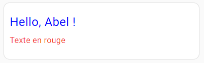
Bonjour,
Voilà
type: custom:mod-card
card:
  type: custom:mushroom-title-card
  title: Hello, {{ user }} !
  subtitle: Text en rouge
card_mod:
  style:
    mushroom-title-card$: |
      h1 {
        --primary-text-color: blue;
      }
      h2 {
        --secondary-text-color: rgb(var(--rgb-red));
      }
La couleur peut être changée en utilisant
les variables du theme utilisé (example ci-dessus)
le code rgb : rgb(123, 255, 0)
le code rgba : rgba(255, 99, 71, 0.5)
Cordialement,
Abel
Abel
Juin 23, 2023, 9:51
5
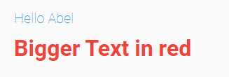
Autre façon et options pour le text
type: custom:mod-card
card:
  type: custom:mushroom-title-card
  title: Hello {{user}}
  subtitle: Bigger Text in red
card_mod:
  style:
    mushroom-title-card$: |
      .title {
        --primary-text-color: rgb(var(--rgb-blue));
        --title-font-size: 20px;
        --title-font-weight: lighter;
      }
      .subtitle {
        --secondary-text-color: rgb(var(--rgb-red));
        --subtitle-font-size: 32px;
        --subtitle-font-weight: bolder;
      }
      .header {
        --title-padding: 8px 24px 8px;
      }
Merci pour ton aide c’est exactement ce que je voulais, il me reste juste à adapter.
Cordialement