Mise à jour de l’animation :
Code de la carte
style: |
@keyframes pulsation {
25% {
transform: scale(1.3);
}
100% {
box-shadow: 0 0 0 40px rgba(128, 0, 128, 0), 0 0 0 6px rgba(128, 0, 128, 0) inset;
transform: scale(1)
}
}
#courrier{
animation:
{% if is_state('input_boolean.test2', 'on') %}
pulsation 1s infinite ease-in;
{% else %}
None
{% endif %}
;
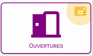
entity: input_boolean.test2
name: Ouvertures
show_name: true
state:
- icon: 'mdi:door-open'
value: 'on'
- icon: 'mdi:door'
value: 'off'
styles:
custom_fields:
courrier:
- border-radius: 50%
- box-shadow: >-
rgb(247 193 57 / 60%) 0px 0px 0px 0px, rgb(247 193 57 / 60%) 0px 0px
0px 6px inset
- position: absolute
- right: 5%
- top: 5%
- font-size: 13px
- line-height: 20px
- display: |
[[[
if (states["input_boolean.test2"].state == 'on') return '';
else return 'none';
]]]
- '--icon-color': |
[[[
if (states["input_boolean.test2"].state == 'on') return 'var(--mail-color)';
]]]
card:
- border-radius: 10px
- border: 2px solid var(--primary-color)
icon:
- color: var(--primary-color)
name:
- font-variant: small-caps
- color: var(--primary-color)
custom_fields:
courrier: |
[[[
return `
<ha-icon
icon="mdi:mail"
style="width: 30px; height: 30px; color: var(--icon-color);">
</ha-icon>`
]]]
type: 'custom:button-card'
Inspiration : https://codepen.io/matchboxhero/pen/pWLOQb?editors=1100