Bonjour Guizmos.
Peux-tu me communiquer le lien pour ce dashboard. J’aimerai m’en inspirer pour faire le mien.
Merci à toi.
Hello
Je vais regarder pour ajouter le code a mon Github. Je te redis quand il sera dispo
Pour info ce dashboard a quand même légèrement évolué.
J’ai ajouté quelques fonctionnalités et des effets de transparence un peu partout.
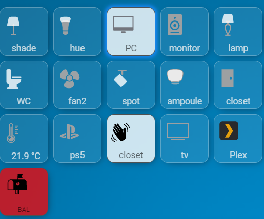
Voici le résultat :
Resalut Guizmos,
Je ne veux pas forcement ton dashboard mais savoir qu’elles ont été tes sources car ce qui m’intéresse c’est le type de dashboard qui à l’aspect de homekit. j’ai essayé d’installé homekit-infused 5 de Jimz011 mais je n’obtiens pas le même résultats que lui.https://github.com/jimz011/homekit-infused.
Merci.
Alors j’utilise le thème « Néon » (voir Édit de mon premier post)
Ensuite j’utilise des button-card avec des icônes qui vont bien et animée pour la plupart.
C’est pour cela que mon code devrait t’aider.
Exemple ici d’un button-card :

(Dédicace à @Clemalex pour cette icône)
type: custom:button-card
entity: media_player.nvidia_shield
name: Shield
icon: custom
styles:
  name:
    - top: 80%
    - left: 15%
    - position: center
    - color: rgba(240, 240, 240, 0.8)
  card:
    - font-size: 100%
    - background-color: rgba(240, 240, 240, 0.1)
    - border-radius: 15%
    - border-style: solid
    - border-color: rgba(240, 240, 240, 0.3)
    - border-width: 1px
    - box-shadow: true
    - transition: true
  custom_fields:
    icon_tv:
      - top: 4%
      - left: 6%
      - width: 130%
      - position: absolute
      - fill: >
          [[[ return (entity.state === 'standby' || entity.state === 'idle' ||
          entity.state === 'playing' || entity.state === 'on') ? 'rgba(122, 181,
          71)' : 'rgba(255, 255, 255, 0.8)'; ]]]
custom_fields:
  icon_tv: |
    [[[
      const state = (entity.state === 'on' || entity.state === 'home') ? 'animate' : null;
      return `
        <svg viewBox="0 0 50 50">
          <style>
            @keyframes animate {
              from {
                opacity: 0.5;
                transform: scale(0.6);
              }
              100% {
                opacity: 1;
              }
            }
            .animate {
              animation: animate 0.8s cubic-bezier(0.25, 1, 0.5, 1);
              transform-origin: center;
            }
          </style>
          <path class="${state}" d="m 9.2075967,4.7204413 v 1.9636454 c 0.129177,-0.01035 0.259031,-0.017662 0.388868,-0.022063 5.0012413,-0.1685642 8.2599973,4.1010403 8.2599973,4.1010403 0,0 -3.743022,4.550583 -7.642221,4.550583 -0.3573592,0 -0.6924262,-0.0326 -1.0066442,-0.08825 v 1.213489 c 0.268709,0.03417 0.547711,0.05516 0.8384112,0.05516 3.628471,0 6.254211,-1.852683 8.795035,-4.045881 0.421261,0.337387 2.144146,1.157547 2.498683,1.516861 -2.415866,2.022602 -8.046571,3.654255 -11.23856,3.654255 -0.3076812,0 -0.6031282,-0.01893 -0.8935692,-0.04688 v 1.707158 H 23 V 4.7204413 Z m 0,12.8519497 V 16.438882 C 4.7671878,15.88025 3.2477124,10.986456 3.2477124,10.986456 c 0,0 1.9882916,-2.9341912 5.9598843,-3.2378086 V 6.6840867 c -4.3990412,0.353282 -8.2075965,4.0789773 -8.2075965,4.0789773 0,0 2.1567355,6.238256 8.2075965,6.809327 z m 0,-9.8237436 v 1.3155321 c 0.235288,-0.025241 0.474916,-0.041369 0.725336,-0.041369 2.3036823,0 3.6708033,1.7898955 3.6708033,1.7898965 L 11.731102,12.393 C 10.88942,10.989878 10.607522,10.369645 9.2075967,10.200446 V 9.0641795 C 6.5314486,9.3536626 4.9217753,11.138142 4.9217751,11.138142 c 0,0 0.929864,3.488948 4.2858217,4.087251 V 14.188412 C 7.3157335,13.552651 6.7006394,11.344987 6.7006394,11.344987 c 0,0 0.9643032,-1.153062 2.2421963,-1.15833 0.08517,-3.5e-4 0.1714491,0.0028 0.259245,0.01379 0.0013,0 0.0029,0.0027 0.0055,0.0028 v 3.985208 c 0.317273,0.106653 0.671374,0.170991 1.0645613,0.170991 2.732453,0 5.281434,-3.538422 5.281434,-3.538422 0,0 -2.360742,-3.2046112 -5.9571273,-3.0916396 -0.131519,0.00388 -0.26105,0.010892 -0.388868,0.019305 z"/>
        </svg>
      `;
    ]]]
aspect_ratio: 1/1
state:
  - value: 'on'
    styles:
      card:
        - background-color: rgba(255, 255, 255, 0.7)
        - border: 1px rgba(80, 80, 80) solid
      name:
        - color: rgba(0, 0, 0, 0.6)
      icon:
        - color: rgba(122, 181, 71)
  - value: idle
    styles:
      card:
        - background-color: rgba(255, 255, 255, 0.7)
        - border: 1px rgba(80, 80, 80) solid
      name:
        - color: rgba(0, 0, 0, 0.6)
      icon:
        - color: rgba(122, 181, 71)
  - value: standby
    styles:
      card:
        - background-color: rgba(255, 255, 255, 0.7)
        - border: 1px rgba(80, 80, 80) solid
      name:
        - color: rgba(0, 0, 0, 0.6)
      icon:
        - color: rgba(122, 181, 71)
  - value: playing
    styles:
      card:
        - background-color: rgba(255, 255, 255, 0.7)
        - border: 1px rgba(80, 80, 80) solid
      name:
        - color: rgba(0, 0, 0, 0.6)
      icon:
        - color: rgba(122, 181, 71)
tap_action:
  action: fire-dom-event
  browser_mod:
    command: popup
    title: Nvidia SHIELD
    card:
      type: vertical-stack
      cards:
        - type: glance
          style: |
            ha-card {
              --ha-card-background: rgba(240, 240, 240, 0.1);
          entities:
            - entity: script.nvidia_shield_on
              tap_action:
                action: toggle
              name: Allumer
              icon: mdi:power
            - entity: script.nvidia_shield_off
              tap_action:
                action: toggle
              name: Eteindre
              icon: mdi:power
          show_state: false
        - type: conditional
          conditions:
            - entity: media_player.nvidia_shield
              state_not: 'off'
          card:
            type: custom:mini-media-player
            entity: media_player.nvidia_shield
            volume_stateless: false
            toggle_power: true
            artwork: full-cover
            source: full
            info: scroll
            style: |
              ha-card {
                --ha-card-background: rgba(240, 240, 240, 0.1);
type: custom:button-card
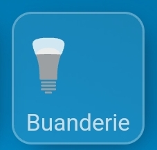
entity: light.lampe_buanderie_on_off
name: Buanderie
icon: custom
styles:
icon:
- top: '-2%'
- left: 3%
- width: 40%
- position: absolute
name:
- top: 80%
- left: 15%
- position: center
- color: rgba(240, 240, 240, 0.8)
card:
- font-size: 80%
- background-color: rgba(240, 240, 240, 0.1)
- border-radius: 15%
- border-style: solid
- border-color: rgba(240, 240, 240, 0.3)
- border-width: 1px
- box-shadow: true
- transition: true
custom_fields:
icon_hue:
- top: 18%
- left: 4.5%
- width: 45%
- position: absolute
custom_fields:
icon_hue: |
[[[
const state = entity.state === 'on' ? 'animate' : null;
return `
<svg viewBox="0 0 50 50">
<style>
@keyframes animate {
0% {
transform: scale(0.85);
}
20% {
transform: scale(1.1);
}
40% {
transform: scale(0.95);
}
60% {
transform: scale(1.03);
}
80% {
transform: scale(0.97);
}
100% {
transform: scale(1);
}
}
.animate {
animation: animate 0.8s;
transform-origin: center;
}
</style>
<path fill="#9da0a2" d="M27.4 47.3h-4.9s-.7.1-.7.8.4.9.7.9h4.9c.3 0 .7-.1.7-.9s-.7-.8-.7-.8zm3.3-2.9H19.3s-.8 0-.8.8.6.9.8.9h11.5c.2 0 .8-.1.8-.9-.1-.8-.9-.8-.9-.8zm0-3H19.3s-.8 0-.8.8.6.9.8.9h11.5c.2 0 .8-.1.8-.9-.1-.8-.9-.8-.9-.8zm0-2.9H19.3s-.8 0-.8.8.6.9.8.9h11.5c.2 0 .8-.1.8-.9s-.9-.8-.9-.8zm5.2-23.2c-3.3-5.3-7-5.6-10.9-5.6-3.8 0-8.4.4-10.9 5.6-.1.1-.1.3.1.7.4.8 3.3 7.2 3.2 18.8 0 1.1-.1 1.6 0 1.7 0 .1 0 .7 1.1.7h13c1 0 1-.5 1.1-.7v-1.7c-.1-11.6 2.8-18 3.2-18.8.1-.4.1-.5.1-.7"/>
<path class="${state}" fill="var(--button-card-light-color-no-temperature)" d="M14.1 15.3c3.4-.3 7-.4 10.9-.4 3.8 0 7.5.2 10.9.4.4-.4.7-.8.9-1.1C39 8.5 38.9 6.5 38.9 6c-.2-4.4-8.4-5-12.1-5h0-3.4c-3.7 0-12 .5-12.1 5 0 .5-.1 2.5 2.1 8.2 0 .3.3.8.7 1.1z"/>
</svg>
`;
]]]
aspect_ratio: 1/1
state:
- value: 'on'
styles:
card:
- background-color: rgba(255, 255, 255, 0.8)
- border: 1px rgba(80, 80, 80) solid
name:
- color: rgba(0, 0, 0, 0.6)
icon:
- color: var(--button-card-light-color-no-temperature)
hold_action:
action: more-info
styles: null
icon:
- top: '-2%'
- left: 3%
- width: 50%
- position: absolute
name:
- top: 80%
- left: 15%
- position: center
card:
- font-size: 100%
- border-radius: 15%
- box-shadow: true
- transition: true
https://forum.hacf.fr/t/mon-dashboard-guizmos/5704?u=guizmos
Le code est dispo sur mon Github 

T’as question ne serait pas la même qu’ici ? (va au moins voir ma réponse pour comprendre le fonctionnement…  )
)
https://forum.hacf.fr/t/modifier-lumieres-theme-de-mattias-persson/3439
Voila des exemples d’icônes animés.
Tu peux copier coller le code et modifier les entités pour faire des tests.
type: vertical-stack
cards:
- type: grid
title: Template
cards:
- type: custom:button-card
entity: switch.lumiere_salon
name: shade
icon: custom
styles:
icon:
- top: '-2%'
- left: 3%
- width: 18%
- position: absolute
name:
- top: 80%
- left: 15%
- position: center
- color: rgba(240, 240, 240, 0.8)
card:
- font-size: 100%
- background-color: rgba(240, 240, 240, 0.1)
- border-radius: 15%
- border-style: solid
- border-color: rgba(240, 240, 240, 0.3)
- border-width: 1px
- transition: true
custom_fields:
icon_shade:
- top: 18%
- left: 8%
- width: 40%
- position: absolute
custom_fields:
icon_shade: |
[[[
const state = entity.state === 'on' ? 'animate' : null;
return `
<svg viewBox="0 0 50 50">
<style>
@keyframes animate {
0% {
transform: scale(0.85);
}
20% {
transform: scale(1.1);
}
40% {
transform: scale(0.95);
}
60% {
transform: scale(1.03);
}
80% {
transform: scale(0.97);
}
100% {
transform: scale(1);
}
}
.animate {
animation: animate 0.8s;
transform-origin: center;
}
</style>
<path fill="#9da0a2" d="M26.4 25.6c.6-.3 1.1-.7 1.1-1.3L25 17.9l-2.5 6.4c0 .7.6 1.1 1.1 1.3v20.8h-5.5v2.7h13.7v-2.7h-5.5V25.6z"/>
<path class="${state}" fill="var(--button-card-light-color-no-temperature)" d="M24.6.9l-9.4.5c-.6.1-1.9 0-2.5 2.1s-2.4 9.1-4 16.9c-.2.7-.5 2-.5 2.3s-.4 1.6.9 1.6c.8.1 7.4.3 15.9.3 8.6 0 15.1-.3 15.9-.3 1.3-.1.9-1.3.9-1.6s-.3-1.6-.5-2.3c-1.6-7.8-3.4-14.8-4-16.9s-1.9-2-2.5-2.1c-1.6-.2-6.9-.4-9.4-.5"/>
</svg>
`;
]]]
aspect_ratio: 1/1
state:
- value: 'on'
styles:
card:
- background-color: rgba(255, 255, 255, 0.8)
- border: 1px rgba(80, 80, 80) solid
- box-shadow: >-
0px 0px 6px 3px
var(--button-card-light-color-no-temperature)
name:
- color: rgba(0, 0, 0, 0.6)
icon:
- color: var(--button-card-light-color-no-temperature)
- type: custom:button-card
entity: light.tz3000_hktqahrq_ts0001_2f2660fe_on_off
name: hue
icon: custom
styles:
icon:
- top: '-2%'
- left: 3%
- width: 18%
- position: absolute
name:
- top: 80%
- left: 15%
- position: center
- color: rgba(240, 240, 240, 0.8)
card:
- font-size: 100%
- background-color: rgba(240, 240, 240, 0.1)
- border-radius: 15%
- border-style: solid
- border-color: rgba(240, 240, 240, 0.3)
- border-width: 1px
- transition: true
custom_fields:
icon_hue:
- top: 18%
- left: 4.5%
- width: 40%
- position: absolute
custom_fields:
icon_hue: |
[[[
const state = entity.state === 'home' ? 'animate' : null;
return `
<svg viewBox="0 0 50 50">
<style>
@keyframes animate {
0% {
transform: scale(0.85);
}
20% {
transform: scale(1.1);
}
40% {
transform: scale(0.95);
}
60% {
transform: scale(1.03);
}
80% {
transform: scale(0.97);
}
100% {
transform: scale(1);
}
}
.animate {
animation: animate 0.8s;
transform-origin: center;
}
</style>
<path fill="#9da0a2" d="M27.4 47.3h-4.9s-.7.1-.7.8.4.9.7.9h4.9c.3 0 .7-.1.7-.9s-.7-.8-.7-.8zm3.3-2.9H19.3s-.8 0-.8.8.6.9.8.9h11.5c.2 0 .8-.1.8-.9-.1-.8-.9-.8-.9-.8zm0-3H19.3s-.8 0-.8.8.6.9.8.9h11.5c.2 0 .8-.1.8-.9-.1-.8-.9-.8-.9-.8zm0-2.9H19.3s-.8 0-.8.8.6.9.8.9h11.5c.2 0 .8-.1.8-.9s-.9-.8-.9-.8zm5.2-23.2c-3.3-5.3-7-5.6-10.9-5.6-3.8 0-8.4.4-10.9 5.6-.1.1-.1.3.1.7.4.8 3.3 7.2 3.2 18.8 0 1.1-.1 1.6 0 1.7 0 .1 0 .7 1.1.7h13c1 0 1-.5 1.1-.7v-1.7c-.1-11.6 2.8-18 3.2-18.8.1-.4.1-.5.1-.7"/>
<path class="${state}" fill="var(--button-card-light-color-no-temperature)" d="M14.1 15.3c3.4-.3 7-.4 10.9-.4 3.8 0 7.5.2 10.9.4.4-.4.7-.8.9-1.1C39 8.5 38.9 6.5 38.9 6c-.2-4.4-8.4-5-12.1-5h0-3.4c-3.7 0-12 .5-12.1 5 0 .5-.1 2.5 2.1 8.2 0 .3.3.8.7 1.1z"/>
</svg>
`;
]]]
aspect_ratio: 1/1
state:
- value: 'on'
styles:
card:
- background-color: rgba(255, 255, 255, 0.8)
- border: 1px rgba(80, 80, 80) solid
- box-shadow: 0px 0px 6px 3px var(--button-card-light-color)
name:
- color: rgba(0, 0, 0, 0.6)
icon:
- color: var(--button-card-light-color-no-temperature)
- type: custom:button-card
entity: binary_sensor.ping_dalg_pc
name: PC
icon: custom
styles:
icon:
- top: '-2%'
- left: 3%
- width: 18%
- position: absolute
name:
- top: 80%
- left: 15%
- position: center
- color: rgba(240, 240, 240, 0.8)
card:
- font-size: 100%
- background-color: rgba(240, 240, 240, 0.1)
- border-radius: 15%
- border-style: solid
- border-color: rgba(240, 240, 240, 0.3)
- border-width: 1px
- transition: true
custom_fields:
icon_imac:
- top: 13%
- left: 11%
- width: 45%
- position: absolute
- fill: |
[[[ return entity.state === 'on' ? '#72757c' : '#9da0a2'; ]]]
loader: |
<img src="/local/loader.svg" width="100%">
tap_action:
loader: |
[[[
if (entity !== undefined) {
let elt = this.shadowRoot;
const loader = (id, style, timeout) => {
if (elt.getElementById(id)) {
elt.getElementById(id).style.display = style;
window.setTimeout(() => {
elt.getElementById(id).style.display = timeout;
}, 20000)
}
};
loader('circle', 'none', 'initial');
loader('loader', 'initial', 'none');
}
]]]
custom_fields:
icon_imac: |
[[[
const state = entity.state === 'on' ? 'animate' : null;
return `
<svg viewBox="0 0 50 50">
<style>
@keyframes animate {
from {
opacity: 0.5;
transform: scale(0.6);
}
100% {
opacity: 1;
}
}
.animate {
animation: animate 0.8s cubic-bezier(0.25, 1, 0.5, 1);
transform-origin: center;
}
</style>
<path class="${state}" d="M31.9 44.5c-1-.3-1.9.4-1.9-3.7h-9.9c0 4.2-.9 3.4-1.9 3.7s-.2.7-.2.7h14.1s.8-.3-.2-.7zM47.6 4.8H2.5c-1.1 0-2 .9-2 2v30.1c0 1.1.9 2 2 2h45c1.1 0 2-.9 2-2v-30a1.95 1.95 0 0 0-1.9-2.1zm-.7 26.4H3.2V7.6H47v23.6z"/>
</svg>
`;
]]]
aspect_ratio: 1/1
state:
- value: 'on'
styles:
card:
- background-color: rgba(255, 255, 255, 0.8)
- border: 1px rgba(80, 80, 80) solid
- box-shadow: >-
0px 0px 6px 3px
var(--button-card-light-color-no-temperature)
name:
- color: rgba(0, 0, 0, 0.6)
icon:
- color: var(--button-card-light-color-no-temperature)
tap_action:
action: call-service
service: script.my_computer_wake
hold_action:
action: call-service
service: script.my_computer_shutdown
- type: custom:button-card
entity: switch.lumiere_salon
name: monitor
icon: custom
styles:
icon:
- top: '-2%'
- left: 3%
- width: 18%
- position: absolute
name:
- top: 80%
- left: 15%
- position: center
- color: rgba(240, 240, 240, 0.8)
card:
- font-size: 100%
- background-color: rgba(240, 240, 240, 0.1)
- border-radius: 15%
- border-style: solid
- border-color: rgba(240, 240, 240, 0.3)
- border-width: 1px
- transition: true
custom_fields:
icon_monitors:
- top: 13%
- left: 7%
- width: 45%
- position: absolute
custom_fields:
icon_monitors: |
[[[
if (entity.state === "on") {
return `
<svg viewBox="0 0 50 50">
<style>
@keyframes cone {
35% {
transform: scale(0.8);
animation-timing-function: cubic-bezier(0, 0.55, 0.45, 1);
}
36% {
transform: translateY(0%);
}
49% {
transform: scale(1.25);
}
63% {
transform: scale(0.85);
animation-timing-function: cubic-bezier(0, 0.55, 0.45, 1);
}
77% {
transform: scale(1.15);
animation-timing-function: cubic-bezier(0, 0.55, 0.45, 1);
}
95% {
transform: scale(1);
}
}
.cone {
animation: cone 1.4s;
transform-origin: center;
}
@keyframes speaker {
0% {
transform: scale(1);
}
40% {
transform: scale(1);
}
49% {
transform: scale(0.95);
}
63% {
transform: scale(1);
}
77% {
transform: scale(0.95);
}
100% {
transform: scale(1);
}
}
.speaker {
animation: speaker 1.3s;
transform-origin: center;
}
</style>
<g class="speaker">
<path fill="#686868" d="M35.8 46.9H14.2c-1.1 0-2-1-2-2.3V6.7c0-1.3.9-2.3 2-2.3h21.5c1.1 0 2 1 2 2.3v37.9c0 1.2-.9 2.3-1.9 2.3z"/>
<path fill="#2a2a2a" d="M39.2 1H10.8C9.4 1 8.3 2.1 8.2 3.5v42.9a2.65 2.65 0 0 0 2.6 2.6h28.3c1.4 0 2.5-1.2 2.6-2.6V3.5c0-1.4-1.1-2.5-2.5-2.5zM25 7c1.3 0 2.4 1.1 2.4 2.4s-1.1 2.4-2.4 2.4-2.4-1.1-2.4-2.4C22.5 8 23.6 7 25 7zm10.2 35.5l-.4 1.9s-.2.6-.6.6H15.8c-.4 0-.6-.6-.6-.6s-.1-1.1-.4-1.9.6-.9.6-.9h19.3c0-.1.8-.1.5.9z"/>
</g>
<path class="cone" fill="#e5dd00" d="M25 15.7c-6.2 0-11.3 5.1-11.3 11.3S18.8 38.3 25 38.3 36.3 33.2 36.3 27c-.1-6.3-5.1-11.3-11.3-11.3zm0 14.5a3.33 3.33 0 0 1-3.3-3.3 3.33 3.33 0 0 1 3.3-3.3 3.33 3.33 0 0 1 3.3 3.3c-.1 1.9-1.5 3.3-3.3 3.3z"/>
</svg>
`;
} else {
return `
<svg viewBox="0 0 50 50">
<path fill="#9da0a2" d="M25 18.6c-4.6 0-8.4 3.8-8.4 8.4s3.8 8.4 8.4 8.4 8.4-3.8 8.4-8.4-3.7-8.4-8.4-8.4zm0 11.7a3.33 3.33 0 0 1-3.3-3.3 3.33 3.33 0 0 1 3.3-3.3 3.33 3.33 0 0 1 3.3 3.3c0 1.8-1.4 3.3-3.3 3.3zM39.2 1H10.9C9.4 1 8.3 2.1 8.3 3.6v42.9a2.65 2.65 0 0 0 2.6 2.6h28.3a2.65 2.65 0 0 0 2.6-2.6v-43C41.7 2 40.5.9 39.2 1zM25 7c1.3 0 2.4 1.1 2.4 2.4s-1.1 2.4-2.4 2.4-2.4-1.1-2.4-2.4S23.7 7 25 7zm10.3 35.5l-.4 1.9s-.2.6-.6.6H15.8c-.4 0-.6-.6-.6-.6l-.4-1.9c-.2-.9.6-.9.6-.9h19.3s.9.1.6.9zM25 38.2c-6.2 0-11.3-5.1-11.3-11.3a11.29 11.29 0 1 1 22.6 0c.1 6.3-5 11.3-11.3 11.3z"/>
</svg>
`;
}
]]]
aspect_ratio: 1/1
state:
- value: 'on'
styles:
card:
- background-color: rgba(255, 255, 255, 0.8)
- border: 1px rgba(80, 80, 80) solid
- box-shadow: >-
0px 0px 6px 3px
var(--button-card-light-color-no-temperature)
name:
- color: rgba(0, 0, 0, 0.6)
icon:
- color: var(--button-card-light-color-no-temperature)
- type: custom:button-card
entity: switch.lumiere_salon
name: lamp
icon: custom
styles:
icon:
- top: '-2%'
- left: 3%
- width: 18%
- position: absolute
name:
- top: 80%
- left: 15%
- position: center
- color: rgba(240, 240, 240, 0.8)
card:
- font-size: 100%
- background-color: rgba(240, 240, 240, 0.1)
- border-radius: 15%
- border-style: solid
- border-color: rgba(240, 240, 240, 0.3)
- border-width: 1px
- transition: true
custom_fields:
icon_lamp:
- top: 13%
- left: 4.5%
- width: 47%
- position: absolute
custom_fields:
icon_lamp: |
[[[
const state = entity.state === 'on' ? 'animate' : null;
return `
<svg viewBox="0 0 50 50">
<style>
@keyframes animate {
0% {
transform: scale(0.85);
}
20% {
transform: scale(1.1);
}
40% {
transform: scale(0.95);
}
60% {
transform: scale(1.03);
}
80% {
transform: scale(0.97);
}
}
.animate {
animation: animate 0.8s;
transform-origin: center;
}
</style>
<path fill="#9da0a2" d="M26.5 21.8l3.8-6.1H19.7l3.8 6.1c-5 .7-6.3 5.8-5.7 10.2.7 5.1 3.2 10.1 5.7 14.4H19v2.5h11.8v-2.5h-4.5C29 42 31.4 37 32.1 32c.6-4.4-.6-9.4-5.6-10.2zm3.1 9.1c-.3 4.3-2.3 8.7-4.4 12.4l-.2.1v.1-.1c-1.8-3-3.3-6.4-4.1-9.7-.7-3.1-1-7.2 2.7-8.4 1.4-.5 3.1-.1 4.2.8 1.6 1 1.8 3 1.8 4.8z"/>
<path class="${state}" fill="var(--button-card-light-color-no-temperature)" d="M38.1 20L35.7 3.8c-.3-1.9-.4-1.7-.6-2-.9-.6-2.3-.7-2.3-.7H17.4s-1.4 0-2.3.7c-.2.3-.3.1-.6 2C14 5.7 11.9 20 11.9 20s5.8.3 13.4.3h0c7.3 0 12.8-.3 12.8-.3z"/>
</svg>
`;
]]]
aspect_ratio: 1/1
state:
- value: 'on'
styles:
card:
- background-color: rgba(255, 255, 255, 0.8)
- border: 1px rgba(80, 80, 80) solid
- box-shadow: >-
0px 0px 6px 3px
var(--button-card-light-color-no-temperature)
name:
- color: rgba(0, 0, 0, 0.6)
icon:
- color: var(--button-card-light-color-no-temperature)
- type: custom:button-card
entity: switch.lumiere_salon
name: WC
icon: custom
styles:
icon:
- top: '-2%'
- left: 3%
- width: 18%
- position: absolute
name:
- top: 80%
- left: 15%
- position: center
- color: rgba(240, 240, 240, 0.8)
card:
- font-size: 100%
- background-color: rgba(240, 240, 240, 0.1)
- border-radius: 15%
- border-style: solid
- border-color: rgba(240, 240, 240, 0.3)
- border-width: 1px
- transition: true
custom_fields:
icon_wc:
- top: 15%
- left: 6.5%
- width: 45%
- position: absolute
custom_fields:
icon_wc: |
[[[
const state = entity.state === 'on' ? 'animate_on' : 'animate_off';
return `
<svg viewBox="0 0 50 50" fill="var(--button-card-light-color-no-temperature)">
<style>
@keyframes animate_on {
0% {
transform: rotateZ(0deg) translate(0%, 0%);
}
100% {
transform: rotateZ(-90deg) translate(-1.5%, 0%);
}
}
@keyframes animate_off {
0% {
transform: rotateZ(-90deg) translate(-1.5%, 0%);
}
45% {
transform: rotateZ(-40deg);
}
55% {
transform: rotateZ(0deg);
}
65% {
transform: rotateZ(-15deg);
}
75% {
transform: rotateZ(0deg);
}
85% {
transform: rotateZ(-5deg);
}
95% {
transform: rotateZ(0deg);
}
}
.animate_on {
animation: animate_on 0.4s;
animation-fill-mode: forwards;
transform-origin: 45% 41%;
transition-timing-function: cubic-bezier(0.85, 0, 0.15, 1);
}
.animate_off {
animation: animate_off 1.05s linear;
animation-delay: 0.05s;
animation-fill-mode: both;
transform-origin: 45% 41%;
}
</style>
<path d="M12.9 1.2h2.5c1.6 0 2.9 1.3 2.9 2.9v18.6c0 1.4 1.1 2.5 2.4 2.5h20.5c.5 0 1 .4.9 1-.1 2.6-1.2 9.6-10.2 11v7.6c0 .2.2.4.4.4h1.5a1.58 1.58 0 0 1 1.6 1.6v.3a1.58 1.58 0 0 1-1.6 1.6H11a1.58 1.58 0 0 1-1.6-1.6v-.3a1.58 1.58 0 0 1 1.6-1.6h1.6c.2 0 .4-.2.4-.4v-7.6s-5.2-.3-5.2-5.9V4.2c0-1.6 1.3-2.9 2.9-2.9l2.2-.1c0 .1 0 0 0 0z"/>
<path class="${state}" d="M22.3 18.8h18.3a1.58 1.58 0 0 1 1.6 1.6v.6a1.58 1.58 0 0 1-1.6 1.6h-19c-.4 0-.7-.3-.8-.7v-2.3c0-.4.3-.7.7-.8h.8z"/>
</svg>
`;
]]]
aspect_ratio: 1/1
state:
- value: 'on'
styles:
card:
- background-color: rgba(255, 255, 255, 0.8)
- border: 1px rgba(80, 80, 80) solid
- box-shadow: >-
0px 0px 6px 3px
var(--button-card-light-color-no-temperature)
name:
- color: rgba(0, 0, 0, 0.6)
icon:
- color: var(--button-card-light-color-no-temperature)
- type: custom:button-card
entity: switch.lumiere_salon
name: fan2
icon: custom
styles:
icon:
- top: '-2%'
- left: 3%
- width: 18%
- position: absolute
name:
- top: 80%
- left: 15%
- position: center
- color: rgba(240, 240, 240, 0.8)
card:
- font-size: 100%
- background-color: rgba(240, 240, 240, 0.1)
- border-radius: 15%
- border-style: solid
- border-color: rgba(240, 240, 240, 0.3)
- border-width: 1px
- transition: true
custom_fields:
icon_fan2:
- top: 13%
- left: 11%
- width: 45%
- position: absolute
custom_fields:
icon_fan2: |
[[[
const path = `
<circle cx="25" cy="25" r="6.6"/>
<path d="M31.9 30.4c-.5.6-1.1 1.1-1.7 1.5-1.4 1.1-3.2 1.7-5.2 1.7-2.3 0-4.5-.9-6-2.4-.9 1.1-1.6 2.3-2.3 3.2l-4.9 5.4c-1.8 2.7.3 5.6 2.5 7 3.9 2.4 9.8 3.1 14.1 1.9 4.6-1.3 7.9-4.7 7.4-9.7-.2-3.4-1.9-6-3.9-8.6zM17 28.3c-.4-1-.6-2.1-.6-3.3a8.7 8.7 0 0 1 6.4-8.4l-1.6-3.5L19 6.2c-1.5-2.8-5-2.5-7.3-1.2-4 2.2-7.5 6.9-8.7 11.3-1.2 4.6.2 9.2 4.7 11.3 3.1 1.3 6.1 1.2 9.3.7zm26.9-17.6c-3.3-3.4-8-4.6-12.1-1.8-2.8 1.8-4.2 4.6-5.5 7.5 4.2.6 7.4 4.2 7.4 8.6 0 .9-.1 1.7-.4 2.5 1.3.2 2.8.3 3.8.4 2.3.4 4.7 1.3 7.1 1.7 3.2.3 4.7-3 4.8-5.6.3-4.6-1.9-10.1-5.1-13.3z"/>
`;
const style = `
<svg viewBox="0 0 50 50">
<style>
@keyframes rotate {
0% {
visibility: visible;
transform: rotate(0deg);
}
100% {
transform: rotate(1080deg);
}
}
.start {
animation: rotate 2.8s ease-in;
transform-origin: center;
fill: #5daeea;
visibility: hidden;
}
.on {
animation: rotate 1.8s linear infinite;
transform-origin: center;
fill: #5daeea;
animation-delay: 2.8s;
visibility: hidden;
}
.end {
animation: rotate 2.8s;
transform-origin: center;
fill: #9ca2a5;
animation-timing-function: cubic-bezier(0.61, 1, 0.88, 1);
}
</style>
`;
if (entity.state === 'on') {
return `${style}<g class="start">${path}</g><g class="on">${path}</g></svg>`;
} else {
return `${style}<g class="end">${path}</g></svg>`;
}
]]]
aspect_ratio: 1/1
state:
- value: 'on'
styles:
card:
- background-color: rgba(255, 255, 255, 0.8)
- border: 1px rgba(80, 80, 80) solid
- box-shadow: >-
0px 0px 6px 3px
var(--button-card-light-color-no-temperature)
name:
- color: rgba(0, 0, 0, 0.6)
icon:
- color: var(--button-card-light-color-no-temperature)
- type: custom:button-card
entity: switch.lumiere_salon
name: spot
icon: custom
styles:
icon:
- top: '-2%'
- left: 3%
- width: 18%
- position: absolute
name:
- top: 80%
- left: 15%
- position: center
- color: rgba(240, 240, 240, 0.8)
card:
- font-size: 100%
- background-color: rgba(240, 240, 240, 0.1)
- border-radius: 15%
- border-style: solid
- border-color: rgba(240, 240, 240, 0.3)
- border-width: 1px
- transition: true
custom_fields:
icon_spot:
- top: 18%
- left: 8%
- width: 40%
- position: absolute
custom_fields:
icon_spot: |
[[[
const state = entity.state === 'on' ? 'animate_on' : 'animate_off';
return `
<svg viewBox="0 0 50 50">
<style>
@keyframes animate_on {
0% {
transform: rotateZ(0deg);
animation-timing-function: cubic-bezier(0.7, 0, 0.84, 0);
}
70% {
transform: rotateZ(-15deg);
animation-timing-function: cubic-bezier(0.16, 1, 0.3, 1);
}
75% {
transform: rotateZ(-15deg);
animation-timing-function: cubic-bezier(0.16, 1, 0.3, 1);
}
88% {
transform: rotateZ(-11deg);
}
100% {
transform: rotateZ(-15deg);
}
}
.animate_on {
animation: animate_on 0.7s;
transform-origin: 40% 20%;
animation-fill-mode: forwards;
animation-delay: -0.1s;
}
@keyframes animate_off {
0% {
transform: rotateZ(-15deg);
animation-timing-function: cubic-bezier(0.7, 0, 0.84, 0);
}
70% {
transform: rotateZ(0deg);
animation-timing-function: cubic-bezier(0.16, 1, 0.3, 1);
}
75% {
transform: rotateZ(0deg);
animation-timing-function: cubic-bezier(0.16, 1, 0.3, 1);
}
88% {
transform: rotateZ(-4deg);
}
100% {
transform: rotateZ(0deg);
}
}
.animate_off {
animation: animate_off 0.7s;
transform-origin: 40% 20%;
animation-fill-mode: forwards;
}
</style>
<path style="clip-path: url(#mask);" fill="#9da0a2" d="M40.5.8H17.1c-.1 0-.1 0-.1.1A3.12 3.12 0 0 0 20.1 4h6.1c.1 0 .1 0 .1.1v7.4L18 19.1l3.6 3.5 9.1-8.6c.4-.4.6-1 .7-1.6V4c0-.1 0-.1.1-.1h6c1.7.1 3.1-1.3 3-3.1z"/>
<defs>
<clipPath id="mask">
<path class="${state}" d="M0 9.1h24l8.3 8.8H50V-9H0z"/>
</clipPath>
</defs>
<path class="${state}" fill="var(--button-card-light-color-no-temperature)" d="M25.5 46.4s1.4.5 10.4-8.2c.5-.4 6.3-6.3 5.8-7.1-.7-.8-18.6-19.5-18.6-19.5s-.6-.9-8.6 6.4c-.6.5-8.7 8-7.7 9.1l18.7 19.3z"/>
</svg>
`;
]]]
aspect_ratio: 1/1
state:
- value: 'on'
styles:
card:
- background-color: rgba(255, 255, 255, 0.8)
- border: 1px rgba(80, 80, 80) solid
- box-shadow: >-
0px 0px 6px 3px
var(--button-card-light-color-no-temperature)
name:
- color: rgba(0, 0, 0, 0.6)
icon:
- color: var(--button-card-light-color-no-temperature)
- type: custom:button-card
entity: switch.lumiere_salon
name: ampoule
icon: custom
styles:
icon:
- top: '-2%'
- left: 3%
- width: 18%
- position: absolute
name:
- top: 80%
- left: 15%
- position: center
- color: rgba(240, 240, 240, 0.8)
card:
- font-size: 100%
- background-color: rgba(240, 240, 240, 0.1)
- border-radius: 15%
- border-style: solid
- border-color: rgba(240, 240, 240, 0.3)
- border-width: 1px
- transition: true
custom_fields:
icon_ampoule:
- top: 13%
- left: 11%
- width: 38%
- position: absolute
custom_fields:
icon_ampoule: >
[[[ const state = entity.state === 'on' ? 'animate' : null; return
` <svg viewBox="0 0 50 50"> <style>@keyframes animate{0%{transform:
scale(0.85);}20%{transform: scale(1.1);}40%{transform:
scale(0.95);}60%{transform: scale(1.03);}80%{transform:
scale(0.97);}100%{transform: scale(1);}}.animate{animation: animate
0.8s; transform-origin: center;}</style> <path fill="rgba(180, 180,
180)" d="M 29.147 48.105 L 21.281 48.105 C 21.281 48.105 20.157
48.173 20.157 48.629 C 20.157 49.087 20.801 49.218 21.281 49.218 L
29.147 49.218 C 29.629 49.218 30.271 49.152 30.271 48.629 C 30.271
48.105 29.147 48.105 29.147 48.105 Z M 34.446 46.209 L 16.144 46.209
C 16.144 46.209 14.857 46.209 14.857 46.733 C 14.857 47.256 15.822
47.319 16.144 47.319 L 34.606 47.319 C 34.927 47.319 35.89 47.256
35.89 46.733 C 35.729 46.209 34.446 46.209 34.446 46.209 Z M 34.446
44.248 L 16.144 44.248 C 16.144 44.248 14.857 44.248 14.857 44.771 C
14.857 45.295 15.822 45.359 16.144 45.359 L 34.606 45.359 C 34.927
45.359 35.89 45.295 35.89 44.771 C 35.729 44.248 34.446 44.248
34.446 44.248 Z M 34.446 42.351 L 25.295 42.351 L 16.144 42.351 C
16.144 42.351 14.857 42.351 14.857 42.874 C 14.857 43.397 15.822
43.463 16.144 43.463 L 34.606 43.463 C 34.927 43.463 35.89 43.397
35.89 42.874 C 35.89 42.351 34.446 42.351 34.446 42.351 Z M 42.794
27.181 C 37.494 23.714 31.556 23.519 25.294 23.519 C 19.194 23.519
11.809 23.781 7.796 27.181 C 7.635 27.246 7.635 27.379 7.956 27.639
C 8.597 28.161 13.252 32.346 13.094 39.932 C 13.094 40.651 12.932
40.978 13.094 41.044 C 13.094 41.109 13.094 41.5 14.857 41.5 L
35.729 41.5 C 37.334 41.5 37.334 41.174 37.494 41.044 L 37.494
39.932 C 37.334 32.346 41.99 28.161 42.633 27.639 C 42.794 27.379
42.794 27.31 42.794 27.181" style=""/> <path fill="rgba(150, 150,
150)" d="M 6.828 35.24 C 14.261 41.681 38.81 39.96 43.204 35.24 C
43.872 34.362 44.375 33.484 44.707 32.825 C 48.372 20.309 48.215
15.922 48.215 14.824 C 47.874 5.16 34.192 3.846 28.021 3.846 L
22.347 3.846 C 16.172 3.846 2.321 4.943 2.152 14.824 C 2.152 15.922
1.983 20.309 5.66 32.825 C 5.66 33.484 6.158 34.582 6.828 35.24 Z"
style=""/> <path class="${state}"
fill="var(--button-card-light-color-no-temperature)" d="M 7.783
34.174 C 14.751 40.14 37.764 38.546 41.882 34.174 C 42.509 33.361
42.981 32.547 43.292 31.937 C 46.727 20.344 46.58 16.28 46.58 15.265
C 46.26 6.312 33.433 5.093 27.65 5.093 L 22.332 5.093 C 16.543 5.093
3.559 6.11 3.4 15.265 C 3.4 16.28 3.241 20.344 6.688 31.937 C 6.688
32.547 7.156 33.564 7.783 34.174 Z" style=""/> </svg> `; ]]]
aspect_ratio: 1/1
state:
- value: 'on'
styles:
card:
- background-color: rgba(255, 255, 255, 0.8)
- border: 1px rgba(80, 80, 80) solid
- box-shadow: >-
0px 0px 6px 3px
var(--button-card-light-color-no-temperature)
name:
- color: rgba(0, 0, 0, 0.6)
icon:
- color: var(--button-card-light-color-no-temperature)
- type: custom:button-card
entity: switch.lumiere_salon
name: closet
icon: custom
styles:
icon:
- top: '-2%'
- left: 3%
- width: 18%
- position: absolute
name:
- top: 80%
- left: 15%
- position: center
- color: rgba(240, 240, 240, 0.8)
card:
- font-size: 100%
- background-color: rgba(240, 240, 240, 0.1)
- border-radius: 15%
- border-style: solid
- border-color: rgba(240, 240, 240, 0.3)
- border-width: 1px
- transition: true
custom_fields:
icon_closet:
- top: 15%
- left: 5%
- width: 45%
- position: absolute
custom_fields:
icon_closet: |
[[[
const state = entity.state === 'on' ? 'door' : 'door reverse';
const opacity = entity.state === 'on' ? 'room' : 'room reverse';
return `
<svg viewBox="0 0 50 50">
<style>
.door {
animation: door 0.4s cubic-bezier(0.250, 0.460, 0.450, 0.940) both;
}
.room {
animation: room 0.4s cubic-bezier(0.250, 0.460, 0.450, 0.940) both;
}
.reverse {
animation-direction: reverse;
}
@keyframes door {
0% {
transform: none;
fill: #9da0a2;
}
100% {
transform: skewY(10deg) translate(4.5%, -3.9%) scaleX(0.8);
fill: #b68349;
}
}
@keyframes room {
0% {
opacity: 0;
}
100% {
opacity: 1;
}
}
</style>
<path class="${opacity}" d="M11.4,1.4h27.2v43.1H11.4V1.4z" fill="#bcbcbc"/>
<path class="${state}" d="M11.4 1.4v43.1h27.2V1.4H11.4zm23 23.4c0 1.1-.9 1.9-1.9 1.9h0c-1.1 0-1.9-.9-1.9-1.9V21c0-1.1.9-1.9 1.9-1.9h0c1.1 0 1.9.9 1.9 1.9v3.8z"/>
</svg>
`;
]]]
aspect_ratio: 1/1
state:
- value: 'on'
styles:
card:
- background-color: rgba(255, 255, 255, 0.8)
- border: 1px rgba(80, 80, 80) solid
- box-shadow: >-
0px 0px 6px 3px
var(--button-card-light-color-no-temperature)
name:
- color: rgba(0, 0, 0, 0.6)
icon:
- color: var(--button-card-light-color-no-temperature)
- type: custom:button-card
entity: sensor.lumi_lumi_weather_temperature
show_name: false
show_state: true
show_icon: false
styles:
state:
- color: rgba(240, 240, 240, 0.8)
- font-size: 100%
- top: 75%
- left: 24%
- position: absolute
card:
- font-size: 100%
- background-color: rgba(240, 240, 240, 0.1)
- border-radius: 15%
- border-style: solid
- border-color: rgba(240, 240, 240, 0.3)
- border-width: 1px
- transition: true
custom_fields:
icon_temp:
- top: 18%
- left: 10%
- width: 45%
- position: absolute
custom_fields:
icon_temp: |
<svg viewBox="10 5 50 50">
<style>@keyframes animate{0%{transform: scale(0.85);}20%{transform: scale(1.1);}40%{transform: scale(0.95);}60%{transform: scale(1.03);}80%{transform: scale(0.97);}100%{transform: scale(1);}}.animate{animation: animate 0.8s; transform-origin: center;}</style>
<path fill="#9da0a2" d="M41.74 10.852v2h-7.75v-2zm-3.25 4.36h-4.5v2h4.5zm-4.5 6.36h7.75v-2h-7.75zm4.5 2.36h-4.5v2h4.5zm-4.5 6.36h7.75v-2h-7.75zM35.2 41.685A10.14 10.14 0 0 1 25.074 51.81a10.14 10.14 0 0 1-10.125-10.125c0-3.618 1.9-6.906 5-8.725V10.006c0-2.826 2.3-5.125 5.125-5.125s5.125 2.3 5.125 5.125V32.96c3.1 1.817 5 5.106 5 8.725zm-2 0c0-3.07-1.706-5.845-4.453-7.24l-.547-.278v-24.16a3.13 3.13 0 0 0-3.125-3.125 3.13 3.13 0 0 0-3.125 3.125v24.16l-.547.278a8.09 8.09 0 0 0-4.453 7.24c0 4.48 3.645 8.125 8.125 8.125s8.125-3.645 8.125-8.125zm-1.666 0a6.47 6.47 0 0 1-6.459 6.458 6.47 6.47 0 0 1-6.458-6.458 6.46 6.46 0 0 1 4.796-6.233l.37-.1v-22.23h2.583v22.23l.37.1a6.46 6.46 0 0 1 4.796 6.233zm-6.14-4.305c-.154-.684-.842-1.134-1.543-.974a5.31 5.31 0 0 0-4.158 5.207 1.29 1.29 0 0 0 2.58 0c0-1.277.902-2.41 2.147-2.7.692-.16 1.13-.85.974-1.543z"/>
</svg>
aspect_ratio: 1/1
- type: custom:button-card
entity: light.tz3000_hktqahrq_ts0001_2f2660fe_on_off
name: ps5
icon: custom
styles:
name:
- top: 80%
- left: 15%
- position: center
- color: rgba(240, 240, 240, 0.8)
card:
- font-size: 100%
- background-color: rgba(240, 240, 240, 0.1)
- border-radius: 15%
- border-style: solid
- border-color: rgba(240, 240, 240, 0.3)
- border-width: 1px
- transition: true
custom_fields:
icon_ps5:
- top: 13%
- left: 11%
- width: 45%
- position: absolute
custom_fields:
icon_ps5: |
[[[
if (entity.state === 'on') {
return `
<svg viewBox="0 0 50 50">
<style>
@keyframes animate {
50% {
transform: translateY(0);
}
100% {
transform: translateY(-45%);
}
}
.animate {
animation: animate 2s cubic-bezier(0.550, 0.085, 0.680, 0.530) both;
}
</style>
<g style="clip-path: url(#mask);">
<g class="animate">
<path fill="#00aa9e" d="M49.2 38.9l-75.6-25.1v7.4l75.6 25.2z"/>
<path fill="#f3c202" d="M49.2 46.4l-75.6-25.2v7.5l75.6 25.1z"/>
<path fill="#326db3" d="M49.2 53.8l-75.6-25.1V51l75.6 25.1zm0-22.3L-26.4 6.4v7.4l75.6 25.1z"/>
</g>
</g>
<defs>
<clipPath id="mask">
<path d="M47.5 33.2c-.5-2.2-3.9-3.5-9.1-3.9-3.8-.3-7.5.6-11.1 1.9l-.6.2v-5.7l-5.7.8-4.6 1.6L6 31.9h-.1c-1.9.7-3.8 2.2-3.7 4.2.1 2.1 4.7 2.6 8.2 3.2 3.3.6 6.2.2 8.9-.7l7.3 4.8L33 41l10.7-4h.1c2.8-1 4-2.5 3.7-3.8zm-31.3 2l-3.6 1.3c-2.2.8-4.1-1.1-2.1-1.9l1.7-.6 7.2-2.7v2.8l-3.2 1.1zm22.5-1.1l-1.9.7-10.2 3.7V36l6.5-2.4 3.8-1.3c4-.9 5.6.5 1.8 1.8z"/>
</clipPath>
</defs>
<path fill="#de0029" d="M26.7 14.6v28.7l-7.3-2.5V7.1l9.3 2.6c6 1.7 9.6 5 9.6 10.7-.1 6.7-3 9.4-8.7 7.6V14.9c-.1-1.6-2.9-1.7-2.9-.3h0z"/>
</svg>
`;
} else {
return `
<svg viewBox="0 0 50 50">
<path fill="#9da0a2" d="M43.8 37h-.1l-10.6 4-4.2 1.6v-4.9l8-2.9 1.9-.7c3.8-1.3 2.2-2.7-1.8-1.9l-3.8 1.3-4.3 1.6v-4.5c3.1-1 6.3-1.6 9.5-1.4 5.3.4 8.7 1.6 9.1 3.9.3 1.4-.9 2.9-3.7 3.9zm-26.7-2.1l-.9.3-3.6 1.3c-2.2.8-4.1-1.1-2.1-1.9l1.7-.6 5-1.9v-4.2l-.6.2L6 31.9h-.1c-1.9.7-3.8 2.2-3.7 4.2.1 2.1 4.7 2.6 8.2 3.2 2.4.4 4.6.3 6.7-.1v-4.3zm12.4-20V28c5.7 1.7 8.7-.9 8.7-7.6.1-5.7-3.6-9-9.6-10.7l-9.3-2.6v33.8l7.2 2.5.1.1V14.6c.1-1.4 2.9-1.3 2.9.3z"/>
</svg>
`;
}
]]]
aspect_ratio: 1/1
state:
- value: 'on'
styles:
card:
- background-color: rgba(255, 255, 255, 0.8)
- border: 1px rgba(80, 80, 80) solid
- box-shadow: >-
0px 0px 6px 3px
var(--button-card-light-color-no-temperature)
name:
- color: rgba(0, 0, 0, 0.6)
icon:
- color: var(--button-card-light-color-no-temperature)
- type: custom:button-card
entity: switch.dalg_s10e
name: closet
icon: custom
styles:
icon:
- top: '-2%'
- left: 3%
- width: 18%
- position: absolute
name:
- top: 80%
- left: 15%
- position: center
- color: rgba(240, 240, 240, 0.8)
card:
- font-size: 100%
- background-color: rgba(240, 240, 240, 0.1)
- border-radius: 15%
- border-style: solid
- border-color: rgba(240, 240, 240, 0.3)
- border-width: 1px
- transition: true
custom_fields:
icon_away:
- top: 15%
- left: 5%
- width: 45%
- position: absolute
custom_fields:
icon_away: |
[[[
const state = entity.state === 'on' ? 'animate' : null;
return `
<svg viewBox="0 0 50 50">
<style>
@keyframes animate {
10%,
20%,
100% {
transform: rotateZ(0deg);
}
30%,
50%,
70% {
transform: rotateZ(7deg);
}
90% {
transform: rotateZ(3deg);
}
40%,
60%,
80% {
transform: rotateZ(-7deg);
}
}
.animate {
animation: animate 1.35s cubic-bezier(0.5, 1, 0.89, 1);
animation-fill-mode: both;
transform-origin: 70% 80%;
animation-delay: 0s;
}
</style>
<path class="${state}" d="M32.1 18.4s.3-1.6.7-2.1c.3-.6.9-1.4 1.6-1.8.6-.4 1.1-.7 1.4-.7s.7-.1 1 .1.6.4.8 1.3l.3 2.7.1 2.4.2 4.1c0 .3.2 3.1.2 3.3s.2 2.7.2 3.2l-.1 2.5c.1 1.6.5 3.1-.2 4.6-.6 1.4-1.7 2.7-2.9 3.6-.5.4-1.9 1.3-2.9 1.7-1.1.5-2.2.8-3.3 1.1-.5.1-1.4.4-2.3.3s-1.8-.6-2.1-1l-1.6-2.3c-.6-.8-2.1-2.3-2.3-2.5l-2.7-2.8c-.2-.2-2.7-3.5-2.9-3.8l-3.1-4.7-1.8-3.2-1.5-2.8-.9-1.8c-.1-.2-.3-1.1-.2-1.4.3-1.2 1.4-1.4 2.3-.7.3.2.9 1 1.1 1.3s6.1 8.1 6.1 8.1c.2.3.7.3.9 0s-.1-.7-.2-.9c-.4-.6-8.3-11.5-8.3-11.5s-.6-.9-.7-1.1c-.3-1.1 0-2.3 1.1-2.7s1.9.3 2.6 1.1c.3.3 8.3 11.5 8.3 11.5.2.2.3.3.5.3.3 0 .5-.4.4-.7-.1-.2-.5-.9-.5-.9L11.8 9c-.6-1-.9-2-.1-3 .7-.8 2.2-1.3 3-.2.3.3 10.1 14.3 10.1 14.3.2.2.5.4.7.3.5-.1.3-.7.1-1-.1-.2-8.4-11.8-8.4-11.8-.4-.9-.6-2 .2-2.8 1-1.1 2.5-.5 3.3.5.2.3 1 1.4 1 1.4l2.7 3.7c.1.2 3.4 4.4 3.8 4.8.9 1.1 1.8 2.2 2.7 3.2l.5.5c.1.1.1.4.1.8 0 1.3.1 2.6.1 3.9 0 .2.1.4.2.6.3.3.6.1.7-.2.1-.2 0-2.4 0-2.7-.3-.3-.5-1.3-.4-2.9zM12.2 46.9s-2.8-.8-4.8-2.7-2.6-2.7-2.8-3-1.8-3-2-3.6c-.2-.5-.2-.7.2-1 .4-.4 1-.5 1.3.1.1.2.4 1 .5 1.2s1 1.9 1.7 2.8 1.6 2.2 4.4 3.8c.6.3 1.2.6 1.9.9.3.1.6.2.8.4.1.2.1.6-.1.8-.2.4-.7.4-1.1.3zM7.1 30.7l.9 3.1c.3.7 1.1 2.3 1.9 3.3s2.4 2.6 3.4 3.2 2 1.1 3 1.5c1 .3 1.1.4 1.2.5.3.4.2 1.2-.4 1.3-.2 0-1.2 0-1.8-.3L12 41.7c-.5-.4-3.9-3.1-5.1-6S5.3 31 5.2 30.4s-.2-1.1 0-1.4c.3-.4.9-.8 1.3-.3.2.3.3.6.3.9.1 0 .2.8.3 1.1zm26.8-25s.2-.1.5-.1.8.3 1.4.7 1.9 1 3.6 2.9 2.9 3.9 3.4 5.8c.5 1.8.8 3.1.9 5.5 0 .5.1 1.6 0 1.7-.2.5-.5.7-1 .7-.6 0-.7-.5-.7-1l-.1-2.9c-.1-.6-.3-1.9-.7-2.9-.3-1-.7-2.3-1.7-3.6-.9-1.3-2.1-2.8-3.2-3.5l-2.4-1.5c-.6-.6-.7-1.2 0-1.8zm4.9-2.5s.3-.2.5-.1c.2 0 .7.3.9.4s2.1 1.3 3.6 3c1.5 1.6 3.5 5.1 3.7 7.4.1.4.2.9 0 1-.2.2-.4.4-.7.4-.2 0-.5 0-.7-.1-.1-.2-.4-1.1-.4-1.3s-.6-2-1.1-3.1C44 9.7 43.5 8.5 42 7.1s-2.2-1.9-2.8-2.2-1.1-.6-1.1-1c.1-.3.3-.6.7-.7z"/>
</svg>
`;
]]]
aspect_ratio: 1/1
state:
- value: 'on'
styles:
card:
- background-color: rgba(255, 255, 255, 0.8)
- border: 1px rgba(80, 80, 80) solid
name:
- color: rgba(0, 0, 0, 0.6)
icon:
- color: var(--button-card-light-color-no-temperature)
- type: custom:button-card
entity: media_player.dalg_tv
triggers_update: input_boolean.nvidia_shield
name: tv
icon: custom
styles:
name:
- top: 80%
- left: 15%
- position: center
- color: rgba(240, 240, 240, 0.8)
card:
- font-size: 100%
- background-color: rgba(240, 240, 240, 0.1)
- border-radius: 15%
- border-style: solid
- border-color: rgba(240, 240, 240, 0.3)
- border-width: 1px
- transition: true
custom_fields:
icon_tv:
- top: 10%
- left: 10.7%
- width: 50%
- position: absolute
- fill: |
[[[ return entity.state === 'on' ? '#616161' : '#9da0a2'; ]]]
loader: |
<img src="/local/loader.svg" width="100%">
tap_action:
loader: |
[[[
if (entity !== undefined) {
let elt = this.shadowRoot;
const loader = (id, style, timeout) => {
if (elt.getElementById(id)) {
elt.getElementById(id).style.display = style;
window.setTimeout(() => {
elt.getElementById(id).style.display = timeout;
}, 20000)
}
};
loader('circle', 'none', 'initial');
loader('loader', 'initial', 'none');
}
]]]
custom_fields:
icon_tv: |
[[[
const boolean = states[entity.entity_id.replace(entity.entity_id.split('.')[0], 'input_boolean')].state;
const style = `
<style>
@keyframes animate_on {
from {
transform: scaleY(0);
}
to {
transform: scaleY(1);
}
}
.animate_on {
animation: animate_on 1s;
transform-origin: -100% 46%;
animation-fill-mode: forwards;
}
@keyframes animate_off {
from {
transform: scaleY(1);
}
to {
transform: scaleY(0);
}
}
.animate_off {
animation: animate_off 1s;
transform-origin: -100% 46%;
animation-fill-mode: forwards;
}
</style>
`;
const path = `
<path d="M46 9.2v27.5H4.1V9.2H46m2.4-2.4H1.6v32.3h46.7c.1 0 .1-32.3.1-32.3zM11.9 43.2h26.3c.6 0 1.1-.4 1.1-1v-.3c0-.6-.4-1.1-1-1.1H11.9c-.6 0-1.1.4-1.1 1v.3a1.11 1.11 0 0 0 1.1 1.1z"/>
`;
const gradient = `
<linearGradient id="A" gradientUnits="userSpaceOnUse" x1="5.401" y1="34.714" x2="43.817" y2="11.74">
<stop offset="0" stop-color="#64acb7"/>
<stop offset="1" stop-color="#7fdbe9"/>
</linearGradient>
`;
if (entity.state === 'off' && boolean === 'off') {
return `
<svg viewBox="0 0 50 50"> ${style} ${gradient}
<path class="animate_off" d="M2.9,8h44.3v29.9H2.9V8z" fill="url(#A)"/> ${path}
</svg>
`;
}
if (entity.state === 'on' && boolean === 'off') {
return `
<svg viewBox="0 0 50 50"> ${style} ${gradient}
<path d="M2.9,8h44.3v29.9H2.9V8z" fill="#20262890"/>
<path class="animate_on" d="M2.9,8h44.3v29.9H2.9V8z" fill="url(#A)"/> ${path}
</svg>
`;
}
if (entity.state === 'on' && boolean === 'on') {
return `
<svg viewBox="0 0 50 50"> ${gradient}
<path d="M2.9,8h44.3v29.9H2.9V8z" fill="url(#A)"/> ${path}
</svg>
`;
} else if (entity.state === 'off' && boolean === 'on') {
return `
<svg viewBox="0 0 50 50"> ${path} </svg>
`;
}
]]]
aspect_ratio: 1/1
state:
- value: idle
styles:
card:
- background-color: rgba(255, 255, 255, 0.8)
- border: 1px rgba(80, 80, 80) solid
- box-shadow: >-
0px 0px 6px 3px
var(--button-card-light-color-no-temperature)
name:
- color: rgba(0, 0, 0, 0.6)
icon:
- color: var(--button-card-light-color-no-temperature)
tap_action:
action: fire-dom-event
browser_mod:
command: popup
title: Philips
card:
type: entities
state_color: true
show_header_toggle: false
entities:
- entity: media_player.nvidia_shield
name: TV
icon: television
secondary_info: last-changed
- entity: light.dalg_tv
- type: custom:hui-element
card_type: horizontal-stack
card_mod:
style: |
#root {
justify-content: space-evenly;
margin: 1.4em -0.7em 0.7em 0;
}
cards:
- type: custom:button-card
entity: media_player.nvidia_shield
icon: mdi:volume-mute
show_name: false
tap_action:
action: call-service
service: media_player.volume_mute
service_data:
entity_id: |
[[[ return entity.entity_id; ]]]
is_volume_muted: >
[[[ return entity.attributes.is_volume_muted ===
'false' ? 'true' : 'false'; ]]]
styles:
card:
- color: '#9da0a2'
- border-radius: 0.6em
- width: 4em
- height: 3.7em
- background: '#FFFFFF10'
- type: custom:button-card
icon: mdi:volume-minus
tap_action:
action: call-service
service: media_player.volume_down
service_data:
entity_id: media_player.nvidia_shield
styles:
card:
- color: '#9da0a2'
- border-radius: 0.6em
- width: 4em
- height: 3.7em
- background: '#FFFFFF10'
- type: custom:button-card
icon: mdi:volume-plus
tap_action:
action: call-service
service: media_player.volume_up
service_data:
entity_id: media_player.nvidia_shield
styles:
card:
- color: '#9da0a2'
- border-radius: 0.6em
- width: 4em
- height: 3.7em
- background: '#FFFFFF10'
- type: custom:hui-element
card_type: horizontal-stack
card_mod:
style: |
#root {
justify-content: space-evenly;
margin: 1.4em -0.7em 0.7em 0;
}
cards:
- type: custom:button-card
entity: media_player.nvidia_shield
icon: mdi:skip-previous
show_name: false
tap_action:
action: call-service
service: media_player.previous_track
service_data:
entity_id: media_player.nvidia_shield
styles:
card:
- color: '#9da0a2'
- border-radius: 0.6em
- width: 4em
- height: 3.7em
- background: '#FFFFFF10'
- type: custom:button-card
entity: media_player.nvidia_shield
icon: mdi:play-pause
show_name: false
tap_action:
action: call-service
service: media_player.play_pause
service_data:
entity_id: media_player.nvidia_shield
styles:
card:
- color: '#9da0a2'
- border-radius: 0.6em
- width: 7em
- height: 3.7em
- background: '#FFFFFF10'
- type: custom:button-card
entity: media_player.nvidia_shield
icon: mdi:skip-next
show_name: false
tap_action:
action: call-service
service: media_player.next_track
service_data:
entity_id: media_player.nvidia_shield
styles:
card:
- color: '#9da0a2'
- border-radius: 0.6em
- width: 4em
- height: 3.7em
- background: '#FFFFFF10'
- type: custom:button-card
entity: media_player.nvidia_shield
name: Plex
icon: custom
styles:
icon:
- top: '-2%'
- left: 3%
- width: 18%
- position: absolute
name:
- top: 80%
- left: 15%
- position: center
- color: rgba(240, 240, 240, 0.8)
card:
- font-size: 100%
- background-color: rgba(240, 240, 240, 0.1)
- border-radius: 15%
- border-style: solid
- border-color: rgba(240, 240, 240, 0.3)
- border-width: 1px
- transition: true
custom_fields:
icon_plex:
- top: 14%
- left: 10%
- width: 40%
- position: absolute
custom_fields:
icon_plex: |
[[[
const state = entity.state === 'idle' ? 'animate' : null;
return `
<svg viewBox="0 0 50 50">
<style>
@keyframes animate {
0% {
transform: scale(0.85);
}
20% {
transform: scale(1.1);
}
40% {
transform: scale(0.95);
}
60% {
transform: scale(1.03);
}
80% {
transform: scale(0.97);
}
100% {
transform: scale(1);
}
}
.animate {
animation: animate 0.8s;
transform-origin: center;
}
</style>
<path d="M7.7.3h34.6c4.1 0 7.4 3.3 7.4 7.4v34.6c0 4.1-3.3 7.4-7.4 7.4H7.7c-4.1 0-7.4-3.3-7.4-7.4V7.7C.3 3.6 3.6.3 7.7.3z" fill="#282a2d"/>
<path d="M25,7.1H14.6L25,25L14.6,42.9H25L35.4,25L25,7.1z" fill="#e5a00d"/>
</svg>
`;
]]]
aspect_ratio: 1/1
state:
- value: 'on'
styles:
card:
- background-color: rgba(255, 255, 255, 0.8)
- border: 1px rgba(80, 80, 80) solid
- box-shadow: 0px 0px 6px 3px var(--button-card-light-color)
name:
- color: rgba(0, 0, 0, 0.6)
icon:
- color: var(--button-card-light-color-no-temperature)
tap_action:
action: fire-dom-event
browser_mod:
command: popup
title: Filmographie
hide_header: true
large: false
card:
type: custom:button-card
show_entity_picture: false
entity_picture: /local/Neon/tv.png
name: Filmographie
tap_action:
action: navigate
navigation_path: '#empty'
styles:
card:
- font-size: 12px
- border-radius: 10px
- background-color: transparent
- height: 500px
name:
- font-weight: lighter
- z-index: 2
- position: absolute
- top: 20px
- left: 20px
- font-size: 45px
- color: var(--secondary-text-color)
icon:
- width: 50%
img_cell:
- z-index: 2
- padding-bottom: 20px
custom_fields:
blur:
- z-index: 1
- border-radius: 10px
- top: 0%
- left: 0%
- width: 100%
- height: 100%
- position: absolute
- background-color: rgba(0, 0, 0, 0.1)
- backdrop-filter: blur(20px)
- '-webkit-backdrop-filter': blur(20px)
films:
- z-index: 3
- position: absolute
- left: 20px
- width: 50px
- top: 410px
series:
- z-index: 3
- left: 150px
- width: 50px
- position: absolute
- top: 410px
animation:
- z-index: 3
- left: 280px
- width: 50px
- position: absolute
- top: 410px
centre:
- z-index: 3
- left: 20px
- width: 350px
- position: absolute
- top: 100px
custom_fields:
blur: |
<div></div>
films:
card:
type: custom:button-card
name: Films
entity: input_select.stat_plex
show_state: false
show_icon: false
tap_action:
action: call-service
service: input_select.select_option
service_data:
option: Films2
entity_id: input_select.stat_plex
styles:
card:
- '--mdc-ripple-press-opacity': 0
- '--mdc-ripple-press-opacity': 0
- border-radius: 10px
- height: 70px
- width: 100px
- background: rgba(240, 240, 240, 0.1)
name:
- color: white
- font-weight: bold
- font-size: 12px
- justify-self: center
series:
card:
type: custom:button-card
name: Séries
entity: input_select.stat_plex
show_state: false
show_icon: false
tap_action:
action: call-service
service: input_select.select_option
service_data:
option: Séries2
entity_id: input_select.stat_plex
styles:
card:
- '--mdc-ripple-press-opacity': 0
- '--mdc-ripple-press-opacity': 0
- border-radius: 10px
- height: 70px
- width: 100px
- background: rgba(240, 240, 240, 0.1)
name:
- color: white
- font-weight: bold
- font-size: 12px
- justify-self: center
animation:
card:
type: custom:button-card
name: Animation
entity: input_select.stat_plex
show_state: false
show_icon: false
tap_action:
action: call-service
service: input_select.select_option
service_data:
option: Animations2
entity_id: input_select.stat_plex
styles:
card:
- '--mdc-ripple-press-opacity': 0
- '--mdc-ripple-press-opacity': 0
- border-radius: 10px
- height: 70px
- width: 100px
- background: rgba(240, 240, 240, 0.1)
name:
- color: white
- font-weight: bold
- font-size: 12px
- justify-self: center
centre:
card:
type: custom:state-switch
entity: input_select.stat_plex
transition: swap-right
states:
Films2:
type: entities
card_mod:
style: |
ha-card {
overflow: visible !important;
background: rgba(240, 240, 240, 0.1);
}
entities:
- entity: sensor.dalg_plex_library_films
name: Films
Séries2:
type: entities
card_mod:
style: |
ha-card {
overflow: visible !important;
background: rgba(240, 240, 240, 0.1);
}
entities:
- entity: sensor.dalg_plex_library_series_tv
name: Séries TV
Animations2:
type: entities
card_mod:
style: |
ha-card {
overflow: visible !important;
background: rgba(240, 240, 240, 0.1);
}
entities:
- entity: sensor.dalg_plex_library_films_animation
name: Films d'animation
- type: conditional
conditions:
- entity: input_boolean.bal
state: 'on'
card:
type: custom:button-card
entity: input_boolean.bal
name: BAL
icon: none
style: |
@keyframes bgcolorswap {
0% {
background-color: red;
}
25% {
background-color: transparent;
}
50% {
background-color: red;
}
75% {
background-color: transparent;
}
100% {
background-color: red;
}
}
styles:
name:
- top: 80%
- left: 15%
- position: center
- color: rgba(240, 240, 240, 0.8)
card:
- font-size: 75%
- background-color: rgba(240, 240, 240, 0.1)
- border-radius: 15%
- border-style: solid
- border-color: rgba(240, 240, 240, 0.3)
- border-width: 1px
- box-shadow: true
- transition: true
- animation: bgcolorswap 4s linear infinite
custom_fields:
bal:
- top: 11%
- left: 13%
- width: 96%
- position: absolute
- display: |
[[[
if (states["input_boolean.bal"].state == 'on') return '';
else return 'none';
]]]
custom_fields:
bal: |
[[[
const state = (entity.state === 'on') ? 'animate' : null;
return `
<svg viewBox="0 0 50 50">
<path class="${state}" d="m 12.569321,3.6514222 -0.0128,2.655463 -4.0389784,0.021548 C 4.0015336,6.3542448 4.319632,6.3326885 3.6192308,6.6721236 2.8802183,7.0330993 2.3344885,7.5788282 1.9607171,8.3306372 1.5651695,9.1340781 1.5779661,8.9021824 1.5779661,14.006804 v 4.438568 H 5.9393095 10.300652 V 20.722798 23 h 1.890634 1.890634 v -2.277427 -2.277426 h 4.167836 4.172325 l -0.01728,-4.803809 C 22.392004,8.2918011 22.413309,8.6785932 22.091188,8.034089 21.713151,7.2777907 21.107259,6.7536121 20.269247,6.4485334 L 19.989985,6.349759 16.659936,6.3282119 13.329889,6.3066638 V 5.5546306 4.8025975 l 2.440629,-0.012793 c 1.340638,-0.00425 2.436362,-0.017283 2.436362,-0.030077 0,-0.012793 -0.309344,-0.4381998 -0.691871,-0.9410522 L 16.8274,2.8948995 17.536331,1.9495819 18.249528,0.99999994 H 15.413802 12.578076 Z M 5.6600446,7.1188566 c 1.0571118,0.1890192 1.8906343,0.9280317 2.2430796,1.9808781 l 0.098774,0.3008135 0.012793,4.1334888 0.012793,4.137754 h -2.839992 -2.835951 l 0.00852,-4.180856 0.012793,-4.1765896 0.1160602,-0.3136091 C 2.6563746,8.5409852 2.8498823,8.2401718 3.1935729,7.896482 3.8468317,7.2391821 4.749047,6.9556545 5.6600177,7.1188566 Z m 6.9180314,3.2698854 v 1.01401 l 0.107305,0.10304 c 0.06869,0.07297 0.150406,0.10753 0.257935,0.10753 0.107531,0 0.189019,-0.03435 0.257713,-0.10753 l 0.107529,-0.10304 v -1.01401 -1.009745 l 0.120325,0.025821 c 0.253447,0.060162 0.704667,0.3351603 0.897951,0.5499941 0.919501,1.0140109 0.532709,2.5995659 -0.747768,3.0635809 -0.571546,0.206304 -1.271946,0.10304 -1.766044,-0.262201 -1.00548,-0.734748 -0.992459,-2.346119 0.02581,-3.0507855 0.154673,-0.1073048 0.622953,-0.3223636 0.708932,-0.3266289 0.01729,2.241e-4 0.03031,0.4557099 0.03031,1.0099694 z m 0.730482,8.249916 v 0.193284 h -0.442465 c -0.485566,0 -0.597361,0.04736 -0.657524,0.287794 -0.08171,0.322363 0.158937,0.485567 0.726217,0.485567 h 0.373772 v 0.167692 0.167467 l -0.455485,0.01729 c -0.4382,0.0128 -0.459751,0.01706 -0.558525,0.133121 -0.141876,0.167692 -0.133121,0.347955 0.02155,0.506893 0.124589,0.120325 0.13761,0.124591 0.558524,0.124591 h 0.433934 v 0.193283 0.193284 h -0.446951 c -0.421138,0 -0.45122,0.0042 -0.558525,0.111795 -0.120325,0.12459 -0.146141,0.300813 -0.06442,0.455485 0.07296,0.13761 0.305078,0.206304 0.704665,0.206304 h 0.365242 v 0.171958 0.171956 h -1.138604 -1.138601 v -1.890631 -1.890633 h 1.138601 1.138601 z"/>
</svg>
`;
]]]
aspect_ratio: 1/1
state:
- value: 'on'
styles:
card:
- background-color: rgba(255, 255, 255, 0.7)
- border: 1px rgba(80, 80, 80) solid
name:
- color: rgba(0, 0, 0, 0.6)
icon:
- color: var(--button-card-light-color-no-temperature)
tap_action:
action: toggle
columns: 5
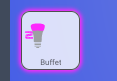
Voici mon résultat ça ne fonctionne pas loooool
type: conditional
conditions:
  - entity: light.lumiere_buffet
    state: 'on'
card:
  type: custom:button-card
  entity: light.lumiere_buffet
  name: Buffet
  show_icon: true
  icon: 'hue:lightstrip'
  styles:
    icon:
      - top: '-2%'
      - left: 3%
      - width: 18%
      - position: absolute
    name:
      - top: 80%
      - left: 15%
      - position: center
      - color: rgba(240, 240, 240, 0.8)
    card:
      - font-size: 70%
      - background-color: rgba(240, 240, 240, 0.1)
      - border-radius: 15%
      - border-style: solid
      - border-color: rgba(240, 240, 240, 0.3)
      - border-width: 1px
      - box-shadow: true
      - transition: true
    custom_fields:
      icon_hue:
        - top: 18%
        - left: 4.5%
        - width: 45%
        - position: absolute
  custom_fields:
    icon_hue: |
      [[[
        const state = entity.state === 'on' ? 'animate' : null;
        return `
          <svg viewBox="0 0 50 50">
            <style>
              @keyframes animate {
                0% {
                  transform: scale(0.85);
                }
                20% {
                  transform: scale(1.1);
                }
                40% {
                  transform: scale(0.95);
                }
                60% {
                  transform: scale(1.03);
                }
                80% {
                  transform: scale(0.97);
                }
                100% {
                  transform: scale(1);
                }
                }
                .animate {
                animation: animate 0.8s;
                transform-origin: center;
              }
            </style>
            <path fill="#9da0a2" d="M27.4 47.3h-4.9s-.7.1-.7.8.4.9.7.9h4.9c.3 0 .7-.1.7-.9s-.7-.8-.7-.8zm3.3-2.9H19.3s-.8 0-.8.8.6.9.8.9h11.5c.2 0 .8-.1.8-.9-.1-.8-.9-.8-.9-.8zm0-3H19.3s-.8 0-.8.8.6.9.8.9h11.5c.2 0 .8-.1.8-.9-.1-.8-.9-.8-.9-.8zm0-2.9H19.3s-.8 0-.8.8.6.9.8.9h11.5c.2 0 .8-.1.8-.9s-.9-.8-.9-.8zm5.2-23.2c-3.3-5.3-7-5.6-10.9-5.6-3.8 0-8.4.4-10.9 5.6-.1.1-.1.3.1.7.4.8 3.3 7.2 3.2 18.8 0 1.1-.1 1.6 0 1.7 0 .1 0 .7 1.1.7h13c1 0 1-.5 1.1-.7v-1.7c-.1-11.6 2.8-18 3.2-18.8.1-.4.1-.5.1-.7"/>
            <path class="${state}" fill="var(--button-card-light-color-no-temperature)" d="M14.1 15.3c3.4-.3 7-.4 10.9-.4 3.8 0 7.5.2 10.9.4.4-.4.7-.8.9-1.1C39 8.5 38.9 6.5 38.9 6c-.2-4.4-8.4-5-12.1-5h0-3.4c-3.7 0-12 .5-12.1 5 0 .5-.1 2.5 2.1 8.2 0 .3.3.8.7 1.1z"/>
          </svg>
        `;
      ]]]
  aspect_ratio: 1/1
  state:
    - value: 'on'
      styles:
        card:
          - background-color: rgba(255, 255, 255, 0.8)
          - border: 1px rgba(80, 80, 80) solid
          - box-shadow: 0px 0px 6px 3px var(--button-card-light-color)
        name:
          - color: rgba(0, 0, 0, 0.6)
        icon:
          - color: var(--button-card-light-color-no-temperature)
  double_tap_action:
    action: more-info
    styles: null
    icon:
      - top: '-2%'
      - left: 3%
      - width: 50%
      - position: absolute
    name:
      - top: 80%
      - left: 15%
      - position: center
    card:
      - font-size: 100%
      - border-radius: 15%
      - box-shadow: true
      - transition: true
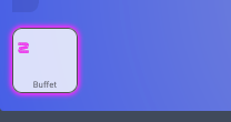
Je ne vois null part le nom des icônes dans tes button-card ou alors c’est ailleurs
C’est cette partie :
  custom_fields:
    icon_hue: |
      [[[
        const state = entity.state === 'on' ? 'animate' : null;
        return `
          <svg viewBox="0 0 50 50">
            <style>
              @keyframes animate {
                0% {
                  transform: scale(0.85);
                }
                20% {
                  transform: scale(1.1);
                }
                40% {
                  transform: scale(0.95);
                }
                60% {
                  transform: scale(1.03);
                }
                80% {
                  transform: scale(0.97);
                }
                100% {
                  transform: scale(1);
                }
                }
                .animate {
                animation: animate 0.8s;
                transform-origin: center;
              }
            </style>
            <path fill="#9da0a2" d="M27.4 47.3h-4.9s-.7.1-.7.8.4.9.7.9h4.9c.3 0 .7-.1.7-.9s-.7-.8-.7-.8zm3.3-2.9H19.3s-.8 0-.8.8.6.9.8.9h11.5c.2 0 .8-.1.8-.9-.1-.8-.9-.8-.9-.8zm0-3H19.3s-.8 0-.8.8.6.9.8.9h11.5c.2 0 .8-.1.8-.9-.1-.8-.9-.8-.9-.8zm0-2.9H19.3s-.8 0-.8.8.6.9.8.9h11.5c.2 0 .8-.1.8-.9s-.9-.8-.9-.8zm5.2-23.2c-3.3-5.3-7-5.6-10.9-5.6-3.8 0-8.4.4-10.9 5.6-.1.1-.1.3.1.7.4.8 3.3 7.2 3.2 18.8 0 1.1-.1 1.6 0 1.7 0 .1 0 .7 1.1.7h13c1 0 1-.5 1.1-.7v-1.7c-.1-11.6 2.8-18 3.2-18.8.1-.4.1-.5.1-.7"/>
            <path class="${state}" fill="var(--button-card-light-color-no-temperature)" d="M14.1 15.3c3.4-.3 7-.4 10.9-.4 3.8 0 7.5.2 10.9.4.4-.4.7-.8.9-1.1C39 8.5 38.9 6.5 38.9 6c-.2-4.4-8.4-5-12.1-5h0-3.4c-3.7 0-12 .5-12.1 5 0 .5-.1 2.5 2.1 8.2 0 .3.3.8.7 1.1z"/>
          </svg>
        `;
      ]]]
Le nom de l’icone c’est « icon_hue »
Le code comprends l’animation :
        const state = entity.state === 'on' ? 'animate' : null;
        return `
          <svg viewBox="0 0 50 50">
            <style>
              @keyframes animate {
                0% {
                  transform: scale(0.85);
                }
                20% {
                  transform: scale(1.1);
                }
                40% {
                  transform: scale(0.95);
                }
                60% {
                  transform: scale(1.03);
                }
                80% {
                  transform: scale(0.97);
                }
                100% {
                  transform: scale(1);
                }
                }
                .animate {
                animation: animate 0.8s;
                transform-origin: center;
              }
et l’icône :
d="M27.4 47.3h-4.9s-.7.1-.7.8.4.9.7.9h4.9c.3 0 .7-.1.7-.9s-.7-.8-.7-.8zm3.3-2.9H19.3s-.8 0-.8.8.6.9.8.9h11.5c.2 0 .8-.1.8-.9-.1-.8-.9-.8-.9-.8zm0-3H19.3s-.8 0-.8.8.6.9.8.9h11.5c.2 0 .8-.1.8-.9-.1-.8-.9-.8-.9-.8zm0-2.9H19.3s-.8 0-.8.8.6.9.8.9h11.5c.2 0 .8-.1.8-.9s-.9-.8-.9-.8zm5.2-23.2c-3.3-5.3-7-5.6-10.9-5.6-3.8 0-8.4.4-10.9 5.6-.1.1-.1.3.1.7.4.8 3.3 7.2 3.2 18.8 0 1.1-.1 1.6 0 1.7 0 .1 0 .7 1.1.7h13c1 0 1-.5 1.1-.7v-1.7c-.1-11.6 2.8-18 3.2-18.8.1-.4.1-.5.1-.7"/>
Donc pour la supprimer, ton code devrait ressembler à ça :
type: conditional
conditions:
  - entity: light.lumiere_buffet
    state: 'on'
card:
  type: custom:button-card
  entity: light.lumiere_buffet
  name: Buffet
  show_icon: true
  icon: 'hue:lightstrip'
  styles:
    icon:
      - top: '-2%'
      - left: 3%
      - width: 18%
      - position: absolute
    name:
      - top: 80%
      - left: 15%
      - position: center
      - color: rgba(240, 240, 240, 0.8)
    card:
      - font-size: 70%
      - background-color: rgba(240, 240, 240, 0.1)
      - border-radius: 15%
      - border-style: solid
      - border-color: rgba(240, 240, 240, 0.3)
      - border-width: 1px
      - box-shadow: true
      - transition: true
  aspect_ratio: 1/1
  state:
    - value: 'on'
      styles:
        card:
          - background-color: rgba(255, 255, 255, 0.8)
          - border: 1px rgba(80, 80, 80) solid
          - box-shadow: 0px 0px 6px 3px var(--button-card-light-color)
        name:
          - color: rgba(0, 0, 0, 0.6)
        icon:
          - color: var(--button-card-light-color-no-temperature)
  double_tap_action:
    action: more-info
    styles: null
    icon:
      - top: '-2%'
      - left: 3%
      - width: 50%
      - position: absolute
    name:
      - top: 80%
      - left: 15%
      - position: center
    card:
      - font-size: 100%
      - border-radius: 15%
      - box-shadow: true
      - transition: true
Ok donc en faite l’icône c’est :
d="M27.4 47.3h-4.9s-.7.1-.7.8.4.9.7.9h4.9c.3 0 .7-.1.7-.9s-.7-.8-.7-.8zm3.3-2.9H19.3s-.8 0-.8.8.6.9.8.9h11.5c.2 0 .8-.1.8-.9-.1-.8-.9-.8-.9-.8zm0-3H19.3s-.8 0-.8.8.6.9.8.9h11.5c.2 0 .8-.1.8-.9-.1-.8-.9-.8-.9-.8zm0-2.9H19.3s-.8 0-.8.8.6.9.8.9h11.5c.2 0 .8-.1.8-.9s-.9-.8-.9-.8zm5.2-23.2c-3.3-5.3-7-5.6-10.9-5.6-3.8 0-8.4.4-10.9 5.6-.1.1-.1.3.1.7.4.8 3.3 7.2 3.2 18.8 0 1.1-.1 1.6 0 1.7 0 .1 0 .7 1.1.7h13c1 0 1-.5 1.1-.7v-1.7c-.1-11.6 2.8-18 3.2-18.8.1-.4.1-.5.1-.7"/>
au lieu de mdi:xxxxxx ?
Donc il faudrait que je trouve une icône svg strip (pour l’exemple) et que je remplace son code SVG par celui que j’ai mentionné juste au-dessus ?
Autre question en enlevant le code « custom_fields » sa enlève l’icône. Par contre, ou c’est config qu’il prenne l’icône quand le custom_fields est indiqué pourquoi ce logo et pas un autre ?
Bon je pense avoir compris pour l’icône :
et le code :
type: conditional
conditions:
  - entity: light.lumiere_buffet
    state: 'on'
card:
  type: custom:button-card
  entity: light.lumiere_buffet
  name: Buffet
  icon: custom
  styles:
    icon:
      - top: '-2%'
      - left: 3%
      - width: 18%
      - position: absolute
    name:
      - top: 80%
      - left: 15%
      - position: center
      - color: rgba(240, 240, 240, 0.8)
    card:
      - font-size: 70%
      - background-color: rgba(240, 240, 240, 0.1)
      - border-radius: 15%
      - border-style: solid
      - border-color: rgba(240, 240, 240, 0.3)
      - border-width: 1px
      - box-shadow: true
      - transition: true
    custom_fields:
      icon_hue:
        - top: 18%
        - left: 4.5%
        - width: 45%
        - position: absolute
  custom_fields:
    icon_hue: |
      [[[
        const state = entity.state === 'on' ? 'animate' : null;
        return `
          <svg viewBox="0 0 50 50">
            <style>
              @keyframes animate {
                0% {
                  transform: scale(0.85);
                }
                20% {
                  transform: scale(1.1);
                }
                40% {
                  transform: scale(0.95);
                }
                60% {
                  transform: scale(1.03);
                }
                80% {
                  transform: scale(0.97);
                }
                100% {
                  transform: scale(1);
                }
                }
                .animate {
                animation: animate 0.8s;
                transform-origin: center;
              }
            </style>
            <path fill="#9da0a2" d="M 6.328125 12.5 C 6.734375 12.414062 7.132812 12.671875 7.222656 13.078125 C 7.308594 13.480469 7.050781 13.878906 6.648438 13.96875 C 6.242188 14.054688 5.84375 13.796875 5.753906 13.394531 C 5.667969 12.988281 5.925781 12.589844 6.328125 12.5 M 9.996094 11.707031 C 10.398438 11.621094 10.800781 11.878906 10.886719 12.28125 C 10.972656 12.6875 10.71875 13.085938 10.3125 13.175781 C 9.90625 13.261719 9.507812 13.003906 9.421875 12.601562 C 9.332031 12.195312 9.589844 11.796875 9.996094 11.707031 M 13.660156 10.917969 C 14.066406 10.828125 14.464844 11.085938 14.550781 11.488281 C 14.640625 11.894531 14.382812 12.292969 13.976562 12.382812 C 13.574219 12.46875 13.171875 12.210938 13.085938 11.808594 C 13 11.402344 13.253906 11.003906 13.660156 10.917969 M 17.324219 10.125 C 17.730469 10.035156 18.128906 10.292969 18.21875 10.699219 C 18.304688 11.101562 18.046875 11.503906 17.644531 11.589844 C 17.238281 11.675781 16.839844 11.421875 16.75 11.015625 C 16.664062 10.609375 16.921875 10.210938 17.324219 10.125 M 8.003906 15.480469 L 19.105469 13.082031 C 19.914062 12.910156 20.429688 12.109375 20.253906 11.300781 C 19.835938 9.363281 17.925781 8.132812 15.992188 8.550781 L 4.886719 10.945312 C 4.078125 11.121094 3.5625 11.917969 3.738281 12.726562 C 4.15625 14.664062 6.066406 15.898438 8.003906 15.480469 M 18.75 19.5 C 18.335938 19.5 18 19.164062 18 18.75 C 18 18.335938 18.335938 18 18.75 18 C 19.164062 18 19.5 18.335938 19.5 18.75 C 19.5 19.164062 19.164062 19.5 18.75 19.5 M 15 19.5 C 14.585938 19.5 14.25 19.164062 14.25 18.75 C 14.25 18.335938 14.585938 18 15 18 C 15.414062 18 15.75 18.335938 15.75 18.75 C 15.75 19.164062 15.414062 19.5 15 19.5 M 11.25 19.5 C 10.835938 19.5 10.5 19.164062 10.5 18.75 C 10.5 18.335938 10.835938 18 11.25 18 C 11.664062 18 12 18.335938 12 18.75 C 12 19.164062 11.664062 19.5 11.25 19.5 M 7.5 19.5 C 7.085938 19.5 6.75 19.164062 6.75 18.75 C 6.75 18.335938 7.085938 18 7.5 18 C 7.914062 18 8.25 18.335938 8.25 18.75 C 8.25 19.164062 7.914062 19.5 7.5 19.5 M 20.25 16.5 L 6.75 16.5 C 3.75 16.5 3 14.25 3 13.5 L 3 17.25 C 3 19.320312 4.679688 21 6.75 21 L 20.25 21 C 20.664062 21 21 20.664062 21 20.25 L 21 17.25 C 21 16.835938 20.664062 16.5 20.25 16.5 M 16.5 6 C 16.085938 6 15.75 5.664062 15.75 5.25 C 15.75 4.835938 16.085938 4.5 16.5 4.5 C 16.914062 4.5 17.25 4.835938 17.25 5.25 C 17.25 5.664062 16.914062 6 16.5 6 M 12.75 6 C 12.335938 6 12 5.664062 12 5.25 C 12 4.835938 12.335938 4.5 12.75 4.5 C 13.164062 4.5 13.5 4.835938 13.5 5.25 C 13.5 5.664062 13.164062 6 12.75 6 M 9 6 C 8.585938 6 8.25 5.664062 8.25 5.25 C 8.25 4.835938 8.585938 4.5 9 4.5 C 9.414062 4.5 9.75 4.835938 9.75 5.25 C 9.75 5.664062 9.414062 6 9 6 M 5.25 6 C 4.835938 6 4.5 5.664062 4.5 5.25 C 4.5 4.835938 4.835938 4.5 5.25 4.5 C 5.664062 4.5 6 4.835938 6 5.25 C 6 5.664062 5.664062 6 5.25 6 M 17.25 3 L 3.75 3 C 3.335938 3 3 3.335938 3 3.75 L 3 6.75 C 3 7.164062 3.335938 7.5 3.75 7.5 L 17.25 7.5 C 20.25 7.5 21 9.75 21 10.5 L 21 6.75 C 21 4.679688 19.320312 3 17.25 3"/>
            <path class="${state}" fill="var(--button-card-light-color-no-temperature)" d="M 6.328125 12.5 C 6.734375 12.414062 7.132812 12.671875 7.222656 13.078125 C 7.308594 13.480469 7.050781 13.878906 6.648438 13.96875 C 6.242188 14.054688 5.84375 13.796875 5.753906 13.394531 C 5.667969 12.988281 5.925781 12.589844 6.328125 12.5 M 9.996094 11.707031 C 10.398438 11.621094 10.800781 11.878906 10.886719 12.28125 C 10.972656 12.6875 10.71875 13.085938 10.3125 13.175781 C 9.90625 13.261719 9.507812 13.003906 9.421875 12.601562 C 9.332031 12.195312 9.589844 11.796875 9.996094 11.707031 M 13.660156 10.917969 C 14.066406 10.828125 14.464844 11.085938 14.550781 11.488281 C 14.640625 11.894531 14.382812 12.292969 13.976562 12.382812 C 13.574219 12.46875 13.171875 12.210938 13.085938 11.808594 C 13 11.402344 13.253906 11.003906 13.660156 10.917969 M 17.324219 10.125 C 17.730469 10.035156 18.128906 10.292969 18.21875 10.699219 C 18.304688 11.101562 18.046875 11.503906 17.644531 11.589844 C 17.238281 11.675781 16.839844 11.421875 16.75 11.015625 C 16.664062 10.609375 16.921875 10.210938 17.324219 10.125 M 8.003906 15.480469 L 19.105469 13.082031 C 19.914062 12.910156 20.429688 12.109375 20.253906 11.300781 C 19.835938 9.363281 17.925781 8.132812 15.992188 8.550781 L 4.886719 10.945312 C 4.078125 11.121094 3.5625 11.917969 3.738281 12.726562 C 4.15625 14.664062 6.066406 15.898438 8.003906 15.480469 M 18.75 19.5 C 18.335938 19.5 18 19.164062 18 18.75 C 18 18.335938 18.335938 18 18.75 18 C 19.164062 18 19.5 18.335938 19.5 18.75 C 19.5 19.164062 19.164062 19.5 18.75 19.5 M 15 19.5 C 14.585938 19.5 14.25 19.164062 14.25 18.75 C 14.25 18.335938 14.585938 18 15 18 C 15.414062 18 15.75 18.335938 15.75 18.75 C 15.75 19.164062 15.414062 19.5 15 19.5 M 11.25 19.5 C 10.835938 19.5 10.5 19.164062 10.5 18.75 C 10.5 18.335938 10.835938 18 11.25 18 C 11.664062 18 12 18.335938 12 18.75 C 12 19.164062 11.664062 19.5 11.25 19.5 M 7.5 19.5 C 7.085938 19.5 6.75 19.164062 6.75 18.75 C 6.75 18.335938 7.085938 18 7.5 18 C 7.914062 18 8.25 18.335938 8.25 18.75 C 8.25 19.164062 7.914062 19.5 7.5 19.5 M 20.25 16.5 L 6.75 16.5 C 3.75 16.5 3 14.25 3 13.5 L 3 17.25 C 3 19.320312 4.679688 21 6.75 21 L 20.25 21 C 20.664062 21 21 20.664062 21 20.25 L 21 17.25 C 21 16.835938 20.664062 16.5 20.25 16.5 M 16.5 6 C 16.085938 6 15.75 5.664062 15.75 5.25 C 15.75 4.835938 16.085938 4.5 16.5 4.5 C 16.914062 4.5 17.25 4.835938 17.25 5.25 C 17.25 5.664062 16.914062 6 16.5 6 M 12.75 6 C 12.335938 6 12 5.664062 12 5.25 C 12 4.835938 12.335938 4.5 12.75 4.5 C 13.164062 4.5 13.5 4.835938 13.5 5.25 C 13.5 5.664062 13.164062 6 12.75 6 M 9 6 C 8.585938 6 8.25 5.664062 8.25 5.25 C 8.25 4.835938 8.585938 4.5 9 4.5 C 9.414062 4.5 9.75 4.835938 9.75 5.25 C 9.75 5.664062 9.414062 6 9 6 M 5.25 6 C 4.835938 6 4.5 5.664062 4.5 5.25 C 4.5 4.835938 4.835938 4.5 5.25 4.5 C 5.664062 4.5 6 4.835938 6 5.25 C 6 5.664062 5.664062 6 5.25 6 M 17.25 3 L 3.75 3 C 3.335938 3 3 3.335938 3 3.75 L 3 6.75 C 3 7.164062 3.335938 7.5 3.75 7.5 L 17.25 7.5 C 20.25 7.5 21 9.75 21 10.5 L 21 6.75 C 21 4.679688 19.320312 3 17.25 3"/>
          </svg>
        `;
      ]]]
  aspect_ratio: 1/1
  state:
    - value: 'on'
      styles:
        card:
          - background-color: rgba(255, 255, 255, 0.8)
          - border: 1px rgba(80, 80, 80) solid
          - box-shadow: 0px 0px 6px 3px var(--button-card-light-color)
        name:
          - color: rgba(0, 0, 0, 0.6)
        icon:
          - color: var(--button-card-light-color-no-temperature)
  double_tap_action:
    action: more-info
    styles: null
    icon:
      - top: '-2%'
      - left: 3%
      - width: 50%
      - position: absolute
    name:
      - top: 80%
      - left: 15%
      - position: center
    card:
      - font-size: 100%
      - border-radius: 15%
      - box-shadow: true
      - transition: true
bon par contre reste à comprendre pourquoi elle et toute petite
Augmente cette valeur et tu devrais agrandir ton icône
Ok, car en comparent avec une icône de MDI il indique :
<svg viewBox="0 0 50 50">
Donc lequel choisir le width ou le viewBox ?
le custom_fields c’est uniquement pour les icônes personnalisées.
Sinon comme pour toi, la ligne icon: hue:lightstrip fait apparaitre une icône « classique »
A ta place j’utiliserais le code que je t’ai donné plus haut (sans custom_field)
Test avec une icone mdi au lieu de hue pour voir
avec une icone mdi :

et le code : (dans les deux lignes <path…> j’ai mis le même code svg)
custom_fields:
    icon_hue: |
      [[[
        const state = entity.state === 'on' ? 'animate' : null;
        return `
          <svg viewBox="0 0 50 50">
            <style>
              @keyframes animate {
                0% {
                  transform: scale(0.85);
                }
                20% {
                  transform: scale(1.1);
                }
                40% {
                  transform: scale(0.95);
                }
                60% {
                  transform: scale(1.03);
                }
                80% {
                  transform: scale(0.97);
                }
                100% {
                  transform: scale(1);
                }
                }
                .animate {
                animation: animate 0.8s;
                transform-origin: center;
              }
            </style>
            <path fill="#9da0a2" d="M2.95 3L2 6.91L19.34 11.25L20.29 7.34L2.95 3M6.09 6.89L4.16 6.41L4.64 4.46L6.57 4.94L6.09 6.89M9.94 7.86L8 7.38L8.5 5.42L10.42 5.91L9.94 7.86M13.8 8.82L11.87 8.34L12.35 6.39L14.27 6.87L13.8 8.82M17.65 9.79L15.72 9.31L16.2 7.35L18.13 7.84L17.65 9.79M4.66 12.75L3.71 16.66L21.05 21L22 17.1L4.66 12.75M7.8 16.65L5.88 16.16L6.35 14.21L8.28 14.69L7.8 16.65M11.65 17.61L9.73 17.13L10.2 15.18L12.13 15.66L11.65 17.61M15.5 18.58L13.58 18.09L14.06 16.14L16 16.62L15.5 18.58M19.36 19.54L17.43 19.06L17.91 17.11L19.84 17.59L19.36 19.54M6.25 12.11L11 10.2L17.75 11.89L13 13.8L6.25 12.11Z"/>
            <path class="${state}" fill="var(--button-card-light-color-no-temperature)" d="M2.95 3L2 6.91L19.34 11.25L20.29 7.34L2.95 3M6.09 6.89L4.16 6.41L4.64 4.46L6.57 4.94L6.09 6.89M9.94 7.86L8 7.38L8.5 5.42L10.42 5.91L9.94 7.86M13.8 8.82L11.87 8.34L12.35 6.39L14.27 6.87L13.8 8.82M17.65 9.79L15.72 9.31L16.2 7.35L18.13 7.84L17.65 9.79M4.66 12.75L3.71 16.66L21.05 21L22 17.1L4.66 12.75M7.8 16.65L5.88 16.16L6.35 14.21L8.28 14.69L7.8 16.65M11.65 17.61L9.73 17.13L10.2 15.18L12.13 15.66L11.65 17.61M15.5 18.58L13.58 18.09L14.06 16.14L16 16.62L15.5 18.58M19.36 19.54L17.43 19.06L17.91 17.11L19.84 17.59L19.36 19.54M6.25 12.11L11 10.2L17.75 11.89L13 13.8L6.25 12.11Z"/>
          </svg>
        `;
      ]]]
et ici le code fourni par MDI pour le SVG :

Et en augmentant cette valeur, l’icône ne grossit pas ?