Mushroom - Icones animés

Hello,

J’essaye de mettre en place des icone animés mais cela ne fonctionne pas.
J’ai pourtant repris le code exact de certains utilisateur de ce thème mais je doit rater un truc…
Voici un exemple:

type: custom:mushroom-template-card
primary: Power
icon: mdi:power
icon_color: teal
fill_container: true
layout: vertical
double_tap_action:
  action: none
hold_action:
  action: none
card_mod:
  style:
    mushroom-shape-icon$: |
      ha-icon {
        --icon-animation: power 1.5s infinite; 
      }
      @keyframes power {
        0%, 100% { clip-path: inset(0 0 0 0); }
        50% { clip-path: polygon(0 0, 42% 0, 42% 58%, 58% 58%, 58% 0, 100% 0, 100% 100%, 0 100%); }
      }

L’icone change mais il n’est pas animé…

Merci pour votre aide.

Bj
Je pense que ton souci viens de l’icon sans etre sur car
Animation1

Je viens de tester avec le même que toi et il bouge pas lol

J’ai réussi avec ça:

type: custom:mushroom-template-card
primary: Paramètres
icon: mdi:cog
icon_color: red
card_mod:
  style: |
    ha-card:active {
      transform: scale(0.975);
      transition: 0s;
    }
    mushroom-shape-icon {
      animation: spin 3s ease-in-out infinite;
      display: flex;
      --icon-symbol-size: 0.80em;
      --icon-size: 90px;
    }
    :host {
      --mush-card-primary-font-size: 16px;
    }

Mais ça fonctionne que pour cette animation…

type: custom:button-card
entity: light.lumieres_salon_lampadaire
name: fliping
icon: mdi:light-flood-up
styles:
  icon:
    - animation: flip 1s infinite
extra_styles: |
  @keyframes flip {
      0% {transform: scaleX(1)}
      49.99% {transform: scaleX(1)}
      50% {transform: scaleX(-1)}
      99.99% {transform: scaleX(-1)}
      100% {transform: scaleX(-1)}
      }

code dans mon gif

marche pas, mais c’est dans une mushroom-template-card, ça viens peut-être de la?

je confirme, ton code dans une button fonctionne.

Quand je veux une animation je passe par

Je voudrais reproduire cela:

type: custom:mushroom-template-card
icon: mdi:light-flood-up
icon_color: '{{ ''red'' if is_state(entity, ''on'') else ''disabled'' }}'
primary: Light
secondary: ''
entity: light.lumiere_cuisine
tap_action:
  action: toggle
fill_container: true
layout: vertical
card_mod:
  style:
    mushroom-shape-icon$: |
      ha-icon {
        {{ '--icon-animation: rotation 1s linear infinite;' if is_state(config.entity, 'on') }}
        transform-origin: 29% 88%;
      }
      @keyframes clip {
        0% {
          clip-path: inset(50% 0 0 0);
        }
        100% {
          clip-path: inset(0 0 0 0);
        }
      }
      .shape {
        --shape-animation: ping 2s infinite;
      }
      @keyframes ping {
        0% {
          box-shadow: 0 0 0 0 rgba(var(--rgb-red), 0.7);
        }
        
        70% {
          box-shadow: 0 0 0 10px transparent;
        }
        
        100% {
          box-shadow: 0 0 0 0 transparent;
        }
      }

Animation1

1 « J'aime »

Ok, cela fonctionne.
Possible de changer aussi l’icone en fonction du state?
par exemple, mdi:lightbulb lorsque éteins et mdi:lightbulb-on quand allumé?

Comment animé une partie de l’icone comme sur l’exemple du signal ici ?

Merci de tes réponses en tout cas.

je sais pas , mais il faut buché un peu :rofl: :wink: dans le lien que tu mets

Ben j’ai bien essayé mais cela fonctionne pas, ou alors pas comme prévu MDR
Par exemple moi le signal j’ai juste un effet sur la partie shape mais l’icon lui bouge pas d’un poil ^^

type: custom:mushroom-template-card
icon: mdi:wifi
icon_color: green
primary: Réseau
layout: vertical
fill_container: true
card_mod:
  style:
    mushroom-shape-icon$: |
      ha-icon {
        --icon-animation: clip 2s steps(1) infinite;
      }
      @keyframes clip {
        0% { clip-path: circle(0% at 50% 85%); }
        20% { clip-path: circle(30% at 50% 85%); }
        40% { clip-path: circle(55% at 50% 85%); }
        60% { clip-path: circle(80% at 50% 85%); }
      }
      .shape {
        --shape-animation: ping 2s infinite;
      }
      @keyframes ping {
        60% { box-shadow: 0 0 0 0 rgba(var(--rgb-green), 0.7); }
        100% { box-shadow: 0 0 5px 15px transparent; }
      }

J’ai réussi avec ce code:

card_mod:
  style: |
    ha-state-icon {
      animation: clip 2s steps(1) infinite;
    }
    @keyframes clip {
      0% { clip-path: circle(0% at 50% 85%); }
      20% { clip-path: circle(30% at 50% 85%); }
      40% { clip-path: circle(55% at 50% 85%); }
      60% { clip-path: circle(80% at 50% 85%); }
    }
    mushroom-shape-icon {
      --icon-symbol-size: 0.80em;
      --icon-size: 90px;
    }
    :host {
      --mush-card-primary-font-size: 16px;
    }

Par contre j’aimerai faire une carte « Météo » avec l’icone qui change en fonction de la météo.
Voici ma carte:

type: custom:mushroom-template-card
icon: mdi:weather-partly-cloudy
icon_color: orange
primary: Météo
layout: vertical
fill_container: true
tap_action:
  action: call-service
  service: browser_mod.popup
  data:
    title: Météo
    content:
      type: custom:meteofrance-weather-card
      entity: weather.nersac
      number_of_forecasts: '5'
      rainChanceEntity: sensor.nersac_rain_chance
      uvEntity: sensor.nersac_uv
      cloudCoverEntity: sensor.nersac_cloud_cover
      snowChanceEntity: sensor.nersac_snow_chance
      rainForecastEntity: sensor.nersac_next_rain
      alertEntity: sensor.16_weather_alert
      style: |
        ha-card {
          background: #333333;
        }
  target: {}
card_mod:
  style: |
    ha-state-icon {
      animation: clip 5s steps(1) infinite;
    }
    @keyframes clip {
      0% { clip-path: circle(0% at 50% 85%); }
      20% { clip-path: circle(30% at 50% 85%); }
      40% { clip-path: circle(55% at 50% 85%); }
      60% { clip-path: circle(80% at 50% 85%); }
    }
    mushroom-shape-icon {
      --icon-symbol-size: 0.80em;
      --icon-size: 90px;
    }
    :host {
      --mush-card-primary-font-size: 16px;
    }

C’est possible?

Bonjour,
oui c’est possible, faut connaitre tout les états de la météo et adpater l’icone adéquat.

Exemple:

type: custom:mushroom-template-card
icon_color: blue
primary: Météo
layout: vertical
fill_container: true
icon: |
  {% if is_state('weather.xxxx', 'sunny') %}
    mdi:weather-sunny
  {% elif is_state('weather.xxxx', 'cloudy') %}
    mdi:weather-cloudy
  {% elif is_state('weather.xxxx', 'rainy') %}
    mdi:weather-rainy
  {% elif is_state('weather.xxxx', 'snowy') %}
    mdi:weather-snowy
  {% else %}
    mdi:weather-night
  {% endif %}

Merci, j’ai ajouté les différents états.

L’idée et d’ajouter en fonction de l’icone sa propre animation, c’est possible ça?
Dans le card-mod on peu définir une animation en fonction de l’icone ou sa sera toujours la même animation?

carte complète
type: custom:mushroom-template-card
icon: |
  {% if is_state('weather.nersac', 'clear-night') %}
    mdi:weather-night
  {% elif is_state('weather.nersac', 'cloudy') %}
    mdi:weather-sunny
  {% elif is_state('weather.nersac', 'exceptional') %}
    mdi:weather-
  {% elif is_state('weather.nersac', 'fog') %}
    mdi:weather-fog
  {% if is_state('weather.nersac', 'hail') %}
    mdi:weather-hail
  {% elif is_state('weather.nersac', 'lightning') %}
    mdi:weather-lightning
  {% elif is_state('weather.nersac', 'lightning-rainy') %}
    mdi:weather-lightning-rainy
  {% elif is_state('weather.nersac', 'partlycloudy') %}
    mdi:weather-partly-cloudy
  {% if is_state('weather.nersac', 'pouring') %}
    mdi:weather-pouring
  {% elif is_state('weather.nersac', 'rainy') %}
    mdi:weather-rainy
  {% elif is_state('weather.nersac', 'snowy') %}
    mdi:weather-snowy
  {% elif is_state('weather.nersac', 'snowy-rainy') %}
    mdi:weather-snowy-rainy
  {% if is_state('weather.nersac', 'sunny') %}
    mdi:weather-sunny
  {% elif is_state('weather.nersac', 'windy') %}
    mdi:weather-windy
  {% else %}
    mdi:weather-sunny-off
  {% endif %}
icon_color: deep-orange
primary: Météo
layout: vertical
fill_container: true
tap_action:
  action: call-service
  service: browser_mod.popup
  data:
    title: Météo
    content:
      type: custom:meteofrance-weather-card
      entity: weather.nersac
      number_of_forecasts: '5'
      rainChanceEntity: sensor.nersac_rain_chance
      uvEntity: sensor.nersac_uv
      cloudCoverEntity: sensor.nersac_cloud_cover
      snowChanceEntity: sensor.nersac_snow_chance
      rainForecastEntity: sensor.nersac_next_rain
      alertEntity: sensor.16_weather_alert
      style: |
        ha-card {
          background: #333333;
        }
  target: {}
card_mod:
  style: |
    mushroom-shape-icon {
      --icon-symbol-size: 0.80em;
      --icon-size: 90px;
    }
    :host {
      --mush-card-primary-font-size: 16px;
    }
    ha-state-icon {
      animation: cloudy 10s ease-in-out infinite, sun 2s infinite;
    }
    @keyframes cloudy {
      0%, 100% { transform: translateX(3px); }
      30% { transform: translateX(-1px); }
      45% { transform: translateX(1.5px); }
      75% { transform: translateX(-3.2px); }
    }
    @keyframes sun {
      50% { clip-path: polygon(0 67%, 18% 55%, 16% 31%, 41% 12%, 67% 24%, 77% 59%, 100% 64%, 100% 100%, 0 100%); }
    }

Pareille tu peu avoir une animation d’ifferent suivant l’état avec card_mod.

exemple, change l’animation que tu veut.:

    ha-state-icon {
      {% if is_state('weather.nersac', 'clear-night') %}
        animation: cloudy 10s ease-in-out infinite, sun 2s infinite;
      {% elif is_state('weather.nersac', 'cloudy') %}
        animation: cloudy 10s ease-in-out infinite, sun 2s infinite;
      {% else %}
        animation: cloudy 10s ease-in-out infinite, sun 2s infinite;
      {% endif %}     
    }

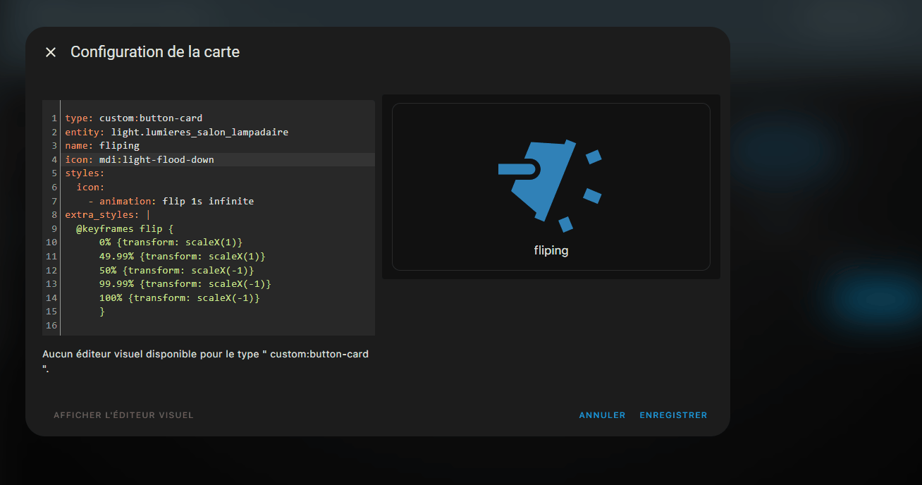
J’ai fait ça, je pense que c’est les indentation qui son pas bonnes, l’icone ne s’anime pas…

card_mod:
  style: |
    mushroom-shape-icon {
      --icon-symbol-size: 0.80em;
      --icon-size: 90px;
    }
    :host {
      --mush-card-primary-font-size: 16px;
    }
    ha-state-icon {
      {% if is_state('weather.nersac', 'clear-night') %}
        animation: moon 10s linear infinite, stars 5s linear infinite;
        }
        @keyframes moon {
          0%, 100% { transform: rotate(12deg); }
          30% { transform: rotate(-6deg); }
          45% { transform: rotate(8deg); }
          75% { transform: rotate(-10deg); }
        }
        @keyframes stars {
          0%, 3.1%, 14.1% { clip-path: inset(0 0 0 0); }
          3% { clip-path: polygon(1% 1%, 0% 99%, 99% 100%, 99% 62%, 68% 62%, 62% 44%, 76% 34%, 100% 34%, 99% 0%); }
          14% { clip-path: polygon(1% 1%, 0% 99%, 99% 100%, 100% 25%, 51% 45%, 38% 34%, 36% 0); }
        } 
      {% elif is_state('weather.nersac', 'cloudy') %}
        animation: cloudy 10s ease-in-out infinite;
        }
        @keyframes cloudy {
          0%, 100% { transform: translateX(3px); }
          30% { transform: translateX(-1px); }
          45% { transform: translateX(1.5px); }
          75% { transform: translateX(-3.2px); }
        }
      {% if is_state('weather.nersac', 'exceptional') %}
        animation: sunny 8s ease-in-out infinite alternate;
        }
        @keyframes sunny {
          70% { transform: rotate(360deg) scale(1); }
          80% { transform: scale(1); }
          90% { transform: scale(1.15); }
          100% { transform: scale(1); }
        }
      {% elif is_state('weather.nersac', 'fog') %}
        animation: cloudy 10s ease-in-out infinite, fog 4s infinite; 
        }
        @keyframes cloudy {
          0%, 100% { transform: translateX(3px); }
          30% { transform: translateX(-1px); }
          45% { transform: translateX(1.5px); }
          75% { transform: translateX(-3.2px); }
        }
        @keyframes fog {
          0%, 26%, 76%, 100% { clip-path: inset(0 0 0 0); }
          25% { clip-path: polygon(0 0, 100% 0, 100% 59%, 60% 59%, 60% 74%, 100% 74%, 100% 100%, 0 100%); }
          75%  { clip-path: polygon(0 0, 100% 0, 100% 100%, 26% 100%, 26% 76%, 0 76%); }
        }
      {% if is_state('weather.nersac', 'hail') %}
        animation: cloudy 10s ease-in-out infinite, hail 2s infinite; 
        }
        @keyframes cloudy {
          0%, 100% { transform: translateX(3px); }
          30% { transform: translateX(-1px); }
          45% { transform: translateX(1.5px); }
          75% { transform: translateX(-3.2px); }
        }
        @keyframes hail {
          0%, 26%, 51%, 76%, 100% { clip-path: inset(0 0 0 0); }
          25% { clip-path: polygon(0 0, 100% 0, 100% 100%, 62% 100%, 47% 69%, 56% 55%, 43% 43%, 31% 58%, 48% 68%, 63% 100%, 0 100%); }
          50%  { clip-path: polygon(0 0, 100% 0, 100% 100%, 62% 100%, 61% 86%, 74% 74%, 61% 60%, 46% 69%, 60% 87%, 63% 100%, 0 100%); }
          75%  { clip-path: polygon(0 0, 100% 0, 100% 100%, 47% 100%, 56% 83%, 42% 68%, 27% 81%, 37% 100%, 0 100%); }
        }
      {% elif is_state('weather.nersac', 'lightning') %}
        animation: cloudy 10s ease-in-out infinite, lightning 4s infinite; 
        }
        @keyframes cloudy {
          0%, 100% { transform: translateX(3px); }
          30% { transform: translateX(-1px); }
          45% { transform: translateX(1.5px); }
          75% { transform: translateX(-3.2px); }
        }
        @keyframes lightning {
          10%, 15% { clip-path: polygon(0 0, 100% 0, 100% 100%, 47% 100%, 69% 55%, 66% 40%, 48% 39%, 24% 100%, 0 100%); transform: scale(1.1); }
          10.1%, 15.1% { clip-path: inset(0 0 0 0); transform: scale(1); }
        }
      {% elif is_state('weather.nersac', 'partlycloudy') %}
        animation: cloudy 10s ease-in-out infinite, sun 2s infinite;
        }
        @keyframes cloudy {
          0%, 100% { transform: translateX(3px); }
          30% { transform: translateX(-1px); }
          45% { transform: translateX(1.5px); }
          75% { transform: translateX(-3.2px); }
        }
        @keyframes sun {
          50% { clip-path: polygon(0 67%, 18% 55%, 16% 31%, 41% 12%, 67% 24%, 77% 59%, 100% 64%, 100% 100%, 0 100%); }
        }
      {% if is_state('weather.nersac', 'pouring') %}
        animation: cloudy 10s ease-in-out infinite, rain 1s infinite; 
        }
        @keyframes cloudy {
          0%, 100% { transform: translateX(3px); }
          30% { transform: translateX(-1px); }
          45% { transform: translateX(1.5px); }
          75% { transform: translateX(-3.2px); }
        }
        @keyframes rain {
          0%, 50%, 100% { clip-path: inset(0 0 0 0); }
          25% { clip-path: polygon(0 0, 100% 0, 100% 83%, 54% 83%, 62% 47%, 47% 46%, 38% 83%, 0 83%); }
          75%  { clip-path: polygon(0 0, 100% 0, 100% 70%, 75% 70%, 80% 48%, 63% 48%, 54% 94%, 32% 94%, 46% 46%, 30% 46%, 23% 72%, 0 72%); }
        }
      {% elif is_state('weather.nersac', 'rainy') %}
        animation: cloudy 10s ease-in-out infinite, rain 1.5s infinite; 
        }
        @keyframes cloudy {
          0%, 100% { transform: translateX(3px); }
          30% { transform: translateX(-1px); }
          45% { transform: translateX(1.5px); }
          75% { transform: translateX(-3.2px); }
        }
        @keyframes rain {
          50% { clip-path: polygon(0 0, 100% 0, 100% 73%, 71% 73%, 50% 39%, 29% 73%, 0 73%); }
        }
      {% if is_state('weather.nersac', 'snowy') %}
        animation: cloudy 10s ease-in-out infinite, snow 4s infinite; 
        }
        @keyframes cloudy {
          0%, 100% { transform: translateX(3px); }
          30% { transform: translateX(-1px); }
          45% { transform: translateX(1.5px); }
          75% { transform: translateX(-3.2px); }
        }
        @keyframes snow {
          50% { clip-path: polygon(0 0, 100% 0, 100% 100%, 65% 100%, 76% 73%, 57% 49%, 34% 56%, 26% 79%, 37% 100%, 0 100%); }
          51% { clip-path: inset(0 0 0 0); }
        }
      {% if is_state('weather.nersac', 'sunny') %}
        animation: sunny 8s ease-in-out infinite alternate;
        }
        @keyframes sunny {
          70% { transform: rotate(360deg) scale(1); }
          80% { transform: scale(1); }
          90% { transform: scale(1.15); }
          100% { transform: scale(1); }
        }
      {% elif is_state('weather.nersac', 'windy') %}
        animation: cloudy 10s ease-in-out infinite; 
        transform-origin: 15% 50%
        }
        @keyframes cloudy {
          0%, 100% { transform: scaleX(1.2); }
          30% { transform: scaleX(0.9); }
          45% { transform: scaleX(1.1); }
          75% { transform: scaleX(0.8); }
        }
      {% else %}
        animation: cloudy 10s ease-in-out infinite, sun 2s infinite;
      {% endif %}     
    }

Ca serait plutot comme ca:

card_mod:
  style: |
    mushroom-shape-icon {
      --icon-symbol-size: 0.80em;
      --icon-size: 90px;
    }
    :host {
      --mush-card-primary-font-size: 16px;
    }
    ha-state-icon {
      {% if is_state('weather.nersac', 'clear-night') %}
        animation: moon 10s linear infinite;
      {% elif is_state('weather.nersac', 'cloudy') %}
        animation: cloudy 10s ease-in-out infinite;
      {% else %}
        animation: sun 2s infinite;
      {% endif %}		
    }
    @keyframes moon {
      0%, 100% { transform: rotate(12deg); }
      30% { transform: rotate(-6deg); }
      45% { transform: rotate(8deg); }
      75% { transform: rotate(-10deg); }
    }
    @keyframes cloudy {
      0%, 100% { transform: translateX(3px); }
      30% { transform: translateX(-1px); }
      45% { transform: translateX(1.5px); }
      75% { transform: translateX(-3.2px); }
    }
    @keyframes sun {
      50% { clip-path: polygon(0 67%, 18% 55%, 16% 31%, 41% 12%, 67% 24%, 77% 59%, 100% 64%, 100% 100%, 0 100%); }
    }

C’est ça merci.
Par contre ça pose pas de soucis que plusieurs keyframes est le même nom?

    @keyframes moon {
      0%, 100% { transform: rotate(12deg); }
      30% { transform: rotate(-6deg); }
      45% { transform: rotate(8deg); }
      75% { transform: rotate(-10deg); }
    }
    @keyframes cloudy {
      0%, 100% { transform: translateX(3px); }
      30% { transform: translateX(-1px); }
      45% { transform: translateX(1.5px); }
      75% { transform: translateX(-3.2px); }
    }
    @keyframes sun {
      50% { clip-path: polygon(0 67%, 18% 55%, 16% 31%, 41% 12%, 67% 24%, 77% 59%, 100% 64%, 100% 100%, 0 100%); }
    }
    @keyframes stars {
      0%, 3.1%, 14.1% { clip-path: inset(0 0 0 0); }
      3% { clip-path: polygon(1% 1%, 0% 99%, 99% 100%, 99% 62%, 68% 62%, 62% 44%, 76% 34%, 100% 34%, 99% 0%); }
      14% { clip-path: polygon(1% 1%, 0% 99%, 99% 100%, 100% 25%, 51% 45%, 38% 34%, 36% 0); }
    } 
    @keyframes sunny {
      70% { transform: rotate(360deg) scale(1); }
      80% { transform: scale(1); }
      90% { transform: scale(1.15); }
      100% { transform: scale(1); }
    }
    @keyframes fog {
      0%, 26%, 76%, 100% { clip-path: inset(0 0 0 0); }
      25% { clip-path: polygon(0 0, 100% 0, 100% 59%, 60% 59%, 60% 74%, 100% 74%, 100% 100%, 0 100%); }
      75%  { clip-path: polygon(0 0, 100% 0, 100% 100%, 26% 100%, 26% 76%, 0 76%); }
    }
    @keyframes hail {
      0%, 26%, 51%, 76%, 100% { clip-path: inset(0 0 0 0); }
      25% { clip-path: polygon(0 0, 100% 0, 100% 100%, 62% 100%, 47% 69%, 56% 55%, 43% 43%, 31% 58%, 48% 68%, 63% 100%, 0 100%); }
      50%  { clip-path: polygon(0 0, 100% 0, 100% 100%, 62% 100%, 61% 86%, 74% 74%, 61% 60%, 46% 69%, 60% 87%, 63% 100%, 0 100%); }
      75%  { clip-path: polygon(0 0, 100% 0, 100% 100%, 47% 100%, 56% 83%, 42% 68%, 27% 81%, 37% 100%, 0 100%); }
    }
    @keyframes lightning {
      10%, 15% { clip-path: polygon(0 0, 100% 0, 100% 100%, 47% 100%, 69% 55%, 66% 40%, 48% 39%, 24% 100%, 0 100%); transform: scale(1.1); }
      10.1%, 15.1% { clip-path: inset(0 0 0 0); transform: scale(1); }
    }
    @keyframes rain {
      0%, 50%, 100% { clip-path: inset(0 0 0 0); }
      25% { clip-path: polygon(0 0, 100% 0, 100% 83%, 54% 83%, 62% 47%, 47% 46%, 38% 83%, 0 83%); }
      75%  { clip-path: polygon(0 0, 100% 0, 100% 70%, 75% 70%, 80% 48%, 63% 48%, 54% 94%, 32% 94%, 46% 46%, 30% 46%, 23% 72%, 0 72%); }
    }
    @keyframes rain {
      50% { clip-path: polygon(0 0, 100% 0, 100% 73%, 71% 73%, 50% 39%, 29% 73%, 0 73%); }
    }
    @keyframes snow {
      50% { clip-path: polygon(0 0, 100% 0, 100% 100%, 65% 100%, 76% 73%, 57% 49%, 34% 56%, 26% 79%, 37% 100%, 0 100%); }
      51% { clip-path: inset(0 0 0 0); }
    }
    @keyframes cloudy {
      0%, 100% { transform: scaleX(1.2); }
      30% { transform: scaleX(0.9); }
      45% { transform: scaleX(1.1); }
      75% { transform: scaleX(0.8); }
    }

A mon avis si , ça va poser problème. Pourquoi le même nom, mets un nom différent.