Bonjour,
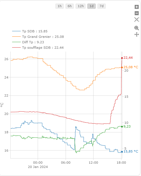
j’utilise type: custom:plotly-graph et j’ai un problème car il me met 2 axe Y. Un à gauche et un à droite.
Quelqu’un sait comme tout mettre à gauche ?
Merci
type: custom:plotly-graph
defaults:
  entity:
    show_value: true
entities:
  - entity: sensor.virt_snd_tp_sdb
    name: |
      $ex "Tp SDB : " + ys[ys.length - 1]
    legendgroup: 1
  - entity: sensor.virt_snd_tp_grand_grenier
    name: |
      $ex "Tp Grand Grenier : " + ys[ys.length - 1]
    legendgroup: 1
  - entity: sensor.virt_snd_Tp_grand_grenier_et_sdb
    name: |
      $ex "Diff Tp : " + ys[ys.length - 1]
    legendgroup: 1
  - entity: sensor.virt_snd_Tp_petit_grenier
    name: |
      $ex "Tp soufflage SDB : " + ys[ys.length - 1]
    legendgroup: 1
layout:
  xaxis:
    rangeselector:
      'y': 1.4
      x: 0.4
      buttons:
        - count: 1
          step: hour
        - count: 6
          step: hour
        - count: 12
          step: hour
        - count: 1
          step: day
        - count: 7
          step: day
  dragmode: pan
  margin:
    t: 0
    l: 40
    r: 65
    b: 60
  showlegend: true
  height: 600
config:
  displayModeBar: true
hours_to_show: 24
refresh_interval: 10