Hey! j’ai un problème depuis plusieurs mois, j’ai cherché un peu partout mais je ne vois pas du tout de solutions…
Mais sur mobile (android companion), c’est limite en plein écran!
C’est un tout petit peu en train de me faire péter un plomb ^^
code du popup
tap_action:
action: fire-dom-event
browser_mod:
service: browser_mod.popup
data:
content:
type: markdown
card_mod:
style: |
ha-markdown {
padding: 0px 0px 0px 0px !important;
}
content: |-
{% if is_state('switch.plug_nous_garage_avr','off') %}
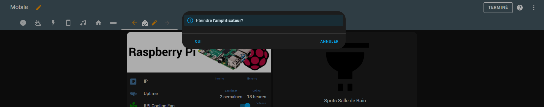
<ha-alert alert-type="info">Allumer **l'amplificateur**?</ha-alert>
{% else %}
<ha-alert alert-type="info">Eteindre **l'amplificateur**?</ha-alert>
{% endif %}
left_button: "oui"
left_button_action:
service: switch.toggle
data:
entity_id: switch.plug_nous_garage_avr
right_button: "annuler"
Bonjour,
opened 09:00AM - 19 Sep 23 UTC
My Home Assistant version: 2023.9.2
**What I am doing:**
I have a card confi… gured as follows:
```
type: custom:popup-card
dismissable: true
entity: climate.schlafzimmer_ai_thermostat
size: normal
card:
type: custom:better-thermostat-ui-card
entity: climate.schlafzimmer_ai_thermostat
eco_temperature: 18
disable_off: false
disable_window: true
style: |
--popup-max-width: 200px;
--popup-min-width: 200px;
```
**What I expected to happen:**
When clicking on the entity, the size should be exactly 200px on all resolutions
**What happened instead:**
On desktop (2K resolution), the popup looks as expected (minus the weird white lines):

On mobile (or a small width window), the popup is always fullscreen:

**Minimal** steps to reproduce:
This happens with all popup cards I have since I moved from the deprecated popup-card component to browser_mod, even if the popup size would definitely fit on screen. Try exaggerating with:
```
type: custom:popup-card
dismissable: true
entity: climate.schlafzimmer_ai_thermostat
size: normal
card:
type: custom:better-thermostat-ui-card
entity: climate.schlafzimmer_ai_thermostat
eco_temperature: 18
disable_off: false
disable_window: true
style: |
--popup-max-width: 100px;
--popup-min-width: 100px;
```
**Error messages from the browser console:**
```
BROWSER_MOD 2.3.0 IS INSTALLED BrowserID: a73da351-92d5f39c
card-mod.js?hacstag=190927524322:5 CARD-MOD 3.2.2 IS INSTALLED
card-mod.js?hacstag=190927524322:5 You may not be getting optimal performance out of card-mod.
See https://github.com/thomasloven/lovelace-card-mod#performance-improvements
card.js:295
RGB Light Card v1.11.0
auto-entities.js?hacstag=1677445841121:172 AUTO-ENTITIES 1.12.1 IS INSTALLED
decluttering-card.js?hacstag=188686483100:186 DECLUTTERING-CARD Version 1.0.0
paper-buttons-row.js?hacstag=244872232213:1370 PAPER-BUTTONS-ROW 2.1.3
mini-graph-card-bundle.js?hacstag=1512800620110:1 MINI-GRAPH-CARD 0.11.0
stack-in-card.js?hacstag=248954055020:200 STACK-IN-CARD Version 0.2.0
get-strategy.ts:88 TypeError: Cannot read properties of null (reading 'location_name')
at l.generateDashboard (original-states-strategy.ts:71:31)
at a (get-strategy.ts:84:27)
at async o.value (ha-panel-lovelace.ts:275:7)
at async ge (browser_mod.js:66:1982)
a @ get-strategy.ts:88
swipe-card.js?hacstag=192732887500:19 SWIPE-CARD Version 5.0.0
hass-hue-icons.js?hacstag=3844345221251:2066 HASS-HUE-ICONS Version 1.2.51
mushroom.js?hacstag=444350375310:3082 🍄 Mushroom 🍄 - 3.1.0
hourly-weather.js?hacstag=499270202510:304 HOURLY-WEATHER-CARD Version 5.1.0
platinum-weather-card-df6d26e2.js:73 PLATINUM-WEATHER-CARD Version 1.0.5
better-thermostat-ui-card.js?hacstag=439367892200:549 BetterThermostatUI-CARD version: 2.0.0
```
---
**By replacing the space in the checkboxes ([ ]) with an X below, I indicate that I:**
- [x] Understand that this is a channel for reporting bugs, not a support forum (https://community.home-assistant.io/).
- [x] Have made sure I am using the latest version of the plugin.
- [x] Have followed the troubleshooting steps of the "Common Problems" section of https://github.com/thomasloven/hass-config/wiki/Lovelace-Plugins.
- [x] Understand that leaving one or more boxes unticked or failure to follow the template above may increase the time required to handle my bug-report, or cause it to be closed without further action.
tap_action:
  action: fire-dom-event
  browser_mod:
    service: browser_mod.popup
    data:
      size: normal
      card_mod:
        style: |
          ha-dialog {
            --mdc-dialog-min-width: 90vw !important;
            --mdc-dialog-min-height: fit-content !important;
            --mdc-dialog-max-width: var(--mdc-dialog-min-width) !important;
            --mdc-dialog-max-height:  var(--mdc-dialog-min-height) !important;
            --ha-dialog-border-radius: var(--ha-card-border-radius) !important;
            --vertical-align-dialog: center !important;
            --header-height: 5vh !important;
            --footer-height: var(--header-height) !important;
            --padding-y: 8px !important;
            -webkit-tap-highlight-color: rgba(0, 0, 0, 0) !important;
          }
          .content {
            height: fit-content !important;
            max-height: 90vh !important
            pointer-events: unset !important;
            padding: 0 !important;
          }
          .container {
            padding: 0 !important;
          }
      content:
        type: markdown
        card_mod:
          style: |
            ha-markdown {
              padding: 0px 0px 0px 0px !important;
            }
        content: |-
          {% if is_state('switch.plug_nous_garage_avr','off') %}
            <ha-alert alert-type="info">Allumer **l'amplificateur**?</ha-alert>
          {% else %}
            <ha-alert alert-type="info">Eteindre **l'amplificateur**?</ha-alert>
          {% endif %}
      left_button: oui
      left_button_action:
        service: switch.toggle
        data:
          entity_id: switch.plug_nous_garage_avr
      right_button: annuler
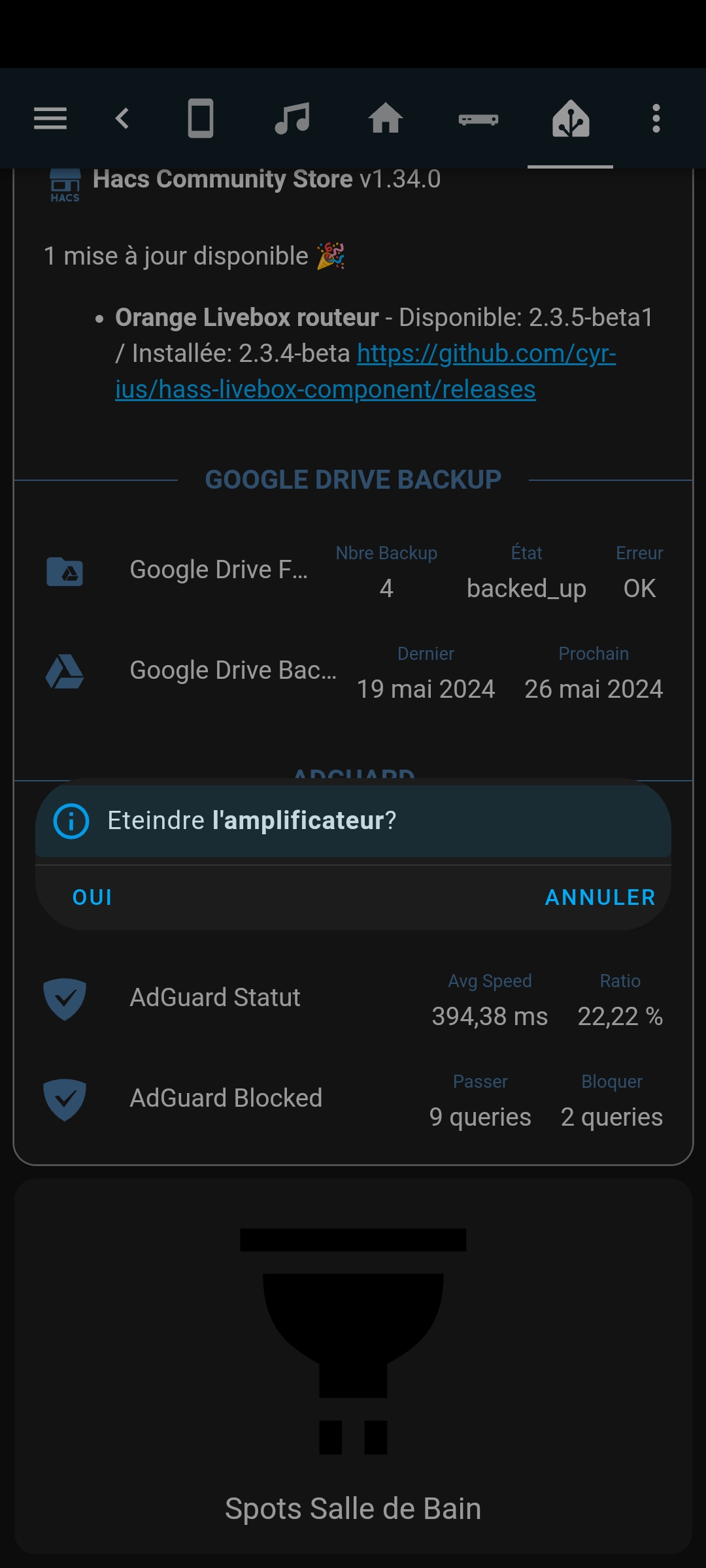
Sur PC
Sur mobile
Tu es formidable.
Avec quelques modifs côté padding&co j’ai réussi à trouver les réglages parfaits pour ma config: Merci encore!!
card_mod:
  style: |
    ha-dialog {
      --mdc-dialog-min-height: fit-content !important;
      --mdc-dialog-max-height: 180vw !important;
      --mdc-dialog-min-width: 340px !important;
      --mdc-dialog-max-width: 90vw !important;;
      --ha-dialog-border-radius: var(--ha-card-border-radius) !important;
      --vertical-align-dialog: center !important;
    }
    .content {
      height: fit-content !important;
      max-height: 90vh !important
      pointer-events: unset !important;
    }
    .container {
      padding: 4px 8px !important;
    }
    div.buttons {
      padding: 8px !important;
    }
Hum…. ça fonctionnait très bien… puis plus depuis quelques semaines je crois…ha et browser_mod:size: x au profit de initial_style: x, je n’ai rien trouvé.lien vers doc du popup browser_mod
Salut,size: classic pour mobile qui était sorti et fessait une petite fenêtre du popup, mais est cassé depuis le core 2025.10.x.
ouvert 06:43AM - 04 Oct 25 UTC
bug
workaround available
third party issue
### My Home Assistant Version
Core 2025.10.0
Frontend 20251001.0
Browser Mod: 2… .6.1
### What I am doing
Using `classic` style on popup on mobile
### What I expect to happen
A classic view which is not full height
### What happened instead
Full height view
### Minimal steps to reproduce
1. Set popup with style `classic`
2. View on mobile
### Include any yaml code here
```YAML
```
### Error messages from the browser console
```console
```
### By checking each box below I indicate that I ...
- [x] Understand that this is a channel for reporting bugs, not a support forum (https://community.home-assistant.io/).
- [x] Have made sure I am using the latest version of the plugin.
- [x] Understand that leaving one or more boxes unticked or failure to follow the template above may increase the time required to handle my bug-report, or cause it to be closed without further action.
- [x] If this issue is to do with an Android device losing connection, sensors becoming unavailable etc., please confirm you have read, understood and tried methods described in Wiki Article [Andoird Devices 'Always On'](https://github.com/thomasloven/hass-browser_mod/wiki/Andoird-Devices-'Always-On')
un fix avec card_mod est proposé dans l’issue et un fix pour le core 2025.11.x est en cours.
Okay!! merci pour le lien!
card_mod:
  style:
    ha-dialog $: |
      @media (max-width: 450px), (max-height: 500px) {
        .mdc-dialog .mdc-dialog__surface {
            min-height: 10%;
        }
      }
Je l’ai mis dans mon thème directement:
  card-mod-more-info-yaml: |
    ha-dialog $: |
      @media (max-width: 392px), (max-height: 835px) {
        .mdc-dialog .mdc-dialog__surface {
            min-height: 10% !important;
        }
      }
Avec l’option size: classic dans le popup browser mod et nikel.max-width and max-height sont les valeurs de résolution fournies dans browser-mod.
You rooock!
Au niveau thème ça passe !! Merci
C’est plus simple dans le thème, ça évite de refaire tous les popups
@mrgrlscz size: est maintenant initial_style: classic depuis la 2.6.0 de browser-mod. size fonctionne quand même, mais j’ai peur qu’elle soit supprimée dans le futur.
@mrgrlscz ,
dev ← fix_ha_dialog_min_max_height_padding
ouvert 03:22PM - 08 Oct 25 UTC
## Proposed change
The min width and the max height was moved to ha-dialog in… stead of dialog styles in this PR (https://github.com/home-assistant/frontend/commit/62714b2b68da3f3068740313aa88684a12a6ec5b)
## Type of change
- [ ] Dependency upgrade
- [x] Bugfix (non-breaking change which fixes an issue)
- [ ] New feature (thank you!)
- [ ] Breaking change (fix/feature causing existing functionality to break)
- [ ] Code quality improvements to existing code or addition of tests
## Example configuration
```yaml
```
## Additional information
- This PR fixes or closes issue: fixes #
- This PR is related to issue or discussion:
- Link to documentation pull request:
## Checklist
- [ ] The code change is tested and works locally.
- [ ] There is no commented out code in this PR.
- [ ] Tests have been added to verify that the new code works.
If user exposed functionality or configuration variables are added/changed:
- [ ] Documentation added/updated for [www.home-assistant.io][docs-repository]
[docs-repository]: https://github.com/home-assistant/home-assistant.io
Plus besoin de surcharger ton thème avec card_mod. Le mode classic fonctionne comme il faut maintenant.

