Problème de marges de boutons sur smartphone

Bonjour,

Je vous soumet ce petit problème pour lequel je m’arrache les cheveux, mais qui me semble à la base « simple ».

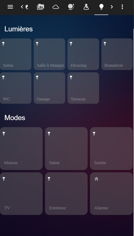
Je souhaite afficher de boutons/tuiles, avec un maximum de 4 tuiles par lignes, sachant que ces tuiles sont des « button-card ».

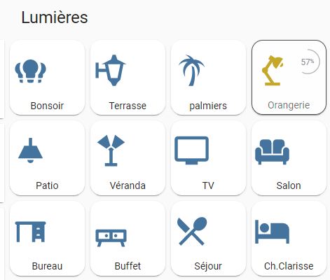
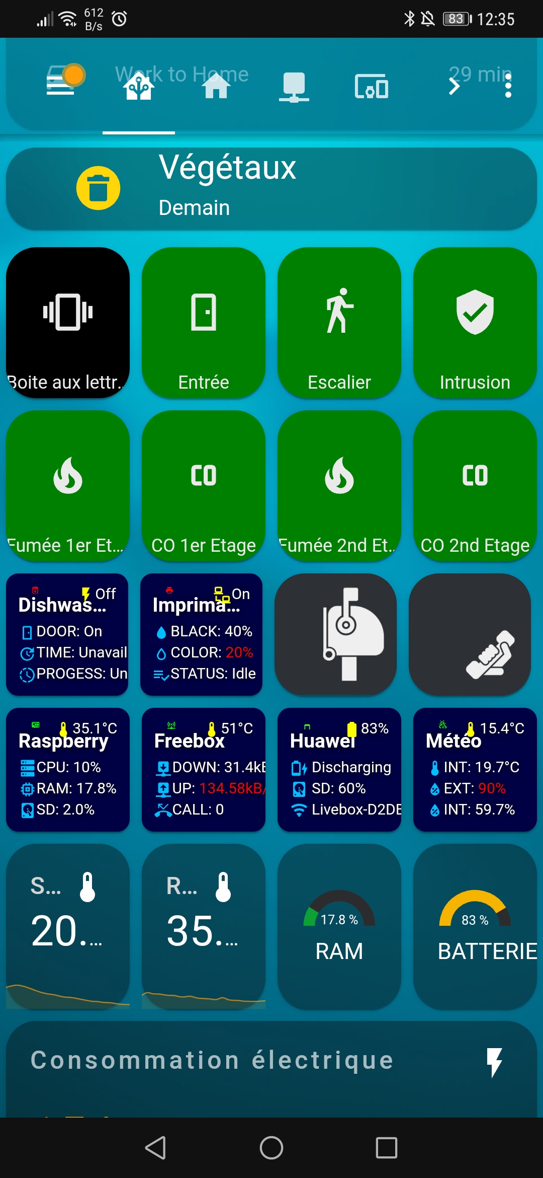
Tout fonctionne correctement si j’utilise des cartes « grid », dans lesquelles je positionne exactement chaque tuile a l’emplacement souhaité (et ça fonctionne correctement sur desktop et sur smartphone):

Extrait du code associé:

################################################################
################################################################
#                     Lights tab
################################################################
################################################################

  - title: Lumières
    path: lumières
    icon: 'mdi:lightbulb'
    panel: false
    badges: []
    cards:
      - type: vertical-stack
        cards:

          ################################
          ###       Bloc  RDC      
          ################################
          - type: vertical-stack
            title: Rez de chaussé
            cards:
              ################################
              ###  Line 1 
              ################################
              - type: grid
                columns: 4
                cards:
                  ###  Cuisine  ######
                  - type: 'custom:button-card'
                    entity: light.cuisine
                    template: light
                    name: Cuisine
                    
                  ### Salon  ###
                  - type: 'custom:button-card'
                    entity: light.salon
                    template: light

                  ### Buffet  ###
                  - type: 'custom:button-card'
                    entity: light.yeelight_buffet
                    template: light
                    name: Buffet
                    
                  ### Entrée  ###
                  - type: 'custom:button-card'
                    entity: light.entree_int
                    template: light
                    name: Entrée
                    
              ################################   
              ### Line 2
              ################################
              - type: grid
                columns: 4
                cards:
                  ###  Buanderie  ######
                  - type: 'custom:button-card'
                    entity: light.buanderie
                    template: light

                  ### WC  ###
                  - type: 'custom:button-card'
                    entity: light.wc
                    template: light

Plutôt que de gérer le positionnement des boutons manuellement 1 par 1 (en créant manuellement chaque ligne, et en positionnant chaque bouton), je souhaite les mettre a la suite, et que le positionnement soit dynamique (en respectant les 4 par ligne). Notamment car j’ai certaines tuiles qui peuvent être cachées (via « conditional »), et je ne veux pas laisser un vide.

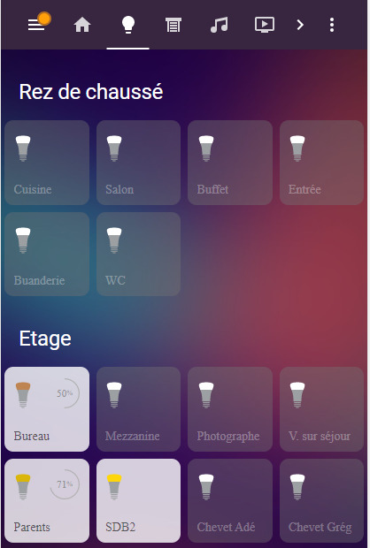
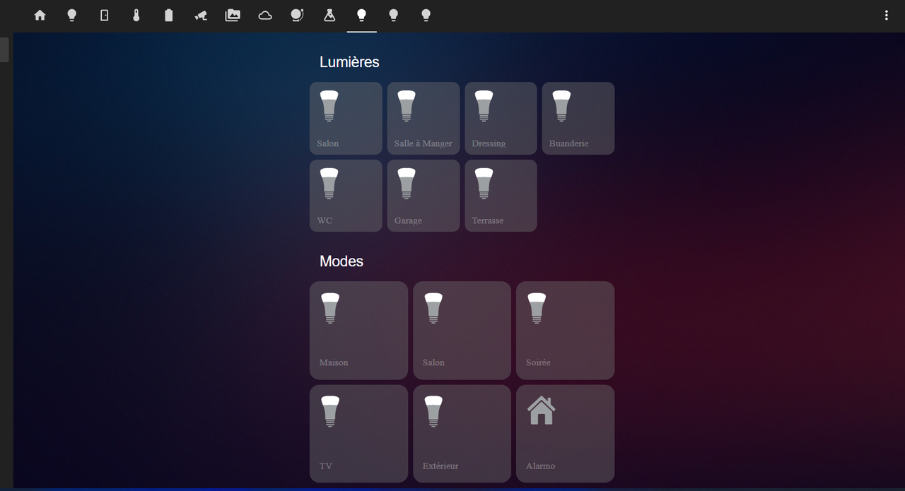
Pour ce faire, j’ai donc utilisé une imbrication de layout-card (en vertical et en grid), et de vertical stack. Le rendu est correct en mode desktop:
image

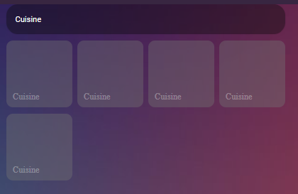
Mais dès que je passe sur smartphone, tout se chevauche:
image

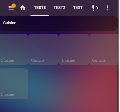
Voici le code associé:

################################################################
################################################################
#                     Test
################################################################
################################################################
  - title: Test3
    path: test3
    panel: true
    cards:
        #### Toute la page
        - type: custom:layout-card
          layout: vertical
          cards:
          ##### Bloc
          - type: vertical-stack              
            cards:
                ## Titre
              - type: markdown
                content: Cuisine
                ## Contenu
              - type: custom:layout-card
                layout: grid
                gridcols: auto auto auto auto
                cards:
                  ## Tuile 1
                  - type: vertical-stack
                    cards:
                      - type: 'custom:button-card'
                        entity: light.cuisine
                        template: base
                        name: Cuisine
                        
                  ## Tuile 2
                  - type: vertical-stack
                    cards:
                      - type: 'custom:button-card'
                        entity: light.cuisine
                        template: base
                        name: Cuisine

                  ## Tuile 3
                  - type: vertical-stack
                    cards:
                      - type: 'custom:button-card'
                        entity: light.cuisine
                        template: base
                        name: Cuisine

                  ## Tuile 4
                  - type: vertical-stack
                    cards:
                      - type: 'custom:button-card'
                        entity: light.cuisine
                        template: base
                        name: Cuisine

                  ## Tuile 5
                  - type: vertical-stack
                    cards:
                      - type: 'custom:button-card'
                        entity: light.cuisine
                        template: base
                        name: Cuisine

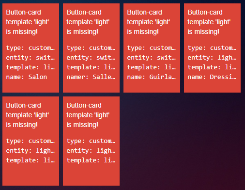
Puis le template du bouton au cas ou:

button_card_templates:

  ###############   Master template   ################
  base:
    aspect_ratio: 1/1
    show_icon: false
    state:
      - value: 'on'
        styles:
          card: [background-color: 'rgba(255, 255, 255, 0.8)']
          name: [color: 'rgba(0, 0, 0, 0.6)']
    styles:
      name:
        [top: 78%, left: 10%, line-height: 100%, position: absolute]
      card:
        - font-family: Sf Display
        - letter-spacing: 0px
        - font-weight: 400
        - color: 'rgba(255, 255, 255, 0.3)'
        - font-size: 110%
        - background-color: 'rgba(115, 115, 115, 0.4)'
        - border-radius: 10%
        - box-shadow: none
        - transition: none
      custom_fields:
        circle:
          [top: 12%, left: 54%, width: 40%, position: absolute]
    hold_action:
      action: more-info          
          
  light:
    template:
      - base
    custom_fields:
      circle: >
        [[[ if (entity.state === 'on' && entity.attributes.brightness) { const
        brightness = Math.round(entity.attributes.brightness / 2.54); const
        radius = 20.5; const circumference = radius * 2 * Math.PI;  return `<svg
        viewBox="0 0 50 50"><circle cx="25" cy="25" r="${radius}"
        stroke="#b2b2b2" stroke-width="1.5" fill="none" style=" transform:
        rotate(-90deg); transform-origin: 50% 50%; stroke-dasharray:
        ${circumference}; stroke-dashoffset: ${circumference - brightness / 100
        * circumference};" /> <text x="50%" y="54%" fill="#8d8e90"
        font-size="14" text-anchor="middle"
        alignment-baseline="middle">${brightness}<tspan
        font-size="10">%</tspan></text></svg>`; } ]]]
      icon_hue: &icon_hue >
        [[[ const state = entity.state === 'on' ? 'animate' : null;
        return `<svg viewBox="0 0 50 50"><style>@keyframes animate{0%{transform: scale(0.85);}20%{transform: scale(1.1);}40%{transform: scale(0.95);}60%{transform: scale(1.03);}80%{transform: scale(0.97);}100%{transform: scale(1);}}.animate{animation: animate 0.8s; transform-origin: center;}</style>
        <path fill="#9da0a2" d="M27.4 47.3h-4.9s-.7.1-.7.8.4.9.7.9h4.9c.3 0 .7-.1.7-.9s-.7-.8-.7-.8zm3.3-2.9H19.3s-.8 0-.8.8.6.9.8.9h11.5c.2 0 .8-.1.8-.9-.1-.8-.9-.8-.9-.8zm0-3H19.3s-.8 0-.8.8.6.9.8.9h11.5c.2 0 .8-.1.8-.9-.1-.8-.9-.8-.9-.8zm0-2.9H19.3s-.8 0-.8.8.6.9.8.9h11.5c.2 0 .8-.1.8-.9s-.9-.8-.9-.8zm5.2-23.2c-3.3-5.3-7-5.6-10.9-5.6-3.8 0-8.4.4-10.9 5.6-.1.1-.1.3.1.7.4.8 3.3 7.2 3.2 18.8 0 1.1-.1 1.6 0 1.7 0 .1 0 .7 1.1.7h13c1 0 1-.5 1.1-.7v-1.7c-.1-11.6 2.8-18 3.2-18.8.1-.4.1-.5.1-.7"/>
        <path class="${state}" fill="var(--button-card-light-color-no-temperature)" d="M14.1 15.3c3.4-.3 7-.4 10.9-.4 3.8 0 7.5.2 10.9.4.4-.4.7-.8.9-1.1C39 8.5 38.9 6.5 38.9 6c-.2-4.4-8.4-5-12.1-5h0-3.4c-3.7 0-12 .5-12.1 5 0 .5-.1 2.5 2.1 8.2 0 .3.3.8.7 1.1z"/></svg>`; ]]]
    styles: &icon_hue_styles
      custom_fields:
        icon_hue:
          [top: 16%, left: 6%, width: 50%, position: absolute]

Tous les exemple que j’ai trouvé, sont avec un positionnement « fixe », or je cherche du dynamique. Quelqu’un aurait il un exemple?
J’ai exploré la possibilité de gérer mes tuiles avec une largeur fixe, mais on s’éloigne du responsive:), j’ai aussi testé avec un width a 25% ou a 22%, ça ne fonctionne pas.

J’ai l’impression de me compliquer la vie pour un besoin simple (j’ai même fait des tests en passant par des « mod-card », puis gérer manuellement des margins pour chaque tuile, je commençait à partir sur une usine a gaz :), ).

Une piste?

1 « J'aime »

@Dapolux as tu simplement essayé la carte horizontal-stack ? C’est ce que j’utilise de mon côté

Merci pour ta suggestion, mais oui j’ai déjà essayé, le problème est le même, il faut faut une ligne manuelle a chaque fois

1 « J'aime »

Alors pour ceux que ça pourrais intéresser, finalement j’ai résolu mon problème en utilisant simplement la carte grid. En fait c’était tout bête.

################################
###       Bloc  RDC      
################################

      - type: vertical-stack
        title: Rez de chaussé
        cards:
          - type: grid
            columns: 4
            cards:

              ###  Cuisine  ######
              - type: 'custom:button-card'
                entity: light.cuisine
                template: light
                name: Cuisine                

              ### Salon  ###
              - type: 'custom:button-card'
                entity: light.salon
                template: light

              ### Buffet  ###
              - type: 'custom:button-card'
                entity: light.yeelight_buffet
                template: light
                name: Buffet

              ### Entrée  ###
              - type: 'custom:button-card'
                entity: light.entree_int
                template: light
                name: Entrée

              ###  Buanderie  ######
              - type: 'custom:button-card'
                entity: light.buanderie
                template: light

              ### WC  ###
              - type: 'custom:button-card'
                entity: light.wc
                template: light

2 « J'aime »

4 messages ont été scindés en un nouveau sujet : Modifier lumières (‹ thème › de Mattias_Persson)

Bonjour,

J’adore ce design. Mais je n’arrive pas à le faire fonctionner correctement

Voici le message d’erreur :

D’ou vient mon problème ?
J’ai pourtant créé le fichier button_card_template.yaml dans lequel j’ai copié le code ci-dessus.
J’ai redémarré HA

Merci d’avance
Cdt

Bonjour @Guizmos,

Il faudrait que tu postes le code source que tu utilises pour en savoir un peu plus.

A priori, je dirais qu’il te manque le template de button-card « light » (comme précise le message d’erreur). Si tu as déclaré ce template dans « button_card_template.yaml », n’oublie pas de déclarer ce fichier (button_card_templates: !include button_card_template.yaml en début de fichier).

Bonjour @Dapolux

Merci pour ta réponse.
J’ai aucune configuration de spéciale. J’ai juste créé le fichier button_card_templates.yaml dans lequel j’ai copié le code que tu as fournis plus haut.
J’ai ensuite créé les cards en suivant ton code.

« Si tu as déclaré ce template dans « button_card_template.yaml », n’oublie pas de déclarer ce fichier (button_card_templates: !include button_card_template.yaml en début de fichier). »

Je dois mettre cette ligne dans mon configuration.yaml ?

Merci

Voici le contenu du fichier button_card_templates.yaml

button_card_templates: 

  ###############   Master template   ################
  base:
    aspect_ratio: 1/1
    show_icon: false
    state:
      - value: 'on'
        styles:
          card: [background-color: 'rgba(255, 255, 255, 0.8)']
          name: [color: 'rgba(0, 0, 0, 0.6)']
    styles:
      name:
        [top: 78%, left: 10%, line-height: 100%, position: absolute]
      card:
        - font-family: Sf Display
        - letter-spacing: 0px
        - font-weight: 400
        - color: 'rgba(255, 255, 255, 0.3)'
        - font-size: 110%
        - background-color: 'rgba(115, 115, 115, 0.4)'
        - border-radius: 10%
        - box-shadow: none
        - transition: none
      custom_fields:
        circle:
          [top: 12%, left: 54%, width: 40%, position: absolute]
    hold_action:
      action: more-info          
          
  light:
    template:
      - base
    custom_fields:
      circle: >
        [[[ if (entity.state === 'on' && entity.attributes.brightness) { const
        brightness = Math.round(entity.attributes.brightness / 2.54); const
        radius = 20.5; const circumference = radius * 2 * Math.PI;  return `<svg
        viewBox="0 0 50 50"><circle cx="25" cy="25" r="${radius}"
        stroke="#b2b2b2" stroke-width="1.5" fill="none" style=" transform:
        rotate(-90deg); transform-origin: 50% 50%; stroke-dasharray:
        ${circumference}; stroke-dashoffset: ${circumference - brightness / 100
        * circumference};" /> <text x="50%" y="54%" fill="#8d8e90"
        font-size="14" text-anchor="middle"
        alignment-baseline="middle">${brightness}<tspan
        font-size="10">%</tspan></text></svg>`; } ]]]
      icon_hue: &icon_hue >
        [[[ const state = entity.state === 'on' ? 'animate' : null;
        return `<svg viewBox="0 0 50 50"><style>@keyframes animate{0%{transform: scale(0.85);}20%{transform: scale(1.1);}40%{transform: scale(0.95);}60%{transform: scale(1.03);}80%{transform: scale(0.97);}100%{transform: scale(1);}}.animate{animation: animate 0.8s; transform-origin: center;}</style>
        <path fill="#9da0a2" d="M27.4 47.3h-4.9s-.7.1-.7.8.4.9.7.9h4.9c.3 0 .7-.1.7-.9s-.7-.8-.7-.8zm3.3-2.9H19.3s-.8 0-.8.8.6.9.8.9h11.5c.2 0 .8-.1.8-.9-.1-.8-.9-.8-.9-.8zm0-3H19.3s-.8 0-.8.8.6.9.8.9h11.5c.2 0 .8-.1.8-.9-.1-.8-.9-.8-.9-.8zm0-2.9H19.3s-.8 0-.8.8.6.9.8.9h11.5c.2 0 .8-.1.8-.9s-.9-.8-.9-.8zm5.2-23.2c-3.3-5.3-7-5.6-10.9-5.6-3.8 0-8.4.4-10.9 5.6-.1.1-.1.3.1.7.4.8 3.3 7.2 3.2 18.8 0 1.1-.1 1.6 0 1.7 0 .1 0 .7 1.1.7h13c1 0 1-.5 1.1-.7v-1.7c-.1-11.6 2.8-18 3.2-18.8.1-.4.1-.5.1-.7"/>
        <path class="${state}" fill="var(--button-card-light-color-no-temperature)" d="M14.1 15.3c3.4-.3 7-.4 10.9-.4 3.8 0 7.5.2 10.9.4.4-.4.7-.8.9-1.1C39 8.5 38.9 6.5 38.9 6c-.2-4.4-8.4-5-12.1-5h0-3.4c-3.7 0-12 .5-12.1 5 0 .5-.1 2.5 2.1 8.2 0 .3.3.8.7 1.1z"/></svg>`; ]]]
    styles: &icon_hue_styles
      custom_fields:
        icon_hue:
          [top: 16%, left: 6%, width: 50%, position: absolute]

Et voici mon code pour les cards :

type: vertical-stack
title: Rez de chaussé
cards:
  - type: grid
    columns: 4
    cards:
      - type: custom:button-card
        entity: switch.lumiere_salon
        template: light
        name: Salon
      - type: custom:button-card
        entity: switch.lumiere_salle_a_manger
        template: light
        namer: Salle à Manger
      - type: custom:button-card
        entity: switch.ewelink_sa_003_zigbee_on_off
        template: light
        name: Guirlande
      - type: custom:button-card
        entity: light.lampe_dressing_on_off
        template: light
        name: Dressing
      - type: custom:button-card
        entity: light.buanderie
        template: light
      - type: custom:button-card
        entity: light.wc
        template: light

Il est à mettre dans le code de tes cards.

Sinon, si tu préfères tu peux tout mettre directement dans le code de tes cartes, sans externaliser (si par exemple tu as une solution plutôt simple). Cette manip d’externaliser le code permet juste d’alléger la maintenance.

N’hésites pas à jeter un coup d’oeil sur la doc du button-card.

Bonne journée!

D’accord, merci pour les infos. J’essaie de tourner ça dans tout les sens pour arriver à mes fins :slight_smile:
Pour le moment c’est pas gagné.

Autre question, pour les icônes, elles viennent avec le code ou il faut faire quelque chose en plus ?

Je trouve ce design extrèmenent pratique avec un téléphone ou une tablette, c’est pourquoi j’ai très envie de le mettre en place.

Comme mon niveau est encore faible avec HA, j’ai besoin de plus de temps et de quelques bons conseils :slight_smile:

C’est normal d’avoir des questions au début :).

Les icones viennent avec le code, c’est une des puissances de l’utilisation des SVG.

Personnellement je n’utilise plus vraiment ce visuel, je me suis un peu plus concentré sur une vue de plans de ma maison car j’avais trop de boutons, ça devenais trop lourd ergonomiquement (cf mon dashboard)

Oui, je progresse assez rapidement. Je commence à comprendre les rouages de ce design.

J’ai réussi à faire apparaitre les boutons avec le bon design. En revanche, je n’arive pas à trouver le paramètre qui change la taille de l’icone en fonction du redimmansionnement de la page.
(en gros sur mon téléphone, les icones des boutons sont ultra petit (le texte aussi)

Et je n’arrive pas à comprendre comment je peux positionner les boutons sur la page. Actuellement tout est au centre.

La taille de l’icone est déterminée dans cette partie:

    styles: &icon_hue_styles
      custom_fields:
        icon_hue:
          [top: 16%, left: 6%, width: 50%, position: absolute]

C’est le paramètre « width » sur lequel il faut jouer.
Cette taille peut être fixe (à déclarer en pixels « px ») ou en % (comme c’est le cas actuellement). Le souci que tu rencontres est certainement lié au fait qu’en % ça dépend de la largeur de ta page (et de la résolution du coup) entière car tu est probablement en mode panel (panel: true). Si c’est bien cela, tu verras que si tu réduis la taille de ta fenêtre en mode bureau, tu auras certainement des icones tout petits.

Super, merci pour ta réponse. En modifiant le ‹ % › en ‹ px › et en jouant sur les valeurs, j’obtiens bien une taille fixe, peut importe la dimension de la fenêtre.

Sais-tu comment je peux ranger mes tuiles en colonne dans ma page ?
Si j’ai bien compris, c’est ce code qui fais le travail :

      - type: state-label
        entity: sensor.placeholder
        attribute: autre
        style:
          top: 53.4%
          left: 50.2%

Mais lorsque je passe en mode « panel:true » et que j’insère le code, j’ai une erreur et je perd mes tuiles. :thinking:

Pour gérer cela, le mieux est d’utiliser les différentes cartes disponibles, et jouer sur ta composition (nottament avec les vertical-stack, les horizontal-stack, et les grid, perso j’utilise beaucoup le layout-card, n’hésites pas a consulter le lien, il y a pas mal d’exemples)

Si cela peut t’aider, voici ma carte et le code:

Capture

le code:

type: vertical-stack
title: Lumières
cards:
  - type: grid
    cards:
      - type: custom:button-card
        entity: light.bonsoir
        name: Bonsoir
        icon: mdi:lightbulb-group
        aspect_ratio: 1/1
        state:
          - value: 'on'
            styles:
              card:
                - background-color: rgba(255, 255, 255, 0.8)
                - border: 1px rgba(80, 80, 80) solid
              name:
                - color: rgba(0, 0, 0, 0.6)
              icon:
                - color: var(--button-card-light-color-no-temperature)
        double_tap_action:
          action: call-service
          service: hue.hue_activate_scene
          service_data:
            group_name: Bonsoir
            scene_name: Detente +
        variables:
          circle_input: |
            [[[ return Math.round(entity.attributes.brightness / 2.54); ]]]
        styles:
          icon:
            - top: '-2%'
            - left: 3%
            - width: 50%
            - position: absolute
          name:
            - top: 80%
            - left: 15%
            - position: center
          card:
            - font-size: 100%
            - border-radius: 15%
            - box-shadow: true
            - transition: true
          custom_fields:
            circle:
              - top: 8.5%
              - left: 56%
              - width: 40%
              - position: absolute
        custom_fields:
          circle: |
            [[[
              if (entity.state === 'on') {
                const input = variables.circle_input;
                const radius = 20.5;
                const circumference = radius * 2 * Math.PI;
                return `
                  <svg viewBox="0 0 50 50">
                    <style>
                      circle {
                        transform: rotate(-90deg);
                        transform-origin: 50% 50%;
                        stroke-dasharray: ${circumference};
                        stroke-dashoffset: ${circumference - input / 100 * circumference};
                      }
                      tspan {
                        font-size: 10px;
                      }
                    </style>
                    <circle cx="25" cy="25" r="${radius}" stroke="#b2b2b2" stroke-width="1.5" fill="none" />
                    <text x="50%" y="54%" fill="#8d8e90" font-size="14" text-anchor="middle" alignment-baseline="middle">${input}<tspan font-size="10">%</tspan></text>
                  </svg>
                `;
              }
            ]]]
      - type: custom:button-card
        entity: light.terrasse
        name: Terrasse
        show_state: false
        show_icon: true
        icon: mdi:coach-lamp
        aspect_ratio: 1/1
        state:
          - value: 'on'
            styles:
              card:
                - background-color: rgba(255, 255, 255, 0.8)
                - border: 1px rgba(80, 80, 80) solid
              name:
                - color: rgba(0, 0, 0, 0.6)
              icon:
                - color: var(--button-card-light-color-no-temperature)
        double_tap_action:
          action: more-info
        variables:
          circle_input: |
            [[[ return Math.round(entity.attributes.brightness / 2.54); ]]]
        styles:
          icon:
            - top: '-2%'
            - left: 3%
            - width: 50%
            - position: absolute
          name:
            - top: 80%
            - left: 15%
            - position: center
          card:
            - font-size: 100%
            - border-radius: 15%
            - box-shadow: true
            - transition: true
          custom_fields:
            circle:
              - top: 8.5%
              - left: 56%
              - width: 40%
              - position: absolute
        custom_fields:
          circle: |
            [[[
              if (entity.state === 'on') {
                const input = variables.circle_input;
                const radius = 20.5;
                const circumference = radius * 2 * Math.PI;
                return `
                  <svg viewBox="0 0 50 50">
                    <style>
                      circle {
                        transform: rotate(-90deg);
                        transform-origin: 50% 50%;
                        stroke-dasharray: ${circumference};
                        stroke-dashoffset: ${circumference - input / 100 * circumference};
                      }
                      tspan {
                        font-size: 10px;
                      }
                    </style>
                    <circle cx="25" cy="25" r="${radius}" stroke="#b2b2b2" stroke-width="1.5" fill="none" />
                    <text x="50%" y="54%" fill="#8d8e90" font-size="14" text-anchor="middle" alignment-baseline="middle">${input}<tspan font-size="10">%</tspan></text>
                  </svg>
                `;
              }
            ]]]
      - type: custom:button-card
        entity: switch.projecteur_palmiers
        name: palmiers
        aspect_ratio: 1/1
        state:
          - value: 'on'
            styles:
              card:
                - background-color: rgba(255, 255, 255, 0.8)
                - border: 1px rgba(80, 80, 80) solid
              name:
                - color: rgba(0, 0, 0, 0.6)
              icon:
                - color: var(--button-card-light-color-no-temperature)
        double_tap_action:
          action: more-info
        styles:
          icon:
            - top: '-2%'
            - left: 3%
            - width: 50%
            - position: absolute
          name:
            - top: 80%
            - left: 15%
            - position: center
          card:
            - font-size: 100%
            - border-radius: 15%
            - box-shadow: true
            - transition: true
      - type: custom:button-card
        entity: light.orangerie
        name: Orangerie
        icon: mdi:desk-lamp
        aspect_ratio: 1/1
        state:
          - value: 'on'
            styles:
              card:
                - background-color: rgba(255, 255, 255, 0.8)
                - border: 1px rgba(80, 80, 80) solid
              name:
                - color: rgba(0, 0, 0, 0.6)
              icon:
                - color: var(--button-card-light-color-no-temperature)
        double_tap_action:
          action: more-info
        variables:
          circle_input: |
            [[[ return Math.round(entity.attributes.brightness / 2.54); ]]]
        styles:
          icon:
            - top: '-2%'
            - left: 3%
            - width: 50%
            - position: absolute
          name:
            - top: 80%
            - left: 15%
            - position: center
          card:
            - font-size: 100%
            - border-radius: 15%
            - box-shadow: true
            - transition: true
          custom_fields:
            circle:
              - top: 8.5%
              - left: 56%
              - width: 40%
              - position: absolute
        custom_fields:
          circle: |
            [[[
              if (entity.state === 'on') {
                const input = variables.circle_input;
                const radius = 20.5;
                const circumference = radius * 2 * Math.PI;
                return `
                  <svg viewBox="0 0 50 50">
                    <style>
                      circle {
                        transform: rotate(-90deg);
                        transform-origin: 50% 50%;
                        stroke-dasharray: ${circumference};
                        stroke-dashoffset: ${circumference - input / 100 * circumference};
                      }
                      tspan {
                        font-size: 10px;
                      }
                    </style>
                    <circle cx="25" cy="25" r="${radius}" stroke="#b2b2b2" stroke-width="1.5" fill="none" />
                    <text x="50%" y="54%" fill="#8d8e90" font-size="14" text-anchor="middle" alignment-baseline="middle">${input}<tspan font-size="10">%</tspan></text>
                  </svg>
                `;
              }
            ]]]
      - type: custom:button-card
        entity: light.patio
        name: Patio
        icon: mdi:ceiling-light
        aspect_ratio: 1/1
        state:
          - value: 'on'
            styles:
              card:
                - background-color: rgba(255, 255, 255, 0.8)
                - border: 1px rgba(80, 80, 80) solid
              name:
                - color: rgba(0, 0, 0, 0.6)
              icon:
                - color: var(--button-card-light-color-no-temperature)
        double_tap_action:
          action: more-info
        variables:
          circle_input: |
            [[[ return Math.round(entity.attributes.brightness / 2.54); ]]]
        styles:
          icon:
            - top: '-2%'
            - left: 3%
            - width: 50%
            - position: absolute
          name:
            - top: 80%
            - left: 15%
            - position: center
          card:
            - font-size: 100%
            - border-radius: 15%
            - box-shadow: true
            - transition: true
          custom_fields:
            circle:
              - top: 8.5%
              - left: 56%
              - width: 40%
              - position: absolute
        custom_fields:
          circle: |
            [[[
              if (entity.state === 'on') {
                const input = variables.circle_input;
                const radius = 20.5;
                const circumference = radius * 2 * Math.PI;
                return `
                  <svg viewBox="0 0 50 50">
                    <style>
                      circle {
                        transform: rotate(-90deg);
                        transform-origin: 50% 50%;
                        stroke-dasharray: ${circumference};
                        stroke-dashoffset: ${circumference - input / 100 * circumference};
                      }
                      tspan {
                        font-size: 10px;
                      }
                    </style>
                    <circle cx="25" cy="25" r="${radius}" stroke="#b2b2b2" stroke-width="1.5" fill="none" />
                    <text x="50%" y="54%" fill="#8d8e90" font-size="14" text-anchor="middle" alignment-baseline="middle">${input}<tspan font-size="10">%</tspan></text>
                  </svg>
                `;
              }
            ]]]
      - type: custom:button-card
        entity: light.veranda
        name: Véranda
        icon: mdi:floor-lamp-dual
        aspect_ratio: 1/1
        state:
          - value: 'on'
            styles:
              card:
                - background-color: rgba(255, 255, 255, 0.8)
                - border: 1px rgba(80, 80, 80) solid
              name:
                - color: rgba(0, 0, 0, 0.6)
              icon:
                - color: var(--button-card-light-color-no-temperature)
        double_tap_action:
          action: more-info
        variables:
          circle_input: |
            [[[ return Math.round(entity.attributes.brightness / 2.54); ]]]
        styles:
          icon:
            - top: '-2%'
            - left: 3%
            - width: 50%
            - position: absolute
          name:
            - top: 80%
            - left: 15%
            - position: center
          card:
            - font-size: 100%
            - border-radius: 15%
            - box-shadow: true
            - transition: true
          custom_fields:
            circle:
              - top: 8.5%
              - left: 56%
              - width: 40%
              - position: absolute
        custom_fields:
          circle: |
            [[[
              if (entity.state === 'on') {
                const input = variables.circle_input;
                const radius = 20.5;
                const circumference = radius * 2 * Math.PI;
                return `
                  <svg viewBox="0 0 50 50">
                    <style>
                      circle {
                        transform: rotate(-90deg);
                        transform-origin: 50% 50%;
                        stroke-dasharray: ${circumference};
                        stroke-dashoffset: ${circumference - input / 100 * circumference};
                      }
                      tspan {
                        font-size: 10px;
                      }
                    </style>
                    <circle cx="25" cy="25" r="${radius}" stroke="#b2b2b2" stroke-width="1.5" fill="none" />
                    <text x="50%" y="54%" fill="#8d8e90" font-size="14" text-anchor="middle" alignment-baseline="middle">${input}<tspan font-size="10">%</tspan></text>
                  </svg>
                `;
              }
            ]]]
      - type: custom:button-card
        icon: mdi:television
        entity: light.tv
        name: TV
        aspect_ratio: 1/1
        state:
          - value: 'on'
            styles:
              card:
                - background-color: rgba(255, 255, 255, 0.8)
                - border: 1px rgba(80, 80, 80) solid
              name:
                - color: rgba(0, 0, 0, 0.6)
              icon:
                - color: var(--button-card-light-color-no-temperature)
        double_tap_action:
          action: more-info
        variables:
          circle_input: |
            [[[ return Math.round(entity.attributes.brightness / 2.54); ]]]
        styles:
          icon:
            - top: '-2%'
            - left: 3%
            - width: 50%
            - position: absolute
          name:
            - top: 80%
            - left: 15%
            - position: center
          card:
            - font-size: 100%
            - border-radius: 15%
            - box-shadow: true
            - transition: true
          custom_fields:
            circle:
              - top: 8.5%
              - left: 56%
              - width: 40%
              - position: absolute
        custom_fields:
          circle: |
            [[[
              if (entity.state === 'on') {
                const input = variables.circle_input;
                const radius = 20.5;
                const circumference = radius * 2 * Math.PI;
                return `
                  <svg viewBox="0 0 50 50">
                    <style>
                      circle {
                        transform: rotate(-90deg);
                        transform-origin: 50% 50%;
                        stroke-dasharray: ${circumference};
                        stroke-dashoffset: ${circumference - input / 100 * circumference};
                      }
                      tspan {
                        font-size: 10px;
                      }
                    </style>
                    <circle cx="25" cy="25" r="${radius}" stroke="#b2b2b2" stroke-width="1.5" fill="none" />
                    <text x="50%" y="54%" fill="#8d8e90" font-size="14" text-anchor="middle" alignment-baseline="middle">${input}<tspan font-size="10">%</tspan></text>
                  </svg>
                `;
              }
            ]]]
      - type: custom:button-card
        entity: light.salon
        name: Salon
        icon: mdi:sofa
        aspect_ratio: 1/1
        state:
          - value: 'on'
            styles:
              card:
                - background-color: rgba(255, 255, 255, 0.8)
                - border: 1px rgba(80, 80, 80) solid
              name:
                - color: rgba(0, 0, 0, 0.6)
              icon:
                - color: var(--button-card-light-color-no-temperature)
        double_tap_action:
          action: more-info
        variables:
          circle_input: |
            [[[ return Math.round(entity.attributes.brightness / 2.54); ]]]
        styles:
          icon:
            - top: '-2%'
            - left: 3%
            - width: 50%
            - position: absolute
          name:
            - top: 80%
            - left: 15%
            - position: center
          card:
            - font-size: 100%
            - border-radius: 15%
            - box-shadow: true
            - transition: true
          custom_fields:
            circle:
              - top: 8.5%
              - left: 56%
              - width: 40%
              - position: absolute
        custom_fields:
          circle: |
            [[[
              if (entity.state === 'on') {
                const input = variables.circle_input;
                const radius = 20.5;
                const circumference = radius * 2 * Math.PI;
                return `
                  <svg viewBox="0 0 50 50">
                    <style>
                      circle {
                        transform: rotate(-90deg);
                        transform-origin: 50% 50%;
                        stroke-dasharray: ${circumference};
                        stroke-dashoffset: ${circumference - input / 100 * circumference};
                      }
                      tspan {
                        font-size: 10px;
                      }
                    </style>
                    <circle cx="25" cy="25" r="${radius}" stroke="#b2b2b2" stroke-width="1.5" fill="none" />
                    <text x="50%" y="54%" fill="#8d8e90" font-size="14" text-anchor="middle" alignment-baseline="middle">${input}<tspan font-size="10">%</tspan></text>
                  </svg>
                `;
              }
            ]]]
      - type: custom:button-card
        entity: light.lampe_bureau
        name: Bureau
        icon: mdi:desk
        aspect_ratio: 1/1
        state:
          - value: 'on'
            styles:
              card:
                - background-color: rgba(255, 255, 255, 0.8)
                - border: 1px rgba(80, 80, 80) solid
              name:
                - color: rgba(0, 0, 0, 0.6)
              icon:
                - color: var(--button-card-light-color-no-temperature)
        double_tap_action:
          action: more-info
        variables:
          circle_input: |
            [[[ return Math.round(entity.attributes.brightness / 2.54); ]]]
        styles:
          icon:
            - top: '-2%'
            - left: 3%
            - width: 50%
            - position: absolute
          name:
            - top: 80%
            - left: 15%
            - position: center
          card:
            - font-size: 100%
            - border-radius: 15%
            - box-shadow: true
            - transition: true
          custom_fields:
            circle:
              - top: 8.5%
              - left: 56%
              - width: 40%
              - position: absolute
        custom_fields:
          circle: |
            [[[
              if (entity.state === 'on') {
                const input = variables.circle_input;
                const radius = 20.5;
                const circumference = radius * 2 * Math.PI;
                return `
                  <svg viewBox="0 0 50 50">
                    <style>
                      circle {
                        transform: rotate(-90deg);
                        transform-origin: 50% 50%;
                        stroke-dasharray: ${circumference};
                        stroke-dashoffset: ${circumference - input / 100 * circumference};
                      }
                      tspan {
                        font-size: 10px;
                      }
                    </style>
                    <circle cx="25" cy="25" r="${radius}" stroke="#b2b2b2" stroke-width="1.5" fill="none" />
                    <text x="50%" y="54%" fill="#8d8e90" font-size="14" text-anchor="middle" alignment-baseline="middle">${input}<tspan font-size="10">%</tspan></text>
                  </svg>
                `;
              }
            ]]]
      - type: custom:button-card
        entity: light.buffet
        name: Buffet
        icon: mdi:buffet
        aspect_ratio: 1/1
        state:
          - value: 'on'
            styles:
              card:
                - background-color: rgba(255, 255, 255, 0.8)
                - border: 1px rgba(80, 80, 80) solid
              name:
                - color: rgba(0, 0, 0, 0.6)
              icon:
                - color: var(--button-card-light-color-no-temperature)
        double_tap_action:
          action: more-info
        variables:
          circle_input: |
            [[[ return Math.round(entity.attributes.brightness / 2.54); ]]]
        styles:
          icon:
            - top: '-2%'
            - left: 3%
            - width: 50%
            - position: absolute
          name:
            - top: 80%
            - left: 15%
            - position: center
          card:
            - font-size: 100%
            - border-radius: 15%
            - box-shadow: true
            - transition: true
          custom_fields:
            circle:
              - top: 8.5%
              - left: 56%
              - width: 40%
              - position: absolute
        custom_fields:
          circle: |
            [[[
              if (entity.state === 'on') {
                const input = variables.circle_input;
                const radius = 20.5;
                const circumference = radius * 2 * Math.PI;
                return `
                  <svg viewBox="0 0 50 50">
                    <style>
                      circle {
                        transform: rotate(-90deg);
                        transform-origin: 50% 50%;
                        stroke-dasharray: ${circumference};
                        stroke-dashoffset: ${circumference - input / 100 * circumference};
                      }
                      tspan {
                        font-size: 10px;
                      }
                    </style>
                    <circle cx="25" cy="25" r="${radius}" stroke="#b2b2b2" stroke-width="1.5" fill="none" />
                    <text x="50%" y="54%" fill="#8d8e90" font-size="14" text-anchor="middle" alignment-baseline="middle">${input}<tspan font-size="10">%</tspan></text>
                  </svg>
                `;
              }
            ]]]
      - type: custom:button-card
        entity: light.sejour
        name: Séjour
        icon: mdi:silverware
        aspect_ratio: 1/1
        state:
          - value: 'on'
            styles:
              card:
                - background-color: rgba(255, 255, 255, 0.8)
                - border: 1px rgba(80, 80, 80) solid
              name:
                - color: rgba(0, 0, 0, 0.6)
              icon:
                - color: var(--button-card-light-color-no-temperature)
        double_tap_action:
          action: more-info
        variables:
          circle_input: |
            [[[ return Math.round(entity.attributes.brightness / 2.54); ]]]
        styles:
          icon:
            - top: '-2%'
            - left: 3%
            - width: 50%
            - position: absolute
          name:
            - top: 80%
            - left: 15%
            - position: center
          card:
            - font-size: 100%
            - border-radius: 15%
            - box-shadow: true
            - transition: true
          custom_fields:
            circle:
              - top: 8.5%
              - left: 56%
              - width: 40%
              - position: absolute
        custom_fields:
          circle: |
            [[[
              if (entity.state === 'on') {
                const input = variables.circle_input;
                const radius = 20.5;
                const circumference = radius * 2 * Math.PI;
                return `
                  <svg viewBox="0 0 50 50">
                    <style>
                      circle {
                        transform: rotate(-90deg);
                        transform-origin: 50% 50%;
                        stroke-dasharray: ${circumference};
                        stroke-dashoffset: ${circumference - input / 100 * circumference};
                      }
                      tspan {
                        font-size: 10px;
                      }
                    </style>
                    <circle cx="25" cy="25" r="${radius}" stroke="#b2b2b2" stroke-width="1.5" fill="none" />
                    <text x="50%" y="54%" fill="#8d8e90" font-size="14" text-anchor="middle" alignment-baseline="middle">${input}<tspan font-size="10">%</tspan></text>
                  </svg>
                `;
              }
            ]]]
      - type: custom:button-card
        entity: light.chambre_de_clarisse
        name: Ch.Clarisse
        icon: mdi:bed
        aspect_ratio: 1/1
        state:
          - value: 'on'
            styles:
              card:
                - background-color: rgba(255, 255, 255, 0.8)
                - border: 1px rgba(80, 80, 80) solid
              name:
                - color: rgba(0, 0, 0, 0.6)
              icon:
                - color: var(--button-card-light-color-no-temperature)
        double_tap_action:
          action: more-info
        variables:
          circle_input: |
            [[[ return Math.round(entity.attributes.brightness / 2.54); ]]]
        styles:
          icon:
            - top: '-2%'
            - left: 3%
            - width: 50%
            - position: absolute
          name:
            - top: 80%
            - left: 15%
            - position: center
          card:
            - font-size: 100%
            - border-radius: 15%
            - box-shadow: true
            - transition: true
          custom_fields:
            circle:
              - top: 8.5%
              - left: 56%
              - width: 40%
              - position: absolute
        custom_fields:
          circle: |
            [[[
              if (entity.state === 'on') {
                const input = variables.circle_input;
                const radius = 20.5;
                const circumference = radius * 2 * Math.PI;
                return `
                  <svg viewBox="0 0 50 50">
                    <style>
                      circle {
                        transform: rotate(-90deg);
                        transform-origin: 50% 50%;
                        stroke-dasharray: ${circumference};
                        stroke-dashoffset: ${circumference - input / 100 * circumference};
                      }
                      tspan {
                        font-size: 10px;
                      }
                    </style>
                    <circle cx="25" cy="25" r="${radius}" stroke="#b2b2b2" stroke-width="1.5" fill="none" />
                    <text x="50%" y="54%" fill="#8d8e90" font-size="14" text-anchor="middle" alignment-baseline="middle">${input}<tspan font-size="10">%</tspan></text>
                  </svg>
                `;
              }
            ]]]
    square: false
    columns: 4

Merci @Plouf34 pour ton code.
Testé et approuvé :slight_smile:

Pratique car on peut l’utiliser en mode lovelace non yaml

Hello

J’ai du mal à faire fonctionner la card TV.
Je reprends le même schéma que pour mes button-card lumière sans succès.

Je n’arive pas à trouver le coupable. Voici mon code pour la card :

type: custom:button-card
entity: media_player.dalg_tv
name: TV
icon: custom
styles:
  icon:
    - top: '-2%'
    - left: 3%
    - width: 18%
    - position: absolute
  name:
    - top: 80%
    - left: 15%
    - position: center
    - color: rgba(240, 240, 240, 0.8)
  card:
    - font-size: 100%
    - border-radius: 15%
    - border-style: solid
    - border-color: rgba(240, 240, 240, 0.3)
    - border-width: 1px
    - box-shadow: true
    - transition: true
  custom_fields:
    icon:
      - top: 13%
      - left: 11%
      - width: 38%
      - position: absolute
      - fill: |
          [[[
            return variables.state === 'on' ? '#616161' : '#9da0a2';
          ]]]
custom_fields:
  icon: |
    [[[
      const style = `
        <style>
          @keyframes on {
            from {
              transform: scaleY(0);
            }
            to {
              transform: scaleY(1);
            }
          }
          .on {
            animation: on 1s;
            transform-origin: -100% 46%;
            animation-fill-mode: forwards;
          }
          @keyframes off {
            from {
              transform: scaleY(1);
            }
            to {
              transform: scaleY(0);
            }
          }
          .off {
            animation: off 1s;
            transform-origin: -100% 46%;
            animation-fill-mode: forwards;
          }
        </style>
      `;
      const path = `
        <path d="M46 9.2v27.5H4.1V9.2H46m2.4-2.4H1.6v32.3h46.7c.1 0 .1-32.3.1-32.3zM11.9 43.2h26.3c.6 0 1.1-.4 1.1-1v-.3c0-.6-.4-1.1-1-1.1H11.9c-.6 0-1.1.4-1.1 1v.3a1.11 1.11 0 0 0 1.1 1.1z"/>
      `;
      const gradient = `
        <linearGradient id="A" gradientUnits="userSpaceOnUse" x1="5.401" y1="34.714" x2="43.817" y2="11.74">
          <stop offset="0" stop-color="#64acb7"/>
          <stop offset="1" stop-color="#7fdbe9"/>
        </linearGradient>
      `;
      if (variables.state === 'on' && variables.timeout < 2000) {
        return `
          <svg viewBox="0 0 50 50"> ${style} ${gradient} 
            <path d="M2.9,8h44.3v29.9H2.9V8z" fill="#20262890"/>
            <path class="on" d="M2.9,8h44.3v29.9H2.9V8z" fill="url(#A)"/> ${path} 
          </svg>
        `;
      }
      if (variables.state === 'on' && variables.timeout > 2000) {
        return `
          <svg viewBox="0 0 50 50"> ${gradient} 
            <path d="M2.9,8h44.3v29.9H2.9V8z" fill="#20262890"/>
            <path class="on" d="M2.9,8h44.3v29.9H2.9V8z" fill="url(#A)"/> ${path} 
          </svg>
        `;
      }
      if (variables.state === 'off' && variables.timeout < 2000) {
        return `
          <svg viewBox="0 0 50 50"> ${style} ${gradient} 
            <path class="off" d="M2.9,8h44.3v29.9H2.9V8z" fill="url(#A)"/> ${path} 
          </svg>
        `;
      } else {
        return `
          <svg viewBox="0 0 50 50"> ${style} 
            ${path}
          </svg>
        `;
      }
    ]]]
aspect_ratio: 1/1
state:
  - value: 'on'
    styles:
      card:
        - background-color: rgba(255, 255, 255, 0.8)
        - border: 1px rgba(80, 80, 80) solid
      name:
        - color: rgba(0, 0, 0, 0.6)
      icon:
        - color: var(--button-card-light-color-no-temperature)