Bonjour,
je partage ici quelques codes de custom:button-card pour dépanner d’autres personnes si besoin.
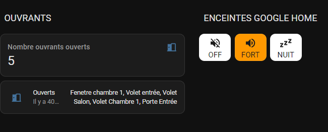
Compter les lumières selon leur état et les afficher en tant que notifications dans une card :
Notifications lights :
Rouge : nombre de Lights unavailable
Jaune : nombre de Lights on
Blanc : nombre de Lights off
Pour réaliser cela :
1/ Ajouter ce code dans configuration.yaml pour compter les lumières en fonction de leur appartenance à un groupe de lumières et de leur état unavailable, on ou off.
La fonction « expand » permet de sélectionner les lumières à l’intérieur du groupe souhaité, « selectattr » de sélectionner les volets selon l’état souhaité et « rejectattr » pour ne pas compter les groupes de lumières qui sont inclus dans le groupe souhaité. (Important sinon un groupe de lumières sera compté comme une lumière)
sensor:
    - platform: template
      sensors:

        count_lights_on:
          friendly_name: "# Lights on"
          value_template: "{{ expand('light.lumieres_maison')| selectattr('state', 'eq', 'on') | rejectattr('attributes.entity_id','defined') | list | count }}"

        count_lights_off:
          friendly_name: "# Lights off"
          value_template: "{{ expand('light.lumieres_maison') | selectattr('state', 'eq', 'off') | rejectattr('attributes.entity_id','defined') | list | count }}"

        count_lights_unavailable:
          friendly_name: "# Lights unavailable"
          value_template: "{{ expand('light.lumieres_maison') | selectattr('state', 'eq', 'unavailable') | rejectattr('attributes.entity_id','defined') | list | count }}"
Ensuite on configure la card custom:button-card avec ce code (à vous d’ajuster les tailles et les emplacements des notifications) :
type: custom:button-card
styles:
  card:
    - font-size: 14px
  custom_fields:
    notification1:
      - background-color: |
          [[[
            if (states['sensor.count_lights_on'].state == 0) return "rgb(28, 28, 28)";
            return "#FFC107";
          ]]]
      - color: rgb(28, 28, 28)
      - border-radius: 50%
      - position: absolute
      - left: 70%
      - top: 15%
      - height: 15px
      - width: 15px
      - font-size: 11px
      - line-height: 15px
      - font-weight: bold
      - font-family: none
    notification2:
      - background-color: |
          [[[
            if (states['sensor.count_lights_off'].state == 0) return "rgb(28, 28, 28)";
            return "#FFFFFF";
          ]]]
      - color: rgb(28, 28, 28)
      - border-radius: 50%
      - position: absolute
      - left: 70%
      - top: 45%
      - height: 15px
      - width: 15px
      - font-size: 11px
      - line-height: 15px
      - font-weight: bold
      - font-family: none
    notification3:
      - background-color: |
          [[[
            if (states['sensor.count_lights_unavailable'].state == 0) return "rgb(28, 28, 28)";
            return "red";
          ]]]
      - color: rgb(28, 28, 28)
      - border-radius: 50%
      - position: absolute
      - left: 15%
      - top: 30%
      - height: 15px
      - width: 15px
      - font-size: 11px
      - line-height: 15px
      - font-weight: bold
      - font-family: none
custom_fields:
  notification1: |
    [[[ return (states['sensor.count_lights_on'].state)]]]
  notification2: |
    [[[ return (states['sensor.count_lights_off'].state)]]]
  notification3: >
    [[[ if (states['sensor.count_lights_unavailable'].state > 0) return
    (states['sensor.count_lights_unavailable'].state)]]]
tap_action:
  action: call-service
  service: light.turn_off
  service_data:
    entity_id: light.lumieres_maison
name: Maison
hold_action:
  action: none
entity: light.lumieres_maison
icon: mdi:lightbulb-multiple-off
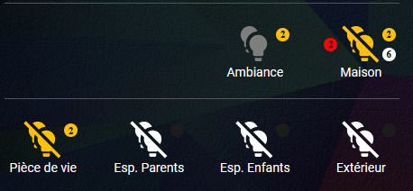
Compter les volets selon leur état et les afficher en tant que notifications dans une card :
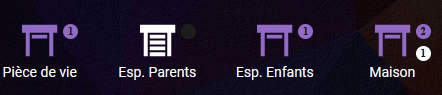
Notifications volets :
Rouge : nombre de Volets unavailable
Violet : nombre de Volets open
Blanc : nombre de Volets closed
Pour réaliser cela :
1/ Ajouter ce code dans configuration.yaml pour compter les volets en fonction de leur appartenance à un groupe de volets et de leur état unavailable, open ou closed.
La fonction « expand » permet de sélectionner les volets à l’intérieur du groupe souhaité, « selectattr » de sélectionner les volets selon l’état souhaité et « rejectattr » pour ne pas compter les groupes de volets qui sont inclus dans le groupe souhaité. (Important sinon un groupe de volets sera compté comme un volet)
sensor:
    - platform: template
      sensors:

        count_covers_open:
          friendly_name: "# Covers open"
          value_template: "{{ expand('cover.volets_maison') | selectattr('state', 'eq', 'open') | rejectattr('attributes.entity_id','defined') | list | count }}"

        count_covers_closed:
          friendly_name: "# Covers closed"
          value_template: "{{ expand('cover.volets_maison') | selectattr('state', 'eq', 'closed') | rejectattr('attributes.entity_id','defined') | list | count }}"

        count_covers_unavailable:
          friendly_name: "# Covers unavailable"
          value_template: "{{ expand('cover.volets_maison') | selectattr('state', 'eq', 'unavailable') | rejectattr('attributes.entity_id','defined') | list | count }}"

        count_covers_total:
          friendly_name: "# Covers total"
          value_template: "{{ expand('cover.volets_maison') | rejectattr('attributes.entity_id','defined') | list | count }}"
Ensuite on configure la card custom:button-card avec ce code (à vous d’ajuster les tailles et les emplacements des notifications) :
type: custom:button-card
styles:
  card:
    - font-size: 14px
  custom_fields:
    notification1:
      - background-color: |
          [[[
            if (states['sensor.count_covers_open'].state == 0) return "rgb(28, 28, 28)";
            return "#926BC7";
          ]]]
      - color: rgb(28, 28, 28)
      - border-radius: 50%
      - position: absolute
      - left: 70%
      - top: 15%
      - height: 15px
      - width: 15px
      - font-size: 11px
      - line-height: 15px
      - font-weight: bold
      - font-family: none
    notification2:
      - background-color: |
          [[[
            if (states['sensor.count_covers_closed'].state == 0) return "rgb(28, 28, 28)";
            return "white";
          ]]]
      - color: rgb(28, 28, 28)
      - border-radius: 50%
      - position: absolute
      - left: 70%
      - top: 45%
      - height: 15px
      - width: 15px
      - font-size: 11px
      - line-height: 15px
      - font-weight: bold
      - font-family: none
    notification3:
      - background-color: |
          [[[
            if (states['sensor.count_covers_unavailable'].state == 0) return "rgb(28, 28, 28)";
            return "red";
          ]]]
      - color: rgb(28, 28, 28)
      - border-radius: 50%
      - position: absolute
      - left: 15%
      - top: 30%
      - height: 15px
      - width: 15px
      - font-size: 11px
      - line-height: 15px
      - font-weight: bold
      - font-family: none
custom_fields:
  notification1: |
    [[[ return (states['sensor.count_covers_open'].state)]]]
  notification2: |
    [[[ return (states['sensor.count_covers_closed'].state)]]]
  notification3: >
    [[[ if (states['sensor.count_covers_unavailable'].state > 0) return
    (states['sensor.count_covers_unavailable'].state)]]]
entity: cover.volets_maison
name: Maison
Ces boutons peuvent être à parfaire, par exemple comme cacher le background de la notification s’il n’y a pas de lumières allumées/éteintes ou de volets ouverts/fermés mais je préfère afficher ces backgrounds pour me dire qu’il peut y a avoir une valeur selon l’état et ainsi ne pas en oublier dans les cards.
Par contre pour le nombre d’entities « unvailalable », s’il n’y en pas, dans ce cas précis, le background ne s’affiche pas pour ne pas surcharger l’affichage.
Afficher le pourcentage d’ouverture du volet en tant que notifications dans une card :
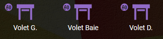
On configure la card custom:button-card avec ce code (à vous d’ajuster les tailles et les emplacements des notifications :
type: custom:button-card
styles:
  card:
    - font-size: 14px
  custom_fields:
    notification:
      - background-color: |
          [[[
            if (states["cover.volets_espace_enfants"].attributes['current_position'] > 0 && states["cover.volets_espace_enfants"].attributes['current_position']< 100) return "#926BC7";
            return "rgb(28, 28, 28)";
          ]]]
      - color: rgb(28, 28, 28)
      - border-radius: 50%
      - position: absolute
      - left: 15%
      - top: 15%
      - height: 15px
      - width: 15px
      - font-size: 11px
      - line-height: 15px
      - font-weight: bold
      - font-family: none
custom_fields:
  notification: >
    [[[ return
    states["cover.volets_espace_enfants"].attributes['current_position']]]]
entity: cover.volets_espace_enfants
name: Volet
Afficher un icône en surbrillance pour un appareil qui « chauffe »
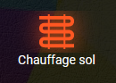
On configure la card custom:button-card avec ce code :
type: custom:button-card
state:
  - value: heat
    styles:
      icon:
        - filter: drop-shadow(0 0 12px var(--button-card-light-color))
name: Chauffage sol
entity: climate.heatpump
icon: mdi:heating-coil
size: 47px
tap_action:
  action: toggle
hold_action:
  action: more-info
Afficher un icône qui clignote en rouge si un détecteur de mouvement signale un passage
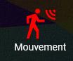
On configure la card custom:button-card avec ce code (à vous d’ajuster la couleur et la vitesse de clignotement) :
type: custom:button-card
state:
  - value: 'on'
    styles:
      icon:
        - color: red
      card:
        - animation: blink 2s ease infinite
styles:
  card:
    - font-size: 14px
entity: binary_sensor.detecteur_occupancy
name: Mouvement
 (le mien est disponible dans la rubrique dashboard)