Salut à tous
j’aurais juste une question avec card_mod, je l’utilise pour supprimer le fond de ma stack in card
J’utilise :
card_mod:
  style: |
    ha-card {
    background: none;
          }
Sa supprime bien le fond et c’est bien pris en compte
Ce qui me donne ça :
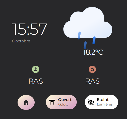
Jusqu’ici tout va bien
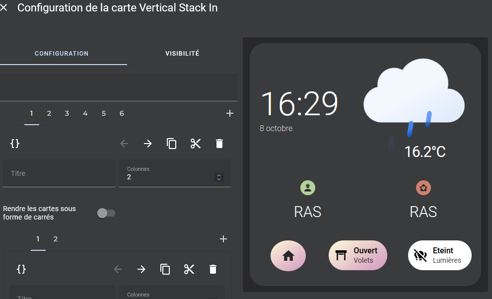
Mais si je modifie quoi que ce soit le fond revient et le code du card mod disparait.

j’ai testé de mettre le code au tout début à la fin pas de changement
Avec un autre thème pas de changement
En soit c’est pas très gênant car une fois le code enregistré tant que j’y retourne pas c’est ok
Mais si quelqu’un à une idée je suis preneur afin de comprendre mon erreur
voici le code complet au cas ou :
Résumé
type: custom:vertical-stack-in-card
cards:
  - square: false
    type: grid
    cards:
      - square: false
        type: grid
        cards:
          - type: custom:gap-card
            height: 80
          - type: custom:button-card
            tap_action:
              action: call-service
              service: |
                [[[
                  this.dispatchEvent(new Event('hass-toggle-menu', { bubbles: true, composed: true}));
                  return none;
                ]]]
            name: |
              [[[ return states['sensor.time'].state ]]]
            label: |
              [[[ return states['sensor.date_fr'].state ]]]
            show_label: true
            styles:
              grid:
                - grid-template-area: "\"l\" \"n\""
                - grid-template-columns: 1fr
                - grid-template-rows: min-content min-content
              card:
                - height: 100px
                - background: none
                - padding: 0 20px
                - margin-top: "-10px"
                - "--mdc-ripple-press-opacity": 0
              name:
                - justify-self: start
                - align-self: start
                - font-size: 66px
                - font-weight: 300
              label:
                - justify-self: start
                - font-size: 16px
                - font-weight: 300
                - opacity: 0.7
          - type: custom:gap-card
            height: 30
        columns: 1
      - square: false
        type: grid
        cards:
          - type: custom:paper-buttons-row
            styles:
              background: none
              text-shadow: 0px 0px 10px var(--card-background-color);
            buttons:
              - layout: icon|name_state
                state: >-
                  {{ state_attr('weather.forecast_maison_marleo','temperature')
                  }}°C
                image: >
                  {% set mapper =
                    { 'breezy':'cloudy',
                      'clear-night':'clear-night',
                      'clear':'day',
                      'mostly-clear':'day',
                      'clear-day':'day',
                      'cloudy':'cloudy',
                      'fog':'fog',
                      'hail':'rainy-7',
                      'haze':'haze',
                      'lightning':'lightning',
                      'lightning-rainy':'lightning-rainy',
                      'mostly-cloudy':'cloudy',
                      'partlycloudy':'partlycloudy',
                      'partly-cloudy-day':'partly-cloudy-day',
                      'partly-cloudy-night':'partly-cloudy-night',
                      'rainy':'rainy-4',
                      'scattered-showers':'rainy-3',
                      'showers':'rainy-6',
                      'sleet':'sleet',
                      'snow':'snowy-6',
                      'mostly-sunny':'day',
                      'sunny':'day',
                      'sunny':'sunny',
                      'thunderstorm':'thunder',
                      'tornado':'tornado',
                      'wind':'wind',
                      'windy':'wind'} %}
                  {% set state = states('weather.forecast_maison_marleo') %}

                  {% set weather = mapper[state] if state in mapper else
                  'weather' %}

                  {% set path = '/local/ic/weather/' %}

                  {% set ext = '.svg'%}
                    {{[path,weather,ext]|join('')}}
                styles:
                  card:
                    - position: absolute
                    - top: 0px
                    - right: "-6px"
                    - background: none
                    - height: 400px
                    - "--mdc-press-opacity": 0
                  icon:
                    - position: absolute
                    - top: 0px
                    - right: "-50px"
                    - margin-top: "-55px"
                    - height: 300px
                    - width: 300px
                  state:
                    - font-weight: 400
                    - font-size: 30px
                    - letter-spacing: "-1px"
                    - margin-left: 0
                    - margin-top: 200px
                    - display: block
                    - text-align: center
                    - width: 140px
                    - color: white
        columns: 1
    columns: 2
  - type: custom:gap-card
    height: 30
  - type: horizontal-stack
    cards:
      - type: custom:button-card
        entity: calendar.travail
        show_state: false
        show_label: true
        show_name: true
        show_icon: true
        icon: mdi:account-hard-hat
        name: |
          [[[
            if (states['calendar.travail'].state == 'off')
            return "RAS";
            else
            return entity.attributes.message;
          ]]]
        label: |
          [[[
            if (states['calendar.travail'].state == 'off')
            return '';
            else
            return entity.attributes.end_time;
          ]]]
        styles:
          card:
            - height: 100px
            - background: none
            - border-radius: 8px 20px 8px 20px
          name:
            - justify-self: center
            - align-self: center
            - font-size: 30px
            - font-weight: 300
          label:
            - justify-self: center
            - font-size: 16px
            - font-weight: 300
            - opacity: 0.7
          icon:
            - width: 20px
            - color: var(--black)
          img_cell:
            - justify-self: center
            - background: var(--green)
            - border-radius: 100%
            - align-self: start
            - width: 30px
            - height: 30px
      - type: custom:button-card
        entity: calendar.personnel
        show_state: false
        show_label: true
        show_name: true
        show_icon: true
        icon: mdi:home-heart
        name: |
          [[[
            if (states['calendar.personnel'].state == 'off')
            return "RAS";
            else
            return entity.attributes.message;
          ]]]
        label: |
          [[[
            if (states['calendar.personnel'].state == 'off')
            return '';
            else
            return entity.attributes.end_time;
          ]]]
        styles:
          card:
            - height: 100px
            - background: none
            - border-radius: 8px 20px 8px 20px
          name:
            - justify-self: center
            - align-self: center
            - font-size: 30px
            - font-weight: 300
          label:
            - justify-self: center
            - font-size: 16px
            - font-weight: 300
            - opacity: 0.7
          icon:
            - width: 20px
            - color: var(--black)
          img_cell:
            - justify-self: center
            - background: var(--red)
            - border-radius: 100%
            - align-self: start
            - width: 30px
            - height: 30px
  - type: custom:gap-card
    height: 30
  - square: false
    type: grid
    cards:
      - type: custom:paper-buttons-row
        styles:
          gap: 8px
          overflow-x: scroll
          margin: 0px 0px 0 8px
        buttons:
          - icon: mdi:home
            layout: icon
            name: Home
            ripple: none
            tap_action:
              action: navigate
              navigation_path: dashboardsalon
            styles:
              name:
                padding: 0 10px
              button:
                background: var(--gradient-on)
                border-radius: 50%
                color: white
                height: 50px
              icon:
                "--mdc-icon-size": 30px
                color: var(--black)
                width: 55px
                height: 55px
                display: flex
                justify-content: center
                align-items: center
      - type: custom:button-card
        template: raccourcis
        entity: cover.piece_de_vie
        variables:
          name: Volets
          background: var(--gray800)
        tap_action:
          action: toggle
        state:
          - value: closed
            label: Fermée
            icon: mdi:window-shutter
            styles:
              card:
                - background: var(--gray800)
                - width: 120%
              icon:
                - color: black
              name:
                - color: black
              label:
                - color: black
          - value: open
            label: Ouvert
            icon: mdi:window-shutter-open
            styles:
              card:
                - background: var(--gradient-on)
                - width: 120%
              icon:
                - color: black
              name:
                - color: black
              label:
                - color: black
      - type: custom:button-card
        template: raccourcis
        entity: light.led_salon
        variables:
          name: Lumières
          background: var(--gray800)
        state:
          - value: "off"
            label: Eteint
            icon: mdi:lightbulb-group-off
            styles:
              card:
                - background: var(--gray800)
                - width: 120%
              icon:
                - color: black
              name:
                - color: black
              label:
                - color: black
          - value: "on"
            label: Allumée
            icon: mdi:lightbulb-group
            styles:
              card:
                - background: var(--gradient-on)
                - width: 120%
              icon:
                - color: black
              name:
                - color: black
              label:
                - color: black
    columns: 3
  - type: custom:gap-card
    height: 30
card_mod:
  style: |
    ha-card {
    background: none;
          }
Merci