Bonjour,
Est-il possible de faire défiler un texte trop grand dans mini-graph-card ?
Ce serait mieux que de réduire la taille du texte en question.
Merci par avance.
Bonjour,
Est-il possible de faire défiler un texte trop grand dans mini-graph-card ?
Ce serait mieux que de réduire la taille du texte en question.
Merci par avance.
Bonjour,
Je ne sais pas si c’est possible avec card-mod mais c’est faisable avec custom:button-card en mettant en custom_fields ta carte custom:mini-graph-card et par dessus, un autre custom_fields avec le texte défilant…
Merci pour ta réponse, mais tu m’as complètement perdu là 
Je te fais un exemple, patiente juste un petit peu 
Tkt je part au taf, c’est pas urgent.
Je te poste un exemple commenté dans l’aprèm
Bonjour,
avec card_mod:
card_mod:
  style: |
    ha-card .header.flex .name.flex {
      display: inline-block;
      animation: marquee 5s linear infinite !important;
    }
    @keyframes marquee {
      0%   { transform: translate(0, 0); }
      100% { transform: translate(-100%, 0); }
    }
Un exemple de ce qui est faisable avec custom:button-card (c’est le logiciel de capture de gif qui donne l’effet saccadé)…
le code :
type: custom:button-card
entity: sensor.perron_thermometre_exterieur_temperature
custom_fields:
scrolling_text: |
[[[
return `<div class="scrolling-container">
<div class="scrolling-text">
${entity.attributes.friendly_name}   ${entity.attributes.friendly_name}
</div>
<div class="scrolling-text">
${entity.attributes.friendly_name}   ${entity.attributes.friendly_name}
</div>
</div>`;
]]]
bottom_card:
card:
type: custom:mini-graph-card
entities:
- sensor.perron_thermometre_exterieur_temperature
hours_to_show: 24
points_per_hour: 1
show:
labels: true
labels_secondary: true
color_thresholds:
- value: 0
color: "#ff0000"
- value: 20
color: "#00ff00"
styles:
card:
- height: 170px
- width: 300px
- position: relative
custom_fields:
scrolling_text:
- position: absolute
- top: 11px
- left: 17px
- width: 80%
- height: 28px
- overflow: hidden
- background-color: rgba(255, 255, 255, 1.0)
- z-index: 2
bottom_card:
- position: absolute
- bottom: 0
- left: 0
- width: 100%
- z-index: 1
extra_styles: |
.scrolling-container {
width: 100%;
overflow: hidden;
white-space: nowrap;
position: relative;
}
.scrolling-text {
display: inline-block;
min-width: fit-content;
padding-right: 20px;
animation: scrolling 8s linear infinite;
background: linear-gradient(to right, rgba(255, 255, 255, 1) 0px, rgba(255, 255, 255, 0) 10px, rgba(255, 255, 255, 0) calc(100% - 10px), rgba(255, 255, 255, 1) 100%);
}
@keyframes scrolling {
0% { transform: translateX(0); }
100% { transform: translateX(-50%); }
}
Un autre exemple avec un effet de fondu au blanc en début et fin de zone de texte défilant :
Le code :
type: custom:button-card
entity: sensor.perron_thermometre_exterieur_temperature
custom_fields:
scrolling_text: |
[[[
const friendlyName = `${entity.attributes.friendly_name}`;
return `
<div class="scrolling-container">
<div class="scrolling-text">
${friendlyName}   ${friendlyName}
</div>
<div class="scrolling-text">
${friendlyName}   ${friendlyName}
</div>
</div>
`;
]]]
fade_start:
card:
type: custom:button-card
styles:
card:
- border: none
- border-radius: 0%
- background: >-
linear-gradient(to right, rgba(255, 255, 255, 1) 0%, rgba(255,
255, 255, 0) 100%)
- width: 10px
- height: 28px
- z-index: 3
fade_end:
card:
type: custom:button-card
styles:
card:
- border: none
- border-radius: 0%
- background: >-
linear-gradient(to left, rgba(255, 255, 255, 1) 0%, rgba(255, 255,
255, 0) 100%)
- width: 20px
- height: 28px
- z-index: 3
bottom_card:
card:
type: custom:mini-graph-card
entities:
- sensor.perron_thermometre_exterieur_temperature
hours_to_show: 24
points_per_hour: 1
show:
labels: true
labels_secondary: true
color_thresholds:
- value: 0
color: "#ff0000"
- value: 20
color: "#00ff00"
styles:
card:
- height: 170px
- width: 300px
- position: relative
custom_fields:
scrolling_text:
- position: absolute
- top: 11px
- left: 17px
- width: 80%
- height: 28px
- overflow: hidden
- background-color: rgba(255, 255, 255, 1.0)
- z-index: 2
bottom_card:
- position: absolute
- bottom: 0
- left: 0
- width: 100%
- z-index: 1
fade_start:
- position: absolute
- top: 11px
- left: 17px
fade_end:
- position: absolute
- top: 11px
- right: 13%
extra_styles: |
.scrolling-container {
width: 100%;
overflow: hidden;
white-space: nowrap;
position: relative;
}
.scrolling-text {
display: inline-block;
min-width: fit-content;
padding-right: 20px;
animation: scrolling 8s linear infinite;
}
@keyframes scrolling {
0% { transform: translateX(0); }
100% { transform: translateX(-50%); }
}
Si la version avec card_mod de @WarC0zes te convient, utilise-la.
Si tu veux des explications sur le(s) code(s) que je t’ai mis, demande-le moi
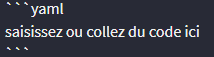
c’est la balise texte préformaté toujours, mais sur la première balise ``` tu ajoutes yaml
Oui, c’est bien ce que tu m’avais déjà dis  ça finira bien par rentrer
Merci a vous @anon51798830 et @WarC0zes.
je vais prendre la solution de WarC0zes, qui dans un premier temps et beaucoup plus simple et rapide.
Quand j’aurais un peu plus de temps je vais me mettre sur la solution de Cleya.
Etant nouveau ici, je ne sais pas a qui donner la solution ?
Ben à @WarC0zes si cette solution te va