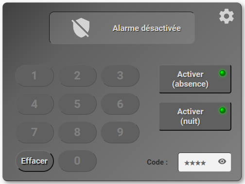
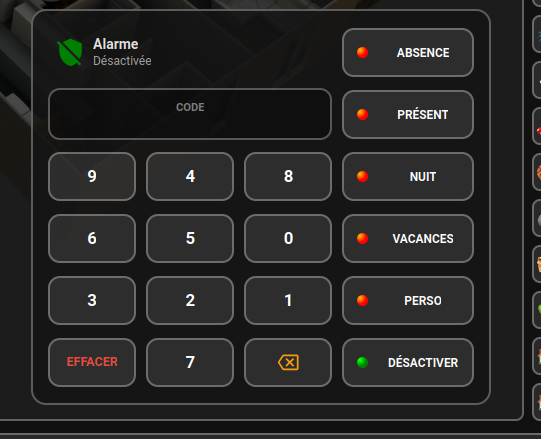
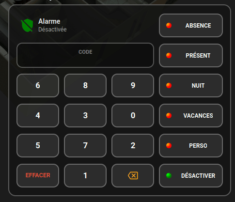
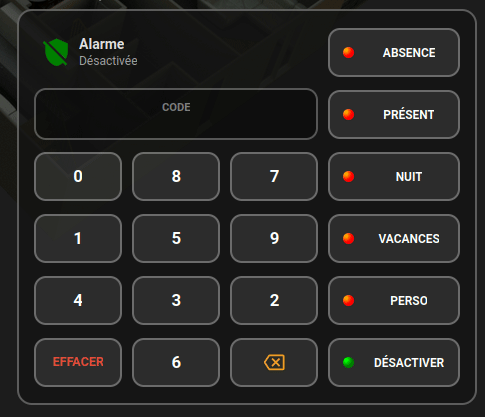
Les possibilités de la carte.
Normalement elle fonctionne dans tous les types de dash ( je n’ai pas tout testé )
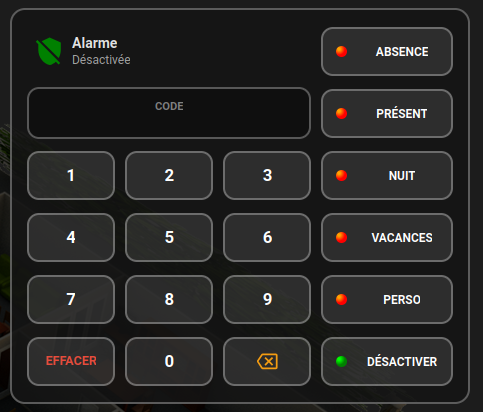
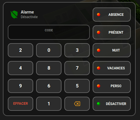
verrouillage / déverrouillage automatique du clavier au bout de 5 saisies erronées que ce soit en sélection de mode ou en saisie de code
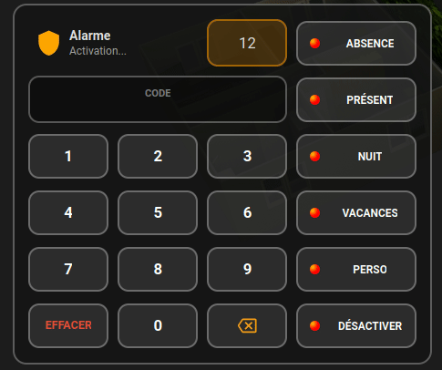
c’est encore plus restrictif sur désactiver, ça verrouille au bout de 3 c’est un bug mais j’ai pas creusé parce que ça me convient bien ( ça doit envoyer des commandes fantômes du coup on arrive plus vite au compte max )
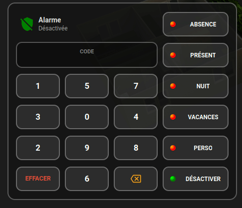
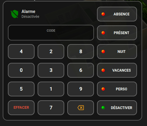
Effacement automatique de la zone de saisie ( temps réglable ) le clavier roll en même temps
Code de la carte
- type: custom:button-card
entity: alarm_control_panel.alarmo
name: Alarme
show_icon: false
show_name: false
tap_action:
action: none
hold_action:
action: none
triggers_update:
- counter.essais_alarme
- timer.timer_alarme
- input_text.code_alarme
styles:
card:
- background: rgba(20, 20, 20, 0.85) !important
- border-radius: 15px !important
- border: 2px solid rgba(255, 255, 255, 0.3)
- padding: 15px
- cursor: default
- pointer-events: >
[[[ return Number(states['counter.essais_alarme'].state) >= 5 ?
'none' : 'auto'; ]]]
grid:
            - grid-template-areas: |
                [[[
                  const code = states['input_text.code_alarme']?.state || "";
                  const essais = states['counter.essais_alarme']?.last_changed || ""; // On récupère le changement du compteur
                  let nums = ['b1', 'b2', 'b3', 'b4', 'b5', 'b6', 'b7', 'b8', 'b9', 'b0'];

                  // La grille change si le code est vide ET (le code vient de changer OU le compteur d'essais a bougé)
                  if (code === "") {
                    // On combine le timestamp du code et celui des essais pour forcer le mélange
                    window.alarmo_stable_seed = states['input_text.code_alarme'].last_changed + essais;
                  }

                  if (!window.alarmo_stable_seed) {
                    window.alarmo_stable_seed = "initial";
                  }

                  const seedRandom = (s) => {
                    let h = 0;
                    const str = String(s);
                    for (let i = 0; i < str.length; i++) h = Math.imul(31, h) + str.charCodeAt(i) | 0;
                    var x = Math.sin(h) * 10000;
                    return x - Math.floor(x);
                  };

                  let s = window.alarmo_stable_seed;
                  for (let i = nums.length - 1; i > 0; i--) {
                    const r = seedRandom(s + i);
                    const j = Math.floor(r * (i + 1));
                    [nums[i], nums[j]] = [nums[j], nums[i]];
                  }

                  return `
                    "status status timer away"
                    "code   code   code   home"
                    "${nums[0]} ${nums[1]} ${nums[2]} night"
                    "${nums[3]} ${nums[4]} ${nums[5]} vacation"
                    "${nums[6]} ${nums[7]} ${nums[8]} custom"
                    "clear ${nums[9]} back disarm"
                  `;
                ]]]
- grid-template-columns: repeat(3, 1fr) 1.5fr
- grid-template-rows: repeat(6, 52px)
- gap: 10px
extra_styles: |
.btn-num {
background: rgba(255, 255, 255, 0.05) !important;
border-radius: 10px !important;
font-size: 20px !important;
height: 100%;
}
custom_fields:
status:
card:
type: custom:button-card
entity: alarm_control_panel.alarmo
name: Alarme
show_label: true
tap_action:
action: none
hold_action:
action: none
label: |
[[[
const essais = states['counter.essais_alarme'].state;
// 1. Si le clavier est bloqué
if (essais >= 5) {
return "⚠️ BLOQUÉ 10 min";
}
// 2. Sinon, affichage normal des états
const s = entity.state;
if (s === 'disarmed') return 'Désactivée';
if (s === 'armed_away') return 'Armée (Absence)';
if (s === 'armed_home') return 'Armée (Présent)';
if (s === 'armed_night') return 'Armée (Nuit)';
if (s === 'arming') return 'Activation...';
if (s === 'pending') return 'Entrée...';
return s;
]]]
styles:
card:
- background: transparent
- border: none
grid:
- grid-template-areas: "\"i n\" \"i l\""
- grid-template-columns: 45px 1fr
icon:
- width: 30px
- color: |
[[[
const s = entity.state;
if (s === 'disarmed') return 'green';
if (s === 'arming' || s === 'pending') return 'orange';
return 'red';
]]]
name:
- justify-self: start
- font-size: 14px
- font-weight: bold
label:
- justify-self: start
- font-size: 12px
- opacity: 0.7
timer:
card:
type: custom:button-card
entity: timer.timer_alarme
show_name: false
show_icon: false
show_state: true
update_interval: 1s
name: |
[[[
const t = states['timer.timer_alarme'];
if (!t || t.state !== 'active') return "";
const expiry = new Date(t.attributes.finishes_at);
const now = new Date();
const diff = Math.max(0, Math.floor((expiry - now) / 1000));
return diff + 's';
]]]
styles:
card:
- background: rgba(255, 255, 255, 0.05)
- border-radius: 12px
- border: |
[[[
return states['timer.timer_alarme'].state === 'active'
? '2px solid rgba(255, 152, 0, 0.5)'
: '2px solid rgba(255, 255, 255, 0.3)';
]]]
- height: 52px
- display: |
[[[
return states['timer.timer_alarme'].state === 'active' ? 'block' : 'none';
]]]
- animation: |
[[[
return states['timer.timer_alarme'].state === 'active'
? 'border-pulse 1.5s infinite'
: 'none';
]]]
name:
- color: orange
- font-size: 1.2rem
- font-weight: bold
extra_styles: |
@keyframes border-pulse {
0% { border-color: rgba(255, 152, 0, 0.1); }
50% { border-color: rgba(255, 152, 0, 1); }
100% { border-color: rgba(255, 152, 0, 0.1); }
}
code:
styles:
card:
- grid-area: code
- width: 100%
- align-self: center
card:
type: custom:button-card
entity: input_text.code_alarme
triggers_update:
- alarm_control_panel.alarmo
- counter.essais_alarme
show_name: false
show_state: false
show_label: true
label: CODE
tap_action:
action: none
custom_fields:
points: |
[[[
// On récupère l'objet entier pour être sûr
const s = states['input_text.code_alarme'];
if (!s) return "";
const val = s.state;
// TEST RADICAL : Si c'est vide ou pas un chiffre, on renvoie une chaîne vide
// On utilise une expression régulière pour ne garder que les chiffres
if (!val || val === 'unknown' || val === 'none' || !/^\d+$/.test(val)) {
return "";
}
// On limite l'affichage aux points correspondants aux chiffres
return "●".repeat(val.length);
]]]
styles:
card:
- background: rgba(0, 0, 0, 0.3)
- border-radius: 12px
- height: 52px
- position: relative
- border: 2px solid rgba(255,255,255,0.3)
- animation: |
[[[
const essais = Number(states['counter.essais_alarme'].state);
const last_changed = states['counter.essais_alarme'].last_changed;
const age = (Date.now() - new Date(last_changed)) / 1000;
if (essais > 0 && age < 1) {
// On enlève "forwards" pour que l'animation ne reste pas bloquée à la fin
return (essais % 2 === 0) ? 'shake-red-A 0.5s ease' : 'shake-red-B 0.5s ease';
}
return 'none';
]]]
grid:
- grid-template-areas: "\"l\" \"points\""
- grid-template-rows: 1fr 1fr
label:
- color: gray
- font-size: 0.8rem
- font-weight: bold
- align-self: end
- justify-self: center
custom_fields:
points:
- color: "#3498db"
- font-size: 1.4rem
- font-weight: bold
- letter-spacing: 5px
- align-self: start
- justify-self: center
extra_styles: |
@keyframes shake-red-A {
0% { transform: translateX(0); border-color: rgba(231,76,60,1); }
20% { transform: translateX(-8px); border-color: rgba(231,76,60,1); }
40% { transform: translateX(8px); border-color: rgba(231,76,60,1); }
60% { transform: translateX(-5px); border-color: rgba(231,76,60,0.7); }
80% { transform: translateX(4px); border-color: rgba(231,76,60,0.4); }
100% { transform: translateX(0); border-color: rgba(255,255,255,0.3); }
}
@keyframes shake-red-B {
0% { transform: translateX(0); border-color: rgba(231,76,60,1); }
20% { transform: translateX(-8px); border-color: rgba(231,76,60,1); }
40% { transform: translateX(8px); border-color: rgba(231,76,60,1); }
60% { transform: translateX(-5px); border-color: rgba(231,76,60,0.7); }
80% { transform: translateX(4px); border-color: rgba(231,76,60,0.4); }
100% { transform: translateX(0); border-color: rgba(255,255,255,0.3); }
}
b1:
card:
type: custom:button-card
name: "1"
show_icon: false
styles:
card:
- background: rgba(255,255,255,0.1)
- border-radius: 12px
- border: 2px solid rgba(255, 255, 255, 0.3)
- height: 3.5rem
name:
- color: white
- font-size: 1.2rem
- font-weight: bold
extra_styles: |
ha-card:hover {
background: rgba(0, 123, 255, 0.4) !important; /* Le bleu Astro */
border-color: rgba(255, 255, 255, 1) !important;
transform: scale(1.05) !important;
transition: all 0.2s ease !important;
}
tap_action:
action: call-service
service: input_text.set_value
service_data:
entity_id: input_text.code_alarme
value: >-
[[[ return (states['input_text.code_alarme']?.state || '') +
'1'; ]]]
b2:
card:
type: custom:button-card
name: "2"
show_icon: false
styles:
card:
- background: rgba(255,255,255,0.1)
- border-radius: 12px
- border: 2px solid rgba(255, 255, 255, 0.3)
- height: 3.5rem
name:
- color: white
- font-size: 1.2rem
- font-weight: bold
extra_styles: |
ha-card:hover {
background: rgba(0, 123, 255, 0.4) !important; /* Le bleu Astro */
border-color: rgba(255, 255, 255, 1) !important;
transform: scale(1.05) !important;
transition: all 0.2s ease !important;
}
tap_action:
action: call-service
service: input_text.set_value
service_data:
entity_id: input_text.code_alarme
value: >-
[[[ return (states['input_text.code_alarme']?.state || '') +
'2'; ]]]
b3:
card:
type: custom:button-card
name: "3"
show_icon: false
styles:
card:
- background: rgba(255,255,255,0.1)
- border-radius: 12px
- border: 2px solid rgba(255, 255, 255, 0.3)
- height: 3.5rem
name:
- color: white
- font-size: 1.2rem
- font-weight: bold
extra_styles: |
ha-card:hover {
background: rgba(0, 123, 255, 0.4) !important; /* Le bleu Astro */
border-color: rgba(255, 255, 255, 1) !important;
transform: scale(1.05) !important;
transition: all 0.2s ease !important;
}
tap_action:
action: call-service
service: input_text.set_value
service_data:
entity_id: input_text.code_alarme
value: >-
[[[ return (states['input_text.code_alarme']?.state || '') +
'3'; ]]]
b4:
card:
type: custom:button-card
name: "4"
show_icon: false
styles:
card:
- background: rgba(255,255,255,0.1)
- border-radius: 12px
- border: 2px solid rgba(255, 255, 255, 0.3)
- height: 3.5rem
name:
- color: white
- font-size: 1.2rem
- font-weight: bold
extra_styles: |
ha-card:hover {
background: rgba(0, 123, 255, 0.4) !important; /* Le bleu Astro */
border-color: rgba(255, 255, 255, 1) !important;
transform: scale(1.05) !important;
transition: all 0.2s ease !important;
}
tap_action:
action: call-service
service: input_text.set_value
service_data:
entity_id: input_text.code_alarme
value: >-
[[[ return (states['input_text.code_alarme']?.state || '') +
'4'; ]]]
b5:
card:
type: custom:button-card
name: "5"
show_icon: false
styles:
card:
- background: rgba(255,255,255,0.1)
- border-radius: 12px
- border: 2px solid rgba(255, 255, 255, 0.3)
- height: 3.5rem
name:
- color: white
- font-size: 1.2rem
- font-weight: bold
extra_styles: |
ha-card:hover {
background: rgba(0, 123, 255, 0.4) !important; /* Le bleu Astro */
border-color: rgba(255, 255, 255, 1) !important;
transform: scale(1.05) !important;
transition: all 0.2s ease !important;
}
tap_action:
action: call-service
service: input_text.set_value
service_data:
entity_id: input_text.code_alarme
value: >-
[[[ return (states['input_text.code_alarme']?.state || '') +
'5'; ]]]
b6:
card:
type: custom:button-card
name: "6"
show_icon: false
styles:
card:
- background: rgba(255,255,255,0.1)
- border-radius: 12px
- border: 2px solid rgba(255, 255, 255, 0.3)
- height: 3.5rem
name:
- color: white
- font-size: 1.2rem
- font-weight: bold
extra_styles: |
ha-card:hover {
background: rgba(0, 123, 255, 0.4) !important; /* Le bleu Astro */
border-color: rgba(255, 255, 255, 1) !important;
transform: scale(1.05) !important;
transition: all 0.2s ease !important;
}
tap_action:
action: call-service
service: input_text.set_value
service_data:
entity_id: input_text.code_alarme
value: >-
[[[ return (states['input_text.code_alarme']?.state || '') +
'6'; ]]]
b7:
card:
type: custom:button-card
name: "7"
show_icon: false
styles:
card:
- background: rgba(255,255,255,0.1)
- border-radius: 12px
- border: 2px solid rgba(255, 255, 255, 0.3)
- height: 3.5rem
name:
- color: white
- font-size: 1.2rem
- font-weight: bold
extra_styles: |
ha-card:hover {
background: rgba(0, 123, 255, 0.4) !important; /* Le bleu Astro */
border-color: rgba(255, 255, 255, 1) !important;
transform: scale(1.05) !important;
transition: all 0.2s ease !important;
}
tap_action:
action: call-service
service: input_text.set_value
service_data:
entity_id: input_text.code_alarme
value: >-
[[[ return (states['input_text.code_alarme']?.state || '') +
'7'; ]]]
b8:
card:
type: custom:button-card
name: "8"
show_icon: false
styles:
card:
- background: rgba(255,255,255,0.1)
- border-radius: 12px
- border: 2px solid rgba(255, 255, 255, 0.3)
- height: 3.5rem
name:
- color: white
- font-size: 1.2rem
- font-weight: bold
extra_styles: |
ha-card:hover {
background: rgba(0, 123, 255, 0.4) !important; /* Le bleu Astro */
border-color: rgba(255, 255, 255, 1) !important;
transform: scale(1.05) !important;
transition: all 0.2s ease !important;
}
tap_action:
action: call-service
service: input_text.set_value
service_data:
entity_id: input_text.code_alarme
value: >-
[[[ return (states['input_text.code_alarme']?.state || '') +
'8'; ]]]
b9:
card:
type: custom:button-card
name: "9"
show_icon: false
styles:
card:
- background: rgba(255,255,255,0.1)
- border-radius: 12px
- border: 2px solid rgba(255, 255, 255, 0.3)
- height: 3.5rem
name:
- color: white
- font-size: 1.2rem
- font-weight: bold
extra_styles: |
ha-card:hover {
background: rgba(0, 123, 255, 0.4) !important; /* Le bleu Astro */
border-color: rgba(255, 255, 255, 1) !important;
transform: scale(1.05) !important;
transition: all 0.2s ease !important;
}
tap_action:
action: call-service
service: input_text.set_value
service_data:
entity_id: input_text.code_alarme
value: >-
[[[ return (states['input_text.code_alarme']?.state || '') +
'9'; ]]]
clear:
card:
type: custom:button-card
name: Effacer
show_icon: false
styles:
card:
- background: rgba(255,255,255,0.1)
- border-radius: 12px
- border: 2px solid rgba(255, 255, 255, 0.3)
- height: 3.5rem
name:
- color: "#e74c3c"
- font-size: 0.9rem
- font-weight: bold
- text-transform: uppercase
extra_styles: |
ha-card:hover {
background: rgba(0, 123, 255, 0.4) !important; /* Le bleu Astro */
border-color: rgba(255, 255, 255, 1) !important;
transform: scale(1.05) !important;
transition: all 0.2s ease !important;
}
tap_action:
action: call-service
service: input_text.set_value
service_data:
entity_id: input_text.code_alarme
value: ""
b0:
card:
type: custom:button-card
name: "0"
show_icon: false
styles:
card:
- background: rgba(255,255,255,0.1)
- border-radius: 12px
- border: 2px solid rgba(255, 255, 255, 0.3)
- height: 3.5rem
name:
- color: white
- font-size: 1.2rem
- font-weight: bold
extra_styles: |
ha-card:hover {
background: rgba(0, 123, 255, 0.4) !important; /* Le bleu Astro */
border-color: rgba(255, 255, 255, 1) !important;
transform: scale(1.05) !important;
transition: all 0.2s ease !important;
}
tap_action:
action: call-service
service: input_text.set_value
service_data:
entity_id: input_text.code_alarme
value: >-
[[[ return (states['input_text.code_alarme']?.state || '') +
'0'; ]]]
back:
card:
type: custom:button-card
icon: mdi:backspace-outline
show_icon: true
show_name: false
styles:
card:
- background: rgba(255,255,255,0.1)
- border-radius: 12px
- border: 2px solid rgba(255, 255, 255, 0.3)
- height: 3.5rem
icon:
- color: "#f39c12"
- width: 1.5rem
- pointer-events: none
extra_styles: |
ha-card:hover {
background: rgba(0, 123, 255, 0.4) !important; /* Le bleu Astro */
border-color: rgba(255, 255, 255, 1) !important;
transform: scale(1.05) !important;
transition: all 0.2s ease !important;
}
tap_action:
action: call-service
service: input_text.set_value
service_data:
entity_id: input_text.code_alarme
value: |
[[[
const ent = states['input_text.code_alarme'];
if (!ent || !ent.state) return "";
return ent.state.slice(0, -1);
]]]
away:
card:
type: custom:button-card
entity: alarm_control_panel.alarmo
show_icon: false
show_name: false
show_label: false
styles:
card:
- background: rgba(255,255,255,0.1)
- border-radius: 12px !important
- border: 2px solid rgba(255, 255, 255, 0.3)
- height: 3.5rem
- padding: 0 5%
- transition: all 0.2s ease
grid:
- grid-template-areas: "'led name'"
- grid-template-columns: 20% 1fr
- column-gap: 5%
custom_fields:
led:
- justify-self: center
name:
- justify-self: center
- color: white
- font-size: 0.85rem
- font-weight: bold
extra_styles: |
ha-card:hover {
background: rgba(0, 123, 255, 0.4) !important;
border-color: rgba(255, 255, 255, 1) !important;
transform: scale(1.05) !important;
}
custom_fields:
name: ABSENCE
led:
card:
type: custom:button-card
styles:
card:
- pointer-events: none
- width: 0.8rem
- height: 0.8rem
- border-radius: 50%
- background: |
[[[
const status = states['alarm_control_panel.alarmo']?.state;
return (status === 'armed_away')
? 'radial-gradient(circle at 3px 3px, Lime 10%, Green 50%)'
: 'radial-gradient(circle at 3px 3px, Orange 10%, Red 50%)';
]]]
tap_action:
action: call-service
service: alarm_control_panel.alarm_arm_away
service_data:
entity_id: alarm_control_panel.alarmo
code: >-
[[[ return states["input_text.code_alarme"]?.state || "";
]]]
home:
card:
type: custom:button-card
entity: alarm_control_panel.alarmo
show_icon: false
show_name: false
show_label: false
styles:
card:
- background: rgba(255,255,255,0.1)
- border-radius: 12px !important
- border: 2px solid rgba(255, 255, 255, 0.3)
- height: 3.5rem
- padding: 0 5%
- transition: all 0.2s ease
grid:
- grid-template-areas: "'led name'"
- grid-template-columns: 20% 1fr
- column-gap: 5%
custom_fields:
led:
- justify-self: center
name:
- justify-self: center
- color: white
- font-size: 0.85rem
- font-weight: bold
extra_styles: |
ha-card:hover {
background: rgba(0, 123, 255, 0.4) !important;
border-color: rgba(255, 255, 255, 1) !important;
transform: scale(1.05) !important;
}
custom_fields:
name: PRÉSENT
led:
card:
type: custom:button-card
styles:
card:
- pointer-events: none
- width: 0.8rem
- height: 0.8rem
- border-radius: 50%
- background: |
[[[
const status = states['alarm_control_panel.alarmo']?.state;
return (status === 'armed_home')
? 'radial-gradient(circle at 3px 3px, Lime 10%, Green 50%)'
: 'radial-gradient(circle at 3px 3px, Orange 10%, Red 50%)';
]]]
tap_action:
action: call-service
service: alarm_control_panel.alarm_arm_home
service_data:
entity_id: alarm_control_panel.alarmo
code: >-
[[[ return states["input_text.code_alarme"]?.state || "";
]]]
night:
card:
type: custom:button-card
entity: alarm_control_panel.alarmo
show_icon: false
show_name: false
show_label: false
styles:
card:
- background: rgba(255,255,255,0.1)
- border-radius: 12px !important
- border: 2px solid rgba(255, 255, 255, 0.3)
- height: 3.5rem
- padding: 0 5%
- transition: all 0.2s ease
grid:
- grid-template-areas: "'led name'"
- grid-template-columns: 20% 1fr
- column-gap: 5%
custom_fields:
led:
- justify-self: center
name:
- justify-self: center
- color: white
- font-size: 0.85rem
- font-weight: bold
extra_styles: |
ha-card:hover {
background: rgba(0, 123, 255, 0.4) !important;
border-color: rgba(255, 255, 255, 1) !important;
transform: scale(1.05) !important;
}
custom_fields:
name: NUIT
led:
card:
type: custom:button-card
styles:
card:
- pointer-events: none
- width: 0.8rem
- height: 0.8rem
- border-radius: 50%
- background: |
[[[
const status = states['alarm_control_panel.alarmo']?.state;
return (status === 'armed_night')
? 'radial-gradient(circle at 3px 3px, Lime 10%, Green 50%)'
: 'radial-gradient(circle at 3px 3px, Orange 10%, Red 50%)';
]]]
tap_action:
action: call-service
service: alarm_control_panel.alarm_arm_night
service_data:
entity_id: alarm_control_panel.alarmo
code: >-
[[[ return states["input_text.code_alarme"]?.state || "";
]]]
vacation:
card:
type: custom:button-card
entity: alarm_control_panel.alarmo
show_icon: false
show_name: false
show_label: false
styles:
card:
- background: rgba(255,255,255,0.1)
- border-radius: 12px !important
- border: 2px solid rgba(255, 255, 255, 0.3)
- height: 3.5rem
- padding: 0 5%
- transition: all 0.2s ease
grid:
- grid-template-areas: "'led name'"
- grid-template-columns: 20% 1fr
- column-gap: 5%
custom_fields:
led:
- justify-self: center
name:
- justify-self: center
- color: white
- font-size: 0.85rem
- font-weight: bold
extra_styles: |
ha-card:hover {
background: rgba(0, 123, 255, 0.4) !important;
border-color: rgba(255, 255, 255, 1) !important;
transform: scale(1.05) !important;
}
custom_fields:
name: VACANCES
led:
card:
type: custom:button-card
styles:
card:
- pointer-events: none
- width: 0.8rem
- height: 0.8rem
- border-radius: 50%
- background: |
[[[
const status = states['alarm_control_panel.alarmo']?.state;
return (status === 'armed_vacation')
? 'radial-gradient(circle at 3px 3px, Lime 10%, Green 50%)'
: 'radial-gradient(circle at 3px 3px, Orange 10%, Red 50%)';
]]]
tap_action:
action: call-service
service: alarm_control_panel.alarm_arm_vacation
service_data:
entity_id: alarm_control_panel.alarmo
code: >-
[[[ return states["input_text.code_alarme"]?.state || "";
]]]
custom:
card:
type: custom:button-card
entity: alarm_control_panel.alarmo
show_icon: false
show_name: false
show_label: false
styles:
card:
- background: rgba(255,255,255,0.1)
- border-radius: 12px !important
- border: 2px solid rgba(255, 255, 255, 0.3)
- height: 3.5rem
- padding: 0 5%
- transition: all 0.2s ease
grid:
- grid-template-areas: "'led name'"
- grid-template-columns: 20% 1fr
- column-gap: 5%
custom_fields:
led:
- justify-self: center
name:
- justify-self: center
- color: white
- font-size: 0.85rem
- font-weight: bold
extra_styles: |
ha-card:hover {
background: rgba(0, 123, 255, 0.4) !important;
border-color: rgba(255, 255, 255, 1) !important;
transform: scale(1.05) !important;
}
custom_fields:
name: PERSO
led:
card:
type: custom:button-card
styles:
card:
- pointer-events: none
- width: 0.8rem
- height: 0.8rem
- border-radius: 50%
- background: |
[[[
const status = states['alarm_control_panel.alarmo']?.state;
return (status === 'armed_custom_bypass')
? 'radial-gradient(circle at 3px 3px, Lime 10%, Green 50%)'
: 'radial-gradient(circle at 3px 3px, Orange 10%, Red 50%)';
]]]
tap_action:
action: call-service
service: alarm_control_panel.alarm_arm_custom_bypass
service_data:
entity_id: alarm_control_panel.alarmo
code: >-
[[[ return states["input_text.code_alarme"]?.state || "";
]]]
disarm:
card:
type: custom:button-card
entity: alarm_control_panel.alarmo
show_icon: false
show_name: false
show_label: false
styles:
card:
- background: rgba(255,255,255,0.1)
- border-radius: 12px !important
- border: 2px solid rgba(255, 255, 255, 0.3)
- height: 3.5rem
- padding: 0 5%
- transition: all 0.2s ease
grid:
- grid-template-areas: "'led name'"
- grid-template-columns: 20% 1fr
- column-gap: 5%
custom_fields:
led:
- justify-self: center
name:
- justify-self: center
- color: white
- font-size: 0.85rem
- font-weight: bold
extra_styles: |
ha-card:hover {
background: rgba(0, 123, 255, 0.4) !important;
border-color: rgba(255, 255, 255, 1) !important;
transform: scale(1.05) !important;
}
custom_fields:
name: DÉSACTIVER
led:
card:
type: custom:button-card
styles:
card:
- pointer-events: none
- width: 0.8rem
- height: 0.8rem
- border-radius: 50%
- background: |
[[[
const status = states['alarm_control_panel.alarmo']?.state;
return (status === 'disarmed')
? 'radial-gradient(circle at 3px 3px, Lime 10%, Green 50%)'
: 'radial-gradient(circle at 3px 3px, Orange 10%, Red 50%)';
]]]
tap_action:
action: call-service
service: alarm_control_panel.alarm_disarm
service_data:
entity_id: alarm_control_panel.alarmo
code: >-
[[[ return states["input_text.code_alarme"]?.state || "";
]]]
A noter qu’il faudra créer les timer qui vous conviennent, et changer éventuellement ceux dans l’automation qui est livrée brute de test
 )
)

 mais c’est du beau boulot mais je crois que