UI LOVELACE Minimalist

Bonjour à tous :slight_smile:

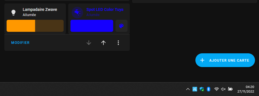
Etant assez novice sur HA je patauge un peu sur l’utilisation de minimalist UI, j’ai suivi les différents sujets sur le forum, mais la je bloque. j’arrive même pas à faire une simple light…

j’ai effectué l’installation de l’intégration via HACS j’ai également installé :
Multiple entity row
button card
auto entities
slider button card

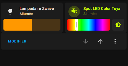
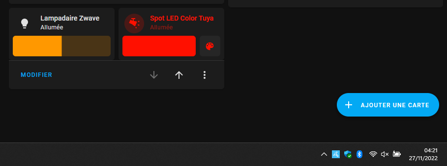
J’ai voulu essayer la carte proposé par @Clemalex

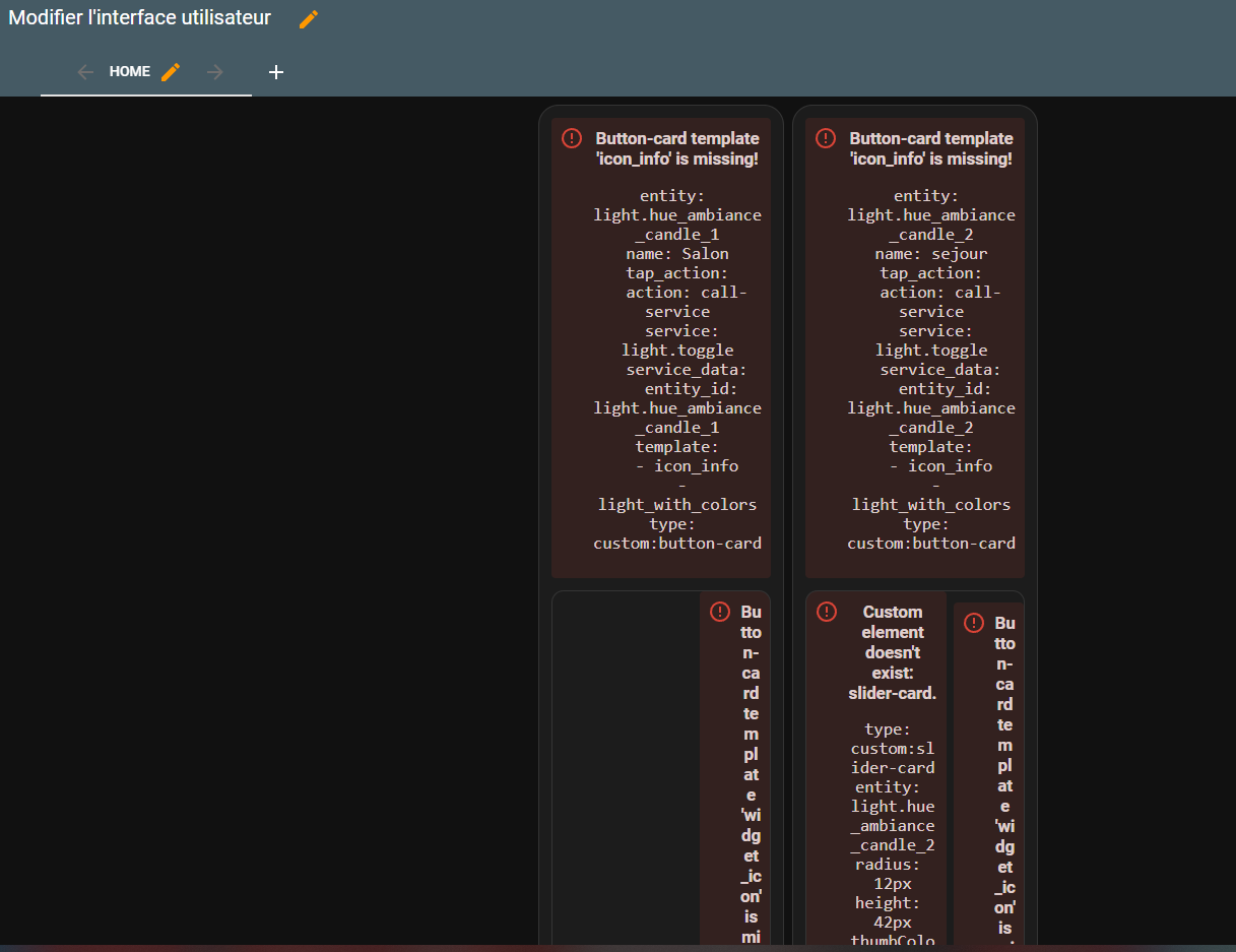
Normalement si j’ai bien suivi sont tuto sur l’utilisation des Template :
1 j’ai entrée le template dans l’éditeur de configuration
2 j’ai créer la carte et voici que ce que j’obtiens :

sbutton_card_templates:
  list_items_light:
    styles:
      card:
        - box-shadow: none
        - padding: 0px
      grid:
        - grid-template-areas: '"item1 item2"'
        - grid-template-columns: 2fr 1fr
        - grid-template-rows: min-content
        - column-gap: 7px
  light_with_colors:
    tap_action:
      action: toggle
    hold_action:
      action: more-info
    label: |-
      [[[ if (entity.state !='unavailable'){
            if (entity.state =='off'){
              var bri = Math.round(entity.attributes.brightness / 2.55);
              return 'Off';  
            }else{
              var bri = Math.round(entity.attributes.brightness / 2.55);
              return (bri ? bri + '%' : 'On') ; 
            }
          }else{
            return "Indisponible";
          }
      ]]]
    state:
      - styles:
          icon:
            - filter: |-
                [[[ 
                    var bri = entity.attributes.brightness / 2.55;
                    return ('brightness(' + (50+bri/2) + '%)') ; 
                ]]]
            - color: |-
                [[[ 
                  var color = entity.attributes.rgb_color;
                  if (color){
                     return 'rgba(' + entity.attributes.rgb_color + ',1)'
                  }
                  else{
                    return 'rgba(var(--couleur-jaune),1)'
                  } 
                ]]]
          img_cell:
            - background-color: |-
                [[[ 
                  var color = entity.attributes.rgb_color;
                  if (color){
                     return 'rgba(' + entity.attributes.rgb_color + ',0.2)'
                  }
                  else{
                    return 'rgba(var(--couleur-jaune),0.2)'
                  } 
                ]]]
        value: 'on'
  light_buttons_with_colors_light:
    show_name: false
    show_icon: false
    variables:
      entity: light.default
      name: Lumière
    styles:
      card:
        - border-radius: 20px
        - box-shadow: var(--box-shadow)
        - padding: 12px
      grid:
        - grid-template-areas: '"item1" "item2"'
        - grid-template-columns: 1fr
        - grid-template-rows: min-content  min-content
        - row-gap: 12px
    custom_fields:
      item1:
        card:
          entity: '[[[ return variables.entity ]]]'
          name: '[[[ return variables.name ]]]'
          tap_action:
            action: call-service
            service: light.toggle
            service_data:
              entity_id: '[[[ return variables.entity ]]]'
          template:
            - icon_info
            - light_with_colors
          type: custom:button-card
      item2:
        card:
          template: list_items_light
          type: custom:button-card
          custom_fields:
            item1:
              card:
                type: custom:slider-card
                entity: '[[[ return variables.entity ]]]'
                radius: 12px
                height: 42px
                thumbColorOff: rgba(var(--couleur-theme),0.2)
                mainSliderColorOff: rgb(var(--couleur-theme),0.2)
                secondarySliderColorOff: var(--google-grey-500)
                mainSliderColor: rgb(var(--couleur-gris-light))
                thumbColor: rgb(var(--couleur-gris-light))
                secondarySliderColor: var(--google-grey-500)
                card_mod:
                  style: |
                    ha-card {
                      border-radius: 14px;
                    }
                    div {
                      border: 2px solid var(--google-grey-500);
                      border-radius: 14px !important;
                      box-sizing: border-box;
                      position: relative;
                    }
            item2:
              card:
                icon: mdi:palette
                tap_action:
                  action: more-info
                type: custom:button-card
                entity: '[[[ return variables.entity ]]]'
                template: widget_icon
  light_buttons_with_colors:
    show_name: false
    show_icon: false
    variables:
      entity: light.default
      name: Lumière
    styles:
      card:
        - border-radius: 20px
        - box-shadow: var(--box-shadow)
        - padding: 12px
      grid:
        - grid-template-areas: '"item1" "item2"'
        - grid-template-columns: 1fr
        - grid-template-rows: min-content  min-content
        - row-gap: 12px
    custom_fields:
      item1:
        card:
          entity: '[[[ return variables.entity ]]]'
          name: '[[[ return variables.name ]]]'
          tap_action:
            action: call-service
            service: light.toggle
            service_data:
              entity_id: '[[[ return variables.entity ]]]'
          template:
            - icon_info
            - light_with_colors
          type: custom:button-card
      item2:
        card:
          template: list_items_light
          type: custom:button-card
          custom_fields:
            item1:
              card:
                type: custom:slider-card
                entity: '[[[ return variables.entity ]]]'
                radius: 14px
                height: 42px
                mainSliderColorOff: var(--google-grey-500)
                secondarySliderColor: rgba(var(--couleur-theme),0.05)
                secondarySliderColorOff: rgba(var(--couleur-theme),0.05)
                thumbColorOff: white
            item2:
              card:
                icon: mdi:palette
                tap_action:
                  action: more-info
                type: custom:button-card
                entity: '[[[ return variables.entity ]]]'
                template: widget_icon
views:
  - title: Home
    cards:
      - square: true
        columns: 2
        type: grid
        cards:
          - entity: light.hue_ambiance_candle_1
            template:
              - light_buttons_with_colors
            type: custom:button-card
            variables:
              entity: light.hue_ambiance_candle_1
              name: Salon
          - entity: light.hue_ambiance_candle_2
            template:
              - light_buttons_with_colors_light
            type: custom:button-card
            variables:
              entity: light.hue_ambiance_candle_2
              name: sejouraisissez ou collez du code ici

Carte

square: true
columns: 2
type: grid
cards:
  - entity: light.hue_ambiance_candle_1
    template:
      - light_buttons_with_colors
    type: custom:button-card
    variables:
      entity: light.hue_ambiance_candle_1
      name: Salon
  - entity: light.hue_ambiance_candle_2
    template:
      - light_buttons_with_colors_light
    type: custom:button-card
    variables:
      entity: light.hue_ambiance_candle_2
      name: sejour

System Information

version core-2022.11.4
installation_type Home Assistant OS
dev false
hassio true
docker true
user root
virtualenv false
python_version 3.10.7
os_name Linux
os_version 5.15.61-v8
arch aarch64
timezone Europe/Paris
config_dir /config
Home Assistant Community Store
GitHub API ok
GitHub Content ok
GitHub Web ok
GitHub API Calls Remaining 5000
Installed Version 1.28.3
Stage running
Available Repositories 1151
Downloaded Repositories 11
Home Assistant Cloud
logged_in false
can_reach_cert_server ok
can_reach_cloud_auth ok
can_reach_cloud ok
Home Assistant Supervisor
host_os Home Assistant OS 9.3
update_channel stable
supervisor_version supervisor-2022.11.2
agent_version 1.4.1
docker_version 20.10.18
disk_total 6.7 GB
disk_used 3.6 GB
healthy true
supported true
board rpi3-64
supervisor_api ok
version_api ok
installed_addons Duck DNS (1.15.0), Mosquitto broker (6.1.3), Zigbee2MQTT (1.28.2-1), Samba share (10.0.0), Terminal & SSH (9.6.1), File editor (5.4.2)
Dashboards
dashboards 2
resources 7
views 2
mode storage
Recorder
oldest_recorder_run 16 novembre 2022 à 20:50
current_recorder_run 26 novembre 2022 à 18:36
estimated_db_size 17.77 MiB
database_engine sqlite
database_version 3.38.5

Hello

Essai ceci

type: horizontal-stack
cards:
  - type: custom:vertical-stack-in-card
    cards:
      - type: tile
        entity: light.eclairage_lampadaire
        show_entity_picture: false
        name: Lampadaire Zwave
        card_mod:
          style: |
            ha-card {
              background: none;
              box-shadow: none;
              {% if is_state(config.entity, 'on') %}
                {% set r = state_attr(config.entity, 'rgb_color')[0] %}
                {% set g = state_attr(config.entity, 'rgb_color')[1] %}
                {% set b = state_attr(config.entity, 'rgb_color')[2] %}
                {% if is_state(config.entity, 'on') %}
                    --primary-text-color: rgb({{r}}, {{g}}, {{b}});
                    --secondary-text-color: rgba({{r}}, {{g}}, {{b}},0.5);
                {% endif %}
              {% endif %}
            }
            ha-tile-icon {
              {% if is_state(config.entity, 'on') %}
                 --icon-color: rgb({{r}}, {{g}}, {{b}}) !important;
                 --shape-color: rgba({{r}}, {{g}}, {{b}},0.2) !important;
              {% endif %}
            }
      - type: custom:mushroom-light-card
        entity: light.eclairage_lampadaire
        use_light_color: true
        show_brightness_control: true
        show_color_control: true
        show_color_temp_control: true
        collapsible_controls: true
        icon_type: none
        primary_info: none
        secondary_info: none
        card_mod:
          style: |
            ha-card {
              margin-top: -15px;
              background: none;
              box-shadow: none;
              {% if is_state(config.entity, 'on') %}
                  --primary-text-color: rgb({{ state_attr(config.entity,'rgb_color') [0] }},
                                          {{ state_attr(config.entity,'rgb_color') [1] }},
                                          {{ state_attr(config.entity,'rgb_color') [2] }});
              {% endif %}
              }
            }
    card_mod:
      style: |
        ha-card {
          {% if is_state('light.eclairage_lampadaire', 'on') %}
              background: rgba({{ state_attr('light.eclairage_lampadaire','rgb_color') [0] }},
                      {{ state_attr('light.eclairage_lampadaire','rgb_color') [1] }},
                      {{ state_attr('light.eclairage_lampadaire','rgb_color') [2] }},0.1);
          {% endif %}
        }
  - type: custom:vertical-stack-in-card
    cards:
      - type: tile
        entity: light.spot_led_salon
        show_entity_picture: false
        name: Spot LED Color Tuya
        card_mod:
          style: |
            ha-card {
              background: none;
              box-shadow: none;
              {% if is_state(config.entity, 'on') %}
                {% set r = state_attr(config.entity, 'rgb_color')[0] %}
                {% set g = state_attr(config.entity, 'rgb_color')[1] %}
                {% set b = state_attr(config.entity, 'rgb_color')[2] %}
                {% if is_state(config.entity, 'on') %}
                    --primary-text-color: rgb({{r}}, {{g}}, {{b}});
                    --secondary-text-color: rgba({{r}}, {{g}}, {{b}},0.5);
                {% endif %}
              {% endif %}
            }
            ha-tile-icon {
              {% if is_state(config.entity, 'on') %}
                 --icon-color: rgb({{r}}, {{g}}, {{b}}) !important;
                 --shape-color: rgba({{r}}, {{g}}, {{b}},0.2) !important;
              {% endif %}
            }
      - type: custom:mushroom-light-card
        entity: light.spot_led_salon
        use_light_color: true
        show_brightness_control: true
        show_color_control: true
        show_color_temp_control: true
        collapsible_controls: true
        icon_type: none
        primary_info: none
        secondary_info: none
        card_mod:
          style: |
            ha-card {
              margin-top: -15px;
              background: none;
              box-shadow: none;
              {% if is_state(config.entity, 'on') %}
                  --primary-text-color: rgb({{ state_attr(config.entity,'rgb_color') [0] }},
                                          {{ state_attr(config.entity,'rgb_color') [1] }},
                                          {{ state_attr(config.entity,'rgb_color') [2] }});
              {% endif %}
              }
            }
    card_mod:
      style: |
        ha-card {
          {% if is_state('light.eclairage_lampadaire', 'on') %}
              background: rgba({{ state_attr('light.eclairage_lampadaire','rgb_color') [0] }},
                      {{ state_attr('light.eclairage_lampadaire','rgb_color') [1] }},
                      {{ state_attr('light.eclairage_lampadaire','rgb_color') [2] }},0.1);
          {% endif %}
        }
card_mod:
  style: |
    ha-card {
      --card-primary-font-size: 10px;
    }


Capture d’écran 2022-11-27 042055

Merci pour ta réponse j’ai abandonné je suis passé sur des mushroom Card pour l’instant :slight_smile: