Bonjour à tous…
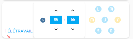
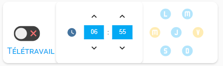
J’avais mon réveil qui fonctionnait bien, et depuis peu, le switch que j’avais intégré ne s’affiche pas correctement.
 .
.
Je me suis dit que cela venait peut-être du lien « SVG namespace » qui ne fonctionnerait plus et l’ai donc remplacé par « https://www.svgrepo.com/show/33995/switch.svg », mais cela n’est pas mieux…
Auriez vous une idée de ce qui ne va pas?
Merci
Ci dessous le code
elements:
- entity: sensor.vide
prefix: Télétravail
style:
color: var(--primary-color)
font-size: 20px
font-variant: small-caps
left: 13%
pointer-events: none
top: 80%
tap_action:
action: none
type: state-label
- entity: input_boolean.wakestatus_2
show_icon: false
show_state: false
styles:
toogle:
- transform: translateX(26px)
card:
- width: 60px
- height: 40px
- background: transparent
- box-shadow: none
custom_fields:
toogle: |
[[[
return `
<div class="switch">
<span class="toggle-thumb">
<svg xmlns="http://www.w3.org/2000/svg" width="36" height="36" viewBox="0 0 24 24" style="fill:#4ADE80;transform:;-ms-filter:"><path d="M10 15.586L6.707 12.293 5.293 13.707 10 18.414 19.707 8.707 18.293 7.293z"></path></svg>
<svg xmlns="http://www.w3.org/2000/svg" width="36" height="36" viewBox="0 0 24 24" style="fill:#F87171;transform:;-ms-filter:"><path d="M16.192 6.344L11.949 10.586 7.707 6.344 6.293 7.758 10.535 12 6.293 16.242 7.707 17.656 11.949 13.414 16.192 17.656 17.606 16.242 13.364 12 17.606 7.758z"></path></svg>
</span>
</div>`
]]]
type: custom:button-card
style: |
ha-card {
margin: 0 0 130px 110px;
}
#toogle .switch {
display: inline-block;
width: 60px;
height: 34px;
position: relative;
}
.toggle-thumb {
position: absolute;
top: 0;
left: 0;
right: 0;
bottom: 0;
display: flex;
justify-content: space-between;
align-items: center;
background-color: #3f3F3f;
border-radius: 40px;
cursor: pointer;
}
.toggle-thumb:before {
content: "";
height: 26px;
width: 26px;
position: absolute;
left: 4px;
bottom: 4px;
border-radius: 50%;
background-color: #EFEFEF;
transition: .4s all ease;
}
.checkbox {
opacity: 0;
width: 0;
height: 0;
z-index: 100;
}
.toggle-thumb:before {
{% if is_state('input_boolean.wakestatus_2', 'on') %}
transform: translateX(26px);
{% endif %}
}
- entity: input_datetime.wake_time_2
hide:
name: true
hour_step: 1
layout:
align_controls: center
name: inside
link_values: true
minute_step: 1
name: ''
style:
.: |
ha-card {
box-shadow: none;
background-color: rgba(0,0,0,0);
opacity: {% if is_state('input_boolean.wakestatus_2', 'off') %} 0.3 {% endif %};
pointer-events: {% if is_state('input_boolean.wakestatus_2', 'off') %} none {% endif %};
}
.time-picker-row{
margin-left: 5px !important;
}
.time-picker-row:
.time-picker-content:
.: |
.time-separator {
display: none;
}
time-unit:
$: |
.time-unit {
padding: 2px !important;
}
.time-input {
border: 2px solid var(--primary-color) !important;
background-color: rgba(0,0,0,0) !important;
color: white !important;
border-radius: 5px;
}
.time-picker-icon {
color: var(--primary-color) !important;
z-index: 100;
}
left: 45%
top: 50%
type: custom:time-picker-card
- entity: input_boolean.wakeweekday_mon_2
icon: mdi:alpha-l-circle
show_label: false
show_name: false
show_state: false
style:
'--paper-item-icon-color': var(--primary-color)
right: 17%
top: 20%
styles:
card:
- width: 35px
- height: 35px
- border-radius: 999px
- background-color: rgba(0, 0, 0, 0)
- box-shadow: none
- opacity: |
[[[
if ( (states['input_boolean.wakestatus_2'].state == 'off') ) return '0.3';
else return '1';
]]]
- pointer-events: |
[[[
if ( (states['input_boolean.wakestatus_2'].state == 'off') ) return 'none';
else return 'auto';
]]]
icon:
- transform: scale(2.1)
type: custom:button-card
- entity: input_boolean.wakeweekday_tue_2
icon: mdi:alpha-m-circle
show_label: false
show_name: false
show_state: false
style:
'--paper-item-icon-color': var(--primary-color)
right: 7%
top: 20%
styles:
card:
- width: 35px
- height: 35px
- border-radius: 999px
- background-color: rgba(0, 0, 0, 0)
- box-shadow: none
- opacity: |
[[[
if ( (states['input_boolean.wakestatus_2'].state == 'off') ) return '0.3';
else return '1';
]]]
- pointer-events: |
[[[
if ( (states['input_boolean.wakestatus_2'].state == 'off') ) return 'none';
else return 'auto';
]]]
icon:
- transform: scale(2.1)
type: custom:button-card
- entity: input_boolean.wakeweekday_wed_2
icon: mdi:alpha-m-circle
show_label: false
show_name: false
show_state: false
style:
'--paper-item-icon-color': var(--primary-color)
right: 22%
top: 50%
styles:
card:
- width: 35px
- height: 35px
- border-radius: 999px
- background-color: rgba(0, 0, 0, 0)
- box-shadow: none
- opacity: |
[[[
if ( (states['input_boolean.wakestatus_2'].state == 'off') ) return '0.3';
else return '1';
]]]
- pointer-events: |
[[[
if ( (states['input_boolean.wakestatus_2'].state == 'off') ) return 'none';
else return 'auto';
]]]
icon:
- transform: scale(2.1)
type: custom:button-card
- entity: input_boolean.wakeweekday_thu_2
icon: mdi:alpha-j-circle
show_label: false
show_name: false
show_state: false
style:
'--paper-item-icon-color': var(--primary-color)
right: 12%
top: 50%
styles:
card:
- width: 35px
- height: 35px
- border-radius: 999px
- background-color: rgba(0, 0, 0, 0)
- box-shadow: none
- opacity: |
[[[
if ( (states['input_boolean.wakestatus_2'].state == 'off') ) return '0.3';
else return '1';
]]]
- pointer-events: |
[[[
if ( (states['input_boolean.wakestatus_2'].state == 'off') ) return 'none';
else return 'auto';
]]]
icon:
- transform: scale(2.1)
type: custom:button-card
- entity: input_boolean.wakeweekday_fri_2
icon: mdi:alpha-v-circle
show_label: false
show_name: false
show_state: false
style:
'--paper-item-icon-color': var(--primary-color)
right: 2%
top: 50%
styles:
card:
- width: 35px
- height: 35px
- border-radius: 999px
- background-color: rgba(0, 0, 0, 0)
- box-shadow: none
- opacity: |
[[[
if ( (states['input_boolean.wakestatus_2'].state == 'off') ) return '0.3';
else return '1';
]]]
- pointer-events: |
[[[
if ( (states['input_boolean.wakestatus_2'].state == 'off') ) return 'none';
else return 'auto';
]]]
icon:
- transform: scale(2.1)
type: custom:button-card
- entity: input_boolean.wakeweekday_sat_2
icon: mdi:alpha-s-circle
show_label: false
show_name: false
show_state: false
style:
'--paper-item-icon-color': var(--primary-color)
right: 17%
top: 80%
styles:
card:
- width: 35px
- height: 35px
- border-radius: 999px
- background-color: rgba(0, 0, 0, 0)
- box-shadow: none
- opacity: |
[[[
if ( (states['input_boolean.wakestatus_2'].state == 'off') ) return '0.3';
else return '1';
]]]
- pointer-events: |
[[[
if ( (states['input_boolean.wakestatus_2'].state == 'off') ) return 'none';
else return 'auto';
]]]
icon:
- transform: scale(2.1)
type: custom:button-card
- entity: input_boolean.wakeweekday_sun_2
icon: mdi:alpha-d-circle
show_label: false
show_name: false
show_state: false
style:
'--paper-item-icon-color': var(--primary-color)
right: 7%
top: 80%
styles:
card:
- width: 35px
- height: 35px
- border-radius: 999px
- background-color: rgba(0, 0, 0, 0)
- box-shadow: none
- opacity: |
[[[
if ( (states['input_boolean.wakestatus_2'].state == 'off') ) return '0.3';
else return '1';
]]]
- pointer-events: |
[[[
if ( (states['input_boolean.wakestatus_2'].state == 'off') ) return 'none';
else return 'auto';
]]]
icon:
- transform: scale(2.1)
> elements:
> - entity: sensor.vide
> prefix: Télétravail
> style:
> color: var(--primary-color)
> font-size: 20px
> font-variant: small-caps
> left: 13%
> pointer-events: none
> top: 80%
> tap_action:
> action: none
> type: state-label
> - entity: input_boolean.wakestatus_2
> show_icon: false
> show_state: false
> styles:
> toogle:
> - transform: translateX(26px)
> card:
> - width: 60px
> - height: 40px
> - background: transparent
> - box-shadow: none
> custom_fields:
> toogle: |
> [[[
> return `
> <div class="switch">
> <span class="toggle-thumb">
> <svg xmlns="http://www.w3.org/2000/svg" width="36" height="36" viewBox="0 0 24 24" style="fill:#4ADE80;transform:;-ms-filter:"><path d="M10 15.586L6.707 12.293 5.293 13.707 10 18.414 19.707 8.707 18.293 7.293z"></path></svg>
> <svg xmlns="http://www.w3.org/2000/svg" width="36" height="36" viewBox="0 0 24 24" style="fill:#F87171;transform:;-ms-filter:"><path d="M16.192 6.344L11.949 10.586 7.707 6.344 6.293 7.758 10.535 12 6.293 16.242 7.707 17.656 11.949 13.414 16.192 17.656 17.606 16.242 13.364 12 17.606 7.758z"></path></svg>
> </span>
> </div>`
> ]]]
> type: custom:button-card
> style: |
> ha-card {
> margin: 0 0 130px 110px;
> }
> #toogle .switch {
> display: inline-block;
> width: 60px;
> height: 34px;
> position: relative;
> }
> .toggle-thumb {
> position: absolute;
> top: 0;
> left: 0;
> right: 0;
> bottom: 0;
> display: flex;
> justify-content: space-between;
> align-items: center;
> background-color: #3f3F3f;
> border-radius: 40px;
> cursor: pointer;
> }
> .toggle-thumb:before {
> content: "";
> height: 26px;
> width: 26px;
> position: absolute;
> left: 4px;
> bottom: 4px;
> border-radius: 50%;
> background-color: #EFEFEF;
> transition: .4s all ease;
> }
> .checkbox {
> opacity: 0;
> width: 0;
> height: 0;
> z-index: 100;
> }
> .toggle-thumb:before {
> {% if is_state('input_boolean.wakestatus_2', 'on') %}
> transform: translateX(26px);
> {% endif %}
> }
> - entity: input_datetime.wake_time_2
> hide:
> name: true
> hour_step: 1
> layout:
> align_controls: center
> name: inside
> link_values: true
> minute_step: 1
> name: ''
> style:
> .: |
> ha-card {
> box-shadow: none;
> background-color: rgba(0,0,0,0);
> opacity: {% if is_state('input_boolean.wakestatus_2', 'off') %} 0.3 {% endif %};
> pointer-events: {% if is_state('input_boolean.wakestatus_2', 'off') %} none {% endif %};
> }
> .time-picker-row{
> margin-left: 5px !important;
> }
> .time-picker-row:
> .time-picker-content:
> .: |
> .time-separator {
> display: none;
> }
> time-unit:
> $: |
> .time-unit {
> padding: 2px !important;
> }
> .time-input {
> border: 2px solid var(--primary-color) !important;
> background-color: rgba(0,0,0,0) !important;
> color: white !important;
> border-radius: 5px;
> }
> .time-picker-icon {
> color: var(--primary-color) !important;
> z-index: 100;
> }
> left: 45%
> top: 50%
> type: custom:time-picker-card
> - entity: input_boolean.wakeweekday_mon_2
> icon: mdi:alpha-l-circle
> show_label: false
> show_name: false
> show_state: false
> style:
> '--paper-item-icon-color': var(--primary-color)
> right: 17%
> top: 20%
> styles:
> card:
> - width: 35px
> - height: 35px
> - border-radius: 999px
> - background-color: rgba(0, 0, 0, 0)
> - box-shadow: none
> - opacity: |
> [[[
> if ( (states['input_boolean.wakestatus_2'].state == 'off') ) return '0.3';
> else return '1';
> ]]]
> - pointer-events: |
> [[[
> if ( (states['input_boolean.wakestatus_2'].state == 'off') ) return 'none';
> else return 'auto';
> ]]]
> icon:
> - transform: scale(2.1)
> type: custom:button-card
> - entity: input_boolean.wakeweekday_tue_2
> icon: mdi:alpha-m-circle
> show_label: false
> show_name: false
> show_state: false
> style:
> '--paper-item-icon-color': var(--primary-color)
> right: 7%
> top: 20%
> styles:
> card:
> - width: 35px
> - height: 35px
> - border-radius: 999px
> - background-color: rgba(0, 0, 0, 0)
> - box-shadow: none
> - opacity: |
> [[[
> if ( (states['input_boolean.wakestatus_2'].state == 'off') ) return '0.3';
> else return '1';
> ]]]
> - pointer-events: |
> [[[
> if ( (states['input_boolean.wakestatus_2'].state == 'off') ) return 'none';
> else return 'auto';
> ]]]
> icon:
> - transform: scale(2.1)
> type: custom:button-card
> - entity: input_boolean.wakeweekday_wed_2
> icon: mdi:alpha-m-circle
> show_label: false
> show_name: false
> show_state: false
> style:
> '--paper-item-icon-color': var(--primary-color)
> right: 22%
> top: 50%
> styles:
> card:
> - width: 35px
> - height: 35px
> - border-radius: 999px
> - background-color: rgba(0, 0, 0, 0)
> - box-shadow: none
> - opacity: |
> [[[
> if ( (states['input_boolean.wakestatus_2'].state == 'off') ) return '0.3';
> else return '1';
> ]]]
> - pointer-events: |
> [[[
> if ( (states['input_boolean.wakestatus_2'].state == 'off') ) return 'none';
> else return 'auto';
> ]]]
> icon:
> - transform: scale(2.1)
> type: custom:button-card
> - entity: input_boolean.wakeweekday_thu_2
> icon: mdi:alpha-j-circle
> show_label: false
> show_name: false
> show_state: false
> style:
> '--paper-item-icon-color': var(--primary-color)
> right: 12%
> top: 50%
> styles:
> card:
> - width: 35px
> - height: 35px
> - border-radius: 999px
> - background-color: rgba(0, 0, 0, 0)
> - box-shadow: none
> - opacity: |
> [[[
> if ( (states['input_boolean.wakestatus_2'].state == 'off') ) return '0.3';
> else return '1';
> ]]]
> - pointer-events: |
> [[[
> if ( (states['input_boolean.wakestatus_2'].state == 'off') ) return 'none';
> else return 'auto';
> ]]]
> icon:
> - transform: scale(2.1)
> type: custom:button-card
> - entity: input_boolean.wakeweekday_fri_2
> icon: mdi:alpha-v-circle
> show_label: false
> show_name: false
> show_state: false
> style:
> '--paper-item-icon-color': var(--primary-color)
> right: 2%
> top: 50%
> styles:
> card:
> - width: 35px
> - height: 35px
> - border-radius: 999px
> - background-color: rgba(0, 0, 0, 0)
> - box-shadow: none
> - opacity: |
> [[[
> if ( (states['input_boolean.wakestatus_2'].state == 'off') ) return '0.3';
> else return '1';
> ]]]
> - pointer-events: |
> [[[
> if ( (states['input_boolean.wakestatus_2'].state == 'off') ) return 'none';
> else return 'auto';
> ]]]
> icon:
> - transform: scale(2.1)
> type: custom:button-card
> - entity: input_boolean.wakeweekday_sat_2
> icon: mdi:alpha-s-circle
> show_label: false
> show_name: false
> show_state: false
> style:
> '--paper-item-icon-color': var(--primary-color)
> right: 17%
> top: 80%
> styles:
> card:
> - width: 35px
> - height: 35px
> - border-radius: 999px
> - background-color: rgba(0, 0, 0, 0)
> - box-shadow: none
> - opacity: |
> [[[
> if ( (states['input_boolean.wakestatus_2'].state == 'off') ) return '0.3';
> else return '1';
> ]]]
> - pointer-events: |
> [[[
> if ( (states['input_boolean.wakestatus_2'].state == 'off') ) return 'none';
> else return 'auto';
> ]]]
> icon:
> - transform: scale(2.1)
> type: custom:button-card
> - entity: input_boolean.wakeweekday_sun_2
> icon: mdi:alpha-d-circle
> show_label: false
> show_name: false
> show_state: false
> style:
> '--paper-item-icon-color': var(--primary-color)
> right: 7%
> top: 80%
> styles:
> card:
> - width: 35px
> - height: 35px
> - border-radius: 999px
> - background-color: rgba(0, 0, 0, 0)
> - box-shadow: none
> - opacity: |
> [[[
> if ( (states['input_boolean.wakestatus_2'].state == 'off') ) return '0.3';
> else return '1';
> ]]]
> - pointer-events: |
> [[[
> if ( (states['input_boolean.wakestatus_2'].state == 'off') ) return 'none';
> else return 'auto';
> ]]]
> icon:
> - transform: scale(2.1)
> type: custom:button-card
> image: /local/images/transparent/transparent.png
> type: picture-elements