Modification d’une carte posté par un autre membre :
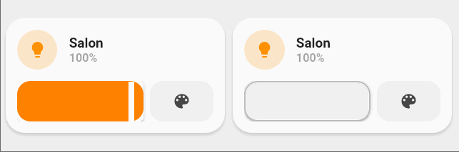
J’ai retravaillé la carte pour afficher la couleur de l’ampoule dans l’icone (la luminosité est prise en compte également)
Et j’ai retravaillé les couleurs et le style pour la faire correspondre à une carte présente dans le thème original 
Prenez ou non 
#cards
type: grid
cards:
  - entity: light.salon_lampe_01
    template:
      - light_buttons_with_colors
    type: custom:button-card
    variables:
      entity: light.salon_lampe_01
      name: Salon
  - entity: light.salon_lampe_01
    template:
      - light_buttons_with_colors_light
    type: custom:button-card
    variables:
      entity: light.salon_lampe_01
      name: Salon
columns: 2
square: false
#templates
button_card_templates:
  list_items_light:
    styles:
      card:
        - box-shadow: none
        - padding: 0px
      grid:
        - grid-template-areas: '"item1 item2"'
        - grid-template-columns: 2fr 1fr
        - grid-template-rows: min-content
        - column-gap: 7px
  light_with_colors:
    tap_action:
      action: toggle
    hold_action:
      action: more-info
    label: |-
      [[[ if (entity.state !='unavailable'){
            if (entity.state =='off'){
              var bri = Math.round(entity.attributes.brightness / 2.55);
              return 'Off';
            }else{
              var bri = Math.round(entity.attributes.brightness / 2.55);
              return (bri ? bri + '%' : 'On') ;
            }
          }else{
            return "Indisponible";
          }
      ]]]
    state:
      - styles:
          icon:
            - filter: |-
                [[[
                    var bri = entity.attributes.brightness / 2.55;
                    return ('brightness(' + (50+bri/2) + '%)') ;
                ]]]
            - color: |-
                [[[
                  var color = entity.attributes.rgb_color;
                  if (color){
                     return 'rgba(' + entity.attributes.rgb_color + ',1)'
                  }
                  else{
                    return 'rgba(var(--couleur-jaune),1)'
                  }
                ]]]
          img_cell:
            - background-color: |-
                [[[
                  var color = entity.attributes.rgb_color;
                  if (color){
                     return 'rgba(' + entity.attributes.rgb_color + ',0.2)'
                  }
                  else{
                    return 'rgba(var(--couleur-jaune),0.2)'
                  }
                ]]]
        value: 'on'
  light_buttons_with_colors_light:
    show_name: false
    show_icon: false
    variables:
      entity: light.default
      name: Lumière
    styles:
      card:
        - border-radius: 20px
        - box-shadow: var(--box-shadow)
        - padding: 12px
      grid:
        - grid-template-areas: '"item1" "item2"'
        - grid-template-columns: 1fr
        - grid-template-rows: min-content  min-content
        - row-gap: 12px
    custom_fields:
      item1:
        card:
          entity: '[[[ return variables.entity ]]]'
          name: '[[[ return variables.name ]]]'
          tap_action:
            action: call-service
            service: light.toggle
            service_data:
              entity_id: '[[[ return variables.entity ]]]'
          template:
            - icon_info
            - light_with_colors
          type: custom:button-card
      item2:
        card:
          template: list_items_light
          type: custom:button-card
          custom_fields:
            item1:
              card:
                type: custom:slider-card
                entity: '[[[ return variables.entity ]]]'
                radius: 12px
                height: 42px
                thumbColorOff: rgba(var(--couleur-theme),0.2)
                mainSliderColorOff: rgb(var(--couleur-theme),0.2)
                secondarySliderColorOff: var(--google-grey-500)
                mainSliderColor: rgb(var(--couleur-gris-light))
                thumbColor: rgb(var(--couleur-gris-light))
                secondarySliderColor: var(--google-grey-500)
                card_mod:
                  style: |
                    ha-card {
                      border-radius: 14px;
                    }
                    div {
                      border: 2px solid var(--google-grey-500);
                      border-radius: 14px !important;
                      box-sizing: border-box;
                      position: relative;
                    }
            item2:
              card:
                icon: mdi:palette
                tap_action:
                  action: more-info
                type: custom:button-card
                entity: '[[[ return variables.entity ]]]'
                template: widget_icon
  light_buttons_with_colors:
    show_name: false
    show_icon: false
    variables:
      entity: light.default
      name: Lumière
    styles:
      card:
        - border-radius: 20px
        - box-shadow: var(--box-shadow)
        - padding: 12px
      grid:
        - grid-template-areas: '"item1" "item2"'
        - grid-template-columns: 1fr
        - grid-template-rows: min-content  min-content
        - row-gap: 12px
    custom_fields:
      item1:
        card:
          entity: '[[[ return variables.entity ]]]'
          name: '[[[ return variables.name ]]]'
          tap_action:
            action: call-service
            service: light.toggle
            service_data:
              entity_id: '[[[ return variables.entity ]]]'
          template:
            - icon_info
            - light_with_colors
          type: custom:button-card
      item2:
        card:
          template: list_items_light
          type: custom:button-card
          custom_fields:
            item1:
              card:
                type: custom:slider-card
                entity: '[[[ return variables.entity ]]]'
                radius: 14px
                height: 42px
                mainSliderColorOff: var(--google-grey-500)
                secondarySliderColor: rgba(var(--couleur-theme),0.05)
                secondarySliderColorOff: rgba(var(--couleur-theme),0.05)
                thumbColorOff: white
            item2:
              card:
                icon: mdi:palette
                tap_action:
                  action: more-info
                type: custom:button-card
                entity: '[[[ return variables.entity ]]]'
                template: widget_icon
Il reste à optimiser le code en combinant les templates