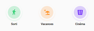
@samg23 , tu saurais comment je peux coloré le pourtour de l’icone

quand il est activé? Et avoir le nom en entier.
C’est avec cette card: Welcome Scenes Card - UI Lovelace Minimalist
Je ne sais pas ce que je doit toucher…
Bonsoir,
Savez vous comment rendre la vue ui-lovelace.yaml comme Dashboard par défaut ?
A chaque fois que je me connecte, le dashboard Aperçu s’affiche et je dois me rendre dans les paramètres utilisateur pour remettre le theme minimalist-desktop/mobile et affecter le tableau de bord UI-lovelace-minimalist par défaut
https://forum.hacf.fr/t/decouverte-et-prise-en-main-de-lovelace/2062
Recherche le mot « défaut »
Merci @Clemalex , j’avais consulté cet article, mais ca ne répond pas à mon problème, bien que je définisse le tableau de bord ui-minimalist dans les paramètres de l’utilisateur, il arrive que celui par défaut (Aperçu) se réaffiche.
J’ai également tenté de faire une automatisation, mais sans succès.
@Galadan, le pourtour tu veux dire comme ca ?
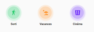
Ou le bord ?
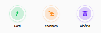
Ou bien rien que l’ombre ?
2 « J'aime »
Partage tes codes 
Que ça profite à tout le monde… 
1 « J'aime »
Voilà le code du template modifié avec les différentes options :
https://forum.hacf.fr/t/dashboard-minimalist/5507/335?u=samg23
J’ai ajouté des commentaires dans le code pour faciliter la compréhension sur ce qu’il faut modifier pour activer telles ou telles options.
---
card_welcome_scenes:
variables:
ulm_weather: "[[[ return variables.ulm_weather]]]"
ulm_language: "[[[return window.navigator.language ]]]"
entity_1:
entity_id:
icon: "[[[ return entity.attributes.icon ]]]"
name: "[[[ return entity.attributes.friendly_name ]]]"
color: >
[[[
var colors = ['yellow', 'blue', 'red', 'purple','green', 'pink'];
var color = colors[Math.floor(Math.random() * colors.length)];
return color;
]]]
entity_2:
entity_id:
icon: "[[[ return entity.attributes.icon ]]]"
name: "[[[ return entity.attributes.friendly_name ]]]"
color: >
[[[
var colors = ['yellow', 'blue', 'red', 'purple','green', 'pink'];
var color = colors[Math.floor(Math.random() * colors.length)];
return color;
]]]
entity_3:
entity_id:
icon: "[[[ return entity.attributes.icon ]]]"
name: "[[[ return entity.attributes.friendly_name ]]]"
color: >
[[[
var colors = ['yellow', 'blue', 'red', 'purple','green', 'pink'];
var color = colors[Math.floor(Math.random() * colors.length)];
return color;
]]]
entity_4:
entity_id:
icon: "[[[ return entity.attributes.icon ]]]"
name: "[[[ return entity.attributes.friendly_name ]]]"
color: >
[[[
var colors = ['yellow', 'blue', 'red', 'purple','green', 'pink'];
var color = colors[Math.floor(Math.random() * colors.length)];
return color;
]]]
entity_5:
entity_id:
icon: "[[[ return entity.attributes.icon ]]]"
name: "[[[ return entity.attributes.friendly_name ]]]"
color: >
[[[
var colors = ['yellow', 'blue', 'red', 'purple','green', 'pink'];
var color = colors[Math.floor(Math.random() * colors.length)];
return color;
]]]
template:
- "ulm_language_variables"
show_icon: false
show_name: false
show_label: true
styles:
grid:
- grid-template-areas: >
[[[
if(variables.ulm_card_welcome_scenes_collapse && states[variables.ulm_card_welcome_scenes_collapse].state == 'on'){
return "\'item1\' \'item2\' ";
} else {
return "\'item1\' \'item2\' \'item3\' \'item4\'";
}
]]]
- grid-template-columns: "1fr"
- grid-template-rows: "min-content min-content"
- row-gap: "0px"
card:
- border-radius: "var(--border-radius)"
- box-shadow: "var(--box-shadow)"
- padding: "10px"
custom_fields:
item3:
- display: >
[[[
if(variables.ulm_card_welcome_scenes_collapse && states[variables.ulm_card_welcome_scenes_collapse].state == 'on'){
return "none";
} else {
return "block";
}
]]]
item4:
- display: >
[[[
if(variables.ulm_card_welcome_scenes_collapse && states[variables.ulm_card_welcome_scenes_collapse].state == 'on'){
return "none";
} else {
return "block";
}
]]]
custom_fields:
item1:
card:
type: "custom:button-card"
template: "card_topbar_welcome"
variables:
ulm_card_welcome_scenes_collapse: "[[[ return variables.ulm_card_welcome_scenes_collapse ]]]"
ulm_weather: "[[[ return variables.ulm_weather]]]"
ulm_language: "[[[ return variables.ulm_language ]]]"
styles:
card:
- border-radius: "none"
- box-shadow: "none"
- padding: "4px"
item2:
card:
type: "custom:button-card"
show_icon: false
show_label: false
show_name: true
show_entity_picture: false
name: |
[[[
var today = new Date();
var time = today.getHours()
let welcome = '';
if (time >= '18'){
welcome = variables.ulm_evening;
} else if (time >= '12'){
welcome = variables.ulm_afternoon;
} else if (time >= '5'){
welcome = variables.ulm_morning;
} else {
welcome = variables.ulm_hello;
}
return welcome + ', ' + ' <br>' + user.name + '!';
]]]
styles:
name:
- align-self: "start"
- justify-self: "start"
- font-weight: "bold"
- font-size: "24px"
- margin-left: "16px"
grid:
- grid-template-areas: "'i n' 'i l'"
- grid-template-columns: "min-content auto"
- grid-template-rows: "min-content min-content"
- text-align: "start"
card:
- box-shadow: "none"
- padding-bottom: "8px"
item3:
card:
type: "custom:button-card"
show_icon: true
show_label: true
show_name: true
show_entity_picture: false
name: "Scenes"
icon: "mdi:dots-vertical"
styles:
icon:
- height: "20px"
- filter: "opacity(50%)"
name:
- align-self: "start"
- justify-self: "start"
- font-weight: "bold"
- font-size: "18px"
- margin-left: "16px"
grid:
- grid-template-areas: "'n i'"
- grid-template-columns: "6fr 1fr"
- grid-template-rows: "min-content min-content"
- text-align: "start"
card:
- box-shadow: "none"
- padding-bottom: "0px"
- bottom: "10px"
item4:
card:
type: "custom:button-card"
template: >
[[[
if(variables.entity_1.entity_id && variables.entity_2.entity_id && variables.entity_3.entity_id && variables.entity_4.entity_id && variables.entity_5.entity_id){
return 'card_scenes_welcome'
} else {
return 'card_scenes_welcome_auto'
}
]]]
styles:
card:
- border-radius: "none"
- box-shadow: "none"
- padding: "4px"
variables:
entity_1: "[[[ return variables.entity_1]]]"
entity_2: "[[[ return variables.entity_2]]]"
entity_3: "[[[ return variables.entity_3]]]"
entity_4: "[[[ return variables.entity_4]]]"
entity_5: "[[[ return variables.entity_5]]]"
card_title_welcome:
tap_action:
action: "none"
show_icon: false
show_label: true
show_name: true
styles:
card:
- background-color: "rgba(0,0,0,0)"
- box-shadow: "none"
- height: "auto"
- width: "auto"
- margin-top: "-10px"
- margin-left: "16px"
- margin-bottom: "-15px"
grid:
- grid-template-areas: "'n' 'l'"
- grid-template-columns: "1fr"
- grid-template-rows: "min-content min-content"
name:
- justify-self: "start"
- font-weight: "bold"
- font-size: "20px"
label:
- justify-self: "start"
- font-weight: "bold"
- font-size: "1rem"
- opacity: "0.4"
card_scenes_welcome:
show_icon: false
show_name: true
show_label: false
styles:
grid:
- grid-template-areas: "'item1 item2 item3 item4 item5'"
- grid-template-columns: "1fr 1fr 1fr 1fr 1fr"
- grid-template-rows: "min-content"
- justify-items: "center"
card:
- border-radius: "var(--border-radius)"
- box-shadow: "var(--box-shadow)"
- padding: "12px"
- overflow: "visible"
custom_fields:
item1:
card:
type: "custom:button-card"
template: "card_scenes_pill_welcome"
# Ajout d'une variable pill_color (obligatoire)
variables:
pill_color: "[[[ return variables.entity_1.color ]]]"
entity: "[[[ return variables.entity_1.entity_id ]]]"
custom_fields:
item1:
card:
type: "custom:button-card"
template: "tap_action"
entity: "[[[ return variables.entity_1.entity_id ]]]"
icon: "[[[ return variables.entity_1.icon ]]]"
styles:
icon:
- color: "[[[ return `rgba(var(--color-${variables.entity_1.color}), 1)`;]]]"
img_cell:
- background-color: "[[[ return `rgba(var(--color-${variables.entity_1.color}), 0.20)`;]]]"
item2:
card:
type: "custom:button-card"
template: "tap_action"
entity: "[[[ return variables.entity_1.entity_id ]]]"
name: "[[[ return variables.entity_1.name ]]]"
item2:
card:
type: "custom:button-card"
template: "card_scenes_pill_welcome"
# Ajout d'une variable pill_color (obligatoire)
variables:
pill_color: "[[[ return variables.entity_2.color ]]]"
entity: "[[[ return variables.entity_2.entity_id ]]]"
custom_fields:
item1:
card:
type: "custom:button-card"
template: "tap_action"
entity: "[[[ return variables.entity_2.entity_id ]]]"
icon: "[[[ return variables.entity_2.icon ]]]"
styles:
icon:
- color: "[[[ return `rgba(var(--color-${variables.entity_2.color}), 1)`;]]]"
img_cell:
- background-color: "[[[ return `rgba(var(--color-${variables.entity_2.color}), 0.20)`;]]]"
item2:
card:
type: "custom:button-card"
template: "tap_action"
entity: "[[[ return variables.entity_2.entity_id ]]]"
name: "[[[ return variables.entity_2.name ]]]"
item3:
card:
type: "custom:button-card"
template: "card_scenes_pill_welcome"
# Ajout d'une variable pill_color (obligatoire)
variables:
pill_color: "[[[ return variables.entity_3.color ]]]"
entity: "[[[ return variables.entity_3.entity_id ]]]"
custom_fields:
item1:
card:
type: "custom:button-card"
template: "tap_action"
entity: "[[[ return variables.entity_3.entity_id ]]]"
icon: "[[[ return variables.entity_3.icon ]]]"
styles:
icon:
- color: "[[[ return `rgba(var(--color-${variables.entity_3.color}), 1)`;]]]"
img_cell:
- background-color: "[[[ return `rgba(var(--color-${variables.entity_3.color}), 0.20)`;]]]"
item2:
card:
type: "custom:button-card"
template: "tap_action"
entity: "[[[ return variables.entity_3.entity_id ]]]"
name: "[[[ return variables.entity_3.name ]]]"
item4:
card:
type: "custom:button-card"
template: "card_scenes_pill_welcome"
# Ajout d'une variable pill_color (obligatoire)
variables:
pill_color: "[[[ return variables.entity_4.color ]]]"
entity: "[[[ return variables.entity_4.entity_id ]]]"
custom_fields:
item1:
card:
type: "custom:button-card"
template: "tap_action"
entity: "[[[ return variables.entity_4.entity_id ]]]"
icon: "[[[ return variables.entity_4.icon ]]]"
styles:
icon:
- color: "[[[ return `rgba(var(--color-${variables.entity_4.color}), 1)`;]]]"
img_cell:
- background-color: "[[[ return `rgba(var(--color-${variables.entity_4.color}), 0.20)`;]]]"
item2:
card:
type: "custom:button-card"
template: "tap_action"
entity: "[[[ return variables.entity_4.entity_id ]]]"
name: "[[[ return variables.entity_4.name ]]]"
item5:
card:
type: "custom:button-card"
template: "card_scenes_pill_welcome"
# Ajout d'une variable pill_color (obligatoire)
variables:
pill_color: "[[[ return variables.entity_5.color ]]]"
entity: "[[[ return variables.entity_5.entity_id ]]]"
custom_fields:
item1:
card:
type: "custom:button-card"
template: "tap_action"
entity: "[[[ return variables.entity_5.entity_id ]]]"
icon: "[[[ return variables.entity_5.icon ]]]"
styles:
icon:
- color: "[[[ return `rgba(var(--color-${variables.entity_5.color}), 1)`;]]]"
img_cell:
- background-color: "[[[ return `rgba(var(--color-${variables.entity_5.color}), 0.20)`;]]]"
item2:
card:
type: "custom:button-card"
template: "tap_action"
entity: "[[[ return variables.entity_5.entity_id ]]]"
name: "[[[ return variables.entity_5.name ]]]"
card_scenes_pill_welcome:
show_icon: false
show_label: false
show_name: false
state:
- operator: "template"
value: >
[[[
return (entity.state !== 'on' && entity.state !== 'playing')
]]]
styles:
card:
- overflow: "visible"
- box-shadow: "none"
### Ajoute une couleur de fond sur la puce active
- operator: "template"
value: >
[[[
return (entity.state == 'on' || entity.state == 'playing')
]]]
styles:
card:
### Option 1 : Seulement avec le theme clair
- background-color: >
[[[
if (!hass.themes.darkMode){
return `rgba(var(--color-${variables.pill_color}), 0.1)`;
}
]]]
### Option 2 : Tout le temps
### Pour activer : commenter l'option 1 et décommenter les lignes ci-dessous
# - background-color: "[[[ return `rgba(var(--color-${variables.pill_color}), 0.1)`; ]]]"
styles:
grid:
- grid-template-areas: "'item1' 'item2'"
- grid-template-columns: "min-content"
- grid-template-rows: "1fr 1fr"
- row-gap: "12px"
- justify-items: "center"
- column-gap: "auto"
card:
- border-radius: "50px"
- place-self: "center"
- width: "52px"
- height: "84px"
### Option 1 : Ombre normale
- box-shadow: >
[[[
if (hass.themes.darkMode){
return "0px 2px 4px 0px rgba(0,0,0,0.80)";
} else {
return "var(--box-shadow)";
}
]]]
### Option 2 : Ombre de la couleur de la puce
### Pour activer : commenter l'option 1 et décommenter les lignes ci-dessous
# - box-shadow: >
# [[[
# if (hass.themes.darkMode){
# return "0px 2px 4px 0px rgba(0,0,0,0.80)";
# } else {
# return `0px 2px 4px 0px rgba(var(--color-${variables.pill_color}), 0.16)`;
# }
# ]]]
color: "var(--google-grey)"
custom_fields:
item1:
card:
type: "custom:button-card"
show_icon: true
show_label: false
show_name: false
styles:
grid:
- grid-template-areas: "i"
icon:
- color: "[[[ return `rgba(var(--color-theme), 0.20)`;]]]"
- width: "20px"
img_cell:
- background-color: "[[[ return `rgba(var(--color-theme), 0.05)`;]]] "
- border-radius: "50%"
- width: "42px"
- height: "42px"
card:
- background: "none"
- box-shadow: "none"
- border-radius: "50px"
- padding: "5px"
state:
- operator: "template"
value: >
[[[
return (entity.state !== 'on' && entity.state !== 'playing')
]]]
styles:
card:
- overflow: "visible"
### Couleur sur le pourtour de la puce
### Pour activer : décommenter la ligne ci-dessous
# - background-color: "[[[ return `rgba(var(--color-${variables.pill_color}), 0.15)`; ]]]"
### Couleur sur le bord de la puce
### Pour activer : décommenter la ligne ci-dessous
# - border: "[[[ return `1px solid rgba(var(--color-${variables.pill_color}), 0.1)`; ]]]"
### Option 1 : Ombre normale
- box-shadow: >
[[[
if (hass.themes.darkMode){
return "0px 2px 4px 0px rgba(0,0,0,0.80)";
} else {
return "var(--box-shadow)";
}
]]]
### Option 2 : Ombre de la couleur de la puce
### Pour activer : commenter l'option 1 et décommenter les lignes ci-dessous
# - box-shadow: >
# [[[
# if (hass.themes.darkMode){
# return "0px 2px 4px 0px rgba(0,0,0,0.80)";
# } else {
# return `0px 2px 4px 0px rgba(var(--color-${variables.pill_color}), 0.16)`;
# }
# ]]]
item2:
card:
type: "custom:button-card"
show_icon: false
show_label: false
styles:
grid:
- grid-template-areas: "n"
name:
- font-weight: "bold"
- font-size: "9.5px"
# Longeur de la zone de texte en dessous de la puce (laisser commanter pour désactiver la limitation)
# - width: "33px"
- padding-bottom: "7px"
card:
- box-shadow: "none"
- background: "none"
- padding: "0px 5px 5px 5px"
- margin-top: "-5px"
- border-radius: "50px"
card_topbar_welcome:
show_icon: false
show_name: false
show_label: false
styles:
grid:
- grid-template-areas: "item1 item2 item3"
- justify-content: "space-between"
- display: "flex"
card:
- border-radius: "none"
- box-shadow: "none"
- padding: "12px"
- background: "none"
custom_fields:
item1:
card:
type: "custom:button-card"
template: "chips"
entity: "[[[ return variables.ulm_card_welcome_scenes_collapse ]]]"
icon: "mdi:chevron-up"
show_icon: true
styles:
grid:
- grid-template-areas: "'i'"
card:
- box-shadow: >
[[[
if (hass.themes.darkMode){
return "0px 2px 4px 0px rgba(0,0,0,0.80)";
} else {
return "var(--box-shadow)";
}
]]]
state:
- value: "on"
icon: "mdi:chevron-down"
styles:
icon:
- color: "rgb(var(--color-theme))"
tap_action:
action: "call-service"
service: "input_boolean.toggle"
service_data:
entity_id: "[[[ return variables.ulm_card_welcome_scenes_collapse ]]]"
item2:
card:
type: "custom:button-card"
template: "chip_weather_date"
entity: "[[[ return variables.ulm_weather]]]"
variables:
ulm_weather: "[[[ return variables.ulm_weather ]]]"
ulm_language: "[[[ return variables.ulm_language ]]]"
styles:
card:
- width: "100px"
- box-shadow: >
[[[
if (hass.themes.darkMode){
return "0px 2px 4px 0px rgba(0,0,0,0.80)";
} else {
return "var(--box-shadow)";
}
]]]
item3:
card:
type: "custom:button-card"
tap_action:
action: "navigate"
navigation_path: "/config/dashboard"
template: "chip_mdi_icon_only"
variables:
ulm_chip_mdi_icon_only_icon: "mdi:cog-outline"
styles:
card:
- align-self: "end"
- box-shadow: >
[[[
if (hass.themes.darkMode){
return "0px 2px 4px 0px rgba(0,0,0,0.80)";
} else {
return "var(--box-shadow)";
}
]]]
# auto-entities
card_scenes_welcome_auto:
show_icon: false
show_name: true
show_label: false
styles:
grid:
- grid-template-areas: "'item1 item2 item3 item4 item5'"
- grid-template-columns: "1fr 1fr 1fr 1fr 1fr"
- grid-template-rows: "min-content"
- justify-items: "center"
- column-gap: "24px"
card:
- border-radius: "var(--border-radius)"
- box-shadow: "var(--box-shadow)"
- padding: "12px"
custom_fields:
item1:
card:
type: "custom:auto-entities"
card:
type: "grid"
columns: 1
square: false
card_param: "cards"
sort:
count: 1
filter:
include:
- domain: "script"
options:
type: "custom:button-card"
template: "card_scenes_pill_welcome"
custom_fields:
item1:
card:
type: "custom:button-card"
template: "tap_action"
entity: "this.entity_id"
icon: "[[[ return variables.entity_1.icon ]]]"
styles:
icon:
- color: "[[[ return `rgba(var(--color-${variables.entity_1.color}), 1)`;]]]"
img_cell:
- background-color: "[[[ return `rgba(var(--color-${variables.entity_1.color}), 0.20)`;]]]"
item2:
card:
type: "custom:button-card"
template: "tap_action"
entity: "this.entity_id"
name: "[[[ return variables.entity_1.name ]]]"
item2:
card:
type: "custom:auto-entities"
card:
type: "grid"
columns: 1
square: false
card_param: "cards"
sort:
count: 1
first: 1
filter:
include:
- domain: "script"
options:
type: "custom:button-card"
template: "card_scenes_pill_welcome"
custom_fields:
item1:
card:
type: "custom:button-card"
template: "tap_action"
entity: "this.entity_id"
icon: "[[[ return variables.entity_2.icon ]]]"
styles:
icon:
- color: "[[[ return `rgba(var(--color-${variables.entity_2.color}), 1)`;]]]"
img_cell:
- background-color: "[[[ return `rgba(var(--color-${variables.entity_2.color}), 0.20)`;]]]"
item2:
card:
type: "custom:button-card"
template: "tap_action"
entity: "this.entity_id"
name: "[[[ return variables.entity_2.name ]]]"
item3:
card:
type: "custom:auto-entities"
card:
type: "grid"
columns: 1
square: false
card_param: "cards"
sort:
count: 1
first: 2
filter:
include:
- domain: "script"
options:
type: "custom:button-card"
template: "card_scenes_pill_welcome"
custom_fields:
item1:
card:
type: "custom:button-card"
template: "tap_action"
entity: "this.entity_id"
icon: "[[[ return variables.entity_3.icon ]]]"
styles:
icon:
- color: "[[[ return `rgba(var(--color-${variables.entity_3.color}), 1)`;]]]"
img_cell:
- background-color: "[[[ return `rgba(var(--color-${variables.entity_3.color}), 0.20)`;]]]"
item2:
card:
type: "custom:button-card"
template: "tap_action"
entity: "this.entity_id"
name: "[[[ return variables.entity_3.name ]]]"
item4:
card:
type: "custom:auto-entities"
card:
type: "grid"
columns: 1
square: false
card_param: "cards"
sort:
count: 1
first: 3
filter:
include:
- domain: "script"
options:
type: "custom:button-card"
template: "card_scenes_pill_welcome"
custom_fields:
item1:
card:
type: "custom:button-card"
template: "tap_action"
entity: "this.entity_id"
icon: "[[[ return variables.entity_4.icon ]]]"
styles:
icon:
- color: "[[[ return `rgba(var(--color-${variables.entity_4.color}), 1)`;]]]"
img_cell:
- background-color: "[[[ return `rgba(var(--color-${variables.entity_4.color}), 0.20)`;]]]"
item2:
card:
type: "custom:button-card"
template: "tap_action"
entity: "this.entity_id"
name: "[[[ return variables.entity_4.name ]]]"
item5:
card:
type: "custom:auto-entities"
card:
type: "grid"
columns: 1
square: false
card_param: "cards"
sort:
count: 1
first: 4
filter:
include:
- domain: "script"
options:
type: "custom:button-card"
template: "card_scenes_pill_welcome"
custom_fields:
item1:
card:
type: "custom:button-card"
template: "tap_action"
entity: "this.entity_id"
icon: "[[[ return variables.entity_5.icon ]]]"
styles:
icon:
- color: "[[[ return `rgba(var(--color-${variables.entity_5.color}), 1)`;]]]"
img_cell:
- background-color: "[[[ return `rgba(var(--color-${variables.entity_5.color}), 0.20)`;]]]"
item2:
card:
type: "custom:button-card"
template: "tap_action"
entity: "this.entity_id"
name: "[[[ return variables.entity_5.name ]]]"
### tap_action
tap_action:
tap_action:
action: "call-service"
service: >
[[[
if(entity.entity_id.startsWith("scene.")){
return "scene.turn_on"
}
else if(entity.entity_id.startsWith("media_player.")){
return "media_player.media_play_pause"
} else {
return "homeassistant.toggle"
}
]]]
service_data:
entity_id: "[[[ return entity.entity_id]]]"
2 « J'aime »
Bonjour à tous,
J’ai un soucis avec les cartes custom, la langue prise en compte est le portuguais ou le polonais en fonction de la carte custom, alors que l’intégration est configuré sur Fr.
J’ai pourtant bien un sous dossier Languages avec les différentes langues, dont le fr.yaml
Pas moyen de trouver une solution a ce petit soucis.
Merci d’avance pour votre aide 
Edit: Trouvé!
J’ai du supprimer tout les fichiers lang sauf le fr.yaml de ma carte custom dans config\ui_lovelace_minimalist\custom_cards , et également vider le dossier lang de la carte custom chargé par UI-Minimalist dans config\custom_components\ui_lovelace_minimalist_ui_minimalist_\ulm_templates\custom_cards. Ensuite plus qu’à recharger le thème.
Hello,
Merci beaucoup!! La version c’est ce que je cherchais en effet! C’est top!
Et pour que lorsque c’est pas actif cela reste grisé? Comme pour un bouton d’une lumière en fait.
Merci encore!
Edit:
@samg23 , comment je peux changer l’icone en fonction de l’état du booléen? Je vois ce que je doit faire mais je ne sais pas ou dans la card…
Hello,
Pour la custom card « Person Info Card », quelqu’un peu m’aider pour la partie driving et temps de trajet, j’ai pas compris ce que je doit utiliser/créer…
https://ui-lovelace-minimalist.github.io/UI/usage/custom_cards/custom_card_person_info/
Merci
Hello,
j’ai pas mal cherché pour faire fonctionner cette carte comme je le voulais.
Ce que j’ai fais pour la partie driving c’est que j’ai créé un sensor template dans mon configuration.yaml pour vérifier si mon téléphone est connecté au bluetooth de ma voiture comme ceci :
- platform: template
  sensors:
    me_in_car:
      friendly_name: me in car
      unique_id: me_in_car
      value_template: >-
        {% if state_attr('sensor.telephone_bluetooth_connection','connected_paired_devices')!=None and 'B0:0B0:B0:B0:B0:B0' in state_attr('sensor.telephone_bluetooth_connection','connected_paired_devices') %}
          on
        {% else %}
          off
        {% endif %}
l’adresse MAC à mettre etant celle du bluetooth de la voiture et évidemment il faut activer ce capteur dans l’application home assistant
Pour le temps de trajet j’ai ajouté le service waze temps de trajet entre la position de mon téléphone et mon domicile. Le service expose un sensor. Dans cet exemple je l’ai appelé me_to_home
et voici le résultat pour l’utilisation de la carte dans mon dashboard :
  - type: horizontal-stack
    cards:
      - type: "custom:button-card"
        template: card_person_info
        variables:
          ulm_card_person_entity: person.me
          ulm_card_person_use_entity_picture: true
          ulm_card_person_zone1: zone.travail
          ulm_multiline: true
          ulm_card_person_driving_entity: sensor.me_in_car
          ulm_card_person_commute_entity: sensor.me_to_home
          ulm_card_person_commute_icon: mdi:car
          ulm_card_person_battery_entity: sensor.telephone_battery_level
          ulm_card_person_battery_state_entity: sensor.telephone_battery_state
j’espère que ca pourra t’aider 
2 « J'aime »
Merci!
Moi j’ai un iPhone, j’ai pas le sensor du BT, mais peut-être que le sensor.connection_type fait le taf?
Tu pense que l’on peu ajouter dans le label par exemple la dernière fois que l’iPhone à synchro son emplacement?
Edit: Non le sensor détecte juste si Wifi ou cellulaire…
Du coup je ne sais pas comment faire… Peut-être avec la sortie d’une zone?
Ou jouer avec ça:
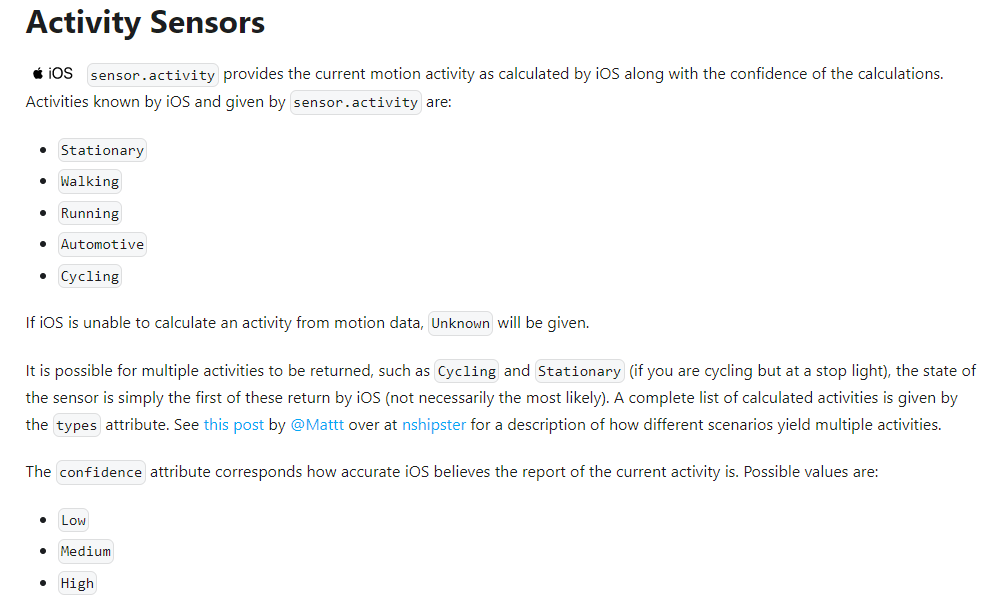
Pour info, j’utilise bien le « Activity Sensor » pour un iPhone, il faut juste changer dans la custom_card la partie label en modifiant le state de la variable driving à « Automotive », voici le bout du code:
label: >
    [[[
      if (variables.ulm_address !== ''){
        return states[variables.ulm_address].state;
      } else if (states[variables.ulm_card_person_driving_entity].state === "Automotive") {
        let state = states[variables.ulm_card_person_entity].state;
        return `Conduit - ${variables["ulm_person_state_" + state] ? variables["ulm_person_state_" + state] : state}`;
      } else {
        let state = states[variables.ulm_card_person_entity].state;
        return variables["ulm_person_state_" + state] ? variables["ulm_person_state_" + state] : state;
      }
    ]]]
Il faut faire la même modif partout ou il y a le variables.ulm_card_person_driving_entity (3 endroits).
La ou j’ai besoin d’un coup de pouce c’est pour ajouter sur la même ligne (ou colonne suivant la config) l’heure de la dernière synchro du téléphone.
Je sais pas ou récupérer cette donnée déjà, quelqu’un sait?
Un message a été scindé en un nouveau sujet : Récupérer la date de dernière position d’un iphone
Salut tout le monde !
Si ca vous intéresse, j’ai créer des cartes pour les intégrations : « Plex Recently Added », « Sonarr Upcoming Media » et « Radarr Upcoming Media ».
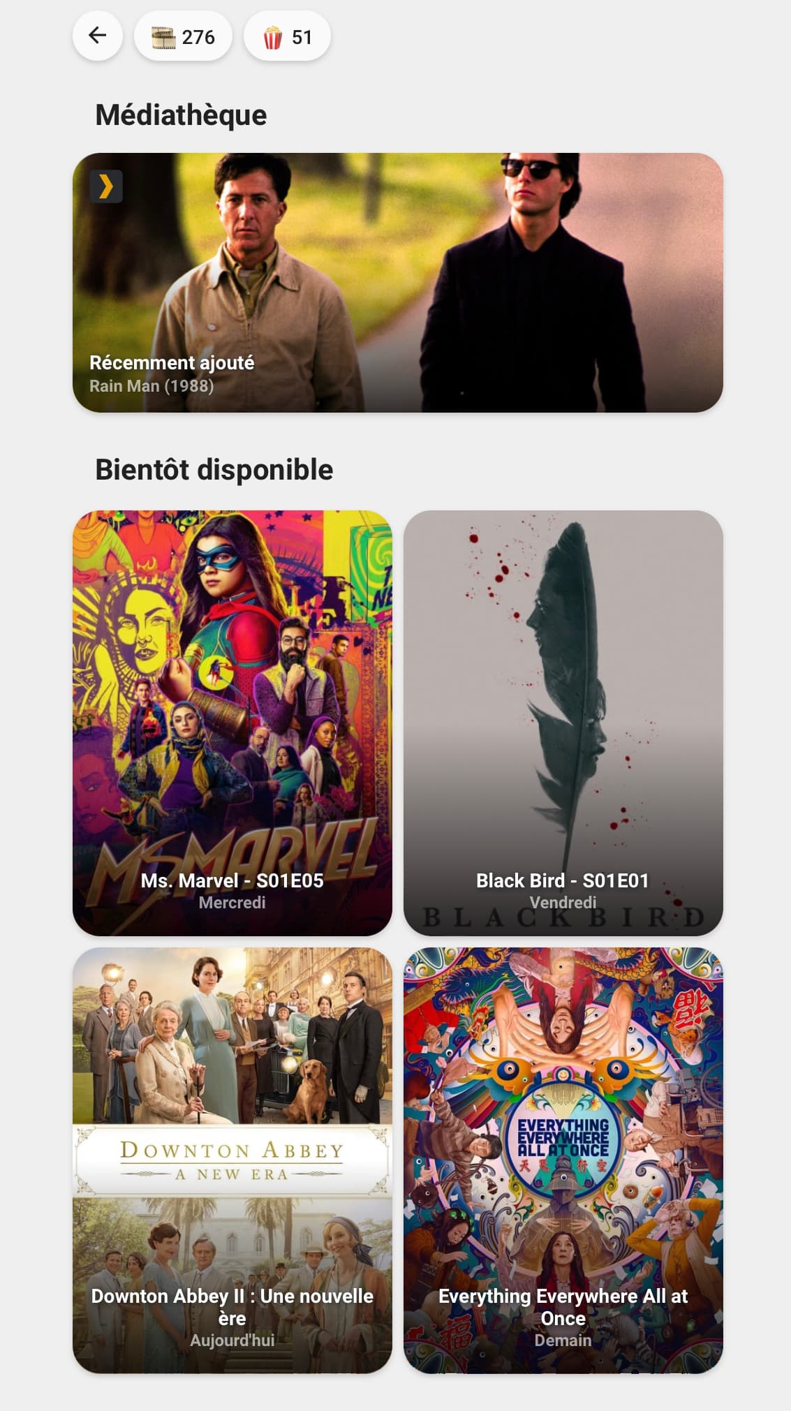
Pour la carte Plex :
Cette carte a besoin des éléments suivants pour fonctionner correctement :
| Intégration | Requis |
|---|---|
| Plex Recently Added | oui |
Utilisation :
- type: custom:button-card
  template: "card_plex_recently_added"
  entity: sensor.plex_recently_added
  name: Récemment ajouté
Pour la carte Sonarr :
Cette carte a besoin des éléments suivants pour fonctionner correctement :
| Intégration | Requis |
|---|---|
| Sonarr Upcoming Media | oui |
Utilisation :
- type: custom:button-card
  template: "card_sonarr_upcoming"
  entity: sensor.sonarr_upcoming_media
  variables:
    ulm_card_upcoming_media: 1
Variables :
| Variable | Exemple | Requis | Explication |
|---|---|---|---|
| ulm_card_upcoming_media | 3 | oui | Le numéro de l'élément à afficher |
Pour la carte Radarr :
Cette carte a besoin des éléments suivants pour fonctionner correctement :
| Intégration | Requis |
|---|---|
| Radarr Upcoming Media | oui |
Utilisation :
- type: custom:button-card
  template: "card_radarr_upcoming"
  entity: sensor.radarr_upcoming_media
  variables:
    ulm_card_upcoming_media: 1
Variables :
| Variable | Exemple | Requis | Explication |
|---|---|---|---|
| ulm_card_upcoming_media | 2 | oui | Le numéro de l'élément à afficher |
Le code du template pour les trois cartes :
card_media:
  show_icon: false
  show_name: true
  show_label: true
  show_state: false
  styles:
    grid:
      - grid-template-areas: '"n n" "l l"'
      - grid-template-columns: min-content auto
      - grid-template-rows: min-content min-content
    card:
      - z-index: 0
      - border-radius: var(--border-radius)
      - box-shadow: var(--box-shadow)
      - background-size: cover
      - background-position: center center
      - text-shadow: >
          [[[ return entity == "undefined" ? 'none' : '1px 1px 5px rgba(18, 22, 23, 0.9)'; ]]]
    name:
      - z-index: 2
      - color: white
      - font-weight: bold
      - font-size: 14px
    label:
      - z-index: 2
      - color: white
      - font-weight: bold
      - font-size: 12px
      - filter: opacity(60%)

card_plex_recently_added:
  triggers_update: "all"
  template:
    - "card_media"
    - "ulm_language_variables"
  label: >
    [[[
      if (entity == "unavailable"){
        return variables.ulm_unavailable;
      } else if (entity == "undefined"){
        return variables.ulm_unknow;
      } else{
        var data = entity.attributes.data;
        var number = (data[1].number == undefined) ? '(' + data[1].aired.split('-')[0] + ')' : data[1].number;
        return `${data[1].title} ${number}`;
      }
    ]]]
  aspect_ratio: 5/2
  styles:
    grid:
      - grid-template-areas: '"icon ." "n n" "l l" ". ."'
      - grid-template-rows: auto repeat(2, min-content) 12px
    card:
      - padding: 0
      - background-image: >
          [[[ return entity === undefined || `url(${states[entity.entity_id].attributes.data[1].fanart})`; ]]]
    name:
      - align-self: end
      - justify-self: start
      - margin-left: 12px
    label:
      - align-self: start
      - justify-self: start
      - margin-left: 12px
    custom_fields:
      icon:
        - z-index: 2
        - align-self: start
        - justify-self: start
        - height: 24px
        - width: 24px
        - margin-left: 12px
        - margin-top: 12px
      blur:
        - z-index: 1
        - position: absolute
        - top: 0
        - left: 0
        - height: 100%
        - width: 100%
        - border-radius: var(--border-radius)
        - background: linear-gradient(rgba(0,0,0,0) 40%, rgba(0,0,0,0.8) 100%)
  custom_fields:
    icon: >
      <svg viewBox="0 0 50 50">
        <path d="M7.7.3h34.6c4.1 0 7.4 3.3 7.4 7.4v34.6c0 4.1-3.3 7.4-7.4 7.4H7.7c-4.1 0-7.4-3.3-7.4-7.4V7.7C.3 3.6 3.6.3 7.7.3z" fill="#282a2d"/>
        <path d="M25,7.1H14.6L25,25L14.6,42.9H25L35.4,25L25,7.1z" fill="#e5a00d"/>
      </svg>
    blur: >
      [[[ return entity === undefined ? null : '<div id="blur"></div>'; ]]]
  tap_action:
    action: none

card_upcoming_media:
  aspect_ratio: 3/4
  styles:
    card:
      - background-image: >
            [[[ return entity === undefined || `url(${states[entity.entity_id].attributes.data[variables.ulm_card_upcoming_media].poster})`; ]]]
    grid:
      - grid-template-areas: '". . ." ". n ." ". l ." ". . ."'
      - grid-template-columns: "8px 1fr 8px"
      - grid-template-rows: auto repeat(2, min-content) 8px
    name:
      - align-self: end
      - justify-self: center
      # - display: inline
      # - max-width: 95%
      # - max-width: 200px
    label:
      - align-self: start
      - justify-self: center
    custom_fields:
      blur:
        - z-index: 1
        - position: absolute
        - top: 0
        - left: 0
        - height: 100%
        - width: 100%
        - border-radius: var(--border-radius)
        - background: linear-gradient(rgba(0,0,0,0) 50%, rgba(0,0,0,0.8) 100%)
  extra_styles: >
    .ellipsis:not(#blur){
      white-space: normal !important;
      word-wrap: break-all;
      max-height: 2.4em;
      line-height: 1.2em;
    }
  custom_fields:
    blur: >
      [[[ return entity === undefined ? null : '<div id="blur"></div>'; ]]]

card_sonarr_upcoming:
  triggers_update: "all"
  template:
    - "card_media"
    - "card_upcoming_media"
    - "ulm_language_variables"
  variables:
    ulm_card_upcoming_media: 1
  label: >
    [[[
      var data = entity.attributes.data;
      var airdate = new Date(data[variables.ulm_card_upcoming_media].airdate);

      Date.prototype.addDays = function (days) {
        const date = new Date(this.valueOf());
        date.setDate(date.getDate() + days);
        return date;
      }

      function formatDate(date){
        var weekday = ['Dimanche','Lundi','Mardi','Mercredi','Jeudi','Vendredi','Samedi'];
        var now = new Date();
        var tomorrow = now.addDays(1);

        var time = date - now;
        var secs = parseInt((time / 1000), 10);
        var days = Math.floor(secs / (3600*24));

        if (days < 6){
          if (weekday[date.getDay()] == weekday[now.getDay()]){
            return "Aujourd'hui";
          } else if (weekday[date.getDay()] == weekday[tomorrow.getDay()]){
            return "Demain";
          } else{
            return weekday[date.getDay()];
          }
        } else{
          return date.toLocaleDateString("fr-FR");
        }
      }
      return formatDate(airdate);
    ]]]
  name: >
    [[[
      if (entity == "unavailable"){
        return variables.ulm_unavailable;
      } else if (entity == "undefined"){
        return variables.ulm_unknow;
      } else{
        var data = entity.attributes.data;
        var number = data[variables.ulm_card_upcoming_media].number;
        return `${data[variables.ulm_card_upcoming_media].title} - ${number}`;
      }
    ]]]

card_radarr_upcoming:
  triggers_update: "all"
  template:
    - "card_media"
    - "card_upcoming_media"
    - "ulm_language_variables"
  variables:
    ulm_card_upcoming_media: 1
  label: >
    [[[
      var data = entity.attributes.data;
      var release = data[variables.ulm_card_upcoming_media].release;
      var airdate = new Date(data[variables.ulm_card_upcoming_media].airdate);

      Date.prototype.addDays = function (days) {
        const date = new Date(this.valueOf());
        date.setDate(date.getDate() + days);
        return date;
      }

      function formatRelease(release){
        if(release.includes("Available")){
          return ""
        } else if (release.includes("In Theaters")){
          return "au cinéma"
        }
      }

      function formatDate(date){
        var weekday = ['Dimanche','Lundi','Mardi','Mercredi','Jeudi','Vendredi','Samedi'];
        var now = new Date();
        var tomorrow = now.addDays(1);

        var time = date - now;
        var secs = parseInt((time / 1000), 10);
        var days = Math.floor(secs / (3600*24));

        if (days < 6){
          if (weekday[date.getDay()] == weekday[now.getDay()]){
            return "Aujourd'hui";
          } else if (weekday[date.getDay()] == weekday[tomorrow.getDay()]){
            return "Demain";
          } else{
            return weekday[date.getDay()];
          }
        } else{
          return date.toLocaleDateString("fr-FR");
        }
      }
      return formatDate(airdate) + " " + formatRelease(release);
    ]]]
  name: >
    [[[
      if (entity == "unavailable"){
        return variables.ulm_unavailable;
      } else if (entity == "undefined"){
        return variables.ulm_unknow;
      } else{
        var data = entity.attributes.data;
        return `${data[variables.ulm_card_upcoming_media].title}`;
      }
    ]]]
3 « J'aime »
Hello,
Depuis la dernière maj, je n’ai plus les couleurs dans mes icones, exemple avec la card_graph:
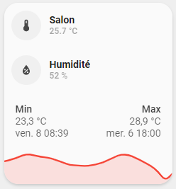
J’ai modifié pour les noms mais je trouve pas pour la couleur…
Voici le code de la card:
### Card Graph Custom ###
custom_card_graph_solo:
  variables:
    ulm_card_graph_color: "var(--info-color)"
    ulm_card_graph_name: "n/a"
    ulm_card_graph_color2: "var(--info-color)"
    ulm_card_graph_hours: 48
    ulm_card_graph_type: "fill"
  triggers_update: "all"
  styles:
    grid:
      - grid-template-areas: "'item1' 'item2'"
      - grid-template-columns: "1fr"
      - grid-template-rows: "min-content  min-content"
    card:
      - border-radius: "var(--border-radius)"
      - box-shadow: "var(--box-shadow)"
      - padding: "0px"
  custom_fields:
    item1:
      card:
        type: "custom:button-card"
        template:
          - "card_generic_swap"
        styles:
          icon:
            - color: "rgba(219,68,55, 1)"
          img_cell:
            - background-color: "rgba(219,68,55, 0.20)"
          card:
            - box-shadow: "none"
            - border-radius: "var(--border-radius) var(--border-radius) 0px 0px"
            - padding: "10px"
        entity: "[[[ return variables.ulm_card_graph_entity ]]]"
        name: "[[[ return variables.ulm_card_graph_name ]]]"
    item2:
      card:
        type: "custom:mini-graph-card"
        entities: >
          [[[
            var ent = [];
            ent.push(variables.ulm_card_graph_entity);
            return ent;
          ]]]
        line_color: >
          [[[
            var col = [];
            col.push(variables.ulm_card_graph_color);
            return col;
          ]]]
        show:
          name: false
          icon: false
          legend: false
          state: false
          extrema: true
          graph: "[[[ return variables.ulm_card_graph_type=='fill'?'line':variables.ulm_card_graph_type; ]]]"
          fill: "[[[ return variables.ulm_card_graph_type=='fill'?true:false; ]]]"
        hours_to_show: "[[[ return variables.ulm_card_graph_hours; ]]]"
        hour24: true
        style: |
          ha-card {
            box-shadow: none;
            border-radius: var(--border-radius);
          }
Et le code du dashboard:
              - type: custom:button-card
                template: custom_card_graph
                variables:
                  ulm_card_graph_color: "var(--google-red)"
                  ulm_card_graph_name: Salon
                  ulm_card_graph_entity: sensor.netatmo_galahome_galastation_temperature
                  ulm_card_graph_color2: "var(--google-blue)"
                  ulm_card_graph_entity2: sensor.netatmo_galahome_galastation_humidity
                  ulm_card_graph_type: fill
                  ulm_card_graph_hours: 48
                custom_fields:
                  item2:
                    card:
                      hours_to_show: 48
                      hour24: true
                      show:
                        extrema: true
Une idée?
Bonjour
Je voudrais créer un bouton dans interface ui-minimalist pour un input_number (offset)
Je suis arrivé a ce résultat
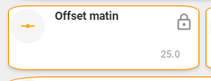
code
type: custom:button-card
aspect_ratio: 3/1
show_state: true
template:
  - icon_info_bg
styles:
  card:
    - background-color: white
    - border-radius: 10%
    - filter: opacity(100%)
    - padding: 2px
    - text-transform: null
    - font-size: 12px
    - border: 2px solid var(--google-yellow)
  icon:
    - color: orange
entity: input_number.volets_auto_offset_ouvre
Mais j’aurais voulu avoir la barre de réglage, pour avoir un bouton qui ressemble a ceci :
cela est il possible ? si oui comment faut il faire.
Merci pour votre aide
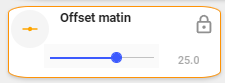
Voila j’ai finalement réussi a faire ma carte input_number, je sais pas si cela sera utile pour d’autre, mais voici le résultat et les codes.
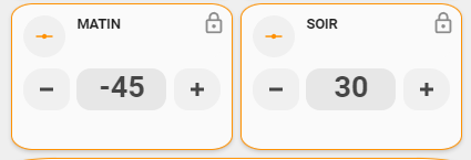
Voici le template utilisé :
Code Template
  card_input_number_round:
    variables:
      ulm_card_input_number_name: '[[[ return entity.attributes.friendly_name ]]]'
    triggers_update: all
    show_icon: false
    show_label: false
    show_state: false
    show_name: false
    styles:
      grid:
        - grid-template-areas: '''item1'' ''item2'''
        - grid-template-columns: 1fr
        - grid-template-rows: min-content  min-content
        - row-gap: 12px
      card:
        - border-radius: var(--border-radius)
        - box-shadow: var(--box-shadow)
        - padding: 12px
    custom_fields:
      item1:
        card:
          type: custom:button-card
          template:
            - icon_info_round
            - input_number
          tap_action:
            action: more-info
          entity: '[[[ return entity.entity_id ]]]'
          name: '[[[ return variables.ulm_card_input_number_name ]]]'
      item2:
        card:
          type: custom:button-card
          template: list_3_items
          custom_fields:
            item1:
              card:
                type: custom:button-card
                template: widget_icon_round
                tap_action:
                  action: call-service
                  service: |
                    [[[
                      if( entity.entity_id.startsWith("input_number.") )
                        return "input_number.decrement";
                      if( entity.entity_id.startsWith("counter.") )
                        return "counter.decrement";
                      return "";
                    ]]]
                  service_data:
                    entity_id: '[[[ return entity.entity_id ]]]'
                icon: mdi:minus-thick
            item2:
              card:
                type: custom:button-card
                template: widget_text_round
                entity: '[[[ return entity.entity_id ]]]'
                tap_action:
                  action: call-service
                  service: cover.stop_cover
                  service_data:
                    entity_id: '[[[ return entity.entity_id ]]]'
            item3:
              card:
                type: custom:button-card
                template: widget_icon_round
                tap_action:
                  action: call-service
                  service: |
                    [[[
                      if( entity.entity_id.startsWith("input_number.") )
                        return "input_number.increment";
                      if( entity.entity_id.startsWith("counter.") )
                        return "counter.increment";
                      return "";
                    ]]]
                  service_data:
                    entity_id: '[[[ return entity.entity_id ]]]'
                icon: mdi:plus-thick
  widget_text_round:
    tap_action:
      action: toggle
    template: widget_icon_round
    show_icon: false
    show_label: true
    show_state: false
    show_name: false
    label: |
      [[[
        var test = Math.trunc(entity.state);
        return test;
      ]]]
    styles:
      grid:
        - grid-template-areas: '''l'''
      card:
        - box-shadow: none
        - padding: 0px
        - border-radius: 14px
        - place-self: center
        - height: 42px
      label:
        - color: rgba(var(--color-theme),0.9)
        - box-shadow: none
        - padding: 0px
        - background-color: rgba(var(--color-theme),0.05)
        - border-radius: 14px
        - height: 42px
        - width: 90px
        - justify-self: center
        - font-weight: bold
        - font-size: 30px
      size: 20px
      color: var(--google-grey)
  widget_icon_round:
    tap_action:
      action: toggle
    show_icon: true
    show_name: false
    styles:
      grid:
        - grid-template-areas: '"i"'
      card:
        - box-shadow: none
        - padding: 0px
        - background-color: rgba(var(--color-theme),0.05)
        - border-radius: 14px
        - place-self: center
        - height: 42px
      icon:
        - color: rgba(var(--color-theme),0.9)
    size: 20px
    color: var(--google-grey)
  icon_info_round:
    color: var(--google-grey)
    show_icon: true
    show_name: true
    show_label: true
    size: 20px
    custom_fields:
      notification: |
        [[[
          if (entity.state =='unavailable'){
            return `<ha-icon icon="mdi:exclamation" style="width: 12px; height: 12px; color: var(--primary-background-color);"></ha-icon>`
          }
        ]]]
    state:
      - styles:
          custom_fields:
            notification:
              - border-radius: 50%
              - position: absolute
              - left: 24px
              - top: '-2px'
              - height: 16px
              - width: 16px
              - border: 2px solid var(--card-background-color)
              - font-size: 12px
              - line-height: 14px
              - background-color: |
                  [[[
                    return "rgba(var(--color-red),1)";
                  ]]]
        value: unavailable
    styles:
      card:
        - border-radius: 21px 8px 8px 21px
        - box-shadow: none
        - padding: 0px
      grid:
        - grid-template-areas: '"i n" "i l"'
        - grid-template-columns: min-content auto
        - grid-template-rows: min-content min-content
      icon:
        - color: var(--google-yellow)
      img_cell:
        - background-color: rgba(var(--color-theme),0.05)
        - border-radius: 50%
        - place-self: center
        - width: 42px
        - height: 42px
      name:
        - align-self: end
        - justify-self: start
        - font-weight: bold
        - font-size: 14px
        - margin-left: 12px
      label:
        - justify-self: start
        - align-self: start
        - font-weight: bolder
        - font-size: 12px
        - filter: opacity(40%)
        - margin-left: 12px
      state:
        - justify-self: start
        - align-self: start
        - font-weight: bolder
        - font-size: 12px
        - filter: opacity(40%)
        - margin-left: 12px
Code Card
type: custom:button-card
aspect_ratio: 3/2
template: card_input_number_round
entity: input_number.volets_auto_offset_ouvre
variables:
  ulm_card_input_number_name: MATIN
styles:
  card:
    - border-radius: 10%
    - filter: opacity(100%)
    - padding: 10px
    - border: 2px solid var(--google-yellow)
state:
  - value: 0
    styles:
      card:
        - border: 2px solid var(--google-grey)
lock:
  enabled:
    - - - return entity.state === 'on';
  duration: 3
  unlock: double_tap
Bonjour,
Je trouve votre card superbe, je vous le prend. Merci de l’avoir partager.
Merci !!! J’arrive pas à intégré plex.
J’ai cette erreur : plex_recently_added: Error on device update! · Issue #57 · custom-components/sensor.plex_recently_added · GitHub
Une idée de ce que je miss ?
Merci
Essaye peut-être avec le nouveau repo GitHub - NemesisRE/sensor.plex_recently_added: ▶️ Plex component to feed Upcoming Media Card.