Pour la météo, j’avais suivi le sujet dédié de @Pulpy-Luke, ça fonctionne très bien. Par contre les z:index, je découvre.
1 « J'aime »
re,
le z-index, force l’élément sur une couche du mille feuille, la première image (en dessous de tout) est sur le z:index 0 pour faire simple.
rien de sorcier, mais comme je l’ai montré plus haut ça peut amener des désagréments esthétiques en édition surtout
c’est pas sorcier, suffit de pas mettre plus bas que ce que j’ai mis, ça fonctionne pas ( j’ai testé )
cdt
2 « J'aime »
Re,
J’ajoute le code de ma première version du menu si ça intéresse du monde, parce que même si je garde tout je ne suis pas à l’abri d’une mauvaise manip et de perdre un truc
- type: custom:mod-card
style:
left: 10%
top: 28.5%
height: 65%
z-index: 14
card:
type: vertical-stack
cards:
- type: custom:bubble-card
card_type: pop-up
hash: "#update1"
card_layout: normal
width_desktop: 400px
styles: |
.bubble-button-card-container {
box-shadow: none;
border-radius: 15px !important; # Ajustez la valeur ici
}
icon: mdi:update
auto_close: "5000"
name: Mises à jour partie1
- type: custom:bubble-card
style:
left: 80%
top: 10%
width: 20%
height: 5%
z-index: 13
card_type: button
button_type: name
icon: mdi:arrow-right-bold
name: Mises à jour partie2
button_action:
tap_action:
action: navigate
navigation_path: "#update2"
styles: |
.bubble-button-card-container {
box-shadow: none;
border-radius: 15px !important; # Ajustez la valeur ici
}
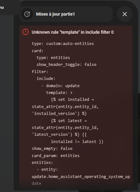
- type: custom:auto-entities
card:
type: entities
show_header_toggle: false
filter:
include:
- domain: update
template: >
{% set installed = state_attr(entity.entity_id,
'installed_version') %} {% set latest =
state_attr(entity.entity_id, 'latest_version') %} {{ installed
!= latest }}
show_empty: false
card_param: entities
entities:
- entity: update.home_assistant_operating_system_update
name: HA OS
type: custom:template-entity-row
state: >
{{ state_attr('update.home_assistant_operating_system_update',
'installed_version') }} ➜ {{
state_attr('update.home_assistant_operating_system_update',
'latest_version') }}
card_mod:
style: |
:host {
{% if state_attr('update.home_assistant_operating_system_update', 'installed_version') != state_attr('update.home_assistant_operating_system_update', 'latest_version') %}
color: red !important;
{% else %}
color: inherit;
{% endif %}
}
- type: custom:mod-card
style:
left: 12.5%
top: 28.5%
height: 65%
z-index: 14
card:
type: vertical-stack
cards:
- type: custom:bubble-card
card_type: pop-up
hash: "#update2"
card_layout: normal
width_desktop: 400px
styles: |
.bubble-button-card-container {
box-shadow: none;
border-radius: 15px !important; # Ajustez la valeur ici
}
icon: mdi:update
auto_close: "5000"
name: Mises à jour partie2
- type: custom:bubble-card
style:
left: 80%
top: 10%
width: 20%
height: 5%
z-index: 13
card_type: button
button_type: name
icon: mdi:arrow-right-bold
name: Restrictions d'eau
button_action:
tap_action:
action: navigate
navigation_path: "#restrictions_eau"
styles: |
.bubble-button-card-container {
box-shadow: none;
border-radius: 15px !important; # Ajustez la valeur ici
}
- type: custom:auto-entities
card:
type: entities
show_header_toggle: false
filter:
include:
- domain: update
template: >
{% set installed = state_attr(entity.entity_id,
'installed_version') %} {% set latest =
state_attr(entity.entity_id, 'latest_version') %} {{ installed
!= latest }}
show_empty: false
card_param: entities
entities:
- entity: update.zerotier_one_update
name: ZeroTier One
type: custom:template-entity-row
state: >
{{ state_attr('update.zerotier_one_update', 'installed_version')
}} ➜ {{ state_attr('update.zerotier_one_update',
'latest_version') }}
card_mod:
style: |
:host {
{% if state_attr('update.zerotier_one_update', 'installed_version') != state_attr('update.zerotier_one_update', 'latest_version') %}
color: red !important;
{% else %}
color: inherit;
{% endif %}
}
- type: custom:mod-card
style:
left: 15%
top: 23.5%
height: 55%
z-index: 14
card:
type: vertical-stack
cards:
- type: custom:bubble-card
card_type: pop-up
hash: "#restrictions_eau"
card_layout: normal
width_desktop: 400px
styles: |
.bubble-button-card-container {
box-shadow: none;
border-radius: 15px !important; # Ajustez la valeur ici
}
icon: mdi:fountain
auto_close: "5000"
name: Restrictions d'eau
- type: custom:bubble-card
style:
left: 80%
top: 10%
width: 20%
height: 5%
z-index: 13
card_type: button
button_type: name
icon: mdi:arrow-right-bold
name: Meteo
button_action:
tap_action:
action: navigate
navigation_path: "#meteo"
styles: |
.bubble-button-card-container {
box-shadow: none;
border-radius: 15px !important; # Ajustez la valeur ici
}
- type: custom:auto-entities
card:
type: entities
show_header_toggle: false
show_empty: false
card_param: entities
entities:
- entity: sensor.arrosage_des_pelouses_restrictions_berlaimont
- entity: sensor.arrosage_des_jardins_potagers_restrictions_berlaimont
- entity: sensor.lavage_des_vehicules_restrictions_berlaimont
- entity: sensor.lavage_des_toitures_facades_restrictions_berlaimont
- entity: >-
sensor.vidange_et_remplissage_des_piscines_restrictions_berlaimont
- entity: >-
sensor.remplissage_vidange_des_plans_d_eau_restrictions_berlaimont
- entity: sensor.restriction_specifique_restrictions_berlaimont
- type: custom:mod-card
style:
left: 17.5%
top: 45%
height: 98%
z-index: 14
card:
type: vertical-stack
cards:
- type: custom:bubble-card
card_type: pop-up
hash: "#meteo"
card_layout: normal
width_desktop: 400px
styles: |
.bubble-button-card-container {
box-shadow: none;
border-radius: 15px !important; # Ajustez la valeur ici
}
icon: mdi:weather-cloudy
auto_close: "20000"
name: Meteo
- type: custom:bubble-card
style:
left: 80%
top: 10%
width: 20%
height: 5%
z-index: 13
card_type: button
button_type: name
icon: mdi:arrow-u-left-top-bold
name: Mises à jour partie1
button_action:
tap_action:
action: navigate
navigation_path: "#update1"
styles: |
.bubble-button-card-container {
box-shadow: none;
border-radius: 15px !important; # Ajustez la valeur ici
}
- type: custom:stack-in-card
mode: vertical
cards:
- type: weather-forecast
show_current: true
show_forecast: true
entity: weather.forecast_maison
forecast_type: hourly
- type: custom:swipe-card
parameters:
allowTouchMove: false
effect: coverflow
centeredSlides: true
slidesPerView: auto
spaceBetween: 8
pagination:
type: progressbar
navigation: null
keyboard:
enabled: true
onlyInViewport: true
navigation: null
cards:
- type: iframe
url: >-
https://embed.windy.com/embed2.html?lat=50,2&lon=15&detailLat=50,2&detailLon=15&zoom=5&level=surface&overlay=rain&product=ecmwf&menu=&message=&marker=&calendar=24&pressure=&type=map&location=coordinates&detail=&metricWind=km%2Fh&metricTemp=%C2%B0C&radarRange=-1
aspect_ratio: 99%
card_mod:
style: |
ha-card {
filter: invert(0%);
}
- type: iframe
url: >-
https://embed.windy.com/embed2.html?lat=50,2&lon=15&detailLat=50,2&detailLon=15&zoom=5&level=surface&overlay=temp&product=ecmwf&menu=&message=&marker=&calendar=24&pressure=&type=map&location=coordinates&detail=&metricWind=km%2Fh&metricTemp=%C2%B0C&radarRange=-1
aspect_ratio: 99%
card_mod:
style: |
ha-card {
filter: invert(0%);
}
- type: iframe
url: >-
https://embed.windy.com/embed2.html?lat=50,2&lon=15&detailLat=50,2&detailLon=15&zoom=5&level=surface&overlay=wind&product=ecmwf&menu=&message=&marker=&calendar=24&pressure=&type=map&location=coordinates&detail=&metricWind=km%2Fh&metricTemp=%C2%B0C&radarRange=-1
aspect_ratio: 99%
card_mod:
style: |
ha-card {
filter: invert(0%);
}
- type: weather-forecast
show_current: false
show_forecast: true
entity: weather.forecast_maison
forecast_type: daily
- type: custom:bubble-card
style:
left: 3.5%
top: 10%
width: 7%
height: 5%
z-index: 13
card_type: button
button_type: name
icon: mdi:update
name: Menu
button_action:
tap_action:
action: navigate
navigation_path: "#update1"
styles: |
.bubble-button-card-container {
box-shadow: none;
border-radius: 15px !important; # Ajustez la valeur ici
}
scrolling_effect: false
- type: custom:mod-card
style:
left: 86.5%
top: 39.75%
height: 87.5%
z-index: 14
card:
type: vertical-stack
cards:
- type: custom:bubble-card
card_type: pop-up
hash: "#alarme"
card_layout: normal
width_desktop: 400px
styles: |
.bubble-button-card-container {
box-shadow: none;
border-radius: 15px !important; # Ajustez la valeur ici
}
icon: mdi:shield-home
auto_close: "10000"
name: Alarme
- type: custom:bubble-card
style:
left: 80%
top: 10%
width: 20%
height: 5%
z-index: 13
card_type: button
button_type: name
icon: mdi:arrow-left-bold
name: Batteries
button_action:
tap_action:
action: navigate
navigation_path: "#batteries"
styles: |
.bubble-button-card-container {
box-shadow: none;
border-radius: 15px !important; # Ajustez la valeur ici
}
- type: custom:alarmo-card
entity: alarm_control_panel.alarmo
name: Alarme maison
button_scale_keypad: 1
use_clear_icon: true
keep_keypad_visible: true
card_mod:
style:
alarmo-button$:
mwc-button$: |
#button {
box-shadow: 2px 2px 4px 0px rgba(0,0,0,0.5);
border: 1px rgba(0,0,0,1.0) outset;
border-radius: 25px;
margin: 4px;
}
ha-textfield $: |
.mdc-text-field {
border-radius: 25px !important;
}
.mdc-text-field__ripple {
border-radius: 25px !important;
}
.mdc-line-ripple {
display: none !important;
}
.: |
ha-card {
margin-top: -5px;
background: transparent;
}
ha-card > div.header > div.icon > alarmo-state-badge {
--state-alarm_control_panel-armed_away-color: var(--red-color);
--state-alarm_control_panel-armed_custom_bypass-color: var(--red-color);
--state-alarm_control_panel-armed_home-color: var(--red-color);
--state-alarm_control_panel-armed_night-color: var(--red-color);
--state-alarm_control_panel-armed_vacation-color: var(--red-color);
--state-alarm_control_panel-arming-color: var(--orange-color);
--state-alarm_control_panel-disarming-color: var(--orange-color);
--state-alarm_control_panel-pending-color: var(--orange-color);
--state-alarm_control_panel-triggered-color: var(--red-color);
--state-alarm_control_panel-disarmed-color: var(--green-color)
}
ha-textfield {
box-shadow: 2px 2px 4px 0px rgba(0,0,0,0.5);
border: 1px rgba(0,0,0,1.0) outset;
border-radius: 50px;
}
- type: custom:mod-card
style:
left: 81.5%
top: 18.5%
height: 45%
z-index: 14
card:
type: vertical-stack
cards:
- type: custom:bubble-card
card_type: pop-up
hash: "#ephemeride"
card_layout: normal
width_desktop: 400px
styles: |
.bubble-button-card-container {
box-shadow: none;
border-radius: 15px !important; # Ajustez la valeur ici
}
icon: mdi:church
auto_close: "5000"
name: Ephemeride
- type: custom:bubble-card
style:
left: 80%
top: 10%
width: 20%
height: 5%
z-index: 13
card_type: button
button_type: name
icon: mdi:arrow-u-right-top-bold
name: Alarme
button_action:
tap_action:
action: navigate
navigation_path: "#alarme"
styles: |
.bubble-button-card-container {
box-shadow: none;
border-radius: 15px !important; # Ajustez la valeur ici
}
- type: custom:auto-entities
card:
type: entities
show_header_toggle: false
entities:
- entity: sensor.jour_anniversaire
- entity: sensor.demain_anniversaire
- entity: sensor.saint_du_jour
- entity: sensor.saint_de_demain
- entity: sensor.jour_ferie
- type: custom:mod-card
style:
left: 84%
top: 31%
height: 70%
z-index: 14
card:
type: vertical-stack
cards:
- type: custom:bubble-card
card_type: pop-up
hash: "#batteries"
card_layout: normal
width_desktop: 400px
styles: |
.bubble-button-card-container {
box-shadow: none;
border-radius: 15px !important; # Ajustez la valeur ici
}
icon: mdi:battery
auto_close: "10000"
name: Batteries
- type: custom:bubble-card
style:
left: 80%
top: 10%
width: 20%
height: 5%
z-index: 13
card_type: button
button_type: name
icon: mdi:arrow-left-bold
name: Ephemeride
button_action:
tap_action:
action: navigate
navigation_path: "#ephemeride"
styles: |
.bubble-button-card-container {
box-shadow: none;
border-radius: 15px !important; # Ajustez la valeur ici
}
- type: custom:battery-state-card
sort: state
entities:
- sensor.temp_labo_battery
- type: custom:bubble-card
style:
left: 96.5%
top: 10%
width: 7%
height: 5%
z-index: 13
card_type: button
button_type: name
icon: mdi:update
name: Menu
card_layout: normal
width_desktop: 400px
button_action:
tap_action:
action: navigate
navigation_path: "#alarme"
styles: |
.bubble-button-card-container {
box-shadow: none;
border-radius: 15px !important; # Ajustez la valeur ici
}
scrolling_effect: false
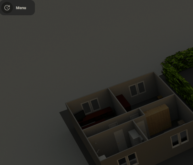
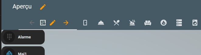
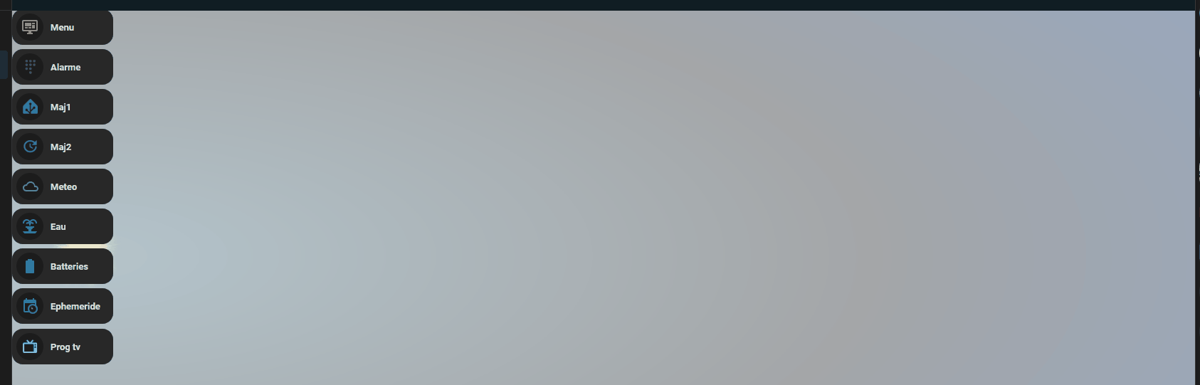
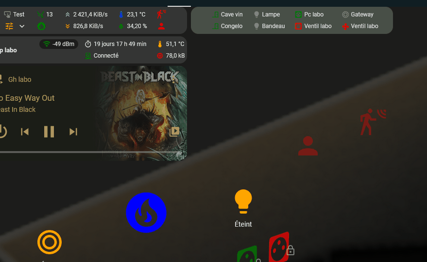
donc un menu de chaque côté avec des liens latéraux entre les cartes
cdt
Re,
je galère un peu sur Ephemeride, mais ça va le faire 
ne demandez pas encore le code, c’est pas fini 
cdt
Re,
Bon ça ne devrait plus trop bouger, du coup je profite du coucher de soleil pour poster 
avec un peu de couleur sur le tap_action
encore certain états à remonter dans les couleurs d’icones par exemple la notif de mise à jour disponibles
cdt
Re,
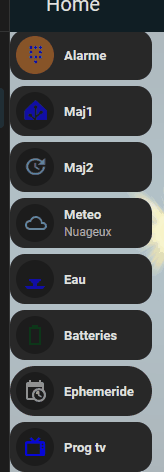
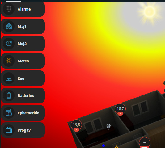
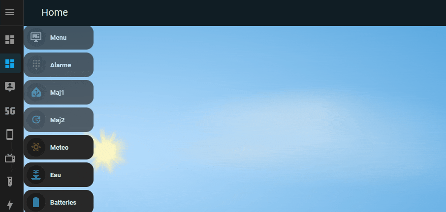
Tjs bubble en exploration, popup en action je me suis affranchi du menu en haut de page pour le passer en bubble et bubble popup (enfin c’est en test, surtout pour voir la charge, parce que ça implique de passer tout mon dashbord sur 1 plan).
On passerait donc de ça
à ça
en n’oubliant pas que dans tous les cas je change de plan aussi de mon plan principal
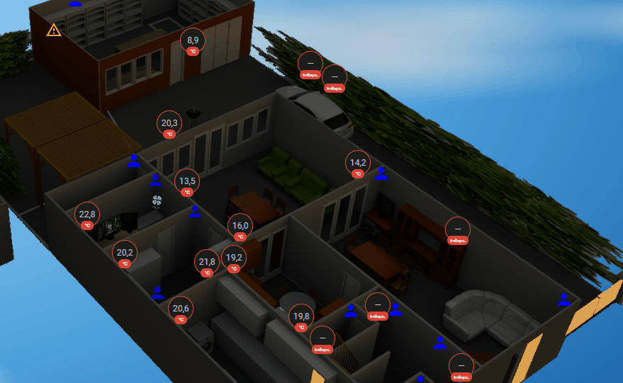
j’ai aussi mis en place un auto popup bubble sur état des portes / fenêtres, il reste ouvert tant qu’une porte ou une fenêtre est ouvert, je vais détailler dans le 1er message du topic cette partie.
cdt
Hello,
Je continue de creuser dans mon coin, je n’irais pas plus loin à priori
Je fini de mettre en place et je ferais un retour si ça intéresse du monde
cdt
1 « J'aime »
Re,
Bon finalement j’ai contourné le soucis des arrondis que j’arrivais pas à modifier dans le popup, j’ai tout mis en transparent.

        - type: custom:bubble-card
          card_type: pop-up
          hash: "#menu"
          card_layout: normal
          name: Menu
          width_desktop: 150px
          show_icon: false
          styles: |
            .bubble-pop-up-background {
              background: rgba(0, 0, 0, 0.0) !important;  /* Fond totalement transparent */
              box-shadow: none !important;  /* Supprime l'ombre */
              backdrop-filter: none !important;  /* Supprime l'effet de flou */
            }
            .bubble-header-container {
              background: transparent !important;
              opacity: 0 !important;
              pointer-events: none !important;
            }
      .bubble-sub-button-3 {
        background-color: orange; !important;
            }
      .bubble-sub-button:active {
        background-color: rgba(0, 123, 255, 0.5); /* Couleur bleue semi-transparente */
      }
cdt
Hello,
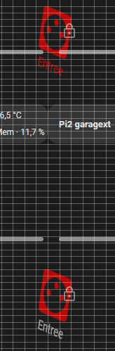
Pour les pro du css, il y a moyen de générer une grille tous les 1% de carte? je le fais via
  - type: custom:hui-image-element
    style:
      left: 0%
      top: 38%
      width: 200%
      height: 1px
      background: rgba(255, 255, 255, 0.3)
  - type: custom:hui-image-element
    style:
      left: 0%
      top: 39%
      width: 200%
      height: 1px
      background: rgba(255, 255, 255, 0.3)
  - type: custom:hui-image-element
    style:
      top: 1%
      left: 31%
      width: 1px
      height: 200%
      background: rgba(255, 255, 255, 0.3)
  - type: custom:hui-image-element
    style:
      top: 1%
      left: 32%
      width: 1px
      height: 200%
      background: rgba(255, 255, 255, 0.3)

mais bon si c’est possible d’avoir moins copieux, merci
code
type: picture-elements
image: /local/plan3D/Transparent 1920x1080.png
elements:
- type: image
image: /local/plan3D/piece maxi/transparent/labo transparent maxi.png
style:
top: 55.3%
left: 53.2%
width: 80.5%
- type: custom:hui-image-element
style:
left: 0%
top: 10%
width: 200%
height: 1px
background: rgba(255, 255, 255, 0.3)
- type: custom:hui-image-element
style:
left: 0%
top: 11%
width: 200%
height: 1px
background: rgba(255, 255, 255, 0.3)
- type: custom:hui-image-element
style:
left: 0%
top: 12%
width: 200%
height: 1px
background: rgba(255, 255, 255, 0.3)
- type: custom:hui-image-element
style:
left: 0%
top: 13%
width: 200%
height: 1px
background: rgba(255, 255, 255, 0.3)
- type: custom:hui-image-element
style:
left: 0%
top: 14%
width: 200%
height: 1px
background: rgba(255, 255, 255, 0.3)
- type: custom:hui-image-element
style:
left: 0%
top: 15%
width: 200%
height: 1px
background: rgba(255, 255, 255, 0.3)
- type: custom:hui-image-element
style:
left: 0%
top: 16%
width: 200%
height: 1px
background: rgba(255, 255, 255, 0.3)
- type: custom:hui-image-element
style:
left: 0%
top: 17%
width: 200%
height: 1px
background: rgba(255, 255, 255, 0.3)
- type: custom:hui-image-element
style:
left: 0%
top: 18%
width: 200%
height: 1px
background: rgba(255, 255, 255, 0.3)
- type: custom:hui-image-element
style:
left: 0%
top: 19%
width: 200%
height: 1px
background: rgba(255, 255, 255, 0.3)
- type: custom:hui-image-element
style:
left: 0%
top: 20%
width: 200%
height: 1px
background: rgba(255, 255, 255, 0.3)
- type: custom:hui-image-element
style:
left: 0%
top: 21%
width: 200%
height: 1px
background: rgba(255, 255, 255, 0.3)
- type: custom:hui-image-element
style:
left: 0%
top: 22%
width: 200%
height: 1px
background: rgba(255, 255, 255, 0.3)
- type: custom:hui-image-element
style:
left: 0%
top: 23%
width: 200%
height: 1px
background: rgba(255, 255, 255, 0.3)
- type: custom:hui-image-element
style:
left: 0%
top: 24%
width: 200%
height: 1px
background: rgba(255, 255, 255, 0.3)
- type: custom:hui-image-element
style:
left: 0%
top: 25%
width: 200%
height: 1px
background: rgba(255, 255, 255, 0.3)
- type: custom:hui-image-element
style:
left: 0%
top: 26%
width: 200%
height: 1px
background: rgba(255, 255, 255, 0.3)
- type: custom:hui-image-element
style:
left: 0%
top: 27%
width: 200%
height: 1px
background: rgba(255, 255, 255, 0.3)
- type: custom:hui-image-element
style:
left: 0%
top: 28%
width: 200%
height: 1px
background: rgba(255, 255, 255, 0.3)
- type: custom:hui-image-element
style:
left: 0%
top: 29%
width: 200%
height: 1px
background: rgba(255, 255, 255, 0.3)
- type: custom:hui-image-element
style:
left: 0%
top: 30%
width: 200%
height: 1px
background: rgba(255, 255, 255, 0.3)
- type: custom:hui-image-element
style:
left: 0%
top: 31%
width: 200%
height: 1px
background: rgba(255, 255, 255, 0.3)
- type: custom:hui-image-element
style:
left: 0%
top: 32%
width: 200%
height: 1px
background: rgba(255, 255, 255, 0.3)
- type: custom:hui-image-element
style:
left: 0%
top: 33%
width: 200%
height: 1px
background: rgba(255, 255, 255, 0.3)
- type: custom:hui-image-element
style:
left: 0%
top: 34%
width: 200%
height: 1px
background: rgba(255, 255, 255, 0.3)
- type: custom:hui-image-element
style:
left: 0%
top: 35%
width: 200%
height: 1px
background: rgba(255, 255, 255, 0.3)
- type: custom:hui-image-element
style:
left: 0%
top: 36%
width: 200%
height: 1px
background: rgba(255, 255, 255, 0.3)
- type: custom:hui-image-element
style:
left: 0%
top: 37%
width: 200%
height: 1px
background: rgba(255, 255, 255, 0.3)
- type: custom:hui-image-element
style:
left: 0%
top: 38%
width: 200%
height: 1px
background: rgba(255, 255, 255, 0.3)
- type: custom:hui-image-element
style:
left: 0%
top: 39%
width: 200%
height: 1px
background: rgba(255, 255, 255, 0.3)
- type: custom:hui-image-element
style:
left: 0%
top: 40%
width: 200%
height: 1px
background: rgba(255, 255, 255, 0.3)
- type: custom:hui-image-element
style:
left: 0%
top: 41%
width: 200%
height: 1px
background: rgba(255, 255, 255, 0.3)
- type: custom:hui-image-element
style:
left: 0%
top: 42%
width: 200%
height: 1px
background: rgba(255, 255, 255, 0.3)
- type: custom:hui-image-element
style:
left: 0%
top: 43%
width: 200%
height: 1px
background: rgba(255, 255, 255, 0.3)
- type: custom:hui-image-element
style:
left: 0%
top: 44%
width: 200%
height: 1px
background: rgba(255, 255, 255, 0.3)
- type: custom:hui-image-element
style:
left: 0%
top: 45%
width: 200%
height: 1px
background: rgba(255, 255, 255, 0.3)
- type: custom:hui-image-element
style:
left: 0%
top: 46%
width: 200%
height: 1px
background: rgba(255, 255, 255, 0.3)
- type: custom:hui-image-element
style:
left: 0%
top: 47%
width: 200%
height: 1px
background: rgba(255, 255, 255, 0.3)
- type: custom:hui-image-element
style:
left: 0%
top: 48%
width: 200%
height: 1px
background: rgba(255, 255, 255, 0.3)
- type: custom:hui-image-element
style:
left: 0%
top: 49%
width: 200%
height: 1px
background: rgba(255, 255, 255, 0.3)
- type: custom:hui-image-element
style:
left: 0%
top: 50%
width: 200%
height: 1px
background: rgba(255, 255, 255, 0.3)
- type: custom:hui-image-element
style:
left: 0%
top: 51%
width: 200%
height: 1px
background: rgba(255, 255, 255, 0.3)
- type: custom:hui-image-element
style:
left: 0%
top: 52%
width: 200%
height: 1px
background: rgba(255, 255, 255, 0.3)
- type: custom:hui-image-element
style:
left: 0%
top: 53%
width: 200%
height: 1px
background: rgba(255, 255, 255, 0.3)
- type: custom:hui-image-element
style:
left: 0%
top: 54%
width: 200%
height: 1px
background: rgba(255, 255, 255, 0.3)
- type: custom:hui-image-element
style:
left: 0%
top: 55%
width: 200%
height: 1px
background: rgba(255, 255, 255, 0.3)
- type: custom:hui-image-element
style:
left: 0%
top: 56%
width: 200%
height: 1px
background: rgba(255, 255, 255, 0.3)
- type: custom:hui-image-element
style:
left: 0%
top: 57%
width: 200%
height: 1px
background: rgba(255, 255, 255, 0.3)
- type: custom:hui-image-element
style:
left: 0%
top: 58%
width: 200%
height: 1px
background: rgba(255, 255, 255, 0.3)
- type: custom:hui-image-element
style:
left: 0%
top: 59%
width: 200%
height: 1px
background: rgba(255, 255, 255, 0.3)
- type: custom:hui-image-element
style:
left: 0%
top: 60%
width: 200%
height: 1px
background: rgba(255, 255, 255, 0.3)
- type: custom:hui-image-element
style:
left: 0%
top: 61%
width: 200%
height: 1px
background: rgba(255, 255, 255, 0.3)
- type: custom:hui-image-element
style:
left: 0%
top: 62%
width: 200%
height: 1px
background: rgba(255, 255, 255, 0.3)
- type: custom:hui-image-element
style:
left: 0%
top: 63%
width: 200%
height: 1px
background: rgba(255, 255, 255, 0.3)
- type: custom:hui-image-element
style:
left: 0%
top: 64%
width: 200%
height: 1px
background: rgba(255, 255, 255, 0.3)
- type: custom:hui-image-element
style:
left: 0%
top: 65%
width: 200%
height: 1px
background: rgba(255, 255, 255, 0.3)
- type: custom:hui-image-element
style:
left: 0%
top: 66%
width: 200%
height: 1px
background: rgba(255, 255, 255, 0.3)
- type: custom:hui-image-element
style:
left: 0%
top: 67%
width: 200%
height: 1px
background: rgba(255, 255, 255, 0.3)
- type: custom:hui-image-element
style:
left: 0%
top: 68%
width: 200%
height: 1px
background: rgba(255, 255, 255, 0.3)
- type: custom:hui-image-element
style:
left: 0%
top: 69%
width: 200%
height: 1px
background: rgba(255, 255, 255, 0.3)
- type: custom:hui-image-element
style:
left: 0%
top: 70%
width: 200%
height: 1px
background: rgba(255, 255, 255, 0.3)
- type: custom:hui-image-element
style:
left: 0%
top: 71%
width: 200%
height: 1px
background: rgba(255, 255, 255, 0.3)
- type: custom:hui-image-element
style:
left: 0%
top: 72%
width: 200%
height: 1px
background: rgba(255, 255, 255, 0.3)
- type: custom:hui-image-element
style:
left: 0%
top: 73%
width: 200%
height: 1px
background: rgba(255, 255, 255, 0.3)
- type: custom:hui-image-element
style:
left: 0%
top: 74%
width: 200%
height: 1px
background: rgba(255, 255, 255, 0.3)
- type: custom:hui-image-element
style:
left: 0%
top: 75%
width: 200%
height: 1px
background: rgba(255, 255, 255, 0.3)
- type: custom:hui-image-element
style:
left: 0%
top: 76%
width: 200%
height: 1px
background: rgba(255, 255, 255, 0.3)
- type: custom:hui-image-element
style:
left: 0%
top: 77%
width: 200%
height: 1px
background: rgba(255, 255, 255, 0.3)
- type: custom:hui-image-element
style:
left: 0%
top: 78%
width: 200%
height: 1px
background: rgba(255, 255, 255, 0.3)
- type: custom:hui-image-element
style:
left: 0%
top: 79%
width: 200%
height: 1px
background: rgba(255, 255, 255, 0.3)
- type: custom:hui-image-element
style:
left: 0%
top: 80%
width: 200%
height: 1px
background: rgba(255, 255, 255, 0.3)
- type: custom:hui-image-element
style:
left: 0%
top: 81%
width: 200%
height: 1px
background: rgba(255, 255, 255, 0.3)
- type: custom:hui-image-element
style:
left: 0%
top: 82%
width: 200%
height: 1px
background: rgba(255, 255, 255, 0.3)
- type: custom:hui-image-element
style:
left: 0%
top: 83%
width: 200%
height: 1px
background: rgba(255, 255, 255, 0.3)
- type: custom:hui-image-element
style:
left: 0%
top: 84%
width: 200%
height: 1px
background: rgba(255, 255, 255, 0.3)
- type: custom:hui-image-element
style:
left: 0%
top: 85%
width: 200%
height: 1px
background: rgba(255, 255, 255, 0.3)
- type: custom:hui-image-element
style:
left: 0%
top: 86%
width: 200%
height: 1px
background: rgba(255, 255, 255, 0.3)
- type: custom:hui-image-element
style:
left: 0%
top: 87%
width: 200%
height: 1px
background: rgba(255, 255, 255, 0.3)
- type: custom:hui-image-element
style:
left: 0%
top: 88%
width: 200%
height: 1px
background: rgba(255, 255, 255, 0.3)
- type: custom:hui-image-element
style:
left: 0%
top: 89%
width: 200%
height: 1px
background: rgba(255, 255, 255, 0.3)
- type: custom:hui-image-element
style:
left: 0%
top: 90%
width: 200%
height: 1px
background: rgba(255, 255, 255, 0.3)
- type: custom:hui-image-element
style:
top: 1%
left: 10%
width: 1px
height: 200%
background: rgba(255, 255, 255, 0.3)
- type: custom:hui-image-element
style:
top: 1%
left: 11%
width: 1px
height: 200%
background: rgba(255, 255, 255, 0.3)
- type: custom:hui-image-element
style:
top: 1%
left: 12%
width: 1px
height: 200%
background: rgba(255, 255, 255, 0.3)
- type: custom:hui-image-element
style:
top: 1%
left: 13%
width: 1px
height: 200%
background: rgba(255, 255, 255, 0.3)
- type: custom:hui-image-element
style:
top: 1%
left: 14%
width: 1px
height: 200%
background: rgba(255, 255, 255, 0.3)
- type: custom:hui-image-element
style:
top: 1%
left: 15%
width: 1px
height: 200%
background: rgba(255, 255, 255, 0.3)
- type: custom:hui-image-element
style:
top: 1%
left: 16%
width: 1px
height: 200%
background: rgba(255, 255, 255, 0.3)
- type: custom:hui-image-element
style:
top: 1%
left: 17%
width: 1px
height: 200%
background: rgba(255, 255, 255, 0.3)
- type: custom:hui-image-element
style:
top: 1%
left: 18%
width: 1px
height: 200%
background: rgba(255, 255, 255, 0.3)
- type: custom:hui-image-element
style:
top: 1%
left: 19%
width: 1px
height: 200%
background: rgba(255, 255, 255, 0.3)
- type: custom:hui-image-element
style:
top: 1%
left: 20%
width: 1px
height: 200%
background: rgba(255, 255, 255, 0.3)
- type: custom:hui-image-element
style:
top: 1%
left: 21%
width: 1px
height: 200%
background: rgba(255, 255, 255, 0.3)
- type: custom:hui-image-element
style:
top: 1%
left: 22%
width: 1px
height: 200%
background: rgba(255, 255, 255, 0.3)
- type: custom:hui-image-element
style:
top: 1%
left: 23%
width: 1px
height: 200%
background: rgba(255, 255, 255, 0.3)
- type: custom:hui-image-element
style:
top: 1%
left: 24%
width: 1px
height: 200%
background: rgba(255, 255, 255, 0.3)
- type: custom:hui-image-element
style:
top: 1%
left: 25%
width: 1px
height: 200%
background: rgba(255, 255, 255, 0.3)
- type: custom:hui-image-element
style:
top: 1%
left: 26%
width: 1px
height: 200%
background: rgba(255, 255, 255, 0.3)
- type: custom:hui-image-element
style:
top: 1%
left: 27%
width: 1px
height: 200%
background: rgba(255, 255, 255, 0.3)
- type: custom:hui-image-element
style:
top: 1%
left: 28%
width: 1px
height: 200%
background: rgba(255, 255, 255, 0.3)
- type: custom:hui-image-element
style:
top: 1%
left: 29%
width: 1px
height: 200%
background: rgba(255, 255, 255, 0.3)
- type: custom:hui-image-element
style:
top: 1%
left: 30%
width: 1px
height: 200%
background: rgba(255, 255, 255, 0.3)
- type: custom:hui-image-element
style:
top: 1%
left: 31%
width: 1px
height: 200%
background: rgba(255, 255, 255, 0.3)
- type: custom:hui-image-element
style:
top: 1%
left: 32%
width: 1px
height: 200%
background: rgba(255, 255, 255, 0.3)
- type: custom:hui-image-element
style:
top: 1%
left: 33%
width: 1px
height: 200%
background: rgba(255, 255, 255, 0.3)
- type: custom:hui-image-element
style:
top: 1%
left: 34%
width: 1px
height: 200%
background: rgba(255, 255, 255, 0.3)
- type: custom:hui-image-element
style:
top: 1%
left: 35%
width: 1px
height: 200%
background: rgba(255, 255, 255, 0.3)
- type: custom:hui-image-element
style:
top: 1%
left: 36%
width: 1px
height: 200%
background: rgba(255, 255, 255, 0.3)
- type: custom:hui-image-element
style:
top: 1%
left: 37%
width: 1px
height: 200%
background: rgba(255, 255, 255, 0.3)
- type: custom:hui-image-element
style:
top: 1%
left: 38%
width: 1px
height: 200%
background: rgba(255, 255, 255, 0.3)
- type: custom:hui-image-element
style:
top: 1%
left: 39%
width: 1px
height: 200%
background: rgba(255, 255, 255, 0.3)
- type: custom:hui-image-element
style:
top: 1%
left: 40%
width: 1px
height: 200%
background: rgba(255, 255, 255, 0.3)
- type: custom:hui-image-element
style:
top: 1%
left: 41%
width: 1px
height: 200%
background: rgba(255, 255, 255, 0.3)
- type: custom:hui-image-element
style:
top: 1%
left: 42%
width: 1px
height: 200%
background: rgba(255, 255, 255, 0.3)
- type: custom:hui-image-element
style:
top: 1%
left: 43%
width: 1px
height: 200%
background: rgba(255, 255, 255, 0.3)
- type: custom:hui-image-element
style:
top: 1%
left: 44%
width: 1px
height: 200%
background: rgba(255, 255, 255, 0.3)
- type: custom:hui-image-element
style:
top: 1%
left: 45%
width: 1px
height: 200%
background: rgba(255, 255, 255, 0.3)
- type: custom:hui-image-element
style:
top: 1%
left: 46%
width: 1px
height: 200%
background: rgba(255, 255, 255, 0.3)
- type: custom:hui-image-element
style:
top: 1%
left: 47%
width: 1px
height: 200%
background: rgba(255, 255, 255, 0.3)
- type: custom:hui-image-element
style:
top: 1%
left: 48%
width: 1px
height: 200%
background: rgba(255, 255, 255, 0.3)
- type: custom:hui-image-element
style:
top: 1%
left: 49%
width: 1px
height: 200%
background: rgba(255, 255, 255, 0.3)
- type: custom:hui-image-element
style:
top: 1%
left: 50%
width: 1px
height: 200%
background: rgba(255, 255, 255, 0.3)
- type: custom:hui-image-element
style:
top: 1%
left: 51%
width: 1px
height: 200%
background: rgba(255, 255, 255, 0.3)
- type: custom:hui-image-element
style:
top: 1%
left: 52%
width: 1px
height: 200%
background: rgba(255, 255, 255, 0.3)
- type: custom:hui-image-element
style:
top: 1%
left: 53%
width: 1px
height: 200%
background: rgba(255, 255, 255, 0.3)
- type: custom:hui-image-element
style:
top: 1%
left: 54%
width: 1px
height: 200%
background: rgba(255, 255, 255, 0.3)
- type: custom:hui-image-element
style:
top: 1%
left: 55%
width: 1px
height: 200%
background: rgba(255, 255, 255, 0.3)
- type: custom:hui-image-element
style:
top: 1%
left: 56%
width: 1px
height: 200%
background: rgba(255, 255, 255, 0.3)
- type: custom:hui-image-element
style:
top: 1%
left: 57%
width: 1px
height: 200%
background: rgba(255, 255, 255, 0.3)
- type: custom:hui-image-element
style:
top: 1%
left: 58%
width: 1px
height: 200%
background: rgba(255, 255, 255, 0.3)
- type: custom:hui-image-element
style:
top: 1%
left: 59%
width: 1px
height: 200%
background: rgba(255, 255, 255, 0.3)
- type: custom:hui-image-element
style:
top: 1%
left: 60%
width: 1px
height: 200%
background: rgba(255, 255, 255, 0.3)
- type: custom:hui-image-element
style:
top: 1%
left: 61%
width: 1px
height: 200%
background: rgba(255, 255, 255, 0.3)
- type: custom:hui-image-element
style:
top: 1%
left: 62%
width: 1px
height: 200%
background: rgba(255, 255, 255, 0.3)
- type: custom:hui-image-element
style:
top: 1%
left: 63%
width: 1px
height: 200%
background: rgba(255, 255, 255, 0.3)
- type: custom:hui-image-element
style:
top: 1%
left: 64%
width: 1px
height: 200%
background: rgba(255, 255, 255, 0.3)
- type: custom:hui-image-element
style:
top: 1%
left: 65%
width: 1px
height: 200%
background: rgba(255, 255, 255, 0.3)
- type: custom:hui-image-element
style:
top: 1%
left: 66%
width: 1px
height: 200%
background: rgba(255, 255, 255, 0.3)
- type: custom:hui-image-element
style:
top: 1%
left: 67%
width: 1px
height: 200%
background: rgba(255, 255, 255, 0.3)
- type: custom:hui-image-element
style:
top: 1%
left: 68%
width: 1px
height: 200%
background: rgba(255, 255, 255, 0.3)
- type: custom:hui-image-element
style:
top: 1%
left: 69%
width: 1px
height: 200%
background: rgba(255, 255, 255, 0.3)
- type: custom:hui-image-element
style:
top: 1%
left: 70%
width: 1px
height: 200%
background: rgba(255, 255, 255, 0.3)
- type: custom:hui-image-element
style:
top: 1%
left: 71%
width: 1px
height: 200%
background: rgba(255, 255, 255, 0.3)
- type: custom:hui-image-element
style:
top: 1%
left: 72%
width: 1px
height: 200%
background: rgba(255, 255, 255, 0.3)
- type: custom:hui-image-element
style:
top: 1%
left: 73%
width: 1px
height: 200%
background: rgba(255, 255, 255, 0.3)
- type: custom:hui-image-element
style:
top: 1%
left: 74%
width: 1px
height: 200%
background: rgba(255, 255, 255, 0.3)
- type: custom:hui-image-element
style:
top: 1%
left: 75%
width: 1px
height: 200%
background: rgba(255, 255, 255, 0.3)
- type: custom:hui-image-element
style:
top: 1%
left: 76%
width: 1px
height: 200%
background: rgba(255, 255, 255, 0.3)
- type: custom:hui-image-element
style:
top: 1%
left: 77%
width: 1px
height: 200%
background: rgba(255, 255, 255, 0.3)
- type: custom:hui-image-element
style:
top: 1%
left: 78%
width: 1px
height: 200%
background: rgba(255, 255, 255, 0.3)
- type: custom:hui-image-element
style:
top: 1%
left: 79%
width: 1px
height: 200%
background: rgba(255, 255, 255, 0.3)
- type: custom:hui-image-element
style:
top: 1%
left: 80%
width: 1px
height: 200%
background: rgba(255, 255, 255, 0.3)
- type: custom:hui-image-element
style:
top: 1%
left: 81%
width: 1px
height: 200%
background: rgba(255, 255, 255, 0.3)
- type: custom:hui-image-element
style:
top: 1%
left: 82%
width: 1px
height: 200%
background: rgba(255, 255, 255, 0.3)
- type: custom:hui-image-element
style:
top: 1%
left: 83%
width: 1px
height: 200%
background: rgba(255, 255, 255, 0.3)
- type: custom:hui-image-element
style:
top: 1%
left: 84%
width: 1px
height: 200%
background: rgba(255, 255, 255, 0.3)
- type: custom:hui-image-element
style:
top: 1%
left: 85%
width: 1px
height: 200%
background: rgba(255, 255, 255, 0.3)
- type: custom:hui-image-element
style:
top: 1%
left: 86%
width: 1px
height: 200%
background: rgba(255, 255, 255, 0.3)
- type: custom:hui-image-element
style:
top: 1%
left: 87%
width: 1px
height: 200%
background: rgba(255, 255, 255, 0.3)
- type: custom:hui-image-element
style:
top: 1%
left: 88%
width: 1px
height: 200%
background: rgba(255, 255, 255, 0.3)
- type: custom:hui-image-element
style:
top: 1%
left: 89%
width: 1px
height: 200%
background: rgba(255, 255, 255, 0.3)
- type: custom:hui-image-element
style:
top: 1%
left: 90%
width: 1px
height: 200%
background: rgba(255, 255, 255, 0.3)
cdt
Re,
J’arrive au terme de mes recherches et de mes besoins, mais je le tiens bien ce coup ci
au passage un petit rappel de comment modifier un élément, si j’arrive à le faire, tout le monde peut le faire, pour rappel, je ne sais pas coder

F12 dans son navigateur > inspection du code on cible sur quoi on veut jouer (modifié)
je sais que je veux jouer sur .bubble-close-button.close-pop-up uniquement quand il est actif
.bubble-close-button.close-pop-up:active {
      .bubble-close-button.close-pop-up:active {
        background-color: rgba(0, 123, 255, 0.5); /* Couleur bleue semi-transparente */
      }

un petit bout de rendu final
si ça intéresse du monde je peux éventuellement faire une vidéo du rendu final, sinon j’en reste là

cdt
1 « J'aime »
Re,
Joli boulot sur bubble + vigieau, Nouvelle intégration Vigieau - #180 par zer que j’ai adapté à ma sauce et intégré en prod


cdt
Hello,
J’ai upgradé en V2 mes entités prises avec verrouillage pour picture element avec en plus passage en streamline-card
je met les 2 codes
1er code en haut 2e code en bas pour voir la différence
ancien code
type: custom:button-card
entity: switch.prise_entree
icon: mdi:power-socket-fr
name: Entree
aspect_ratio: 1
tap_action:
  action: toggle
show_state: false
show_last_changed: false
styles:
  card:
    - background-color: rgba(0, 0, 0, 0)
    - filter: opacity(70%)
    - padding: 0px
    - font-size: 20px
    - transform: >-
        perspective(5000px) rotateX(-5deg) rotateY(-50deg) rotate(12deg)
        translate(10px, -20px)
    - transform-origin: center
size: 100%
state:
  - value: "on"
    icon: mdi:power-socket-fr
    styles:
      card:
        - color: green
      icon:
        - color: green
  - value: "off"
    icon: mdi:power-socket-fr
    styles:
      card:
        - color: red
      icon:
        - color: red
  - value: unavailable
    icon: mdi:exclamation-thick
    styles:
      card:
        - border: 2px solid orange
      icon:
        - color: orange
lock:
  enabled:
    - - - return entity.state === 'on';
  duration: 3
  unlock: double_tap
style:
  top: 35%
  left: 50%
  width: 100px
  height: 100px
  opacity: 1
nouveau code carte et streamline template
Streamline template
streamline_templates:
  switch_prise_zoom:
    card:
      type: custom:button-card
      entity: '[[entity]]'
      name: '[[name]]'
      icon: mdi:power-socket-fr
      aspect_ratio: 1
      tap_action:
        action: toggle
      show_state: false
      show_last_changed: false
      styles:
        card:
          - background-color: rgba(0, 0, 0, 0)
          - filter: opacity(70%)
          - padding: 0px
          - font-size: 20px
          - transform-origin: center
          - transform: '[[transform]]'
        icon:
          - color: |
              [[[
                if (states['[[entity]]'].state == 'on') {
                  return 'green';
                } else if (states['[[entity]]'].state == 'off') {
                  return 'red';
                } else {
                  return 'orange';
                }
              ]]]
          - animation: |
              [[[
                return states['[[entity]]'].state == 'unavailable' ? 'blink 1s infinite' : 'none';
              ]]]
      size: 100%
      lock:
        enabled:
          - - - return entity.state === 'on';
        duration: 3
        unlock: double_tap
Streamline card
                    - type: custom:streamline-card
                      template: switch_prise_zoom
                      variables:
                        - entity: switch.prise_entree
                        - name: Entree
                        - transform: >-
                            perspective(5000px) rotateX(-5deg) rotateY(-50deg)
                            rotate(12deg) translate(10px, -20px)
                      style:
                        top: 35%
                        left: 50%
                        width: 100px
                        height: 100px
                        opacity: 1
                        custom_fields:
                          style: |
                            @keyframes blink {
                              50% { opacity: 0; }
                            }
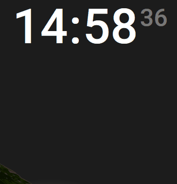
Re,
Nouvelle carte clock intégrée avec couleur police adaptative en fonction de la météo ( pas trop compliqué )
Code
  - type: custom:mod-card
    style:
      left: 88%
      top: 14%
      height: 25%
    card:
      type: vertical-stack
      cards:
        - type: clock
          show_seconds: true
          card_mod:
            style: |
              ha-card {
                background: transparent !important;
                box-shadow: none;
                border-radius: 15px !important;
                color:
                  {% set state = states('weather.forecast_maison') %}
                  {% if state == 'clear-night' %}
                    white
                  {% else %}
                    black
                  {% endif %};
              }
              ha-card > div > div {
                font-size: 100px !important;
              }
              ha-card > div > div > div.time-part.second {
                font-size: 50px !important;
              }
edit: il y a une vertical stack inutile que pour cette carte
cdt
Re,
Suite à la mise à jour de auto-entities v1.15.1, certaines de mes cartes ont cassé c’est peut-être aussi le passage à HA 2025.4.4 > 2025.5.2 ( à vrai dire j’en sais rien et je ne me suis pas replongé dans les changelogs )
modification du code
      template: >
        {% set installed = state_attr(entity.entity_id, 'installed_version') %}
        {% set latest = state_attr(entity.entity_id, 'latest_version') %} {{
        installed != latest }}
devient
      attributes:
        installed_version:
          - "{{ state_attr(entity.entity_id, 'installed_version') != state_attr(entity.entity_id, 'latest_version') }}"
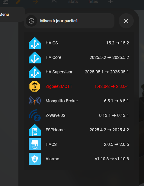
cdt
Il serait temps de mettre a jour Z2m 
Hello,
rien ne presse et j’ai pas envie  j’ai tenté sur mon HA de test avec la même config en pi4 / conbee2, résultat Z2M est par terre
cdt
1 « J'aime »
tu as lu le breaking change ?
Si besoin d’un coup de main n’hésite pas. Ouvre un sujet, je te donnerai un coup de main.
il faut juste mettre des options sur false, si tu les utilises dans la v1 pour le passage en v2.
1 « J'aime »
re,
je ferai ça un de ces quatre, j’ouvrirai un topic si besoin, parce que sauf erreur je n’ai rien du tout dans mon configuration.yaml
cdt
Re,
si ça intéresse quelqu’un la dernière petite bubble que vient remplacer une auto-entities sur le tel, les icones ne changent pas suivant l’état
- icone verte si « off » fond vert
- icone orange clignotant fond rouge si 1 capteur au moins est « unavailable »
- icone rouge clignotant fond rouge si 1 capteur au moins est « on »

code de la carte
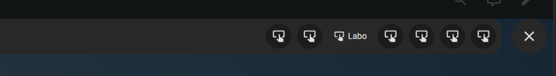
type: vertical-stack
cards:
  - type: custom:bubble-card
    icon: mdi:security
    hash: "#securite"
    card_layout: normal
    width_desktop: 400px
  - type: custom:bubble-card
    card_type: separator
    name: RDC
  - type: custom:bubble-card
    card_type: button
    button_type: name
    card_layout: large-1-rows
    sub_button:
      - entity: binary_sensor.porte_entree_2
        name: Pentree
        icon: mdi:door-closed
        show_name: true
        show_state: false
        show_background: false
      - entity: binary_sensor.porte1_salon_2
        name: P1salon
        icon: mdi:door-closed
        show_name: true
        show_state: false
        show_background: false
      - entity: binary_sensor.porte2_salon_2
        name: P2salon
        icon: mdi:door-closed
        show_name: true
        show_state: false
        show_background: false
      - entity: binary_sensor.porte_chaufferie_labopi2
        name: Pchauff
        icon: mdi:door-closed
        show_name: true
        show_state: false
        show_background: false
      - entity: binary_sensor.porte_labo_labopi2
        name: Plabo
        icon: mdi:door-closed
        show_name: true
        show_state: false
        show_background: false
      - entity: binary_sensor.porte_cave_labopi2
        name: Pcave
        icon: mdi:door-closed
        show_name: true
        show_state: false
        show_background: false
    card_mod:
      style: |
        ha-card {
          {% set capteurs = [
            'binary_sensor.porte_entree_2',
            'binary_sensor.porte1_salon_2',
            'binary_sensor.porte2_salon_2',
            'binary_sensor.porte_chaufferie_labopi2',
            'binary_sensor.porte_labo_labopi2',
            'binary_sensor.porte_cave_labopi2'
          ] %}
          {% if capteurs | select('is_state', 'on') | list | count > 0 or
                capteurs | select('is_state', 'unavailable') | list | count > 0 %}
            background: rgba(255, 0, 0, 0.2) !important;
          {% else %}
            background: rgba(180, 255, 180, 0.15) !important;
          {% endif %}
        }
    styles: |
      .bubble-button-card-container {
        background: rgba(var(--rgb-secondary-text-color), 0.2) !important;
        box-shadow: none;
        border-radius: 15px !important;  # Ajustez la valeur ici
      }
      .bubble-sub-button-1 > ha-icon {
        color: ${hass.states['binary_sensor.porte_entree_2'].state === 'unavailable'
          ? 'orange'
          : hass.states['binary_sensor.porte_entree_2'].state === 'on'
          ? 'red'
          : 'green'} !important;
        animation: ${
          hass.states['binary_sensor.porte_entree_2'].state === 'unavailable'
            ? 'blink-orange 1s infinite'
            : hass.states['binary_sensor.porte_entree_2'].state === 'on'
            ? 'blink-rouge 1s infinite'
            : 'none'
        } !important;
      }
      .bubble-sub-button-2 > ha-icon {
        color: ${hass.states['binary_sensor.porte1_salon_2'].state === 'unavailable'
          ? 'orange'
          : hass.states['binary_sensor.porte1_salon_2'].state === 'on'
          ? 'red'
          : 'green'} !important;
        animation: ${
          hass.states['binary_sensor.porte1_salon_2'].state === 'unavailable'
            ? 'blink-orange 1s infinite'
            : hass.states['binary_sensor.porte1_salon_2'].state === 'on'
            ? 'blink-rouge 1s infinite'
            : 'none'
        } !important;
      }
      .bubble-sub-button-3 > ha-icon {
        color: ${hass.states['binary_sensor.porte2_salon_2'].state === 'unavailable'
          ? 'orange'
          : hass.states['binary_sensor.porte2_salon_2'].state === 'on'
          ? 'red'
          : 'green'} !important;
        animation: ${
          hass.states['binary_sensor.porte2_salon_2'].state === 'unavailable'
            ? 'blink-orange 1s infinite'
            : hass.states['binary_sensor.porte2_salon_2'].state === 'on'
            ? 'blink-rouge 1s infinite'
            : 'none'
        } !important;
      }
      .bubble-sub-button-4 > ha-icon {
        color: ${hass.states['binary_sensor.porte_chaufferie_labopi2'].state === 'unavailable'
          ? 'orange'
          : hass.states['binary_sensor.porte_chaufferie_labopi2'].state === 'on'
          ? 'red'
          : 'green'} !important;
        animation: ${
          hass.states['binary_sensor.porte_chaufferie_labopi2'].state === 'unavailable'
            ? 'blink-orange 1s infinite'
            : hass.states['binary_sensor.porte_chaufferie_labopi2'].state === 'on'
            ? 'blink-rouge 1s infinite'
            : 'none'
        } !important;
      }
      .bubble-sub-button-5 > ha-icon {
        color: ${hass.states['binary_sensor.porte_labo_labopi2'].state === 'unavailable'
          ? 'orange'
          : hass.states['binary_sensor.porte_labo_labopi2'].state === 'on'
          ? 'red'
          : 'green'} !important;
        animation: ${
          hass.states['binary_sensor.porte_labo_labopi2'].state === 'unavailable'
            ? 'blink-orange 1s infinite'
            : hass.states['binary_sensor.porte_labo_labopi2'].state === 'on'
            ? 'blink-rouge 1s infinite'
            : 'none'
        } !important;
      }
      .bubble-sub-button-6 > ha-icon {
        color: ${hass.states['binary_sensor.porte_cave_labopi2'].state === 'unavailable'
          ? 'orange'
          : hass.states['binary_sensor.porte_cave_labopi2'].state === 'on'
          ? 'red'
          : 'green'} !important;
        animation: ${
          hass.states['binary_sensor.porte_cave_labopi2'].state === 'unavailable'
            ? 'blink-orange 1s infinite'
            : hass.states['binary_sensor.porte_cave_labopi2'].state === 'on'
            ? 'blink-rouge 1s infinite'
            : 'none'
        } !important;
      }
      .card-content {
        width: 100%;
        margin: 0 !important;
      }
      .bubble-sub-button {
        height: 30px !important;
        width: 63px !important;
      }
      .bubble-sub-button-container {
        width: 100% !important;  # Étend la largeur sur toute la carte
        display: flex !important;
        justify-content: center !important;  # Centre les sous-boutons horizontalement
        align-items: center !important;  # Aligne les boutons verticalement
      }
      .bubble-sub-button-icon {
        --mdc-icon-size: 18px !important;
      }
      .bubble-name-container {
        margin-right: -10px !important;
      }
      @keyframes blink-orange {
        0% { opacity: 1; }
        50% { opacity: 0.3; }
        100% { opacity: 1; }
      }
      @keyframes blink-rouge {
        0% { opacity: 1; }
        50% { opacity: 0.3; }
        100% { opacity: 1; }
      }
    show_icon: false
    scrolling_effect: false
cdt
1 « J'aime »
Re,
Ajout d’une picture element 6 états ( 3 matériel +3 ports ethernet )pour coller avec ça Centralisation de l'arrêt et du redémarrage de raspberry pi sans WOL
cdt