Re,
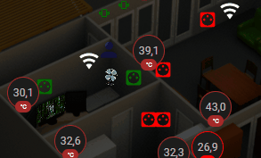
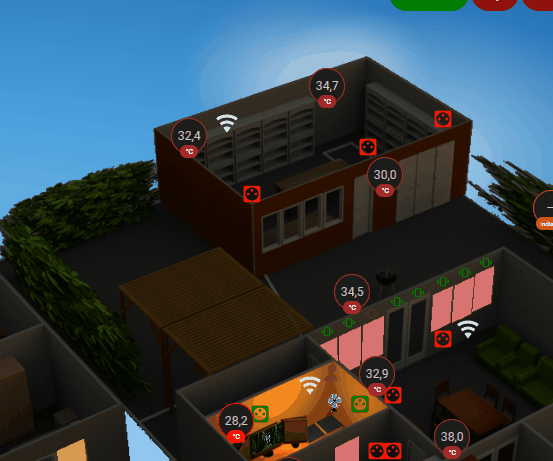
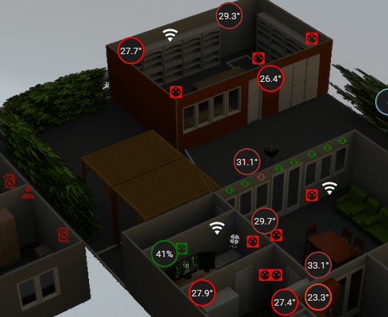
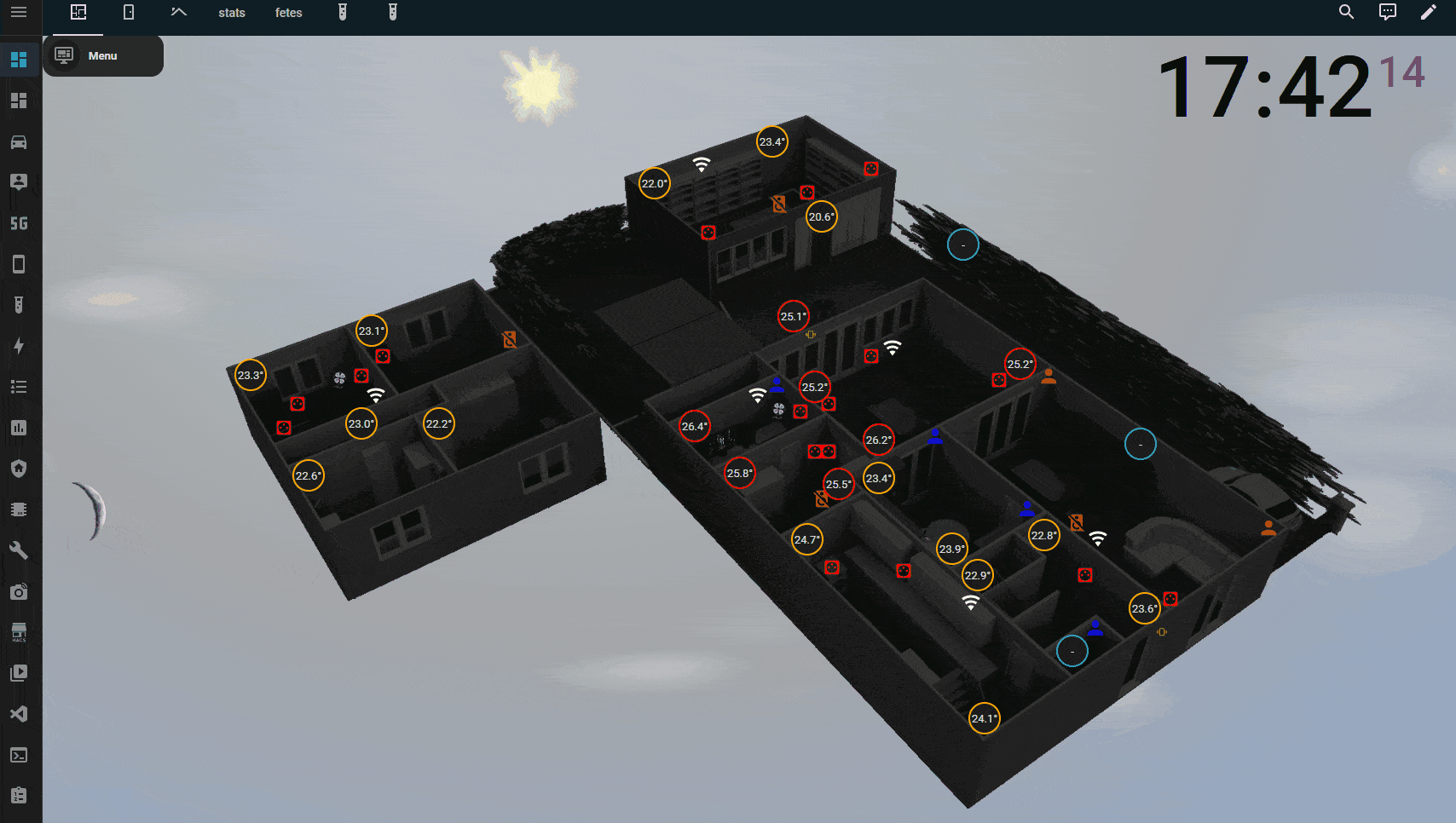
Ajout de l’état des bornes du mesh wifi et ajout de la surveillance des GH ( de façon “conditionnelle”, je n’affiche rien sauf si un GH “tombe” ) cf Notifications dynamiques en fonction de la pièce occupée
cdt
Re,
Ajout de l’état des bornes du mesh wifi et ajout de la surveillance des GH ( de façon “conditionnelle”, je n’affiche rien sauf si un GH “tombe” ) cf Notifications dynamiques en fonction de la pièce occupée
cdt
Re,
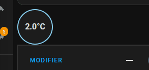
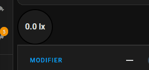
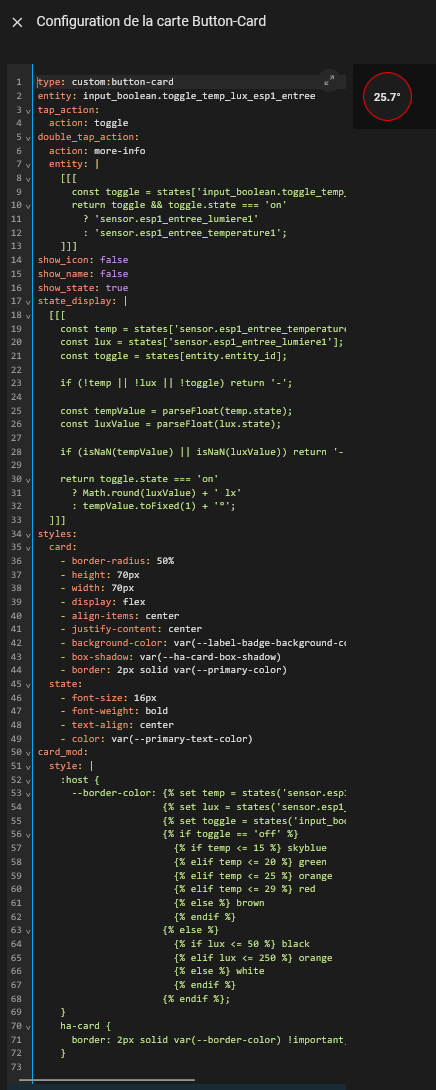
Aujourd’hui exit les state-badge trop peu permissif à mon goût et migration vers button-card
tant qu’à faire on va améliorer le rendu avec l’ajout des lux à la température
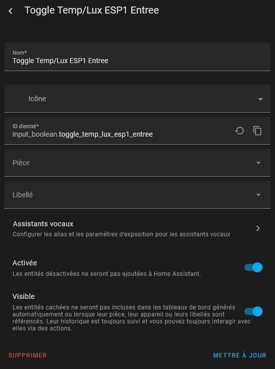
déjà on commence par créer un input boolean pour switcher au clic entre les deux infos
J’ai fixé les mêmes seuils de changement de couleur que sur mes state-badge
testé un a un que ça fonctionne
la bascule
la température
la luminosité et le tout ensemble
type: custom:button-cardentity: input_boolean.toggle_temp_lux_esp1_entreetap_action:action: toggleshow_icon: falseshow_name: falseshow_state: truestate_display: |[[[const temp = states[‹ sensor.esp1_entree_temperature1 ›];const lux = states[‹ sensor.esp1_entree_lumiere1 ›];const toggle = states[entity.entity_id];

if (!temp || !lux || !toggle) return '-';

const tempValue = parseFloat(temp.state);
const luxValue = parseFloat(lux.state);

if (isNaN(tempValue) || isNaN(luxValue)) return '-';

return toggle.state === 'on'
  ? Math.round(luxValue) + ' lx'
  : tempValue.toFixed(1) + '°';
]]]styles:card:- border-radius: 50%- height: 70px- width: 70px- display: flex- align-items: center- justify-content: center- background-color: var(–label-badge-background-color)- box-shadow: var(–ha-card-box-shadow)- border: 2px solid var(–primary-color)state:- font-size: 16px- font-weight: bold- text-align: center- color: var(–primary-text-color)card_mod:style: |:host {–border-color: {% set temp = states(‹ sensor.esp1_entree_temperature1 ›) | float %}{% set lux = states(‹ sensor.esp1_entree_lumiere1 ›) | int %}{% set toggle = states(‹ input_boolean.toggle_temp_lux_esp1_entree ›) %}{% if toggle == ‹ off › %}{% if temp <= 15 %} skyblue{% elif temp <= 20 %} green{% elif temp <= 25 %} orange{% elif temp <= 29 %} red{% else %} brown{% endif %}{% else %}{% if lux <= 50 %} black{% elif lux <= 250 %} orange{% else %} white{% endif %}{% endif %};}ha-card {border: 2px solid var(–border-color) !important;}
type: custom:button-cardentity: input_boolean.toggle_temp_lux_esp1_entreetap_action:action: toggledouble_tap_action:action: more-infoentity: |[[[const toggle = states[‹ input_boolean.toggle_temp_lux_esp1_entree ›];return toggle && toggle.state === ‹ on ›? ‹ sensor.esp1_entree_lumiere1 ›: ‹ sensor.esp1_entree_temperature1 ›;]]]show_icon: falseshow_name: falseshow_state: truestate_display: |[[[const temp = states[‹ sensor.esp1_entree_temperature1 ›];const lux = states[‹ sensor.esp1_entree_lumiere1 ›];const toggle = states[entity.entity_id];
if (!temp || !lux || !toggle) return '-';

const tempValue = parseFloat(temp.state);
const luxValue = parseFloat(lux.state);

if (isNaN(tempValue) || isNaN(luxValue)) return '-';

return toggle.state === 'on'
  ? Math.round(luxValue) + ' lx'
  : tempValue.toFixed(1) + '°C';
]]]styles:card:- border-radius: 50%- height: 70px- width: 70px- display: flex- align-items: center- justify-content: center- background-color: var(–label-badge-background-color)- box-shadow: var(–ha-card-box-shadow)- border: 2px solid var(–primary-color)state:- font-size: 16px- font-weight: bold- text-align: center- color: var(–primary-text-color)card_mod:style: |:host {–border-color: {% set temp = states(‹ sensor.esp1_entree_temperature1 ›) | float %}{% set lux = states(‹ sensor.esp1_entree_lumiere1 ›) | int %}{% set toggle = states(‹ input_boolean.toggle_temp_lux_esp1_entree ›) %}{% if toggle == ‹ off › %}{% if temp <= 15 %} skyblue{% elif temp <= 20 %} green{% elif temp <= 25 %} orange{% elif temp <= 29 %} red{% else %} brown{% endif %}{% else %}{% if lux <= 50 %} black{% elif lux <= 250 %} orange{% else %} white{% endif %}{% endif %};}ha-card {border: 2px solid var(–border-color) !important;}
Au final ça donnera un badge d’état 2 infos + more info pour avoir le graphe
solution mise en prod ( ou presque à 95% )
bonus 
cdt
Re,
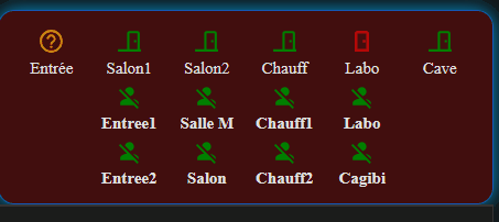
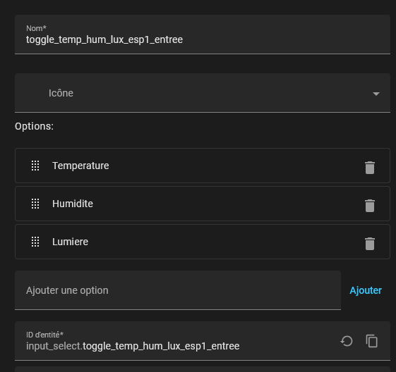
Amélioration du “state badge” custom button-card à x états avec un input select
info 1 > clic > info 2 > clic info x > clic > retour à l’info 1
le double clic déclenche le more info sur toutes les entités
info 1 > clic > info 2 > clic info x > clic > retour à l’info 1
le double clic déclenche le more info sur toutes les entités
type: custom:button-card
entity: input_select.toggle_temp_hum_lux_esp1_entree
style:
  top: 64.5%
  left: 70.7%
tap_action:
  action: call-service
  service: input_select.select_next
  service_data:
    entity_id: input_select.toggle_temp_hum_lux_esp1_entree
double_tap_action:
  action: more-info
  entity: |
    [[[
      const toggle = states['input_select.toggle_temp_hum_lux_esp1_entree'];
      if (!toggle) return 'sensor.esp1_entree_temperature1';

      switch(toggle.state) {
        case 'Lumiere':
          return 'sensor.esp1_entree_lumiere1';
        case 'Humidite':
          return 'sensor.esp1_entree_humidite1';
        case 'Temperature':
        default:
          return 'sensor.esp1_entree_temperature1';
      }
    ]]]
show_icon: false
show_name: false
show_state: true
state_display: |
  [[[
    const temp = states['sensor.esp1_entree_temperature1'];
    const lux = states['sensor.esp1_entree_lumiere1'];
    const humidity = states['sensor.esp1_entree_humidite1'];
    const toggle = states['input_select.toggle_temp_hum_lux_esp1_entree'];

    if (!temp || !lux || !humidity || !toggle) return '-';

    const tempValue = parseFloat(temp.state);
    const luxValue = parseFloat(lux.state);
    const humidityValue = parseFloat(humidity.state);

    if (isNaN(tempValue) || isNaN(luxValue) || isNaN(humidityValue)) return '-';

    switch(toggle.state) {
      case 'Lumiere':
        return Math.round(luxValue) + 'lx';
      case 'Humidite':
        return humidityValue.toFixed(0) + '%';
      case 'Temperature':
      default:
        return tempValue.toFixed(1) + '°';
    }
  ]]]
styles:
  card:
    - border-radius: 50%
    - height: 38px
    - width: 38px
    - display: flex
    - align-items: center
    - justify-content: center
    - background-color: var(--label-badge-background-color)
    - box-shadow: var(--ha-card-box-shadow)
    - border: 2px solid var(--primary-color)
  state:
    - font-size: 13px
    - text-align: center
    - color: var(--primary-text-color)
card_mod:
  style: |
    :host {
      --border-color:
        {% set temp = states('sensor.esp1_entree_temperature1') | float %}
        {% set lux = states('sensor.esp1_entree_lumiere1') | int %}
        {% set humidity = states('sensor.esp1_entree_humidite1') | float %}
        {% set toggle = states('input_select.toggle_temp_hum_lux_esp1_entree') %}

        {% if toggle == 'Lumiere' %}
          {% if lux <= 50 %}
            black
          {% elif lux <= 250 %}
            orange
          {% else %}
            white
          {% endif %}
        {% elif toggle == 'Humidite' %}
          {% if humidity <= 30 %}
            red
          {% elif humidity <= 40 %}
            orange
          {% elif humidity <= 60 %}
            green
          {% elif humidity <= 70 %}
            blue
          {% else %}
            purple
          {% endif %}
        {% else %}
          {% if temp <= 15 %}
            skyblue
          {% elif temp <= 20 %}
            green
          {% elif temp <= 25 %}
            orange
          {% elif temp <= 29 %}
            red
          {% else %}
            brown
          {% endif %}
        {% endif %};
    }
    ha-card {
      border: 2px solid var(--border-color) !important;
    }
cdt
Re,
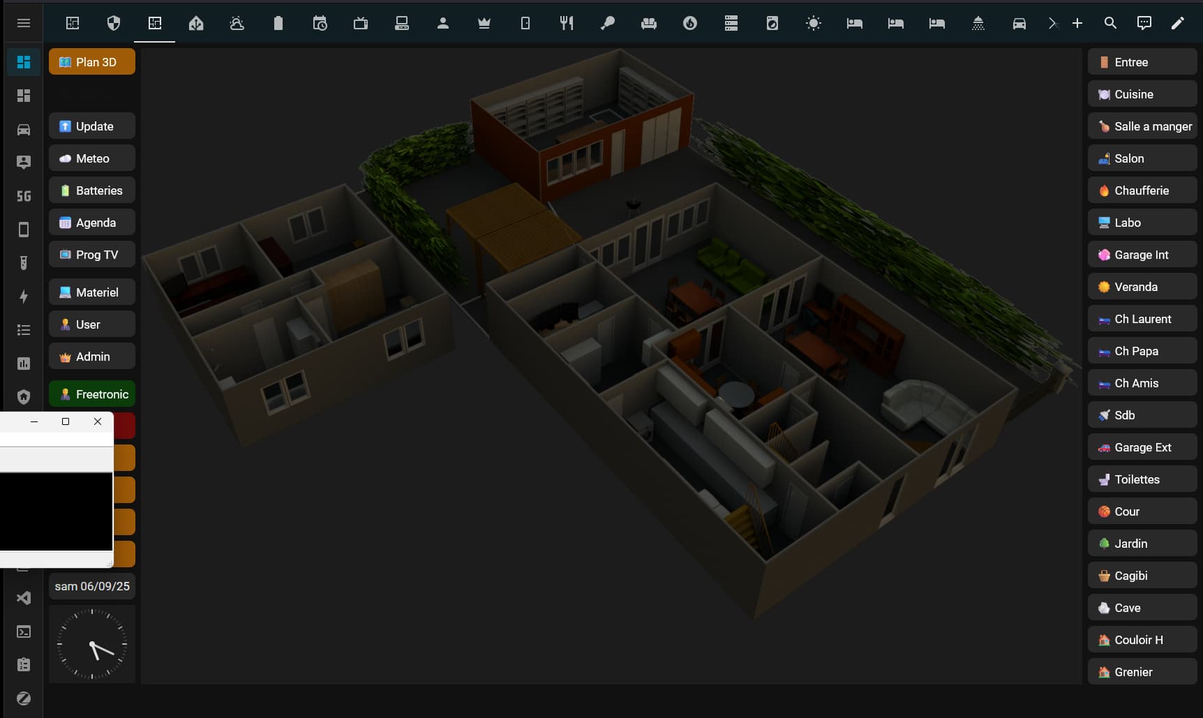
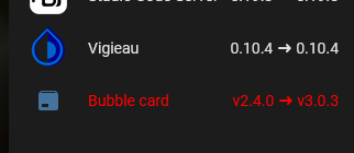
Exit bubble card, pas envie de chercher ce qui ne passe pas en V3.0.x du coup migration en cours sur custom button card général ou presque, j’ai posé les bases plus qu’à copier les codes et à fixer les liens de navigation
Désolé les gif est crade, mais il a fallu compresser un max pour qu’il passe ici
cdt
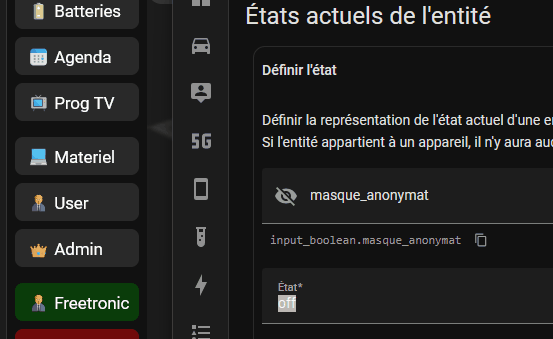
Re,
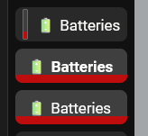
Vu que j’en avais assez de cacher des bouts de cartes avec les membres de la maison, j’ai mis un mode anonymat pour faire des gif et video ça sera plus facile pour moi, sur un input boolean on passe en anonyme ou pas.
- type: custom:button-card
name: Freetronic
show_icon: false
show_name: false
entity: person.freetronic
state:
- value: home
styles:
card:
- background: |
[[[
if (states['input_boolean.masque_anonymat'].state === 'on') {
return 'black';
}
return 'rgba(0, 128, 0, 0.4)';
]]]
- value: not_home
styles:
card:
- background: |
[[[
if (states['input_boolean.masque_anonymat'].state === 'on') {
return 'black';
}
return 'rgba(255, 0, 0, 0.4)';
]]]
- value: unknown
styles:
card:
- background: |
[[[
if (states['input_boolean.masque_anonymat'].state === 'on') {
return 'black';
}
return 'rgba(255, 140, 0, 0.6)';
]]]
- value: unavailable
styles:
card:
- background: |
[[[
if (states['input_boolean.masque_anonymat'].state === 'on') {
return 'black';
}
return 'rgba(255, 140, 0, 0.6)';
]]]
card_mod:
style: |
ha-card {
margin-bottom: 0px;
border-radius: 8px !important;
padding: 0 !important;
{% if is_state('input_boolean.masque_anonymat', 'on') %}
pointer-events: none !important;
{% endif %}
}
custom_fields:
menu: |
[[[
if (states['input_boolean.masque_anonymat'].state === 'on') {
return `<div class="subbtn-masked"> </div>`;
}
return `<div class="subbtn">🧑💼 Freetronic</div>`;
]]]
styles:
grid:
- grid-template-areas: "\"menu\""
- grid-template-columns: 1fr
- grid-template-rows: 38px
custom_fields:
menu:
- justify-self: stretch
- align-self: stretch
- padding: 0
- margin: 0
- min-height: 38px
extra_styles: |
.subbtn {
display: flex !important;
align-items: center !important;
justify-content: flex-start !important;
width: 100% !important;
height: 38px !important;
box-sizing: border-box !important;
padding: 0 12px !important;
gap: 8px !important;
border-radius: 6px !important;
background: transparent !important;
color: white !important;
cursor: pointer !important;
transition: all 0.2s ease !important;
text-align: left !important;
}
.subbtn-masked {
display: flex !important;
align-items: center !important;
justify-content: flex-start !important;
width: 100% !important;
height: 38px !important;
min-height: 38px !important;
box-sizing: border-box !important;
padding: 0 12px !important;
border-radius: 6px !important;
background: black !important;
color: transparent !important;
}
ha-card:hover:not(:has(.subbtn-masked)) {
background: rgba(0,123,255,0.4) !important;
transform: translateX(2px) !important;
}
ha-card:hover:not(:has(.subbtn-masked)) .subbtn {
color: white !important;
}
cdt
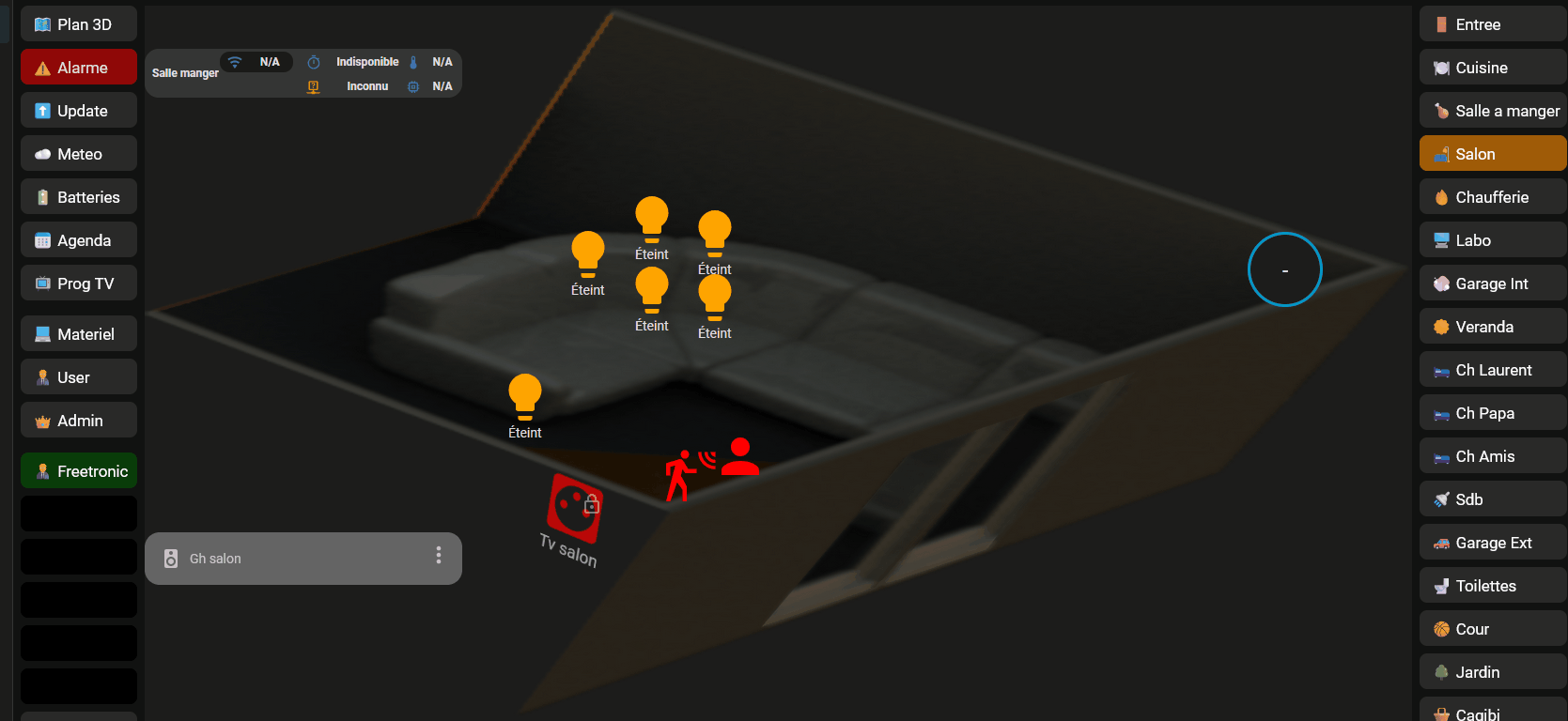
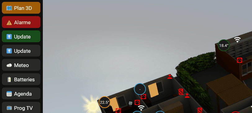
Re,
Les dernières évolutions, exit bubble ( il me reste une carte ) et les popups
bouton update interactif simple qui pointe vers le dashbord upgrade, le tout en streamline parce que tout le menu est en train d’y passer.
oui je m’étais planté de texte 
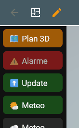
Alertes météos, bouton interactif plus complexe, en fonction de l’attribut et de la couleur de l’alerte, icone, nom et couleur dynamiques ça pointe vers le dashbord meteo pour plus de précisions, le tout en streamline parce que tout le menu est en train d’y passser
cdt
Edit, un peu galère celui-là
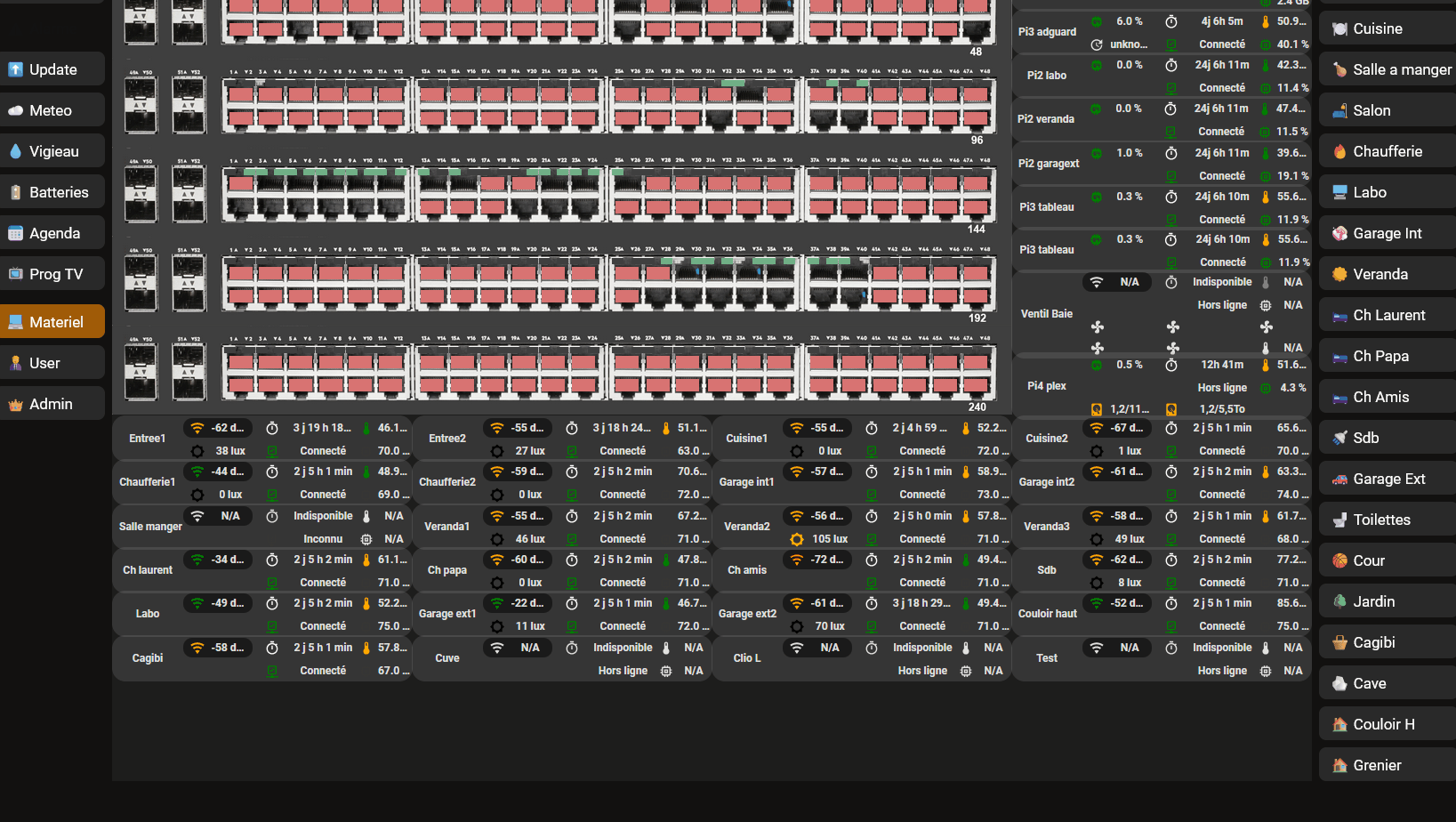
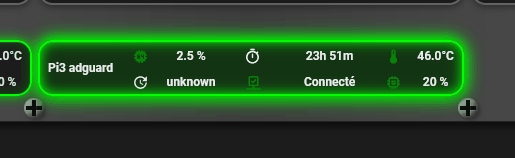
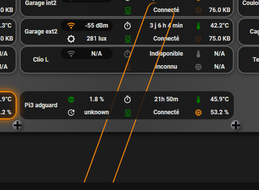
Re,
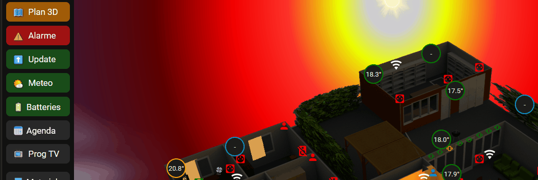
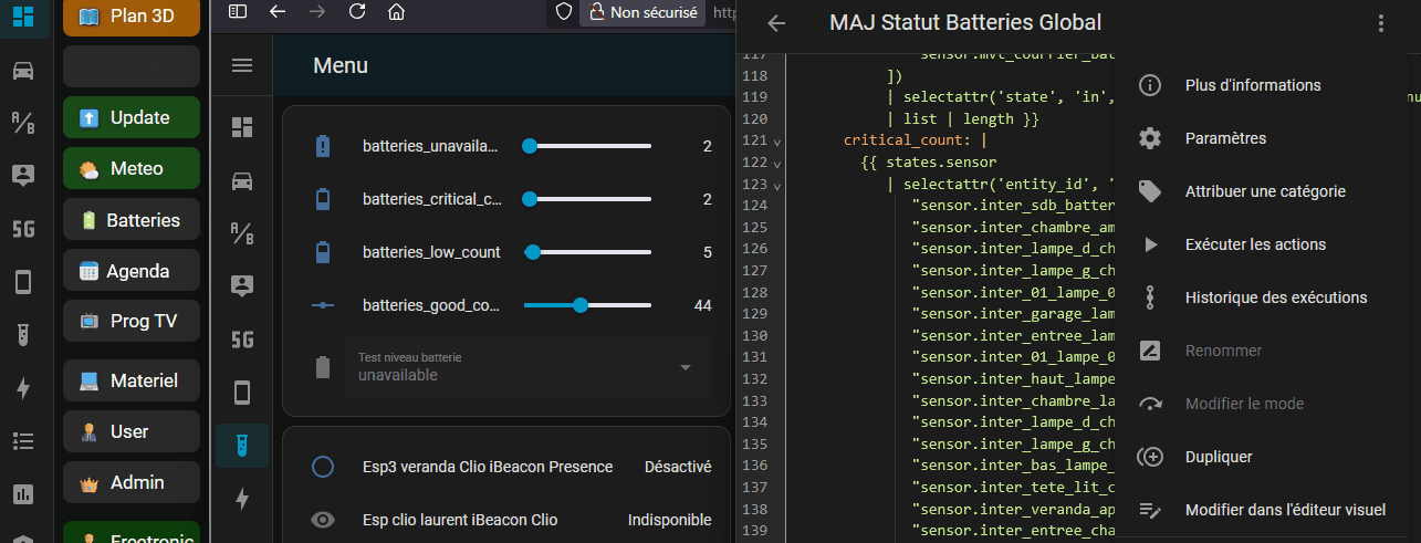
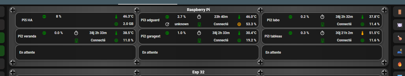
Dernières modifs sans les tuyaux, j’ai scindé la page matériel en 2 pour que ça soit moins lourd à charger
en test
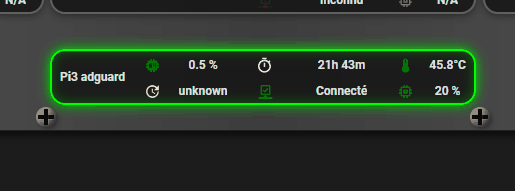
le tour “surveille” 4 entités, si une change, le tour change
        card_mod:
          style: |
            ha-card {
              {% set cpu = states('sensor.pi3_adguard_cpu_utilise') | float(0) %}
              {% set temp = states('sensor.pi3_adguard_cpu_temperature') | float(0) %}
              {% set mem = states('sensor.pi3_adguard_memoire_utilisee') | float(0) %}
              {% set status = states('binary_sensor.pi3_adguard') %}

              {% set cpu_free = 100 - cpu %}
              {% set mem_free = 100 - mem %}

              {% set has_red = (cpu_free < 25) or (temp >= 65) or (mem_free < 25) or (status in ['off', 'unavailable']) %}
              {% set has_orange = (cpu_free < 50 and cpu_free >= 25) or (temp >= 50 and temp < 65) or (mem_free < 50 and mem_free >= 25) %}

              {% if has_red %}
                border: 2px solid #ff0000 !important;
                box-shadow:
                  0 0 15px #ff0000,
                  inset 0 0 15px rgba(255, 0, 0, 0.4),
                  0 2px 8px rgba(0,0,0,0.4),
                  inset 0 1px 0 rgba(255,255,255,0.1) !important;
              {% elif has_orange %}
                border: 2px solid #ff8800 !important;
                box-shadow:
                  0 0 15px #ff8800,
                  inset 0 0 15px rgba(255, 136, 0, 0.4),
                  0 2px 8px rgba(0,0,0,0.4),
                  inset 0 1px 0 rgba(255,255,255,0.1) !important;
              {% else %}
                border: 2px solid #00ff00 !important;
                box-shadow:
                  0 0 12px #00ff00,
                  inset 0 0 12px rgba(0, 255, 0, 0.3),
                  0 2px 8px rgba(0,0,0,0.4),
                  inset 0 1px 0 rgba(255,255,255,0.1) !important;
              {% endif %}
            }
même chose avec un effet pulsar plus ou moins rapide
        card_mod:
          style: |
            ha-card {
              {% set cpu = states('sensor.pi3_adguard_cpu_utilise') | float(0) %}
              {% set temp = states('sensor.pi3_adguard_cpu_temperature') | float(0) %}
              {% set mem = states('sensor.pi3_adguard_memoire_utilisee') | float(0) %}
              {% set status = states('binary_sensor.pi3_adguard') %}

              {% set cpu_free = 100 - cpu %}
              {% set mem_free = 100 - mem %}

              {% set has_red = (cpu_free < 25) or (temp >= 65) or (mem_free < 25) or (status in ['off', 'unavailable']) %}
              {% set has_orange = (cpu_free < 50 and cpu_free >= 25) or (temp >= 50 and temp < 65) or (mem_free < 50 and mem_free >= 25) %}

              position: relative !important;
              overflow: visible !important;

              {% if has_red %}
                --glow-color: #ff0000;
                --glow-intensity: 15px;
                --speed: 1s;
              {% elif has_orange %}
                --glow-color: #ff8800;
                --glow-intensity: 15px;
                --speed: 2s;
              {% else %}
                --glow-color: #00ff00;
                --glow-intensity: 12px;
                --speed: 6s;
              {% endif %}

              border: 2px solid var(--glow-color) !important;
              box-shadow:
                0 0 var(--glow-intensity) var(--glow-color),
                inset 0 0 var(--glow-intensity) var(--glow-color),
                0 2px 8px rgba(0,0,0,0.4),
                inset 0 1px 0 rgba(255,255,255,0.1) !important;
              animation: glow-pulse var(--speed) ease-in-out infinite !important;
            }

            @keyframes glow-pulse {
              0%, 100% {
                filter: brightness(1) drop-shadow(0 0 5px var(--glow-color));
              }
              50% {
                filter: brightness(1.3) drop-shadow(0 0 20px var(--glow-color));
              }
            }
j’ai tenté de faire un effet “tron” sans y parvenir pour le moment, parfois on obtient des trucs inutilisables 
cdt
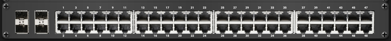
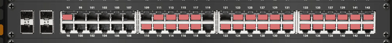
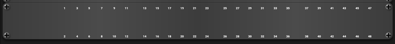
Hello,
Quelques ressources
c’est le code adapté à mon dashboard, pour les positionnements et echelles, il faudra vous débrouiller 
  - type: custom:button-card
    show_name: false
    show_icon: false
    style:
      height: 50%
      width: 99%
      left: 50%
      top: 108.5%
    styles:
      card:
        - background: |
            linear-gradient(90deg,
              rgba(60,60,60,1) 0%,
              rgba(75,75,75,1) 25%,
              rgba(60,60,60,1) 50%,
              rgba(75,75,75,1) 75%,
              rgba(60,60,60,1) 100%)
        - border-radius: 15px
        - box-shadow: |
            inset 0 1px 0 rgba(255,255,255,0.1),
            inset 0 -1px 0 rgba(0,0,0,0.5),
            0 4px 8px rgba(0,0,0,0.6)
        - position: absolute
        - height: 33.5%
    custom_fields:
      vis_tl: |
        [[[
          return `<div style="width:20px;height:20px;position:absolute;top:4px;left:4px;z-index:10;">
            <div style="width:20px;height:20px;background:radial-gradient(circle at 30% 30%, #8a8a8a, #4a4a4a);border-radius:50%;box-shadow:inset -2px -2px 4px rgba(0,0,0,0.5), inset 2px 2px 4px rgba(255,255,255,0.3), 2px 2px 4px rgba(0,0,0,0.3);display:flex;align-items:center;justify-content:center;position:relative;">
              <div style="position:absolute;width:16px;height:4px;background:linear-gradient(to bottom, #1a1a1a, #0a0a0a);box-shadow:inset 0 2px 3px rgba(0,0,0,0.9),0 1px 0 rgba(255,255,255,0.1);"></div>
              <div style="position:absolute;width:4px;height:16px;background:linear-gradient(to right, #1a1a1a, #0a0a0a);box-shadow:inset 2px 0 3px rgba(0,0,0,0.9),1px 0 0 rgba(255,255,255,0.1);"></div>
            </div>
          </div>`;
        ]]]
      vis_tr: |
        [[[
          return `<div style="width:20px;height:20px;position:absolute;top:4px;right:4px;z-index:10;">
            <div style="width:20px;height:20px;background:radial-gradient(circle at 30% 30%, #8a8a8a, #4a4a4a);border-radius:50%;box-shadow:inset -2px -2px 4px rgba(0,0,0,0.5), inset 2px 2px 4px rgba(255,255,255,0.3), 2px 2px 4px rgba(0,0,0,0.3);display:flex;align-items:center;justify-content:center;position:relative;">
              <div style="position:absolute;width:16px;height:4px;background:linear-gradient(to bottom, #1a1a1a, #0a0a0a);box-shadow:inset 0 2px 3px rgba(0,0,0,0.9),0 1px 0 rgba(255,255,255,0.1);"></div>
              <div style="position:absolute;width:4px;height:16px;background:linear-gradient(to right, #1a1a1a, #0a0a0a);box-shadow:inset 2px 0 3px rgba(0,0,0,0.9),1px 0 0 rgba(255,255,255,0.1);"></div>
            </div>
          </div>`;
        ]]]
      vis_bl: |
        [[[
          return `<div style="width:20px;height:20px;position:absolute;bottom:4px;left:4px;z-index:10;">
            <div style="width:20px;height:20px;background:radial-gradient(circle at 30% 30%, #8a8a8a, #4a4a4a);border-radius:50%;box-shadow:inset -2px -2px 4px rgba(0,0,0,0.5), inset 2px 2px 4px rgba(255,255,255,0.3), 2px 2px 4px rgba(0,0,0,0.3);display:flex;align-items:center;justify-content:center;position:relative;">
              <div style="position:absolute;width:16px;height:4px;background:linear-gradient(to bottom, #1a1a1a, #0a0a0a);box-shadow:inset 0 2px 3px rgba(0,0,0,0.9),0 1px 0 rgba(255,255,255,0.1);"></div>
              <div style="position:absolute;width:4px;height:16px;background:linear-gradient(to right, #1a1a1a, #0a0a0a);box-shadow:inset 2px 0 3px rgba(0,0,0,0.9),1px 0 0 rgba(255,255,255,0.1);"></div>
            </div>
          </div>`;
        ]]]
      vis_br: |
        [[[
          return `<div style="width:20px;height:20px;position:absolute;bottom:4px;right:4px;z-index:10;">
            <div style="width:20px;height:20px;background:radial-gradient(circle at 30% 30%, #8a8a8a, #4a4a4a);border-radius:50%;box-shadow:inset -2px -2px 4px rgba(0,0,0,0.5), inset 2px 2px 4px rgba(255,255,255,0.3), 2px 2px 4px rgba(0,0,0,0.3);display:flex;align-items:center;justify-content:center;position:relative;">
              <div style="position:absolute;width:16px;height:4px;background:linear-gradient(to bottom, #1a1a1a, #0a0a0a);box-shadow:inset 0 2px 3px rgba(0,0,0,0.9),0 1px 0 rgba(255,255,255,0.1);"></div>
              <div style="position:absolute;width:4px;height:16px;background:linear-gradient(to right, #1a1a1a, #0a0a0a);box-shadow:inset 2px 0 3px rgba(0,0,0,0.9),1px 0 0 rgba(255,255,255,0.1);"></div>
            </div>
          </div>`;
        ]]]
on numérote
      - type: custom:button-card
        show_name: false
        show_icon: false
        style:
          height: 50%
          width: 99%
          left: 50%
          top: 108.5%
         styles:
          card:
            - background: |
                linear-gradient(90deg,
                  rgba(60,60,60,1) 0%,
                  rgba(75,75,75,1) 25%,
                  rgba(60,60,60,1) 50%,
                  rgba(75,75,75,1) 75%,
                  rgba(60,60,60,1) 100%)
            - border-radius: 15px
            - box-shadow: |
                inset 0 1px 0 rgba(255,255,255,0.1),
                inset 0 -1px 0 rgba(0,0,0,0.5),
                0 4px 8px rgba(0,0,0,0.6)
            - position: absolute
            - height: 33.5%
        custom_fields:
          vis_tl: |
            [[[
              return `<div style="width:20px;height:20px;position:absolute;top:4px;left:4px;z-index:10;">
                <div style="width:20px;height:20px;background:radial-gradient(circle at 30% 30%, #8a8a8a, #4a4a4a);border-radius:50%;box-shadow:inset -2px -2px 4px rgba(0,0,0,0.5), inset 2px 2px 4px rgba(255,255,255,0.3), 2px 2px 4px rgba(0,0,0,0.3);display:flex;align-items:center;justify-content:center;position:relative;">
                  <div style="position:absolute;width:16px;height:4px;background:linear-gradient(to bottom, #1a1a1a, #0a0a0a);box-shadow:inset 0 2px 3px rgba(0,0,0,0.9),0 1px 0 rgba(255,255,255,0.1);"></div>
                  <div style="position:absolute;width:4px;height:16px;background:linear-gradient(to right, #1a1a1a, #0a0a0a);box-shadow:inset 2px 0 3px rgba(0,0,0,0.9),1px 0 0 rgba(255,255,255,0.1);"></div>
                </div>
              </div>`;
            ]]]
          vis_tr: |
            [[[
              return `<div style="width:20px;height:20px;position:absolute;top:4px;right:4px;z-index:10;">
                <div style="width:20px;height:20px;background:radial-gradient(circle at 30% 30%, #8a8a8a, #4a4a4a);border-radius:50%;box-shadow:inset -2px -2px 4px rgba(0,0,0,0.5), inset 2px 2px 4px rgba(255,255,255,0.3), 2px 2px 4px rgba(0,0,0,0.3);display:flex;align-items:center;justify-content:center;position:relative;">
                  <div style="position:absolute;width:16px;height:4px;background:linear-gradient(to bottom, #1a1a1a, #0a0a0a);box-shadow:inset 0 2px 3px rgba(0,0,0,0.9),0 1px 0 rgba(255,255,255,0.1);"></div>
                  <div style="position:absolute;width:4px;height:16px;background:linear-gradient(to right, #1a1a1a, #0a0a0a);box-shadow:inset 2px 0 3px rgba(0,0,0,0.9),1px 0 0 rgba(255,255,255,0.1);"></div>
                </div>
              </div>`;
            ]]]
          vis_bl: |
            [[[
              return `<div style="width:20px;height:20px;position:absolute;bottom:4px;left:4px;z-index:10;">
                <div style="width:20px;height:20px;background:radial-gradient(circle at 30% 30%, #8a8a8a, #4a4a4a);border-radius:50%;box-shadow:inset -2px -2px 4px rgba(0,0,0,0.5), inset 2px 2px 4px rgba(255,255,255,0.3), 2px 2px 4px rgba(0,0,0,0.3);display:flex;align-items:center;justify-content:center;position:relative;">
                  <div style="position:absolute;width:16px;height:4px;background:linear-gradient(to bottom, #1a1a1a, #0a0a0a);box-shadow:inset 0 2px 3px rgba(0,0,0,0.9),0 1px 0 rgba(255,255,255,0.1);"></div>
                  <div style="position:absolute;width:4px;height:16px;background:linear-gradient(to right, #1a1a1a, #0a0a0a);box-shadow:inset 2px 0 3px rgba(0,0,0,0.9),1px 0 0 rgba(255,255,255,0.1);"></div>
                </div>
              </div>`;
            ]]]
          vis_br: |
            [[[
              return `<div style="width:20px;height:20px;position:absolute;bottom:4px;right:4px;z-index:10;">
                <div style="width:20px;height:20px;background:radial-gradient(circle at 30% 30%, #8a8a8a, #4a4a4a);border-radius:50%;box-shadow:inset -2px -2px 4px rgba(0,0,0,0.5), inset 2px 2px 4px rgba(255,255,255,0.3), 2px 2px 4px rgba(0,0,0,0.3);display:flex;align-items:center;justify-content:center;position:relative;">
                  <div style="position:absolute;width:16px;height:4px;background:linear-gradient(to bottom, #1a1a1a, #0a0a0a);box-shadow:inset 0 2px 3px rgba(0,0,0,0.9),0 1px 0 rgba(255,255,255,0.1);"></div>
                  <div style="position:absolute;width:4px;height:16px;background:linear-gradient(to right, #1a1a1a, #0a0a0a);box-shadow:inset 2px 0 3px rgba(0,0,0,0.9),1px 0 0 rgba(255,255,255,0.1);"></div>
                </div>
              </div>`;
            ]]]
          text: |
            [[[
              // Positions exactes des ports (coordonnées left de vos images)
              const portPositions = [
                // Groupe 1 (ports 1-6)
                15.9, 19.1, 22.2, 25.4, 28.6, 31.8,
                // Groupe 2 (ports 7-12)
                36.4, 39.6, 42.8, 46, 49.2, 52.4,
                // Groupe 3 (ports 13-18)
                57, 60.2, 63.4, 66.6, 69.9, 73.1,
                // Groupe 4 (ports 19-24)
                77.9, 81.1, 84.4, 87.6, 90.9, 94.1
              ];

              // Ports du haut = impairs (1, 3, 5, ..., 47)
              const topHtml = portPositions.slice(0, 24).map((position, index) => {
                const num = 1 + index * 2; // 1, 3, 5, ...
                if (num > 47) return '';   // Stop à 47
                return `<span style="position:absolute;top:12px;left:${position}%;transform:translateX(-50%);font-size:10px;color:white;font-weight:bold;z-index:5;">${num}</span>`;
              }).join('');

              // Ports du bas = pairs (2, 4, 6, ..., 48)
              const bottomHtml = portPositions.slice(0, 24).map((position, index) => {
                const num = 2 + index * 2; // 2, 4, 6, ...
                if (num > 48) return '';   // Stop à 48
                return `<span style="position:absolute;bottom:4px;left:${position}%;transform:translateX(-50%);font-size:10px;color:white;font-weight:bold;z-index:5;">${num}</span>`;
              }).join('');

              return `<div style="position:absolute;width:100%;height:100%;top:0;left:0%;pointer-events:none;">${topHtml}${bottomHtml}</div>`;
            ]]]
on groupe tout
cdt