Bonjour,
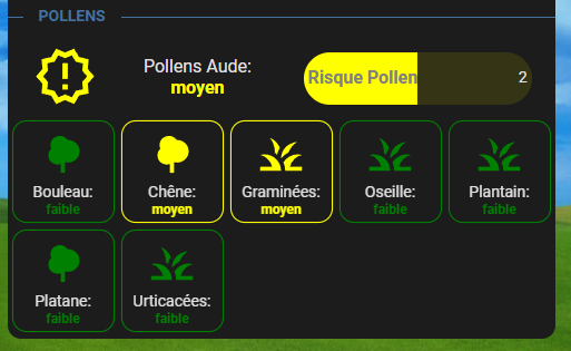
j’ai jouer avec l’intégration Pollens et vous partage ma carte. Merci a tous ceux qui ont partager leur carte pour donner des idées. J’ai configurer les états en texte ( ceux qui ont en numérique faudra adapter ), Les états et border sont en couleur ( suivant le niveau ). La bar de risque change de couleur suivant le niveau. Les entités sont filtrer pour afficher que celle du moment et ranger par ordre alphabétique.
Code:
type: custom:stack-in-card
mode: vertical
keep:
  box_shadow: true
  margin: false
  border_radius: true
  background: false
  outer_padding: false
cards:
  - type: custom:mod-card
    card_mod:
      style:
        .: |
          :host {
            --text-divider-color: rgb(68, 115, 158);
            --text-divider-line-size: 1px;
          }
    card:
      type: custom:text-divider-row
      text: POLLENS
      align: left
  - type: custom:mod-card
    card_mod:
      style: |
        ha-card {
          margin: -15px -5px 0px -5px;
        }
    card:
      type: horizontal-stack
      cards:
        - type: custom:button-card
          entity: sensor.pollens_11
          name: 'Pollens Aude:'
          icon: mdi:alert-decagram-outline
          layout: icon_name_state2nd
          color_type: icon
          show_name: true
          show_state: true
          state:
            - value: nul
              operator: '=='
              color: black
              icon: mdi:decagram-outline
              styles:
                state:
                  - color: black
            - value: faible
              operator: '=='
              color: green
              icon: mdi:check-decagram-outline
              styles:
                state:
                  - color: green
            - value: moyen
              operator: '=='
              color: orange
              icon: mdi:alert-decagram-outline
              styles:
                state:
                  - color: orange
            - value: élevé
              operator: '=='
              color: red
              icon: mdi:alert-decagram
              styles:
                state:
                  - color: red
          size: 55%
          styles:
            card:
              - '--mdc-ripple-color': rgb(68, 115, 158)
              - '--mdc-ripple-press-opacity': 0.5
            name:
              - font-size: 16px
            state:
              - font-weight: bold
              - font-size: 16px
        - type: custom:bar-card
          entities:
            - entity: sensor.pollens_11_risklevel
              name: Risque Pollen
              icon: mdi:alert-circle
              height: 47px
              color: red
              min: 0
              max: 4
              positions:
                indicator: 'off'
                icon: 'off'
              severity:
                - color: Red
                  from: 2
                  to: 3
                - color: Orange
                  from: 1
                  to: 2
                - color: Green
                  from: 0
                  to: 1
          card_mod:
            style: >
              bar-card-currentbar, bar-card-backgroundbar {
                border-radius: 25px;
              }

              #states > bar-card-row > bar-card-card > bar-card-background >
              bar-card-contentbar > bar-card-name {
                font-size: 16px;

              }  ha-card {
                margin-top: -2px;
                background: none;
                border: none;
              }
  - type: conditional
    conditions:
      - entity: sensor.pollens_11
        state_not: nul
    card:
      type: custom:mod-card
      card_mod:
        style: |
          ha-card {
            margin: 5px 5px 5px 5px;
          }
      card:
        type: custom:auto-entities
        card:
          type: grid
          columns: 5
          square: false
        card_param: cards
        filter:
          include:
            - entity_id: sensor.pollens_11_*
              options:
                type: custom:button-card
                color_type: icon
                aspect_ratio: 1/1
                show_name: true
                show_state: true
                name: |
                  [[[
                    return entity.attributes.pollen_name + ":"
                  ]]]
                styles:
                  card:
                    - '--mdc-ripple-color': rgb(68, 115, 158)
                    - '--mdc-ripple-press-opacity': 0.5
                    - border-radius: 8px
                  name:
                    - font-size: 14px
                  state:
                    - font-weight: bold
                    - font-size: 12px
                state:
                  - value: faible
                    operator: '=='
                    color: green
                    styles:
                      card:
                        - box-shadow: 0px 0px 0px 2px green
                      state:
                        - color: green
                  - value: moyen
                    operator: '=='
                    color: orange
                    styles:
                      card:
                        - box-shadow: 0px 0px 0px 2px orange
                      state:
                        - color: orange
                  - value: élevé
                    operator: '=='
                    color: red
                    styles:
                      card:
                        - box-shadow: 0px 0px 0px 2px red
                      state:
                        - color: red
                size: 50%
          exclude:
            - entity_id: sensor.pollens_11_*
              state: nul
            - entity_id: sensor.pollens_11
            - entity_id: sensor.pollens_11_risklevel
        sort:
          method: name
          reverse: false
Edit:
J’ai corriger le code, en ajoutant la partie stack-in-card, pour avoir la carte qui s’affiche en un seul carte.
Edit 2:
Code corrigé pour les états a 3 max (nul, faible, moyen et élevé) au lieu de 4 avant ( erreur de ma part ).