Oui en browser_mod, la j’ai mis le code du template car je pensais que c’était ici qu’il fallait mettre quelque chose.
1 « J'aime »
Hello,
Je suis toujours coincé avec cette popup.
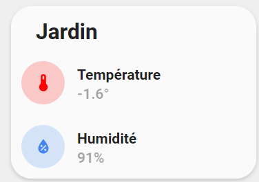
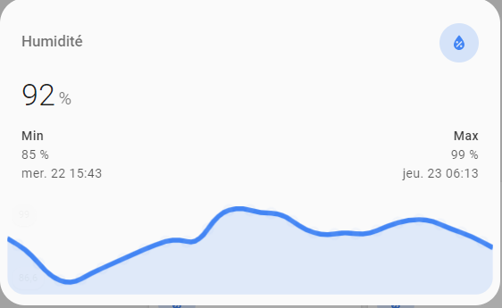
Je souhaiterais sur la carte si dessous que lorsque j’appuie sur la température ou l’humidité un pop s’ouvre avec le graph.
Code
- type: custom:button-card
  template:
    - custom_card_temperature
  variables:
    ulm_card_graph_title: "Jardin"
    ulm_card_graph_color: "var(--google-red)"
    ulm_card_graph_entity: sensor.netatmo_galahome_galastation_galamodule_temperature
    ulm_card_graph_color2: "var(--google-blue)"
    ulm_card_graph_entity2: sensor.netatmo_galahome_galastation_galamodule_humidity
    ulm_card_graph_type: fill
    ulm_card_graph_hours: 48
Template
custom_card_temperature:
  variables:
    ulm_card_graph_title: ""
    ulm_card_graph_color: "red"
    ulm_card_graph_name: "Température"
    ulm_card_graph_color2: "var(--info-color)"
    ulm_card_graph_name2: "Humidité"
    ulm_card_graph_entity2: ""
    ulm_card_graph_hours: 48
    ulm_card_graph_type: "fill"
  triggers_update: "all"
  styles:
    grid:
      - grid-template-areas: "'item1' 'item2' 'item3'"
      - grid-template-columns: "1fr"
      - grid-template-rows: "min-content  min-content"
    card:
      - border-radius: "var(--border-radius)"
      - box-shadow: "var(--box-shadow)"
      - padding: "0px"
  custom_fields:
    item1:
      card:
        type: "custom:button-card"
        template:
          - "card_title"
        name: "[[[ return variables.ulm_card_graph_title ]]]"
    item2:
      card:
        type: "custom:button-card"
        name: "[[[ return variables.ulm_card_graph_name ]]]"
        template:
          - "icon_info_bg"
        tap_action:
          action: fire-dom-event
          browser_mod:
            command: call-service
            service: browser_mod.popup
            service_data:
              deviceID:
                - this
              card:
                type: "custom:mini-graph-card"
                entity: "[[[ return variables.ulm_card_graph_entity ]]]"
                line_color: >
                  [[[
                    var col = [];
                    col.push(variables.ulm_card_graph_color);
                    return col;
                  ]]]
                show:
                  name: false
                  icon: false
                  legend: false
                  state: false
                  extrema: true
                  graph: "[[[ return variables.ulm_card_graph_type=='fill'?'line':variables.ulm_card_graph_type; ]]]"
                  fill: "[[[ return variables.ulm_card_graph_type=='fill'?true:false; ]]]"
                hours_to_show: "[[[ return variables.ulm_card_graph_hours; ]]]"
                hour24: true
                style: |
                  ha-card {
                    box-shadow: none;
                    border-radius: var(--border-radius);
                  }
        styles:
          icon:
            - color: "rgba(255,0,0, 1)"
          img_cell:
            - background-color: "rgba(255,0,0, 0.20)"
          card:
            - box-shadow: "none"
            - border-radius: "var(--border-radius) var(--border-radius) 0px 0px"
            - padding: "10px"
          label:
            - align-self: "center"
            - font-size: "14px"
        entity: "[[[ return variables.ulm_card_graph_entity ]]]"
        label: |
          [[[
                  return states[variables.ulm_card_graph_entity].state + "°";
          ]]]
    item3:
      card:
        type: "custom:button-card"
        name: "[[[ return variables.ulm_card_graph_name2 ]]]"
        template:
          - "icon_info_bg"
        styles:
          icon:
            - color: "rgba(66,133,244, 1)"
          img_cell:
            - background-color: "rgba(66,133,244, 0.20)"
          card:
            - box-shadow: "none"
            - border-radius: "var(--border-radius) var(--border-radius) 0px 0px"
            - padding: "10px"
          label:
            - align-self: "center"
            - font-size: "14px"
        entity: "[[[ return variables.ulm_card_graph_entity2 ]]]"
        label: |
          [[[
                  return states[variables.ulm_card_graph_entity2].state + "%";
          ]]]
Merci pour votre aide!
Hello,
Bon j’ai réussi à m’en sortir avec cette popup !! 
Juste un petit coup de main, je voudrais que l’icone soit du même style que ceux de la carte de base:
Je suppose que c’est dans la partie « ha-card » mais ce que j’ai essayé ne fonctionne pas…
Voici le code de la carte:
---
### Card Graph Custom ###
custom_card_temperature:
  variables:
    ulm_card_graph_entity: ""
    ulm_card_graph_title: ""
    ulm_card_graph_color: "red"
    ulm_card_graph_name: "Température"
    ulm_card_graph_color2: "var(--info-color)"
    ulm_card_graph_name2: "Humidité"
    ulm_card_graph_entity2: ""
    ulm_card_graph_hours: 48
    ulm_card_graph_type: "fill"
  triggers_update: "all"
  styles:
    grid:
      - grid-template-areas: "'item1' 'item2' 'item3'"
      - grid-template-columns: "1fr"
      - grid-template-rows: "min-content  min-content"
    card:
      - border-radius: "var(--border-radius)"
      - box-shadow: "var(--box-shadow)"
      - padding: "0px"
  custom_fields:
    item1:
      card:
        type: "custom:button-card"
        template:
          - "card_title"
        name: "[[[ return variables.ulm_card_graph_title ]]]"
    item2:
      card:
        type: "custom:button-card"
        name: "[[[ return variables.ulm_card_graph_name ]]]"
        template:
          - "icon_info_bg"
        entity: "[[[ return variables.ulm_card_graph_entity ]]]"
        label: |
          [[[
                  return states[variables.ulm_card_graph_entity].state + "°";
          ]]]
        tap_action:
          action: fire-dom-event
          browser_mod:
            service: browser_mod.popup
            data:
              content:
                type: "custom:mini-graph-card"
                template:
                  - "icon_info_bg"
                entities:
                  - entity: "[[[ return variables.ulm_card_graph_entity ]]]"
                    name: "[[[ return variables.ulm_card_graph_name ]]]"
                styles:
                  icon:
                    - color: "[[[ return `rgba(var(--color-${variables.ulm_card_graph_color}), 1)`;]]]"
                  img_cell:
                    - background-color: "[[[ return `rgba(var(--color-${variables.ulm_card_graph_color}), 0.20)`;]]]"
                  card:
                    - box-shadow: "none"
                    - border-radius: "none"
                    - padding-top: "1px"
                    - padding-bottom: "5px"
                line_color: >
                  [[[
                    var col = [];
                    col.push(variables.ulm_card_graph_color);
                    return col;
                  ]]]
                show:
                  name: true
                  icon: true
                  legend: true
                  state: true
                  extrema: true
                  graph: "[[[ return variables.ulm_card_graph_type=='fill'?'line':variables.ulm_card_graph_type; ]]]"
                  fill: "[[[ return variables.ulm_card_graph_type=='fill'?true:false; ]]]"
                hours_to_show: "[[[ return variables.ulm_card_graph_hours; ]]]"
                hour24: true
                style: |
                  ha-card {
                    box-shadow: none;
                    border-radius: var(--border-radius);
                  }
    item3:
      card:
        type: "custom:button-card"
        name: "[[[ return variables.ulm_card_graph_name2 ]]]"
        template:
          - "icon_info_bg"
        styles:
          icon:
            - color: "rgba(66,133,244, 1)"
          img_cell:
            - background-color: "rgba(66,133,244, 0.20)"
          card:
            - box-shadow: "none"
            - border-radius: "var(--border-radius) var(--border-radius) 0px 0px"
            - padding: "10px"
          label:
            - align-self: "center"
            - font-size: "14px"
        entity: "[[[ return variables.ulm_card_graph_entity2 ]]]"
        label: |
          [[[
                  return states[variables.ulm_card_graph_entity2].state + "%";
          ]]]
        tap_action:
          action: fire-dom-event
          browser_mod:
            service: browser_mod.popup
            data:
              content:
                type: "custom:mini-graph-card"
                entities:
                  - entity: "[[[ return variables.ulm_card_graph_entity2 ]]]"
                    name: "[[[ return variables.ulm_card_graph_name2 ]]]"
                line_color: >
                  [[[
                    var col = [];
                    col.push(variables.ulm_card_graph_color2);
                    return col;
                  ]]]
                show:
                  name: true
                  icon: true
                  legend: true
                  state: true
                  extrema: true
                  graph: "[[[ return variables.ulm_card_graph_type=='fill'?'line':variables.ulm_card_graph_type; ]]]"
                  fill: "[[[ return variables.ulm_card_graph_type=='fill'?true:false; ]]]"
                hours_to_show: "[[[ return variables.ulm_card_graph_hours; ]]]"
                hour24: true
                style: |
                  ha-card {
                    box-shadow: none;
                    border-radius: var(--border-radius);
                  }
Merci!
Bonjour,
pour changer la couleur de l’icone sur mini-graph-card ajoute c’est ligne dans style:
style: |
  ha-card .header.flex .icon {
    color: red;
  }
Bonus:
lien avec des exmples de card_mod pour plein de cartes. Tu trouvera ton bonheur pour custom les cartes.
https://community.home-assistant.io/t/card-mod-add-css-styles-to-any-lovelace-card/120744/1395
1 « J'aime »
Hello @WarC0zes,
Merci pour ton aide, j’ai essayé ton code:
style: |
  ha-card .header.flex .icon {
    color: red;
  }
Et celui là:
style: |
    ha-card {
      --card-mod-icon-color: red;
    }
Et cela fonctionne bien pour l’icone par contre, je ne trouve pas pour ajouter un background à cet icone…
Pour le background de l’icone:
  ha-card .header.flex .icon {
    color: orange;
    background: black;
  }
simplement…
Et pour mettre le background rond au lieu de carré?
C’est possible de faire un truc comme ça:
.header.flex .name.flex {
  color: "[[[ return variables.ulm_card_graph_color ]]]";
?
Mettre la couleur en variable?
Background rond:
            ha-card .header.flex .icon {
              color: orange;
              background: black;
              border-radius: 25px;
            }
pour ton variable, essaye ca:
.header.flex .name.flex {
  color: var(ulm_card_graph_color);
1 « J'aime »
Hello,
J’ai fait ça:
style: |
  ha-card .header.flex .name.flex {
    color: var(ulm_card_graph_color);
  }
  ha-card .header.flex .icon {
    color: var(ulm_card_graph_color);
    background: rgba(255,0,0,0.20);
    border-radius: 50px;
  }
Mais cela ne fonctionne pas pour les variables. Si je met direct le code RGBA c’est bon et pourtant c’est la même chose dans la variable ulm.
Et je n’arrive pas a agrandir le background de l’icone non plus.
Merci à toi.
Hello @WarC0zes , tu as une idée… je sèche complet… j’ai fouillé mais je ne trouve pas.
Aucune idée pour ton variable, d’ou mon abstention.
Tu devrait ouvrir un post pour ca.
Salut,
Essaye ça
style: |
  ha-card .header.flex .name.flex {
    color: var(--ulm_card_graph_color)  !important;
  }
  ha-card .header.flex .icon {
    color: var(--ulm_card_graph_color) !important;
    background: rgba(255,0,0,0.20);
    border-radius: 50px;
  }
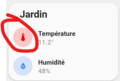
Merci @WarC0zes pour ton aide, tu sais comment agrandir le background de l’icone par hasard, il est tout petit actuellement:

VS

@Pulpy-Luke , non cela ne fonctionne pas non plus, est-ce la variable qui est mal déclarée?
ulm_card_graph_color: "rgba(255,0,0, 1)"
perso j’ai pas les " dans les thèmes
j’ai testé sans mais c’est pareil
vérifie tout ça avec le mode dev du navigateur => F12
Je sais pas trop ou regarder mais j’ai trouvé ça:
ha-card .header.flex .icon {
    color: rgb(var(--ulm_card_graph_color));
    background: rgba(255,0,0,0.20);
    border-radius: 50px;
}
Hello,
Bon j’ai laissé tombé les variable, tant pis.
Par contre j’ai toujours ce background qui est pas assez grand a mon gout.
VS
Une idée?
Bonsoir,
Ajoute du padding :
padding: 30px;
Je mets 30px mais tu ajusteras.
Attention, vide ton cache après les modifications.
Bob
1 « J'aime »
Arf… c’était ça…
Merci !!
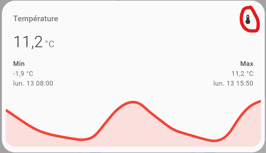
Sais-tu pour ajuster le popup sur le graph, pour pas avoir de bord blanc ?
Mais je ne sais pas comment…
style: |
    ha-card .header.flex .icon {
      color: rgba(255,0,0,1);
      background: rgba(255,0,0,0.20);
      border-radius: 50px;
      padding: 10px;
    }