Parfait merci pour ton retour !
Donc @la_mule dans mon exemple pour la carte Separator :
type: custom:bubble-card
card_type: separator
sub_button:
  - entity: switch.prise_1
    show_name: false
    show_state: true
styles: |
  .bubble-sub-button-1 {
    background-color: ${hass.states['switch.prise_1'].state === 'on' ? 'green' : 'grey'} !important;
  }
2 « J'aime »
selecus
Juillet 14, 2024, 11:17
124
salut @Clooos
et je vois que la communauté internationale sur GitHub t’occupe beaucoup, alors encore une fois, merci beaucoup pour tout le travail que tu fais
Clooos
Juillet 14, 2024, 12:24
125
Merci ! Et aucune idée pour les notifications, je n’ai rien changé à ce niveau.
Sinon la v2.1.0 stable vient de sortir
2 « J'aime »
Merci pour ce retour !
‹ ${hass.states[‹ switch.prise_1 ›]… ›
Je confirme que cela a bien l’effet escompté !
Pour changer la couleur du texte, j’ai trouvé la solution par hasard en ne tapant que ‹ color ›…
Tout est OK pour moi !
lilp
Juillet 16, 2024, 1:49
127
Bonjour,
Le souci n’est pas présent sur mobile.
type: vertical-stack
cards:
- show_current: true
show_forecast: true
type: weather-forecast
entity: weather.albert
forecast_type: daily
tap_action:
action: navigate
navigation_path: /lovelace/Meteo_detail
- type: vertical-stack
cards:
- type: custom:tabbed-card
options: {}
tabs:
- card:
type: horizontal-stack
cards:
- type: custom:bubble-card
card_type: button
button_type: state
card_layout: large-2-rows
name: LilP
entity: person.lilphoenix
icon: mdi:human-male
show_state: true
styles: |
.bubble-name-container {
margin-right: 0px !important;
}
.bubble-button-card-container {
background-color: ${state === 'home' ? 'green' : (hass.states['person.lilphoenix'].state == 'Work' ? 'red' : (hass.states['person.lilphoenix'].state == 'not_home' ? 'blue' : 'rgba(221,221,221,1'))} !important;
}
.bubble-sub-button-1 {
display: ${hass.states['sensor.oneplus_wifi_connection'].state == 'not connected' ? '' : ''} !important;
}
.bubble-sub-button-2 {
${icon.setAttribute("icon", hass.states['sensor.oneplus_battery_state'].state == 'charging' ? 'mdi:battery-charging' : 'mdi:battery')}
.bubble-sub-button-3 {
background-color: ${hass.states['person.lilphoenix'].state == 'home' ? 'green' : 'red'} !important;
}
.bubble-sub-button-4 {
background-color: ${hass.states['person.lilphoenix'].state == 'home' ? 'green' : 'red'} !important;
}
- type: custom:bubble-card
card_type: button
button_type: state
card_layout: large-2-rows
name: Flo
entity: person.flo
icon: mdi:human-male
show_state: true
styles: |
.bubble-name-container {
margin-right: 0px !important;
}
.bubble-button-card-container {
background-color: ${state == 'home' ? 'green' : (hass.states['person.flo'].state == 'Work' ? 'red' : (hass.states['person.flo'].state == 'not_home' ? 'blue' : 'rgba(221,221,221,1'))} !important;
}
.bubble-sub-button-1 {
display: ${hass.states['sensor.iphone_de_flo_ssid'].state == 'not connected' ? '' : ''} !important;
}
.bubble-sub-button-2 {
${icon.setAttribute("icon", hass.states['sensor.iphone_de_flo_battery_state'].state == 'charging' ? 'mdi:battery-charging' : 'mdi:battery')}
.bubble-sub-button-3 {
background-color: ${hass.states['person.flo'].state == 'home' ? 'green' : 'red'} !important;
}
.bubble-sub-button-4 {
background-color: ${hass.states['person.flo'].state == 'home' ? 'green' : 'red'} !important;
}
attributes:
label: Flo
attributes:
label: Présence
- card:
type: horizontal-stack
cards:
- type: custom:button-card
entity: person.lilphoenix
aspect_ratio: 1/1
name: LilPhoenix
show_entity_picture: true
show_name: true
tap_action:
action: navigate
navigation_path: /lovelace/lilp-details
hold_action:
action: none
styles:
card:
- border-radius: 5%
- padding: 5%
- color: gray
- font-size: 9px
- text-shadow: 0px 0px 0px black
- text-transform: capitalize
- justify-self: end
- align-self: middle
- color: |
[[[
if (entity.state == 'not_home') return "blue";
if (entity.state == 'home') return "#77c66e";
if (entity.state == 'work') return "orange";
return "lightblue";
]]]
grid:
- grid-template-areas: '"icon status" "n n" "battery proximity" "wifi alarm"'
- grid-template-columns: 2fr
- grid-template-rows: 2fr min-content min-content min-content min-content
name:
- font-size: 15px
- align-self: middle
- justify-self: start
- padding-bottom: 10px
custom_fields:
icon:
- clip-path: circle()
- width: 80%
- pointer-events: none
- display: grid
- border: 5px solid
- border-color: |
[[[
if (entity.state == 'not_home') return "blue";
if (entity.state == 'home') return "#77c66e";
if (entity.state == 'work') return "orange";
return "lightblue";
]]]
- border-radius: 500px
- margin: 0 +10% 0 0
- justify-self: end
- opacity: 1
status:
- align-self: start
- justify-self: end
proximity:
- padding: 0.5em 0px
- align-self: middle
- justify-self: end
- numeric_precision: 2
wifi:
- padding: 0.5em 0px
- align-self: middle
- justify-self: start
battery:
- padding: 0.5em 0px
- align-self: middle
- justify-self: start
alarm:
- padding: 0.5em 0px
- align-self: middle
- justify-self: end
calendar:
- padding: 0.5em 0px
- align-self: middle
- justify-self: end
custom_fields:
icon: |
[[[ return entity === undefined ? null : `<img
src="${states[entity.entity_id].attributes.entity_picture}"
width="100%">`; ]]]
status: |
[[[
if (entity.state =='not_home') {
return `<ha-icon icon="mdi:home-export-outline" style="width: 20px; height: 20px;color: '#EF4F1A';">
</ha-icon><span> Away</span>`;
}
if (entity.state =='home') {
return `<ha-icon icon="mdi:home" style="width: 20px; height: 20px;color: #77c66e;">
</ha-icon><span> ${entity.state} </span>`;
}
if (entity.state =='work') {
return `<ha-icon
icon="mdi:briefcase" style="width: 20px; height: 20px color: orange;">
</ha-icon><span> ${entity.state}</span>`;
}
else {
return `<ha-icon
icon="mdi:map-marker-radius" style="width: 20px; height: 20px color: blue;">
</ha-icon><span> ${entity.state}</span>`;
}
]]]
proximity: |
[[[
return `<ha-icon icon="mdi:map-marker-distance" style="width: 20px; height: 20px">
</ha-icon> Distance <span><span>${states['sensor.home_oneplus_distance'].state} Kms</span></span>`
]]]
battery: >
[[[ var mdi = states['sensor.oneplus_battery_state'].state
=='Charging'
? "mdi:battery-charging" : "mdi:battery";
return `<ha-icon icon= ${mdi} style="width: 20px; height: 20px">
</ha-icon><span>${helpers.localize(states['sensor.oneplus_battery_level'])}</span>`;
]]]
wifi: |
[[[ var id = states['sensor.oneplus_wifi_connection'];
return `<ha-icon icon=${id.attributes.icon} style="width: 20px; height: 20px">
</ha-icon> <span >${helpers.localize(id)}</span>`;
]]]
alarm: |
[[[
return `<ha-icon icon="mdi:alarm" style="width: 20px; height: 20px">
</ha-icon> <span><span >${states['sensor.oneplus_next_alarm'].state}</span></span>`
]]]
- type: custom:button-card
entity: person.flo
aspect_ratio: 1/1
name: Flo
show_entity_picture: true
show_name: true
hold_action:
action: none
state:
- value: home
styles:
custom_fields:
icon:
- border-color: '#77c66e'
- icon-color: green
- value: not_home
styles:
card: null
custom_fields:
icon:
- border-color: lightblue
- value: work
styles:
custom_fields:
icon:
- border-color: orange
- value: lyon
styles:
custom_fields:
icon:
- border-color: blue
- value: lamures
styles:
custom_fields:
icon:
- border-color: blue
styles:
card:
- border-radius: 5%
- padding: 5%
- color: gray
- font-size: 9px
- text-shadow: 0px 0px 0px black
- text-transform: capitalize
- justify-self: end
- align-self: middle
- color: |
[[[
if (entity.state == 'not_home') return "lightblue";
if (entity.state == 'home') return "#77c66e";
if (entity.state == 'work') return "orange";
return "blue";
]]]
grid:
- grid-template-areas: >-
"icon status" "n n" "battery proximity" "wifi alarm"
"sd sd"
- grid-template-columns: 2fr
- grid-template-rows: 1fr min-content min-content min-content min-content
name:
- font-size: 15px
- align-self: middle
- justify-self: start
- padding-bottom: 10px
custom_fields:
icon:
- clip-path: circle()
- width: 40%
- pointer-events: none
- display: grid
- border: 5px solid
- border-color: gray
- border-radius: 500px
- margin: 0 +10% 0 0
- justify-self: start
- opacity: 1
status:
- align-self: start
- justify-self: end
proximity:
- padding: 0.5em 0px
- align-self: middle
- justify-self: end
wifi:
- padding: 0.5em 0px
- align-self: middle
- justify-self: start
battery:
- padding: 0.5em 0px
- align-self: middle
- justify-self: start
alarm:
- padding: 0.5em 0px
- align-self: middle
- justify-self: end
custom_fields:
icon: >
[[[ return entity === undefined ? null : `<img
src="${states[entity.entity_id].attributes.entity_picture}"
width="100%">`; ]]]
status: |
[[[
if (states['person.flo'].state =='not_home') {
return `<ha-icon icon="mdi:home-export-outline"
style="width: 20px; height: 20px; color: '#EF4F1A';">
</ha-icon><span> Away</span>`;
}
if (states['person.flo'].state =='home') {
return `<ha-icon
icon="mdi:home"
style="width: 20px; height: 20px; color: #77c66e;">
</ha-icon><span> ${entity.state}</span>`;
}
if (states['person.flo'].state =='work') {
return `<ha-icon
icon="mdi:briefcase"
style="width: 20px; height: 20px; color: orange;">
</ha-icon><span> ${entity.state}</span>`;
}
else {
return `<ha-icon
icon="mdi:map-marker-radius"
style="width: 20px; height: 20px; color: blue;">
</ha-icon><span> ${entity.state}</span>`;
}
]]]
proximity: |
[[[
return `<ha-icon
icon="mdi:map-marker-distance"
style="width: 20px; height: 20px; color: var(--text-color-sensor);">
</ha-icon> <span>\<span style="color: var(--text-color-sensor);">${states['proximity.flo'].state} Kms</span></span>`
]]]
battery: |
[[[
if (states['sensor.iphone_de_flo_battery_state'].state =='charging') {
return `<ha-icon
icon="mdi:battery-charging"
style="width: 20px; height: 20px; color: var(--text-color-sensor);">
</ha-icon> <span><span style="color: var(--text-color-sensor);">${states['sensor.iphone_de_flo_battery_level'].state}% battery</span></span>`;
} else {
return `<ha-icon
icon="mdi:battery"
style="width: 20px; height: 20px; color: var(--text-color-sensor);">
</ha-icon> <span><span style="color: var(--text-color-sensor);">${states['sensor.iphone_de_flo_battery_level'].state}% battery</span></span>`;
}
]]]
wifi: |
[[[
if (states['sensor.iphone_de_flo_ssid'].state =='<not connected>') {
return `<ha-icon
icon="mdi:wifi"
style="width: 20px; height: 20px; color: var(--text-wifi-color-sensor);">
</ha-icon> <span><span style="color: var(--text-wifi-color-sensor);">Disconnected</span></span>`;
} else {
return `<ha-icon
icon="mdi:wifi"
style="width: 20px; height: 20px; color: var(--text-wifi-color-sensor);">
</ha-icon> <span><span style="color: var(--text-color-sensor);">${states['sensor.iphone_de_flo_ssid'].state}</span></span>`;
}
]]]
attributes:
label: Détails
- type: custom:mini-graph-card
name: Température
entities:
- entity: sensor.temperature_salon_temperature
name: Salon
color: green
tap_action:
double_tap_action: sensor.temperature_salon_humidity
action: more-info
action: more-info
- entity: sensor.ble_temperature_temperature_masterbedroom
name: Master bedroom
color: lightblue
- entity: sensor.ble_temperature_temperature_salle_de_bain
name: Salle de bain
color: yellow
- entity: sensor.temperature_158d0001c2a1bb
name: Bedroom
show:
labels: true
- type: custom:bubble-card
card_type: separator
name: Lumières
icon: mdi:lightbulb-multiple
- type: vertical-stack
cards:
- type: horizontal-stack
cards:
- type: custom:tabbed-card
options: {}
tabs:
- card:
type: vertical-stack
cards:
- type: custom:bubble-card
card_type: button
button_type: slider
entity: light.nous_p2_light_salon_1
name: Salon 1
icon: mdi:lightbulb
show_state: true
show_last_changed: true
scrolling_effect: true
button_action:
tap_action:
action: toggle
- type: custom:bubble-card
card_type: button
button_type: slider
entity: light.nous_p3_light_salon_2
name: Salon 2
icon: mdi:lightbulb
show_state: true
show_last_changed: true
scrolling_effect: true
button_action:
tap_action:
action: toggle
attributes:
label: Salon
icon: mdi:sofa
- card:
type: vertical-stack
cards:
- type: custom:bubble-card
card_type: button
button_type: slider
entity: light.ampoule_chambre_tbo
name: Tibo
icon: mdi:lightbulb
show_state: true
show_last_changed: true
scrolling_effect: true
button_action:
tap_action:
action: toggle
- type: custom:bubble-card
card_type: button
button_type: slider
entity: light.ampoule_chambre_flo
name: Flo
icon: mdi:lightbulb
show_state: true
show_last_changed: true
scrolling_effect: true
button_action:
tap_action:
action: toggle
- type: custom:bubble-card
card_type: button
button_type: slider
entity: light.nous_p3_light_chambre
name: Chambre
icon: mdi:lightbulb
show_state: true
show_last_changed: true
scrolling_effect: true
button_action:
tap_action:
action: toggle
attributes:
label: Masterbedroom
icon: mdi:bed-king
- card:
type: vertical-stack
cards:
- type: custom:bubble-card
card_type: button
button_type: slider
entity: light.ampoule_entree
name: Entrée
icon: mdi:lightbulb
show_state: true
show_last_changed: true
scrolling_effect: true
button_action:
tap_action:
action: toggle
attributes:
label: Entrée
icon: mdi:door
- type: custom:bubble-card
card_type: separator
name: Poubelles
icon: mdi:trash-can
- type: horizontal-stack
cards:
- type: custom:tabbed-card
options: {}
tabs:
- card:
type: custom:button-card
entity: sensor.poubelle_grise_jour
name: Poubelles
icon: mdi:trash-can
layout: icon_name_state2nd
show_state: true
size: 20%
custom_fields:
date: |
[[[
return 'Le ' + states['sensor.poubelle_grise_jour'].attributes.date;
]]]
state:
- value: Dans 7 Jours
operator: '=='
color: green
styles:
state:
- color: green
- value: Dans 6 Jours
operator: '=='
color: green
styles:
state:
- color: green
- value: Dans 5 Jours
operator: '=='
color: green
styles:
state:
- color: green
- value: Dans 4 Jours
operator: '=='
color: green
styles:
state:
- color: green
- value: Dans 3 Jours
operator: '=='
color: green
styles:
state:
- color: green
- value: Dans 2 Jours
operator: '=='
color: green
styles:
state:
- color: green
- value: Demain
operator: '=='
color: orange
icon: mdi:delete-restore
styles:
state:
- color: orange
- value: Aujourd'hui
operator: '=='
color: red
icon: mdi:delete-restore
styles:
state:
- color: red
styles:
icon:
- margin-left: 32px
name:
- margin-left: 6px
- justify-self: start
- font-size: 15px
state:
- font-weight: bold
- margin-left: 6px
- justify-self: start
- font-size: 12px
custom_fields:
date:
- top: 73%
- left: 43%
- position: absolute
- color: white
- font-size: 12px
attributes:
label: Poubelles
- card:
type: horizontal-stack
cards:
- type: custom:button-card
entity: sensor.poubelle_grise_jour
name: Poubelle grise
icon: mdi:trash-can
layout: icon_name_state2nd
show_state: true
size: 30%
custom_fields:
date: |
[[[
return 'Le ' + states['sensor.poubelle_grise_jour'].attributes.date;
]]]
state:
- value: Dans 7 Jours
operator: '=='
color: green
styles:
state:
- color: green
- value: Dans 6 Jours
operator: '=='
color: green
styles:
state:
- color: green
- value: Dans 5 Jours
operator: '=='
color: green
styles:
state:
- color: green
- value: Dans 4 Jours
operator: '=='
color: green
styles:
state:
- color: green
- value: Dans 3 Jours
operator: '=='
color: green
styles:
state:
- color: green
- value: Dans 2 Jours
operator: '=='
color: yellow
styles:
state:
- color: yellow
- value: Demain
operator: '=='
color: orange
icon: mdi:delete-restore
styles:
state:
- color: orange
- value: Aujourd'hui
operator: '=='
color: red
icon: mdi:delete-restore
styles:
state:
- color: red
styles:
icon:
- margin-left: 32px
name:
- margin-left: 6px
- justify-self: start
- font-size: 15px
state:
- font-weight: bold
- margin-left: 6px
- justify-self: start
- font-size: 12px
custom_fields:
date:
- top: 73%
- left: 43%
- position: absolute
- color: white
- font-size: 12px
- type: custom:button-card
entity: sensor.poubelle_jaune_jour
name: Poubelle Jaune
icon: mdi:trash-can
layout: icon_name_state2nd
show_state: true
size: 30%
custom_fields:
date: |
[[[
return 'Le ' + states['sensor.poubelle_jaune_jour'].attributes.date;
]]]
state:
- value: Dans 7 Jours
operator: '=='
color: green
styles:
state:
- color: green
- value: Dans 6 Jours
operator: '=='
color: green
styles:
state:
- color: green
- value: Dans 5 Jours
operator: '=='
color: green
styles:
state:
- color: green
- value: Dans 4 Jours
operator: '=='
color: green
styles:
state:
- color: green
- value: Dans 3 Jours
operator: '=='
color: green
styles:
state:
- color: green
- value: Dans 2 Jours
operator: '=='
color: yellow
styles:
state:
- color: yellow
- value: Demain
operator: '=='
color: orange
icon: mdi:delete-restore
styles:
state:
- color: orange
- value: Aujourd'hui
operator: '=='
color: red
icon: mdi:delete-restore
styles:
state:
- color: red
styles:
icon:
- margin-left: 32px
name:
- margin-left: 6px
- justify-self: start
- font-size: 15px
state:
- font-weight: bold
- margin-left: 6px
- justify-self: start
- font-size: 12px
custom_fields:
date:
- top: 73%
- left: 43%
- position: absolute
- color: white
- font-size: 12px
attributes:
label: Détails
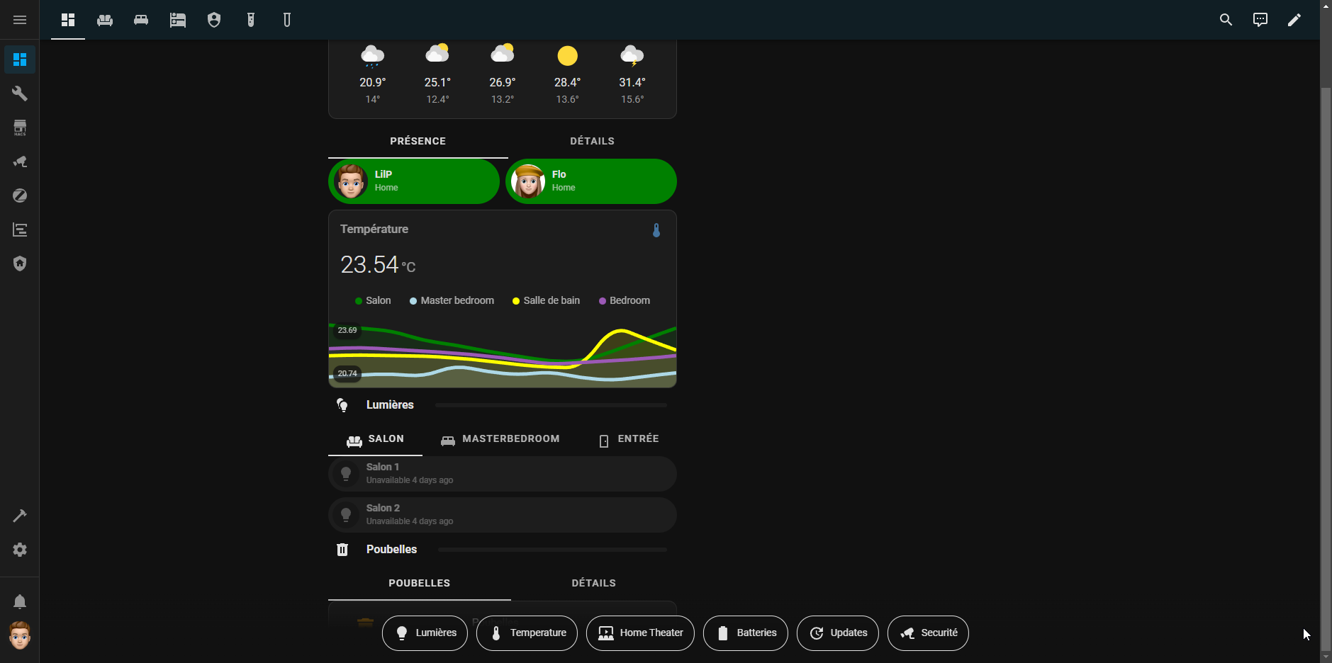
Arf, depuis la mise à jour 2.1 le code suivant ne fonctionne plus correctement! J’avais réussi à rendre les cartes Bubble moins… rondes.
Code
    styles: |
      /* main_card */
      ha-card {
        --bubble-button-background-color: transparent !important;
      }
      ha-card > div > div {
        border-radius: var(--ha-card-border-radius) !important;   /* ####################### de mémoire c'est ce paramètre ####################### */
      }
      ha-card > div > div > div {
        background-color: transparent !important;
      }

      /* text */
      div.bubble-name-container.name-container {
        color: var(--secondary-text-color);
      }
      .is-unavailable div.bubble-name-container.name-container {
        color: var(--warning-color);
      }
      .is-on div.bubble-name-container.name-container {
        color: var(--contrast);
      }

      /* sub_button */
      .bubble-sub-button-container > div {
        color: var(--primary-text-color) !important;
        background-color: var(--surface0) !important;
        opacity: ${state == 'on' ? '1' : 'var(--beta)' };
      }

      /* slider_radius */
      .range-fill {
        border-radius: 4px;
      }
Et j’en profite pour remonter le fait qu’avec un theme light… c’est loin d’être lisible… (voir capture ci-dessous)
Je pense qu’il y a confusion pour le thème clair; Bubble card n’a pas de thème dédié. De plus ton code montre que tu utilises les couleurs définies dans HA. C’est donc à toi de soit modifier ton thème soit choisir des couleurs « hors thème ».
Pour ton problème de bord tu peux le régler avec ça
ha-card > div > div {
  border-radius: 12px !important;
}
.bubble-button-card-container
 .bubble-range-slider {
   border-radius: 12px !important;
 }
Alors, j’ai trouvé pour le border-radius, quelque chose à changé dans le dev de la carte car mon code initial fonctionnait, cependant voici la solution pour mon ‹ problème ›:
div.bubble-range-slider.range-slider {
  border-radius: var(--ha-card-border-radius) !important;
}
Pour ce qui est du theme light, c’était en effet de mon ressort. la couleur accent-color de mon thème était trop sombre. J’ai simplement eu à l’éclaircir:
2 « J'aime »
la_mule
Juillet 21, 2024, 12:50
131
Bonjour,
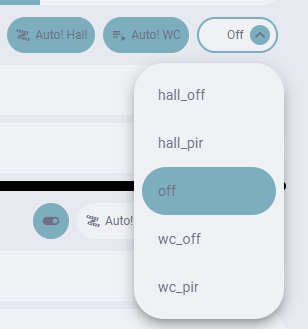
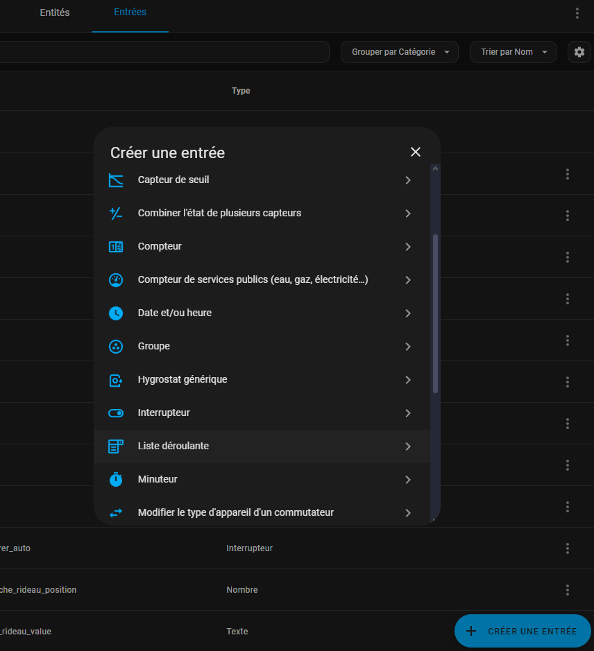
J’ai créé une bubble card de type select, impossible d’appeler une scène qui positionne mes volets. Même en créant une entrée de type liste déroulante, je ne peux pas appeler la scène. D’ailleur impossible de la modifié une fois créée.
J’avoue que j’ai vraiment du mal à bien saisir…
Quelqu’un saurait éclairer ma lanterne ?
pour créer un input_select, suis l’image ci-dessous
c’est grâce à un input_select que tu pourras utiliser ‹ select cards ›. tu as également besoin de savoir que input_select n’est pas réellement actionnable, comme un bouton. c’est un menu qui ne fait rien. si tu veux qu’il y ait des conséquences c’est à toi de tout programmer derrière. par exemple si tu veux si tu veux déclencher une action lorsque tu changeras d’une sélection à l’autre, c’est à toi de la programmer via une automatisation
Marleo
Juillet 22, 2024, 11:49
133
Salut
J’ai pas trouvé le code pour, si quelqu’un à l’info je suis preneur
Bonjour à tous.
J’ai un soucis d’affichage en mode normal ou en mode section.
En mode normal la carte est en mode scroll.
Savez-vous d’où ça vient ?
Merci bonne journée
azga
Juillet 24, 2024, 3:37
135
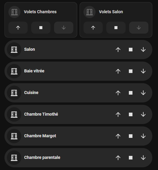
Bonjour,
Tout d’abord merci pour cette belle card
image
Merci
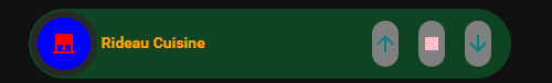
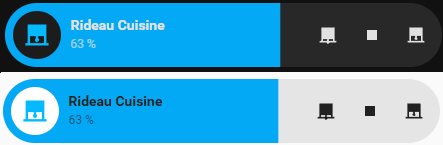
J’ai personnellement utilisé le type slider plutôt que cover pour mes rideaux ; et ça donne ça :
Le code YAML que j'ai utilisé
type: custom:bubble-card
card_type: button
button_type: slider
entity: cover.rideau_cuisine
icon: ''
card_layout: large
show_state: false
show_attribute: true
attribute: current_position
sub_button:
  - entity: cover.rideau_cuisine
    tap_action:
      action: call-service
      service: cover.close_cover
      target:
        entity_id: cover.rideau_cuisine
    show_background: false
    icon: mdi:roller-shade-closed
  - entity: cover.rideau_cuisine
    tap_action:
      action: call-service
      service: cover.stop_cover
      target:
        entity_id: cover.rideau_cuisine
    show_background: false
    icon: mdi:stop
  - entity: cover.rideau_cuisine
    tap_action:
      action: call-service
      service: cover.open_cover
      target:
        entity_id: cover.rideau_cuisine
    show_background: false
    icon: mdi:roller-shade
styles: |-
  .bubble-button-card-container {}
  .bubble-icon-container {}
  .bubble-icon {
    opacity: 1;
    color: ${state === 'closed' ? 'var(--primary-text-color)' : 'var(--primary-color)'} !important;
  }
Après j’ai fait une demande sur Github pour une amélioration du design dans le style du Media Player. Si cette idée te plaît tu peux aller voter pour:
azga
Juillet 24, 2024, 9:04
137
Sympa comme idée, effectivement.
selecus
Juillet 24, 2024, 10:03
138
du coup est-ce que tu peux dire plus précisément ce que tu cherches à modifier et comment tu voudrais le modifier pour le cover
azga
Juillet 25, 2024, 4:08
139
Mettre de la couleur pour chaque entités, icônes, textes… voir la possibilité de ce qui est possible ou non.
C’est bien vrai !
Bon je te propose ça… c’est moche mais c’est exhaustif. Je pense que tu as tout ce que tu as besoin.
type: custom:bubble-card
card_type: cover
entity: cover.rideau_cuisine
card_layout: large-2-rows
layout_options:
  grid_columns: 4
  grid_rows: 1
styles: |2-
     .bubble-cover-card-container {
      background: rgba(12,120,50,0.5) !important;
    }
    .bubble-icon-container  {
      background: blue !important;
    }
    .bubble-icon {
      color: red !important;
    }
    .bubble-name {
      color: orange !important;
    }
    .bubble-button  {
      background: grey !important;
    }
    .bubble-buttons .bubble-button .bubble-icon {
      color: teal !important;
    }
    .bubble-buttons .bubble-button .bubble-icon-stop {
      color: pink !important;
    }
azga
Juillet 25, 2024, 9:25
141
Oh super merci !
Avec ca, je vais pouvoir commencer a faire ce que je veux
Alors c’est possible de faire un volet roulant virtuel et de lui ajouter les paramètres qui te manque. Le lien ci-dessous explique comment faire mais ça peut être un peu abstrait à première vue.
J’ai fait ça avec mes rideaux