[CARTE] Réveil (ou activation d'automatisation)

sensor:
  - platform: template
    sensors: 
      #Capteur dont l'état est vide
      vide:
          value_template: "" 

D’ailleurs attention aux codes des templates qui bientôt ne seront plus supportés sous cette forme.

A mettre un label. De mémoire, il n’y avait pas la possibilité de mettre juste un label. Donc je crée une entité donc l’état est vide pour y insérer un préfixe.

c’est la variable qui indique si le reveil doit sonner?

Pas du tout, c’est l’icône qui active ou non.

C’est juste une variable utiliser dans une picture-elements afin de mettre un label.

De base, cette carte ne permet pas de mettre juste des texte. Donc je crée une entité vide et j’utilise l’élément state-label avec un préfixe. :innocent:

C’est un contournement d’une limitation.

Voici la liste des éléments depuis la doc :

@Gubu : cette carte est utilisée conjointement avec l’autre sujet :+1:

Bonjour @Clemalex , et Bravo pour ce réveil… Je suis débutant, et pense avoir bien intégrés tous les prérequis (card-mod, time-picker-card, button-card et custom-ui et l’image transparent… )
Par contre je n’ai aucune idée de l’endroit où il faut copier le code de la carte…? Dans quel fichier doit il se trouver? :crazy_face:
Merci!

Tu cliques sur ajouter une carte et tu prends la dernière « carte manuelle »

Super, merci… ça progresse… par contre, quand je clique sur le réveil ou les jour, rien ne change… une idée d’où je dois chercher?
image

Merci
Christian

Du côté des entités.

Tu ouvres un onglet en parallèle qui affiche les outils de développement de HA.

Et tu regarde sinle clique d’une entité sur la carte, influe bien sur l’entité dans les outils.

Bonjour @Clemalex , thanks again for this great work!.. After a long break, I worked on it again, and could get it work… :grinning:
However, as I like thinks to be perfect, I have two questions :

  • With the current theme (see below), I see some little grey border around the buttons… can I change them to background color in this card code?
  • How can I change in the code the color of the activated and disactivated day buttons? Can I do it directly in this card code?
    Thanks in advance!
1 « J'aime »

Hello
@Kri72 ,

pourriez-vous partager votre code cela nous permet également de voir comment supprimé ses lignes qui vous dérangent éventuellement.

could you share your code it also allows us to see how deleted its lines that bother you possibly.

@Kri72 :

Color management when it is disabled is done with opacity and black color (0,0,0,0)

Hello!!
Here is my code : :crazy_face:

Code

elements:

  • entity: sensor.vide
    prefix: Bureau
    style:
    color: var(–primary-color)
    font-size: 20px
    font-variant: small-caps
    left: 13%
    pointer-events: none
    top: 80%
    tap_action:
    action: none
    type: state-label
  • entity: input_boolean.wakestatus_1
    show_icon: false
    show_state: false
    styles:
    toogle:
    - transform: translateX(26px)
    card:
    - width: 60px
    - height: 40px
    - background: transparent
    - box-shadow: none
    custom_fields:
    toogle: |
    [[[
    return <div class="switch"> <span class="toggle-thumb"> <svg xmlns="http://www.w3.org/2000/svg" width="36" height="36" viewBox="0 0 24 24" style="fill:#4ADE80;transform:;-ms-filter:"><path d="M10 15.586L6.707 12.293 5.293 13.707 10 18.414 19.707 8.707 18.293 7.293z"></path></svg> <svg xmlns="http://www.w3.org/2000/svg" width="36" height="36" viewBox="0 0 24 24" style="fill:#F87171;transform:;-ms-filter:"><path d="M16.192 6.344L11.949 10.586 7.707 6.344 6.293 7.758 10.535 12 6.293 16.242 7.707 17.656 11.949 13.414 16.192 17.656 17.606 16.242 13.364 12 17.606 7.758z"></path></svg> </span> </div>
    ]]]
    type: custom:button-card
    style: |
    ha-card {
    margin: 0 0 130px 110px;
    }
    #toogle .switch {
    display: inline-block;
    width: 60px;
    height: 34px;
    position: relative;
    }
    .toggle-thumb {
    position: absolute;
    top: 0;
    left: 0;
    right: 0;
    bottom: 0;
    display: flex;
    justify-content: space-between;
    align-items: center;
    background-color: #3f3F3f;
    border-radius: 40px;
    cursor: pointer;
    }
    .toggle-thumb:before {
    content: «  »;
    height: 26px;
    width: 26px;
    position: absolute;
    left: 4px;
    bottom: 4px;
    border-radius: 50%;
    background-color: #EFEFEF;
    transition: .4s all ease;
    }
    .checkbox {
    opacity: 0;
    width: 0;
    height: 0;
    z-index: 100;
    }
    .toggle-thumb:before {
    {% if is_state(‹ input_boolean.wakestatus_1 ›, ‹ on ›) %}
    transform: translateX(26px);
    {% endif %}
    }
  • entity: input_datetime.wake_time_1
    hide:
    name: true
    hour_step: 1
    layout:
    align_controls: center
    name: inside
    link_values: true
    minute_step: 1
    name: ‹  ›
    style:
    .: |
    ha-card {
    box-shadow: none;
    background-color: rgba(0,0,0,0);
    opacity: {% if is_state(‹ input_boolean.wakestatus_1 ›, ‹ off ›) %} 0.3 {% endif %};
    pointer-events: {% if is_state(‹ input_boolean.wakestatus_1 ›, ‹ off ›) %} none {% endif %};
    }
    .time-picker-row{
    margin-left: 5px !important;
    }
    .time-picker-row:
    .time-picker-content:
    .: |
    .time-separator {
    display: none;
    }
    time-unit:
    $: |
    .time-unit {
    padding: 2px !important;
    }
    .time-input {
    border: 2px solid var(–primary-color) !important;
    background-color: rgba(0,0,0,0) !important;
    color: white !important;
    border-radius: 5px;
    }
    .time-picker-icon {
    color: var(–primary-color) !important;
    z-index: 100;
    }
    left: 45%
    top: 50%
    type: custom:time-picker-card
  • entity: input_boolean.wakeweekday_mon_1
    icon: mdi:alpha-l-circle
    show_label: false
    show_name: false
    show_state: false
    style:
    ‹ –paper-item-icon-color ›: var(–primary-color)
    right: 17%
    top: 20%
    styles:
    card:
    - width: 35px
    - height: 35px
    - border-radius: 999px
    - background-color: rgba(0, 0, 0, 0)
    - box-shadow: none
    - opacity: |
    [[[
    if ( (states[‹ input_boolean.wakestatus_1 ›].state == ‹ off ›) ) return ‹ 0.3 ›;
    else return ‹ 1 ›;
    ]]]
    - pointer-events: |
    [[[
    if ( (states[‹ input_boolean.wakestatus_1 ›].state == ‹ off ›) ) return ‹ none ›;
    else return ‹ auto ›;
    ]]]
    icon:
    - transform: scale(2.1)
    type: custom:button-card
  • entity: input_boolean.wakeweekday_tue_1
    icon: mdi:alpha-m-circle
    show_label: false
    show_name: false
    show_state: false
    style:
    ‹ –paper-item-icon-color ›: var(–primary-color)
    right: 7%
    top: 20%
    styles:
    card:
    - width: 35px
    - height: 35px
    - border-radius: 999px
    - background-color: rgba(0, 0, 0, 0)
    - box-shadow: none
    - opacity: |
    [[[
    if ( (states[‹ input_boolean.wakestatus_1 ›].state == ‹ off ›) ) return ‹ 0.3 ›;
    else return ‹ 1 ›;
    ]]]
    - pointer-events: |
    [[[
    if ( (states[‹ input_boolean.wakestatus_1 ›].state == ‹ off ›) ) return ‹ none ›;
    else return ‹ auto ›;
    ]]]
    icon:
    - transform: scale(2.1)
    type: custom:button-card
  • entity: input_boolean.wakeweekday_wed_1
    icon: mdi:alpha-m-circle
    show_label: false
    show_name: false
    show_state: false
    style:
    ‹ –paper-item-icon-color ›: var(–primary-color)
    right: 22%
    top: 50%
    styles:
    card:
    - width: 35px
    - height: 35px
    - border-radius: 999px
    - background-color: rgba(0, 0, 0, 0)
    - box-shadow: none
    - opacity: |
    [[[
    if ( (states[‹ input_boolean.wakestatus_1 ›].state == ‹ off ›) ) return ‹ 0.3 ›;
    else return ‹ 1 ›;
    ]]]
    - pointer-events: |
    [[[
    if ( (states[‹ input_boolean.wakestatus_1 ›].state == ‹ off ›) ) return ‹ none ›;
    else return ‹ auto ›;
    ]]]
    icon:
    - transform: scale(2.1)
    type: custom:button-card
  • entity: input_boolean.wakeweekday_thu_1
    icon: mdi:alpha-j-circle
    show_label: false
    show_name: false
    show_state: false
    style:
    ‹ –paper-item-icon-color ›: var(–primary-color)
    right: 12%
    top: 50%
    styles:
    card:
    - width: 35px
    - height: 35px
    - border-radius: 999px
    - background-color: rgba(0, 0, 0, 0)
    - box-shadow: none
    - opacity: |
    [[[
    if ( (states[‹ input_boolean.wakestatus_1 ›].state == ‹ off ›) ) return ‹ 0.3 ›;
    else return ‹ 1 ›;
    ]]]
    - pointer-events: |
    [[[
    if ( (states[‹ input_boolean.wakestatus_1 ›].state == ‹ off ›) ) return ‹ none ›;
    else return ‹ auto ›;
    ]]]
    icon:
    - transform: scale(2.1)
    type: custom:button-card
  • entity: input_boolean.wakeweekday_fri_1
    icon: mdi:alpha-v-circle
    show_label: false
    show_name: false
    show_state: false
    style:
    ‹ –paper-item-icon-color ›: var(–primary-color)
    right: 2%
    top: 50%
    styles:
    card:
    - width: 35px
    - height: 35px
    - border-radius: 999px
    - background-color: rgba(0, 0, 0, 0)
    - box-shadow: none
    - opacity: |
    [[[
    if ( (states[‹ input_boolean.wakestatus_1 ›].state == ‹ off ›) ) return ‹ 0.3 ›;
    else return ‹ 1 ›;
    ]]]
    - pointer-events: |
    [[[
    if ( (states[‹ input_boolean.wakestatus_1 ›].state == ‹ off ›) ) return ‹ none ›;
    else return ‹ auto ›;
    ]]]
    icon:
    - transform: scale(2.1)
    type: custom:button-card
  • entity: input_boolean.wakeweekday_sat_1
    icon: mdi:alpha-s-circle
    show_label: false
    show_name: false
    show_state: false
    style:
    ‹ –paper-item-icon-color ›: var(–primary-color)
    right: 17%
    top: 80%
    styles:
    card:
    - width: 35px
    - height: 35px
    - border-radius: 999px
    - background-color: rgba(0, 0, 0, 0)
    - box-shadow: none
    - opacity: |
    [[[
    if ( (states[‹ input_boolean.wakestatus_1 ›].state == ‹ off ›) ) return ‹ 0.3 ›;
    else return ‹ 1 ›;
    ]]]
    - pointer-events: |
    [[[
    if ( (states[‹ input_boolean.wakestatus_1 ›].state == ‹ off ›) ) return ‹ none ›;
    else return ‹ auto ›;
    ]]]
    icon:
    - transform: scale(2.1)
    type: custom:button-card
  • entity: input_boolean.wakeweekday_sun_1
    icon: mdi:alpha-d-circle
    show_label: false
    show_name: false
    show_state: false
    style:
    ‹ –paper-item-icon-color ›: var(–primary-color)
    right: 7%
    top: 80%
    styles:
    card:
    - width: 35px
    - height: 35px
    - border-radius: 999px
    - background-color: rgba(0, 0, 0, 0)
    - box-shadow: none
    - opacity: |
    [[[
    if ( (states[‹ input_boolean.wakestatus_1 ›].state == ‹ off ›) ) return ‹ 0.3 ›;
    else return ‹ 1 ›;
    ]]]
    - pointer-events: |
    [[[
    if ( (states[‹ input_boolean.wakestatus_1 ›].state == ‹ off ›) ) return ‹ none ›;
    else return ‹ auto ›;
    ]]]
    icon:
    - transform: scale(2.1)
    type: custom:button-card
    image: /local/images/transparent/transparent.png
    type: picture-elements
1 « J'aime »

Hello Clemalex… I’m talking about these grey lines, around the button :
image

It’s a french forum, so In french, please!

1 « J'aime »

Effectivement merci d’écrire en français à minima

Bonjour à tous…
J’avais mon réveil qui fonctionnait bien, et depuis peu, le switch que j’avais intégré ne s’affiche pas correctement.
image.
Je me suis dit que cela venait peut-être du lien « SVG namespace » qui ne fonctionnerait plus et l’ai donc remplacé par « https://www.svgrepo.com/show/33995/switch.svg », mais cela n’est pas mieux…
Auriez vous une idée de ce qui ne va pas?
Merci
Ci dessous le code

elements:
  - entity: sensor.vide
    prefix: Télétravail
    style:
      color: var(--primary-color)
      font-size: 20px
      font-variant: small-caps
      left: 13%
      pointer-events: none
      top: 80%
    tap_action:
      action: none
    type: state-label
  - entity: input_boolean.wakestatus_2
    show_icon: false
    show_state: false
    styles:
      toogle:
        - transform: translateX(26px)
      card:
        - width: 60px
        - height: 40px
        - background: transparent
        - box-shadow: none
    custom_fields:
      toogle: |
        [[[
         return `
           <div class="switch">
                <span class="toggle-thumb">
                     <svg xmlns="http://www.w3.org/2000/svg" width="36" height="36" viewBox="0 0 24 24" style="fill:#4ADE80;transform:;-ms-filter:"><path d="M10 15.586L6.707 12.293 5.293 13.707 10 18.414 19.707 8.707 18.293 7.293z"></path></svg>
                     <svg xmlns="http://www.w3.org/2000/svg" width="36" height="36" viewBox="0 0 24 24" style="fill:#F87171;transform:;-ms-filter:"><path d="M16.192 6.344L11.949 10.586 7.707 6.344 6.293 7.758 10.535 12 6.293 16.242 7.707 17.656 11.949 13.414 16.192 17.656 17.606 16.242 13.364 12 17.606 7.758z"></path></svg>
                </span>
           </div>`
        ]]]   
    type: custom:button-card
    style: |
      ha-card {
      margin: 0 0 130px 110px; 
      }  
      #toogle .switch {
          display: inline-block;
          width: 60px;
          height: 34px;
          position: relative;
        }
      .toggle-thumb {
          position: absolute;
          top: 0;
          left: 0;
          right: 0;
          bottom: 0;
          display: flex;
          justify-content: space-between;
          align-items: center;
          background-color: #3f3F3f;
          border-radius: 40px;
          cursor: pointer;
        }
      .toggle-thumb:before {
           content: "";
           height: 26px;
           width: 26px;
           position: absolute;
           left: 4px;
           bottom: 4px;
           border-radius: 50%;
           background-color: #EFEFEF;
           transition: .4s all ease;
         }
      .checkbox {
          opacity: 0;
          width: 0;
          height: 0;
          z-index: 100;
        }
      .toggle-thumb:before {
        {% if is_state('input_boolean.wakestatus_2', 'on') %}
          transform: translateX(26px);
        {% endif %}
      } 
  - entity: input_datetime.wake_time_2
    hide:
      name: true
    hour_step: 1
    layout:
      align_controls: center
      name: inside
    link_values: true
    minute_step: 1
    name: ''
    style:
      .: |
        ha-card {
          box-shadow: none;
          background-color: rgba(0,0,0,0);
          opacity: {% if is_state('input_boolean.wakestatus_2', 'off') %} 0.3 {% endif %};
          pointer-events: {% if is_state('input_boolean.wakestatus_2', 'off') %} none {% endif %};
        }
        .time-picker-row{
          margin-left: 5px !important;
        }
      .time-picker-row:
        .time-picker-content:
          .: |
            .time-separator {
              display: none;
            }
          time-unit:
            $: |
              .time-unit {
                padding: 2px !important;
              }
              .time-input {
                border: 2px solid var(--primary-color) !important;
                background-color: rgba(0,0,0,0) !important;
                color: white !important;
                border-radius: 5px;
              }     
              .time-picker-icon {
                color: var(--primary-color) !important;
                z-index: 100;
              }
      left: 45%
      top: 50%
    type: custom:time-picker-card
  - entity: input_boolean.wakeweekday_mon_2
    icon: mdi:alpha-l-circle
    show_label: false
    show_name: false
    show_state: false
    style:
      '--paper-item-icon-color': var(--primary-color)
      right: 17%
      top: 20%
    styles:
      card:
        - width: 35px
        - height: 35px
        - border-radius: 999px
        - background-color: rgba(0, 0, 0, 0)
        - box-shadow: none
        - opacity: |
            [[[
              if ( (states['input_boolean.wakestatus_2'].state == 'off') ) return '0.3';
              else return '1';
            ]]] 
        - pointer-events: |
            [[[
              if ( (states['input_boolean.wakestatus_2'].state == 'off') ) return 'none';
              else return 'auto';
            ]]] 
      icon:
        - transform: scale(2.1)
    type: custom:button-card
  - entity: input_boolean.wakeweekday_tue_2
    icon: mdi:alpha-m-circle
    show_label: false
    show_name: false
    show_state: false
    style:
      '--paper-item-icon-color': var(--primary-color)
      right: 7%
      top: 20%
    styles:
      card:
        - width: 35px
        - height: 35px
        - border-radius: 999px
        - background-color: rgba(0, 0, 0, 0)
        - box-shadow: none
        - opacity: |
            [[[
              if ( (states['input_boolean.wakestatus_2'].state == 'off') ) return '0.3';
              else return '1';
            ]]] 
        - pointer-events: |
            [[[
              if ( (states['input_boolean.wakestatus_2'].state == 'off') ) return 'none';
              else return 'auto';
            ]]] 
      icon:
        - transform: scale(2.1)
    type: custom:button-card
  - entity: input_boolean.wakeweekday_wed_2
    icon: mdi:alpha-m-circle
    show_label: false
    show_name: false
    show_state: false
    style:
      '--paper-item-icon-color': var(--primary-color)
      right: 22%
      top: 50%
    styles:
      card:
        - width: 35px
        - height: 35px
        - border-radius: 999px
        - background-color: rgba(0, 0, 0, 0)
        - box-shadow: none
        - opacity: |
            [[[
              if ( (states['input_boolean.wakestatus_2'].state == 'off') ) return '0.3';
              else return '1';
            ]]] 
        - pointer-events: |
            [[[
              if ( (states['input_boolean.wakestatus_2'].state == 'off') ) return 'none';
              else return 'auto';
            ]]] 
      icon:
        - transform: scale(2.1)
    type: custom:button-card
  - entity: input_boolean.wakeweekday_thu_2
    icon: mdi:alpha-j-circle
    show_label: false
    show_name: false
    show_state: false
    style:
      '--paper-item-icon-color': var(--primary-color)
      right: 12%
      top: 50%
    styles:
      card:
        - width: 35px
        - height: 35px
        - border-radius: 999px
        - background-color: rgba(0, 0, 0, 0)
        - box-shadow: none
        - opacity: |
            [[[
              if ( (states['input_boolean.wakestatus_2'].state == 'off') ) return '0.3';
              else return '1';
            ]]] 
        - pointer-events: |
            [[[
              if ( (states['input_boolean.wakestatus_2'].state == 'off') ) return 'none';
              else return 'auto';
            ]]] 
      icon:
        - transform: scale(2.1)
    type: custom:button-card
  - entity: input_boolean.wakeweekday_fri_2
    icon: mdi:alpha-v-circle
    show_label: false
    show_name: false
    show_state: false
    style:
      '--paper-item-icon-color': var(--primary-color)
      right: 2%
      top: 50%
    styles:
      card:
        - width: 35px
        - height: 35px
        - border-radius: 999px
        - background-color: rgba(0, 0, 0, 0)
        - box-shadow: none
        - opacity: |
            [[[
              if ( (states['input_boolean.wakestatus_2'].state == 'off') ) return '0.3';
              else return '1';
            ]]] 
        - pointer-events: |
            [[[
              if ( (states['input_boolean.wakestatus_2'].state == 'off') ) return 'none';
              else return 'auto';
            ]]] 
      icon:
        - transform: scale(2.1)
    type: custom:button-card
  - entity: input_boolean.wakeweekday_sat_2
    icon: mdi:alpha-s-circle
    show_label: false
    show_name: false
    show_state: false
    style:
      '--paper-item-icon-color': var(--primary-color)
      right: 17%
      top: 80%
    styles:
      card:
        - width: 35px
        - height: 35px
        - border-radius: 999px
        - background-color: rgba(0, 0, 0, 0)
        - box-shadow: none
        - opacity: |
            [[[
              if ( (states['input_boolean.wakestatus_2'].state == 'off') ) return '0.3';
              else return '1';
            ]]] 
        - pointer-events: |
            [[[
              if ( (states['input_boolean.wakestatus_2'].state == 'off') ) return 'none';
              else return 'auto';
            ]]] 
      icon:
        - transform: scale(2.1)
    type: custom:button-card
  - entity: input_boolean.wakeweekday_sun_2
    icon: mdi:alpha-d-circle
    show_label: false
    show_name: false
    show_state: false
    style:
      '--paper-item-icon-color': var(--primary-color)
      right: 7%
      top: 80%
    styles:
      card:
        - width: 35px
        - height: 35px
        - border-radius: 999px
        - background-color: rgba(0, 0, 0, 0)
        - box-shadow: none
        - opacity: |
            [[[
              if ( (states['input_boolean.wakestatus_2'].state == 'off') ) return '0.3';
              else return '1';
            ]]] 
        - pointer-events: |
            [[[
              if ( (states['input_boolean.wakestatus_2'].state == 'off') ) return 'none';
              else return 'auto';
            ]]] 
      icon:
        - transform: scale(2.1)


> elements:
>   - entity: sensor.vide
>     prefix: Télétravail
>     style:
>       color: var(--primary-color)
>       font-size: 20px
>       font-variant: small-caps
>       left: 13%
>       pointer-events: none
>       top: 80%
>     tap_action:
>       action: none
>     type: state-label
>   - entity: input_boolean.wakestatus_2
>     show_icon: false
>     show_state: false
>     styles:
>       toogle:
>         - transform: translateX(26px)
>       card:
>         - width: 60px
>         - height: 40px
>         - background: transparent
>         - box-shadow: none
>     custom_fields:
>       toogle: |
>         [[[
>          return `
>            <div class="switch">
>                 <span class="toggle-thumb">
>                      <svg xmlns="http://www.w3.org/2000/svg" width="36" height="36" viewBox="0 0 24 24" style="fill:#4ADE80;transform:;-ms-filter:"><path d="M10 15.586L6.707 12.293 5.293 13.707 10 18.414 19.707 8.707 18.293 7.293z"></path></svg>
>                      <svg xmlns="http://www.w3.org/2000/svg" width="36" height="36" viewBox="0 0 24 24" style="fill:#F87171;transform:;-ms-filter:"><path d="M16.192 6.344L11.949 10.586 7.707 6.344 6.293 7.758 10.535 12 6.293 16.242 7.707 17.656 11.949 13.414 16.192 17.656 17.606 16.242 13.364 12 17.606 7.758z"></path></svg>
>                 </span>
>            </div>`
>         ]]]   
>     type: custom:button-card
>     style: |
>       ha-card {
>       margin: 0 0 130px 110px; 
>       }  
>       #toogle .switch {
>           display: inline-block;
>           width: 60px;
>           height: 34px;
>           position: relative;
>         }
>       .toggle-thumb {
>           position: absolute;
>           top: 0;
>           left: 0;
>           right: 0;
>           bottom: 0;
>           display: flex;
>           justify-content: space-between;
>           align-items: center;
>           background-color: #3f3F3f;
>           border-radius: 40px;
>           cursor: pointer;
>         }
>       .toggle-thumb:before {
>            content: "";
>            height: 26px;
>            width: 26px;
>            position: absolute;
>            left: 4px;
>            bottom: 4px;
>            border-radius: 50%;
>            background-color: #EFEFEF;
>            transition: .4s all ease;
>          }
>       .checkbox {
>           opacity: 0;
>           width: 0;
>           height: 0;
>           z-index: 100;
>         }
>       .toggle-thumb:before {
>         {% if is_state('input_boolean.wakestatus_2', 'on') %}
>           transform: translateX(26px);
>         {% endif %}
>       } 
>   - entity: input_datetime.wake_time_2
>     hide:
>       name: true
>     hour_step: 1
>     layout:
>       align_controls: center
>       name: inside
>     link_values: true
>     minute_step: 1
>     name: ''
>     style:
>       .: |
>         ha-card {
>           box-shadow: none;
>           background-color: rgba(0,0,0,0);
>           opacity: {% if is_state('input_boolean.wakestatus_2', 'off') %} 0.3 {% endif %};
>           pointer-events: {% if is_state('input_boolean.wakestatus_2', 'off') %} none {% endif %};
>         }
>         .time-picker-row{
>           margin-left: 5px !important;
>         }
>       .time-picker-row:
>         .time-picker-content:
>           .: |
>             .time-separator {
>               display: none;
>             }
>           time-unit:
>             $: |
>               .time-unit {
>                 padding: 2px !important;
>               }
>               .time-input {
>                 border: 2px solid var(--primary-color) !important;
>                 background-color: rgba(0,0,0,0) !important;
>                 color: white !important;
>                 border-radius: 5px;
>               }     
>               .time-picker-icon {
>                 color: var(--primary-color) !important;
>                 z-index: 100;
>               }
>       left: 45%
>       top: 50%
>     type: custom:time-picker-card
>   - entity: input_boolean.wakeweekday_mon_2
>     icon: mdi:alpha-l-circle
>     show_label: false
>     show_name: false
>     show_state: false
>     style:
>       '--paper-item-icon-color': var(--primary-color)
>       right: 17%
>       top: 20%
>     styles:
>       card:
>         - width: 35px
>         - height: 35px
>         - border-radius: 999px
>         - background-color: rgba(0, 0, 0, 0)
>         - box-shadow: none
>         - opacity: |
>             [[[
>               if ( (states['input_boolean.wakestatus_2'].state == 'off') ) return '0.3';
>               else return '1';
>             ]]] 
>         - pointer-events: |
>             [[[
>               if ( (states['input_boolean.wakestatus_2'].state == 'off') ) return 'none';
>               else return 'auto';
>             ]]] 
>       icon:
>         - transform: scale(2.1)
>     type: custom:button-card
>   - entity: input_boolean.wakeweekday_tue_2
>     icon: mdi:alpha-m-circle
>     show_label: false
>     show_name: false
>     show_state: false
>     style:
>       '--paper-item-icon-color': var(--primary-color)
>       right: 7%
>       top: 20%
>     styles:
>       card:
>         - width: 35px
>         - height: 35px
>         - border-radius: 999px
>         - background-color: rgba(0, 0, 0, 0)
>         - box-shadow: none
>         - opacity: |
>             [[[
>               if ( (states['input_boolean.wakestatus_2'].state == 'off') ) return '0.3';
>               else return '1';
>             ]]] 
>         - pointer-events: |
>             [[[
>               if ( (states['input_boolean.wakestatus_2'].state == 'off') ) return 'none';
>               else return 'auto';
>             ]]] 
>       icon:
>         - transform: scale(2.1)
>     type: custom:button-card
>   - entity: input_boolean.wakeweekday_wed_2
>     icon: mdi:alpha-m-circle
>     show_label: false
>     show_name: false
>     show_state: false
>     style:
>       '--paper-item-icon-color': var(--primary-color)
>       right: 22%
>       top: 50%
>     styles:
>       card:
>         - width: 35px
>         - height: 35px
>         - border-radius: 999px
>         - background-color: rgba(0, 0, 0, 0)
>         - box-shadow: none
>         - opacity: |
>             [[[
>               if ( (states['input_boolean.wakestatus_2'].state == 'off') ) return '0.3';
>               else return '1';
>             ]]] 
>         - pointer-events: |
>             [[[
>               if ( (states['input_boolean.wakestatus_2'].state == 'off') ) return 'none';
>               else return 'auto';
>             ]]] 
>       icon:
>         - transform: scale(2.1)
>     type: custom:button-card
>   - entity: input_boolean.wakeweekday_thu_2
>     icon: mdi:alpha-j-circle
>     show_label: false
>     show_name: false
>     show_state: false
>     style:
>       '--paper-item-icon-color': var(--primary-color)
>       right: 12%
>       top: 50%
>     styles:
>       card:
>         - width: 35px
>         - height: 35px
>         - border-radius: 999px
>         - background-color: rgba(0, 0, 0, 0)
>         - box-shadow: none
>         - opacity: |
>             [[[
>               if ( (states['input_boolean.wakestatus_2'].state == 'off') ) return '0.3';
>               else return '1';
>             ]]] 
>         - pointer-events: |
>             [[[
>               if ( (states['input_boolean.wakestatus_2'].state == 'off') ) return 'none';
>               else return 'auto';
>             ]]] 
>       icon:
>         - transform: scale(2.1)
>     type: custom:button-card
>   - entity: input_boolean.wakeweekday_fri_2
>     icon: mdi:alpha-v-circle
>     show_label: false
>     show_name: false
>     show_state: false
>     style:
>       '--paper-item-icon-color': var(--primary-color)
>       right: 2%
>       top: 50%
>     styles:
>       card:
>         - width: 35px
>         - height: 35px
>         - border-radius: 999px
>         - background-color: rgba(0, 0, 0, 0)
>         - box-shadow: none
>         - opacity: |
>             [[[
>               if ( (states['input_boolean.wakestatus_2'].state == 'off') ) return '0.3';
>               else return '1';
>             ]]] 
>         - pointer-events: |
>             [[[
>               if ( (states['input_boolean.wakestatus_2'].state == 'off') ) return 'none';
>               else return 'auto';
>             ]]] 
>       icon:
>         - transform: scale(2.1)
>     type: custom:button-card
>   - entity: input_boolean.wakeweekday_sat_2
>     icon: mdi:alpha-s-circle
>     show_label: false
>     show_name: false
>     show_state: false
>     style:
>       '--paper-item-icon-color': var(--primary-color)
>       right: 17%
>       top: 80%
>     styles:
>       card:
>         - width: 35px
>         - height: 35px
>         - border-radius: 999px
>         - background-color: rgba(0, 0, 0, 0)
>         - box-shadow: none
>         - opacity: |
>             [[[
>               if ( (states['input_boolean.wakestatus_2'].state == 'off') ) return '0.3';
>               else return '1';
>             ]]] 
>         - pointer-events: |
>             [[[
>               if ( (states['input_boolean.wakestatus_2'].state == 'off') ) return 'none';
>               else return 'auto';
>             ]]] 
>       icon:
>         - transform: scale(2.1)
>     type: custom:button-card
>   - entity: input_boolean.wakeweekday_sun_2
>     icon: mdi:alpha-d-circle
>     show_label: false
>     show_name: false
>     show_state: false
>     style:
>       '--paper-item-icon-color': var(--primary-color)
>       right: 7%
>       top: 80%
>     styles:
>       card:
>         - width: 35px
>         - height: 35px
>         - border-radius: 999px
>         - background-color: rgba(0, 0, 0, 0)
>         - box-shadow: none
>         - opacity: |
>             [[[
>               if ( (states['input_boolean.wakestatus_2'].state == 'off') ) return '0.3';
>               else return '1';
>             ]]] 
>         - pointer-events: |
>             [[[
>               if ( (states['input_boolean.wakestatus_2'].state == 'off') ) return 'none';
>               else return 'auto';
>             ]]] 
>       icon:
>         - transform: scale(2.1)
>     type: custom:button-card
> image: /local/images/transparent/transparent.png
> type: picture-elements

Salut @Kri72

Il faudrait utiliser la bonne balise pour l’insertion de code :wink:

image

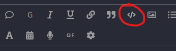
Là c’est juste pas possible :stuck_out_tongue:

Mais déjà, tu peux aller faire un tour sur ce post :

Super, merci beaucoup,
J’ai modifié mon post avec la bonne balise, et ai appliqué les changements… tout fonctionne correctement à nouveau!
image
Merci beaucoup! :smile: