bonjour j’arrive pas a comprendre pourquoi je n’arrive pas a avoir les bouton de contrôle en bas j’ai pourtant recopier ton code mais en lecture j’ai plus rien sous la ligne lecture en cours.
Salut
Tu es en local quand tu regarde dans HA?
En local tu auras les contrôles mais à distance ils seront absents.
Et cela dépend aussi de ton media_player et de ces attributs
Tu récupères ou les attributs, en local ou a distance j ai pas de changement
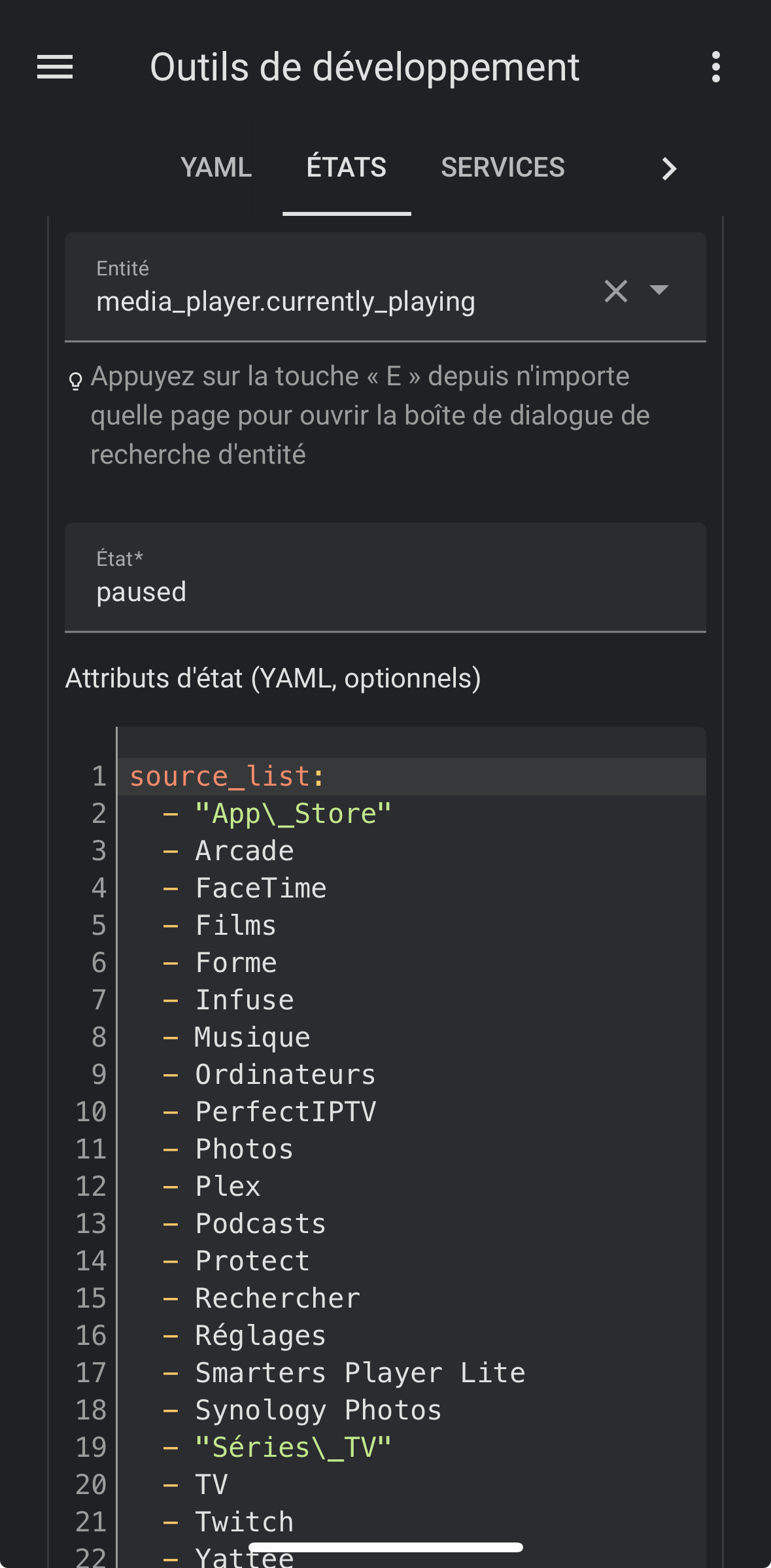
Tout semble en règle,
Tu peux partager ton code complet pour voir
type: custom:stack-in-card
cards:
  - type: custom:mushroom-media-player-card
    entity: media_player.plex_sony_tv
    icon: mdi:play
    use_media_info: true
    use_media_artwork: false
    show_volume_level: false
    media_controls:
      - play_pause_stop
      - previous
      - next
    fill_container: false
    card_mod:
      style: |
        mushroom-shape-icon {
          display: flex;
          {% set media_type = state_attr(config.entity, 'media_content_type') %}
          {% if media_type == 'tvshow' %}
            --card-mod-icon: mdi:television-classic;
            animation: flicker 1s linear infinite alternate;
          {% elif media_type == 'movie' %}
            --card-mod-icon: mdi:movie-roll;
            animation: spin 2s linear infinite reverse;
          {% elif media_type == 'video' %}
            --card-mod-icon: mdi:movie-roll;
            animation: spin 2s linear infinite reverse;
          {% elif media_type == 'music' %}
            --card-mod-icon: mdi:music;
            animation: beat 1.3s ease-out infinite both;
          {% elif media_type == 'playlist' %}
            --card-mod-icon: mdi:music;
            animation: beat 1.3s ease-out infinite both;
          {% else %}
            --card-mod-icon: mdi:play;
          {% endif %}

          {{ 'animation: none;' if not is_state(config.entity, 'playing') }}

        }
        @keyframes flicker {
          0%, 31.98%, 32.98%, 34.98%, 36.98%, 39.98%, 67.98%, 68.98%, 95.98%, 96.98%, 97.98%, 98.98%, 100% { --icon-color: rgba(var(--rgb-indigo), 1); }
          32%, 33%, 35%, 36%, 37%, 40%, 68%, 69%, 96%, 97%, 98%, 99% { --icon-color: rgba(var(--rgb-indigo), 0.6); }
        }
        @keyframes beat {
          0%, 60% { --icon-symbol-size: 21px; }
          5%, 17%, 57% { --icon-symbol-size: 22px; }
          10%, 20%, 51% { --icon-symbol-size: 23px; }
          25%, 45% { --icon-symbol-size: 24px; }
          30%, 39% { --icon-symbol-size: 25px; }
          33% { --icon-symbol-size: 26px; }
        }
        ha-card {
          --ha-card-border-width: 0;
        }
        ha-card:before {
          transform: translate3d(0,0,0);
          -webkit-transform: translate3d(0,0,0);
          content: "";

          background: url('/local/idle_art.png') center no-repeat;
          {% if not (is_state('media_player.plex_sony_tv', 'idle') or is_state('media_player.plex_sony_tv', 'standby')) %}
            background: url( '{{ state_attr(config.entity, "entity_picture") }}') center no-repeat;
          {% endif %}

          width: 50%;
          height: auto;
          background-size: contain;
          margin: 4px 4px 16px;
          margin-left: auto;
          margin-right: auto;
          filter: drop-shadow(4px 4px 6px rgba(0, 0, 0, 0.5));
          border-radius: var(--control-border-radius);

          {% set media_type = state_attr(config.entity, 'media_content_type') %}
          {% if media_type == 'tvshow' %}
            aspect-ratio: 2 / 3;
          {% elif media_type == 'movie' %}
            aspect-ratio: 2 / 3;
          {% elif media_type == 'video' %}
            aspect-ratio: 2 / 3;
          {% else %}
            aspect-ratio: 1 / 1;
          {% endif %}
        }
  - type: conditional
    conditions:
      - entity: media_player.plex_sony_tv
        state_not: 'off'
      - entity: media_player.plex_sony_tv
        state_not: idle
    card:
      entity: media_player.plex_sony_tv
      hide:
        icon: true
        name: true
        runtime: true
        source: true
        power: true
        state_label: true
        volume: true
        info: true
        progress: false
        controls: true
      more_info: false
      type: custom:mini-media-player
      toggle_power: false
      group: true
      card_mod:
        style:
          mmp-progress$: |
            paper-progress {
              /* Apply album art color to progress bar when paused */
              --paper-progress-container-color: rgba(var(--album-art-color), 0.2) !important;
              /* Apply album art color to progress bar when playing */
              --paper-progress-active-color: rgb(var(--album-art-color)) !important;
            }
          .: |
            ha-card {
                /* Move progress bar up into gap. Check if PLAY|STOP are supported */
              --base-offset: calc(0 * var(--mush-spacing, 12px)
                                  + 1.33 * var(--mush-spacing, 12px)
                                  + var(--mush-card-primary-line-height, 1.5) * var(--mush-card-primary-font-size, 14px)
                                  + var(--mush-card-secondary-line-height, 1.5) * var(--mush-card-secondary-font-size, 12px)
                                  + var(--mush-control-height, 42px));

                /* Check if Play (16385) or Stop (4096) are supported and add control button height if they are */
              {% if state_attr(config.entity, 'supported_features') | int | bitwise_and(20480) > 0 %}
                --control-offset: calc(var(--mush-spacing, 12px) + var(--mush-control-height, 42px));
              {% else %}
                --control-offset: 0px;
              {% endif %}

                /* Check if album name is present and add to height if it is */
              {% set album_name = state_attr(config.entity, 'media_album_name') %}
              {% if album_name == None or album_name == "" %}
                --album-offset: 0px;
              {% else %}
                --album-offset: calc(var(--mush-card-secondary-line-height, 1.5) * var(--mush-card-secondary-font-size, 12px));
              {% endif %}

                bottom: calc(var(--base-offset) + var(--control-offset) + var(--album-offset));

                /* Correct margins for progress bar */
              margin: 0px 28px -12px;

                /* Set height of card to match pregress bar height */
              height: var(--mmp-progress-height);

                /* Remove border outline */
              --ha-card-border-width: 0;

                /* Round corners of progress bar */
              --mmp-border-radius: var(--control-border-radius, 12px) !important;

                /* Set height of progress bar */
              --mmp-progress-height: 12px !important;

                /* Remove transitions to prevent progress bar floating in */
              transition: all 0s;
            }
card_mod:
  style: |
    ha-card:before {
      transform: translate3d(0,0,0);
      -webkit-transform: translate3d(0,0,0);
      content: "";
      position: absolute;
      height: 100%;
      width: 100%;

      background: url('/local/idle_art.png') center no-repeat;
      {% if not (is_state('media_player.plex_sony_tv', 'idle') or is_state('media_player.plex_sony_tv', 'standby')) %}
        background: url( '{{ state_attr('media_player.plex_sony_tv', "entity_picture") }}' ) center no-repeat;
      {% endif %}

      filter: blur(150px) saturate(200%);
      background-size: 100% 100%;
    }
    ha-card {
      transform: translate3d(0,0,0);
      -webkit-transform: translate3d(0,0,0);
    }
Essaye avec ce code (en remplaçant uniquement le media_player.currently_playing par le tiens de partout)
- type: custom:mushroom-media-player-card
entity: media_player.currently_playing
name: Plex
icon: mdi:play
use_media_info: true
use_media_artwork: false
show_volume_level: false
media_controls:
- play_pause_stop
- previous
- next
volume_controls:
- volume_buttons
- volume_set
fill_container: false
card_mod:
style: |
mushroom-shape-icon {
display: flex;
{% set media_type = state_attr(config.entity, 'media_content_type') %}
{% if media_type == 'tvshow' %}
--card-mod-icon: mdi:television-classic;
animation: flicker 1s linear infinite alternate;
{% elif media_type == 'movie' %}
--card-mod-icon: mdi:movie-roll;
animation: spin 2s linear infinite reverse;
{% elif media_type == 'music' %}
--card-mod-icon: mdi:music;
animation: beat 1.3s ease-out infinite both;
{% elif media_type == 'playlist' %}
--card-mod-icon: mdi:music;
animation: beat 1.3s ease-out infinite both;
{% else %}
--card-mod-icon: mdi:play;
{% endif %}
{{ 'animation: none;' if not is_state(config.entity, 'playing') }}
}
@keyframes flicker {
0%, 31.98%, 32.98%, 34.98%, 36.98%, 39.98%, 67.98%, 68.98%, 95.98%, 96.98%, 97.98%, 98.98%, 100% { --icon-color: rgba(var(--rgb-indigo), 1); }
32%, 33%, 35%, 36%, 37%, 40%, 68%, 69%, 96%, 97%, 98%, 99% { --icon-color: rgba(var(--rgb-indigo), 0.6); }
}
@keyframes beat {
0%, 60% { --icon-symbol-size: 21px; }
5%, 17%, 57% { --icon-symbol-size: 22px; }
10%, 20%, 51% { --icon-symbol-size: 23px; }
25%, 45% { --icon-symbol-size: 24px; }
30%, 39% { --icon-symbol-size: 25px; }
33% { --icon-symbol-size: 26px; }
}
ha-card {
--ha-card-border-width: 0;
}
ha-card:before {
transform: translate3d(0,0,0);
-webkit-transform: translate3d(0,0,0);
content: "";
background: url('/local/mushroom/idle_art.png') center no-repeat;
{% if not is_state(config.entity, 'idle') %}
background: url( '{{ state_attr(config.entity, "entity_picture") }}') center no-repeat;
{% endif %}
background-size: contain;
margin: 4px 4px 16px;
filter: drop-shadow(4px 4px 6px rgba(0, 0, 0, 0.5));
border-radius: var(--control-border-radius);
{% set media_type = state_attr(config.entity, 'media_content_type') %}
{% if media_type == 'tvshow' %}
aspect-ratio: 16 / 9;
{% elif media_type == 'movie' %}
aspect-ratio: 16 / 9;
{% elif media_type == 'video' %}
aspect-ratio: 2 / 3;
{% else %}
aspect-ratio: 1 / 1;
{% endif %}
}
- type: conditional
conditions:
- entity: media_player.currently_playing
state_not: 'off'
- entity: media_player.currently_playing
state_not: idle
card:
entity: media_player.currently_playing
hide:
icon: true
name: true
runtime: true
source: true
power: true
state_label: true
volume: true
info: true
progress: false
controls: true
more_info: false
type: custom:mini-media-player
toggle_power: false
group: true
card_mod:
style:
mmp-progress$: |
paper-progress {
/* Apply album art color to progress bar when paused */
--paper-progress-container-color: rgba(var(--album-art-color), 0.2) !important;
/* Apply album art color to progress bar when playing */
--paper-progress-active-color: rgb(var(--album-art-color)) !important;
}
.: |
ha-card {
/* Move progress bar up into gap. Check if PLAY|STOP are supported */
--base-offset: calc(0 * var(--mush-spacing, 12px)
+ 1.33 * var(--mush-spacing, 12px)
+ var(--mush-card-primary-line-height, 1.5) * var(--mush-card-primary-font-size, 14px)
+ var(--mush-card-secondary-line-height, 1.5) * var(--mush-card-secondary-font-size, 12px)
+ var(--mush-control-height, 42px));
/* Check if Play (16385) or Stop (4096) are supported and add control button height if they are */
{% if state_attr(config.entity, 'supported_features') | int | bitwise_and(20480) > 0 %}
--control-offset: calc(var(--mush-spacing, 12px) + var(--mush-control-height, 42px));
{% else %}
--control-offset: 0px;
{% endif %}
/* Check if album name is present and add to height if it is */
{% set album_name = state_attr(config.entity, 'media_album_name') %}
{% if album_name == None or album_name == "" %}
--album-offset: 0px;
{% else %}
--album-offset: calc(var(--mush-card-secondary-line-height, 1.5) * var(--mush-card-secondary-font-size, 12px));
{% endif %}
bottom: calc(var(--base-offset) + var(--control-offset) + var(--album-offset));
/* Correct margins for progress bar */
margin: 0px 28px -12px;
/* Set height of card to match pregress bar height */
height: var(--mmp-progress-height);
/* Remove border outline */
--ha-card-border-width: 0;
/* Round corners of progress bar */
--mmp-border-radius: var(--control-border-radius, 12px) !important;
/* Set height of progress bar */
--mmp-progress-height: 12px !important;
/* Remove transitions to prevent progress bar floating in */
transition: all 0s;
}
card_mod:
style:
.: |
ha-card:before {
transform: translate3d(0,0,0);
-webkit-transform: translate3d(0,0,0);
content: "";
position: absolute;
height: 100%;
width: 100%;
background: url('/local/mushroom/idle_art.png') center no-repeat;
{% if not is_state('media_player.currently_playing', 'idle') %}
background: url( '{{ state_attr('media_player.currently_playing', "entity_picture") }}' ) center no-repeat;
{% endif %}
filter: blur(150px) saturate(200%);
background-size: 100% 100%;
}
ha-card {
transform: translate3d(0,0,0);
-webkit-transform: translate3d(0,0,0);
}
:host {
/* Set width of popup */
--popup-min-width: 450px;
}
ha-header-bar$: |
.mdc-top-app-bar {
/* Remove header background so that popup background is visible */
--mdc-theme-primary: none;
/* Reduced the gap between header and album art */
margin-bottom: -16px;
}
card_mod:
style:
ha-header-bar$: |
.mdc-top-app-bar {
--mdc-theme-primary: none;
margin-bottom: -16px;
}
.: |
:host {
--popup-min-width: 450px;
}
card_mod:
style:
.: |
ha-state-icon {
display: flex;
{% set media_type = state_attr(config.entity, 'media_content_type') %}
{% if media_type == 'tvshow' %}
--card-mod-icon: mdi:television-classic;
animation: flicker 1s linear infinite alternate;
{% elif media_type == 'movie' %}
--card-mod-icon: mdi:movie-roll;
animation: spin 1.5s linear infinite;
{% elif media_type == 'video' %}
--card-mod-icon: mdi:movie-roll;
animation: spin 1.5s linear infinite;
{% elif media_type == 'music' %}
--card-mod-icon: mdi:music;
animation: beat 1.3s ease-out infinite both;
{% elif media_type == 'playlist' %}
--card-mod-icon: mdi:music;
animation: beat 1.3s ease-out infinite both;
{% else %}
--card-mod-icon: mdi:multimedia;
{% endif %}
{{ 'animation: none;' if not is_state(config.entity, 'playing') }}
}
@keyframes flicker {
0%, 31.98%, 32.98%, 34.98%, 36.98%, 39.98%, 67.98%, 68.98%, 95.98%, 96.98%, 97.98%, 98.98%, 100% { --icon-color: rgba(var(--rgb-cyan), 1); }
32%, 33%, 35%, 36%, 37%, 40%, 68%, 69%, 96%, 97%, 98%, 99% { --icon-color: rgba(var(--rgb-cyan), 0.3); }
}
@keyframes beat {
0%, 60% { --icon-symbol-size: 21px; }
5%, 17%, 57% { --icon-symbol-size: 22px; }
10%, 20%, 51% { --icon-symbol-size: 23px; }
25%, 45% { --icon-symbol-size: 24px; }
30%, 39% { --icon-symbol-size: 25px; }
33% { --icon-symbol-size: 26px; }
}
ha-card {
{% if not is_state(config.entity, 'off') %}
background: rgba(var(--rgb-card-background-color), 0.6) url( '{{ state_attr(config.entity, "entity_picture") }}' ) center no-repeat;
background-size: cover;
background-blend-mode: overlay;
{% endif %}
border-radius: 35px 35px 35px 35px !important;
height: 55px !important;
margin-left: -8px;
}
Je n arrive pas à le remettre en forme il y a plein d erreur de positionnement
bonjour, j’essaye également ce code mais j’ai des erreurs.
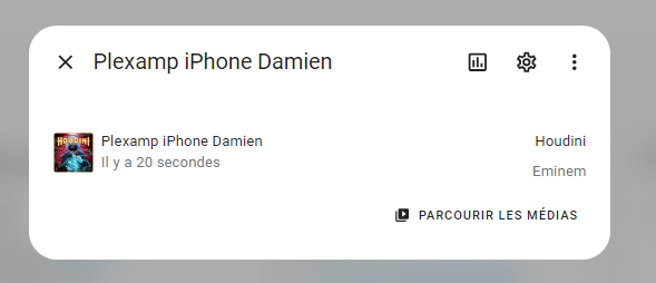
Ma source est mon homepod
type: custom:stack-in-card
cards:
  - type: custom:mushroom-media-player-card
    entity: media_player.cuisine
    icon: mdi:play
    use_media_info: true
    use_media_artwork: false
    show_volume_level: false
    media_controls:
      - play_pause_stop
      - previous
      - next
    fill_container: false
    card_mod:
      style: |
        mushroom-shape-icon {
          display: flex;
          {% set media_type = state_attr(config.entity, 'media_content_type') %}
          {% if media_type == 'tvshow' %}
            --card-mod-icon: mdi:television-classic;
            animation: flicker 1s linear infinite alternate;
          {% elif media_type == 'movie' %}
            --card-mod-icon: mdi:movie-roll;
            animation: spin 2s linear infinite reverse;
          {% elif media_type == 'video' %}
            --card-mod-icon: mdi:movie-roll;
            animation: spin 2s linear infinite reverse;
          {% elif media_type == 'music' %}
            --card-mod-icon: mdi:music;
            animation: beat 1.3s ease-out infinite both;
          {% elif media_type == 'playlist' %}
            --card-mod-icon: mdi:music;
            animation: beat 1.3s ease-out infinite both;
          {% else %}
            --card-mod-icon: mdi:play;
          {% endif %}

          {{ 'animation: none;' if not is_state(config.entity, 'playing') }}

        }
        @keyframes flicker {
          0%, 31.98%, 32.98%, 34.98%, 36.98%, 39.98%, 67.98%, 68.98%, 95.98%, 96.98%, 97.98%, 98.98%, 100% { --icon-color: rgba(var(--rgb-indigo), 1); }
          32%, 33%, 35%, 36%, 37%, 40%, 68%, 69%, 96%, 97%, 98%, 99% { --icon-color: rgba(var(--rgb-indigo), 0.6); }
        }
        @keyframes beat {
          0%, 60% { --icon-symbol-size: 21px; }
          5%, 17%, 57% { --icon-symbol-size: 22px; }
          10%, 20%, 51% { --icon-symbol-size: 23px; }
          25%, 45% { --icon-symbol-size: 24px; }
          30%, 39% { --icon-symbol-size: 25px; }
          33% { --icon-symbol-size: 26px; }
        }
        ha-card {
          --ha-card-border-width: 0;
        }
        ha-card:before {
          transform: translate3d(0,0,0);
          -webkit-transform: translate3d(0,0,0);
          content: "";

          background: url('/local/idle_art.png') center no-repeat;
          {% if not (is_state('media_player.cuisine', 'idle') or is_state('media_player.cuisine', 'standby')) %}
            background: url( '{{ state_attr(config.entity, "entity_picture") }}') center no-repeat;
          {% endif %}

          width: 50%;
          height: auto;
          background-size: contain;
          margin: 4px 4px 16px;
          margin-left: auto;
          margin-right: auto;
          filter: drop-shadow(4px 4px 6px rgba(0, 0, 0, 0.5));
          border-radius: var(--control-border-radius);

          {% set media_type = state_attr(config.entity, 'media_content_type') %}
          {% if media_type == 'tvshow' %}
            aspect-ratio: 2 / 3;
          {% elif media_type == 'movie' %}
            aspect-ratio: 2 / 3;
          {% elif media_type == 'video' %}
            aspect-ratio: 2 / 3;
          {% else %}
            aspect-ratio: 1 / 1;
          {% endif %}
        }
  - type: conditional
    conditions:
      - entity: media_player.cuisine
        state_not: 'off'
      - entity: media_player.cuisine
        state_not: idle
    card:
      entity: media_player.cuisine
      hide:
        icon: true
        name: true
        runtime: true
        source: true
        power: true
        state_label: true
        volume: true
        info: true
        progress: false
        controls: true
      more_info: false
      type: custom:mini-media-player
      toggle_power: false
      group: true
      card_mod:
        style:
          mmp-progress$: |
            paper-progress {
              /* Apply album art color to progress bar when paused */
              --paper-progress-container-color: rgba(var(--album-art-color), 0.2) !important;
              /* Apply album art color to progress bar when playing */
              --paper-progress-active-color: rgb(var(--album-art-color)) !important;
            }
          .: |
            ha-card {
                /* Move progress bar up into gap. Check if PLAY|STOP are supported */
              --base-offset: calc(0 * var(--mush-spacing, 12px)
                                  + 1.33 * var(--mush-spacing, 12px)
                                  + var(--mush-card-primary-line-height, 1.5) * var(--mush-card-primary-font-size, 14px)
                                  + var(--mush-card-secondary-line-height, 1.5) * var(--mush-card-secondary-font-size, 12px)
                                  + var(--mush-control-height, 42px));

                /* Check if Play (16385) or Stop (4096) are supported and add control button height if they are */
              {% if state_attr(config.entity, 'supported_features') | int | bitwise_and(20480) > 0 %}
                --control-offset: calc(var(--mush-spacing, 12px) + var(--mush-control-height, 42px));
              {% else %}
                --control-offset: 0px;
              {% endif %}

                /* Check if album name is present and add to height if it is */
              {% set album_name = state_attr(config.entity, 'media_album_name') %}
              {% if album_name == None or album_name == "" %}
                --album-offset: 0px;
              {% else %}
                --album-offset: calc(var(--mush-card-secondary-line-height, 1.5) * var(--mush-card-secondary-font-size, 12px));
              {% endif %}

                bottom: calc(var(--base-offset) + var(--control-offset) + var(--album-offset));

                /* Correct margins for progress bar */
              margin: 0px 28px -12px;

                /* Set height of card to match pregress bar height */
              height: var(--mmp-progress-height);

                /* Remove border outline */
              --ha-card-border-width: 0;

                /* Round corners of progress bar */
              --mmp-border-radius: var(--control-border-radius, 12px) !important;

                /* Set height of progress bar */
              --mmp-progress-height: 12px !important;

                /* Remove transitions to prevent progress bar floating in */
              transition: all 0s;
            }
card_mod:
  style: |
    ha-card:before {
      transform: translate3d(0,0,0);
      -webkit-transform: translate3d(0,0,0);
      content: "";
      position: absolute;
      height: 100%;
      width: 100%;

      background: url('/local/idle_art.png') center no-repeat;
      {% if not (is_state('media_player.cuisine', 'idle') or is_state('media_player.cuisine', 'standby')) %}
        background: url( '{{ state_attr('media_player.cuisine', "entity_picture") }}' ) center no-repeat;
      {% endif %}

      filter: blur(150px) saturate(200%);
      background-size: 100% 100%;
    }
    ha-card {
      transform: translate3d(0,0,0);
      -webkit-transform: translate3d(0,0,0);
    }
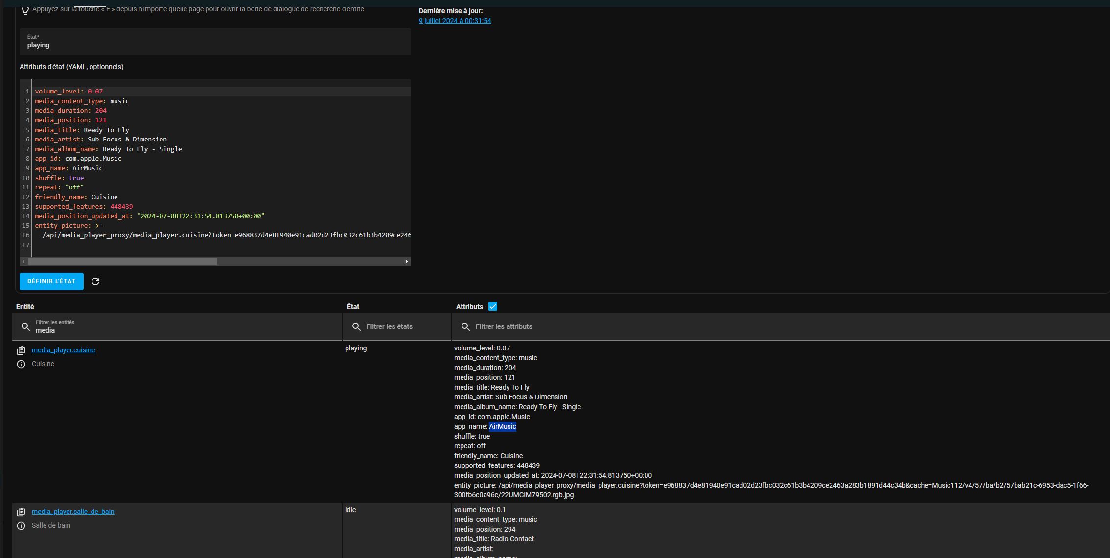
Fais moi un petit screen
Je vais tester avec mon homepod pour voir ce que j’ai comme résultat.
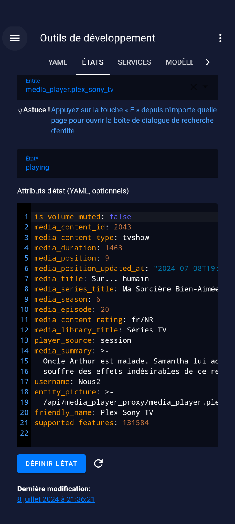
Mais théoriquement cela ne devrait pas changer, je vois les bons attributs dans ton screen « media_content_type » = music et on voir « entity_picture » qui correspond à la pochette d’album.
Quand tu vas dans le media_player en cours de lecture, tu vois bien la pochette de l’ablum ?
Sinon, vous pouvez créer un media_player ‹ centralisé ›
A mettre dans le configuration.yaml :
media_player:
  - platform: universal
    name: Currently Playing
    children:
      - media_player.plex_tv
      - media_player.apple_tv_4k
      - media_player.plex_apple_tv_4k
      - media_player.plex_nvidia_shield
Ajouter vos media_player sous children (en retirant les miens)
Un fois HA redémarrer, vous mettez le media_player.currently_playing qu’on vient de créer dans la carte
De cette façon si un des media_player présent dans la liste est en cours de lecture, il sera actif dans le curretly_playing
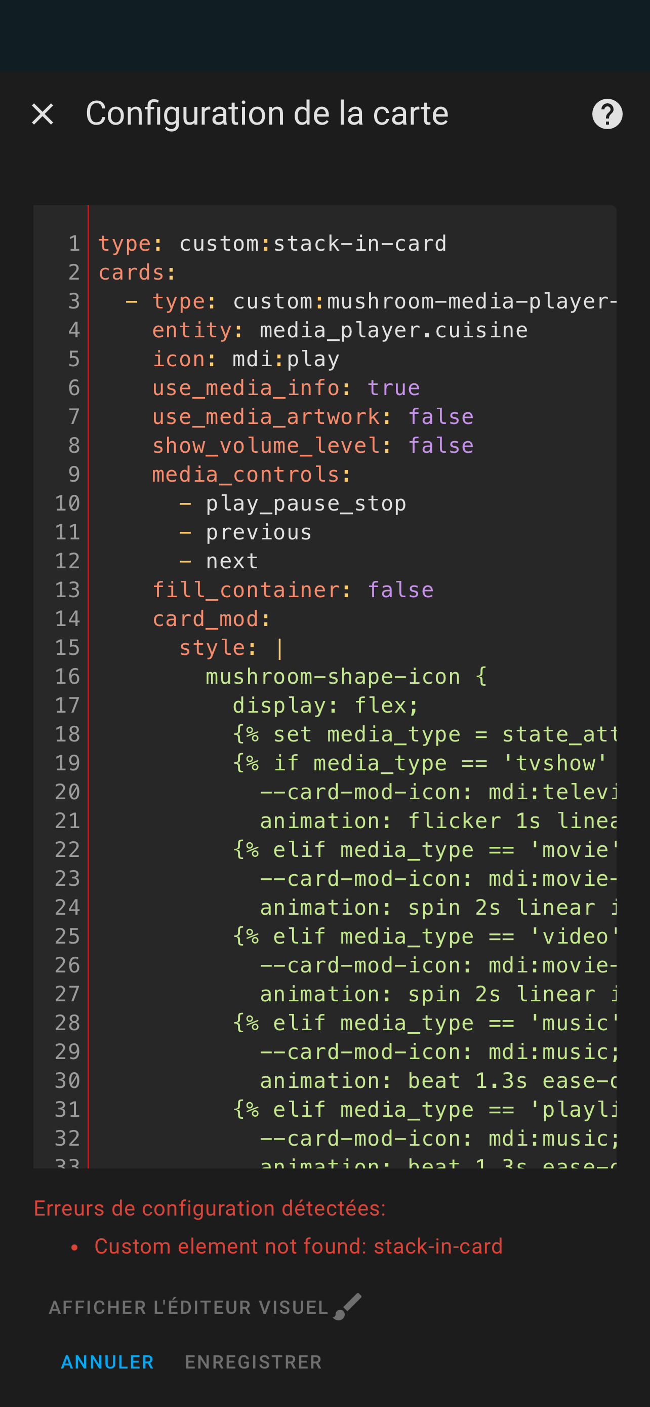
Tu as installé stack-in-card depuis HACS ?
J’ai l’impression qu’il ne trouve pas le module…
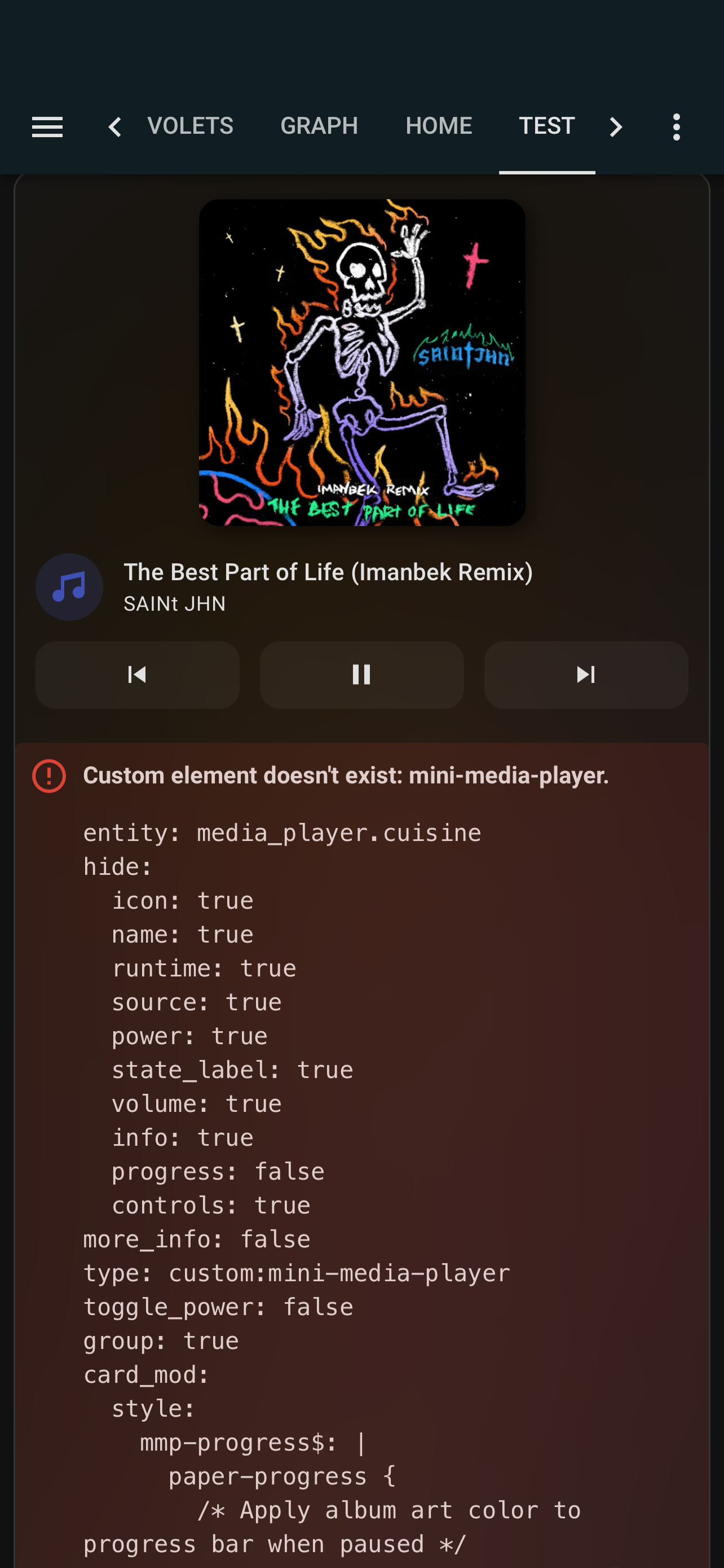
Tu fais la même chose mais avec mini-media-player 
sa fonctionne merci pour ton aide
est il possible de faire en sorte que la pochette prenne prennes toute la carte
j’arrive pas a avoir une image en fond en veille ou en attente vous faite comment ?
tu l’a placé ou ton image de veille