J’en suis là, et j’arrête… 
Je postes le code ce soir 
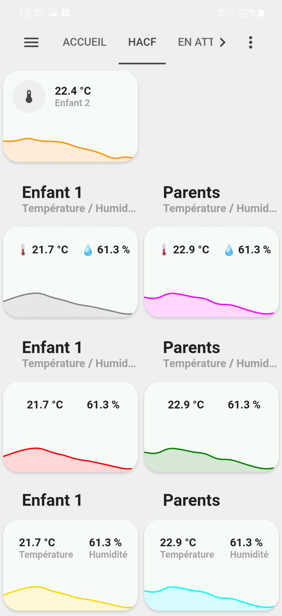
Edit:
Le modèle :
Il est pas super propre car j’ai fais pas mal de tests mais je laisse pour montrer (un peu) les possibilités de codage…
button_card_templates:
  graph_with_card:
    variables:
      entity_carte_gauche: sensor.default
      entity_carte_droite: sensor.default
      entity_graph: sensor.default
      color: var(--info-color)
      name_carte_gauche: Default name
      name_carte_droite: Default name
      show_icon_carte_gauche: 'false'
      show_icon_carte_droite: 'false'
      show_name_carte_gauche: 'false'
      show_name_carte_droite: 'false'
      icon_carte_gauche: null
      icon_carte_droite: null
    styles:
      card:
        - border-radius: var(--border-radius)
        - box-shadow: var(--box-shadow)
        - padding: 0px
      grid:
        - grid-template-areas: '"item1" "item2"'
        - grid-template-columns: 1fr
        - grid-template-rows: min-content  min-content
      custom_fields:
        item2:
          - padding-top: >
              [[[ if (!variables.show_name_carte_gauche &&
              !variables.show_name_carte_droite) return '13px';]]]
    custom_fields:
      item1:
        card:
          type: custom:button-card
          entity: '[[[ return variables.entity_carte_gauche ]]]'
          name: '[[[ return variables.name_carte_gauche ]]]'
          template:
            - icon_info
            - generique
          show_icon: '[[[ return variables.show_icon_carte_gauche ]]]'
          show_name: '[[[ return variables.show_name_carte_gauche ]]]'
          label: |
            [[[
              if (variables.icon_carte_gauche ) return (variables.icon_carte_gauche + " " + states[variables.entity_carte_gauche].state+ " " + states[variables.entity_carte_gauche].attributes.unit_of_measurement);
              return states[variables.entity_carte_gauche].state + " " + states[variables.entity_carte_gauche].attributes.unit_of_measurement;
            ]]]
          styles:
            card:
              - '--padding-mobile': >
                  [[[ if (!variables.show_icon_carte_gauche &&
                  !variables.show_icon_carte_droite) return '5px 5px 14px 0px';
                  if (variables.show_icon_carte_gauche &&
                  variables.show_icon_carte_droite) return '3px 0 0px 10px';
                  return '10px 0 9px 10px'; ]]]
              - '--padding-computer': >
                  [[[ if (!variables.show_icon_carte_gauche &&

                  !variables.show_icon_carte_droite) return '23px 0 12px 0';
                  return '12px'; ]]]
              - padding: var(--padding-computer)
            grid:
              - grid-template-areas: '"i l item1_item1" "i n item1_item1"'
              - grid-template-columns: >
                  [[[ if (!variables.show_icon_carte_gauche &&

                  !variables.show_icon_carte_droite) return 'auto'; return
                  'min-content auto'; ]]]
          extra_styles: |
            #label {
              white-space: nowrap;
            }
            /* telephone */
            @media screen and (max-width: 800px) {
              #label {
                white-space: pre-line;
              }
              #card {
                padding: var(--padding-mobile) !important;
              }
            }
          custom_fields:
            item1_item1:
              card:
                entity: '[[[ return variables.entity_carte_droite ]]]'
                name: '[[[ return variables.name_carte_droite ]]]'
                template:
                  - icon_info
                  - generique
                label: |
                  [[[
                    if (variables.icon_carte_droite ) return (variables.icon_carte_droite + " " + states[variables.entity_carte_droite].state) + " " + states[variables.entity_carte_droite].attributes.unit_of_measurement;
                    return states[variables.entity_carte_droite].state + " " + states[variables.entity_carte_droite].attributes.unit_of_measurement;
                  ]]]
                show_icon: '[[[ return variables.show_icon_carte_droite ]]]'
                show_name: '[[[ return variables.show_name_carte_droite ]]]'
                extra_styles: |
                  #label {
                    white-space: nowrap;
                  }
                  /* telephone */
                  @media screen and (max-width: 800px) {
                    #label {
                      white-space: pre-line;
                    }
                  }
                type: custom:button-card
      item2:
        card:
          type: custom:mini-graph-card
          entities:
            - entity: '[[[ return variables.entity_graph ]]]'
          line_color: '[[[ return variables.color ]]]'
          show:
            name: false
            icon: false
            legend: false
            state: false
          style: |
            ha-card {
              box-shadow: none;
              border-radius: var(--border-radius);
            }
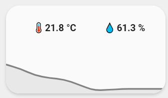
#carte grise
type: custom:button-card
template: graph_with_card
variables:
  entity_carte_gauche: sensor.temperature_enfant1
  entity_carte_droite: sensor.humidity
  entity_graph: sensor.temperature_salon
  name_carte_gauche: Enfant 1
  name_carte_droite: Enfant 2
  color: gray
  show_icon_carte_droite: false
  show_icon_carte_gauche: false
  show_name_carte_droite: false
  show_name_carte_gauche: false
  icon_carte_gauche: 🌡️
  icon_carte_droite: 💧
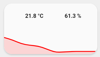
#carte rouge
type: custom:button-card
template: graph_with_card
variables:
  entity_carte_gauche: sensor.temperature_enfant1
  entity_carte_droite: sensor.humidity
  entity_graph: sensor.temperature_salon
  name_carte_gauche: Enfant 1
  name_carte_droite: Enfant 2
  color: red
  show_icon_carte_droite: false
  show_icon_carte_gauche: false
  show_name_carte_droite: false
  show_name_carte_gauche: false
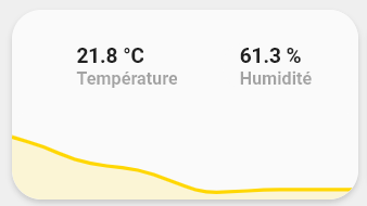
#carte jaune
type: custom:button-card
template: graph_with_card
variables:
  entity_carte_gauche: sensor.temperature_enfant1
  entity_carte_droite: sensor.humidity
  entity_graph: sensor.temperature_salon
  name_carte_gauche: Température
  name_carte_droite: Humidité
  color: gold
  show_icon_carte_droite: false
  show_icon_carte_gauche: false
  show_name_carte_droite: true
  show_name_carte_gauche: true