Un exemple de style appliqué seulement sur les téléphone.
Ok, faut enlever alors? ça fait partie du clean? ^^
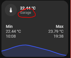
Il y a une petite erreur au niveau affichage du nom:
show_icon: '[[[ return variables.show_icon_carte_droite ]]]'
- show_name: '[[[ return variables.show_name_carte_gauche ]]]'
+ show_name: '[[[ return variables.show_name_carte_droite ]]]'
1 « J'aime »
Le joli copier/merder !
 j’ai eu de la chance de chercher a afficher les noms pour la voir ^^
On peux mettre le nom de l’entité principale, par exemple pour afficher le nom de la pièce?
Faut ajouter une variable name ds le template mais comment la faire afficher comme le template icon_info?
Ton template et celui « de base »:
Juste ajouter le nom de la pièce qui est égale au sensor du graph en gros.
Sinon parfait !!
Pas forcément. Enleve et regarde depuis un petit écran…
La carte est fonctionnelle mais comme je l’ai mise sans nettoyage, je ne me souviens plus de tous les tests que j’ai fais.
Pas forcément du nettoyage peut être…
Edit et met une image, je m’y perd dans les templates…
Hello,
Comment ça @M_nu62880, comment je gère la filtration?
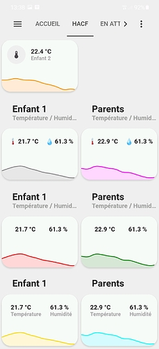
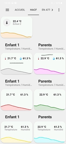
@Clemalex , j’ai édité le post comme demandé, j’ai un autre truc que je comprends pas, pourtant j’ai l’impression d’avoir fait chaque page de la même façon mais elle ne s’affiche pas pareil sur le téléphone, deux screens seront plus parlant:
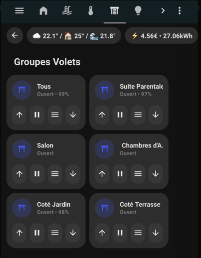
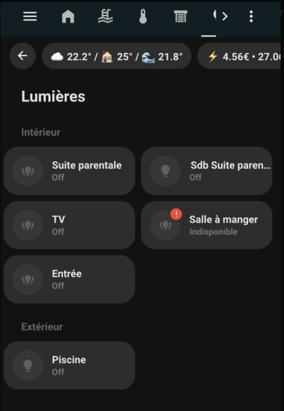
Tu vois le soucis? J’ai beau reprendre le code, je vois pas la diff…
Une nouvelle carte depuis une demande sur le forum officiel :

Ce n’est pas fini. il faut encore adapter le modèle (au lieu de prendre celui generique  ancien nom) en plus de reprendre en variable les couleurs et modeliser le tout.
Pour les plus impatients, le code actuel :
Carte de gauche (sans couleur de fond)
#left card
type: custom:button-card
styles:
  card:
    - border-radius: 20px
    - box-shadow: var(--box-shadow)
    - padding: 0px
  grid:
    - grid-template-areas: '"item1" "item2" "item3" "item4" "item5" "item6"'
    - grid-template-columns: 1fr
    - grid-template-rows: min-content
custom_fields:
  item1:
    card:
      entity: sensor.canon_mg5700_series
      name: Canon MG5750
      template:
        - icon_info
        - generique
      styles:
        card:
          - padding: 12px
      type: custom:button-card
  item2:
    card:
      type: custom:bar-card
      name: BK
      height: 20px
      positions:
        name: outside
        value: outside
        icon: 'off'
        indicator: 'off'
        minmax: 'off'
      color: black
      entities:
        - entity: sensor.canon_mg5700_series_black_bk
      style: |
        bar-card-currentbar{
          border: 0.01rem solid rgb(226,226,226);
        }
        bar-card-backgroundbar{
          display: none;
        }
        bar-card-name{
          width: 2rem;
          margin-right: 40px !important;
        }
        bar-card-value{
          width: 2rem;
          margin-left: 40px !important;
          justify-content: center;
          display: flex;
        }
        bar-card-background{
          margin: 4px 0 4px 0 !important;
          text-align: initial;
        }
        ha-card{
          --bar-card-border-radius: 5px;
          border-radius: 0px;
          box-shadow: none;
        }
        #states{
          padding: 0 16px;
        }
      animation:
        state: 'off'
  item3:
    card:
      type: custom:bar-card
      name: B
      height: 20px
      positions:
        name: outside
        value: outside
        icon: 'off'
        indicator: 'off'
        minmax: 'off'
      color: black
      entities:
        - entity: sensor.canon_mg5700_series_black_pgbk
      style: |
        bar-card-currentbar{
          border: 0.01rem solid rgb(226,226,226);
        }
        bar-card-backgroundbar{
          display: none;
        }
        bar-card-name{
          width: 2rem;
          margin-right: 40px !important;
        }
        bar-card-value{
          width: 2rem;
          margin-left: 40px !important;
          justify-content: center;
          display: flex;
        }
        bar-card-background{
          margin: 4px 0 4px 0 !important;
          text-align: initial;
        }
        ha-card{
          --bar-card-border-radius: 5px;
          border-radius: 0px;
          box-shadow: none;
        }
        #states{
          padding: 0 16px;
        }
      animation:
        state: 'off'
  item4:
    card:
      type: custom:bar-card
      name: 'Y'
      height: 20px
      positions:
        name: outside
        value: outside
        icon: 'off'
        indicator: 'off'
        minmax: 'off'
      color: rgb(250,179,0)
      entities:
        - entity: sensor.canon_mg5700_series_yellow
      style: |
        bar-card-currentbar{
          border: 0.01rem solid rgb(226,226,226);
        }
        bar-card-backgroundbar{
          display: none;
        }
        bar-card-name{
          width: 2rem;
          margin-right: 40px !important;
        }
        bar-card-value{
          width: 2rem;
          margin-left: 40px !important;
          justify-content: center;
          display: flex;
        }
        bar-card-background{
          margin: 4px 0 4px 0 !important;
          text-align: initial;
        }
        ha-card{
          --bar-card-border-radius: 5px;
          border-radius: 0px;
          box-shadow: none;
        }
        #states{
          padding: 0 16px;
        }
      animation:
        state: 'off'
  item5:
    card:
      type: custom:bar-card
      name: M
      height: 20px
      positions:
        name: outside
        value: outside
        icon: 'off'
        indicator: 'off'
        minmax: 'off'
      color: rgb(248,75,122)
      entities:
        - entity: sensor.canon_mg5700_series_magenta
      style: |
        bar-card-currentbar{
          border: 0.01rem solid rgb(226,226,226);
        }
        bar-card-backgroundbar{
          display: none;
        }
        bar-card-name{
          width: 2rem;
          margin-right: 40px !important;
        }
        bar-card-value{
          width: 2rem;
          margin-left: 40px !important;
          justify-content: center;
          display: flex;
        }
        bar-card-background{
          margin: 4px 0 4px 0 !important;
          text-align: initial;
        }
        ha-card{
          --bar-card-border-radius: 5px;
          border-radius: 0px;
          box-shadow: none;
        }
        #states{
          padding: 0 16px;
        }
      animation:
        state: 'off'
  item6:
    card:
      type: custom:bar-card
      name: C
      height: 20px
      positions:
        name: outside
        value: outside
        icon: 'off'
        indicator: 'off'
        minmax: 'off'
      color: rgb(66,126,222)
      entities:
        - entity: sensor.canon_mg5700_series_cyan
      style: |
        bar-card-currentbar{
          border: 0.01rem solid rgb(226,226,226);
        }
        bar-card-backgroundbar{
          display: none;
        }
        bar-card-name{
          width: 2rem;
          margin-right: 40px !important;
        }
        bar-card-value{
          width: 2rem;
          margin-left: 40px !important;
          justify-content: center;
          display: flex;
        }
        bar-card-background{
          margin: 4px 0 4px 0 !important;
          text-align: initial;
        }
        ha-card{
          --bar-card-border-radius: 5px;
          border-radius: 0px;
          box-shadow: none;
        }
        #states{
          padding: 0 16px 16px 16px;
        }
      animation:
        state: 'off'
Carte de droite (avec couleur de fond)
type: custom:button-card
styles:
  card:
    - border-radius: 20px
    - box-shadow: var(--box-shadow)
    - padding: 0px
  grid:
    - grid-template-areas: '"item1" "item2" "item3" "item4" "item5" "item6"'
    - grid-template-columns: 1fr
    - grid-template-rows: min-content
custom_fields:
  item1:
    card:
      entity: sensor.canon_mg5700_series
      name: Canon MG5750
      template:
        - icon_info
        - generique
      styles:
        card:
          - padding: 12px
      type: custom:button-card
  item2:
    card:
      type: custom:bar-card
      name: BK
      height: 20px
      positions:
        name: outside
        value: outside
        icon: 'off'
        indicator: 'off'
        minmax: 'off'
      color: black
      entities:
        - entity: sensor.canon_mg5700_series_black_bk
      style: |
        bar-card-name{
          width: 2rem;
          margin-right: 40px !important;
        }
        bar-card-value{
          width: 2rem;
          margin-left: 40px !important;
          justify-content: center;
          display: flex;
        }
        bar-card-background{
          margin: 4px 0 4px 0 !important;
          text-align: initial;
        }
        ha-card{
          --bar-card-border-radius: 5px;
          border-radius: 0px;
          box-shadow: none;
        }
        #states{
          padding: 0 16px;
        }
      animation:
        state: 'off'
  item3:
    card:
      type: custom:bar-card
      name: B
      height: 20px
      positions:
        name: outside
        value: outside
        icon: 'off'
        indicator: 'off'
        minmax: 'off'
      color: black
      entities:
        - entity: sensor.canon_mg5700_series_black_pgbk
      style: |
        bar-card-name{
          width: 2rem;
          margin-right: 40px !important;
        }
        bar-card-value{
          width: 2rem;
          margin-left: 40px !important;
          justify-content: center;
          display: flex;
        }
        bar-card-background{
          margin: 4px 0 4px 0 !important;
          text-align: initial;
        }
        ha-card{
          --bar-card-border-radius: 5px;
          border-radius: 0px;
          box-shadow: none;
        }
        #states{
          padding: 0 16px;
        }
      animation:
        state: 'off'
  item4:
    card:
      type: custom:bar-card
      name: 'Y'
      height: 20px
      positions:
        name: outside
        value: outside
        icon: 'off'
        indicator: 'off'
        minmax: 'off'
      color: rgb(250,179,0)
      entities:
        - entity: sensor.canon_mg5700_series_yellow
      style: |
        bar-card-name{
          width: 2rem;
          margin-right: 40px !important;
        }
        bar-card-value{
          width: 2rem;
          margin-left: 40px !important;
          justify-content: center;
          display: flex;
        }
        bar-card-background{
          margin: 4px 0 4px 0 !important;
          text-align: initial;
        }
        ha-card{
          --bar-card-border-radius: 5px;
          border-radius: 0px;
          box-shadow: none;
        }
        #states{
          padding: 0 16px;
        }
      animation:
        state: 'off'
  item5:
    card:
      type: custom:bar-card
      name: M
      height: 20px
      positions:
        name: outside
        value: outside
        icon: 'off'
        indicator: 'off'
        minmax: 'off'
      color: rgb(248,75,122)
      entities:
        - entity: sensor.canon_mg5700_series_magenta
      style: |
        bar-card-name{
          width: 2rem;
          margin-right: 40px !important;
        }
        bar-card-value{
          width: 2rem;
          margin-left: 40px !important;
          justify-content: center;
          display: flex;
        }
        bar-card-background{
          margin: 4px 0 4px 0 !important;
          text-align: initial;
        }
        ha-card{
          --bar-card-border-radius: 5px;
          border-radius: 0px;
          box-shadow: none;
        }
        #states{
          padding: 0 16px;
        }
      animation:
        state: 'off'
  item6:
    card:
      type: custom:bar-card
      name: C
      height: 20px
      positions:
        name: outside
        value: outside
        icon: 'off'
        indicator: 'off'
        minmax: 'off'
      color: rgb(66,126,222)
      entities:
        - entity: sensor.canon_mg5700_series_cyan
      style: |
        bar-card-name{
          width: 2rem;
          margin-right: 40px !important;
        }
        bar-card-value{
          width: 2rem;
          margin-left: 40px !important;
          justify-content: center;
          display: flex;
        }
        bar-card-background{
          margin: 4px 0 4px 0 !important;
          text-align: initial;
        }
        ha-card{
          --bar-card-border-radius: 5px;
          border-radius: 0px;
          box-shadow: none;
        }
        #states{
          padding: 0 16px 16px 16px;
        }
      animation:
        state: 'off'
3 « J'aime »
Suite du sujet Dashboard -  Minimalist :
Hello @Clemalex ,
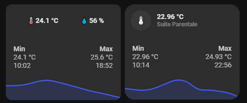
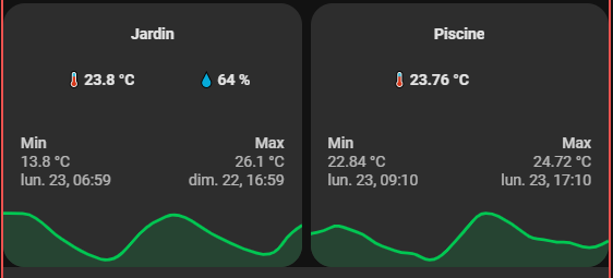
Du coup c’est possible d’ajouter le nom de la pièce dans ta carte?
Oui pourquoi pas, reprends cette image et indique où pour les 3 cartes :
En dessous ou au dessus peut-être ?
Voilà :
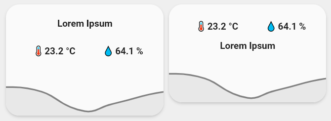
Carte de gauche (`show_label_up: true`)
type: custom:button-card
template: graph_with_card
variables:
  entity_carte_gauche: sensor.temperature
  entity_carte_droite: sensor.humidity
  entity_graph: sensor.temperature_salon
  name_carte_gauche: Enfant 1
  name_carte_droite: Enfant 2
  color: gray
  show_icon_carte_droite: false
  show_icon_carte_gauche: false
  show_name_carte_droite: false
  show_name_carte_gauche: false
  icon_carte_gauche: 🌡️
  icon_carte_droite: 💧
  show_label_up: true
  label: Lorem Ipsum
  show_label_down: false
Carte de droite(`show_label_down: true`)
type: custom:button-card
template: graph_with_card
variables:
  entity_carte_gauche: sensor.temperature_
  entity_carte_droite: sensor.humidity
  entity_graph: sensor.temperature_salon
  name_carte_gauche: Enfant 1
  name_carte_droite: Enfant 2
  color: gray
  show_icon_carte_droite: false
  show_icon_carte_gauche: false
  show_name_carte_droite: false
  show_name_carte_gauche: false
  icon_carte_gauche: 🌡️
  icon_carte_droite: 💧
  show_label_up: true
  label: Lorem Ipsum
  show_label_down: false
Le modele(template)
button_card_templates:
  graph_with_card:
    variables:
      entity_carte_gauche: sensor.default
      entity_carte_droite: sensor.default
      entity_graph: sensor.default
      color: var(--info-color)
      name_carte_gauche: Default name
      name_carte_droite: Default name
      show_icon_carte_gauche: 'false'
      show_icon_carte_droite: 'false'
      show_name_carte_gauche: 'false'
      show_name_carte_droite: 'false'
      icon_carte_gauche: null
      icon_carte_droite: null
      show_label_up: false
      show_label_down: false
      label: Chambre
    show_label: |
      [[[ if (variables.show_label_up) return 'true'; return 'false' ]]]
    label: >
      [[[ if (variables.show_label_up || variables.show_label_down ) return
      variables.label; return '' ]]]
    styles:
      card:
        - border-radius: var(--border-radius)
        - box-shadow: var(--box-shadow)
        - padding: 0px
      grid:
        - grid-template-areas: |
            [[[ if (variables.show_label_up) return '"l" "item1" "item2"';
                if (variables.show_label_down) return '"item1" "l" "item2" ';
                return '"item1" "item2"'
            ]]]
        - grid-template-columns: 1fr
        - grid-template-rows: min-content  min-content
      label:
        - font-weight: bold
        - font-size: 14px
        - padding-top: >
            [[[ if (variables.show_label_up ) return '20px'; if
            (variables.show_label_down ) return '0' ]]]
        - filter: opacity(100%)
      custom_fields:
        item2:
          - padding-top: >
              [[[ if (!variables.show_name_carte_gauche &&
              !variables.show_name_carte_droite) return '13px';]]]
    custom_fields:
      item1:
        card:
          type: custom:button-card
          entity: '[[[ return variables.entity_carte_gauche ]]]'
          name: '[[[ return variables.name_carte_gauche ]]]'
          template:
            - icon_info
            - generique
          show_icon: '[[[ return variables.show_icon_carte_gauche ]]]'
          show_name: '[[[ return variables.show_name_carte_gauche ]]]'
          label: |
            [[[
              if (variables.icon_carte_gauche ) return (variables.icon_carte_gauche + " " + states[variables.entity_carte_gauche].state+ " " + states[variables.entity_carte_gauche].attributes.unit_of_measurement);
              return states[variables.entity_carte_gauche].state + " " + states[variables.entity_carte_gauche].attributes.unit_of_measurement;
            ]]]
          styles:
            card:
              - '--padding-mobile': >
                  [[[ if (!variables.show_icon_carte_gauche &&
                  !variables.show_icon_carte_droite) return '5px 5px 14px 0px';
                  if (variables.show_icon_carte_gauche &&
                  variables.show_icon_carte_droite) return '3px 0 0px 10px';
                  return '10px 0 9px 10px'; ]]]
              - '--padding-computer': >
                  [[[ if (!variables.show_icon_carte_gauche &&

                  !variables.show_icon_carte_droite) return '23px 0 12px 0';
                  return '12px'; ]]]
              - padding: var(--padding-computer)
            grid:
              - grid-template-areas: '"i l item1_item1" "i n item1_item1"'
              - grid-template-columns: >
                  [[[ if (!variables.show_icon_carte_gauche &&

                  !variables.show_icon_carte_droite) return 'auto'; return
                  'min-content auto'; ]]]
          extra_styles: |
            #label {
              white-space: nowrap;
            }
            /* telephone */
            @media screen and (max-width: 800px) {
              #label {
                white-space: pre-line;
              }
              #card {
                padding: var(--padding-mobile) !important;
              }
            }
          custom_fields:
            item1_item1:
              card:
                entity: '[[[ return variables.entity_carte_droite ]]]'
                name: '[[[ return variables.name_carte_droite ]]]'
                template:
                  - icon_info
                  - generique
                label: |
                  [[[
                    if (variables.icon_carte_droite ) return (variables.icon_carte_droite + " " + states[variables.entity_carte_droite].state) + " " + states[variables.entity_carte_droite].attributes.unit_of_measurement;
                    return states[variables.entity_carte_droite].state + " " + states[variables.entity_carte_droite].attributes.unit_of_measurement;
                  ]]]
                show_icon: '[[[ return variables.show_icon_carte_droite ]]]'
                show_name: '[[[ return variables.show_name_carte_gauche ]]]'
                extra_styles: |
                  #label {
                    white-space: nowrap;
                  }
                  /* telephone */
                  @media screen and (max-width: 800px) {
                    #label {
                      white-space: pre-line;
                    }
                  }
                type: custom:button-card
      item2:
        card:
          type: custom:mini-graph-card
          entities:
            - entity: '[[[ return variables.entity_graph ]]]'
          line_color: '[[[ return variables.color ]]]'
          show:
            name: false
            icon: false
            legend: false
            state: false
          style: |
            ha-card {
              box-shadow: none;
              border-radius: var(--border-radius);
            }
1 « J'aime »
Top!!
Merci @Clemalex !
Il y a un moyen simple de désactivé l’entité de droite si jamais il y a qu’une données a afficher?
Hello 
J’ai quelques soucis à comprendre les input_select et input_boolean pour la gestion des personnes sur le thème. Quelqu’un aurait-il un exemple si cela vous dérange pas ? ^^
Merci à vous
il faut utiliser la carte originale pour ce cas.
Pourquoi passer par cette carte où tu as demandé d’avoir 2 informations pour au final demander d’afficher une seule information 
La logique derrière n’a pas été expliquée il me semble, donc on ne peut faire que des suppositions.
Personnellement; je préfère utiliser l’entité person.<utilisateur> comme ici.
C’est pas faux…
Mais du coup, le design est diffèrent, je voulais garder ton style:
@Drealine, j’ai aussi adapté la gestion des personnes avec le person.<utilisateur> en ajoutant des zones tu peux faire quelque chose de plus précis:
  personne-antho:
    template: personne
    show_entity_picture: true
    entity_picture: |
      [[[ return entity.attributes.entity_picture; ]]]
    hold_action:
      action: more-info
      entity: person.antho
    styles:
      custom_fields:
        notification:
          - background-color: |
              [[[
                if (states['person.antho'].state == 'home'){
                  return "rgba(var(--couleur-bleu),1)";
                }else{
                  return "rgba(var(--couleur-vert),1)";
                }
              ]]]
    custom_fields:
      notification: |
        [[[
          if (states['person.antho'].state == 'work'){
            return `<ha-icon icon="mdi:headset" style="width: 10px; height: 10px; color: white;"></ha-icon>`
          }else{
            if (states['person.antho'].state == 'home'){
              return `<ha-icon icon="mdi:home-variant" style="width: 10px; height: 10px; color: white;"></ha-icon>`
            }else{
              return `<ha-icon icon="mdi:run" style="width: 10px; height: 10px; color: white;"></ha-icon>`
            }
          }
        ]]]
1 « J'aime »
@Clemalex , j’ai repris ton template en enlevant la partie droite, cela semble fonctionner:
Mais niveau code, ça doit-être pourri ^^:
  graph_with_card_2:
    variables:
      entity_carte_gauche: sensor.default
      entity_graph: sensor.default
      color: var(--info-color)
      name_carte_gauche: Default name
      show_icon_carte_gauche: 'false'
      show_name_carte_gauche: 'false'
      icon_carte_gauche: null
      show_label_up: false
      show_label_down: false
      label: label.default
    show_label: |
      [[[ if (variables.show_label_up) return 'true'; return 'false' ]]]
    label: >
      [[[ if (variables.show_label_up || variables.show_label_down ) return
      variables.label; return '' ]]]
    styles:
      card:
        - border-radius: 20px
        - box-shadow: var(--box-shadow)
        - padding: 0px
      grid:
        - grid-template-areas: |
            [[[ if (variables.show_label_up) return '"l" "item1" "item2"';
                if (variables.show_label_down) return '"item1" "l" "item2" ';
                return '"item1" "item2"'
            ]]]
        - grid-template-columns: 1fr
        - grid-template-rows: min-content  min-content
      label:
        - font-weight: bold
        - font-size: 14px
        - padding-top: >
            [[[ if (variables.show_label_up ) return '20px'; if
            (variables.show_label_down ) return '0' ]]]
        - filter: opacity(100%)
      custom_fields:
        item2:
          - padding-top: |
              [[[ if (!variables.show_name_carte_gauche) return '13px';]]]
    custom_fields:
      item1:
        card:
          type: custom:button-card
          entity: '[[[ return variables.entity_carte_gauche ]]]'
          name: '[[[ return variables.name_carte_gauche ]]]'
          template:
            - icon_info
            - generique
          show_icon: '[[[ return variables.show_icon_carte_gauche ]]]'
          show_name: '[[[ return variables.show_name_carte_gauche ]]]'
          label: |
            [[[
              if (variables.icon_carte_gauche ) return (variables.icon_carte_gauche + " " + states[variables.entity_carte_gauche].state+ " " + states[variables.entity_carte_gauche].attributes.unit_of_measurement);
              return states[variables.entity_carte_gauche].state + " " + states[variables.entity_carte_gauche].attributes.unit_of_measurement;
            ]]]
          styles:
            card:
              - '--padding-mobile': >
                  [[[ if (!variables.show_icon_carte_gauche) return '2px 5px
                  14px 0px'; if (variables.show_icon_carte_gauche) return '3px 0
                  0px 10px'; return '10px 0 9px 10px'; ]]]
              - '--padding-computer': >
                  [[[ if (!variables.show_icon_carte_gauche) return '23px 0 12px
                  0'; return '2px'; ]]]
              - padding: var(--padding-computer)
            grid:
              - grid-template-areas: '"i l item1_item1" "i n item1_item1"'
              - grid-template-columns: >
                  [[[ if (!variables.show_icon_carte_gauche) return 'auto';
                  return 'min-content auto'; ]]]
          extra_styles: |
            #label {
              white-space: nowrap;
            }
            /* telephone */
            @media screen and (max-width: 800px) {
              #label {
                white-space: pre-line;
              }
              #card {
                padding: var(--padding-mobile) !important;
              }
            }
      item2:
        card:
          type: custom:mini-graph-card
          entities:
            - entity: '[[[ return variables.entity_graph ]]]'
          line_color: '[[[ return variables.color ]]]'
          show:
            name: false
            icon: false
            legend: false
            state: false
          style: |
            ha-card {
              box-shadow: none;
              border-radius: var(--border-radius);
            }
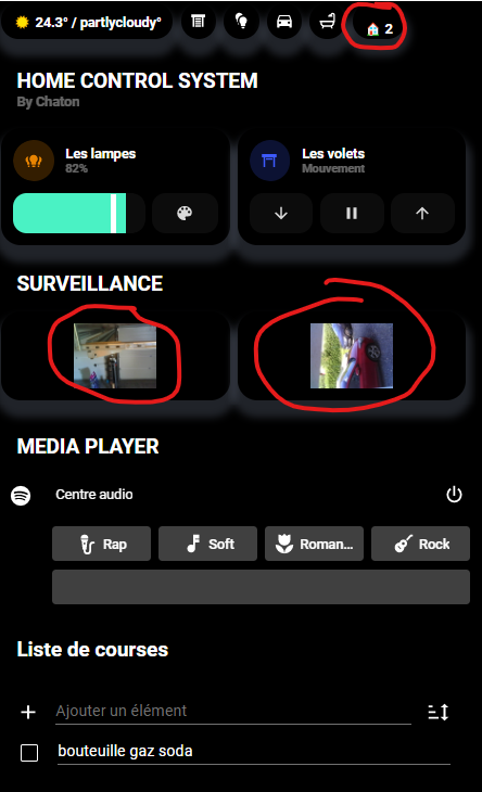
Re bonjour,
Tout est bon pour ce superbe Dash et grâce aux efforts de @Clemalex c’est de la folie lol
Voici mes soucis cependant : (Je suis en phase d’adaptation, c’est pas encore fini fini)
-
Quelqu’un ici aurait un template pour y mettre une camera dedans en live stream ?
impossible de trouver comment étirer l’image dans celle-ci -
le Chips en haut (Pilule) avec le logo qui n’est pas centré
Un grand merci à tous pour votre aide.
sven
1 « J'aime »
Bonjour Drealine,
Pour les inputs et les boolean tu dois crée deux fichiers à la source de ta configuration HA et les inclure à ton fichier configuration :
- input_select.yaml
- input_boolean.yaml
et les intégrer dans ton fichier configuration, je t’invite à aller lire ces deux doc qui m’ont permis de m’en sortir seul (Input Select - Home Assistant et Input Boolean - Home Assistant)
Ensuite tu peux crée des entités select et boolean afin de faire varier leurs états.
Comme ceci:
invite_present:
name: Mode visiteur
icon: mdi:smiley
initial: off
Du coup celui-deviendra : input_boolean.invite_present
Tu ne devra plus qu’adapter les noms et autres pour utiliser les codes existants
J’espère avoir pu t’aider
excellente journée,
sven